


Colour theory isn’t very helpful when it comes to decorating your home, but here is what I recommend instead to help you create a beautiful home you’ll love forever.
I’ve always (not-so) secretly thought that applying the rules of colour theory in interior decorating was completely overrated.
Recently a designer invited me to write an article about colour theory and sent me a list of questions about this topic. Questions like, “How can one use color theory to decorate their home?” and, “What’s one colour theory rule everyone should follow?”
So many people still think that colour theory may help them make the right colour choices when they’re decorating their home, and choosing paint colours for their walls. Writing this article was a great opportunity for me to drill down into what applying the rules of colour theory can do for you, and what it can’t!
So, what is colour theory?
I actually looked up the definition of colour theory: “Color theory is the collection of rules and guidelines which designers use to communicate with users through appealing color schemes in visual interfaces.”
Here’s what I think colour theory is—colour theory explains how colour is organized theoretically and describes the relationship between these colours.
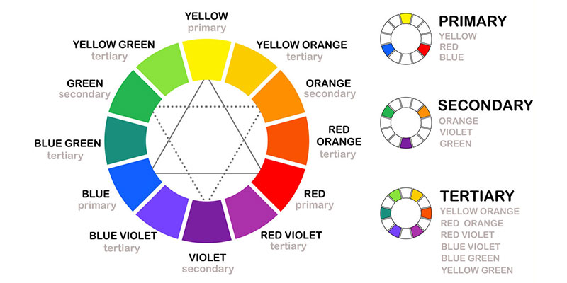
Most people visualize the colour wheel when they think of colour theory, and they learn the terms that describe colour relationships on this wheel—colours opposite each other are complementary, while colours located next to each other are analogous, etc.
Sir Isaac Newton’s Colour Wheel
Here’s why colour theory isn’t helpful for decorating your home
The one useful fact colour theory does tell you is that colours exist in relationships. But knowing this fact doesn’t help you make the choices you need to make when you’re decorating your home.
Colour theory is really great at describing your colours only after the decorating is done. That’s when you can describe the relationship between the colours as split-triad-complementary or some other description. But as far as I’ve experienced, no one ever stands in their (or their client’s) living room and says, “Hmm, I’ve always wanted to design a room with complementary colours. I’m going to look at my colour wheel and choose colours that do that.”
Creating a Colour Palette
So, if using colour theory isn’t helpful, what is helpful? Creating a colour palette.
When it comes to creating a colour palette you need to keep something in mind. Creating a colour palette for any room with existing hard finishes such as tile or carpet – which happens to be MOST rooms – is different than creating a colour palette for a room that really is a blank canvas.
Rooms with hard finishes (kitchens, bathrooms, living/family rooms with stone fireplaces and rooms with wall-to-wall carpeting):
The rooms in your home that have hard finishes—countertops, wall and floor tile, stone, mid-tone or darker broadloom carpet, patterned or “stripey” vinyl or even wood floors, etc. already have a starting point limiting your colour palette.
When you’re creating a colour palette for a room with these types of existing finishes, you need to look first at the colours already there. I call these finishes “bossy” because they dictate which colours you can add, or combine together, for your wall colour and decorating palette.
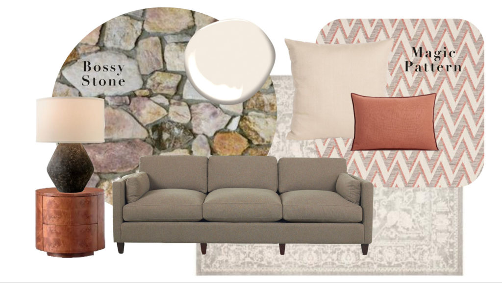
The multiple earth tones of stone is a good example of a bossy element that your decorating needs to coordinate with, like this neutral room below. Notice how the colour wheel above tells us nothing about the colours in this room?

If your finishes are simply solid black or white or cream, you are closer to a blank canvas situation. But if you instead have beige, taupe or grey finishes, especially if they have a mix of tones in them in the form of a pattern or texture, you need to take these colours into account when you decorate.
If you don’t want to be bossed around by the colours in your existing hard finishes, there are two ways to have more freedom with creating a colour palette. If you can, paint over an existing, bossy finish, and if you can’t paint it, change it. But, if neither option works for you, you can’t simply ignore it.
Colours that relate to other finishes in the room, ALWAYS look more harmonious.
No matter what colour theory tells you.
Once you’ve identified the colours in your existing hard finishes, the next step is to find a magic pattern that relates to the colours in your finishes and introduces more colours you love. This becomes your colour palette. Simply repeat all the colours in the pattern in large, medium and small doses.
Repeat all the colours in your pattern in large, medium and small doses around the room
If you have a bossy finish like stone, be sure to repeat the dominant colours. In this case the violet greys (repeated in the sofa, and area rug). And pick a pattern that has that colour and pulls in a fresher colour you want to decorate with. Like this rusty coral blush introduced in with the zig zag fabric. Then repeat it.

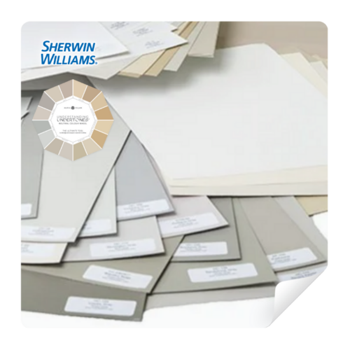
See Undertones Instantly
- Real Benjamin Moore paint chips
- All 9 neutral undertone families
- Compare directly to your fixed elements
Rooms without one or more existing finishes (living or bedrooms):
If you do have a room that is essentially a blank canvas, say just wood floors and four walls, or the perfect versatile white kitchen, and NO bossy finishes, you have many more options. So you need to start by finding some colour inspiration. This becomes the jumping-off point for your colour palette.
Colour inspiration can come from items like a piece of art, an area rug, or some pillows or other fabric. If you’re choosing decorating colours for your bedroom with wood floors (because most often carpet needs to be treated as a colour), start by buying some bedding you love. It’s much easier to commit to a paint colour when you can see how it relates to something else in the room.
The eye goes immediately to the soft furnishings in any room to see how they coordinate with the wall paint colours. Knowing what colour your hardwood floors are, or the colour of your wood-stained bedroom furniture will not help you choose paint or decorating colours. Unless there is wood up on the walls, trim or cabinetry, it’s mostly pretty neutral.
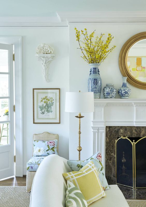
Want white walls? It works best if your soft furnishings have a lot of white like this pretty room below.
You’ll have a lot more freedom of expression and confidence in the colours you have chosen if you’ve started with a pattern you love – one with at least two or three colours to work with. Find some beautiful art, wallpaper, or fabric you love and then match the paint colour and accessories to the colours in those items.
The colour rule everyone should follow
For the article I wrote, I was asked, “What’s one colour theory rule everyone should follow?” If I could wave a magic wand and have the world follow one rule about colour theory, I would make this the rule—follow me. 🙂
It’s been my life passion to unlock the mystery of how colour works and show you how to make every colour choice for your home. Just sayin’.
Basic colour theory teaches you about relationships between super-saturated colours, but in a world where 80% of the time we are choosing one kind of neutral or another, that isn’t going to be much help. That’s why I’ve developed a comprehensive system of identifying neutrals by their specific undertones, how to un-complicate whites, and everything you need to know about coordinating more saturated colours in real life.
And if my magic wand would allow me to have the world follow one more colour rule, I’d give them one to help choose tricky, subtle neutrals. Because most colour mistakes happen in the most nuanced of colours. And most often, those are the colours we are choosing for expensive paint jobs and glued down hard finishes like tile and stone.
Read more: Should you install the current fad tile?
The neutral rule everyone should follow
When working with neutrals, this rule is super important. Make sure you DO NOT, at all costs, make the current, trendy neutral the dominant colour scheme in your house!
Here’s what I mean—during any and every trend, people install finishes, buy furnishings and decorate their home by shopping in stores stocked with tile, carpet, countertops, and even furnishings in the new neutral—sadly, often not just for one finish but for ALL of their finishes and furnishings.
For instance, the grey trend happened during the 2010s before the trends moved on to the current black, white, and cognac trend around 2020. In some parts of the country, grey has been OUT for years already.
Yet you can still find these grey finishes in flooring, cabinetry, etc. at your big box stores. This doesn’t mean the grey trend is sticking around. If it’s not “out” where you live, a change is coming your way.
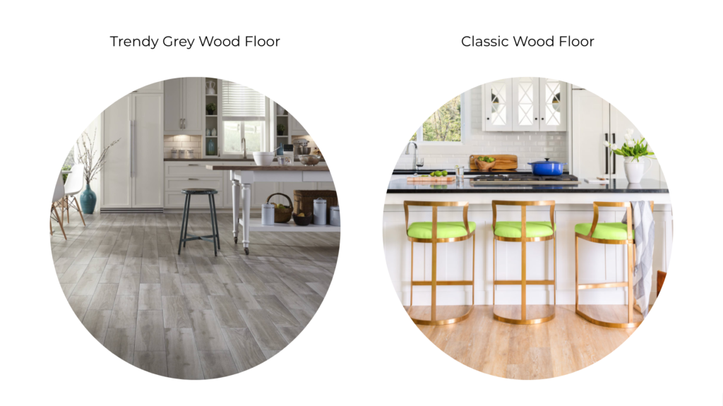
Trends eventually move on and they leave in their wake homes filled with dated hard finishes and large furnishings. Just visit any realtor site and look up homes for sale in your neighbourhood. Count how many grey finishes you find. Do they look like the homes you are pinning on Pinterest?
Even more frustrating is that these finishes (ie. flooring and tile) and some of the furnishings are meant to last years—even decades—well past the trend cycles they were selected in. Remember this reader who didn’t like any of the grey flooring?
The Killam Colour System™ in Action
Start with the Colour Wheel to identify undertones, then upgrade to the Bundle for a more complete colour decision toolkit.
Choosing Classic and Timeless Finishes
And this brings me back around to my mantra—choosing simple, solid, classic and timeless finishes lets you be the boss when creating a colour palette for your home that you love forever.
What qualifies a hard finish as classic and timeless? Basically, it’s when you follow these guidelines:
- Solid or so subtly patterned that it reads as a solid colour
- Looks like it’s “married” to every other hard finish in the room—not just matching, but meant to be together forever
- Doesn’t jump out and say, “Look at me! Look at me!”
- The same neutral undertone or white gradation
This is what you get when you follow classic and timeless guidelines for your hard finishes (and large furnishings):
- You will still love your finishes long after the latest trend has come and gone
- You’ll save money by not needing to rip out and replace dated (and expensive) tile, stone, counters, broadloom, etc.
- The most freedom to choose a colour palette that you love AND that can be updated SIMPLY by changing paint colours and refreshing your decorating
- No one will be able to walk into your home and instantly identify or date which year you built or renovated your home

A timeless black and white fireplace creates a versatile blank canvas for this colourful room
So, if you are baffled about whether blue is the complement of orange and what that means in your decorating, you’re onto something!
Bottom line: colour theory is much too theoretical to help you decorate. Stop worrying about complementary colours and start learning how to create colour palettes that relate to what you already have and bring in what you love.
If you’ve always wanted to find a more useful way to master colour—way beyond colour theory—Sign up to be notified when I launch the upcoming dates in my True Colour Expert workshop. This is where I reveal the guidelines I have discovered inside my system of Understanding Undertones to designers, decorators, architects, homeowners and stagers.
Related posts:
Tools That Make Colour Easy


Maria, I love all your blog posts. Confession: I’ve been so busy being a mom for the part 23 years I had no idea the Tuscan trend wasn’t timeless. I last updated my countertops 18 years ago to Tuscan Marble formica. Imagine my surprise when I fisrt found your blog by typing in what is a classic and timeless bathroom in a google search, subscribed to your blog and saw my 28 year old oak cabinets in one of your posts with the kitchen timelines.
I also almost bought gray LVT plank floors becuase they are still being sold in my area, and of course, again thought they were considered timeless because gray is a neutral. You saved me from that mistake only for me to find out plank floors are not exactly timeless but at least I got the color right.
You nail it when you say hard furnishings are expected to last for about 20 years because thats how long my maple laminte floors lasted. I also had no idea that trends last about ten years. In my 48 years of life I’m just now understanding what classic and timeless finishes are all the while realizing I’ve been investing in trendy because that’s what’s out there and we tend to want the now end of things. I just drove by a home that’s up for sale and was updated with a fresh coat of charcoal paint with white trim. I think we’re a bit behind here in the North Country.
I enjoy every morsel of what you have to offer in your blog posts like a kid opening presents on christmas morning- can’t wait to see what “gifts” you have to offer us in the world of interior design. 🙂
Once you have discovered Maria, you never look at design, or decorating the same way again. Big box store kitchen displays now almost want to make me scream. I have been able to save many friends from disasters by seeing undertones and going classic and simple.
I am a visual artist and can make a striking painting but cannot pick colors for my house. I liked the comparison of the artist and neutral color wheel. I used your color wheel to pick cabinet color recently. I had green beige tile and granite. Who knew? It made it easier to narrow down the right off white for the cabinets. I have many clashing neutrals in my home which we built before your blog but used your trick of repeating and making it look intentional. Thanks for all you do.
Could you do a post on timeless wall to wall carpeting? There may be reasons why hardwood can’t be laid without considerable time and expense. When entering a flooring store, the array of carpeting product is immense.
Hi S Palm – Maria has an excellent post on choosing wall to wall carpet:
https://mariakillam.com/4-steps-to-choosing-the-perfect-wall-to-wall-carpet-colour/
I began following your blog in 2014 while I was designing my current home. Your advice was so spot on. We moved into our completed home late 2015. I’m still thrilled with my choices thanks to your expert advice. I fashioned my foyer after the foyer and staircase in the RL women’s store in Manhattan. It affected all my permanent service choices. I’m still completely pleased with it. It feels timeless. Thank you!
I’ve been reading your blog for years and love all your work, but THIS article is the best! It really distills what to do to choose a color palette and decorate a room into an easy system. It’s nothing different than all you’ve been saying, but really puts it in a simple way for me to understand!
Thank you!
Yep – that is the #1 rule: follow Maria!!! 😃🙏🏻🤓💕
Good Day Maria;
We recently had a flood in are 2 story home. I need to start from the beginning. I loved my Mahoney floos, my granite entry, I am in the process now of having to pick the counter tops, kitchen flooring etc. I love the classic’s, any ideas for choosing classics would be wonderful. After 6 months of being out of are home in a rental, I am excited to began are new adventure in classic design and color choices. Color choices, and patterns have been perplexing to me. I love your blogs. Thank you
Terry
I am 100% sympathetic to the devastation of flooding, living in Houston. TX through Harvey!!
My son & his wife spent the night in the crawl space attic of the small home they were about to sell..with their sick 7mo old in a suitcase & 2 big labs.
They were able to wade out the next afternoon in waist deep water to the home of kind, unknown neighbors. They lost everything and lived with with me for a year!
Finally.. they have recently bought a BIG newly remodeled home in this insane HouTX market.
It has all gray vinyl planking. 🙁
This house also flooded because “idiots” opened a dam. (DAMN!)
The seller picked everything.)
Since it’s new and they now have 2 littles, 2 dogs and a pool, that flooring will have to do for awhile. They need giant rugs and nearly every piece of furniture you can imagine!!
I’m not sure how they’ll manage this enormous challenge. I’m biting my tongue but it’s not ez being a long time Maria follower!!
Best of luck in your redoing process!
Glad your excited about it!
I would encourage you to purchase Maria’s 2 e-books. These along with a search of blog posts helped me tremendously with my new build. And you can always purchase one of her e-design packages, too.💕
Good Day Maria;
We recently had a flood in are 2 story home. I need to start from the beginning. I loved my Mahoney floors, my granite entry, I am in the process now of having to pick the counter tops, kitchen flooring etc. I love the classic’s, any ideas for choosing classics would be wonderful. After 6 months of being out of are home in a rental, I am excited to begin are new adventure in classic design and color choices. Color choices, and patterns have been perplexing to me. I appreciate reading your blogs. Thank you
Terry
I like the simplicity of this post, Maria. It makes it easier to follow a subject that can become so complicated as I look around my living room with the ‘bossy’ stone fireplace. As I read your post, I’m gaining a bit of confidence to take the leap of freshening up the wall colour! Thanks for another great article.
Maria, I’ve learned so much since reading your blog. Thank you!
We’re getting ready to remodel our master bath. I’m leaning toward using a honed Calcutta gold porcelain slab for vanity countertops. Looks so authentic!
And 3” hex Calcutta gold tile on floor and flowing right into shower. I love the brass plumbing hardware with a finish that doesn’t turn. Or should I go with polished nickel? I’m looking for “timeless” as this is going to be our “retirement” bath that most probably will never get another major update while we’re here. Am I on the right track? Will these finished be easy to work with over time? I would greatly appreciate any feedback to ease me mind.
Designers never pull out a color wheel, so yeah, it’s not too helpful.
I follow Maria because she sees color so clearly. I can “sort of” identify color based on the basic wheel – but those colors are not really the same as furnishings where the subtle undertones make and break a room.
A long time ago, an artist friend gave me some paint advice – the colors were beautiful but did not match the real world of furnishings and finishes. They made bold statements and handcuffed me in making additional choices.
You’ve done it again, Maria! You’ve taught us well through your great, concise advice and the example pics you included. I’m not thrilled with the hard finishes in our 2004 home (that we purchased 8 years ago), but thanks to your blog and all the knowledge you share, I’ve been able to create a home that I love, with only a few more minor tweaks needed. I do really wish everyone would follow you! There would be much more beauty out there :] I agree with Holly that getting one of your new blog posts is like opening a Christmas gift. I will be a lifelong fan!
Excellent post! Really distills it all down for anyone beginning their decorating design journey.
I’m an artist – classical painter. Interior design to me is no different than creating a painting.
Color theory is critical to every successful painting, and in my opinion critical to every successful room. It’s much more complex than the color wheel. The color wheel only defines hue, but every color also has saturation and value. These three qualities define a color.
The mood of the painting, the focal point and the depth of the scene are greatly impacted by color choices (hue, saturation and value), which when not chosen carefully, create chaos and confusion.
I experience a well designed room just like I experience a painting. I get a feeling when I step in the room, something grabs my attention (focal point) and my eye travels around the room in great enjoyment as I’m guided by color (hue, saturation and value), contrast, form (shapes), and balance. Using color theory, I can explain why the room, “the painting”, works or doesn’t work with regard to the color choices. Being a student of color theory transforms amateur artists into masters.
Master artists know how to invite the viewer into the painting, they know how and where to create a focal point, and they know how to guide the eye of the viewer on a beautiful journey.
Whether it’s 2D on a canvas, or 3D in a room, the journey can be a meaningful experience, the memory of which can last forever. A lot of the success of both hinges on color theory, a worthy subject. Spectacular rooms are like classical paintings – timeless.
Maria great post! The picture by Tiek Design is very classy, beautiful and a perfect display of professional work! Love it.
So, I am so “Mariafied” that when I was watching an episode of Law And Order last night, there was a bathroom crime scene and of course, what was I focusing on? The fixtures and tile in the space! White porcelian tub, white subway tile and a tiny white hex tile floor. I never once thought it was trendy. All I could think of is a scrub brush and Tide Bleach Pen would do wonders in there! Classic, timeless and God knows it has been there a while Haha! :’)
Maria, does painting the main area of your home gray immediately stick you in the gray trend? I just realized that’s what’s keeeping me up at night with my house remodel. I basically went from a Tuscan kitchen for the past18 years to now and I’m finally updating my space. Not sure if the “beige” part of a greige like BM classic gray is suitable for a black and white kitchen and wondering if going with a gray like gray owl (because there are subtle silver specks in the black countertop) is considered “dated” and my brain says well if you’re gonna get stuck in a trend, get stuck in the most CURRENT trend, NOT the trend from over 10 years ago!
So what’s the verdict now that we’re in the black and white trend? Has the gray trend been so overdone that we should steer away from applying gray paint to our walls unless it’s a greige?
I would love to hear from Maria about all the painted cabinetry that is popular now and how to approach it from a timeless standpoint. I’m redoing a small bath and love the navy vanities but is it timeless? Should I go with white instead?
I remodeled/redecoprated my home using my strong intuition and I agree…..start decorating with colors you love. I wear mostly pinks, teals, and I used these colors on my homeland it is beautiful. Got rid of the blah brown backsplash and instead put in handcrafted teal mermaid tail tiles….gorgeous, especially along with my swirled brown granite ( I just knew color in the kitchen had to come back), almond wraparound cabinets with Etsy pink/gold/ivory pulls. Blush velvet stools/chairs along with oversized Anthro floral teal sofa make it perfect for me.
Thank you, Maria for this detailed post! We live in a rental apartment with red granite flooring in tropical India. The stone is simply hard to ignore so all my previous attempts at decorating as if it did not matter left me with a bossy elephant in the room situation. Your post has been the only one I’ve encountered where the colour of the flooring is pointed out. I still find picking the right colour for curtains a challenge.
It was not typical to find rugs in homes before Pinterest and IG inspiration from the west of the world which has made it a very expensive add on. So I’m wondering if you’d have any suggestions for rugless decorating.