So many of you still ask me about how light affects paint colour. And while there are some ways that light can play a role, here are 5 things you really need to know about light and colour.
When it comes to choosing a colour, too many of us (designers included) throw up our arms and call it a gamble due to the mysterious workings of light.
My colour advice runs starkly counter to this popular wisdom.
Why? Because it’s too easy to blame the light for bad colour selections.
Light is only a 10% gamble
It’s much more empowering and effective to at least control for what can be predicted. And that is a lot.
In other words, use my system to choose the right neutral undertone in the first place. Before you worry about the effect of light.
Because it’s almost never the case that the “light” turned your neutral paint colour pasty blue or fleshy pink. It’s almost always that you simply chose the wrong neutral undertone in the first place.
There are exceptions of course, but they are rarer than you think.
Learn how to identify undertones and you won’t have to guess
While light DOES affect colour, you CAN get 90% of the way to the right colour by understanding the undertones of neutrals. The other 10% can be achieved with proper colour testing.
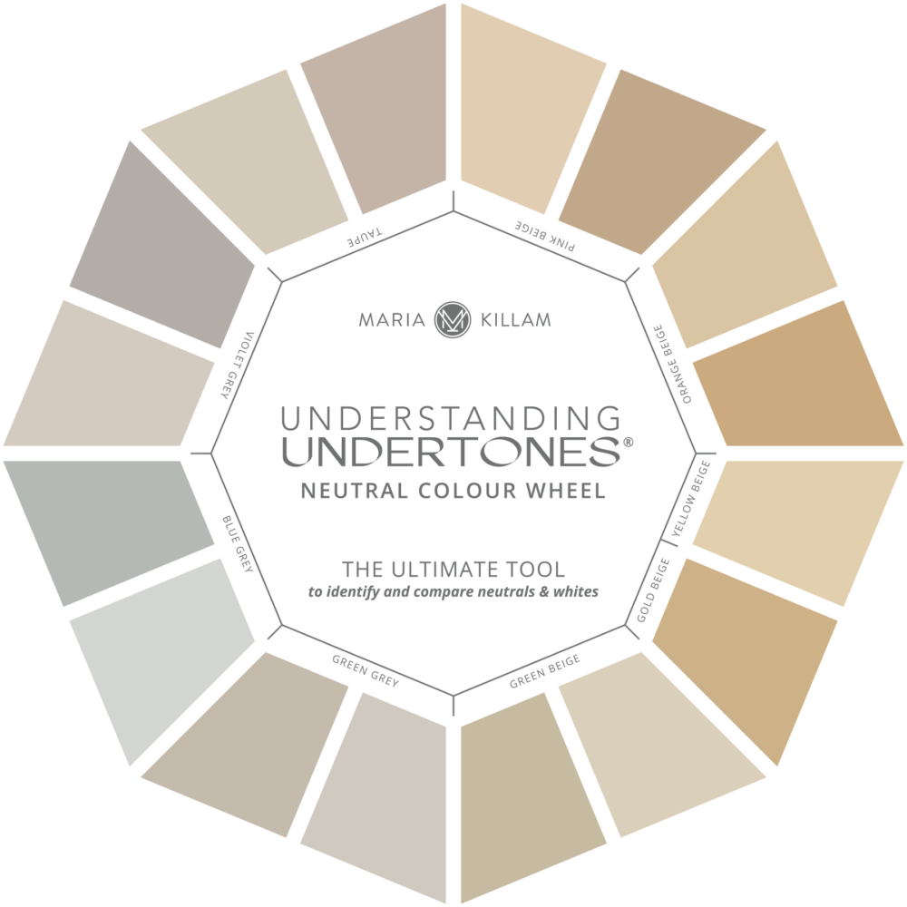
The Killam Colour System Colour Wheel
Because if you have the right neutral undertone to relate to your tile, carpet, stone, sofa, etc., you’re MUCH less likely to experience your colour suddenly looking too pink or blue once it’s painted on the walls.
This is because colour is relative, meaning it needs to relate to something else in the room. And in order to find the colour that relates best, you need to compare a large sample to both the hard finishes (countertops, tile, stone) and soft furnishings (fabric, carpet, sofa) in your room.
Not only do my large painted colour boards help you see the correct undertone for your room, but they also are large enough to tell you if the light is likely to do something unexpected to the colour. You can use them to compare to your furnishings at different times of the day.
For example, a pretty, warm grey will go blue or violet in the company of lots of even warmer beige and gold. When everyone was “updating” Tuscan interiors with BM Revere Pewter (a green grey) I heard this complaint all the time, “eeek! why do my walls look purple?”
5 things you need to know about light and paint colour
There are however some really important ways that light will influence your paint colour and it’s helpful to be aware of them. This note from a reader made me think I really should create this post to list them all in one place for you.
Hi Maria,
I have just completed both “The Exterior Masterclass” and the “Shop Online with Color Confidence” courses. It is unbelievable how much valuable information these courses provide. These courses in conjunction with the “True Colour Expert Training”, which I personally attended, plus all the other incredible amount of knowledge I gained throughout the years from all your teachings have made every job, every project so much better. I would like to repeat, what I have personally told you that you truly changed my life!
There is however one sentence that is repeated over and over again which gives me food for thought, especially after completing the Exterior Masterclass:
“Paint colors get twice as bright in interiors and two to three times as bright on exteriors.”
For interiors you give an example with the color yellow, how to be careful as the color will intensify once it is painted on all four walls. You also explain how designers sometimes need to mute a color in order for it to look just right on the walls. For exteriors, you explain how daylight changes the color and it gets washed out and lighter.
I therefore find the above statement a little confusing. It almost seems that for interiors we pick a lighter color that gets more intense – darker; but for exteriors we pick a darker color that will get more washed out – lighter.
I have been confused about that sentence and perhaps I am misunderstanding it. I would greatly appreciate if you can provide clarity on that. Looking forward to your insight.
Again, I am genuinely grateful to you for sharing your knowledge and passion with us. Thank you Judy M.
Thanks for your question Judy! It does take some experience to choose a colour that not only relates well to your room but also has both the right depth (or shade, dark to light) or intensity to look just right.
1. Colour intensity
First, let’s talk about colour intensity or saturation. This is less a conversation about light. But since you asked, in my system, the relevant comparative descriptors for saturation are “clean and dirty.” A colour that is relatively true to its basic hue, let’s say yellow, is “cleaner” than one that is more muted by additional non-yellow pigments, in other words, “dirty.”
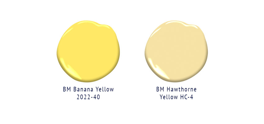 It’s more an issue of scale. Let’s say you see a beautiful sunny yellow paint chip that makes your heart happy and you want to wrap your room in it. First consider that once this 2-inch colour swatch covers a few hundred square feet of wall, the colour will be amplified. Sure, it’s still the same sunny yellow, but there will be SO MUCH of it that it will likely be super intense, obnoxious even.
It’s wiser to choose a much more muted (dirty) yellow instead. Often I recommend looking at a one that looks more “beige” for the perfect happy yellow for your room. Here’s an example of the more muted Hawthorne Yellow on the walls below.
Looks like it could be Banana Yellow if you compare to the chips above, that’s how much brighter it is all over the walls.

This is a common mistake with yellows, but it also applies to pretty much all non-neutral colours, blues, greens, yellows, oranges, pinks and violets. And, the only way you’ll know if you are choosing a more muted colour is by comparing it to others.
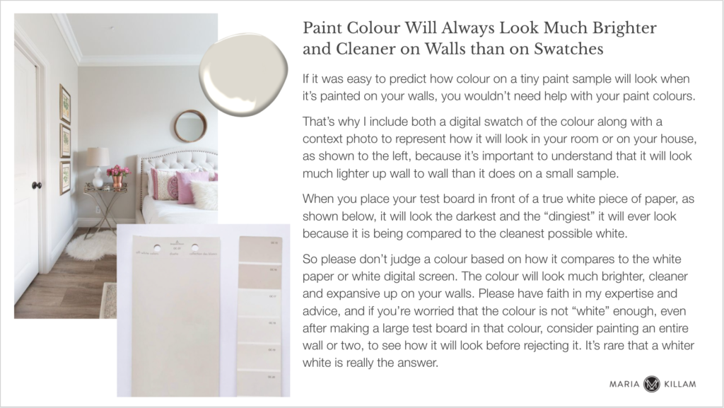
2. Colours will look lighter on the walls than they do on a small chip
Colour intensity is a different issue than how light or dark a neutral colour will appear on the walls. And learning to get this right takes some practice.
A pale, or highly reflective colour will reflect as much light as is available, and if that is a lot of light it will very likely look much brighter overall than it does as a small swatch surrounded by a border of bright white in the fan deck.
Now that we are well into the white walls trend, and everyone has been asking for some kind of white paint colour, I’ve had to create this slide for my colour eDesign presentations:
3. Exterior light is way more intense
For exteriors, this effect is much exaggerated. Exterior light is much more intense. So a reflective or light colour can often look blown out. If you choose the same pale creamy neutral that is perfect for your interior, it will look completely washed out on your exterior.
For example, if you need a perfect “cream” for an exterior, you need to look at colours that look like pale beiges in interior light.
Pale greiges and complex creams will look like soft “whites” on exteriors. So, if you are looking for the right “pale” neutral, you need to test a couple of shades deeper than you might think.
Even in the white farmhouse trend, while a crisp true white or off white might be what you are after, it’s worth considering some pale neutrals that will give your exterior a softer look.
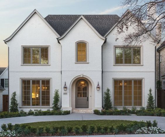
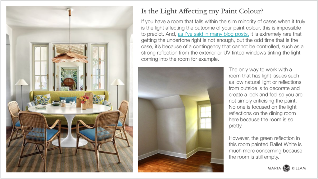
This house below is painted BM Ballet White OC-9, a green beige complex cream. But on an exterior it looks like the perfect soft white doesn’t it? See all the whites, creams, greige and complex creams and so much more in my Masterclass for Exterior Colour Selection here.
4. The most common issue is reflections
And speaking of outside, one of the most common ways that light can dramatically skew a paint colour is when other colours are reflected into your room from the landscape or an outdoor surface or structure.
This is a tough one because you can’t change the angle of the sun. And you probably don’t want to pave your garden in order to make your interior paint colour look true.
This situation accounts for the most stubborn cases of sour green looking walls, no matter what colour you throw at them. I’ve also seen orange reflections off wood decking, or brick buildings next door, etc.
While you can attempt to “correct” the colour by choosing a colour with a generous amount of the opposite pigment to your reflection situation, it’s really a game of mad science with no guarantees.
What to do if you have strong reflections on your walls
Instead, consider a LOW reflective, or DARK colour for your room. Embrace the opportunity to create a cozy feel, especially if the room affected is a dining room, bedroom or smaller area of your home and doesn’t connect directly to the rest of the spaces.
This fascinating designer from the UK has embraced a dark, nurturing feel for her entire home that looks out onto her lush green garden (below).
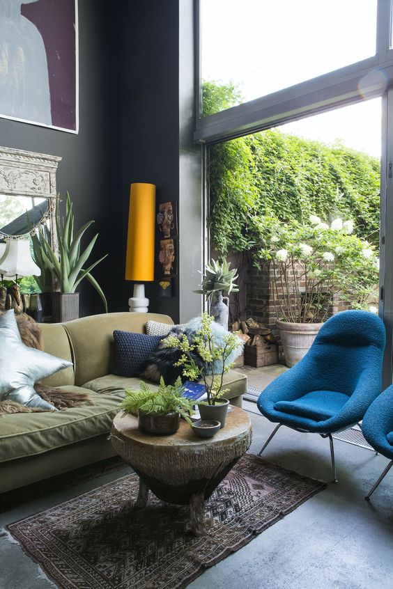
But really, if you have a strong reflection coming in your windows, the best thing to do is to get busy making your room beautiful and compelling with decorating and styling. Styling is the best distraction so you’re not just staring at your paint colour and noticing how it is shifting around in the light.
Because now that everyone is looking for some kind of “white” for their walls, we are in the realm of the MOST reflective colours. And reflective colours REFLECT.
Here is a slide I include for my eDesign clients. The point is, do we care about a green glow on the walls if the room is simply fabulous?
And finally, the issue I DO emphasize to my students, clients and readers is that:
5. A light colour will NOT come to life in a dark room
I can’t state this enough. Everyone wants the blown-out white look they see all day long in edited photos of rooms online. And intuitively, it seems to make sense that if your room is gloomy, you should paint it a really light colour.
The problem is that while a light or highly reflective paint colour can maximize the AVAILABLE light, it can’t actually ADD light that is not there.
The only way to add light is to add light sources such as pretty lamps.
White walls in a room that lacks natural light will only reveal the shadows in your room. Whites and pale greiges can look pasty and flat in low light rooms. It’s much better to add something warm like a rich cream, yellow, yellow beige, or a pretty colour. Or again, you could add a dramatic dark paint colour.
This is the famous problem with North facing rooms. Paint up a large board of any colour you are considering to compare to your decor and watch it throughout the day. The first thing you’ll notice is that it will look the same BECAUSE there is no sun. Therefore, if the colour has a dull lifeless feel in your room, consider something richer instead.
Related post: How to Get Light to Play in a Room
So here are a few of the ways I think that you DO need to consider the way light will affect your paint colour. But remember, it’s not the first question you need to ask when choosing a paint colour. If you are working with neutrals, understanding the undertones will go much farther in helping you choose the right paint colour.
Don’t forget to compare a LARGE sample to all the elements in your room at different times of day, and consider a COLOUR or rich tone instead of white or a pale neutral if your room is not endowed with tonnes of light.
For colours other than neutrals, look for the more subdued versions, since they will be amplified by scale. And for exteriors, consider going a couple of shades darker than you think you want. Then, test, test and test!
I hope this helps!
If you’d like help with your paint colours, see my eDesign packages here.
Learn how to choose exterior colours here. Learn how to choose the right paint colours here.
PS. I’m on vacation in Shawnigan Lake this week, we’ve rented a cottage right on the water! The weather is fabulous!

![]()
Related posts:
5 Reasons Your Paint Colour Looks Wrong (It’s NOT the Lighting)


Maria, this is one of the most helpful posts I’ve read in a long time. Your wisdom is so easily shared and understood. Thank you so very much for being YOU!
I have green coming in from my back yard and seemingly splashing my walls in the middle of the day with green when they’re actually pale blue/gray. One thing that helps is to use a flat finish paint. It reflects less. I am not a fan of eggshell or satin for rooms other than bathrooms and kitchens. I don’t touch my walls, so the whole “must be able to wipe them” factor doesn’t apply to me. Flat paint makes your walls look better and smoother in every way, and you can touch it up. Also, when light comes in to a room like that, I hang pictures on the walls. That breaks up the effect of the exterior light. I totally agree that what you can control and should control is how much interior light you have and what bulb warmth you choose. My bathroom appeared beige even though everything was gray until I swapped out the bulbs for bright white, and now it’s gray like I wanted it to be.
As always, your posts are wonderfully informative!! I love going back through your older posts and re-reading them.
And the key is to test,test,test (with a big sample board!)
Maria thanks for this very useful blog post! What are your thoughts on light bulb color temperature? I have seen some designers say you need all the lights in your kitchen to be 4000K. I personally prefer 2700-3000K or I feel like I’m in a warehouse. Is this just personal preference?
Hi Amy, here’s a post I wrote about that https://mariakillam.com/do-you-prefer-warm-cool-or-daylight-lighting-for-your-kitchen/
Maria
This is a truly “enlightening” post. I really mean that – so much to consider. Thanks. Oh, and hello from Arbutus Ridge, just down the road.
Enjoy your vay kay – you’ve earned it!
Side question…
You always say pick your paint color last. How do you go about choosing a paint color when your finishings are all neutral? (White, ivory, cream, beige)
I’m completely stuck. It seems like if I choose a color (say blue) it won’t relate to anything in the room. So then do you need to stick to a neutral color?
Thanks, Maria!
Hi Kristin, this post might help: https://mariakillam.com/the-best-neutral-paint-colours/
Maria
Hi, Kristin! I’m no decorator, but my thought is if you want to try a color (say a shade of blue) on your walls, I would first put together a Pinterest board with ideas for decor (pillows, throw blankets, art work, area rugs, etc) to which you are drawn that have some blue in them. Get a good idea of which shade of blue you love. Maybe purchase a pillow or piece of art that you love. Then pick the paint (of course, using the techniques that Maria has taught us!) Back before I started following Maria, I did this backwards. I picked a paint for our bedroom, then tried to find bedding to match. It was so difficult to do, and I was never really happy with the results. Please learn from my mistake 🙂 I do think you can have neutral furnishings with neutral paint, but it takes some effort to make it look amazing. And in the end, you probably will want to introduce some color into your scheme. Best of luck to you!
great post Maria! if i had a dollar for every room (before Maria) i’ve painted the color of mucky mud, dead elephant, elmer fudd’s pate, and yowzah yellow, i’d be rich. i love your posts even if i do get it spectacularly wrong sometimes (often).
Great post! Thanks for sharing your wisdom with us.
Love that picture of Lucy and Terreeia! Make me smile too
Great post! Thinking of whites still makes my head want to explode though.
Cute pic of Terreeia and Lucy. The expression on T’s face is pure joy, and Lucy looks like she missed the punchline.
Enjoy your vacay, that place looks awesome. Please let us know if they got the undertones right in the interior! If not, hope it doesn’t keep u up at night. 🙂
I actually think it’s beautiful the way the wall in the empty room photo is green in one area because of the reflection. That is the beauty of having a lot of windows, to me, the streaks and color shifts throughout the day.
My question is how to deal with rooms which have windows in 2, 3 or even 4 different directions. Does the light in that case “even out” and the different light colors from each direction have less of an impact, or do you find it tricker?
Fantastic post. Thank you!