


Tired of guessing or trying to rely on your colour memory? Now you can take my system of Understanding Undertones® with you. The new colour wheel is a complete reference key of perfect, accurate examples of all 9 undertones in a portable format you can take anywhere. And, here’s how it works.

The wait is over!!
The Real-Paint Neutral Colour Wheel is finally here!
While you’ve been patiently waiting for this tool to transform the way you choose colour, we’ve been working to make it as useful and accurate as possible for all of YOU – through Covid delays, a plant relocation, and supply issues. And, here it is.
Being able to see the complete range of the 9 most common and useful undertones of neutrals together in one place is the best way to take my system of Understanding Undertones® with you wherever you go.
***Please note the colour wheel is inexpensively priced specifically because the shipping is so expensive. They are shipped out of a fulfillment house in the US (NOT my garage) so there is no better, cheaper way to get it to you. If the wheels were shipped out of Canada (which is where I’m located) they would have cost even more as everything is more expensive in Canada.
But if you’re new around here, you may be wondering. . .
What is the neutral colour wheel?
This colour wheel is just a small part of the system for Understanding Undertones, which is essentially a powerful and practical language that divides the wild world of neutrals into 9 simple undertone categories.
Think of it as a complete reference key – perfect, accurate examples of each undertone category and the best whites in a portable format you can take everywhere. This neutral colour wheel will help you choose the right beige, grey or white.
But Maria, why does the wheel spin? It’s a common misconception to think that spinning the wheel will give you a colour combination or pairing. Not true. The wheel spins because I’ve included concise descriptions of each undertone – especially helpful as you are learning my system. Simply spin the wheel and point the arrow to one of the nine undertones for a useful summary of that neutral undertone.
This wheel is made with REAL PAINT – just like the paint chips you find in any paint store. That means it’s true-to-colour. YAY! While my system uses Benjamin Moore and Sherwin-Williams paint colours, you can compare this wheel to any paint colours from any paint company.
The only way to get colour right is to directly compare. And when you’re trying to narrow down the undertones of say, your countertop or floor, this wheel allows you to easily compare directly to accurate paint samples of the most useful undertones you need to know. Keep reading and I’ll show you exactly what I mean.
By the way, if you don’t already have copies of both my eBooks, How to Choose Paint Colours and White is Complicated, you’ll want to grab this bundle instead. The ebooks will help you understand how to apply the insights you’ll gain from comparing the wheel to neutrals. It’s truly the first step to learning my system AND includes complete lists of my go-to paint colours in my system, categorized by undertone.

I already have one of your colour wheels. What’s different about this one?
I wasn’t satisfied with the last iteration of the wheel because colours were printed, rather than painted. That means each wheel is only as accurate as the printer happens to be at that moment. A surprisingly big margin of inaccuracy is standard for printed colour. Who knew?
It was a steep part of the learning curve that went into making this concept a reality. We finally found a printer that could produce the colour wheel with REAL PAINT. This is the same way the fan deck for your favourite paint company is made. And now, it’s exactly as I envisioned it. The new colour wheel is a compact and portable true-to-colour tool to help you quickly establish the neutral undertone of anything and everything conveniently.
So the previous version, which we gave away for free (only charging shipping/handling), requires some alterations if you want it to work as it should. That is, as a tool for ACCURATE COMPARISON. Many of you gathered the necessary chips and cut and glued them onto the printed wheel.
And, as long as you add the real paint chips, the old colour wheel is still pretty useful as a map and reference of the possible neutral undertones. You can still download the list of paint chips here.
In general, the design of the new colour wheel also became cleaner, simpler. Less is more right?
How do I use the neutral colour wheel?
Real paint is a game-changer. And that’s really what makes this an indispensable tool for Understanding Undertones. Simply place the colour wheel on any neutral surface, paint colour, or fabric to dramatically narrow down the colours you’ll need to consider.
Let me show you.
In order to make it compact enough to be practical and portable, the swatches of the neutrals on the wheel are relatively small. So you can’t stop there. The colour wheel is meant to help you narrow down the realm of undertones that are worth testing further, with much larger samples like my curated collections of large painted samples (categorized by undertone).
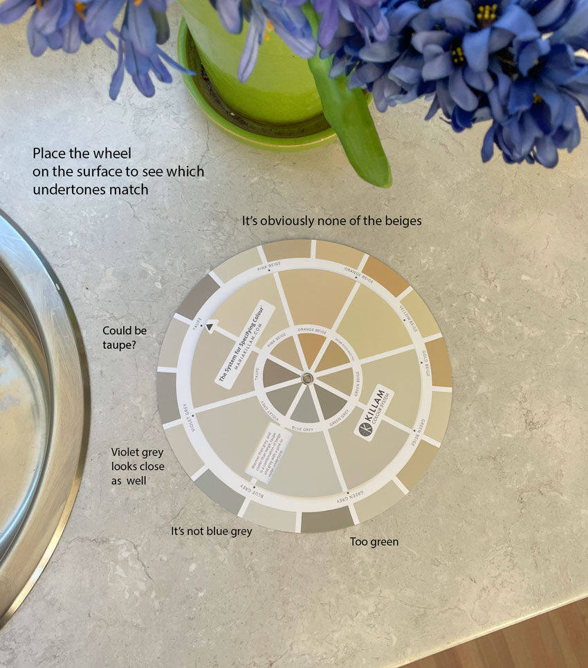
What is the overall read?
The overall read simply means if you stand back, what is the overall undertone you see – even if there are multiple undertones in the item.
Some hard finishes (like a tile or countertop) and fabrics are made up of multiple colours in tiny little bits that require you to lean in close in order to identify them. That’s when you want to stand back to assess what ONE colour the entirety of these could be described as.
In the photo of my studio countertop above, you can see the wheel reveals that the overall read of this surface is in the realm of violet grey to taupe.
When considering the undertone of any patterned surface the most important goal is to get a sense of the overall read of the colour. This can be tricky. I’ve found the best way to do this is to step back and look at it from a distance, sometimes I even squint my eyes so the pattern blurs a bit.
Now that I’ve narrowed it down to two undertones, I pulled out a taupe and a violet grey from my curated collection of large painted samples to confirm (see below). These large samples make it much easier to see, especially if you step back to get that overall read view.
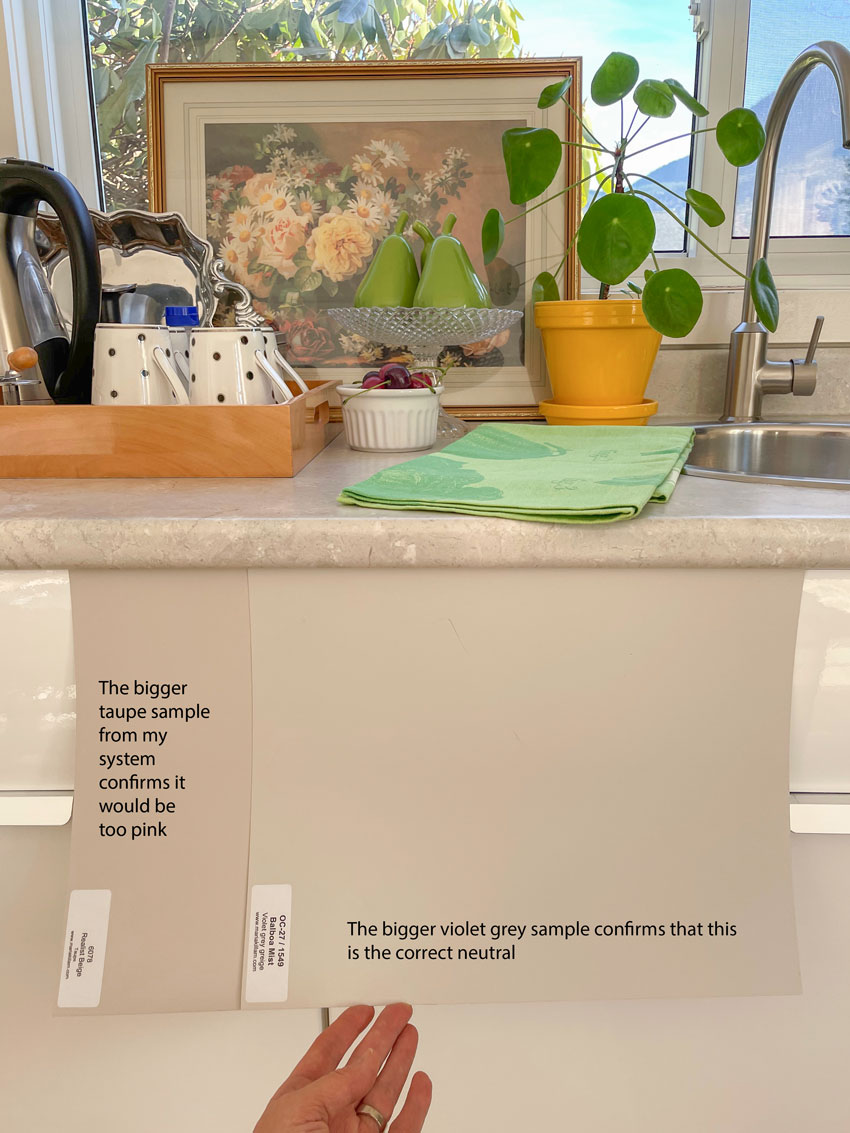
With the larger samples, you can see the subtleties even better. And this way of comparing colour confirms that the countertop is indeed violet grey and not the warmer, pinker taupe.
Read more: The Magic Behind Getting Colour Right
Take the system of understanding undertones with you.
Let’s say you are shopping for a neutral carpet (and you want to avoid pink beige) or maybe you’re trying to coordinate fabric, paint or decor items in your home. Now you can carry your neutral colour wheel with you shopping to compare and source the samples that are worth taking home for further testing with the rest of the elements in your room. Easy, right?
I’m going to say this again. The ONLY way to get colour right is to directly COMPARE. Placing one colour on top of the other to see just how similar or different they are. The shifts in undertones can be significant but also extremely SUBTLE. Much too subtle to rely on guessing or your colour memory, even if you have an excellently trained eye for spotting undertones.
When you look at all the undertones together on the wheel at a glance it demonstrates just how subtle the shifts are.
The colour wheel is a quick reference for my entire system of understanding the undertones of neutrals.
***Please note the colour wheel is inexpensively priced specifically because the shipping is so expensive. They are shipped out of a fulfillment house in the US (NOT my garage) so there is no better, cheaper way to get it to you. If the wheels were shipped out of Canada (which is where I’m located) they would have cost even more as everything is more expensive in Canada.
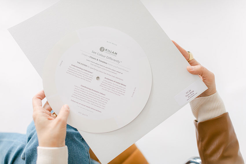
Can I use this wheel to find the gradation of white?
YES! We included an accurate key to the four gradations of USEFUL whites on the back so you can place the wheel on anything white to see if it’s likely a blue white, true white, off white, or cream.
If you’re in a room and you’re trying to identify just how cool or creamy the white trim is, directly comparing it to the wheel is a great place to start. Before you even pull out all the useful whites in various gradations from my curated large painted colour board collection (or list in my eBook), you’ll quickly know precisely which whites to pull out and test. Another shortcut.
Flip the wheel over to quickly identify the gradation of whites.
Make your design consultations more efficient.
Identifying the undertones in a client consultation is much more efficient with the colour wheel. Before you pull out all the neutral boards to parade in front of the grey tile or beige sofa to see which undertone it is, you can narrow down the options you need to consider by plunking down the wheel first.
An indispensable design tool for pros and novices alike.
For anyone trained in the Killam colour system, the wheel is an excellent cheat sheet or quick reference to make your colour process even smoother and faster.
And if you’re just discovering my system, the wheel is an excellent place to start to train your eye. It’s an easy visual to help you commit the 9 undertones of neutrals and the 4 gradations of useful whites to memory. It will also help you get used to what the subtle shifts between the colours look like. This will vastly accelerate the learning of my system for you. It’s a great way to practice and get the language and guiding structure of my system into your head, before you dive deeper in my course.
No one before has created a more convenient, accessible and straightforward tool for organizing the world of seemingly ambiguous neutrals into 9 simple, accurately represented categories that you can take anywhere to compare to anything!
***Please note the colour wheel is inexpensively priced specifically because the shipping is so expensive. They are shipped out of a fulfillment house in the US (NOT my garage) so there is no better, cheaper way to get it to you. If the wheels were shipped out of Canada (which is where I’m located) they would have cost even more as everything is more expensive in Canada.
These colour wheels will sell fast.
Many of you have been waiting a long time for these! And because they are so lightweight and slim, it makes sense to order the bundle of three, saving you on shipping. Give one to your bestie, your colleague, your mom. Keep an extra wheel in your design kit, and one in your car – so it’s never far away when shopping for home decor.
The other reason you’ll want more than one is because these had to be painted on the same stock that paint chips come on, meaning they are a bit thinner than cardstock. It’s a good idea to store your wheel inside the clear sleeve it arrives in. This will help keep it pristine.
If you’ve been waiting to order a set of large painted colour boards, you’ll receive the new true-to-colour wheel included for FREE in each set!
You will also receive a complimentary colour wheel in the exclusive Wow box that’s also filled with samples, cheat sheets and helpful materials when you sign up for my True Colour Expert Training!
*Watch my Instagram Live Here where I answered questions about the new Colour Wheel. *
Related posts:
The Right Way to Use my Colour Wheel to Identify Undertones
When it Comes to Decorating, Skip the Colour Theory: Try This Instead
A New Build Conversation about Exterior Stone (It’s all in the Undertones)

The buy it now link is not found
Sorry about that! The link is working now: https://mariakillam.com/colourwheel/
Yes the but now link is not found.
Sorry about that! The link is working now: https://mariakillam.com/colourwheel/
Same problem with the link 🙁
Sorry about that! The link is working now: https://mariakillam.com/colourwheel/
Maria, all the “Buy it now” links are broken. Sorry.
Sorry about that! The link is working now: https://mariakillam.com/colourwheel/
This link works https://mariakillam.com/product/colour-wheel/
I was able to order the color wheel through the website. Go to the products drop-down, color wheel and then proceed from there. 🙂
if you go to the website, under products you’ll find there. i just ordered through there.
Woo hoo! I just got my color wheel! If only I had this when I was remodeling this past summer, instead of whipping out my paint swatches to compare undertones, this wheel would have been so much simpler to use. I’ve been waiting for this! Thank, you, Maria, for coming out with such an excellent system! By ordering your eBooks and following your color system, I’m happy with every color I chose! 🙂
Maria and company thank you so much for this valuable tool! I am so excited to have and use this new color wheel! Although my self made one was ok, it was a bit clumsy to use.😃
So excited for this…ordering!
hi,
I’d love to order a color wheel. I see the price in the cart, but before I move to check out, I’m curious how much the shipping is? Or is the price in the cart including shipping? I hate to move all the way through an order process only to find out the shipping price at the very end, which sometimes changes my mind. Thank you.
Shipping/handling to Dallas, TX was $9.99.
thanks so much, KJ
I’ve been waiting on this color wheel for months! I even created my own ‘wheel’ using all of the colors recommended in the eBooks. Can’t wait for it to arrive and to use it!
I ordered on 3 Feb and it arrived on 7 Feb in excellent condition. Not sure what I’d been expecting; but, on removing the color wheel from the mailer, I believe my breath was taken a bit away. Of course, I knew it’d be neutral colors, but they were somehow more exciting in person. And, not just the colors: the perfectly sized cellophane envelope, the neatly stapled hang-tag at top and the very faint scent of real paint made for an exquisite presentation. I am appreciating that you made such a lovely item for us to use. Thank you.
Mine arrived and I ran around the house throwing it on tile, counters, rug, and standing back. You are right that most carpet is pink beige and even though I tried so hard no to get pink beige I think the new carpet on the stairs and upstairs is pink beige or taupe. No wonder my yellow beige paint looks weird with it. We need a new bed upstairs and I took my new beige colour wheel, in plastic because it was raining, to the bed store and chose a fabric for the headboard that would not clash with the carpet. (It was also the only choice that was not grey!) This tool is extremely helpful and fun. Thank you.
Hi. You mention your color wheel uses real paint. I wonder, what is the brand of paint? Also, does it apply to other brands? My builder strictly uses Sherwin Williams. Thanks!