


All-white walls are dominating design. And with countless white paint colour choices, you may be wondering how to choose the right white for your walls? That’s where my system can help.
In 2020, the colour pendulum swung all the way over to WHITE.
Since my eDesign department averages $30,000 – $40,000 per month in sales during the new build and renovation season (which starts immediately in January each year) this means it’s easy to stay on the pulse of where colour is going because all around the country the requests are the same.
Black windows.
White walls.
The end.
All this is fine for a new build. It’s also possible for a renovation where everything is being replaced.
Choosing White for a New Build is Different than Finding the Perfect White for an Existing Space
If you are choosing colour for ANY space that is NOT NEW. That’s when you need to understand white on a much deeper level if you want to get it right.
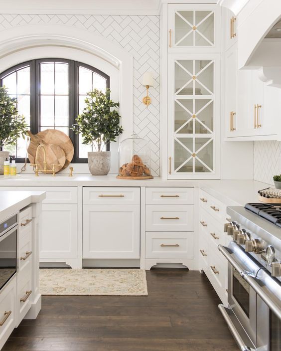
If you have existing beige, gold or brown finishes from the earthy trend, or even grey or taupe finishes from the early years of the fresh trend, your process for finding the right white will be a bit more complicated than if you were starting from scratch. You have existing bossy elements that need to be considered.
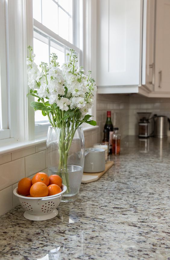
Updating a kitchen with existing finishes is a different process in terms of choosing the right white.
Understanding Trend Cycles
My career has spanned 3 major trend cycles now, and with each new cycle, my understanding of the colours most associated with each trend deepens. Early in the Tuscan trend, in the 90s, we were using butterscotch, yellows, warm beiges, browns and orange maple. Later, when the trend cooled to espresso, pink beige and travertine were everywhere. In this very long earthy trend, I made my first important distinctions that were the beginning of my system. I distinguished the undertones of beiges.
As trends cooled off into taupes and greys and cleaner accent colours at the start of the fresh trend, I further distinguished the important undertones of greys and how to use them.
![]()
Use my Understanding Undertones Colour Wheel to help identify the neutral undertones in any space
White has always been a conversation throughout. But my distinctions on how and where to use white have never been so important as they are now when everyone wants white on white with some black absolutely everywhere.
I’m Grateful for all the Insights I Gain Working with You, My Readers and Clients
I feel so blessed to have the opportunity to help so many wonderful clients and readers with their colour dilemmas. Which gives me the added blessing of being able to share my insights with you! As you know, this is my passion, and I can’t wait to share everything I’ve learned.
I’ve never seen such a pervasive trend as the current obsession with white. Social media has made it possible for this trend to take hold more widely and quickly than any trend we’ve seen before.
And this is why I am excited to share with you my most profound insights on whites. My new Specify Colour with Confidence course will show you how to choose the perfect white every single time. Whether you have the luxury of starting with a blank slate, or you are trying to make the smartest possible updates to an existing home.
Why it’s Still Critical to Understand the Undertones of Neutrals in the White Trend
Many of you are wondering: Is it still important to know your undertones of beiges and greys and how to use them? Doesn’t white have ALL our attention now? You bet it is!
Take a look at rooms with white walls on Pinterest. They usually have a collection of light “neutral” furnishings in them, often with completely competing undertones!
Styling and blown-out photography distract us from this fact, but there it is.
Even if you are not painting any walls beige or grey, you will need to know how to spot a rogue beige, taupe or grey undertone when you are shopping for sofas and carpets, not to mention countertops and tiles.
And if you are updating an interior that has existing finishes, it’s important to know how to identify the undertones in any hard finishes that are staying like carpet, countertops and tile to help you find the perfect pale neutral or white. Below is an example of how my large painted boards of mid-tone neutrals can be used to compare and identify the undertone of the carpet so we can then work towards a fresher colour to relate.
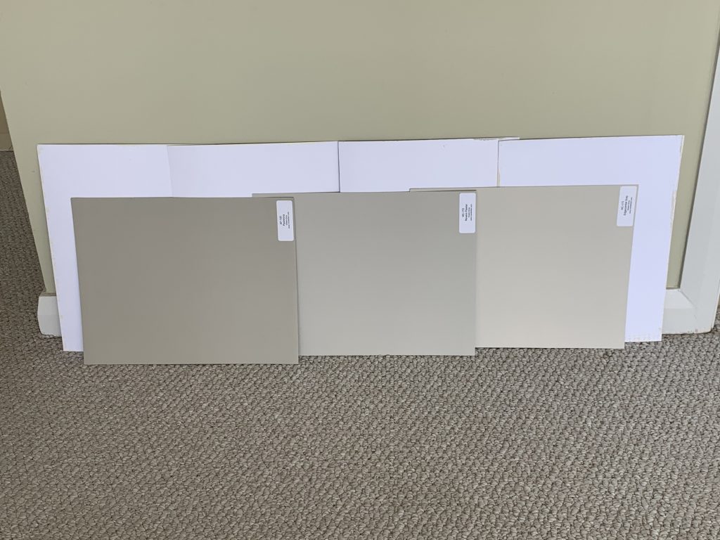
Establishing that this carpet is green grey by comparing it to known mid tone to light green greys means you can now work backward to a very pale green grey greige or creamy white (or a colour as long as you repeat green grey in your decorating) to update the walls of this room.
You can purchase my large samples here.
We learn the most from our eDesign clients. And since for a few years now, most of my clients want some version of “white” for their homes, in my new Specify Colour with Confidence course, I’m including all the insights and tips I’ve learned for how to choose the perfect white every time.
Here’s what you will learn about whites:
- How to choose the perfect white when starting from scratch (hint, it has nothing to do with looking at all the whites in your fan deck, or doing research online).
- What is a foundation palette? And how does it determine flow throughout the home?
- How to predict when white will look ethereal and heavenly, like the blown-out images on Pinterest we are all in love with. And when the reality will be quite different from expectations. What to do then?
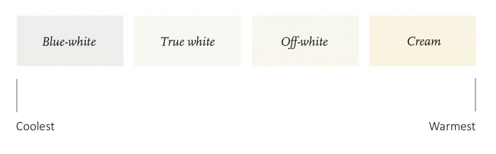
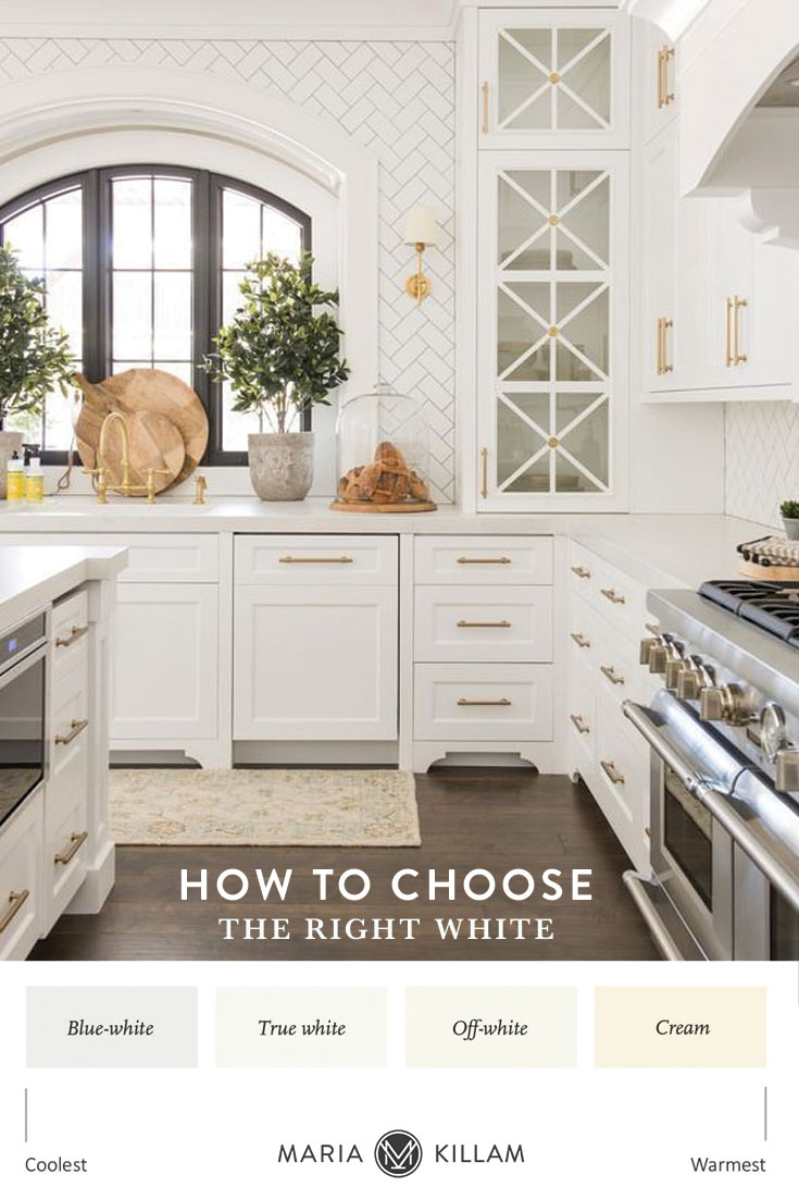
- To simplify the hundreds of possible whites by viewing them through the lens of my essential 4 gradations of useful whites. Reduce the list of whites you need to consider to less than 20 that will work best every time. Stop driving yourself crazy splitting hairs over whites.
- What makes white make dingy in some contexts and stark and cold in others.
- How to treat white as a colour when you decorate so your room looks polished and not unfinished.
- The trick for getting the freshest possible look in a room that will not support white walls at all because of earthy finishes and furnishings. Hint: those earthy finishes will make a very pale neutral look very fresh and “white” by comparison. I will give you the magical palette of the best super pale neutrals, greiges and complex creams, that will do the trick of creating a fresh “white” look in almost any room that needs updating.
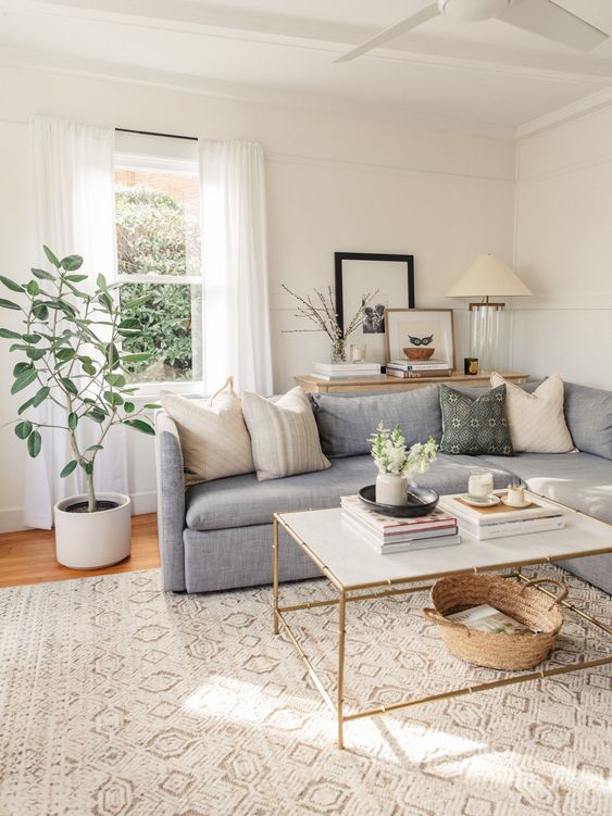
The Four Gradations of Useful Whites in my System
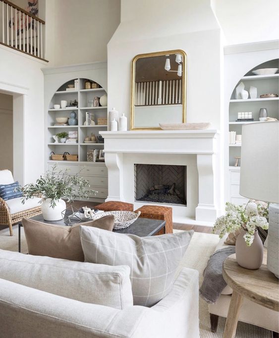
Pale greige and blue greys create an airy “white” look in this room by Studio McGee
You will never lose sleep again trying to choose the right white. And your clients will no longer see you flip and flop on selecting the perfect white. In my new Specify Colour with Confidence course, you will learn how to identify the correct white quickly and pull it out with confidence.
Interior Design by Maria Killam
I’ll also be teaching 10 ways to expertly choose COLOUR for your projects! Colour is ALWAYS more timeless than the current, trendy, neutral and you’ll also gain confidence on how to work with colour to make a room sing!
You’ll also learn to create flow using colour and recognize the real difference between clean and dirty colours. PLUS, you’ll learn the three best possible colour descriptors to keep in your back pocket.
And I’m dying to know, please tell me in the comments what your most pressing questions are about choosing whites OR colour.
Also, I’d love to hear whether you are still grappling with getting neutrals and whites right? Or do you have one or two “go-to” whites you use every time? Are you in love with the white trend?
Related Posts
Two Steps to Choosing the Right White Tile
Why are You Obsessed with White Walls?
Ask Maria: Is it a Mistake to Choose a White that’s Not in Google?

I call my house the big white elephant because I have a familyroom with an enormously tall clipped ceiling that’s open to the catwalk upstairs and the 2 story foyer beyond. It’s a whole lot of builder’s white that I’ve only tackled on the shortest wall that also has the fireplace and all the windows on the back of the house. I’ve never felt confident enough in a bold color to attempt to rent the scaffolding necessary to paint the whole elephant at once. Instead, I’m breaking the walls apart by adding picture frame molding along the staircase wall, the staircase and most likely half of the tallest wall in the familyroom. I’m using Behr’s white semi-gloss on those walls and the molding to mimic the look of panels with molding that you see in classic old homes like Greek Revival or Colonial homes. I’m adding molding anywhere I can manage so I’m adding a lot of pure white. The time will come when I go with a color on the walls that are left but that won’t be until I replace my 15 year old sofa and loveseat. I have your color wheels so I’m prepared!
It’s always a puzzle to me why people in Canada would want to paint their walls white when we spend 6 months looking out the window at white snow!!
Well it’s not really about the weather, it’s about trends changing. Colour trends last approximately 10 years and we’ve been doing grey for that long (the brown tuscan trend before that) and I think it seemed too soon to go back to beige which is why WHITE is what everyone is doing next. Not EVERYONE obviously, but in the world of trends, it will seem that way for the most part! Maria
Thank you for a comprehensive post. Would you please explain the term “complex cream” in the context of paint? Thanks!
Hi Karen! Kristy here, just wanted to answer your question while Maria is tied up in a course today 😉 Maria refers to the palest colours in the taupe and warm grey categories as greiges, and the palest colours in the beige categories as complex creams. And often, these light and airy neutrals can be excellent substitutes for a white paint colour because they are a more forgiving backdrop for decorating, than a stark white.
These stark white walls/trim make this house look embossed, ungrounded. Elegant on envelopes, but per some of your earlier posts, it would look terrible in spaces that aren’t very bright. Even in these brightly lit photos, there are a lot of gray shadows. It also looks a little like the owner can’t commit to a color and is living with a primer coat in the meantime. Maybe this is the primer-coat era after the gray trend before the next trend?
First, LOVE your blog! You are so generous with your knowledge. Taking your course and becoming a True Color Expert was the best decision I made for my business! Selecting color is my favorite thing to do.
Regarding white, if a client wants Chantilly Lace on the walls and a brighter white for trim, I struggled with finding a brighter True White. Are Blue Whites my only option? Thank you for your help.
Yes they are. Or you could just paint the trim the same white. Hope that helps, Maria
I love the white trend! I’ve loved it for years already because of studying your whites and lights, Maria. And the ultimate for me is that I just got a new car that is a pearly white with cognac leather interior! It could park in my sunroom and fit right in with the color scheme! It is even a plug-in and hybrid!
A comment on “Art Gallery White” walls…
I work in a museum of contemporary art. New exhibits go up @ twice a year. Part of the budget for new exhibits involves painting the gallery walls…usually NOT white. Right now we have a photograpy exhibit, primarily black and white, and another one upstairs, this one mostly color photography. Downstairs, one gallery has been painted a vivid yellow-orange, which showcases the B&W news photos. The other gallery is a soft greige. Upstairs, the walls were painted “Pale Oats” which is the most luscious shade of barely peach. There is a small gallery, really just a short dark hall, which was painted lavender.
The curators and preparators, with their finely tuned sense of color, design these gallery walls for these particular exhibits. In March and April, when these exhibits close, a new one, with new colors on the walls will go up . It will be exciting to see those selections.
Take a look: https://decordova.org/
So “the best color to display art is white” and “all art galleries are painted white” is very much NOT the truth.
Just saying.
Hi Anne, I agree with you, but most people can relate to what ‘art gallery white’ means because they were white for a long time! Thanks for putting in this clarification! Maria
Hi There,
Just a quick note to ask if Maria has ever considered teaching her live workshop in Denver, Colorado. Please!
Also, is the new White Workshop a separate workshop from the live Specify Color with Confidence workshop, or is it one part of the Specify Color workshop?
Thanks,
Mary Anne Shube
Design Dimensions
Hi Mary Anne, Kristy here… Thanks for your question! Maria currently doesn’t have any plans to teach her workshop in Colorado, but she would LOVE to see you in one of her other locations if you would like to make the trip. 🙂 Maybe Dallas or San Diego? Also, the new White Workshop is part of Day Two within the three-day Specify Colour with Confidence workshop. She reworked some of the curriculum to share more insights about white since it is so pervasive right now.
Hi,
Will your ebook, White it’s Complicated, teach me what I need to know to choose white color correctly? I am currently unable to attend workshops. Thank you.
Yes it will, the white workshop is best for a professional that specifies colour all the time and sees many different scenarios and needs more training than an ebook can provide. Maria
Hi Maria,
I’ve been working on my own bathroom remodel. I was really careful to make sure all the different tile trims matched. They are a perfect bright white. The shower has nine foot ceilings that are completely tiled along with a chair rail height white tile surrounding the bathroom. I was so excited until my husband installed the tub he picked out (I was only concerned about the comfort so I let him choose). The tub is a standard off white! I hadn’t anticipated the brand new tub looking dingy surrounded by super white tile. I’m so bummed. It was the one item I didn’t color check! I thought I would share this mistake for your other readers. I think it’s going to be ok, but I can’t unsee it. I’m using a very light grey grout color and bringing in a beautiful (my favorite color) cabinet with a marble counter. I’m hoping the dingy colored tub will fade to the background once its decorated and finished. I can’t figure out why manufacturers don’t make standard tubs a true white without being special order? We had a forced remodel due to a mold issue and I didn’t have the funds or the time for a special order tub!!
Hi Ann, Can you send me some photos of this? I am curious to see what your’e talking about! Send them to [email protected]. Thanks, Maria
I see all these wonderfully painted and decorated white neutral rooms and I think, “Oh, how beautiful!” Then I picture myself sitting in those rooms and I think, “Oh my gosh, how boring!” So while I can appreciate their beauty, the white trend just isn’t for me.
I love love the white trend and have been doing most of my house in white walls and trim. My next project is to paint my kitchen cabinets white. The walls are already SW Alabaster and in two of my bathrooms (I have 3) I painted the vanities SW Pure White. I think it goes well with the Alabaster. So my thought is to go with Pure White for my kitchen cabinets. When you enter my home the kitchen is right smack in the middle and the first thing you see. At the present time my cabinets are a muslin color (for about 18 years now) and I cannot wait to paint them white. Hope it is the right decision as the two colors have worked well in the two bathrooms. My counter top is a dark brown while the island is a cream color on top with a medium brown wood on the bottom.
Hi Maria,
Wow, the white trend is winning .. Excited to hear that 🤩 I am so amazed with the combinations of warm and cool white in your designs, like on McGee pic.. never thought the warm and cool tones could be combined .. 😲 I guess only white or pale grey allows to do that .. I really LOVE all whites and greiges and especially olive tones, but I could never combine them without the help of a professional designer .. So, thank you so much, Maria, for sharing your knowledge with us .. 😍🤗🌷
You have an old article about how white looks different based on the direction of the sun. So what do you do when you have windows in 3 or 4 directions in the same room? If you have enough light from multiple directions it must change throughout the day, but do they cancel out so the impact of the color change is less?