I know I’ve been declaring beige is back for awhile, but then it happened. An Instagram and TikTok celebrity/influencer shared about her renovation recently and all the things that went wrong.
When I watched it I thought at first that she was generous to share what NO ONE would normally share.
But then I realized she sells fashion, not interior design. And that kind of video would simply generate even more shares from the people watching it. Someone shared it with me after all, so suddenly I too was looking at her bathing suits (not for me 😆).
Here’s how to know when a trend is peaking
It is generous of her though to be honest about her renovation challenges. Many of us have experienced this too. And we can all learn from what went wrong.
She vented in her stories and outlined all the problems she was having with this kitchen, including that there was a seam right in the middle of her expensive marble island.
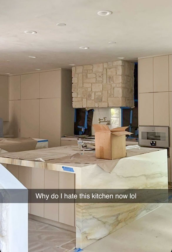
This is a screen shot from her stories
And my friends… This is when you know a trend is BIG. It’s the first warm beige kitchen I’ve seen in my feed that is utterly botched… 😭
Magazine worthy kitchens are really hard to copy.
Which got me thinking that when a new trend first comes in, it’s generally done well and with good taste. That’s because there’s usually a designer involved when a trend first emerges.
Six months go when I was trying to find an English Country kitchen (the new trending warm kitchen) done wrong, it was very difficult to find.
However, the more trending kitchens influence everyone to copy them, that’s usually when it all goes sideways. Because coordinating neutrals in a beautiful way? A kitchen, or bathroom that is perfect and not just perfectly nice? Well it’s all in the details, isn’t it?
And most people are winging it with their inspiration. They are doing DIY design and simply working with a contractor or builder, who asks for things on a need-to-know basis. And who often bosses you around because they know more about the INSTALLATION–not to be confused with DESIGN elements–than you do.
That’s when it all goes wrong and the details get lost in the rush of getting things done in the most efficient way possible and making decisions without a design plan.
And if you don’t know how to choose the right neutral… you could be taking a very big risk.
The wrong beige
The thread that binds the current kitchen trends including “Warm Modern”, “English Country” and “New Tuscan” are WARM neutrals, specifically BEIGE. Along with warm taupes and green greys, beiges are currently the IT colours for cabinetry.
So what colour are her kitchen cabinets? Anyone have a guess?
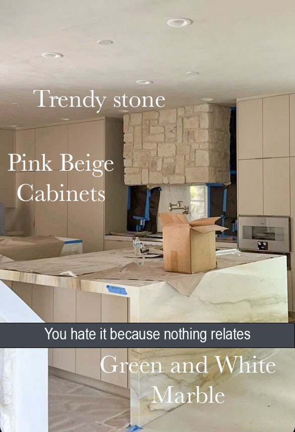
That’s right, pink beige. Which in no way relates to her white, green and orange marble.
But wait there’s more. This is what they were painted in the first go around:
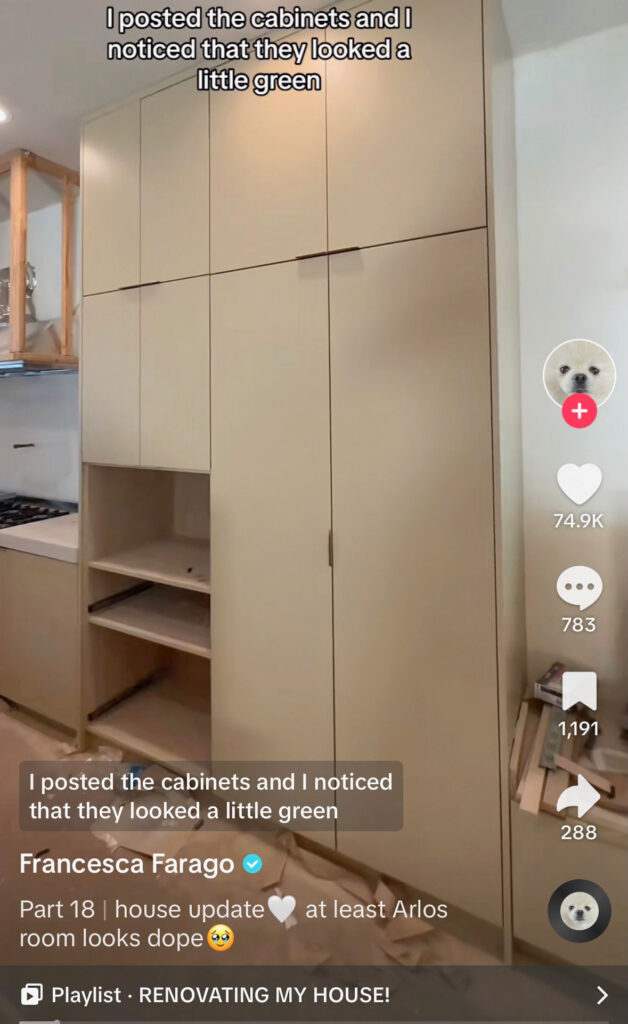
In this first round they had a green undertone, but if you compare to her installed marble in the first image, the colour is not green enough to work.
Also, if we go back to look at her marble, what’s the most prominent colour that is not repeated anywhere in her kitchen?
That’s right, white.
It looks like she’s going for warm modern here with the slab cabinets and marble waterfall island. So the stone hood fan is much too rustic for the rest of the kitchen design. The texture of the stone is completely out of scale and too lumpy to be the feature of the rectangular hood fan.
And the taupe and pink beige of the stone is not relating to the colours in the marble at all. Yikes… her contractor needs a neutral colour wheel.
How could we fix this beige kitchen?
First thing I would do is a simple white plaster hood that picks up the white of the marble. Then I would paint the cabinets a muted green that is slightly more green than a neutral to match the earthy green tones in the marble.
If green wasn’t what she wanted, this would not be the marble for her. But this is an expensive mistake to make only to learn that neutrals weren’t as neutral as you thought. So Francesca, if you come across this post, I hope this is helpful! 💛
Here’s the thing, it’s SO easy to mess up a big expensive project like this if kitchens, bathrooms and the subtle undertones of neutrals is not what you do all day.
So if you’re starting a home project and you’re interested in the trending warm look for kitchens and bathrooms but want to know how to do it well in a timeless way? Then my Create your Dream Home course is for you!
You definitely don’t want to get stuck making expensive colour mistakes while being pressured by your contractor.
And if you’re working in the world of home design, or considering a decorating side hustle, know that even if your clients are still asking for the perfect white, they are really looking for a nuanced warm neutral. Because this trend is coming fast!
Maybe you’ve been asked more often lately for “the perfect ivory” or “warm cream” or “soft beige” (which we hear every day in our edesign department). I’d love to hear from you whether this warm shift is on your horizon right now.
Now more than ever it’s important to get smart on the subtle undertones of neutrals. You can learn how I’ve helped thousands of clients with my system for choosing colour so you can be more efficient and charge more for your services in my True Colour Expert training! Sign up now to secure your spot!
Related Posts:
Creating Flow with Marble Finishes: My New Fireplace


Hi Maria! I built my house in 2010 before I found you. I wanted a creamy kitchen, not white or espresso brown which was the trend then. I was worried in my large kitchen, that pure white cabinets with traditional white marble would be too cold. I chose BM ivory white and am very happy with the color and chose creama marfel marble thinking it was an excellent combo based on my 4” marble sample. My walls are BM seaspray, picked by a designer. Around the marble behind my stove, my walls look green and the marble looks pink! Ha. I think, however only I notice because I have been following you!
Maria,
We renovated our kitchen in 1994 and used a designer every step of the way, especially when the contractor wanted to make a change for installation reasons. We even used a designer when it came time to repaint and update. Thirty years later and the colors, cabinets and countertops have stood the test of time. Kitchens aren’t something you can change out every few years. It takes a practiced eye to create a classic.
Hi Kathryn, curiosity has killed this cat. I am dying to know what colors you chose for your cabinets, walls and countertops that have stayed beautiful 30 years?? That is a perfect example of timeless design right there! Kudos
Hi, Maria…Is her floor pink beige also? What color countertop would be better, to break up all the pink beige, if she could have a different color marble, but still have it work? (Thinking about the big seam down the middle) Wondering what you would do, then? Would you skip the waterfall part, so it would go better with the stone, but what does that stone hood really need, it looks so odd, in there? Trying to learn and meaning no disrespect. Curious, I guess, cause I like pink beige. Thank you. Love you, Candy❤️
It looks like flooring paper to protect the floor, which also happens to be pink beige. I’m partial to pink beige myself, so I love the cabinets and the look of the floor; which is exactly why that countertop is so jarring. Honestly, I think you have to pick the cheaper replacement, but if it were me, I’d change the counter and keep the rest.
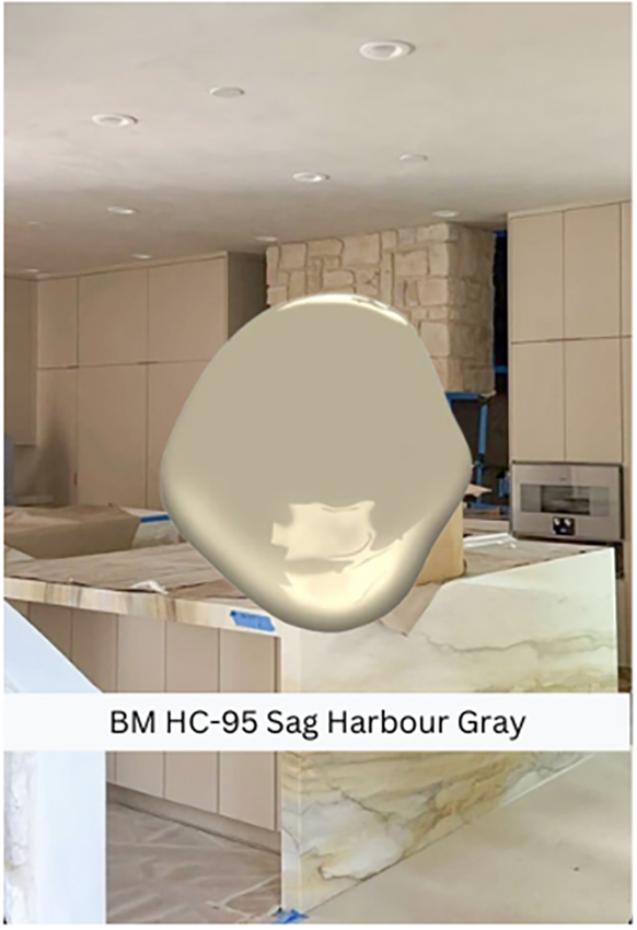
Gosh, Maria, I’m glad you found us a real-life example to show us how this trendy look can go astray. I do feel bad for the Instagram-er, though. I don’t know how one can go into this expensive (and inconvenient) of a project and not make sure everything goes with that beautiful marble. “Yes” to the Sag Harbour Gray and plaster the vent hood.
Creating a new kitchen, and house, now.
Asked husband what colors he liked.
He said the yellow on a vintage tea cup saucer I had bought decades ago.
And, the backdrop blue on 4 lamps purchased from a thrift store, donated by someone who found over 20 of the same lamps in the trash at the street on garbage day. He discovered those lamps had been removed during a renovation at the nearest Ritz-Carlton; they had been sprinkled about the ‘lounge’ area.
Both colors ‘strong’. Hmm, sorry, have no language for his colors of choice. Called my friend The Decorator, texted her pics of saucer/lamps.
Immediately, without referring to paint chips, she gave me which colors to use. Looked at my fan, and neither were exactly the lamp or saucer. She said, You won’t get tired of these. I knew immediately what she meant.
A month later, house is painted. Husband so pleased. End result, all the walls are his lamp blue, kitchen cabinets are his saucer yellow. Excepting they are not ‘his’ colors.
Will never tell him, we did a switcheroo.
All ceilings are the same blue as the walls. Ceilings look wildly different than the walls, even from room to room. Is there a name for that Maria? How our eyes ‘physically’ absorb/intake color?
Never been trendy. Lamps are about 40 years old, saucer maybe 75 years old.
I haven’t seen your kitchen, but I know I love it. 😉
In my neighborhood, many people post about painting their kitchen cabinets white yet they have splotchy brown/beige countertops. I am shocked at how many people respond and say it will look great, and some even post their kitchen photos where they did that. They are proud of it–but it looks bad. I looked at two houses recently, and both had cream cabinets. One had painted the walls stark white. The other had painted the walls a warm gray. I couldn’t bring myself to buy either house. I knew I would have work to do either way! I really don’t like the beige trend. I think it’s so much harder to get right than the gray trend, which is ugly in its way, too. But with grays, mixing in colors is easier, and I like colors.
I’m so glad you mentioned texture, specifically, the “lumpy stone.” Texture and shape are so important in design! Those roughhewn, rectangular lumps of stone would never complement the smooth, sweeping curves of the marble, even if the colors were complementary.
Do we know what color or material the floor is? I love your suggestions! If the floor is a nice classic wood, she is in business!
Looks like flooring paper to protect the floor.
Maria,
For one option, you said “Then I would paint the cabinets a muted green that is slightly more green than a neutral to match the earthy green tones in the marble.”
I’m contemplating painting my natural maple kitchen cabinets a light green close to neutral with white quartz countertops with a little gray veining. Could you suggest one or two Ben Moore greens that meet your criteria for a low light townhome kitchen? I tend to lean more towards yellow beige than pink beige in other furnishings. Thanks.
Cindy
Hi Maria! I love your page! I have a few questions about this beige kitchen trend….can we still do white? Is Cararra marble still in style? Are white cabinets out? What color appliances are we supposed to get? Is stainless still good?
Also, my kitchen is very small and has an over the range microwave, which I hate. I feel like it dates my home to 2002, and also the exhaust fan does not work well. Where else could I put a microwave?
Thanks so much! <3
Can you buy the smallest microwave available and place it on the countertop? I have removed all the over the range microwaves in the dozen townhomes that I own and rent and it looks so much better. If there is not a vent for an exhaust fan, don’t expect a new recirculating fan to work very well. Only the vented exhaust hoods work really well.
When I renovated my small galley kitchen a couple of years ago (through an interior designer who had taken courses under Maria), we looked at how best to maximize space. All the cabinets were subsequently raised to the ceiling. This provided space for open cabinetry below. One now holds the raised microwave – at eye-height, it’s perfect. (I never had one over the oven.) She added a wall on the counter side of the fridge, which created a much deeper cabinet over the fridge. The 1980s dark-wood cabinets were painted white, which brightened everything. Lots more space and brightness. Ironically, given the new trend, while all the walls in the rest of the house were painted white, the two bedrooms were untouched with Kilim beige, a soft beige I’ve always loved and opted not to change.
Thing that bothers me most about the kitchen is the hood, as you mentioned, is way too rustic for that marble. I would repeat the marble in the backsplash behind the hood and maybe do the hood in the marble as well or a warm metal. Make it more contemporary and repeat the marble.
The kitchen in this post is why my newly renovated kitchen is white and hale navy cabinets, leathered negresco granite, new oak floors to match the rest of my 1925 house and a very pale grayish blue on the walls. Despite knowing the trend was going to warm neutrals, I was getting rid of maple and brown splotchy granite, did not want any beige anywhere near my space. It is beautifully bright and fresh. Black and white done well is classic, and blue is my favorite color. I truly don’t believe my kitchen will ever be tied to a specific trend era. I can’t imagine the horror of making such an expensive mistake like the example here.
This example is the clearest yet of obvious mismatches. I want to text it to everyone I know and ALL builders!
Where I live people are still painting houses gray. The black and white trend still hasn’t reached us!
I shudder at that beige kitchen and would hate it even if it were done right. When you mentioned English kitchens, I’ve been reading English Home for years and have never seen a kitchen anything like all beige. Even in cottages used for short-term rentals the kitchens are usually okay. So I don’t understand how beige kitchens are supposed to be English country.
My kitchen, done with your help, still looks wonderful 11years later. Trends are meaningless; beauty lasts.
OOF. I immediately saw the bad mish mash of undertones. And the stone 😱 This reminds me when my friend was building a home last year — I mentioned that if I were to ever build a home I would 100% hire a designer. She said something to the effect that her and her husband “had good enough taste” to do it on their own. No surprise, her house ended up a hot mess. Just because you can recognize when something looks GOOD, doesn’t mean you know how to recreate it. Expensive mistakes for sure!
Wow, that stone hood looks awful to me, not because of color or because it’s mixing rustic with modern, but awful because that heavy stone is just hanging there pasted to the wall! It might look better with supporting stone on the sides.
Changing to a green undertone will definitely help. But then it’s gone from a warm to a cool tone. What a dilemma w so much green in that marble. I tots want to cry about the marble but the pink beige is just next level. Wishing her a talented designer to turn it around. 💛
Hi Maria – your assessment is spot on – as usual…
looks like a buffet of design trends…. one of everything…
could it be a case of money thrown to the winds of design …
and not respecting the need for a professional approach…
Previous commenter said it well: just because you like it doesn’t mean you can re-create it…
.
Great example! Heartbreaking for the homeowner, but a great example for others to learn from.
I work as a color consultant in a paint store and I can definitely agree that beige is back. About a year ago, I had a few people come in asking for mid-tone beiges and I thought, “Wow, beige is truly back??” Yes. Yes, it is. Now, I get questions daily from customers wanting to “warm up” their stark white homes, or wanting something “light, warm, and not gray”. We’ve definitely turned the corner on another trend. I’m so grateful I’ve taken your courses, otherwise I’d be very nervous right now. Thanks for always keeping us informed!
What about her pink beige floors?
My heart sank at the first screenshot you posted. You can tell a lot of heart went into those choices, yet it’s so wrong. I hope she comes across this!