


The English country kitchen that’s everywhere right now—the one that looks layered, soulful, collected, and quietly confident—is not simple. It only looks relaxed.
What people are responding to in magazines and on Instagram is the warm approachable quality. But that effortless look and feel? It’s the result of thousands of decisions being made correctly, in the right order, by people who have spent decades doing nothing but kitchens.
DeVOL Kitchens does this beautifully. So do designers like Jean Stoffer. But they are not making casual, creative improvisational choices. They are executing with deep experience, knowledge of visual language and materials. Respect for constraints and careful editing. That experience gives them clear parameters for each choice. Considerations like specific colour relationships, scale, balance, contrast, placement and just the right amount of tension to keep it interesting.
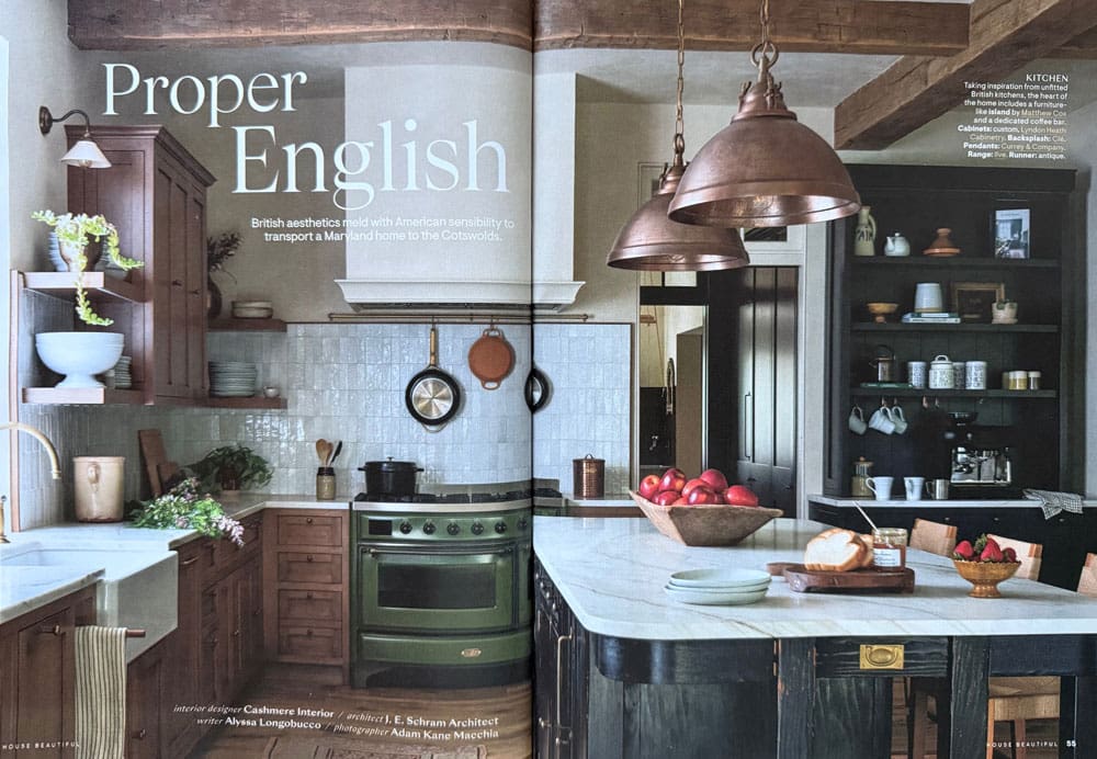
House Beautiful | Cashmere Interiors
This is the most detail-dependent kitchen trend we’ve ever seen because the styling is baked into the design itself. Notice the double cabinet with shelves on both sides, with the perfect light above each one, the moulding on the hood fan, the shelving sitting on the countertop on the right side. Great styling.
Every English country kitchen you admire includes elements that look effortless but are anything but: moody artwork placed exactly where it belongs (to the point where HomeSense now has a section filled with these small pieces).
Understated vintage light fixtures. Unfitted pieces like rustic shelves stacked with hand thrown pottery with perfect patina. Each casual element is highly deliberate.
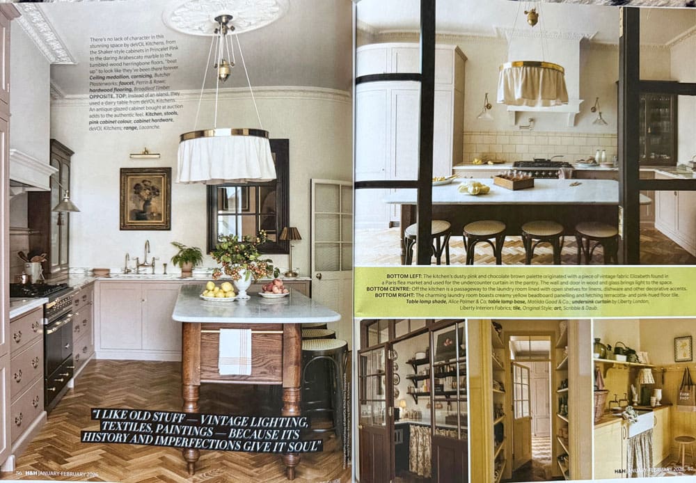
This kitchen below has subway tile on the left and just a 3″ countersplash on the right along with 2 different styles of sconces. Not to mention all the other details including the crown moulding.
None of that is intuitive. And none of it is easy to execute if you’re not a designer—and an excellent stylist.
Because there are so many unseen calculations going on behind designs like these, it’s bound to be copied poorly over and over.
Why This Trend Is So Hard (Even for Smart, Stylish People)
Don’t get me wrong, I’m not trying to discourage you (well actually I am). But it’s wise to have some respect for what goes into the perfect after photo in this trend.
Because it’s got a deceivingly folksy casual vibe that is much more sophisticated than it looks.
My approach to this look is to keep the big investment stuff relatively simple. Yes plain. Classic and timeless. And get the feel with paint colours and styling. Details like lighting and hardware that are easier to update in time than miles of the trendy busy stone countertops. If you look back at the two examples above, notice that the countertops are relatively quiet and white. These pros know the value of that. It means an update with paint and details when the look blows over is much easier to achieve.
The Line You Need to Respect (This Is Where People Go Off the Rails)
Here’s the hard truth that needs to be said clearly:
If you are asking:
- “How do I mix metals?” (Choose one and focus on other decisions. There are MANY)
- “Can I do two or three colours?” (If you’re asking this question, it’s unlikely to come together)
- “Can I mix patterns?” (A hard no unless Kelly Wearstler is involved)
- “Can I install that super busy marble” (This is a limiting trendy choice, simplicity creates freedom)
You are already past what you can safely execute on your own.
It’s time to pump the breaks and make some safer, wiser choices with a much higher likelihood of working out. And of standing the test of time.
Because once you start layering risky creative decisions, every choice starts affecting the next one. And the good options downstream of every specific choice like a trendy backsplash or busy stone get dramatically narrower. Sometimes to one or none. That level of coordination takes many years of experience.
Why Candy Store Brain + AI Can Complicate Design Decisions
I love your creative enthusiasm! And I respect your concern about making expensive decisions for your home in an informed way. That’s why you’re here afterall.
But here’s a pattern we’re seeing more often, and it’s worth taking a closer look.
Now that we have this fun new way to generate and visualize ideas in AI, sometimes, when clients receive a clear, professionally coordinated eDesign plan, the can’t resist running parts of it through AI. But the salient characteristic of AI generated “interiors” is their randomness. Quite the opposite of an experienced, tightly coordinated timeless plan.

House Beautiful
Or, when faced with the done and dusted smart coordinated plan, they go to the tile shop and slip into candy store brain mode. Because, surely, Maria didn’t consider all these fabulous options! (Trust me, I didn’t because most of the tile on display is eye catchy because it’s trendy not timeless).
What comes back is often a long list of tweaks, alternatives, and overlapping suggestions. What about this? But the plot of careful colour relationships, timelessness and balance is long lost.
Because that is what you’re paying for in our eDesign renovation packages is professional, timeless and comprehensive colour and finish combinations. The well honed art of combining finishes with deep experience and colour expertise. Colour is the first way it goes expensively wrong without a system. With a custom for you plan you’re jumping ahead the stress of the learning curve. Of figuring out every unforeseen factor in advance without the experience necessary to do so.
So, with love, generating even more ideas out of context is counterproductive. Save that creative energy for decorating and styling your fabulous new home. That’s the fun part! And you don’t want to get there completely DONE with making decisions so you’re rooms remain forever unfinished.
AI can be a helpful research tool, but it can’t assess subtle undertones, judge visual weight, or understand how pieces relate to one another in a real room. What’s trendy vs timeless. It has NO idea what’s actually practical to source or execute.
Good design isn’t about considering more options. It’s about making a clear set of informed decisions and allowing them to work together. Besides, there are a lot fewer perfect timeless combinations you won’t regret shortly than you might think.
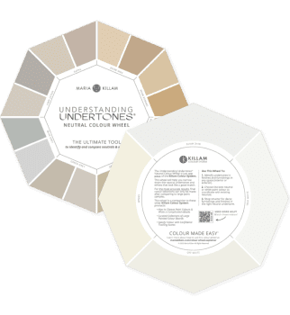
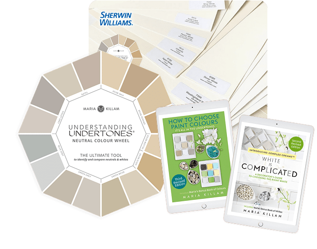
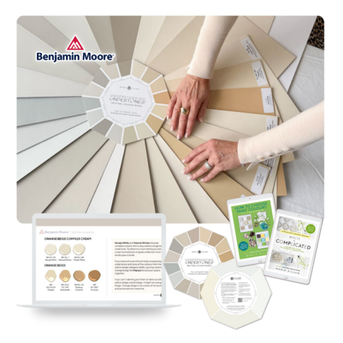
See Undertones Instantly
- Real Benjamin Moore paint chips
- All 9 neutral undertone families
- Compare directly to your fixed elements
Why People Think They Can Do This (But Would Never Do It Anywhere Else)
Choosing finishes for a home is one of the most complex decision-making processes most people will ever undertake.
Thousands (not an exaggeration) of interrelated choices. Permanent and immediate consequences (as soon as it’s installed). Enormous financial impact along with little room for error.
I mean it’s not life or death, but it’s pretty upsetting to live with expensive selections you can’t stand looking at. They work disappointment on your nerves everyday.
And yet, this is one of the only professions where people say: “I’ll just do it myself.” This budget of hundreds of thousands? Nah, I got it.
So if you’re thinking, “I’ll just choose what I like and it will all work out?” Remember that knowing what you like when you see it is very different than creating a masterpiece from scratch.

Michelangelo The Creation of Adam
Choosing finishes and colours for kitchens and bathrooms isn’t about creativity and taste. It’s about proven systems, sequence, and restraint. Knowledge of what works and what doesn’t. About what will stand the test of time and what won’t. About good investment vs bad.
Embrace limitations, make informed choices
And the fastest way to love your home?
Make fewer decisions—and make them well.
The only way to do that is to understand the why behind what works and what doesn’t. And that means wrapping your arms around colour and getting smart on what’s timeless.
Create Your Dream Home the Smart Way!
So I invite you to learn from my decades of experience in starting, following through and completing successful home projects right down to my favourite part, decorating and styling! In my upcoming Spring session of Create Your Dream Home Colour Foundations starting March 30th.

Finally learn colour the right way.
Create Your Dream Home is a 6-week online colour foundations program designed to give you the clarity and confidence you need to make the right choices for your home — from paint colours and finishes to flow and décor.
Throughout the program, you’ll discover how to truly see colour:
- Understanding Undertones
- How to test colour accurately
- Why certain choices create harmony while others fall flat and
- What makes a home feel timeless and beautifully pulled together.
You’ll learn the Killam Colour System step-by-step so every decision becomes easier, clearer, and far less stressful.
This is the knowledge homeowners wish they had before renovating, decorating, or building — because it dramatically reduces overwhelm, avoids expensive mistakes, and helps you create a home you love coming back to.
The Killam Colour System™ in Action
Love the look? Get help translating it into a kitchen that still feels timeless in your home.
What Students Say:
“Before this course I was so afraid to use neutrals. No more! I now have a full understanding of how undertones work and how to use it to make smart design decisions.”
“I can now speak with authority when identifying the undertones of neutrals. This changed everything.”
“A-ha! Now I know what is ‘wrong’ when I go into a neutral room and my eyes know that something is not right – too many competing undertones!”
Related Posts
The Trending English Country Kitchen: How to Get the Look
4 Timeless Ways to Use Warm Neutrals
Trends Taking Over in 2026: Rich Wood Tones


My first comment after years of blog lurking! Love your stuff and your advice has saved me thousands of $!
I actually turned my orange oak/burgendy-brown granite kitchen into a budget English kitchen and love it. But it took months and months of studying my favorite kitchens- including
Stoffer and Heidi Callier. We sprayed the kitchen greige, replaced cathedral doors with shaker, replaced granite with a Maria-approved quartz, and put on brass hardware and faucet. Backsplash is tongue and groove, existing island painted charcoal with walnut top, and white oak floors. My dad and I built the range hood cover. The finishing riches were the moody oil paintings you mentioned, and filling the glass front cabinets with white dishes, chinoiserie, and copper-ware.
Eleanor, good for you! Your kitchen sounds wonderful! I wish I could see it 🙂
Maria, this is such a fantastic post with so much great advice. I love that you are always looking to save people from making expensive, hard-to-change mistakes. I have seen pictures of hundreds, if not thousands, of kitchens where it’s obvious that people tried to DIY things without a good plan and/or without the help of a knowledgeable designer. We need everyone to find your blog so people can create spaces that look like they belong in the home and that they will love forever. Thank you for sharing your talent with us!
This is good advice, and yet… Is there any kitchen from the past 100 years that we can’t date to the decade? (I’m old enough to remember when 1980s French country kitchens, 1990s Tuscan kitchens, and 2000s white shaker kitchen were all described as “timeless.”)
I’m coming around to the idea that an eccentric personal space is the only thing that doesn’t date. (Resale, of course, is another matter).