


I recently received this reader question along with some photos:
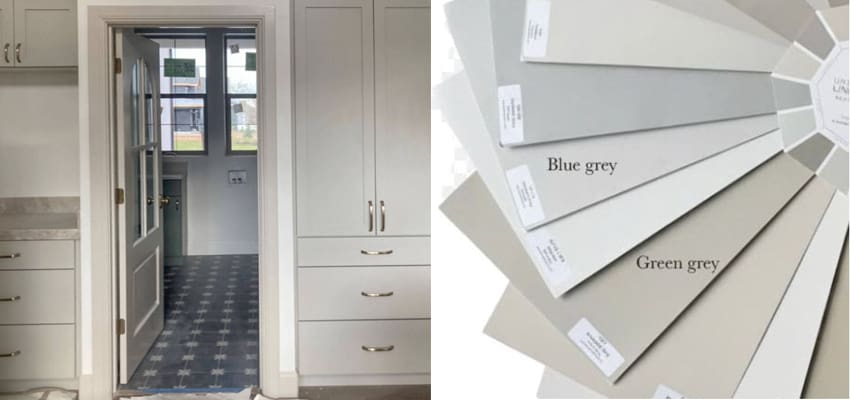
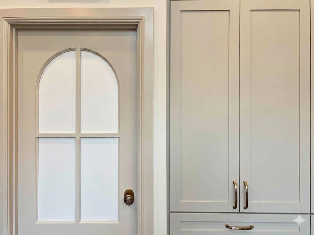
We did SW Accessible Beige for my kitchen but you have one person doing the trim and walls and another doing the cabinets. The cabinet guy went to Sherwin Williams and got Accessible Beige, even showed me the label on the can, but it ended up looking like this — so much closer to Agreeable Gray. And the trim and the cabinets are right next to each other. I was devastated and because of shifts in company ownership and other things, there was nothing I could do. Technically he painted it the right color.
Eight months later I learned that Sherwin Williams can’t use the computer to add the exact color mix to the type of enamel paint the cabinet maker used. They have to do it manually. Apparently he could have used a paint other than enamel for cabinets, but I didn’t know to request it.
The average person isn’t going to notice unless I point it out, but I see it every day. Now I’m working on painted backsplash right next to more cabinets and not sure which one to use. Let me know how much it would be for the answer. Just something for people to be aware of. Hope this helps someone.
Testing is key
I posted about this exact problem with whites here. That was before the trends turned to trim and cabinets painted a neutral over a white which is obviously even more noticeable.
This is why I always recommend having a sample cabinet sprayed to compare to your colour boards and finishes. You can’t assume it will turn out the same in different formulas.

See Undertones Instantly
- Real Benjamin Moore paint chips
- All 9 neutral undertone families
- Compare directly to your fixed elements
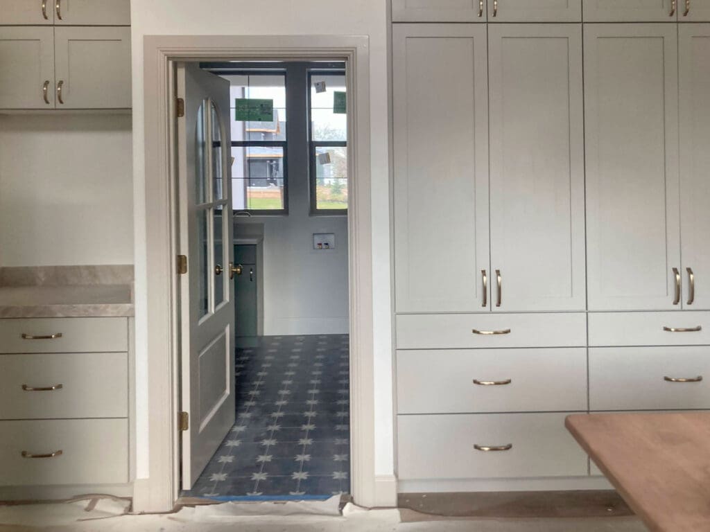
Here’s another photo, had AI make the window white so we could see the difference.
Will decorating help?
Can we decorate to distract the eye around this dilemma? No, unfortunately, not every colour problem can be saved with styling.
Once the house is finished and there are rugs, art, lamps, furniture and actual life in the room, will it bother her less? Probably. More layers always help.
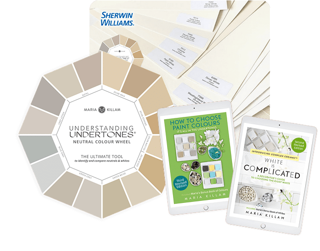
The Killam Colour System™ in Action
Start with the Colour Wheel to identify undertones, then upgrade to the Bundle for a more complete colour decision toolkit.
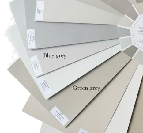
It’s also an undertone issue
But the other issue here is that Taj Mahal is not so neutral that it works with any warm neutral in this trend. It goes with a few different undertones, but not usually green grey.
Accessible Beige in my system is a green grey but the reason Sherwin Williams named it a beige is because if you don’t know that grey is three undertones, green grey looks beige when it’s sitting beside blue gray.
Get the Killam Colour System Starter Kit Here
And if this conversation is critical because beige is back and so are all the expensive colour mistakes that go along with trying to get it right. Because if your white trim and cabinets aren’t an exact match, you could decorate to distract, but with colour, it becomes much more obvious.
The best way to avoid expensive mistakes
The lesson here is, get your cabinets matched to your trim colour since you can’t do it the other way around. And have sample cabinet painted so you can test all your finishes together. Compare it carefully to a large sample of the colour you actually asked for.
But also, if you choose a countertop that is not some kind of white, you have to be precise about the undertone. Taj Mahal is not perfect with green grey.
And the fact that this kind of expensive mistake should be so easy to avoid is exactly why I created Create Your Dream Home. Because they rarely happen because you’re careless. They happen because no one told you how to compare undertones and which decisions had to come first.
If you’re renovating, building or choosing finishes right now, this is the kind of mistake you want to catch before the paint is sprayed, the counters are installed and everyone says, “Technically, it’s the right colour.”
Learn the system before your house becomes the lesson. We’ve extended the early bird rate for one more day, register here, the next cohort starts May 25. Watch the lessons when you have time and keep the course forever.
Over to you my lovelies, what would you do if this was your kitchen? Which backsplash would you install?
If you have an Ask Maria question for the blog, email me here with photos!
Related posts:
What Everyone Should Know About Paint
Why AI Gets your Paint Colour Wrong
Help! My New Sofa Clashes with my Paint Colour


I’d find a beautiful wallpaper for the backsplash that incorporates all or two beige colors, that way it might make the paint colors look intentional or at the very least, if the backsplash is beautiful, (softly colorful, floral) it will prevent eyes from resting on paint colors or undertone differences.
How will wallpaper work as a backsplash can it be washed ?
Do you have a picture?
I’ve not seen wallpaper as a
Backsplash thank you
Accessible Beige has looked pink to me so often. I was actually surprised when I learned it’s a green grey in your system.
In a previous house I painted my dining room Accessible beige and it always looked slightly pink to me. I have often wondered if it wasn’t mixed correctly or if there was another reason? The room had medium brown wood floors and white/off white trim. I hope someone can explain to me why it appeared pink!
I know this is a design site but sometimes I think people need to get some real problems. Repaint, it’s not rocket science.
We can’t afford to have the cabinets repainted. The color that worked with everything was Accessible Beige. I wasn’t complaining, I was just letting her know this could happen. I’m not a perfectionist and I can laugh and love it as mine, but don’t be rude, ok?
The different painted surfaces still look fine to me as they seem to be the same color value and the contrast is rather pleasing and interesting even if not the hoped for perfection.
But I don’t follow the counter top issue. If Accessible Beige is a green grey was it not a good choice with the Taj Mahal to begin with? Is the “Agreeable Grey”, as the cabinets turned out to be, even more off from the Taj Mahal?
The Accessible Beige is GORGEOUS with the countertop (Perla Venata, same mountain as Taj but somehow different, not sure), but the Agreeable Gray doesn’t look great with it. Fine but not what I was going for. Thanks for your thoughts 💖
Hi Jena. Your cabinets are beautiful. Since the mismatch is between the cabinets and the millwork, have you thought about repainting the door and trim in the kitchen? Maria might be able to help you with that. Perhaps something that relates to an art object that you’d like to decorate with? Or to your countertops? In others words, perhaps use the millworker as a bridge. I’ve been there and I empathize.
Repaint the door/trim-
The cabinets are lovely!
Ooh, I feel your pain, the person this happened to. I’d be annoyed.
I remember reading on your blog before that Accessible Beige is a green gray. It’s one of the examples I always think about to illustrate how color names are just marketing and not very useful.
But oddly in the pictures, while the cabinets do look green gray to me, the trim looks beige. I wonder if it’s possible that the trim is the one that doesn’t match the swatch? Curious if the original person has checked.