There are many ways to make your home look more pulled together, even if you are waiting to change this or that. Stop waiting for a pretty house and apply these 10 ways to make your home look more expensive!
Wouldn’t it be great if we loved everything in our homes? If all the finishes, all the furnishings and decor were just what we wanted?
Everyone has a home wish list. We all have finishes we would like to update and place holder furnishings. But this doesn’t mean we should wait for “someday” to have a pretty house.
Below are my 10 best tricks for making your home look more pulled together and expensive NOW.
Before I get into my specific tips though, I’d like to point out that decorating and styling is what gives a home the look and feel we all want. And it doesn’t have to break the bank. You’d be much happier in your house if you find those lamps I’m always talking about, get some throw pillows and create a vignette or two, rather than spend every last dime on new crown moulding for example.
The act of decorating is essentially to put thought and energy into creating a pretty room. In a well decorated room things look considered. There is a sense of intentionality.
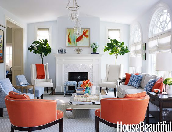
10 Ways to Make Your Home Look More Expensive
Decorating is the opposite of tossing in a bunch of furnishing just because you need something to sit on.
Every house is somewhere on the spectrum from thrown together to well decorated.
But trust me, you can move the needle and make the best of any decorating (or undecorated) situation. You just have to give it some love and attention. And below are some of my best tips for doing just that.
1. Create an Intentional Colour Palette
The most impactful way to create an intentionally designed look is to create a decorating colour palette and stick with it.
Choose a fabulous piece of artwork, area rug or a fabric with multiple colours to establish the perfect colour palette. Simply pick up two or three colours from the pattern and repeat. Then repeat them again in adjacent rooms for flow.
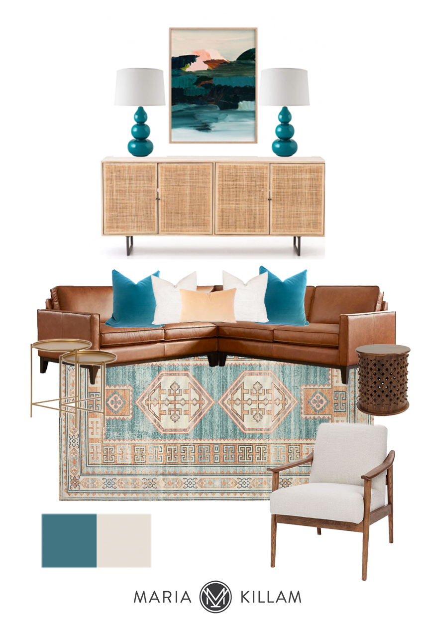
Below is mood board I created recently for a recent Get Me Started eDesign consultation. The area rug set the palette of teal, peach and ivory and I repeated them in the toss pillows, art work, lamps and paint colours for adjacent rooms.
Read more: Find out why I think a Cognac sofa is timeless.
Shop this room:
Triple Gourd Lamps | Wall Art | Woven Sideboard | Metal Nesting Side Tables
Cognac Sofa | Teal Pillow | Ivory Pillow | Peach Pillow | Side Table | Area Rug | Side Chair
2. Edit Your Decor
It’s next to impossible to create an intentional look if you are holding on to too much filler and things that don’t work. Everything in the room should have a place and a a role. And ideally, they should work with the colour palette. I know you’ve heard it before, but it really is important to get rid of clutter and dust-collecting knick knacks that aren’t serving you or contributing to the look and feel of the room.
And rather than trying to work everything around the dumpy chair you don’t like, see if you can just let it go. Maybe you can find an inexpensive but fresher one, or even a thrifted one in a better shape and colour.
It can be tricky to get objective about your stuff. A great way to see a room with fresh eyes is to remove EVERYTHING that is non essential and only bring back and add in things that serve the look and feel and colour palette you want to create. You are likely to find that your room feels more comfortable and refreshed with A LOT LESS in it.
3. Add 1 High-End Piece (aka some bling)
One special high-end piece can elevate any room. Often it’s a light fixture or a striking piece of art.
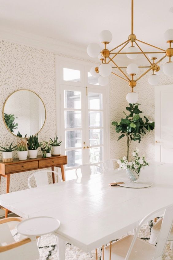
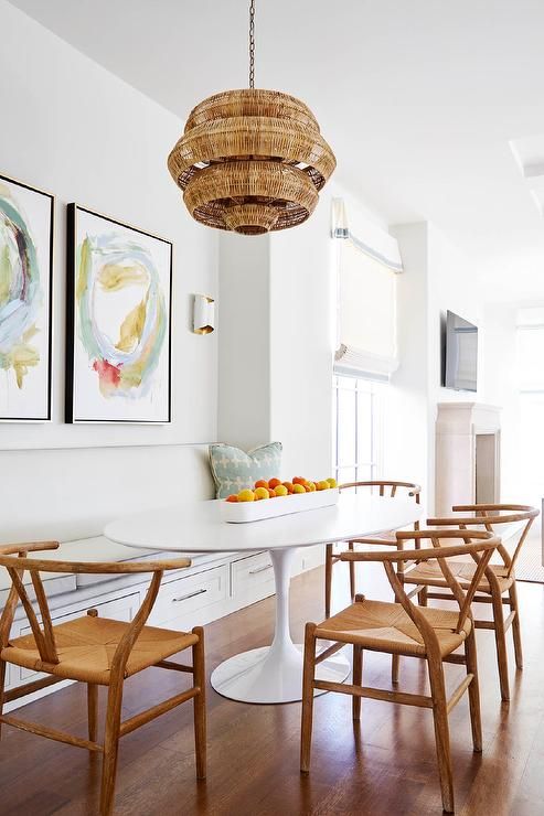
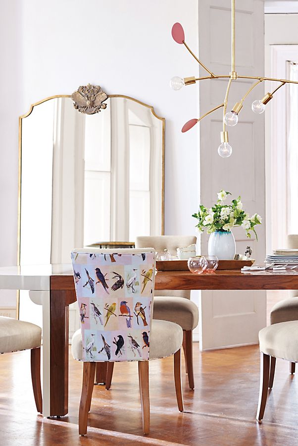
This simple white dining room below comes to life with a glamorous and modern brass chandelier.
Or maybe it’s the perfect antique mirror for over the mantel, or that stylish Saarinen dining table you’ve been coveting like this one below (even if it’s just a copy).
In each room, choose one key element that brings in some bling to create an elevated look.
4. Create Atmosphere with Lighting
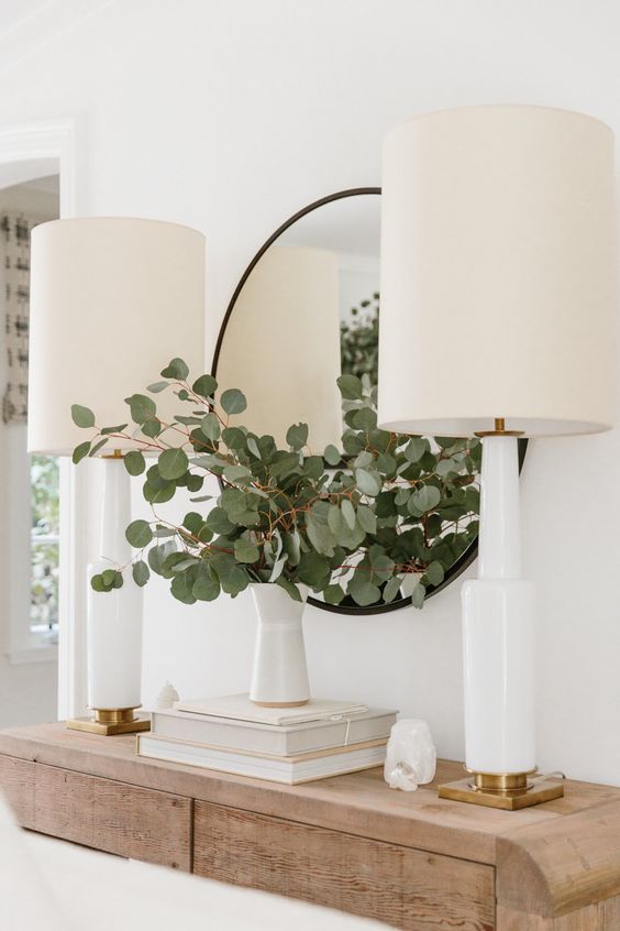
I can’t emphasize this enough. In fact, I wrote this post about the 5 lamps everyone needs in their home. Rarely without a designer’s intervention do people have enough mood lighting in their rooms (as I mentioned above). If you don’t have the budget for anything else, get lamps.
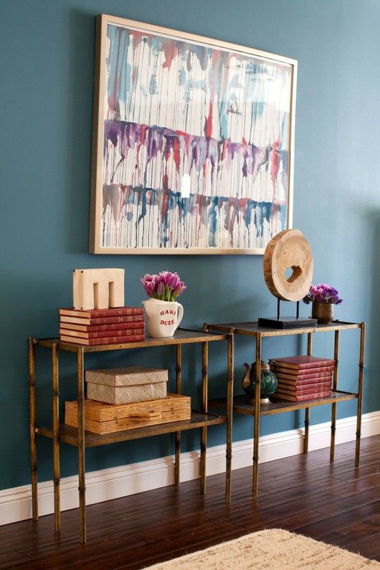
In order to add more lamps to a room, consider where you might add a table or surface to put them on. Maybe you need a slim sofa table, a credenza on a blank wall, or larger end tables to accommodate more lamps. Wall sconces and floor lamps are good too. Just don’t expect your room to have a cozy high end feel if you are relying on pot or recessed can lights.
I even have two uplights behind my sofa! I love the soft glow at night.
5. The Right Paint Colour
A big part of the reason people agonize so much about paint colours is that paint has impact. Just the right paint colour can definitely pull together a room. It can create a fresher look or it can create drama.
Have all neutral furniture? Consider adding colour to the walls. Just be sure to find some accessories in the colour you want first so you can choose just the right shade. Don’t make this paint colour mistake.
A new paint colour will certainly create a refreshing change, but remember it can’t do all the heavy lifting.
You can get my help choosing the perfect colour for your room here.
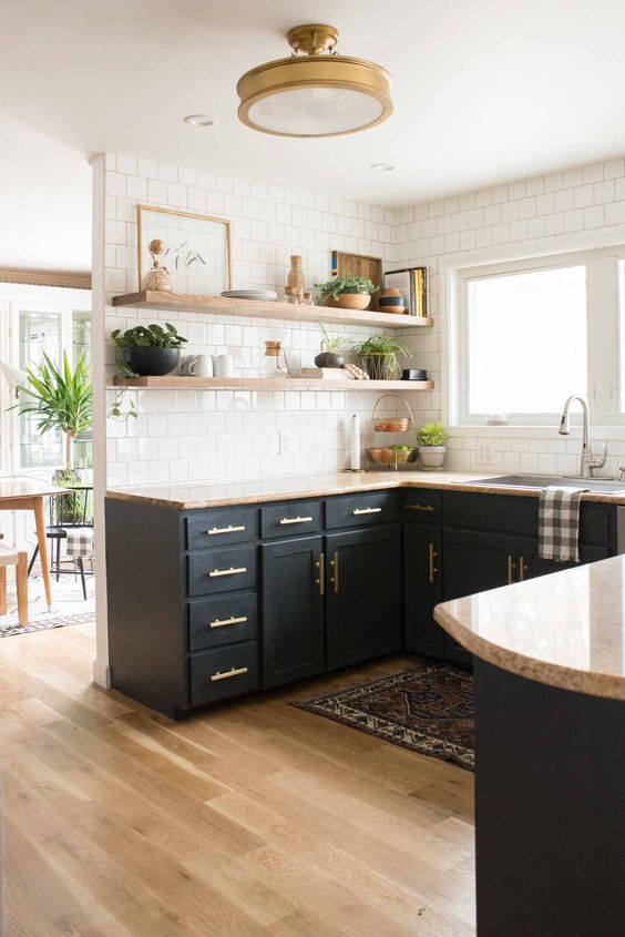
You can also repurpose a piece of furniture with a new colour. And of course I’m a huge fan of reviving kitchen cabinets with paint. There is hardly a more dramatic transformation that can be achieved with a fresh coat on your kitchen cabinets.
An older kitchen can look like new simply by painting the cabinets and adding a pretty backsplash. This pretty update above even makes the pink beige granite look pretty because the dark colour takes all the attention away from it. Removing the uppers also goes a long way to giving a kitchen a good update.
Read more: Third Rule of Design: expensive does not equal timeless
Whether you paint your cabinets a colour pulled from your decor, or a classic white, consider filling the hardware holes so you can update the hardware too. Attention to details always makes a room look more polished.
Read more: Ask Maria: What Mood Does Black and White Convey, Warm or Cool?
6. Add Some Sparkle
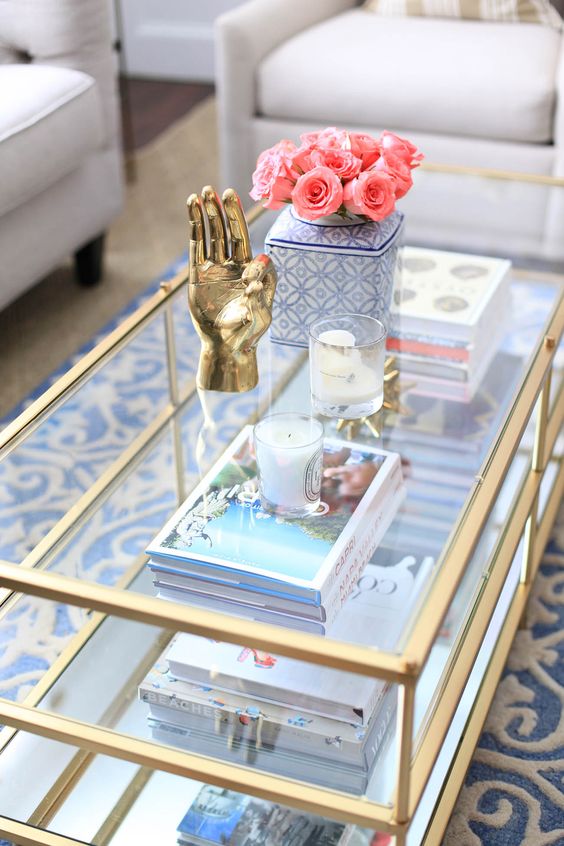
Every room needs a little sparkle. Reflective surfaces add and amplify light, they bring a sense of glamour, and most often, they are less visually heavy than more solid materials.
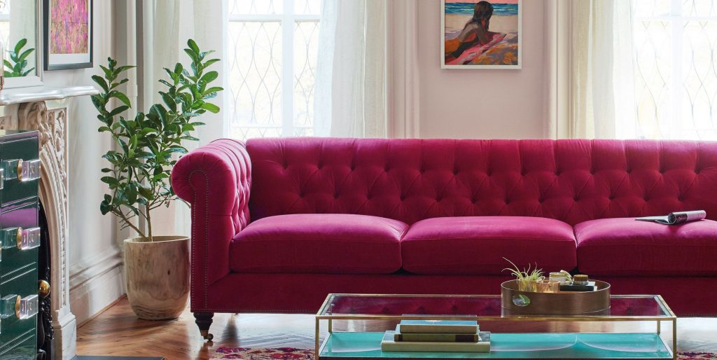
A glass coffee table is always a good idea.
Read more: How to Style a Vignette in 5 Easy Steps
You can place a mirror anywhere, try a large one leaning against a wall to reflect some light and expand the view.
7. Add Wall Art
Every room needs a focal point. A large scale piece of art or a well designed gallery wall will instantly inject personality into any room. Here is a post on ideas for sourcing art inexpensively.
Art can also set the colour palette. This is what gives a room identity. Mousy, little drab pictures won’t accomplish this. It’s best to go bold with it. Look for scale and dynamic colours and textures.
8. Move Your Dated Sofa into the Family Room
Too often the piece that is bossing you around is a lumpy old sofa. If it’s completely holding you back see if you can just shift it into the basement or playroom and finally get a sofa with a pretty classic tailored shape in your favourite colour. I promise you won’t regret it.
9. Update your Window Coverings
Drapes and window coverings can be expensive. But you can make simple off the shelf drapes look more expensive by simply hanging them correctly and adding extra panels to make them look fuller and more luxurious. Single curtain panels will ALWAYS look cheap and chintzy. ESPECIALLY if the curtain rod is not wide enough and hung too low.
Read more: How to choose the right curtain rod colour
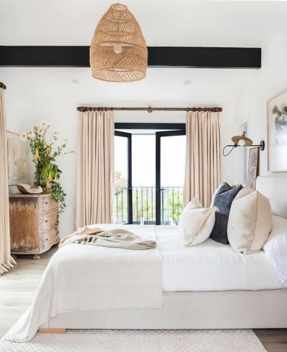
Place your curtain rod high, close to the ceiling to maximize height, and wide enough that the drapes can be gathered mostly to the outside of the window frame. This will make the window look larger. Get at least 2 or 3 panels for each side of a large window so they look nice and full. Curtain rings and a pretty rod are details that will make even big box store curtains look luxurious.
10. Styling (aka create a look and a feel)
You will enjoy the changes you accomplish from any of the tips above, but don’t stop there! A room will never feel finished without some styling. You can find my tips for creating coffee table vignettes here. And I have lots of inspiration for styling kitchens and styling bathrooms on Pinterest.
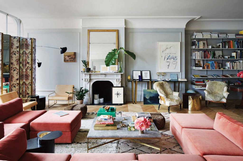
No matter how well decorated your house is, it needs styling. Below is the very stylish apartment of Jenna Lyons. Every surface is styled and the room is full of personality. This is what styling does. It adds interest and personality.
Obviously I’m not saying that your room has to be photoshoot ready everyday, but have some fun expressing your personality with vignettes on surfaces like coffee tables, sideboards, shelving and your mantel.
If all else fails, start with a pretty plant or fresh flowers.
Which one is your decorating advice?
Related Posts
The Enchanting World of Atmosphere








Love ❤️ love ? love this post with great ideas. Thanks Maria!
Maria – thank you great designer tips …
One thing I find that works for me to see my interior .
I take pictures of my space and lots of times as I look at the photo what is irritating me stands out .
I’ll move things and remove things .
Then take more pictures ..
It can be eye opening ..
We can become accustomed to seeing things everyday ..
Looking at photos of your interior is what others are seeing when they enter your home ….
That is always a great tip, thanks for posting it Nancy! Maria
Good design information Maria! To me the accessories are the frosting on the cake! It is so rewarding to transform a room with new paint, draperies, artwork and accessories. It is like living in a new house! Good post as usual!
Such an insightful post, thanks (again), Maria.
Great post with links to many of the other great posts on how to create style. Helps me to really appreciate the skills you decorators have.
I see transformations all the time on the home remodeling shows. Owners with rooms full of too much stuff and furniture that is just thrown together. Instead of remodeling an entire home I best most would be amazed at what a proper restyling would do.
Definitely will save this, great guidance. We also need to tune into family member’s comfort and needs, often that is the reason for the ugly hulking chair. I had an extended family member who late in life had such painful arthritis, she could only sleep in her recliner. Maybe moving it into the bedroom would have been a solution but then what does she sit in to be comfortable in the family room? Another ugly chair? And those in motorized or wheel chairs for whom the edge of an area rug is an impediment.
We have a home that we wish had higher ceilings therefore I would like to use low profile furniture. But my tall husband with a bad back may not be comfortable. This is his home too. An opportunity for furniture and textile designers to hone in on these difficulties and get to this market.
Love this post❤️ and the photos are gorgeous!
It is so hard to put into words what a great photo, such as these, show.
Thank you! You have brought tears of joy to my day.
Question, If I have 36′ of wall between my crown molding and top of window, do I still hang my rod just under the crown?
Not necessarily. . . but it really depends because every situation is custom, I would say around 8″ above the trim around the windows in general if you have that much space in between the wall and the ceiling although I have also seen a treatment with the drapes still starting under the crown as well. Hope that helps, Maria
Thank you for the great informative article.
Lots of fantastic trips. ❤️
Thank you for this! I loved clicking on your past work ….Yaletown and “From brown to blue & white!”… Gorgeous! And scrolling down to the bottom ….is your information block in black and white with a bit of green new? It is striking…very crisp. It reminded me of Mary McDonald’s work….http://marymcdonald.com/about.html….but with a twist….congrats on all you do!
Thank you for this! I loved clicking on your past work ….Yaletown and “From brown to blue & white!”… Gorgeous! And scrolling down to the bottom ….is your information block in black and white with a bit of green new? It is striking…very crisp. It reminded me of Mary McDonald’s work but with a twist….congrats on all you do!
Great ideas, Maria! My favorite is #1 (intentional color palette) probably because I have already done it thanks to you. But I want to work on bling (#3) and sparkle (#6). However, anyone who lives where there are earthquakes (especially the west coast) or has kids needs to nix the idea of a large leaning mirror…a huge safely hazard. ? And never hang anything over your bed that can land on your head if it falls. Color me cautious. ?
Haha great advice Liz thanks! Maria
I have been trying to add lamps to my living room, as per your advice. I have a sofa table behind my couch, which is only a few inches below the back of my couch. I have not been able to figure out how tall those lamps should be. Tall? Short and squat so lampshade is at eye level?
It’s hard to say without seeing your living room. Take a look at a bunch of inspiration photos online and perhaps just come home with short ones and taller ones and see what you think! Hope that helps, Maria
Loved this post! My personal tip for making curtain panels look fuller and more expensive; I place inexpensive blackout liners behind them. It’s truly amazing the difference it makes….
Hi Maria,
Can I add that some greenery or fresh flowers always makes my home feel better?
I have plants in almost every room. They add so much life to my home. Without them my rooms feel flat.
My favourite tip is STYLING, I absolutely LOVE LOVE how you say styling gives a room personality. When you look at photos that are good and photos that are great the great photos have always been styled from someone who is an expert at it. Thank you for your tips!!
fantastic instructive post and loved the photos too.
in the picture of the kitchen with the dark cabinets, did not even notice the granite (not my favorite) countertops. They appeared to be the same color and blended with the raw wood shelving on the wall, which made them look intentional and also not noticeable.
This was a very good article – thank-you. Very helpful and comprehensive. 🙂
Love them all!!
Another tip for looking at your home through fresh eyes is to get a reasonably sized mirror, and look at your home decor ‘backwards’ through it. It will not look like your home at all, and it makes it much easier to see what works and what does not.
Wow that raspberry sofa is beautiful! I love most shades or green, but raspberry always catches my eye and is my absolute favorite to wear. I only wish I could be that bold with color in my environment.
I always fear I’ll get sick of it, but I’m more afraid it will fade with all our So Cal sunshine streaming in.
Great tips, but updating the window coverings is a huge one! So many people overlook that…
#1 Intentional Color Palette always looks great, but I’ve found it very difficult to implement if you have a lot of art, because you don’t choose art for the color and thus end up with a lot of different colors. It ends up looking more like the last photo above, titled Jenna Lyons, although hers isn’t necessary due to art but just having a lot of stuff in different colors. Still the feeling is more jumbled and not cohesive like a very simple room with art purchased simply for the color.
Question about color palettes- can you choose “blue and green” for your color palette and use differing shades- like navy with lighter blues, and olive with more eucalyptus shades of green- or should you try to keep the shades as close as possible? And I’ve heard you mention to choose a maximum of 2-3 colors per room, then if you have a few different colors in an adjacent room, can you sprinkle an Additional color in to create flow? Thank you!