


Almost daily, I get this question in my DM’s: Are white walls officially out?
The short answer? The look of fresh, light walls is still very much in. But it has become slightly warmer. So the way we get the “warm white walls” look is not what you think.
By the way, I’m not here to sway you according to the trends. My timeless advice does remain consistent, and that’s what I want to share with you. I’ve been here steering you away from stark art gallery white walls before, during, and since the white trend, into friendlier, more versatile, custom wall colour options all along.
Given that stark white walls were never the best idea, and that now the trends are shifting, and here’s what you need to know.
Why warm white paints aren’t as warm as you think
We are officially running away from cold, stark interiors. Especially with high contrast black everywhere. In 2026, everyone wants warmth, comfort, and cozy sophistication.
So to get the look, you reach for popular “warm” off-whites like Benjamin Moore White Dove or Sherwin-Williams Alabaster, expecting them to instantly cozy up the space. They sure do look warmer than the cool true whites like BM Chantilly Lace and SW High Reflective white comparing chip to chip.
But that warmth is relative.
Those off-whites are not going to look as warm as you think on your walls! Every day I see videos and carousels with headlines, like the ones below, promoting popular “warm” off whites, like Sherwin Williams Snowbound and Benjamin Moore White Dove. (Both of which, by the way, I specify often for cabinets and trim. Because off whites and whites are still the most timeless choice for trim and wood work).
But there’s one thing you should notice looking at posts like these.
We are always looking at beautifully styled rooms, most often with warm lighting bathing the room. But strip that room of all the furniture and decor and what you have is basically a stark white box.
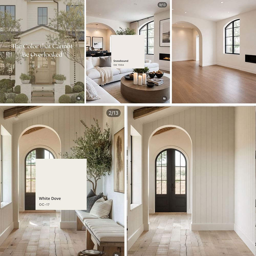
At the end of the day, an off-white is still a stark white. Unless your home gets tons of natural light and is filled with white furnishings, off-white paint ends up looking thin, dingy, or like primed drywall waiting for actual colour.
What is replacing stark white walls?
If you want walls that feel bright and fresh without feeling stark, you aren’t actually looking for an off-white.
What you’re really looking for are Complex Creams and Taupe Greiges.
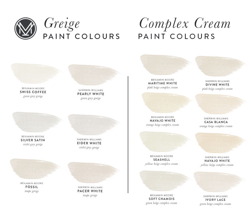
In the Killam Colour System®, these are the palest colours in the undertone categories of beige and taupe. Because they have slightly more pigment than a thin off-white, they sit back softly on the wall and you get that magical Goldilocks colour that is fresh but also warm. The perfect cozy backdrop.
And you can choose the right undertone to relate perfectly to your furniture and finishes for that high-end, pulled together look you’re actually trying to achieve.
White vs. Off-White vs. Complex Cream vs. Greige
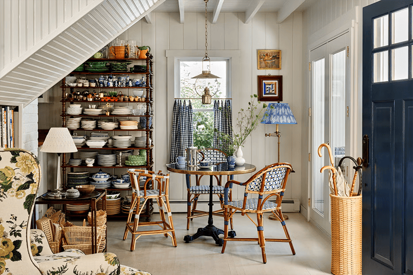
Benjamin Moore Seapearl (Taupe Greige) walls by Read McKendree
Here’s the easiest way to think about it. (Hint: It’s most definitely NOT about whether your room faces North or South, East or West).
True white: These are the whites that don’t flash too-cool blue or grey undertones, and don’t show any creamy yellow undertones either. They basically only work when your room is already strictly contemporary, think art gallery with plenty of modern bright white furniture and ample natural light from walls of large windows. For most normal homes, True White is best reserved for trim, ceilings and millwork where it provides nice contrast with more liveable wall colours. Examples: SW High Reflective White, BM Chantilly Lace.
Off-white: Softer and more versatile than true white, but still mostly too stark for walls, these slightly warmer whites still need ample natural light (more than you think). Balanced off whites are extremely useful for trim, ceilings, millwork and cabinetry. Examples: SW Alabaster, BM Cloud White.
Complex Cream (Palest Beiges): In my system, these are the palest colours in the undertones of beige. They give you the light, creamy look people often think they’re going to get from a warm white. Especially useful for updating a home with earthy finishes (brown, beige and gold). But also the perfect choice for a new home that needs a warm yet fresh backdrop for decorating. Examples: SW Neutral Ground, BM Ballet White.
Taupe Greige (Palest Taupes): If you have a home full of finishes from the recent grey trend, such as grey or taupe tile, carpet and stone, chances are high that the taupe greiges, the palest colours in my system in the undertone category of taupe, will be the sweet spot for a creamy look that still relates to all the grey finishes. Examples: SW Pacer White, BM Fog Mist.
What if your whole house is already painted white?
If your house, like many homes currently are, is already painted white top to bottom, inside and out, don’t worry! Just because trends are shifting warmer, it doesn’t mean you need to immediately do a complete repaint.
While it’s true that too-stark white walls are no longer trending, there is an easier fix.
Because warmth can absolutely be achieved with good decorating. Layering in the art, pillows, area rugs, drapes and plenty of warm atmosphere from a shaded lamp in every corner of every room goes a long way towards warming up the feel. At least while you figure out which of the more versatile pale neutrals will be the best choice for your home and plan your update. It’s absolutely not a rush. And I show you how to do it each week on my Decorate or Renovate channel over on Youtube.
🥳 My YouTube channel just hit 100K subscribers!! It’s where I share exactly HOW to create a home you love forever AND save money with my Decorate or Renovate channel. Please help me keep the momentum growing! Subscribe to my channel here.

Stop Guessing and Get Colour Right the First Time
Going into 2027 it’s officially not the move to simply choose an Instagram famous off white for your walls. But don’t worry! Choosing paint colours doesn’t have to feel like a high-stakes guessing game. Once you understand neutral undertones, picking the perfect custom pale neutral for your home becomes straightforward, no unwelcome surprises.
Need help choosing the perfect warm neutral for your walls? Shop my one room, two room or more or open layout paint packages here.
Related Posts
The Best Warm Whites for Walls are Not What You Think
Why Good Decorating Starts with the Right Advice
If You Keep Rearranging Your Furniture Watch This


I got a sample of Kestrel White this weekend because my fireplace has lots of taupe in it. The person at Sherwin Williams was like “I don’t know why they call this white, it’s not white.”
I’m hoping it will look great on my walls, haven’t painted test patches yet. Fingers crossed! I love your YT channel, congratulations on reaching 100,000 subscribers!
Can pale complex creams work in rooms that don’t have a lot of natural light?
Maria, this is so true! I don’t know what lighting, time of day, or digital retouching effects photographers use for posts, but those supposedly warm off whites never looked like anything but primer on our walls. I even ordered a real paint peel and stick samples, chose one, and even then it looked warmer and more chromatic than the actual paint we purchased based on the peel and stick!
Now we know to go warmer and deeper with our choices
because they wash out so easily, even in rooms like our hall powder room, which has no natural light.
Maria, I love your guidance always. I enjoy the way you identify the trends and tell us how to keep our homes timeless. I tried some complex creams and they didn’t work in my home but SW pure white is the perfect off white for my home. However. I layered warmth too with your guidance. 😉
Your house is the most beautiful house I have ever seen! It is pure perfection. Your talent and vision is amazing. Thanks for opening my eyes on what yellow can do for a home. Wow! Absolutely gorgeous.
Good day Maria, I discovered your U tube channel just a couple of months ago. I was following another designer that is big on changing everything and buying a lot of stuff. When I saw a few of decorate or renovate. I loved it.
I moved into a new house almost 2 years ago and it does not look finished.
I did not paint any wall. I wanted to live in it before making any changes. The house is beige everywhere. I bought your color wheel system and from the kitchen counter and the back splash is taupe. (open concept)
We had to remove the beige carpet and changed it to something light gray. Then I needed couches and I wanted to have 2 colorful chairs. BUT at the store my husband sat on a chair and said “I loved it.” Guess what : The two couches are gray and the chair he loved is also gray. I know I need color but I am stuck and now I am afraid to move forward I don’t want to buy anything else because I am afraid to make a mistake.
I want to lighten the walls because the house is pretty dark. I saw your house on home worthy and I loved it for me it was the best home worthy Iever. I love your style. If you ever are in the Kansas City area and need someone to do a decorate instead of renovate, I am your girl.