Everyone wants to know how to choose the right white. I invented a colour system that gives you a better question. The most popular whites are usually NOT the best choice for your walls.
I get so many questions about splitting hairs between whites. Most often, it’s when someone has chosen off white for their walls and then they’re stuck wondering, “what is the magical trim colour that will look crisp with my off white walls?”
So first, I RARELY if EVER specify an Off White for any client’s walls. I know that homeowners, designers and builders are going around choosing Alabaster or Simply White for every project. But I’ve been standing firm through this trend saying:
WAIT! There are better options.
Read this before you paint your walls white
Not least of all because only options you have to create contrast with trim and cabinets if you have Off White walls is with a brighter True White, which I find mostly looks underwhelming and kind of blah because the contrast is pretty meek. It ends up looking like a warm and a cool white. A mismatch even.
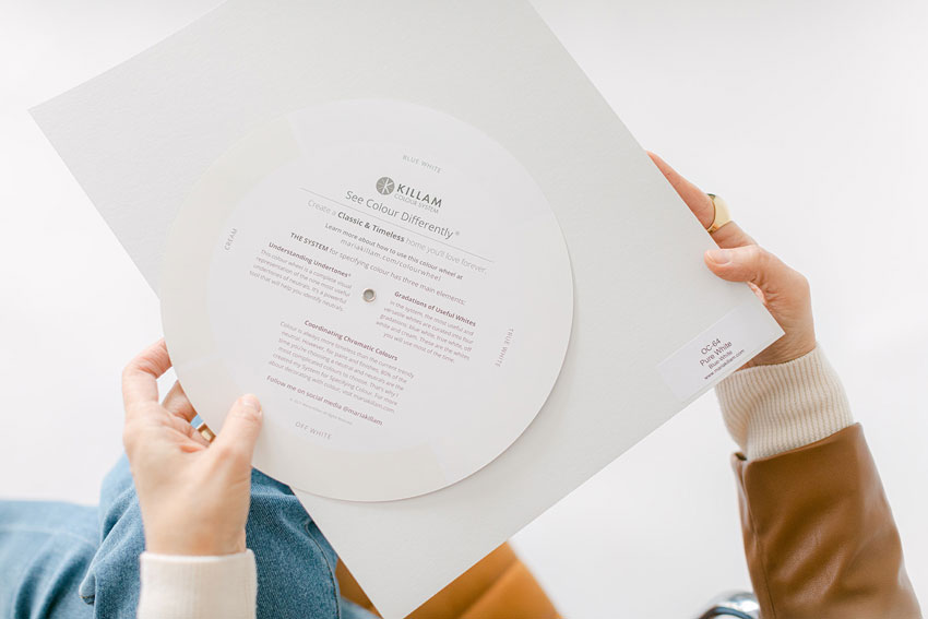
Learn about the Gradations of Useful Whites here.
Or – and this is a big trend that I get asked about in my SCWC workshops – to add some colour and contrast, you reach for a mushroom colour (a Taupe, Green Grey or Violet Grey typically) for the trim and/or cabinets. Warm neutral cabinets, I can get behind , it’s a nice way to cozy up a kitchen with timeless finishes, or in a darker tone, distract the eye from dated countertops (below)!
Wildflower Home (see the dated before here)
But running that same mushroom trim colour throughout your house will limit your wall colour options dramatically. And you might faint when you get the quotes for repainting it when you’re over it.
White walls are not as versatile as you think
When I’m consulting on paint colours, whether in person or online in my eDesign consultations, when a client has True White or Off White trim, it’s a joy because there are endless options for pretty wall colours when the trim is versatile and crisp throughout.
Besides, and I’ve said this many times before, Off White walls seem like the safe and versatile choice, but I’m hauling up my 25 (plus!) years of experience here to convince you they are anything but.
Because stark white walls need plenty of white furnishings to look right. Otherwise the room will just look unintentional, unpainted or builder boring. And white walls often don’t get along well with pale “white” upholstery. If you know how to compare colours effectively, you’ll notice “white” fabrics are usually in the realm of cream, barely there beige and greige.
What you want is a wall colour that feels fresh and bright without making your furnishings and decor look dirty or dingy. And that means you want that perfect colour that sits back and feels perfect with everything in the room.
Not to mention, it takes PLENTY of natural light to make white walls look amazing the way they look on Instagram.
And speaking of barely there beige.
My favourite whites for walls, you may have guessed, are not technically white at all!
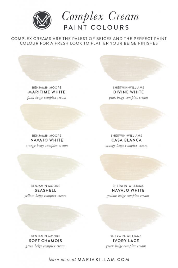
Meet the Complex Creams
If the neutrals in your home fall in the undertones of grey, you’ll want to explore the greiges here and here.
But if you’re looking for the perfect warm look for your walls that is fresh without being too stark, you need to get to know the Complex Creams. They are the palest beiges categorized by undertone in my system.
See what they look like in some of my rooms below.
Orange Beige Complex Cream – BM Indian White
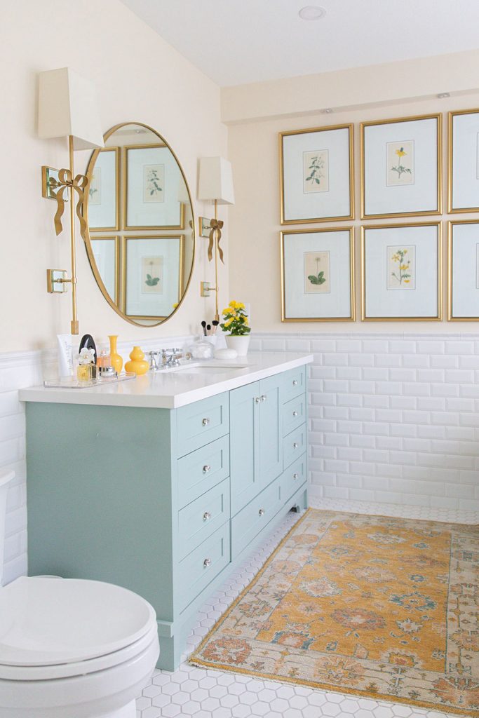
In my previous primary bath, I painted the walls an orange beige complex cream to perfectly match the ground colour of my framed botanicals.
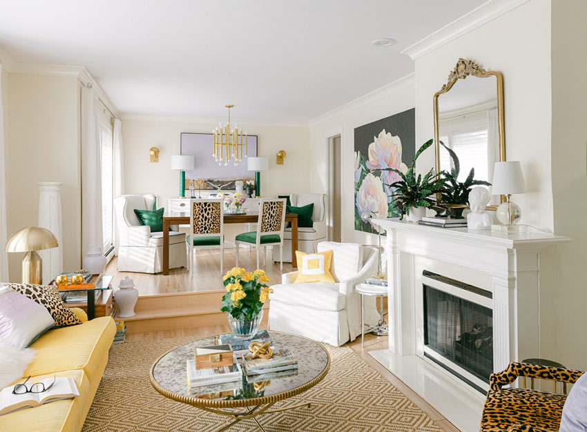
Orange Beige Complex Cream – SW Casablanca
And I used it again in my living room to pick up the warm marigold leaning yellow of my sofa. Notice that the room looks like a warm white. And the Complex Cream walls are perfectly fresh for decorating with colour.
Cloverdale Rice Paper – Green Beige Complex Cream
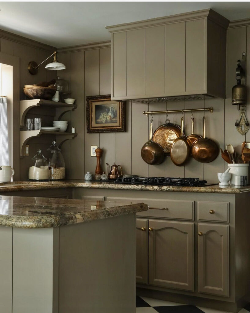
My kitchen in the last house was painted a Green Beige Complex Cream which gave just enough colour to the walls for the low light conditions through much of the day.
And my new kitchen cabinets are a Green Beige Complex Cream. which I have no plans to change because they look great with the Calacatta Gold marble backsplash. And I’ve run more of this colour throughout the house for flow because it’s such a versatile backdrop for decorating.
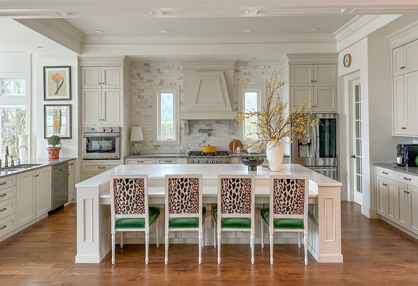
Custom Cabinet Colour – Similar to SW Neutral Ground – Green Beige Complex Cream
Here are some of the Complex Creams in my System (below). Learn more about how to get the right neutral undertone for your space by reading my eBooks here.
Once you identify the undertones of the neutrals in your space with my Neutral Colour Wheel, you can consider which Complex Cream will be best.
And if you’ve been following me and learning all about colour, you know it’s time to become a True Colour Expert. Get on the list to be the first to know when I release the dates of my Fall sessions. I can’t wait to meet you! We just finished our last event of the season last week!

Follow me on Instagram here to watch my questions of the day and see the trendy and timeless pics of the day!
And if you need help hiding your dated countertops with a dramatic colour, I can help with my Create a Classic Kitchen package here.
Related Posts


I love all of these complex creams. Years ago, a film set-designer friend told us he always used Behr’s Swiss Coffee, which I’ve since used throughout my homes. It’s enchanting when it interacts with sunlight, lamplight, and candlelight! I love SW Navaho, too. All of these have such lovely character, depending on the undertone you’re seeking!
I just painted my east facing bedroom Behr’s Swiss coffee. I went all in and did the trim and woodwork as well. It is the most lovely color that reminds me of fresh homemade vanilla ice cream. Now onto the decorating which I am finding to be very easy. It is not a bossy white in terms of picture matte or pillow background, etc. I have not found it to clash yet. So happy!
Cate Do u do your ceilings, doors, baseboards and casings in Swiss Coffee too? Thanks
Maria, you know your stuff with the complex creams!
Last year, my sister moved to a different state right when the demand for housing was through the roof. They found a new house under construction, BUT the catch was that they could not choose the finishes. The builder was building as fast as possible to meet demand, and he didn’t want personalization to slow him down. They had an idea of the range of finishes, so they signed the contract.
It turned out that their new house has a white kitchen and the walls throughout are a complex cream.
It looks SO GOOD that for the first time ever, they didn’t paint as soon as they moved in.
I tried a cream in my new house (which looks great in my Hawaii house), and it was horrible. Very yellow looking, in a not good way. Apparently colors look yellower in northern light. I ended up using Simply White everywhere and it looks great, but I really am the exception you are talking about. Modern house, giant windows with mountain views, brightly colored modern art on the walls. I really designed the house around the art so “gallery look” is appropriate. The floors are white oak and cabinets are walnut, and furniture will be bright colored mid-century style. I can’t imagine a better neutral wall color for this combo, but I can imagine over time I might paint certain rooms or walls or ceilings different “colors” (not neutrals.) I love the idea of colored ceilings in my master closet and mud/laundry room because there’s not enough wall space for color to make an impact, and the ceilings are 10′.
I should add that I’ve lived for almost 30 years in houses that were beige/complex cream throughout, because that’s what they were when I moved in and I didn’t re-paint, and am thoroughly sick of it. So there’s that factor as well. At least I skipped the gray phase!
Wow your house sounds so amazing. I also have strongly colored original art and upholstery
Even though my style is different, I still learned a lot of invaluable things from your blog, e-books and online courses. Which goes to show good design crosses styles. Test test test! Always get actual samples and view them in the actual room. If you have white walls, bring white into the room. All about undertones. Avoid border tiles and busyness. I was able to 99% avoid gray, 95% avoid black. My bathroom tile is a little trendy but either in a classic mid-century way, or something I loved way before it was trendy and will forever. And it primarily works because you taught me not to add stupid details that clash, make it busy, and date it. I really didn’t want a white kitchen but I still went classic with slab walnut. And because of your exterior class I avoided stone exterior although it is ubiquitous in my mountain town (I drove around and saw you were right about how much it dates a house), chose darker “white” than I would have thought, and a nice green. And your neutral brown roof color suggestion was perfect.
We are doing what Lorri’s sister did too and had to pick from a small list of colors for the whole house. Our cabinets are SW Pure White and we picked PP Early Evening (similar to SW Agreeable Gray). They said the ceilings will be the same color. The family room has the most windows and is on the East side of the home. I am wondering
If this be too dark. The flooring is a medium brown engineered wood thank goodness.
I painted my kitchen walls and cabinets BM White Down at your recommendation and love it. What is the undertone?
Do you have Maria’s whites ebook? In her system White Down is a Cream, not a Complex Cream. Creams are generally more yellow.
Hi Maria, Thank you for discussing complex creams. I love them. My new favorite is SW Origami White….it reminds me of a pearl. I have a question about your kitchen. I feel the prior owners matched the complex cream cabinets to the background color of the backsplash and the violet gray perimeter countertops to the veins in the backsplash. Since these two colors are both in the beautiful marble of your backsplash, why do you feel they don’t work together? Doesn’t the backsplash tie it all together? Just trying to understand how to best select coordinating finishes. Thank you!
The violet grey countertops don’t clash but isn’t found in the backsplash tile which is green beige, green grey and blue grey. And since this entire house was taupe when I arrived, my guess is they thought they were choosing taupe countertops and didn’t know they were purple until they were installed and much bigger. Hope that helps, Maria
Ok, I see. I was wrong about the colors in your backsplash. Thank you so much for clarifying. I really enjoy your blog and appreciate your generosity with your readers.
What warm white would you go with for trim that is cream? Looking for something fresh & light! Or would you not do a warm white? Thanks 🙂
We remodeled a couple of years ago and the contractor needed a color to paint throughout. I chose BM Shoji White based off one of Maria’s older blog posts with a bright white trim and doors and I love it so much. The contractor mistakenly painted the ceilings in a flat Shoji White, but I liked it so much I didn’t have him correct it. It feels very warm and peaceful! I am in no hurry to choose different colors for specific rooms like I thought I might be.
*SW Shoji White, not BM
We have bought a 20-year old house with very orange undertone wood flooring throughout. The previous owners had painted various orangey browns that felt like being surrounded by mud! Using Maria’s colour wheel and large paint samples, we selected SW Casablanca for the master bedroom and it has made such a difference. We also tested SW Dover White but it did not look quite right. In our room, the Casablanca doesn’t look white (I would call it an antique white) but it looks like it belongs and has been a perfect backdrop for our mostly white furniture and curtains. We went with True White for trim and ceilings. Next we will be taking this colour plan to the open plan living areas. I would never have chosen this colour on my own so a million thanks for your system, Maria!
We chose to paint our whole interior in Alabaster and that was before I learned about your undertone wheel. And now I don’t know what to do for the rest of our color decisions. Do I need to stick with yellow beige colors which I don’t really care for because of the alabaster walls?
Love the complex creams! Question for you: What colors do you recommend for trim and ceilings to go with cream walls? Would you use the same color for all three but in different sheens? Or a neutral white? I’m assuming flat sheen for the ceiling, eggshell for walls, and semi gloss for the trim – same color for all three, or same for the trim and ceilings with a different wall color, or all different? Thank you!!
Would love anyone to Chime is as I know Maria is extremely busy. We have natural concrete floors which have a green grey undertone, but there is also Doug fir wood stairs/ceilings that have a pink/orange undertone. We for sure want a warm complex Cream for the walls ceiling trim and cabinets. Do we try to match the undertone of the concrete floors or the wood from the ceiling and stairs?
Thank you for any suggestions.