


I only recently learned that there is apparently a name for one of AI’s favourite decorating moves:
The umbrella bouquet. 😂
You know the one. A neat little mound of flowers or greenery, perfectly domed like an umbrella, sitting obediently in the corner of every suspiciously perfect room.
Last month I was listening to a podcast where a florist mentioned that nobody in her shop would ever arrange flowers that way and suddenly I started seeing them EVERYWHERE.
And then I had an uncomfortable realization.
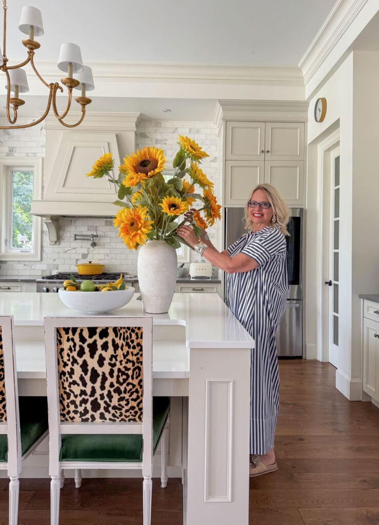
I have absolutely made the occasional umbrella bouquet myself. 😂 Including this one in my own kitchen.
How to Spot AI-Generated Interior Design Images
Once I saw it, I couldn’t unsee it, but here’s the bigger issue, 95% of the inspiration images being sent to our eDesign department right now are AI generated.
And this week someone sent me an AI-generated house she wanted to copy, including painting everything Dover White because she loved the warm creamy look of the images.
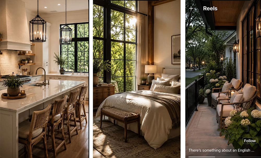
These are four examples of AI-generated interior design images, and once you notice the perfectly rounded flower arrangements, you’ll start spotting them everywhere. AI also warms everything up without asking.
That beautiful “cream” you are looking at is way too thin if it’s not at least in the category of the palest of beige which in my system are a complex cream.
And this is the part of AI that concerns me most. It can make an imaginary room look so convincing that it gives people enormous confidence to forge ahead with very real purchases.
And then the beige clashes. The cream goes yellow or green. The stone looks pink. Suddenly, the floors don’t relate to anything. And with warm neutrals making a comeback, we’re about to see a whole new generation of decorating mistakes. Because here’s what most people don’t realize: nothing clashes faster or more obviously than the wrong beiges together.
AI can give you ideas. It still cannot promise that the materials you are ordering will actually look good together once they arrive in your house.
Other clues include impossibly perfect lighting, furniture proportions that don’t quite make sense, and architectural details that would be difficult or impossible to build. The problem is that the images are getting so convincing that even experienced eyes sometimes need a second look. Also some words that I think AI has killed are, “quietly”, “matters”, and “It’s not about X, it’s about Y.”
Now I want to know, what are your dead giveaways that an interior image is AI, and what words do you think AI has killed dead?
Related posts:
Why AI Gets your Paint Colour Wrong
The Mystery of the Dark Entryway


Understanding collagen is useful for learning about skin structure.
I enjoyed learning more about hair maintenance.
Dead give away- the perfectly placed greenery!
While in Charleston, visit Kaminski’s. Great desserts!!!!
In these images: the light is shining outside but the rooms are dark inside, necessitating the interior lights to be on.This way they can showcase a mood, not just a room.
AI – The clear glass kitchen pendants are on and you can look at them – lol!
AI – large tropical plants are impossibly fit into rooms. No way is a large palm keeping itself contained into a tiny corner behind a chair without reaching out. I have a relatively small one in my bedroom and it takes up an amazing amount of space.
I’ve seen images with fireplaces stacked on top of fireplaces, like one below and one above the mantle. It is comical. The biggest give away for me is usually the warmth of the picture overall.
The dead giveaway I’ve noticed is every lightbulb or lamp has a perfect soft-glow to it. In real photography, lamp lighting doesn’t “glow” like it does in AI generated images. Its an almost “storybook” look, that’s very visually comforting and inviting but most photography just doesn’t capture light that way.
I don’t think your sunflower bouquet looks like an umbrella. The flowers are at different heights and create an irregular outline, not a perfect dome.
I hate AI in general. It is making kids not think in school, it is ruining the environment, and Open AI encouraged a kid in Tumbler Ridge to commite an atrocity.
I loved looking at Italian designs by Edward George until I started looking closer. Wall sconces were placed in impossible places; potted lemon trees inside with lemons on them; impossibly placed french doors, bed “footboard”’on the side of a bed. Things like this destroy credibility