
Since I wrote my ‘Beige is Back’ post from High Point Market last month, I have been receiving emails from readers wondering if it’s a huge mistake to paint their house greige since it seems like it belongs with the grey trend which was about 8 years in, so that means something new (black and white) is right around the corner).
I received a really good question from a reader about this very topic in Australia:
I bought your (Renovate with Confidence) webinar and found it useful even though I live in Australia and so don’t have access to any of the paints you specify (but I knew this would be the case before I purchased the webinar). It has been great for developing a frame work for making decisions.
Before this training, I was in a perpetual loop of indecision. How could I choose anything for our whole-house renovation until I’d chosen my kitchen cabinets and how could I choose them until I understood which countertop I needed!
Now I know what to do!
However, I’m wondering if there was any chance Maria would provide an update to the last 10 minutes of the third video?
When the webinar was produced, we were in the middle of the grey/fresh trend. However, as Maria has mentioned in a post recently, grey is on its way out, and beige is back!
If we were to choose a cream kitchen (as I’d really like to do), what would be her go to colours for the rest of the decorating?
At the end of the video, Maria provides her 4 go-to greige colours that would go with a fresh, white kitchen. Is there any chance of here doing the same thing and providing 4 go-to colours for a warm, cream kitchen? Given that your readers tend to want to be ahead of the trends rather than at the end of them, I can see this being of value to many other webinar consumer, not just me.
Many thanks for considering this request. And many thanks for setting me free from my indecisive loop!
This was my response:
Thanks so much for your email! I’m glad you got a lot out of the training!
The answer to your question is really custom to each person. While greige is pale and versatile enough to get along well with a broad range of decor, deeper neutrals like beige or grey have more prominent undertones that need to relate to your furnishings perfectly to look good. And since when you are building new, you most likely don’t have a decorating plan yet, pale and versatile is the way to go. So, in most cases greige is STILL the answer.
However, if you want a CREAM foundation palette (cream hard finishes, kitchen cabinets and trim) and you still want a look that is current and FRESH, you can paint your walls a complex cream.
But the context for ‘beige is in’ and ‘grey is out’ is this:
Choosing CHARCOAL for EVERYTHING, for example, cabinets, sofas, floring, and tile IS OUT, OUT OUT. And as far as I’m concerned, ALWAYS HAS BEEN A MISTAKE, because it’s been the TRENDY neutral of the past decade.
Beige is slowly coming back in because it warms up grey and balances all the stronger, more dramatic emerald colours that are coming back.
I was browsing the West Elm site just this week and interested to note that in many of their standard fabric colours, FOREST GREEN, was one of the options. If you’ve lived through forest green in the 80s (like me), this colour probably wouldn’t be your first choice.
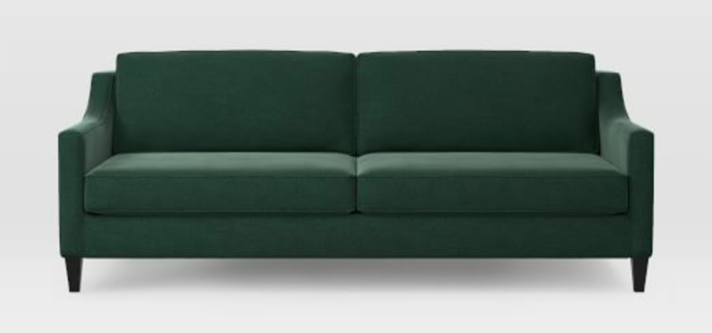
However, my training about GREIGE is still totally current.
GREIGE is not OUT, Everything GREY is OUT
GREIGE is not OUT. It’s anything that would make your house scream “Decorated in the GREY TREND” that is OUT.
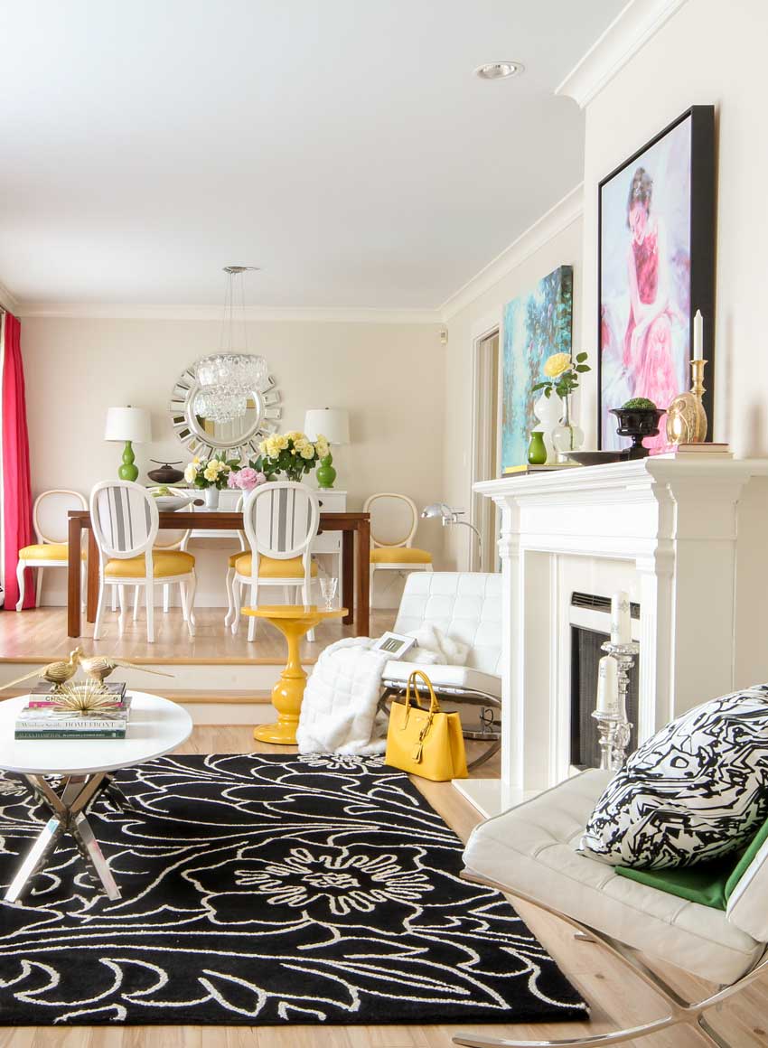
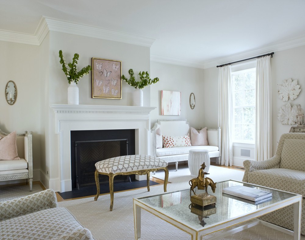
Maria’s living room
My living room has zero grey in my actual furnishings, but the walls are greige. Which provides the crisp backdrop strong colour like this needs.
Consider complex cream
If your kitchen and trim are CREAM, that means your walls need to be darker that’s true, because a pale greige will look too cool. But continuing with cream on the walls is typically a more flexible choice than introducing a darker ‘beige’. If I give you 4 go-to beige’s (either, pink beige, yellow beige, green beige or orange beige) you will have to have chosen furniture first before you choose which ‘darker beige’ coordinates with it all.
See my 2020 update on COMPLEX CREAMS, the palest of the beiges, here.
An Off White foundation palette is the most versatile
My best advice without seeing anything would be to choose an off-white for cabinets and trim and then if you want to introduce a ‘beige’ in your home over a ‘greige’ I would consider a colour like BM Feather Down or Natural Wicker, if you just want your walls to be cream without looking yellow.
When grey and beige look dated
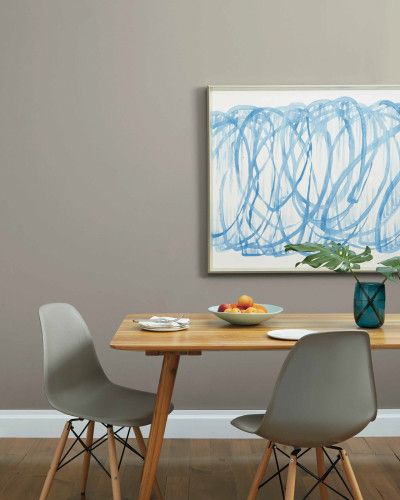
There are a lot of designers who call any shade of warm grey, greige, like this mid-tone grey:
If your entire house is painted a medium or dark shade of grey like this image (above), then that would technically position your house inside the grey trend.
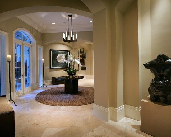
Just like a house that is painted in deeper, pink beige or gold beige tones right now would place your home in the Tuscan brown trend (below).
But a house painted in ‘greige’, which really is just a hint more shaded than “white” will still look current and classic. Like this pretty room painted BM Classic Gray OC 23 below.
So before y’all get cranky about where your house is inside ANY colour trend, listen up.
If you are NOT HAPPY with your house right now, it usually has way more to do with the fact that your home is missing a look and a feel. If you run out and paint your house a trendy new colour, that will not automatically fill your home with the atmosphere you’re craving (especially if you blindly paint it trendy art gallery white).
Decorate before you paint
A home that has a look and a feel is achieved through a coordinated combination of colours, well placed art, end tables, lighting and accessories. You’ll still need all those things AFTER you paint your house a new and fabulous colour. And likely it will be hard to choose a new and trendy colour without changing up a few of those things.
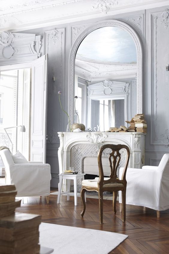
You’ll notice this room (below) is technically painted a ‘trendy blue grey’ however, we would all happily hang out here for a weekend because it has a look and a feel (and of course, perfect medium brown, classic and timeless chevron floors).
In fact, I would say this room is a “classic” use of gray because it looks timeless and not like everything was bought at the same time during the grey trend. Because grey will always be a classic choice if it is the right colour to pull together your room. Ditto for beige, or any other neutral.
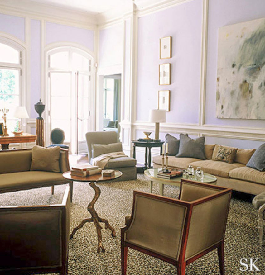
This interior by Suzanne Kasler is mostly beige on beige. Gold beige in fact. With cream mouldings. But the lavender walls keep it fresh along with the leopard carpeting.
So back to the question that seems to be on everyone’s mind lately. . . will painting my house greige instantly date my house?
Well if you paint it a mid-tone grey (which many designers call GREIGE) YES, technically that is dated.
However, in my system, greige is PALE and looks pretty white to most people.
Why greige is more versatile than white
Well first, now that the idea of painting your house ‘art gallery white’ has suddenly hit mainstream America, that will become the new ‘default’ neutral for a lot of homes. And I’m telling you right now, art gallery white will only be a good idea for a handful of homes decorated in–you guessed it–lots of white.
Greige is basically white, but it’s really just a smarter more versatile white because it has some complexity to it. It’s simply a more versatile backdrop because it’s still pale.
If you go back to the first photo on this post, you’ll notice that my walls are painted a warmer, creamy taupe greige (Rice Paper by Cloverdale Paint). When it was published on the cover of Style at Home a few years ago, they called my walls WHITE.
When white is wrong
In most people’s homes, painting your house BM Cotton Balls (for example) is way too stark for all your furniture.
We recently had an eDesign client who had painted her house Cotton Balls because it was recommended by her decorator.
She sent photos and said “The only place I like it is my entry, everywhere else, it looks so wrong”.
Why did she ONLY like it in her entry?
Because she didn’t have any furniture or hard finishes in her entry that would make her plain white walls look wrong.
Everywhere else, it was simply the wrong colour compared to her furniture in the great room, and the finishes in the kitchen.
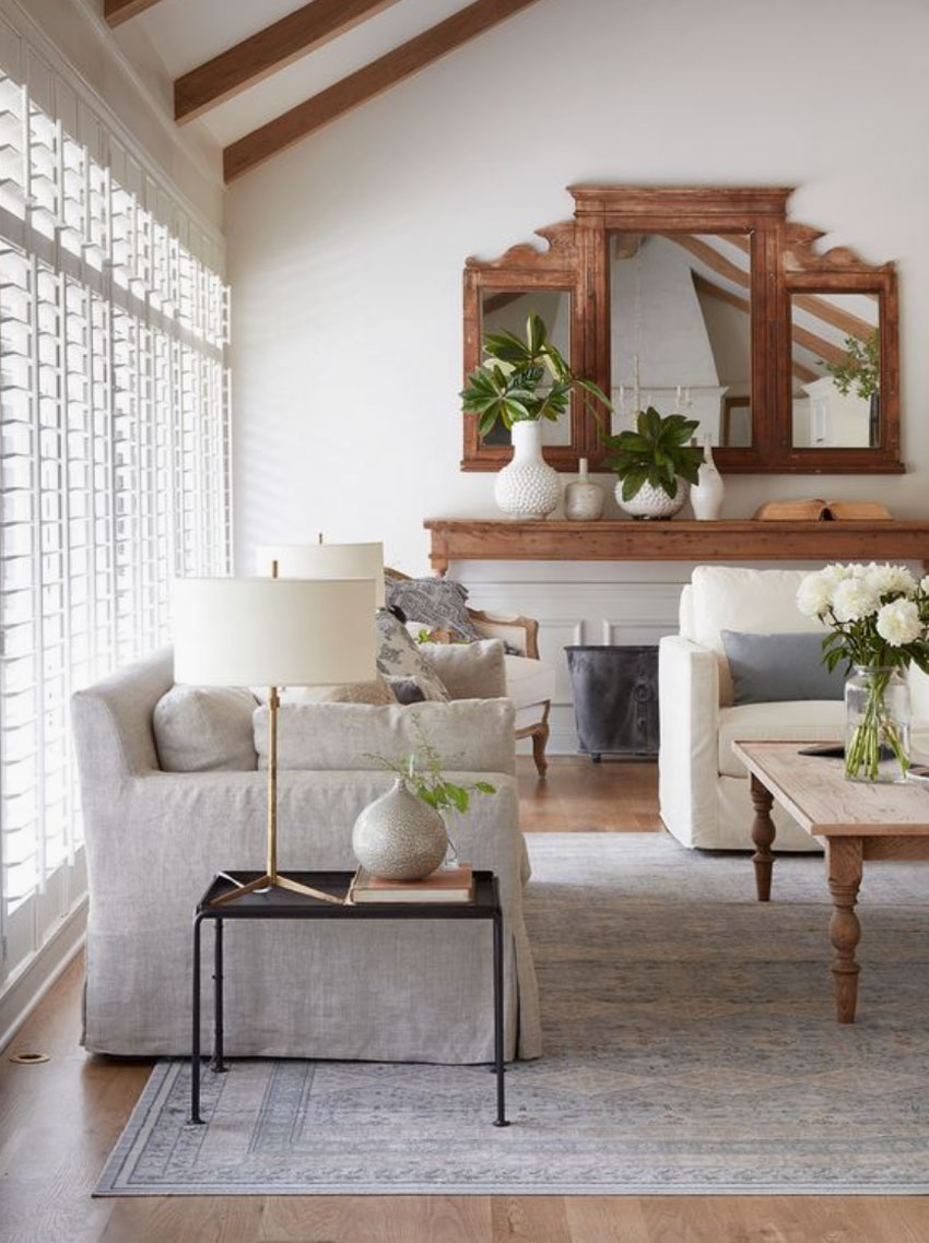
Even in this room, painted art gallery white by Joanna Gaines (who was probably part responsible for bringing white to the masses), a better “white” could have been chosen.
The slipcovered sofa is a greige, which means the walls would in fact have looked better painted a greige, like BM Pale Oak or, better yet, a cream to relate to the cream slipcovered chair.
The reason why this white still works–even though it could have been more perfect–is because the furniture is pale, fresh and super current. And we are busy being distracted by the styling and the pretty mirror above the sofa table that acts as the focal point for the room.
Show me a room that is painted white with no white repeated in the room, and I’ll show you what colour it could have been painted to make it even more perfect.
Find a pale and fresh paint colour that relates to your room
So to recap, let me say this again, the answer to ‘Which new NEUTRAL is the most CLASSIC AND TIMELESS’ is this:
The colour that relates to your existing finishes and furnishings.
You will never get a random, click-bait list of ‘go-to’ colours that you can choose from, that ‘work every time’ in this blog because there’s no such thing.
What will help much more than a list of ‘no fail’ colours is my curated collection of neutrals. This system of 50 colours will help you find the right white or neutral every time. You can find it in either of my ebooks and buy the collection of large painted colour samples here.
White is not ‘the answer’ if you can’t pull it off in the house you live in.
And if you want “white”, it’s very likely that greige or cream might be better options for your house and furniture.
When greige is not right either
But don’t paint your house greige if it is in fact still entrenched in the Tuscan Trend, it could look like a pasty apartment beige, or even blue, if you do that because it will look too cool and stark. This is where you should consider a deep cream. (Read my updated post on the COMPLEX CREAMS here).
In my system, greige is a category is the bridge between neutrals and WHITE. For walls it is most often the lightest I would recommend unless you have a lot of white furniture and upholstery (which most people don’t).
So please be careful about considering paint colours through the lens of trend cycles, it’s much more important that the wall colour does what you need it to do for your room, and that means it needs to relate well to your stuff.
Focus on creating a look and feel
Focus on creating a look and a feel because that’s way more important than whether your house is on trend or not. If you’re stuck and need a colour palette in your living room, our Get me Started package is what you need.
If you are building a new house or renovating, and you want the perfect foundation palette and pale versatile neutral to decorate around, I would love to help you get it just right with my New Build or Complete Renovation packages here.
Check out this wonderful blog post by Marisa Zerby from from State College, PA who attended my Long Island course last month:
I wanted to thank you again for the three days you spent training us in NY this past week. As I’m just branching out in the design world, I feel more confident than ever when it comes to specifying color. I’ve taken my boards on two consultations already and found myself laughing (on the inside) at how easy it was to decide on a color and explain WHY it was correct! I can’t imagine being without them again!
I also wanted to pass along a post that I published on my blog this week sharing my experience attending your class. You and Terreeia make a wonderful team and the whole experience overall was so stream-lined and organized. I’d recommend it over and over again to anyone that was willing to see the color of the world in a whole new light!




Maria, You had me at “cranky”! Oh you’ve written the best post. I was thinking, what use is all this, if we all are constantly chasing our tails for the newest on trend paint colors/colors etc. only to have them be “out” in a flash. This post had me high fiving and nodding my head and saying yesssss outloud lol. You didn’t write what I was afraid to read with one hand covering my eyes lol. You wrote what I was hoping to read and helped cast my fears aside. And…wow. I’ll say it again. What a post. You articulated very well what is what. I love the way greige and or gray walls set the stage for the “starz” of the show to shine. It’s head to toe charcoal that is nauseating lol not anything else. I will forever keep this info in a prominent place so I can refer to it always. We are adding on a sunroom/family room off of our kitchen. Marrying this new addition onto the existing home is challenging and your words are so helpful. Also changing our house color at this time. Was built in the 80’s with cream/tan siding and chocolate colored brick on lower front of house and chimney. I am thinking of limewashing the brick so it will blend nicely with whatever color siding we choose. Have you ever seen this done? I had previously purchased your exterior house color package and plan on pouring over it this week. I have white trim on window casings etc and that won’t change. Current roof color is a ghastly brown (trust me—ghastly lol) that will also be going. Lots of neutral brown roofs out there. But not this one lol. So long and short of it, your’re helping so many of us muddle through our decorating crisis’ one great post at a time!
Robin,
I had the brick trim on our house limewashed. The siding is a pale, clear yellow, trim white, roof grey, and the lime wash looks great. So much better than paint. I like the way it pales the brick color without obliterating it, as white paint would. The soft effect makes the pile of brick so much less noticeable (the brick encases a full flight of stairs leading to the front door), whereas solid white would make them stand out, but in a different way than the natural brick did. We also had limestone slabs laid on the brick steps—an immense improvement.
Oh thank you Kay! You have given me the confidence I need to jump in. I really don’t know of anyone who has used this technique. Your description of your brick before and after is the effect I am looking for. Thanks again.
Such a helpful post! You’ve answered questions I did not know to ask. I am grateful for all your advice and love your passion!
Maria, this is one of your most helpful posts ever. In Syracuse, NY it took about five years for the grey trend to catch on, and now I am seeing grey walls, grey tile, grey, grey, grey on renovated houses. Grey cabinets too. The houses sell because they seem current, but the poor people who buy them won’t be happy for very long. Even though I love the color grey, I never wanted grey walls in my house. Greige, of course, is perfect. I love how you keep us thinking classic! Changing up accessories when new trends fit into an existing design is one thing, but changing furniture—even repainting!—is something else—too much labor and expense.
Great post. ? We would all like to be able to change things up decoratively without repainting our whole house. Thank you!
Fantastic article. I always appreciate your thoughtful style of explaining things in action in the real world.
Is there an “ivory Greige” from the Benjamin Moore, Valspar or Kelly Moore paint lines that you would suggest to consider. I love the color in your room at the beginning of the article.
Many thanks, Rachel
Thanks Rachel! Sherwin Williams, Shoji White. Maria
Fabulous post! I agree. Maria designed my living room, including the wall color. It is the look and feel, not just the beige wall color, which makes me sigh with delight every time I look at it. My bedroom (also designed by Maria) is greige and I feel the same way about it.
Well said Maria! It is nice to know what trendy colors are currently in. If you are building or remodeling and starting fresh you can then go wild with the latest trendy colors but if you are stuck with the furniture that you have, like so many are, then you still need to paint with colors that relates to your furniture and hard surfaces. The nice thing about this is as you stated is you can use a lighter shade that relates like a greige to make your home look more current. You clarified that beautifully.
I am also in Australia and once found (but can’t at this moment) a website that you could pull up an American paint colour, it translated it to rbg then gave a closest match in a selection of other brands including Australian brands. If I find it again I will share
I think this is the one .
https://www.easyrgb.com/en/compare.php#inputFORM
All of this discussion is related to your advice on interior color trends and your advice related to them. I just did your You Tube Exterior paint color selection tutorial, and it related mainly to complementing undertones of brick, roof, and stone surfaces of your home.
I’m STILL not finding the answers I’m looking for! I have a cedar-sided home, and zero stone to contend with. Just my roof color to consider, and I suppose my concrete driveway, but I didn’t see where that was considered in any scenario in your tutorial.
I’d like to paint my house SW Iron Ore (almost black)(I saw a picture in an April magazine with a house done in BM Caviar w/ white trim- STUNNING!), with SW bright white trim, and a mix of SW Umber Rust and SW French Roast to create a wood-grain for my garage door and front door and back deck. The house is a 2-story colonial w/ bay windows w/ copper roofs that match a copper roof front door overhang. I want to paint these the same shade as the garage and front door.
The roof is a grey/brown.
Question: Is the GREY trend going to be OVERSATURATED in the EXTERIOR market in the very near future too? I’m starting to see more homes popping up in the dark, dark grey color now, not as dark as I want mine, but I LOVE it. Would you advise to stay away from it now? Where am I safer to go to if not to the grey?
Painting your house a dark and dramatic shade of grey will definitely place it inside the grey trend. It would be a custom situation where charcoal or black would be a really good solution. You love it now because of course it’s trendy, just like you’re not interested in painting your house brown, however 6 or 7 years ago you might have ‘loved’ that idea just as much which is why the bottom line for the most classic and timeless exterior colours, which I teach in the exterior colour training is, white, cream, A COLOUR, like blue or green or yellow, OR a midtone shade of grey which has always been considered a heritage grey, that I’ve been specifying for 20 years and doesn’t scream the grey trend at all. I mention it in the exterior training, as being the colour of stone. Hope that helps, Maria
Is Revere Pewter considered a greige? It just looks great with my furnishings. I do have Sherwin Williams Creamy in my front hall.
It’s too dark to be a greige but it is a lovely neutral feeling grey because it’s the colour of stone. Maria
when i was house hunting i thought greige and gray walls would be the first color to change. we finally settled in and bought a beige sofa and traditional dark wood furniture. we also set out some antique furniture that were passed down to us. With kids and pets white furniture was an absolute no. we’re now ready to paint our walls to the greige/gray except i look around and realize that those colors just don’t incorporate well with our furniture or the theme in our house. i’ve looked on Pinterest and magazines to give me an idea how it could work but every picture i see with gray/greige walls have white and contemporary furniture with metal or white decor. i’ve abandoned the idea of greige/gray and decided to go beige because not only does it fit better in our house i quite honestly think the greige/gray theme is a trend that is being overdone. In fact I’ve seen the trend go so far as to where on top of gray walls i’m also seeing gray towels, gray granite counters, gray furniture, gray tiles, gray everything as much as possible in the house (both my mother-in-law and girlfriend designed and decorated their house this way). so yes, i am happy beige is coming back!
I have a master bath with white cabinets that are about 12-15 years old. I am considering painting them gray. Are gray cabinets going to look dated? If so I will stick with the white!
I’m a little confused that your “White is Complicated” book calls greige a combination of gray and white. But everyone else (including it’s name) says it is a combination of gray and beige. Can you clarify this? Thanks
I’m not fond of mid tone greys of the grey trend, but find the warm pale greiges quite beautiful. My question is: are all warm pale greys considered greige? What about pale blue green grey? If your furnishings included both shades, what criteria do you use to choose one over another? I read on another of your posts that you don’t take wood furniture into consideration, but what if it is strongly colored stain?
Hi Patti, blue green or blue greys are not ‘greige’, taupe, green grey and violet grey in the lightest shades are considered greige and the rest of the beige’s in the lightest shades are complex creams! Maria
Hi Maria, there is a picture on your post that says it is your living room. May you please tell me what colour is in your walk in the photo?
I’m trying to find a Greige for my house that is safe to use when The surrounding buildings are grey, plus the pavement and often grey sky’s where I live in the west coast.
My living room is SW Shoji White. Hope that helps, Maria
Hi Maria! I used Ben Moore Affinity paint in the color Coastal Path. Every site states that this color goes well with charcoals. Is this color considered a greige color?
Me again! I love your living room picture and Shoji white I actually have sampled on my walls. However, it is a slightly lighter color than my cream trim and cannot decide if it would look ‘right’ or not. Thanks so much for any general insight or thoughts!