


Last summer I drove out to a house in the country where the drywall had just been installed and my client was ready for colours. She had this bookcase/library in the garage waiting to be installed in the great room.
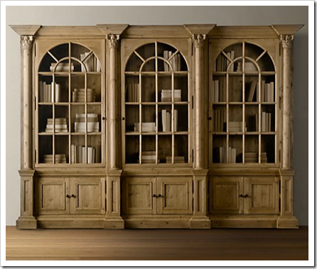
To ensure that there was enough contrast between the paint colour we chose for the walls and this unit which would fill up an entire wall, I actually matched the colour to a Benjamin Moore paint chip. It was in the realm of BM HC-34 Wilmington Tan. And as you can see that’s just how it looks in the above photo too. Not brown, not orange, not red and not the limed gray of the other furniture in their store. It’s a good thing to know if you are buying any of these pieces.

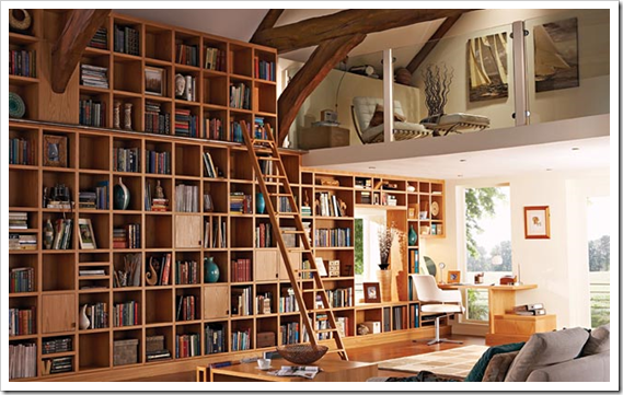
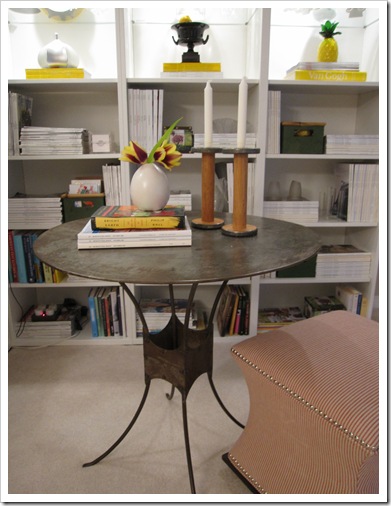 Photo by Maria Killam
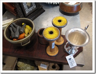
 Photo by Maria Killam
Download my eBook, to learn which colours are ALWAYS gold beige. How to Choose Paint Colours: It’s All in the Undertones.
If you would like your home to fill you with happiness every time you walk in, contact me.
To make sure the undertones in your home are right, get some large samples!
If you would like to learn to how choose the right colours for your home or for your clients, become a True Colour Expert.
While you’re here, subscribe to this feed so you don’t miss out!

I love your library corner. The shelves are beautifully decorated and crisp. Love the pop of yellow (Is this in the same room as your yellow couch?). I like the mix of the spool candle holders and the rustic table with the more modern shelfing. Very nice!
Love it!! Can't wait to see what you cover the ottoman in, maybe something in black and white?!!! Love how the top of the spools pick up the pop of yellow, very clever Maria!!! I had to laugh about the gray comment. I remember trying to come up with a bunch of different taupes for a neighborhood of ladies that all called on me for color consults. Luckily lighting and furnishings dictated which taupe to use but after awhile it was not a challenge I could walk in and zero in on the perfect taupe almost immediately. Funny how colors go in cycles, I wonder what wall color people will be clammering for in the near future?? Kathysue
Hi Maria! I have never put so much thought into choosing paint before I started reading your blog. Before it was just pick a color I like on a paint chip and go with it. I've tested out eight different grays and decided on BM Revere Pewter for the main part of my house since it's an open floor plan. However, I want to break up the grey a little with a fresh green in the kitchen and I want my cabinets to be gray. I like BM Fieldstone but is it a no-no to mix different grays in the house? Any input you have would be very appreciated! Thank you!
Maria,
Thanks for the tip about the Wilmington Tan matching that RH furniture. Hope you are doing well!
Cheers,
Kristie
I am very familiar with Wilmington Tan, painted my old sons room that color and its a gorgeous rich color…good choice! Love your library corner…so cozy!
Maria, the metal table is the perfect touch in your library corner!
Might I inquire if the woodwork in the home with the large bookcases is painted or natural wood?
I love your blog and learn so much!
Maria I love the patina on the table and I have been on the lookout for something just like it!
I have a Giveaway from The Zhush I know you will love! Come & join!
xoxo
Karena
Art by Karena
Maria, That is a beautiful ottoman. The shape is scrumptious! And I LOVE your shelving unit and especially the color. Your house is going to be stunning–I just know it!
xo
Donna @ Comin' Home
Wow, I absolutely LOVE that table…and the ottoman is great too. I look forward to a post about what you recover it in!
http://bjdhausdesign.blogspot.com/
Maria, your library is beautiful! I'm a huge yellow fan and you've used it perfectly! Those old spools are great, love that round table. Perfect.
Perfect. As always in the right spot. Me love her reel-candlestick. I keep this idea!
I think the patina is just right. It gives the room a nice warmth.
By the way…I was at a Crate & Barrel outlet store the other day & saw a lot of yellow things. I knew you were on the lookout for yellow so I thought I would mention C&B as a source for you.
i know it will be just right when you recover the ottoman! I'll bet you pick something fresh…crisp..with a pop of colour…am I right on that?
have a great day!
Love your library corner and the table. How do you find time to read? Glad to see Bright Earth is in your collection
Maria, I'm curious as to what wall colour you selected to contrast with the wilmington tan.
As far as your library vignette, I myself quite love the whole look of it. I also love the ottoman as is.
Love your library corner, love the table and love the spools – your partner needs to just suck it up that you have great taste. The ottoman I agree would work better recovered.
Hi Susan,
Those bookshelves are 'BESTA' from IKEA. And they came in white.
Hi De Tout, we chose a green gray, I think it Clarksville Gray or Sag Harbour, can't remember exactly but it was a green.
Maria
Hi Maria, I LOVE the mix of patina and polish! It's so much more interesting than everything the same. Bravo. Why change the ottoman??
Susan – I also covet that bookcase!
If you look at the door near the floor at the left you can see a bit of darker wood grain swirl. From the color and grain of the wood, it's probably unstained Douglas fir.
Douglas fir cut as boards has a very uniform, almost always straight grain, and that warm orange-tan color.
It's a subtle graining, but in certain lights it's distinctly striped by the growth rings.
Love the table!!! Where did you found it?
There is nothing I like better than a little old mixed with some modern. You have achieved that with you mix of table, objects and the ottoman. Perfection…don't change a thing!
That library at the end is AMAZING! Where is that from? I would put my books there and read them all day on that chair on the upstairs, sometimes gazing out at the view downstairs while sipping some tea.
It would be the perfect inspiration for COLOR!
Thanks for your post
-Drew
Kat n' Drew Cards