


Since gray is the new brown, I have been hearing all kinds of reactions about how cold it is, with people (including designers) declaring: ‘I would NEVER decorate with gray’.
I even had a reader who sent me an email asking about a statement a designer had made, ‘You can’t mix two neutrals together; therefore, brown and gray can’t go together’ and I’m here to tell you, yes they can.
The problem with the ‘trendy neutral of the moment’ whether that’s brown or grey in your area, is that so many people choose it as their DEFAULT NEUTRAL.
If they have a colour choice to make, whether it’s a new sofa, new hardwood or outdoor furniture, everything ends up BROWN or GREY or BLACK, for example.
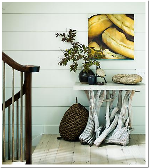
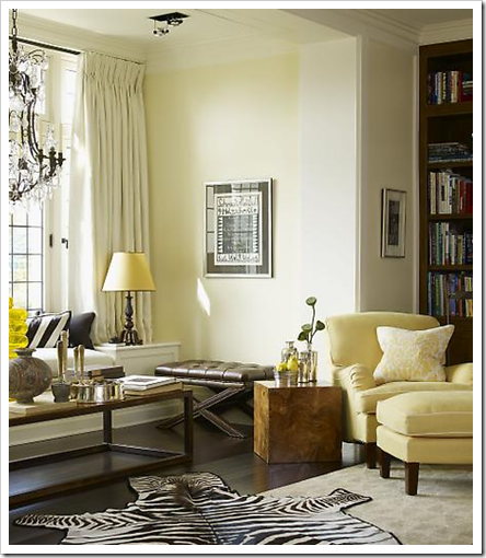
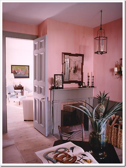
Grey is the current trendy neutral because earth tones feel dated and overused. Bright and clean colours are trending, and beige dies as a backdrop to clean colours. Nothing bring grey to life faster than yellows (above), fresh greens, orange/peach, reds and pinks (below).
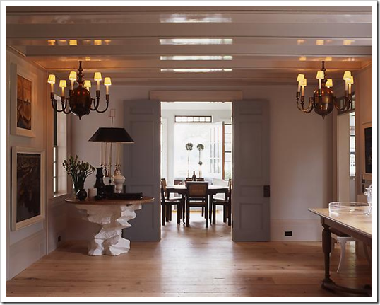
The other day I picked up an old House & Garden Magazine and flipped it open to this interior by Steven Gambrel his interiors will explain what I’m saying the best (all images in this post from his website):
Gray has three undertones. It’s either blue, green or violet. And this is why your gray wall might look blue, green or purple, because you missed the undertone before you painted the walls.
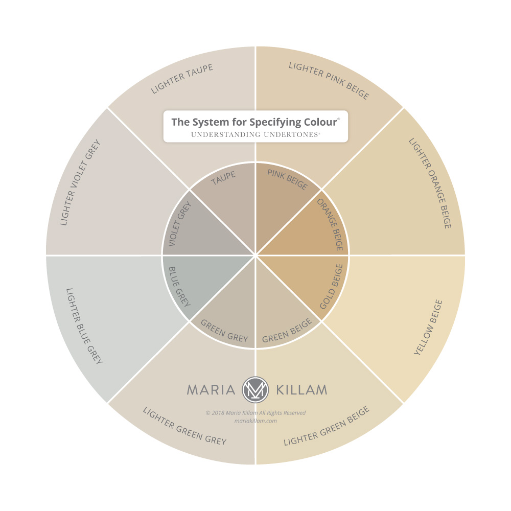
Here is an interior painted in a pale blue gray:

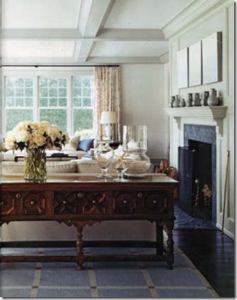

Muted blues are tricky to specify for the walls because people often get them confused between green grays and blue grays. A gray that technically ‘reads’ like a neutral gray on the walls is usually a green gray, like HC-173 Edgecomb Gray (below) here the ceilings are the same colour:

Basically if you want blue walls, you need to actually select a blue gray so that you don’t end up with baby blue.
If you look closely at this kitchen (above) the stone countertop and flooring and subway tile have a green undertone while the interior panels of the doors have been painted a blue-gray. It’s subtle and doesn’t look necessarily wrong (to the untrained eye) but can you see it now that I’m describing the difference? Most people can.
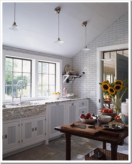
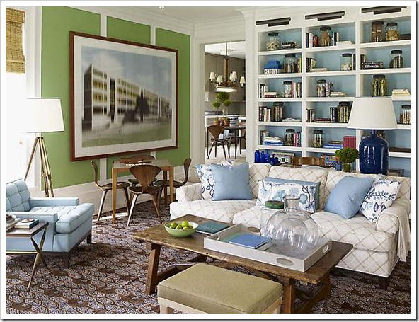
I prefer this combination of grays (above), because it looks more intentional.
A more sophisticated analogous colour scheme with the blue gray walls and toss cushion paired with the green gray drapery, upholstery and carpeting.
A small sidenote–this is not a colour combination I would use when decorating (too cold for me in general), I am simply showing it to demonstrate the two grays and because I think it has been tastefully done.
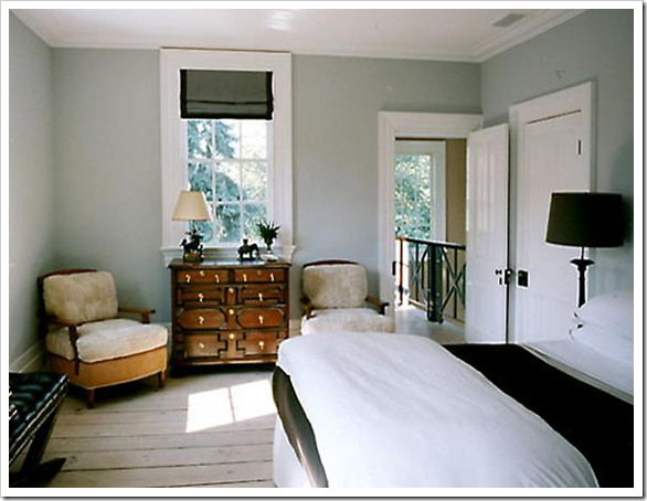
In this image (above) the doors are actually a violet gray, and the beams on the ceiling look slightly lighter.
I recently received this comment on one of my posts:
“Just from reading your blog I see colour differently. I was buying paint the other day and a chap came in with three gallons of Abalone Benjamin Moore, he showed the clerk a photo of his purple wall and both he and the clerk scratched their heads and said it was the weirdest thing that the light made the paint purple. Boy, did the clerk give me daggers when I chimed in that Abalone is purple based.”
And this is exactly what has so many people think that the light changed the colour when really, you just choose the wrong grey.
See how this room really looks like a cold blue gray? Well there it is; technically the extreme of gray. But as you can see by all the images prior to this one, there is a huge variation of grays that simply provide a calm, neutral backdrop when mixed with warm colours.
There’s nothing wrong with a blue grey if you love blue!
Rooms that are the most interesting and sophisticated, usually have a well balanced combination of warm and cool colours which have been introduced by the flooring (shown above) or the warmer tones in the furniture itself.
All images from S.R. Gambrel
Here Steven has taken blue and green and warmed them up and away from gray undertones for the decor of this room!
Obviously most of these images are very tone on tone and neutral so for many of you, it’s too much gray, but I hope I’ve shown that when someone says ‘gray’, they are probably not thinking about the coldest blue gray in the paint deck!
It’s all in the Undertones, download my ebook here if you really want to get the undertone of your greys right. (if you have a computer you can download my book)
If you would like to transform the way you see colour, become a True Colour Expert.
Related posts:
True Colour Expert Training is Here!
What Everyone should know about Beige
New to this Blog? Click here ; Subscribe to my Monthly Newsletter.
While you’re here, subscribe to this feed so you don’t miss out!

I really like the Manchester Tan but you're right, I would pass it by if I saw just the paint chip.
I agree on different tones of gray looking stunning. I really love grey and golden beige together though, I think it has such a sophistication to it. Great post, as always! 🙂
So to choose the best gray (or any neutral) we need to choose one with the SAME undertone as our hard surfaces and furnishings?
I am so jumping on the gray bandwagon in our next place … I think the way you showed the difference between the blue gray and green gray is really helpful.
I always learn so much from your blog. Revere Pewter is a favorite of mine. All best, Kathleen
Thanks Maria, great post. I love the rooms you showed us! I'm in the middle of painting some bookshelves grey and they are stunning. My husband made them for his office.
Ruthie
* GREAT TIMING, Maria… (for me, at least!). It took weeeeeeks n' weeeeeks (AGONIZING, I might add!) to find the "right" color for our bedroom walls (also taking into consideration a whole new stone FP wall).
Finally decided to "just try" some gray samples on the walls… EUREKA!!! Even my husband just loves it!!! It's so very clean & sophisticated w/ all the creams n' whites & new wood floors… (Our painter liked the old brown suede walls, but I was READY for something "new", and oh! Is this "IT"!!!)~ (Added bonus~ it also very subtly highlights/enhances the views we enjoy there, too!).
Only problem NOW is: I want to redo the entire HOUSE!!! (I LOVE this color~ it's FABULOUS!!!).
I always appreciate your blog & the time you take to share your vast talents w/ us… and BTW, really enjoyed your last posting, too! Great fuN!
Biggest thanks & best wishes,
Linda in AZ *
[email protected]
I love shades of gray, have always worn varying shades in the fall/winter season. For the home I think it is very sophisticated.
In the past few months I too have added some gray accents in my house. I love the comfortable yet sophisticated feeling they convey.
I have had a gray tone bedroom for five years now. The color is called Gray Verbena, and actually looks like a soft faded Frenchy-Swedish gray-ish blue.
My guest room is a called Studio Beige, and is very greige.
I have a brown living room and dance parlor, and the undertone is gray.
Been thinking about painting my very large kitchen gray.
I think gray has been around forever and people have been using it, but they just don't know it ha ha.
Great post as ever.
xo xo
Great post! I love gray. Since I sell out of my home, I've used grays for some time. To me they go with almost anything. I will say I stay away from the blue grays and tend toward what I call grays with a brown undertone (which I'm sure isn't right to someone like you who really knows what is behind the color). As usual, you always share such useful info. Thanks for your time you put into your wonderful blog.
marcie
Maria,
Thanks so much for this post! I love those moody colors, yet find them difficult to achieve. Although I will say, I know my color knowledge is growing thanks to your blog!
As always, much thanks!
~Angela
I had no idea Gray could be so buautiful. Yes, I am loving it now!
I've seen some beautiful rooms done with gray, Maria. I actually thought of a pair of gray slacks I have while reading this and the different colored tops I pair with them.
I love gray, so I'm really happy to read this post! It is my neutral of choice and think it can look so sophisticated if done right. I usually like really pale grays mixed with different shades of blue, green, and lavender. I think it provides a gorgeous base to add different colors in without being as stark and bright as white.
All these rooms are beautiful!
Such a great post! My clients are all catching the gray vibe right now and it is a lot of fun.
Since gray is my favorite color I loved this post! Very informative!
Maria,
Great post! You know I love gray/grey! It has always appealed to me and I am enjoying all the attention it's getting. Gives us more options and as we know more we explore more with paint, fabric, clothing, furniture etc. Thanks Maria.
Bette
I love the grays and thank you for teaching us to read their undertones.
I compared Revere Pewter to the grayscale I made in my Colour Theory class and I see a red undertone instead of green. Looks like I need to do more colour mixing exercises until I can read the undertones correctly.
My next home will be done in grays and I will use some of the colours you listed to bring the grays to life. I can't wait!
Love all the different shades and do agree it is starting to take over brown!
i totally agree with you and the photos you've used here illustrate really well!
spaces 2, 8 & 13 are beautiful, calming and very cosy.
Well… I was trying to concentrate on what you were saying here but I was absolutely drooling over those interiors! I did go back to read your expert thoughts on the subject of grey. Thanks Maria, I always leave your blog feeling smart & happy!
Have a great week.
xo Lisa
Maria, Great post! A few years ago, we painted our front hall "American White" by Benjamin Moore and love it. It is a cool, white, bluey gray. Thanks for the explanations on the three undertones. I wish that I had read this before painting for a better educated guess!
yes i've been loving gray for a while now!! it works in so many spaces & as you said can be so far from cold…
I have a whole paint deck of smaples I made for myself of grayed-colors (i call them huetrals bc I heard it in HB haha) and they look so boring & gray on the chip but are the most beautiful pale colors on the walls. clients always love them.
loved to hear your paint brand discussion the other day. Am realdy to try some new brands now to see the magic!! 🙂
xoxooxo
Hi Maria, It amazes me how almost every time I have a quandry about color and design, you answer it on your blog. I was just thinking about turning our whole house into cooler colors eventually. Since I live in a warmer climate in Texas, I tend to want to see and experience cooler colors — blues, greens (turquoise is my favorite) and cool grays with pops of yellow and orange/reds. And specifically what I want to do in our master suite that right now has deep blue-gray-green wall color. I love it, but am thinking of an accent wall of Paris Rain (BM 1501, I believe) and the rest of the walls some shade of white. Thanks for showing the many options and ideas for using gray. Love it!
Ah Maria! I love grays. It's my favorite neutral to wear and I'm jonesing to use it in my home!! I'm going to paint my bedroom a shade of gray that will compliment the watery blue-green coverlet and white. It's funny how just in time your posts are!!! Thanks so much for your hard work! 🙂
Lovely post, stunning insight!
Hi Maria:
At work several of us talk about how much we hate mixing warm and cool grays. In our mind, this is the mark of a true inexperienced designer. You didn't mention this. Thoughts?
Val, IIDA
Hi Val,
Thanks for the good question! Personally I would not decorate using 2 different grays I just posted that image of the living room decorated in blue and green grays because at least it has been done well, instead of mixed by accident which is generally the case.
Maria
I love gray and have posted about it a few times. I find it incredibly sophisticated and it can be styled so differently, warm and cooler as well. All depends as you said on the undertones and accent colours. And as a neutral it fits so well with classic and modern design.
I love the warmer grays.
PS: I have posted on the Honest Scrap Award you have so graciously given to me! Thanks again!
XX
Victoria
Hey Maria,
Great lesson on gray. I just had my bedroom painted SW Ellie Gray today! I love it, definitely blue undertones but not too blue (I'm not really a blue girl!)
You are just so smart!
xo
Thanks for defining the different grays. That is really helpful.
I *love* gray, but is it really so new? Looking back through my collection of MS Living magazines, gray colour schemes have been regularly featured as far back as 2000.
I would be interested to know if Canada is very far behind the US in trends. Do you think we are?
I love grays too – yum!
I agree when done *right* you can mix warm and cool – gray, green, whatever color you want to.
What's funny is as a color specialist my point of view is that if an individual is not able to successfully combine warm and cool colors (gray or whatever) then that is the mark of underdeveloped color ability and knowledge — maybe inexperience.
Recognizing when it is executed well and how to do it then simply choosing to not use color that way is a preference; as Maria has detailed. That is different than deciding that it can not or should not ever be done.
I love Blue gray the best. The gray and yellow and gray and pink that you highlighted are pretty awesome! I love the surprising elevated pop of gray in the last picture too. Thanks for sharing!
Hi Ginny,
Gray as a wall colour is not new, where it's 'new' is furniture, check out Restoration Hardware's site, where it's all gray. Just like in the 80's (after the brown 70's) that pickled pink oak came in everywhere, now it's gray, washed looking wood.
Hmm. . . I can see that a post on this is missing on my site! Thanks for mentioning it!
Maria
I've been loving grey for a few years — 5 room plus the hallway in our house are grey!! I lean towards the blue & purple greys.
I don't find grey cold at all — I think it's soft and relaxing and pretty 🙂
And total BS that grey & brown don't go together — they make an awesome colour combo!! Our bedroom is grey, brown, and tan, the ensuite walls are grey with a dark brown vanity (I try to ignore the dark green floor tiles!!), and our grey hallway has dark brown doors.
Thanks for the birthday wishes — isn't that purple kitchen FAB?!!?
Kelly
Im not much of a gray fan. BUT, it was everywhere at Highpoint. Yellow and gray and pink and gray were VERY popular. It will only be a matter of time before it is everywhere!
I absolutely agree with you. I love gray for the versatility it offers. I think gray is by far the perfect neutral color because it's neutral but it has warmth that make rooms cozy. I made a post about gray a while ago.
http://bellevivir.blogspot.com/2009/09/pink-and-gray-wedding.html
I love your blog.
It was very interesting for me to read that post. Thank you for it. I like such themes and everything connected to this matter. I definitely want to read more soon.
WHAT AN EXCELLENT POST! I love gray, and I have been wanting to use it in my house, but have been so afraid! You did a great job of explaining it! I want to use it with yellow, so I appreciated you showing the best colors to use with the gray!
I have never realized that people were afraid of gray. I have loved to use steely blue gray as an accent for years.
I'm a big fan of purplish grays lately. I think they are so pretty and sophisticated-very Parisian to me.
And I totally agree about the raise of gray in popularity. Here in New York I feel as if it's the color that most people mention to me that they would like to try on their walls, but that they are nervous it will come out too cold looking.
Instead of trying to explain it-I'll just send them to this blog post from now on!
I LOVE gray. I wanted a gray bedroom when we moved into our new house but our carpet was too gold and I just couldn't get the color picked out. My husband and mother both thought I was crazy because it is a 'boring' 'dull' color but then I showed my husband the picture he loved the bedroom. Since I didn't get a gray bedroom, I am painting our half bath gray. I have distressed wood floors and a coffee colored cabinet and I think it will look great. Thanks for the great photos and info on the color gray.
I seriously heart that room in the second photo. Wow.
Love your blog, Maria, but I'm not seeing how Manchester Tan is classified as a gray rather than a tan or beige shade. What am I missing here?
Maria, I recently painted my walls a slightly grayed "French" pink, and wanted to do a very neutral mid-tone gray for the woodwork. I bought zillions of paint pots, and every gray went taupe, purply, or greeny against the pink. Basically they all looked muddy against the pink. I finally gave up and painted the woodwork a fairly dark grayed blue (definitely more blue than gray) which I'm not loving. It's too dark against the light pink, and too blue. Kinda baby-nursery. What went wrong? Any suggestions? I'd love to redo the woodwork if I could find the right gray.
Hi Anonymous,
You are right Manchester Tan is classified as a beige (technically) but many people see it as a gray tone so that's why I mentioned it here in this post. Thanks for the great question, and you are not missing anything 🙂
Hi Beth,
Without knowing which pink you are talking about, it's impossible for me to say. I would need to compare that pink to the possible grays to define it for you further. It sounds like you were going to dark but I am guessing here. Email me and I'll take a look.
Maria
I love gray and I find it a much more appealing neutral than browns, for some reason. I do, however, find them very complicated (warm, cool, undertones, etc.) so I love this post because it sheds light on the color for a color novice like myself.
Thanks for this post! Just wondering what you thought of BM Oystershell 864 or Winterwood 1486 as neutrals in a home's palette. I recently created three possible palettes for a very large home – these were the base colors for 2 of the palettes (Grant Beige was the other). Have you used either of these with success? Thoughts?
This is a terrific post – I clicked on it because I am a big believer in gray. But I do mix cool and warm tones – done properly, I think it can look very layered and sophisticated. I often use Ben Moore American White instead of a standard white as a backdrop to cool grey textiles. It's much more livable and warms it up moreso than a cool "blue based" white without looking "yellow" like a warm white. Just one not -so-inexperienced designer's opinion 🙂
How informative can a an article be? This is a keeper and so are you!
love to you,
nancy
we love gray! our family room is sw-dorian gray and our dining room is sw-black fox. we hate the blue in our kitchen with these two grays. when we are ready to re-paint i will definitely be needing your services!
I'm a real fan of this post; mostly because I tend to use grey (UK spelling) regularly and have been doing so for years. A number of my clients are initially reticent, fearing that it's either 'too dark, or too fashionable'. It is not necessarily either; what it can be, and usually is, is a very hard working colour that supports an indulgently wide selection of colour palettes. If you've ever been to the Tate Modern in London, you'll see how well grey works in both vast spaces and more intricate ones. The right tone can very quickly create an environment, whilst at the same time, identify it.
Your blog inspires me and although it endorses a lot of what I tell my clients, I am learning so much. I wish I could take you out for tea and cake and chat about all things colour. Maybe one day…
Gray has become my color lately, oh O love all the hues of it, and mixing it with naturals.
Beautiful post!
Hi Maria, this is my first time visiting your website and I'm about to buy my very first home. I am looking for the New England farmhouse(i.e. ebony woods, blacks, crisp whites, grays, and accents of fresh greens) but feel, since its a newer house (2000), I need to do more of a contemporary version that still retains traditional quality and comfort. However, the dilemma rises that my space is completely open with all of the rooms except for the bedrooms. We still have an unfinished basement which will be great, but upstairs in all of its 1230 sq. ft. glory is still, amazingly enough, stuck in a time warp. I will be painting over an 80s kitchen with a 'too tall' bar/window/gap that exposes the TINY room I had never hoped for, but fell in love with. What color scheme should I stick with that can carry a foyer, kitchen, dining and living room, without it being too tired and overdone? Grays over blacks? Vice-Versa? Whites over darks? Black for cabinets? I'm TRULY stuck…small areas/rooms shoved together in one big room…any help? If I could just figure out what gray (warm or cool) to start out with I might end up NOT screwing it all up!
Hi Maria – If I want to pair dark gray with white and spring green which undertone should I go for? Do I choose a green undertone to play off the spring green? How do I warm it up?
This was great and so imformative. I had no idea about all those grays! I am looking for a shade to paint a dresser that will be a TV Stand. I really like the blue-gray color. Thank you!!
I was looking to find the words to explain why I am so attracted to gray scale, even though my house is colorful to say the least. Thank you for explaining it to me, I'm going to see if I can link this to my blog! Thank you, Liz
Thank you for the information on grays, as well as a general run-down of how to balance them or not let it get too cold. My mom's living room and kitchen are not separated, and the walls are a color that is such a blue-gray that I can't tell you whether I think it's more gray or blue. The blue carpet doesn't help.
I'd like to warm up the space for her, but my budget won't allow for carpet replacement. Any color/accent tips that could specifically warm up a blue-gray room?
I want to paint the exterior of my house a dark gray. How do I decide on the right shade of white for the trim?
I just painted an accent wall a steel gray last night. While playing around with some things in my "closet", I placed awall candle holder against the wall and was stunned at well it looked. The sconce is a rusted metal, copper tone. It jumped off the steel gray wall.
Hello,
I am thinking or painting a room a bluish grey with black trim. The room is a medium size with only one window. I guess my question is, do you think black trim looks good with grey? The carpet is blue (which I don't like), but I'll be changing it a little later in the year. Thanks so much.
Phyllis
Hi Phyllis,
I think that combination would look quite masculine and cool. And it all depends on which blue gray you choose and how you are going to warm up the rest of the room with the furniture.
Maria
Hi Maria,
I'm so happy to hear back from you. I love to decorate but not always so good at it. I think at times I think something will look good then I'm afraid to try just in case I'm wasting my money?? This room only has the one window and that's on the door coming into the house. It's kind of like a sitting room. I have to small stuffed gold colored chairs so I was thinking of maybe a couple of throws with a little black and gold in them, then some picutres on the walls, framed in black?
Although when you say "masculine and cool", I live in NH and it's more country living. So, I'm wondering if the gray and black would be ok in my house though it's not all country…Kind of hard to explain. Do you have any suggestions with how I just described it?
Thanks so very much. When I sign up to things and post I have never gotten a response or one as quick as this one.
Phyllis
Hi Phyllis,
I wouldn't paint that room a cool blue gray unless you had other elements in the space that repeated that colour. Blue gray is still blue and needs to be repeated.
Maria
Hi Maria,
Once again thank you for responding to my email, but I do have to say I don't understand…I guess instead of blue/gray it should be gray/blue? Or should it just be a gray? Sorry to sound like I don't know what I'm doing, but I don't with this one. Thanks again.
Hi Phyllis,
Gray is either blue, green or purple, so my point is simply that I don't consider blue/gray to be a 'neutral' gray. The most neutral feeling gray is a greeny gray. like the ones I've mentioned in this post.
Maria
I just painted my bedroom Pavestone from Sherwin Williams and bought the dwell gray and yellow bedding from Target and it is stunning and really modern looking and affordable.
Thanks so much for this post! I have been going crazy trying to pick out a color for my kitchen. The cabinets are white but the counter tops are a primary colored blue (think laminate swirled old blue jean and blue jean). There is only one south facing window and the room opens up to the dining room (HC 80 Bleeker Beige) and the family room (1634 Santorini Blue). I have tried: 2141-60 Titanium, (I think was too blue in the darker space between the cabinets and the counter top), 1570 Gray Wisp (too dark), and 1569 Night Mist (which was alright but I didn't love it). Do you have any suggestions? I think I need to look more in the taupe/beige range of a gray and that is my problem? Also, your site was so informative I signed up for your newsletter, can't wait!
I forgot to mention, I hate the counter tops and would eventually love to replace them with a gray quartz, but for now they are what they are. 🙂 Oh, and when I say the cabinets are white, I mean that is the color, stark, white white, no color added, just base. (I didn't pick any of it).
I just keep reading your site and getting more color ideas. 🙂 thanks again!
Hi Andrea,
For me to give you an accurate colour I would need to see your countertop, email me for my rates, possibly a quick consult would be what you would need to get it right. It is very rare that the colour ends up being what you thought when I see the whole room.
[email protected].
Thanks for reading my blog!
Maria
Hi Maria,
So gray is the new brown.Do you think this gray trend will also be popular for home exteriors? Spring is when we start to think about painting our exteriors and I would like to know if you have some favorite grays for exteriors .
I LOVE grey, every shade of grey. My master bedroom is a darker grey with hints of lighter grey with accent colors of mocha brown and creamy white, and I love it, its so peaceful yet deep…yay grey!!
Wonderful to find you!! Hubby getting ready to paint and what I'm hearing is go green/gray for neutral! Do you know i BM Silver Fox is green gray ? How do we find out? THANKS!!
Maria, I sort of 'happened' on your gray post and found it to be interesting and informative. I just wanted to mention the uniqueness of Full Spectrum grays, because when a gray has NO black in it, and is made of a minimum of 7 different colors in varying proportions to create the different grays, you can actually use warm and cool, etc., quite successfully (depending on situation of course), since each of the colors has elements of the other in it. Check out Ellen Kennon paints and EcoHues colors.
Thanks for your always-inspiring posts with great images. I'm an admirer!
This article caught my eye today b/c I’ve been having a crisis with the FR in my new house. Summary: the natural light that fills the room is dim gray and shadowy, which I don’t like. (I know this is different from intentionally using grey in a room). I love rooms filled with natural light. I also don’t like the muted red brick fireplace in the room, that has grey tones in the brick. I’ve come to think that the persian carpet I have in the room is the biggest mistake… muted, light teal/aqua, with grey-yellow accent. It all seems to work together to emphasize the gray toned light throughout the room; it all looks murky to me. Depressing. Instead of using yellows to counterbalance the gray, I think I should be using red. And instead of having muted color tones, I think I should be using crisp, bright colors.
Ugh!
Grey is often used with red leather furniture (cool undertones) and often I think it looks uninteresting and bland, perhaps the wrong undertone or value? What is your experience here?
So glad to have found this blog! I am currently on my 2cd quest for the perfect gray. Two years ago I redid my great room with a “pure” mid grey with cream and brown leather couches, absolutely love it ! It took many testings to find the perfect shade, but I found it. Now I am trying to find a more gray/beige neutral for the master bedroom, and most are turning out to be slightly too green in the room. I am currently testing BM- Briarwood which is close to what I am looking for, but again a tad green. Looking for a fabulous warm gray/beige with less green undertones. I was hoping Maria or a poster would have a few helpful suggestions? Thanks !
I painted my open concept great room (new construction) SW Passive which is a wonderful green gray that reads gray, blue and greeny gray depending on the time of day. It’s a true neutral. Get lots of inquiries from the builder bringing new clients by for a tour. One shade darker, Argos, is also great. Good luck!
I am struggling through some grey right now. I have chosen a darker blue grey (so says the paint chip) and I love it. Problem is, I have to merge into another room where I was planning on going warmer (very pale yellow green). I can’t seem to compliment without turning my blue grey into outright blue. Ideas? Thoughts? Anything would be helpful.
PS I am planning on using very organic shades of dark browns and creams in both rooms to pull them together.
If it’s dark it’s hard to go light and have it look good, it depends on how the rooms transition. Go darker with the green? Maria
I just completed saying goodby to Living room (gold and red) country French and saying hello to benjamin moore ashen grey. I love it with my dark hardwood floors! Sophisticated. Looking for warmth now…
I read you everyday!
I am wondering about a complimentary beige or grey to go inside my north facing living room with a feature wall done in Van Courtland Blue?
HI Maria,
I have just purchased your eBook and am looking forward to being able to pick the perfect grey. I am trying to go for a French/Nordic look and am going to slipcover my sofa and love seat in a white linen. I love the Jeanne D’Arc magazines and Vintage by Nina We have darker brown hardwood floors. I have about 50 million post its on my 3 different Benjamin Moore fan decks. Every time I read a post on a blog or see something on Pinterest and look at the color I save it as a consideration. I have been at this for about 4 months and now have too many colors to choose from. I am planning to paint this fall, so I am so excited to get reading this book. My husband does not like grey, but he is thinking of the grey/dusty rose from the 80’s. I want a more neutral subtle grey. I have just recently refinished the fireplace with pebble tile and painted the orange oak with the Annie Sloan pure white chalk paint and love it.
Hi Maria,
I’ve enjoyed reading your books this last year and have learned a lot that helped with BM color choices inside our new home. Now I am stumped! We want to paint the exterior of our house a different color but the grey stone at its base has purple undertones. I can’t figure out whether to find a grey color with purple undertones to match or something with a different undertone. The choices I’ve put up on boards thus far don’t look right. Any suggestions? Thanks – Laura
Yes your gray should have the correct purple undertone. I would need to see the stone to be able to help. Maria
There are only a few paint colours here that look grey to me. Most are shades of cream and tan.
Hi Maria,
If I had only known about this site before I choose my paint colours. I choose a lovely deep plum for my living room walls. I love it! I choose, what I thought was, a grey for the next room ( an open concept kitchen and dining room). My walls look like a really pale purple. Is there anything that I can do to make it look more grey…lighting, accessories etc….? Any suggestions would be greatly appreciated.
No, this is a time when you have to paint again if you don’t like the purple undertone. Maria
We have a bright red/dark navy Persian rug in our family room. We want to keep the walls light and creamy. Is there such a thing as a creamy grey? Or am I being a little too fussy here. The room is long and narrow with one south facing window at the end. Thanks!
Yes I would call it an ivory greige and you can find it in my white ebook, which you can download here: https://mariakillam.com/product/white-is-complicated/
Hi Maria,
I love your website. Since I have found you I have gone and read all of your posts! Hopefully have a quick ?, we put new flooring in tile that looks like wood. I think the undertone is pink/purple/red maybe even some green. I have blue grey furniture I like the look of edgecomb (made myself a color board) when I look at the color boards of stone hearth, or cedar key, it almost looks exactly like the floor. I am just not sold on so much purple in a undertone. I have was thinking collingwood might work. Any thoughts or other paint color you would suggest I look at?
If the undertone of your floor is purple your floors will look less purple if the walls relate, as long as it also looks good with everything else. Sounds like you’re on the right track! Maria
Thank you!
Thanks Maria for this post! It is definitely a keeper for two reasons…
1. Your information about greys in the original post is so good and
2. Seeing all your responses on here to the questions and remarks is as valuable as the post itself.
This post is a great “training” tool on greys as far as I am concerned.
I am building my first home. I have chosen gray with dark Gray trim for exterior as am so tired of browns. Problem is I like the Tuscan type interior you know wrought iron, dark woods. Can I pull this off or am I dreaming
AS long as your house doesn’t scream charcoal, you’re good. Maria
Thank you, Maria, for explaining greys so well. I know I come in years after the post, but it I’m so glad I did. I had to read it twice to let it sink in. When I looked at the kitchen the second time round, I could see clearly what you mean. You’re doing a fantastic job, thank you!
Maria, I am trying to decide on color of new flooring. We are going with the luxury vinyl planks. My walls are painted Benjamin Moore Revere Pewter. I really love grey flooring but I’m worried that it might be too much grey and too cold. The floor I have picked out is Adura Max Sausalito Waterfront. I keep second guessing it. I’m wondering if I should warm up the room with brown colored flooring? Any thoughts or ideas?
It’s definitely too trendy. Read my post about timeless hardwood. Maria
What do you think the new color trend will be in 2018
Great question for this old post! Black is the new Grey. . . I wrote a post about that here: https://mariakillam.com/maisontobjet/
Thanks for your comment! Maria
Sooo, I just had new grey wood look tile put in… and it looked grey before installed but it has now taken on a blue tint! How do I counteract this? My walls were done with a warm grey prior to install..
There’s nothing you can do to make the blue go away except paint your walls a blue grey if you want them to be less noticeable.Currently, your walls are probably painted a green grey which makes them seem more neutral. We can help you with that in our eDesign department here: https://mariakillam.com/product/interior-paint-colour-consultation/
However, you probably just need to decorate next. Once you install an area rug, a colourful sofa and some decor, you will not notice the blue grey wood floors, we can also help you with that here: https://mariakillam.com/product/get-me-started/
Hope that helps,
Maria
My house is a combination of Benjamin Moore’s Grey Tint and a warm beige from another line called “Crepes”. They are lovely together, and go well with a pale white/beige rug (no pink tones) and black and leopard print furniture.I love the way the grey lights up in the winter, my house is on a North slope and the back wall is completely glassed with 8′ by 9′ windows. I’m selling this house though, because that’s what I do every 4 years. I get bored. I’m moving on to blue/sand/white/coastal, and I don’t care if the blue and white china trend is old. I think it’s a classic. But I am SO over grey, unless I find a house that cries out for Swedish style. I let the house tell me what it wants.
Hi Maria,
What is the undertone of Benjamin Moore’s 2019 Color of the Year – AF-690 Metropolitan? In photos on-line, sometimes I see green and other times, violet. What do you as the Undertone Expert, see?
It has a violet undertone. Odd choice given grey is on it’s way out. Maria
If grey is on its way out, and I want to paint my house to sell in the next couple of years, what neutral should I lean towards for the wall, cabinet, and countertop colors?
Thx.
Greige or whatever goes with your fixed finishes. A mid-tone grey or darker is definitley considered out but by those in the know. And it depends on where you live. Grey is just hitting some areas of the country now. Hope that helps! Maria
Happy belated birthday, Maria!
I want to know which is the undertone color on the Repose Grey paint from Sherwin Williams.
Thanks,
Casilda
Maria, now that we are at the end of the “grey” era, what is the new color trend going to be? I’d like to be ahead of the trends for once instead of updating about the time something is going out lol. Love your blog!
Yes it’s Black! Here’s the post I wrote about that! https://mariakillam.com/what-everyone-should-know-about-black/
Hello , my garden is painted in cool Gray. The fence in a dark almost black gray and the shed in a light cool gray. Inside my living room we just painted a dark warm gray . But we have view to the garden from my living room . Will it be to much gray???. Also the fact that outside is cool gray and inside is warm gray?. What do you think?
Thank you
Mariana
Yes if you think it’s too much then it definitely is. Gray came along to be the crisp backdrop to COLOUR. Not to be chosen every time a colour decision needed to be made. Maria
Hi Maria,
Do you work with Dulux paints as well. I am a South African and struggling to work out the undertones for that particular brand. Would you be able to help.
Kindest regards,
Robyn
Yes we use Dulux paints however, they seem to differ depending on the country. They will not respond to calls or emails from my office in Australia so I don’t have their fan deck. Send us a few colours if you want to buy an edesign package and we can check that they are the same here.
Maria, I love all your tips and ideas when decorating. I do have a question however. I live in a small mother-in-law apartment of about 600 sq ft. Should I paint all the walls the same color throughout? The small living room/kitchen gets some natural light but the bedroom does not and therefore is quite dark. I am thinking of shades of lavender and like BM 1248 Organdy and/or SW 7079 Ponder. What undertones should I look for? Thank you so much for your advice.
Hi Mary,
There really isn’t any rules about having it all be the same colour, that might be the right solution but it’s better if your colours all coordinate and I can’t tell you if shades of lavender would be best but if there’s lavender in your decorating then that could be right! If you need help, I can help you choose a wall colour through eDesign! Thanks for your comment, Maria
Hi – I’m interested in some of your books, but don’t like the e-book style because I think trying to understand color on the computer is even harder. Do you have a print version of any of your books that you offer?
Currently I don’t but you are welcome to print it once you download it! Maria
I clicked though your email to read this post, but none of the images are showing for me, either on my phone or on my laptop 🙁
Great post. I’ve read both of your books and feel way more comfortable with color! Thank you!
I painted my walls gray and they look blue. I want to paint my trey ceiling and was wondering if you could tell me what color might offset the blue back to gray?
Hi Lisa, as I said in this post, grey WILL ALWAYS be either, green, blue or violet. If you were a ‘blue’ person, grey isn’t grey until it looks blue. If you’re not, you’re likely looking for a green grey and there’s no way to paint the ceiling a colour that will change it from a blue grey to a green grey. Unfortunately you’ll have to re-paint to get the colour that you want. My ebooks will help you choose the right grey. http://www.mariakillam.com/product/how-to-choose-paint-colours-pdf/
Hope that helps, Maria
hello Maria.I am new to your blog but I do enjoy your color tips..I personally am not a fan of any kind of gray or browns or tan..it just isn’t me..I like bright,colorful color combo’s..maybe you could do a bog on bright blues,reds,pinks,dark rose pinks,bright yellows with black and whites on the walls etc..I wuuld love to see what you could come up with..here on your blog..thnk you for the great tips you offer to us..Mary E..
What do you think of BM Grey Mirage? I know it used to be popularvbut i don’t see to much of it anymore.. I kind of like it!
Is there a trick to knowing undertones of spray paint before buying a can?
Oh exactly.
Because I got a great discount at another store, I asked them to match a BM grey. They were good at it and did a great job. A great job in bright light, that is.
I’d painted almost 1000 sq feet when in the evening, my teen daughter arrived and commented on the lavender. I’d been denying what I’d been seeing… but she was right. I called my designer and she came and said “I’d HOPED you were exaggerating”.
No one’s fault but mine. And instead of saving $, we picked new colours and I paid the higher cost, plus donated gallons of grey with violet undertones. [Note – I think I like the greens we chose better in the end, but what a high emotion discovery that was]
[…] but shades also have different undertones. All grays have blue, purple, or green undertones. That means under the perfect conditions (or not-so-perfect conditions) these colors can show […]
Really wanted to read this post linked in your email, but none of the images are showing. When I click on an image, it says Forbidden.
Maria,
Wow. Great repost. I am trying to figure out our paint color. We now have so many sample paint cans we are going to have to add another garage to hold them all. We want a paint that is quiet, but still let’s our molding pop a little bit. We have lots of blue and white decor but don’t want baby blue walls. Have tried 50% of SW Lattice, Silverpointe, and 15 others. 🤦♀️ Hopefully your article will help solve this. Thank you.
Thank you so much for all of the wonderful information you provide!!! I love reading your articles. However, I noticed this post is originally from 2009 and yet it’s the link that was in my email from you today. Is there a way to access current posts? I understand that color is color no matter the decade when you’re discussing undertones but I want to be careful taking advise on current trends when the post was written 12 year ago.