


The best neutral paint colours are curated for you in my large painted colour board collection. Here’s how they can help you choose the right neutral for your home and they happen to be on sale right now!
In my career I have been a constant witness to the very real distress that good, capable people go through trying to choose the right paint colour.
This crushing uncertainty is built up around the common myth that choosing a paint colour is a blind leap of faith. That colour is highly mysterious and unpredictable. Put something up that looks right and hope that the light doesn’t do something awful to it.
Make your best guess and cross your fingers.
I’m here to tell you that this un-empowering belief about choosing colour is completely false.
I Created My System for Specifying Colour for YOU
In my 20 years as a decorator and colourist, I’ve conducted thousands of consultations and I have analyzed the patterns in the ways that neutral colours interact thoroughly for you so that you don’t have to go through that pain.
Ok, I LOVE to analyze colour, so for me it wasn’t at all painful. But trying to do it all in the condensed couple of days you have to choose your colour before the painter arrives? Now that IS painful. And not necessary at all, because you can stand on my shoulders and use my system for specifying colour to arrive at the right colour so quickly you’ll wonder how you ever lived without it.
Nothing gives me more joy than relieving anxiety about colour and decorating. Making rooms more beautiful and perfect than my clients’ wildest dreams. That’s what I live for!
That’s why I created my System for Specifying Colour ® and Understanding Undertones® in neutrals. So ANYONE, homeowners, colour enthusiasts, as well as pro designers and decorators, can learn how to effectively choose the right colour in any situation.
Empower Yourself to Choose the Right Colour Every Time
My system is essentially a clear mental map of the range of the most useful neutrals and whites, based on my insights gained from years of experience. It takes the shapeless and overwhelming world of nuanced neutral colour and gives you a simple way to structure and categorize them in your mind. Begin learning my system in my best selling eBooks here.
And with that, and the help of the most indispensable tool, my collections of large painted colour boards – which includes the best neutral paint colours – you will go from novice to confident, colour savvy in no time!
Because… lean in close… I’m going to tell you the KEY and the most useful insight that makes my system work:
In order to identify and choose colour (and neutrals) accurately, you need to COMPARE.
My system reduces all the overwhelming world of neutral colours to the most useful tried and true 20% (aka the best neutral paint colours). And then it organizes them into a finite number of undertone categories. That means instead of an entire fan deck, all you have to do is work through the best representatives of the 9 undertones in a process of elimination until you arrive at the best one.
And the method for doing this right is to COMPARE the boards, labelled by undertone category, to the furnishings and fixed elements in your room.
And the most effective way to do that? Using my large painted colour boards.
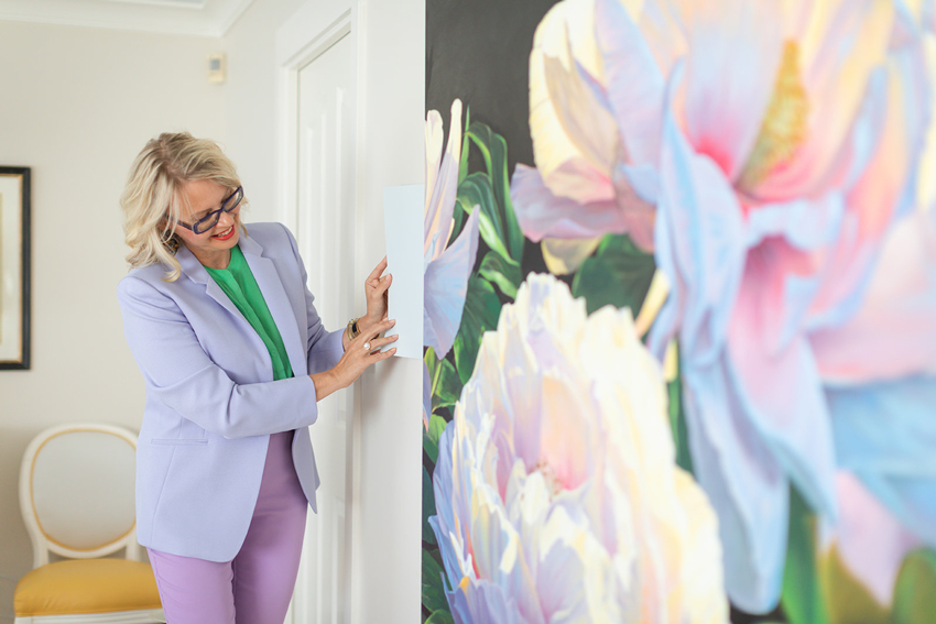
Because you need large samples of the colours to be able to see which relates best when you compare them to your tile, stone, upholstery, rugs and decor.
NOBODY can choose a colour from a 2-inch chip. And going down rabbit holes on Pinterest and Google to find pictures of popular paint colours, or designer favourites is even less effective.
Why?
Because there is no COMPARING happening. The images of rooms online have NOTHING to do with YOUR room and the things in it.
My large painted colour board collections are curated to cover all 9 undertones of neutrals identified in my system. I’ve included a range from very pale to deeper, so that you can quickly work through the possibilities to arrive at the right one. It’s so simple to see the right one when you are directly comparing a large board to the elements in your room.
You’ve probably heard the advice that you should paint or stick colour swatches directly onto your walls. But, did you know this really isn’t an effective way to choose colour.
Why?
Because it doesn’t allow you to directly compare the colour under consideration to the items that matter. Your sofa, carpet, countertops, tile, etc. You need the full range of possibilities at your fingertips. Without large painted colour boards you lack the ability to move them around and compare colours to the elements in the room. Trying to judge the merits of any colour floating on a wall by itself, without the concrete affirmation you’ll get by directly comparing, is crazy making.
And if you’re choosing colour for clients? Well, the large painted boards make it easy for anyone to see that the colour is right. If your client still isn’t convinced? Show them the rest of the options compared to the bossiest elements in the room to demonstrate that your suggestion is indeed right.
The boards make it easy for any skeptic to see that the colour is right. That’s the magic, they quickly eliminate any stressful second guessing.
Ready to choose the right white?
Choosing the right pale or “white” shade of paint for your space isn’t about the popularity contest going on on Pinterest or knowing your favourite designer’s go to white. Nor is it about just tinting up to a brighter, lighter paint colour. This is the biggest paint colour mistake I keep seeing.
My “white” walls are a complex cream (SW Shoji White)
Choosing a very pale or white paint colour is STILL about understanding what undertones already exist in your hard finishes and furnishings. Because the best white for your room is not likely to be one of the most popular whites.
For most rooms, the best white paint colour is a colour that is not technically “white” at all. It is more likely to be one of the very palest neutrals in the greige or complex cream category.
All those bright white rooms all over Houzz and Pinterest? You might be surprised how many of them actually have very subtle pale neutrals on the walls rather than white. The photography is just really blown out and brightened.
In the white trend, people are constantly painting their walls some popular white only to be dismayed that their walls end up looking cold, blue and dingy. Not at all like the digitally blown-out images that appear to be warm and flooded with light as seen on Pinterest and Instagram. There’s no photoshop filter for the walls inside your home.
Because those images are mostly not true. You will not suddenly have a glowing, light-filled room by slapping white paint on the walls.
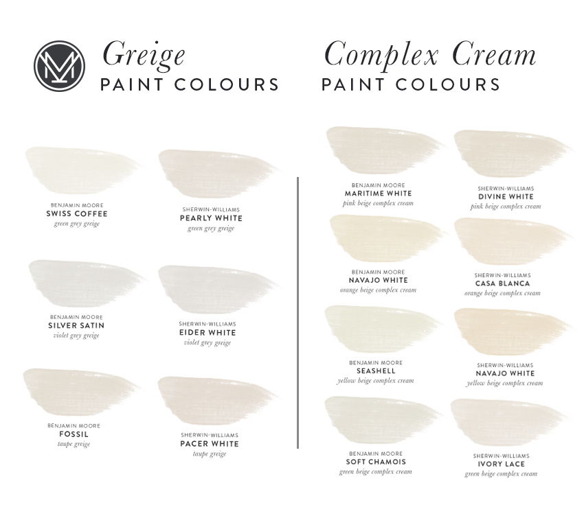
So, do you know the difference between white, off white, cream, greige, or complex cream? More importantly, do you know which one of these neutral colours is the right choice for your space?
That distinction can be pretty intimidating and hard to recognize without my System for Specifying Colour coupled with large painted colour samples like these.
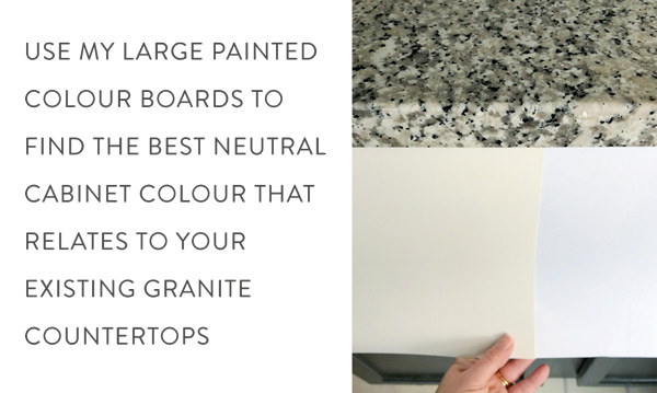
Choosing White Paint for Millwork, Cabinetry and Trim
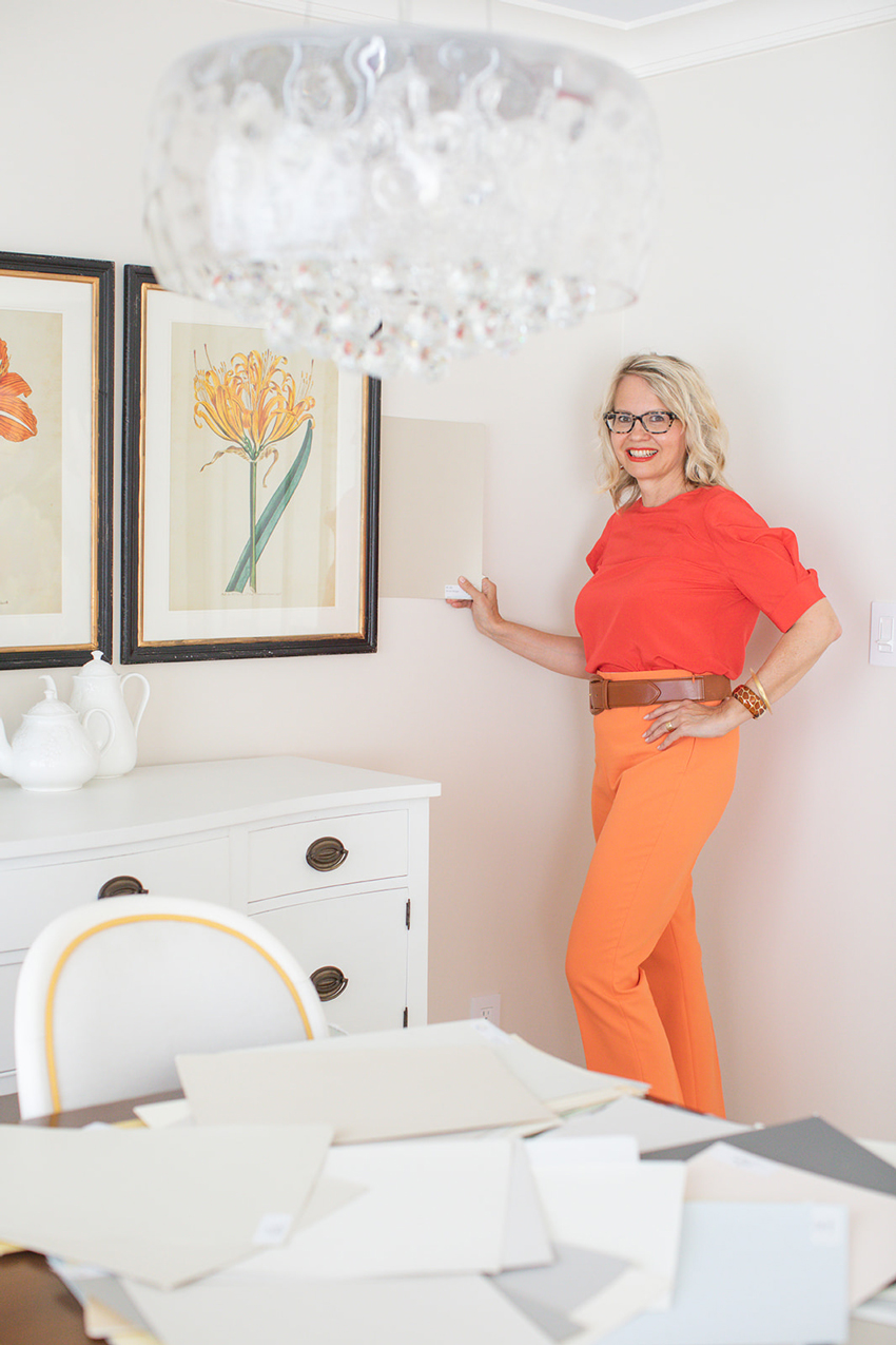
Ready to repaint your trim or give your kitchen a refresh by painting your cabinets? Don’t just come home from the paint store with any ol’ can of white paint. Use my large painted colour boards to find the right one that works your existing countertops.
Have Nothing in Your Room Yet to Compare to?
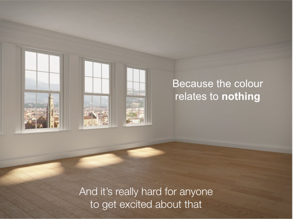
What if you have nothing in your room yet but versatile hardwood floors to compare colour options to? What then?
You are making life much more difficult for yourself trying to choose your paint colour first.
And DON’T make the common mistake of choosing a wall colour to relate to your wood floors. If you have an empty room, CHOOSE SOME DECOR FIRST.
Are you waiting for your paint colour to propose? You don’t want to pick a wall colour that doesn’t relate to a single thing in your living room (or your bathroom or your kitchen, for that matter). Paint colour options are nearly endless, you’ll have a much easier time, and a better outcome, with some decor to guide you.
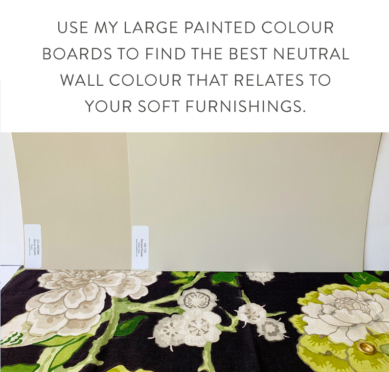
I did not paint a single room in my house without knowing which fabrics I was installing in each room first.
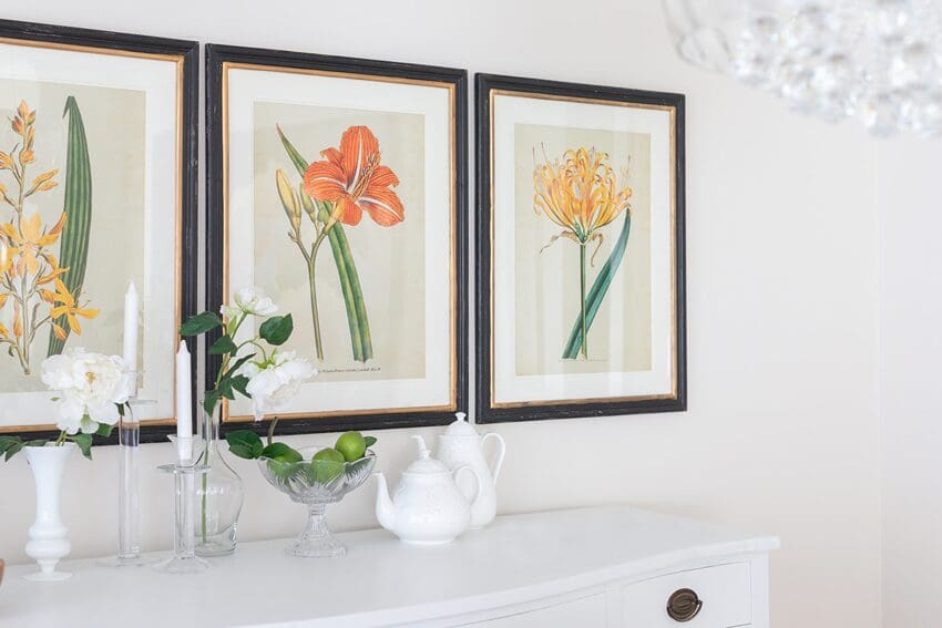
Whether it’s a pillow, a piece of fabric, or an area rug you love, use that as your starting point. Then grab my curated collection of large painted colour boards to find the neutral wall colour that best relates.
Which one looks the best? You’ll only know if you compare to the one that is not as good
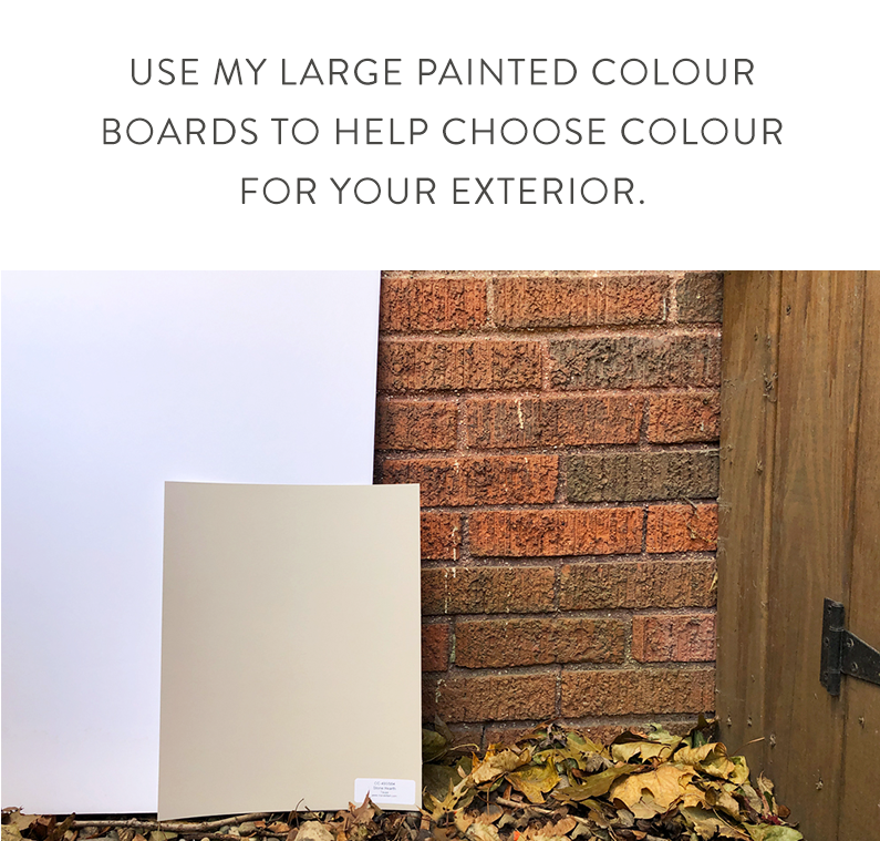
Choosing Colour for an Exterior?
My colour boards will help you choose exterior colour too. Struggling to see the neutral undertones in your stone or brick? Start with the darkest colours in the collection labelled by undertone category (the darker the colour, the more obvious the undertone) to help you identify the right undertone, then work backwards until you find the freshest and palest choice that also relates.
Order your collection of the best neutral paint colours
If you don’t have any of my painted colour boards, you’ll want the set of 50 in my first collection, called the Core Collection (Benjamin Moore paint colours) or, the set of 50 in the Foundation Collection (Sherwin-Williams). These collections represent the core of my system.
The second collection of 50 large painted colour boards is called the VIP Collection (Benjamin Moore paint colours). This collection has the best darks, including navy blues, forest greens, yellows, pinks and a few more greiges, and some more whites and creams because these light colours have become so popular.
And the best news is if you want more than one they are bundled for an even better price!
Click here to order (no promo code required), and the discount is higher if you bundle them together!
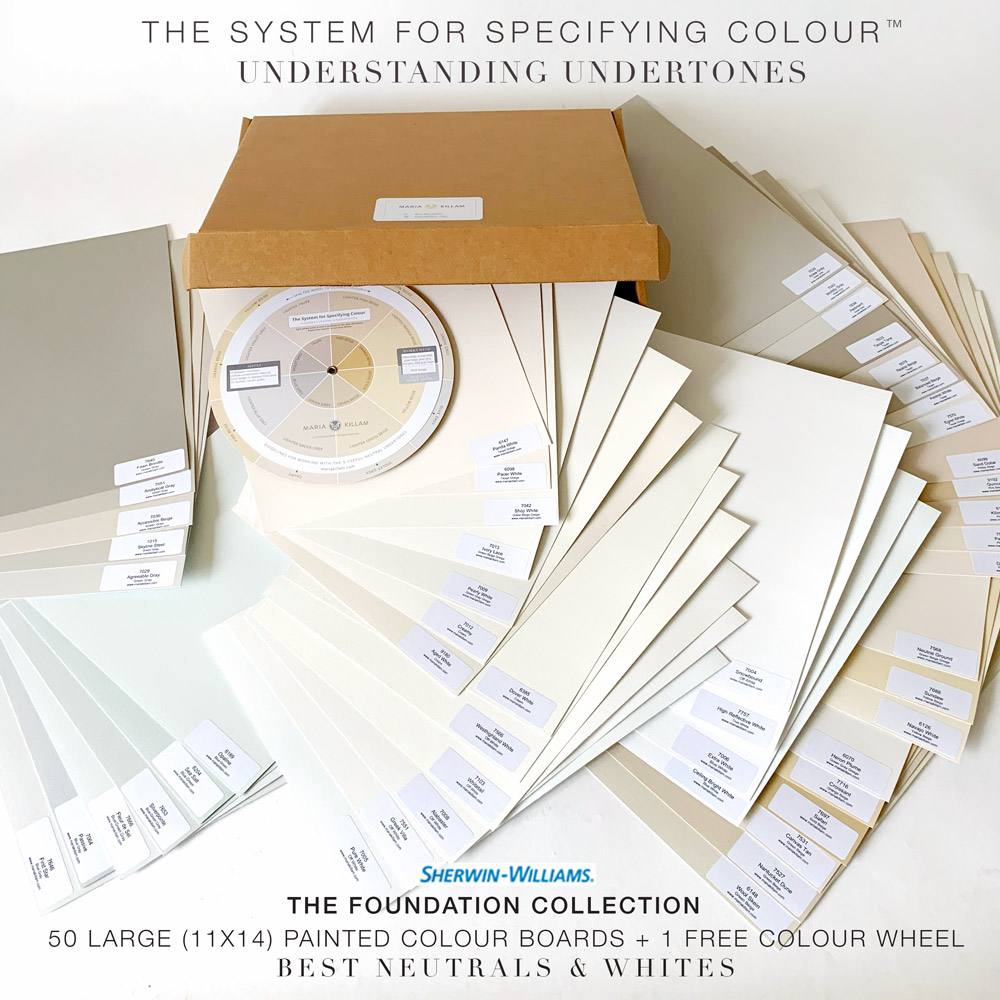
Sherwin-Williams Foundation Collection
What people are saying about my large painted colour board collections:
Five Stars! Excellent!
Coming into a client appointment with these boards makes all the difference. I no longer have to explain why it’s the right color, they can see it for themselves. Thank-you Maria!-AngelaMaria, you are so right about large samples. I have used these to figure out the undertones of not only the paint on my walls, but rugs, artwork, and my clothes.
So versatile and handy. Love them!-Dottie
Learning my System for Specifying Colour
To build that useful mental framework for working with neutrals and whites, you can start learning my system in my best-selling eBooks – both have been updated in 2020 to include new distinctions for the palest neutrals.
My collection of pale neutrals are the magical unicorn colours you need! They are so close to white, yet have enough substance to relate to finishes that have no business being paired with stark white (and most home finishes fall into this category).
What are these magical colours? They are greiges and complex creams, and I’ve categorized them by undertone.
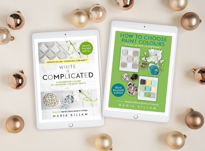
The books explain my system simply, for anyone, without complicated jargon, to give you a clear mental framework for choosing colour effectively in any situation. And they include complete lists of the system colours.
Or join me live on ZOOM! I’ll be training more True Colour Experts again: Click here to save your spot.

I have followed you since about 2006 when you chose Muslin for bedroom. Now I have had living room repainted based on your large paint sheets. The tile is pinky beige and with your Sherman-Williams samples I found Patience just perfect. The change transforms the room. Your system is perfect and feel so lucky to have your advise.
All the best,
Arrha
Thanks Martha! xo
Hi Maria,
Do the neutrals and whites in the BM Core collection overlap with the neutrals and whites in the BM VIP collection? I already have the Core boards from two years ago but I would love to add the complex creams and greiges to what I already have. What’s the best way to do this? Thanks!
Hi Maria (Great name by the way) no they do not overalap, the VIP collection has a list of greige’s and a few complex creams in addition to a whole slew of other good colours, you can see the updated, current lists in either of my ebooks. If you have bought the book and don’t have the update (which was sent out this Spring) email [email protected].
Maria, I’m new to your blog (referred by a friend). I bought a fixer-upper and I’m pretty much starting over with no furniture. I’d really like to paint the walls before I move in, but it seems you recommend choosing paint colors based on décor, of which I have none. Should I paint one coat with a combination primer/paint in a neutral white, and then do the next coat after I have furnishings and some décor?
In exactly the same boat! Moving into an apartment painted a horrifying color and want to go with a fresh coat of paint before. Am now second-guessing!
Same problem with a new build. I guess if you’re a decorator you might be able to choose all your decor before your house is even built, but personally I need to see the house first before I start picking details like fabrics. And it’s even worse that I had to choose the door color now because the lead times are so long. I know I like warmer off-whites and not cool whites, so I chose BM Simply White for the doors. I have BM Ivory in another house which is a bit creamier so I’m going to test both of those for the walls once they are drywalled. Then I will just repaint specific rooms myself after I move in.
[…] Supply hyperlink […]
What undertone of a neutral would you choose to complement a kitchen that has countertops of a blue white tone, and cabinets are a true white? I can’t seem to find information on your site about neutral complementing a blue white/true white. Or maybe I haven’t grasped the concepts yet. Still reading the ebooks. Thanks for any help! Love your information and love sharing it with others to help them!
Hi Maria,
I really like the paint color you’ve chosen for your walls. I’m considering painting my home that has a lot of beige and warm colors Shoji white but sometimes it looks beige and sometime grey – would you say Shoji White is more green beige or violet grey?