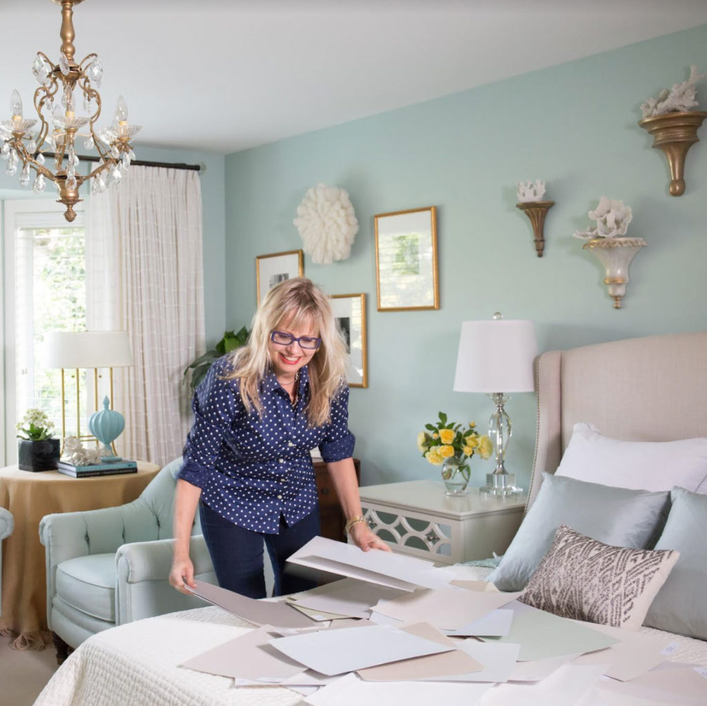
Maria’s master bedroom
If you would like your confidence in specifying colour to go from 0-60 in one minute, you need your own private collection of large painted colour boards.
You know how there seem to be a million collections of colours and paint company brochures that are curated by celebrity designers?
Scrolling through pinterest images, you can’t help but see paint colours with captions like “This is XX favourite grey” “Here’s XX collection of whites”.
Why are none of these truly helpful?
Because they are not curated by UNDERTONE.
Why are they not curated by undertone? Because they don’t know what the undertone is either.
Not because there’s anything wrong with that. It’s because The System for Specifying Colour just wasn’t invented until now. This is why this system should be in design school. Because if you open up any shelter magazine or online article in 2019 and this is how neutrals are currently being described by designers:
“This white has a lot more depth than some of the brighter whites.”
“A timeless grey that that is not too warm or too cool.”
“This white is the perfect hue, not too beige or too white.”
“The best neutral because it has hints of both beige and grey to match anything”
When you read all these quotes without the context of the colour sitting beside it, or the important headline, or all the supporting copy to go with it, it sounds almost comical.
Because you have just read an article where everyone is basically talking about their go-to grey, or go-to white or go-to beige or go-to taupe.
So you walk out of the paint store clutching your new paint chips or make sure you pin them carefully to your Pinterest boards, and now what?
Who cares?
How does that help you?
I’m here to tell you, it doesn’t.
A frequently asked question in our eDesign department is “Do we only specify Benjamin Moore, or can we specify other paint companies colours?”
And the answer is YES. We have lots of other fan decks because my system is completely TRANSFERRABLE to any other paint company.
I discovered and created my System for Specifying Colour® while working at Benjamin Moore, however this is about Understanding Undertones®.
Once you understand my system, everywhere you go in the world, you’ll see the same 9 primary Undertones over and over.
And, they aren’t proprietary to any paint system.
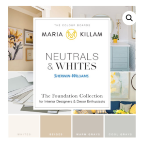
And I have good news! My set of 50 core neutrals is now available in Sherwin Williams!
Okay so here’s how it works:
If you don’t have ANY of my large colour painted colour boards, you’ll need either the Core Collection with Benjamin Moore or the NEW Foundation Collection with Sherwin Williams.
Either of these will give you the most current and popular neutrals from light to dark in the 9 Undertones in my system.
This means 95% of the time you need a neutral, you’ll find it in either of these collections. And that’s because choosing a colour for a powder room or dining room to create flow from another room is one thing. But haven’t you noticed that 80% of the time you’re specifying a neutral?
It goes back to the 80/20 rule I talked about in this post.
If you are someone who specifies both Benjamin Moore AND Sherwin Williams, you might want BOTH collections because it’s nice to specify a colour you don’t have to get colour matched.
Currently we sell a Sherwin Williams set of 25 (The Essential Collection) which includes the most popular whites and greys, taupes including the most popular pale pink beige. We have a few of these sets left but they will be discontinued. You can get this collection here.
However, over the years, we have had so many requests to carry the FULL collection of 50 samples of my Understanding Undertones system in Sherwin Williams, but the reason I didn’t, is because historically the set of 25 colours have been my lowest sellers.
Not anymore. Sherwin Williams paint colours are becoming equally as popular as Benjamin Moore. We constantly specify both in our eDesign department.
Please note there are 21 colours that overlap from the Essential collection to the Foundation collection (they were that good).
This means, if you need to choose the perfect white to coordinate with a new countertop you are installing, you will find it in the Core or Foundation collection:
Colours and Styling by Maria Killam
If you need the perfect grey, to repeat the green and blue greys in your area rug (below)? You’ll find it in the Core or Foundations Collection:
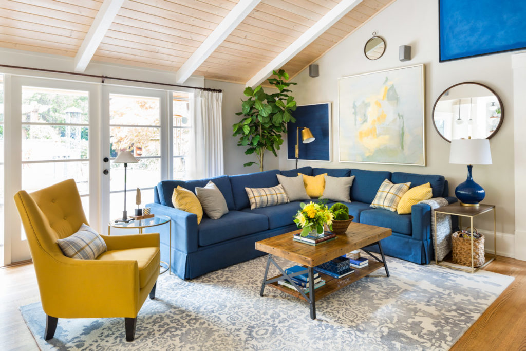
Interior Design by Maria Killam
If you’ve been following me for a while, you would have read the countless testimonials from my Live colour workshops. And most people often mention the large colour samples, because even if you were using them BEFORE you attended my workshop, they become an even more valuable tool afterwards.
Learning the answer to the question ‘Why’ the colour YOU specified is right, is taught by comparing colour.
Once you understand how to compare colour to explain why the colour you are specifying is correct, your world will change.
Suddenly, you’ll be amazed at the words that are coming out of your mouth.
It’s simply impossible to be consistently accurate specifying the minutia of one neutral vs. another without using large painted colour boards.
When I review the in-class exercises at the front of each live workshop, my students see for themselves how perfect the ‘right colour’ looks, vs. the one that just looks ‘meh’. Or worse, not right at all.

If you need to choose a ‘colour’ over a neutral. That is much easier to see, even in the fan deck size (below).

Maria in Charleston | Fall 2018
The cost to paint ONE colour board
And you can totally paint your own colour boards. If you are a homeowner, you probably don’t need a large collection of colour boards, and the instructions are right here. I’m just saying you can’t choose neutrals accurately without them.
Here’s what it actually costs:

Or you can buy the NEW Sherwin Williams Collection here for $349.
The undertone of the colour is printed on the top of the boards to make them easy to find and specify.
Please note this new collection overlaps with 21 colours from the Essential Collection which has now been discontinued.
If you have any of my large painted colour boards, let us know what you think below!
Transform the way you see colour, become a True Colour Expert. Register here.
Related posts:
Are you a Colour Scientist? Take this Test
How I Discovered my System of Understanding Undertones®
The 80/20 Rule Also Applies to the Most Popular Paint Colours


Yours are the only marketing emails I open regularly, and excitedly! I was a telephone/remote client of yours about 5 years ago and you not only helped me with my new house, you have completely opened my eyes to seeing color in a new and clearer way. I am not redecorating or moving any time soon but I still love your blog. The photos and explanations are both always fantastic. Thank you Maria!
Maria your color boards are invaluable! It is now a no brainer to choose the right color for everything! After taking your course and learning your system it was like the lights came on and that now I see it moment appeared! The thing I love about your course is more than learning how to choose color. You teach so many eye opening nuances related to design up to running a business. This is by far the best course I have ever taken and the only take away is that I didn’t know this year’s ago! I recommend your course to everyone. Thanks for being part of my life!
I am such a fan of Maria’s color boards. I have all of her collections and I am only sorry I didn’t have this 50 set collection when I renovated my home. The boards were such a lifesaver. My home is a small, open rancher and everyday I feel so happy with the color I chose for the walls. Now, until you start reading Maria’s posts, most of us completely underestimate how difficult it is to choose a great off white. I will be forever grateful for having the boards. It saved me from making very expensive mistakes. If I were starting a project I would buy this collection, even if I already had the 25 set.
There’s a company called Samplize where you can order your own 1’x1’ adhesive sample of most paint colors. I was really happy with their product when I was choosing paint colors for our remodel. I don’t know if they ship to Canada.
Ha! Must be something in the air! This morning, while passing by the local sw, I thought time to paint the kitchen now that my floors are in! Need to figure out a plan and test. For us the plan is to google what sw white goes well with IKEA white Ringhult (rest of space is blue Kallarp cabs and the Carrara laminate counter). Another thing which drives me batty- and we had this issue with our last home where we painted EVERY room – what to do with all those hardly used test pots!?! Free cycle? I used most of mine painting furniture. If I was building or in the trades/design business I would be onboard with investing in these Real painted boards.
I donate my leftover paint to local community theatre groups and the schools which do productions. They all have gladly accepted leftover paint for their sets. Just a thought. It beats going in the landfill.
I am not in building or the trades – although after my renovation I can speak to “the boys” with the best of them. I know it may seem frivolous, but I had one experience years ago with a paint not being quite right and it really set my teeth on edge. My hubs is a great guy, but there was no way I was going to say I wanted the room re-painted in a slightly different off-white. In the renovation, we also had our cabinets refaced, so I could not specify an exact color, but I matched the door I chose with a board and I used that board on all my travels. I must confess that I hid my boxes of boards under our bed because I really didn’t want him to know how many I had!!!
Haha that’s a great story, thanks for your comment Joanne! Maria
That is hilarious! My mother, who had a thing for dishes, always seemed to have some in the car trunk/boot and would have to sneak them in the house before they went grocery shopping.
Dear Maria,
I am not a professional decorator but have the SW set of 25 color boards. They have been tremendously helpful in choosing paint colors for my homes. I think you should offer sets of boards that do not overlap in the new SW set or offer a trade in opportunity for those of us who have always been SW fans. I just can’t afford a new set which contains 21 of the same colors.
I totally understand and I would have loved to do that but since the boards are hand-painted and time consuming we can’t offer that right now because we can barely keep up with the orders we do have.
This change was in response to pressure to turn my system into 50 colours and I currently don’t have the resources to print two sets of 25 colours.
I can say that I am sourcing another producer and if it works out I may have a supplement later in the year but can’t confirm that right now. It will likely require a deposit and a wait list but I don’t want to get ahead of myself
While it does cost more to make your own boards we are happy to send anyone who has purchased the original set of 25 the list of paint colours that are included in the new foundation collection. Please email [email protected].
I have the original Sherwin Williams color boards, and I would like to supplement it with the new colors that have been added to this new set.
When / if they become available, I would be interested in purchasing those, as well. I would be agreeable to putting up a deposit.
I have enjoyed my color boards!! I have the three set that were available before this new set came out.
Thanks so much!!!
Hi Judy,
Unfortunately we will not be selling a supplement because our current supplier can barely keep up with our orders. I know it’s not ideal but paying for a new set with 20 duplicates is still less expensive than painting them all yourself. However since you have the original set if you’d like to paint them, we would be happy to send you the list! Maria
I love your color theory. You’ve also convinced me on the benefits of white or cream subway tile back splash. Many of the counter tops right now are white marble, quartz or quartzite. As you recommend, it’s better to get away from bossy granite. What about all the marble looking counter tops. Do you think in ten years we’ll be complaining that they are too bossy?
I think white marble is a classic surface for a kitchen or bathroom. Still leaves you with colour options down the road! Thanks for your comment! Maria
If SW Alabaster is in that set, I surely (as a homeowner) would love to know it’s undertone. It went blue in my house.
Hi Glenda, Alabaster is an off-white that if it looked blue in your house, it’s probably too cool and stark to relate to your room. But I would be happy to confirm that, send me photos at [email protected]! Maria
I will do that! Thanks Maria.
I was amused last week when the contractor who will be building our new home said that after his wife chose the paint color in his own home, the “furniture changed the color of the paint.” It wasn’t the appropriate time to bring up your color system, but I knew from following your blog that it was all about the undertones!
While I wouldn’t expect a run down of every color in the boards, can you give a few examples (color names as opposed to numbers) of what it includes? My idea of what I would want might be different than your idea of what should be in it and it would be nice to know if my expectations for what might be in the colors overlap. I am thinking agreeable gray, repose gray, collonade gray, light french gray, accessible beige, alabaster, dover white, pediment, extra white or pure white, etc.
Hi Tanya, All except, Repose gray, Collonade Grey, Light French Gray are in the collection. And what you’re buying is a system. Colours that work almost every time you need a neutral. Colours that even if they are not that popular right now, help you identify the existing neutrals in someone’s house so you can work backwards in determining what a ‘fresher’ and ‘newer alternative would be. All of these colours are not that useful until you understand what undertone they are and how to work with them which is what makes it powerful.
Hope that helps,
Maria
It sure does, thanks Maria.
At the beginning of this article, you are in a bedroom. The wall color is beautiful. Can you tell me the color of those walls. I am looking at blues/greens for the walls in my master bath which has gray tile. You wrote in one blog about whether a color was dirty or clean. You recommended a light blue/green,but said you yourself might use a turquoise blue that was much brighter (showing a room picture with it) and that gray can be combined with bright colors to really make things pop. My bath is a bit small to use the bright color for my taste, but the color in this blog might be just right.
Hi Marlynda, yes it’s BM Palladian Blue (it’s my master bedroom). Maria
Palladian Blue is in my short list of choices.
Thanks so much!
Marlynda
Hi Maria, Excellent points about the sample boards. The sample board you are holding in the photo with the blue, green and beige fabrics is lovely. Would you mind sharing the colour with us, please?
Thank you.
As I am not a designer, I would love to get the SW Essential collection with 25 to help match tile and brick to paint my walls. However, you no longer apparently offer this collection for the regular home owner? Why is only the smaller collection offered in BM? My painters tend to use SW over BM (and the store is much much closer to me), and so the BM collection is not helpful.
This is very frustrating.