


Here’s an update of everything that I’ve been working on and thinking about including thoughts on AI for designers, my love of one day makeovers, the major colour trend shift happening right now, the easiest way to become a better designer and my new website!
The other day I realized it’s been ages since you had an update on how things are going in my world so I thought it was high time that I wrote this post. Writing this blog used to be everything and now my attention is split between YouTube, Instagram and my True Colour Insider Community seem to be where my personal streams of conciousness live.
My new website is up!
So if you’re reading this post you’re on my new website which we’ve had up for a few weeks while we work out the kinks. I would love to hear your comments and feedback on what you think of the functionality.
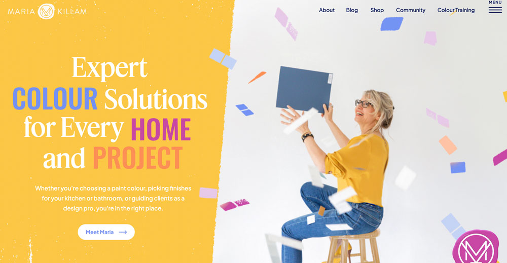
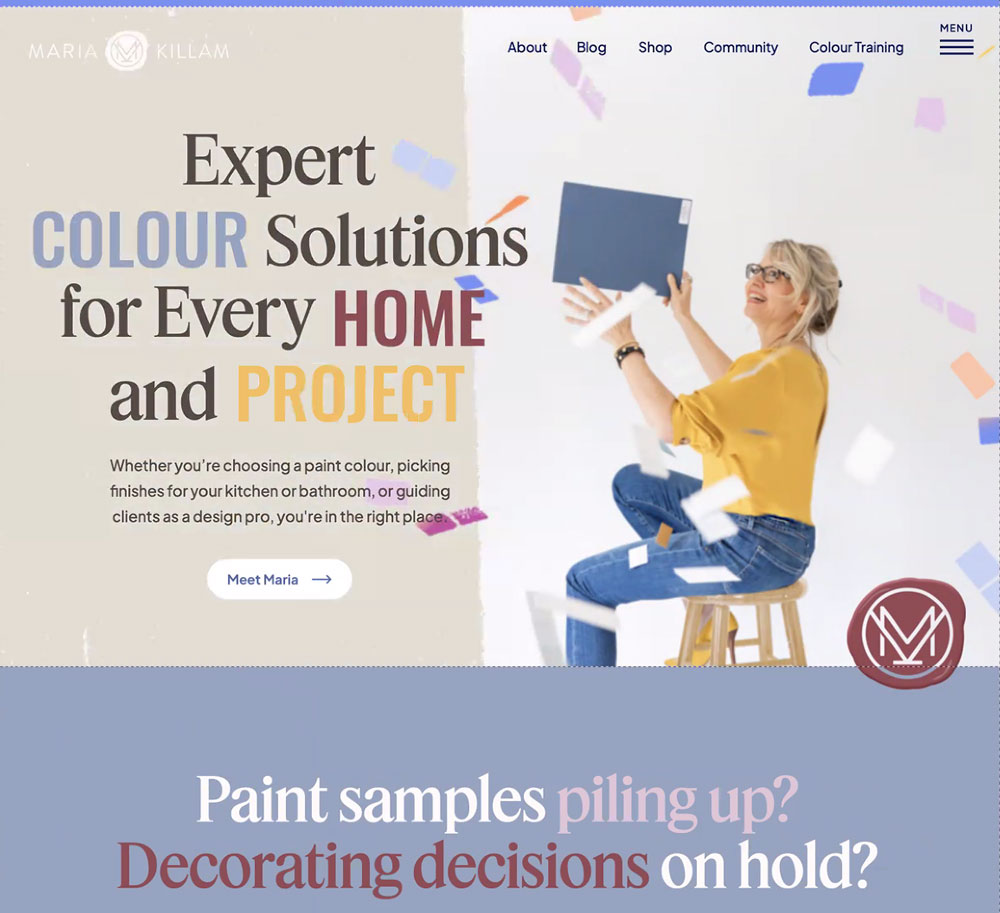
One thing that started bothering me with the new site was how candy coloured it was. It was easy to change the colours with my last website because it was so white. This one is fully colour! And while I like all the colour individually, together it’s too much.
Plus since colour trends are going through a major shift right now, I felt we needed to add a few new ones to the palette.
This is a screen grab of the new neutral that will be appear on the left side to replace the yellow (above) when we met with my site designer on Friday. Instead of all the general copy being a blue black, it will be a softer brown. And I’ve added a couple neutrals along with burgundy.
I also love the tweak to the logo we made. My website designer created custom paint dots for the site and then I had the inspired idea of adding it to the MK in my logo! So.Much.Better.
What is trending in interior colour?
Speaking of colour trends shifting, I notice these shifts from moment to moment. Inside slack with my team–and I often post similar notes in my Insider Community–with a “Place an X on your calender for this trend moment”.
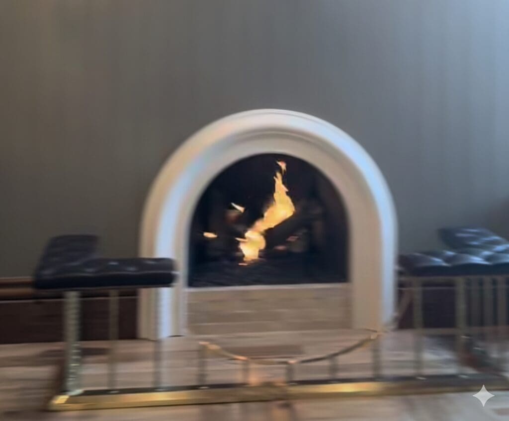
This was July 27. . . a fleeting screen shot of a house tour on Instagram with an arched fireplace. Haven’t seen that until now but it makes sense given arches are back.
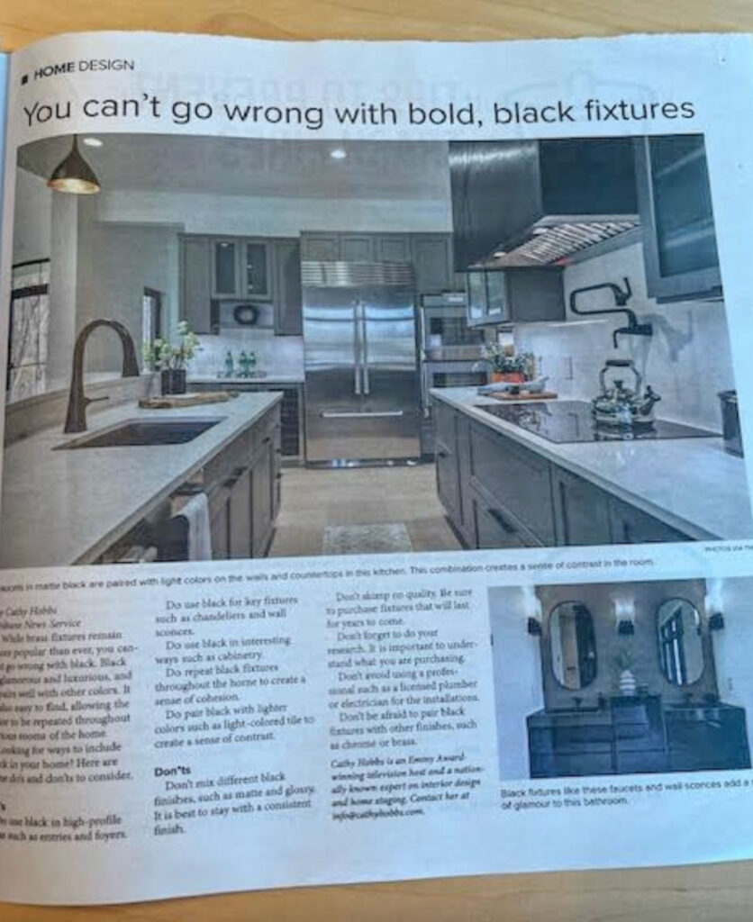
It’s exactly how I knew that all black fixtures and windows became builder standard approximately January 2024. That’s how you know a trend is on the decline and soon to reach obsolescence.
Just last month a reader sent the eDesign department a photo of a recent article in the Seattle Times. Which simply proves media articles are not the place to get an accurate trends report.
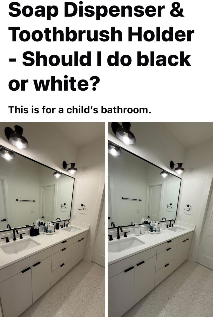
And I recently saw this on a facebook forum. It made me sad how many people still only see black or white as an option inside this trend. It’s a KIDS bathroom 🙁
The quickest way to get good at design
Here’s something my team and I have been reflecting on lately: we tend to pack a lot into our courses. It’s a firehose of information — in the best way — but we’re always looking for ways to make the experience easier to digest and apply.
The truth is, these courses are a complete transformation in how you see and work with colour. Just read what our participants say below — people are genuinely moved. It’s not unusual for someone to come up to me after a session to say it completely changed how they look at design.
Our challenge has been figuring out how to communicate that transformation — because it’s not something you can truly grasp until you’ve experienced it yourself. This isn’t information you can find anywhere else.
That’s why it’s the perfect course not only for beginners who want to start strong, but also for seasoned design professionals who want to elevate their expertise and add colour mastery to their list of services.
And here’s the best part — once you learn how to confidently specify and sell colour, everything gets faster and easier. You make better decisions, your clients trust you more quickly, and your projects become more profitable almost immediately.
My Dallas True Colour Expert Training is coming up in two weeks and I have one more virtual Create your Dream Home event for homeowners coming up in November here.
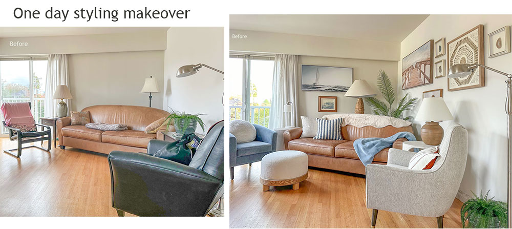
My Current Design Obsession: One-Day Makeovers
In the last couple years I’ve become completely obsessed with one-day makeovers — the kind I’ve been posting on my YouTube channel.
After years of styling, I’ve learned how to create a magazine-worthy room in just one day, and honestly, they’re all I want to do right now.

Before
If you live nearby and have a space that could use a refresh, I’d love to hear from you! These makeovers are for content so my time is free — but because my time is free, the project needs to be something we can complete start to finish in one day.
After (I had the ceiling photoshopped blue)
You’ll want to set aside a budget for art, lamps, and accessories — maybe a chair or an end table or two. Most people don’t already have those finishing touches, and yet they’re the very things that make the room come alive and finish the space.
When sending ideas and photos, here are a few guidelines and dealbreakers to keep in mind:
- Room size matters. Most spaces need a new area rug, but anything larger than an 8×10 quickly becomes hard to find, hard to move, and impossible without a small team of furniture lifters.
- Scale is everything. Bigger rooms often need larger coffee tables and more substantial furniture pieces — the kind that are usually custom or require extra sourcing time.
- The right chairs make the room. Many living rooms are missing this key element, and larger rooms need larger chairs which also normally cannot be found off-the-shelf.
- Bathrooms are tempting… but usually require painting, new mirrors, and updated lighting — all of which are hard to tackle in a single day.
- Bedrooms often need the perfect duvet before they come together so they are also difficult to finish in one day.
So if you’ve got a space that has the right basic pieces: furnishings and an large area rug, but it needs some magic? Send me your photos and ideas. I’m always on the lookout for the next great transformation!
A well deserved Makeover
The following space I transformed was for a lovely man and his wife now lives in a care home close by. Vancouver General Hospital. Every day, he walks over, brings her back to their apartment in her wheelchair, feeds her lunch, and lets her nap in her chair while they visit together. Later, he wheels her back to the home. That’s why we couldn’t add a rug, it would have made it difficult for him to move her chair through the space.
Their family is incredibly devoted. One of their sons drives 30 minutes each way every day to have dinner with his mom at 5:00 pm. While their other son, who lives in New York, joins them over Zoom.
It was this gentleman’s dream to have a beautifully decorated home, even though he’s legally blind. After I finished styling his apartment, he slowly walked around, viewing the art with his one good eye. Now, he sits in his chair beside the TV, facing the newly transformed living room, and admires it; not just with his eyes, but in his mind.
My favorite projects are the ones where people have no idea what’s coming. Watching them walk into their transformed space, completely blown away by how it feels. That moment makes me so happy. It’s something you can’t really understand until you experience it.
I’d love to hear from you! What interests you the most about watching these makeovers? What would you like to see more of in the videos? Let me know in the comments!
I would be delighted to decorate more spaces for charity, just as I had the opportunity to do for Wilma’s Transition House last year. If there’s a charity or project you’d like to nominate, please send me their story and photos—I’d be happy to consider it. Send them here.
Which brings me to the last conversation I want to have with you about AI.
Can AI Really Design Beautiful Rooms Yet?
There’s been a lot of buzz lately about how AI can now turn mood boards into 3D room renderings — and it all sounds pretty magical, doesn’t it? But here’s what we’ve found in our studio: if accuracy of colour, detail, and the mood or styling of the space truly matters (and for our clients, it always does), AI is still falling short.
Yes, it can generate quick concepts, but it takes several iterations to get the colours and proportions right. And more often they never get there. So, while it’s impressive, it’s not exactly the time saver you might expect. In fact, all it’s really done is raise the expectations around what renderings should look like.
For example, the black trim on this house should have been painted out to match the house. Plus the stone was a random green grey that in no way related to anything. The taupe roof didn’t relate to the pink cobblestone. This is what I tried to do:
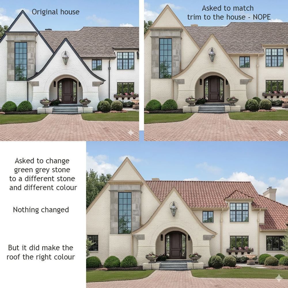
So while we’d love to include ultra-realistic AI renderings in our client packages, it’s just not there yet. Clients now see these ultra-polished AI images floating around online and assume that’s what design visuals should always look like — instant, effortless, and at no extra cost.
When AI catches up, we’ll be the first to celebrate — and you can be sure we’ll let you know!
In the meantime, my team continues to do what we do best: assembling beautifully detailed design packages for our clients, filled with accurate colour specifications, curated finishes, and thoughtful guidance to bring every project to life with confidence and style. See all our packages here
Poll:
- What’s been your experience with AI and design tools?
- Are you using AI to help with decorating or design projects?
- Do you find it helpful — or more work than it’s worth?
- Not touching it (yet)?
Tell us below — I’d love to know what you think!
Related Posts
These are the Defining Interior Trends of 2026
Ask Maria: When is Black Timeless (and 4 Design Traps to Avoid)

IHi Maria
‘m of the opinion that AI may NEVER get colour right!
Trying to fix but can’t seem to edit
Thank you for the update, Maria! As someone with 30+ years in website and UX design now transitioning into interiors, I just have to say that when your new site went live, my first thought was this is so Maria! I loved it. The yellow feels like you — warm, confident, and recognizable to those of us who’ve followed you for years. While neutrals are your expertise, that signature pop of yellow is part of your brand’s personality. I hope you keep that spark of “you-ness” shining through your site!
OH yes the yellow will still be there along with few neutrals to balance everything out! Thanks for your comment! Maria
Hi, I really loved all the information in this message and will look forward to reading more of your posts. I don’t want to be that person (the grammar police), but I wanted to let you know about a typo I noticed as I was reading the email. I know you would want to fix it. See below.
“I would love to here your thoughts, let’s get the conversation started!”
Kind regards, Val Brown
Thanks Val, we appreciate your grammer eyeballs on my content! Maria
I have played around with both ChatGPT and CoPilot. Both have been helpful but not perfect. Like you, they have either not followed my directions or gone ahead and changed things I did not want changed. It has taken many tries. I am helping my daughter come up with a plan for her new house. Using AI to help her see what works and doesn’t has been helpful for her and it helps me get a better feel for what she doesn’t want.
Also, what a sweet makeover for that couple! I wish I lived down the road from you! ♥
Thanks Rory! Maria
Maria- my favorite posts are the ones of your work for real clients. They are where most of us live. While your private home is beautiful and you have done an amazing job pulling it all together, but we have seen a lot of it and it feels a bit like bragging especially because your money is made from the very people who are viewing these articles and buying your services and you don’t stop, you push push push. I am being to seek out other online designers. Just my opinion – you asked for it.
Thanks so much for taking the time to share your thoughts. I totally understand wanting to see more client transformations — and I have good news! We’re actually doing a lot of one-day makeovers right now, including one this week, and I can’t wait to share those before-and-afters with everyone.
My own home is a big part of how I teach colour and styling principles — it’s my live classroom, really — but the real magic happens in the work we do every week for clients.
As for my products, yes — that’s how I keep the blog, the free advice, and all the design education going after 17 years. It’s always my goal to make sure everyone, whether you ever buy a thing or not, walks away inspired and more confident about colour. I appreciate you being part of this community and sharing what you’d love to see more of. Maria
The new blog looks great. I LOVE the video updates on your home as it proves that you live what you preach. Often when I’ve seen video or magazine makeovers or design projects I wonder to myself “would/could the designer really live with that themselves?” Your makeovers design first around a homeowners needs but with the same principals you have applied to your own home and lifestyle. Proving you are 100% authentic and not just echoing the latest trends. Thanks for letting us see your own fabulous home in all it’s transitions!
Maria, I love your new blog! I actually like the candy colors. They’re so happy and feel like you! The posts I enjoy the most are the ones where you help others to freshen up their spaces often while working with existing (often dated) finishes. I really like your one-day makeovers and when you show us design mistakes and virtually “correct” them while explaining to us your thought process. Really, I enjoy all your content even if it’s not totally relevant to me in the moment. I just want to thank you for sharing your talents with us and helping me personally to understand color and decorating better! You’ve helped my home be more beautiful (and have more lamps) 🙂
Oh Maria, thank you for giving us permission to come clean with our guilty secret! I’ve been using an AI design app called See It Done for a few months (I tested quite a few out, this one seemed to be the best).
Some pros:
– I actually found my style. I asked for my rooms to be made over in various styles – like Hampton, transitional, English traditional, industrial, even Maria Killam (it was not at all authentic, but recognisable). I found one that both worked well with the fixed elements I wasn’t able to change and appealed to me.
– I asked it to style my rooms for real estate photos, it did a good job of paring out the excess furniture and decor and popping in a few pieces that worked well.
– I used it to show my sister that the distressed white timber floor that she wanted to put in her living room was… hideous (and that a timeless mid-brown was amazing). My sis does amazing things with vignettes and wall decor, but her fixed elements are all very bossy, and she can’t understand why having the most dramatic flooring, wall colours, mouldings and furniture doesn’t make for a fabulous room. I think she gets it now.
– It did some really nice bookcase styling – I slavishly copied the one it created for my home office, and was very happy with the real-life results. Not what I’d choose to live with, but very effective for real estate photos.
– I asked it to do nothing to the room but “fix” the lighting and perspective. This gave me a better idea of how the room would show with a professional photographer vs my own amateur efforts. As my son had earlier pointed out, a lot of the rooms had good basics, but poor lighting and photography made them look less attractive than they were.
Now the cons:
– cliched and stereotypical styles. I did each room in my house in English traditional, and they got very boring.
– some styles didn’t work at all – I asked for a bedroom in dark academia for a teenager and the results were awful, no matter how I tried tweaking the parameters. But I know it’s possible, I found some good examples with a simple image search in google.
– It’s often not very subtle – I asked for a bedroom in a blue-grey colour scheme, and absolutely every surface and item was shades of blue-grey. I asked for a living room with “touches” of green and blue, and got an intensely colourful result.
– it’s absolutely, positively not going to give you colour advice. While I could see that an off-white floor rug looked good against my terracotta floors, the program isn’t good enough to show the undertones, and I had already found out through bitter, expensive experience that all whites are not the same (pre-Maria).
I worry a lot about AI ruthlessly taking jobs from humans (among other things) and felt guilty about even using it. But so far, it hasn’t replaced any services I would have paid a human for. I’ve studied the RE listings in our small town and realised our few local stylists have a single theme – and it wouldn’t suit or enhance our somewhat quirky home. I’m going to style for sale myself, but with more confidence and less waste thanks to the insights I’ve gained from the AI renders. And when we move, I’ll be signing up to Maria’s services to ensure I get a beautiful, co-ordinated home that’s a reflection of my personality, not a cookie-cutter stereotype.
But in the meantime… it saved my sister spending thousands of dollars for a ton of disappointment.
Hello! I have really enjoyed the Videos you did at the Big Box stores of how to sort through and find some timeless finishes options. I also enjoy the one-day makeovers to study for principles in action and how to address real life room challenges.
Hi Maria & the MK team!
Your updated site is easy to navigate and contains so much great content! The one day makeovers inspire me greatly. I’m a senior with limited budget, so while I’m attracted to the pricier elements, I enjoy seeing what can be purchased at our local Home Sense. There’s so little offered in Eastern Canada and it’s become challenging to find one-of-a-kind pieces. It is frustrating to see links to goods from other countries, as we are hit with taxes, custom fees and shipping fees.
Love seeing your own house. The colours are dreamy. I would enjoy seeing more content with spaces that have 8ft ceilings.
Thanks for providing so much content, information, suggestions, etc! Please keep on doing you!
Karen from little Prince Edward Island
I really enjoy the one day makeovers of real homes, where there may be conflicting undertones, asymetry, and a host of other real world, less-than-perfect things to deal with or work around. It’s inspiring and insightful.
Please please please move the floating bubble menu to the right, or get rid of it entirely. This blog has a lot of large images that are essential to understanding the concepts being discussed, and the bubble menu cuts right through them. It’s incredibly disruptive, to the point of causing discomfort.
AI is only a collection of other peoples ideas. Maybe once they have all the data then AI might get it right but I am sure most people would still prefer the human touch or voice when it comes to making decisions. This is my humble opinion.
Definitely would not trust AI with color. I have used it to add landscaping to photos of brand new homes with a dirt front yard. Seems to do ok with basic instruction like that.
Given that I’ve been reading your blog for almost 2 decades….I’m not in the demographics for most of your readers (anymore)…this website is just Way Too Much Colour for me and takes away from your exceptional professionalism. My take is that if I were decades younger and didn’t ‘know’ you and learned as much as I have…I may not stay on this website especially if I were a Newbie tiptoe-ing into colour. I agree that it needed a sprucing up but the background isn’t even white anymore. I would prefer that the topics, photos ‘pop’ jump out.
…also just curious why the colourful scroll bar goes horizontal when I scroll vertically?
I am not a designer and have a hard time visualizing something. So I use AI all the time as a buyer who is currently house-hunting to get a general idea of how changing exterior paint could look. I also decorate rooms inside with it. It gives general good ideas but definitely can’t rely on it with anything specific yet as it usually adds doors, removes, windows, or sometimes changes the entire house – no matter how specific of a prompt I give. Still, I find it incredibly useful (and fun!) to get a general idea of potential design changes.