


This advice is for the decorating challenged. If you are a good decorator, you probably won’t need guidelines for how to decorate around a dark neutral sofa. Chances are you already do these things instinctively. But if you are not in love with your space and you’re not sure why, or you need to furnish your living room and don’t know where to start, read on for the surest strategy for creating a pretty living room.
Recently, I arrived at a design consultation where my client had mid-tone taupe carpeting, a dark taupe sofa and curtains that matched.
It was a sea of taupe that she had tried to brighten up with a small turquoise area rug and a few cushions.
Since I see this every day, I thought I’d ask the obvious question:
“Why did you buy matching curtains?”
She replied, “Well before this I had a burgundy sofa with burgundy drapes, so I just did the same thing.”
When someone is unsure which colour to choose, it seems easiest to just keep choosing the same colour.
I think this happens over and over for a few reasons:
- “Matching” is the most basic decorating principle. We all get it. Does it match?
- If you got your sofa recently in the trendy neutral of the moment, chances are, at the same big box stores there are ample “matching” rugs and curtains. You simply buy curtains in the same grey and check them off your list. It doesn’t take a lot of planning or thought. It’s convenient. It’s safe. It’s done.
- Getting everything in the same “safe” and “versatile” neutral seems prudent. Especially if you have no decorating plan.
- Dark neutrals are “practical.” They don’t show dirt (the worst reason in my opinion to live every day in a drab room).
Do you see any of your reasons here?
And this, my friends, is how depressingly drab rooms are constantly being born.
Why your sofa looks different than it did in the showroom
If you’ve ever ordered a sofa off the showroom floor, had it delivered to your home, only to discover it looks completely different in YOUR lighting, that’s because you didn’t have a plan.
And, common advice will be to always take a sample home to see what it looks like in your living room, but if you don’t have a plan to begin with, this advice won’t make any sense. If you have nothing in your living room, waving around a 9’x 9′ sample will not help you, unless you are matching it to an existing rug (for example) and if that’s the case then you should definitely bring a sample home.
But if your living room is empty, you’re almost safer to buy a ‘colour’ off the showroom floor than a neutral since, as you know from reading this blog, a sofa that looks ‘neutral’ in the showroom, based on their light and based on the items they chose to showcase it will not look ‘neutral’ anymore in your home.
For example, if you buy a ‘linen’ sofa in a showroom with a dark colour on the wall behind it, it will seem ‘neutral’ there, but when you bring that sofa home and place it against a white wall for example, that’s where it might look pink beige or green beige or whatever undertone it happens to be.
How to Decorate Around a Dark Sofa
So do not assume you need to be wealthy and hire a decorator to achieve a better look.
If you stick to some very SIMPLE rules, it’s not as hard as you may think to create a fresh and pretty room.
The first key principle is you need to create is CONTRAST
Remember this the next time you need to choose a colour:
“Would buying this (rug, curtain, sofa, ottoman, chair) in the same matching neutral be a missed opportunity for creating contrast?”
The answer is almost definitely yes.
Because even if you aren’t comfortable with adding colour to your room, contrast between light and dark elements is necessary to make any room come to life.
And if you’re starting with a practical dark neutral sofa, this means your area rug and drapes will likely need to be LIGHT.
Safe decorating is riskier than playful decorating
While it’s wise to be conservative and choose very simple tile and flooring, in other words, hard finishes that require major work and expense to replace–upholstery, area rugs, drapery and textiles will need to be recovered or replaced at least every decade or so. Textiles are where you can add contrast, trendy pattern or colour and make things interesting!
Not all of us are comfortable with a playful approach to decorating. That’s why I’m suggesting these easy guidelines to keep you from the pitfalls of overly safe decorating which will only leave you underwhelmed or worse.
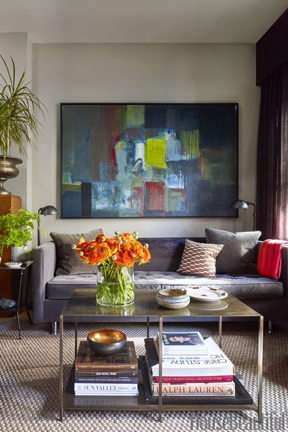
Let’s look at this successfully pretty room with the dark neutral sofa again.
In the image above, the curtains and rug do match the sofa, but notice they the curtains are not directly BEHIND the sofa. Also the room is expertly styled, layered with pretty colours and interesting objects, and includes a great piece of art that pulls in colour.
This is NOT the look most of us will achieve with a matching sofa, drapes and area rug. Far from it.
Let’s picture this room without the art and colourful styling shall we?
It would start to look something like this:
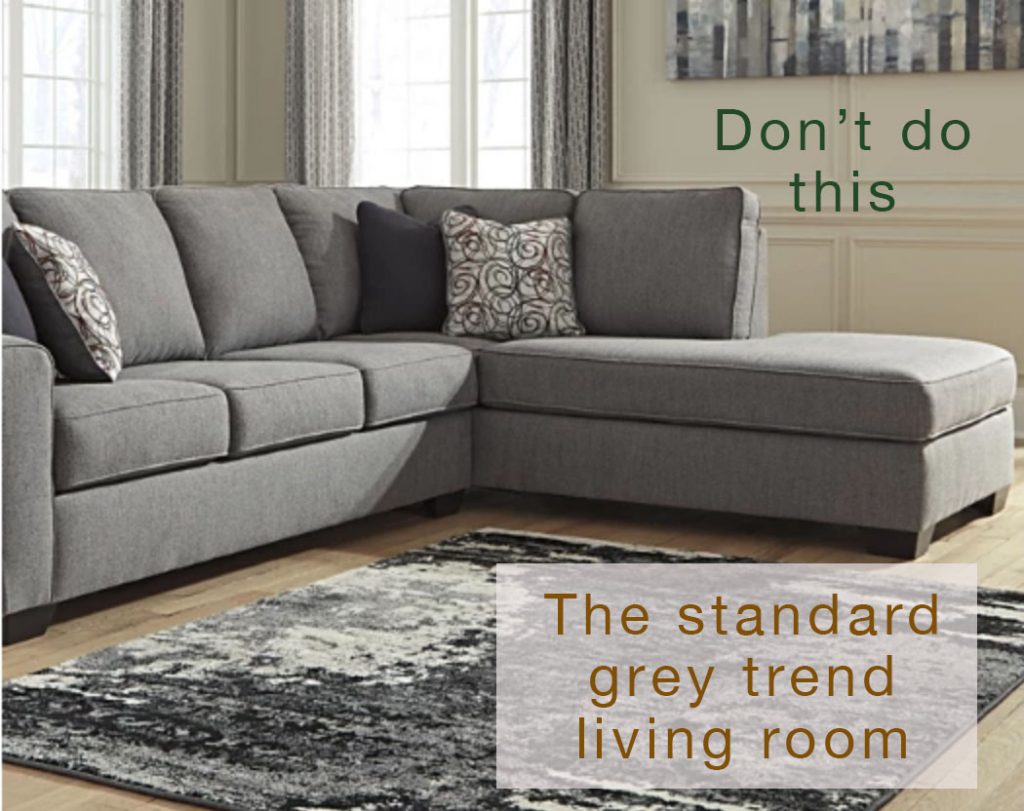
Look familiar?
Without a professional designer involved, it will be hard to achieve the expertly styled room anytime soon. And it will be easier if you follow my guidelines for adding contrast, so you don’t end up with the drab look in the image above.
Read more: What if I don’t like all the grey flooring that’s everywhere
First, let me just assure you:
Pretty does not cost more than ugly. However, ugly is always on sale.
While most homeowners can wrap their heads around a decent quality sofa, they tend to balk at spending on drapes or area rugs (or lamps). This is where they will just get what’s easily available and inexpensive. Sorta like picking up the placeholder area rug along with groceries at Costco.
This is how most people end up with the too-small cheap and boring charcoal or taupe area rug and the skimpy grey drapes. Now that, in my mind, is a waste of money.
Decorating requires some strategy, but it’s not chess.
I believe you don’t have to strain your bank account to make prettier choices. What you DO need to do is a bit of planning in advance.
You need to plan ahead for pretty.
Read more: Second Rule of Design: Waiting Now equals Beautiful Later
But it can be quite simple. Basically, you need to strategically add in CONTRAST and COLOUR.
Off-the-shelf curtains from IKEA, Pottery Barn, or any big box store come in range of colours and are relatively inexpensive. And if you need to go with a less expensive area rug, there are many many options that will provide some contrast and pattern at affordable price points.
And don’t choose a rug that is too small, it should be at least 8 by 10 or 9 by 12. Go with a less expensive rug in the largest size you can afford.
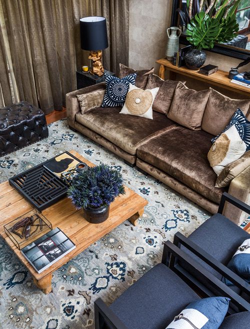
For example, a simple natural fibre jute rug, like this very inexpensive one from Ikea, will give you a much fresher look with a dark grey, taupe or brown sofa than a matching dark shag rug will – just like in this nicely layered room below.
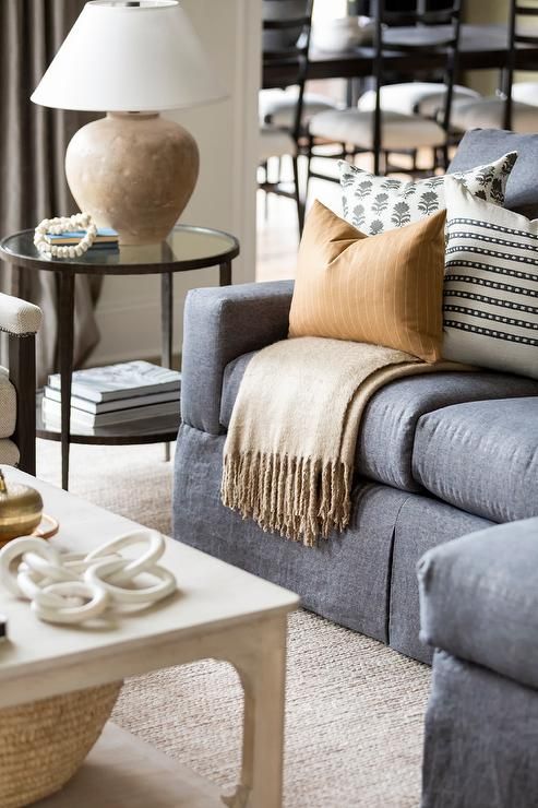
Let’s take a closer look at what makes this room with the standard charcoal sofa work. Warm natural wood tones, cognac or camel and lots of off white or cream will instantly wake up a room with a dark neutral sofa even if you don’t want to venture into colour.
Lots of shops on Etsy even provide curated pillow combinations (like this one) with good contrasting neutral colour and pattern combinations to create a similar look – just in case you feel a bit throw pillow challenged.
And while a light cream area rug might not be your idea of practicality, trust me on this. The potentially shorter but much more beautiful life of an inexpensive light coloured area rug will give you so much more joy for your buck than a dark and drab one.
If you’re really worried about a light rug, look for one with a subtle pattern in it where the balance of colour is still light like this one.
Essentially, you can think of the sofa, area rug and drapes as sort of the foundational triad of your room. Along with accent chairs, they are the largest elements in your room besides the floor and walls. This means they are the elements where you need to add colour and contrast. In AT LEAST one of the three.
When choosing a sofa and area rug combo, keep the rule of alternating contrast in your mind. If your sofa is dark, it needs to be balanced with contrasting light rug. You just can’t buy both in the colour of wet mud and call it a day.
Also remember that dark drapes can be very heavy looking. Always consider whether they could instead match the white pillows or coffee table that you might be adding to the room or the lighter wall colour instead of the dark sofa.
And don’t forget about pattern in your drapes or rug, that’s always a great way to add interest.
Ready to take it to the next level? Add COLOUR and CONTRAST!
Here’s how to add both colour and contrast:
- Find a pattern in a pillow or area rug that repeats the taupe, grey, brown or black of your sofa, along with some cream or white and the accent colour you want to incorporate in your room. Take your time, this can be a tricky treasure to find. Etsy is a good source for patterned pillows. And pretty area rugs are increasingly available at really accessible price points. Wayfair is a good source.
- Repeat the accent colour from this pattern in larger, more solid pieces like drapes, pillows, an area rug, artwork or even the accent chairs or ottoman. Or paint the colour on your walls.
- Repeat all three colours – the neutral colour of the sofa, the white or cream and the accent colour – in lamps, art and accessories.
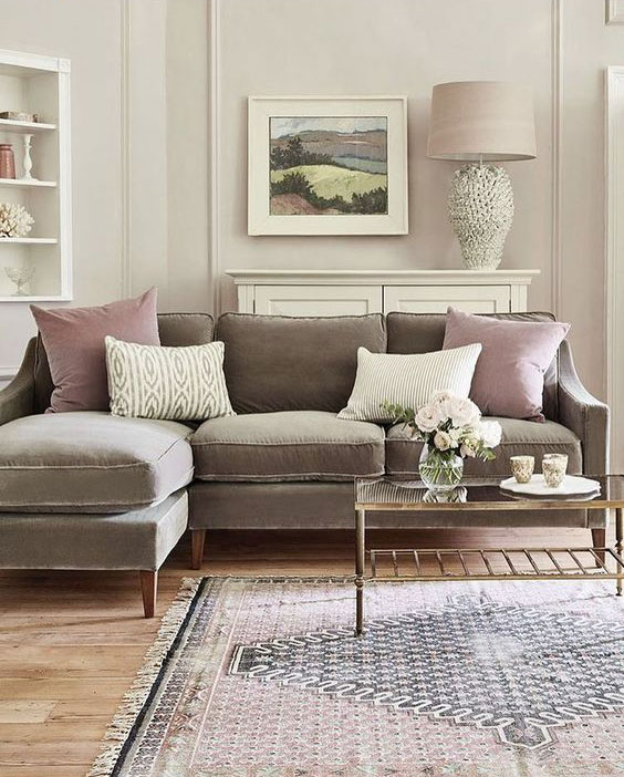
Imagine this room above with a solid taupe brown rug and taupe drapes to match the sofa. Sad right? See what they did here with the patterned light area rug that picks up the taupe brown and introduces blue and cream? And then they repeated the colours in the accent chairs, pillows and lamps.
It really is that simple. As long as you keep two principles in mind:
Does my room have contrast?
Do I have a textile pattern that repeats my sofa colour and pulls in both colour and contrast?
If the answer is yes, then put those same colours on repeat in your room.
More inspiration for dark sofas
Here’s another example for inspiration. The area rug is a bit small, but it is so pretty and does just what it needs to do, it has a pattern that repeats the neutral taupe sofa and pulls in a new pretty accent colour and some white, which are then repeated to pull the room together.
Even if you removed the pretty styling, the sofa rug and pillows are still way ahead of the look we would have with everything matching the sofa.
Bottom line, before you go shopping, make sure you create a plan. This way, it’ll be way easier to stick to your convictions before you buy anything!
If you’d like your living room to fill you with joy when you walk in the room, see my Get Me Started package here. And, if you are still agonizing over the right paint colour, try one of these eDesign packages.
Related Posts
Ask Maria: What is the Most Timeless Colour?
How to Transform a Charcoal Sofa with Colour: Before & After

You must be hiding in my house somewhere. I went way too neutral and used way too much gray. I am trying to undo those mistakes. Your pictures are very inspiring.
I guess even designers make mistakes, as your own living room area rug is much too small for the space. At the very least, all front legs of your sofa and chairs should be sitting on the rug. I see this mistake all too often. Thank you for putting this in your blog post today. Spend the extra money everyone and get an area rug that fits your space.
I need to add some colour to my room. I just recently changed out my raspberry, green and cream chairs and area rug for grey, cream and taupe. I think I’ve created a boring room. Hmmm🤔
Hi Joanna, you make a great point but in my living room I had to consider my fireplace hearth which is in the way of going with a 9×12 therefore, when I replace the rug in that room it will be the same size.
There are no hard and fast rules in decorating only guidelines.
Maria
Maria & team, these problem solving posts with simple, detailed solutions are what keep your posts as one of the very few blogs that come to my inbox. I can count on your posts to use photos to demonstrate simple, easy to use information to make my own space prettier, happier, and more polished. I thank you for that! I have a dark brown leather sofa in our farm family room I have wanted to replace, but the cost holds me back. Now, I will look at it with fresh eyes using the direct questions and steps from this easy to use post. Thank you! I may be able to save the room yet!
Great advice and tips as always! Loved this one. Made the jump a few weeks back to buy the contrasting area rug and can barely stand the wait of it’s arrival! So thankful for finding you a few years ago. Your services and tips have made 2020 in my home so much more relaxing and enjoyable 😊
Love this post. Lots of useful tops here.
The ads on your site are irritating. The blog used to be beautiful and now it has been cheapened. I’m surprised you would sacrifice the entire look of your beautiful blog for ad revenue. I’m truly trying to give you constructive criticism as I used to really enjoy your site.
Margaret, If you mean ads from outside advertisers rather than Maria’s, my Ad Blocker app (there are many) takes care of them so I don’t see them (sorry Maria). I do realize that running a blog and other websites can be very expensive, so I understand why it’s done, but it’s better for me to run an ad blocker than abandon the website completely. On some sites I have to turn it off temporarily in order to access the site, but by and large it has made a huge difference in my annoyance level on many sites. 🙂
Margaret, so you are aware Maria addressed the use of ads before they began in her blog and wasn’t thrilled she needed to start. I think she has tried to keep them streamlined and not overpower her posts. Given her blog has always been free and the current economic environment we live in I appreciate that her blog is free and this is a very small inconvenience for the quality of the guidance shared and the work put into this blog.
Thanks for another great blog Maria – I know I have defaulted to the matching neutrals before and I’m trying to learn not to do that. The advice is useful and helped me figure out a couple of things I’ve done right and why they work. Also why a couple of rooms still look so boring 😬
Thank you for this. These are my favorite kind of posts! Super informative and with pictures to show exactly what you’re talking about. I despise my dark brown leather sectional…I wanted a robins egg blue sectional but my husband thought that was nuts.
Thank you Maria for the “instruction manual” of how to put a film together-now I will need to see what “adjustments” need to be made at my house-even just switching a few things around from room to room-
Also-I have no ads on my screen just the promotional offers that you have available-
Ugh!! I meant “room” not “film” DANG iPhone!!
I always enjoy reading your blog.
When are dark rugs appropriate in a Family Room? If you have a light colored couch?
Yes
I loved this post. Lots of good advice for decorating regardless of couch color. Contrast, pattern, color, artwork all work together to make a beautiful room. Thanks.
Great post! I would love to hear your thoughts on a corollary: people who adore *one* color and put it everywhere in the room, not understanding that it can be difficult to make a room all one color look great.
Thanks so much for your post, Maria! This is truly very helpful!
Are different shades of the same hue the same color, or different colors? Like in the video where you were showing how to use your giant paint boards against your dining room botanicals, you had Manchester Tan and another (paler) green beige…would those be considered the same color or different in terms of being able to provide contrast?
Additionally, if the foundational triad in a living room is the sofa, area rug, and drapes, would the triad in a bedroom be the bedding, the bed, and the drapes? Or…?
And is your advice the same if the couch is a light neutral (or a color) rather than a dark?
Thanks so much!
A-L,
Great questions! I have the same. I hope Maria answers here or even better yet, does a blog post on these very same questions! ( :
Maria, this blog has very valuable advice!!!! I also appreciate the many images you pull from different sources to illustrate your points. Keep up the good work. Much appreciated.
Hi,
Do you have any recommendation for a sleeper sofa? Not my favorite but short on space. Any suggestions would be greatly appreciated. Daughter having twins so needs to be twin friendly!
Good instructional post. You are an excellent teacher! Love your examples. They are so helpful for beginners. Thanks for all of your great posts!
“Ugly is always on sale”. You’re funny. And honest. Keep it coming
I don’t think I have ever commented before (and I’ve been reading your blogs for EVER!!), but this is just such a good post, Maria. One of your best ever, IMO. I guess that’s just my way of saying that my living room sucks in exactly this way (or close enough) and thank you for this great formula for how to fix it.
My favorite quote – “You just can’t buy both in the color of wet mud and call it a day”! Informative AND funny!
Hi Maria, I love when you have examples to illustrate this ‘how to’ for us! Would these guidelines work if I had a light neutral sofa such as a cream sofa? I am helping my daughter to design and paint her living room using all that I have learned from your training and posts. She has a very similar taupe patterned berber to consider that runs upstairs like the one in the House Beautiful example and the ‘going out the door trend’ of a pinkish violet grey stained hardwood floors. My daughter had decided on a cream sofa for this room and she wanted a neutral wall color and so I have specified Pale Oak given that the berber is in sight from the living room and the hardwood floors. Using your color wheel and color boards, this is the color that matched up. I was surprised at first since I thought the berber was a green beige or green gray undertone but as it turned out it there was a taupe undertone. With the color boards I was able to see the subtle pink. So subtle. Anyhow, this post is so timely with deciding on the decor. Can we now go and pick a contrasting color with an area rug ? This is such good news. We can actually choose a color to add to the room! I can send you the before and after pictures since I know how you love to see examples of your teachings applied. Thanks Sandy
Maria: Awesome post with the detailed formula of how to get color and contrast. Love the pics that illustrate what you are describing. It is so wonderful to have this really detailed blog (reference manual) at my fingertips. Thank you so much for the amazing amount of work and info you share with us!!
Very informative post, I don’t understand why pattern is not used more often in rooms, it can bring the joy into them.
Maria, thank you for this very informative article. You have been very generous in sharing your knowledge.
Thank you for yet another informative blog post, Maria! You may have addressed this question somewhere, but what if someone has a lighter neutral wall to wall carpet that they can’t afford to remove and replace with wood flooring. Is it okay to put an area rug on top of a wall to wall carpet in a living room space to add color and definition to the sitting area? It seems like this could work, but I’m not a designer and perhaps this a serious design faux pas. Thanks for your advise!
I’m not Maria, but I think I’ve read elsewhere on her blog that what you suggest doing would be okay. Enjoy your decorating!
I skew the exact opposite of this- had a Louis XV style love seat done in coral zebra and considering redoing the big English curved arm sofa from its current linen to a rich dark peacock velvet. Our house, my crazy rules! Hubs is concerned. He always loves it when I’m done tho 😉
I so love the pops of color on a neutral background. It’s fresh and exciting to see the transformation!
How do you feel about layering an area rug over a carpet? I have a relatively new medium brown sofa that is staying in my living room along with some beautiful pink burgundy and sort of hunter green iris painting. I am replacing the carpet, wall color, other art work and some chairs. I love color but would like to have a creamy carpet in the room. Could the brown be considered replicated by some mahogany side tables. And then perhaps a rich pink/green toned area rug? Also what undertones do I need look for with brown? And please tell me I don’t have to have a pink toned beige carpet. PLEASE. But if I do I guess I do. I LOVE your website!