Shari and her husband couldn’t agree on a ‘colour’ when they went shopping for a new sofa, so they chose charcoal.
The reason why they couldn’t agree on a colour, is because choosing a sofa BEFORE the carpet, artwork or throw pillows is like picking all the paint colours for your house BEFORE you buy a stick of furniture.
If you don’t have an inspiration starting point, then it’s much harder to make decisions on paint or furniture.
And the reason why most people ignore this advice and just pick colours or a sofa ANYWAY is mostly because if decorating is not your gift, choosing an area rug or a throw pillow, might be even harder than just buying a new sofa.
Tell me if I’m right? This is just MY theory.
Shari had been following my blog for a while and she sent me a note asking if I could help. Since she lives almost across the street from me, I popped over to take a look.
Her husband made their coffee table out of a slab of wood. It adds a nice touch of warmth to the space.
Also the other thing they did right was they didn’t just buy a set of matching coffee tables. A collected look is always better than three matching coffee tables (same goes for your bedroom).
The medium brown floors are also just right. Timeless and classic.
Shari has a daycare business in her home in Yarrow. She has two of her own children, 7 and 11, and during the week she’ll have up to 7 children in her home ranging from 11 months to 9 years old.
She needed a carpet that could get dirty and not immediately show everything. I suggested yellow or white curtains to replace the grey ones, but Shari said the charcoal colour worked better for room darkening if the TV was on during the day.
I said if all she needed was a carpet, pillows and some accessories, we could do that kind of transformation in just one day, with a single trip to HomeSense.
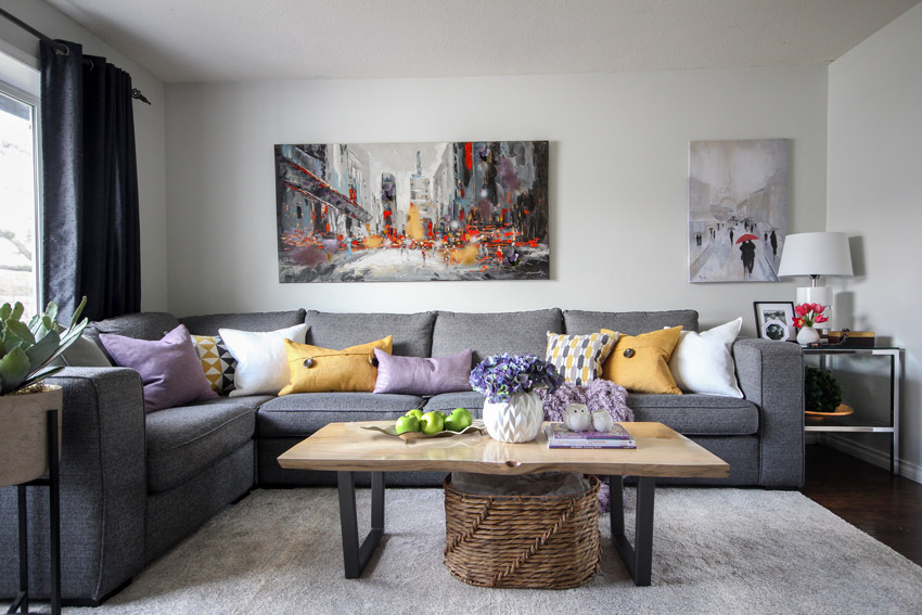
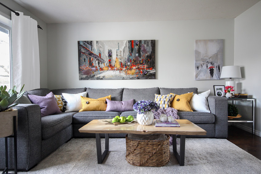
I snapped a picture of the existing artwork, grabbed a sofa cushion and three and a half hours later, this was the result:
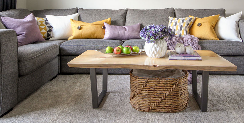
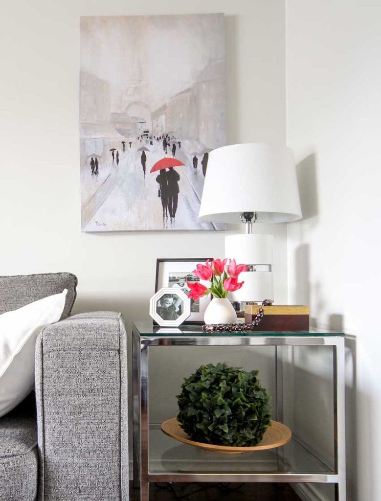
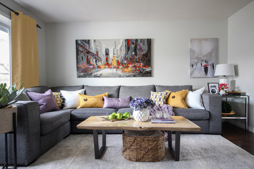
We choose the art with the red umbrella to coordinate with the existing art work, this made the wall look more finished. The area rug, eight new pillows, a basket for throws, some vases, purple books for the coffee table, and some smaller, more interesting shaped frames, all this for a little under $1000.
When you buy an area rug to coordinate with YOUR charcoal sofa, DO NOT buy the matching charcoal shag from Costco. You need to ALTERNATE the contrast. A dark grey rug would have died in here with the sofa.
The drapes should also be a colour or white (off-white or cream) but as already mentioned, Shari says the charcoal drapes block out the sun more effectively.
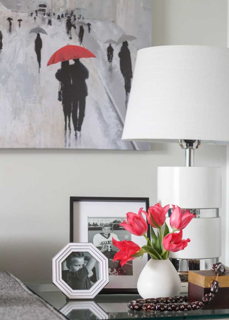
Anytime you see a tear-shaped vase, pick it up. You need so few flowers to add a splash of colour to any vignette. Make sure all your frames are NOT the same size, you need a variety of sizes to turn them into an accessory.
These frames hold photos of her 9 year old son Tyson, the football star!
Also, notice that I added some coffee table books underneath the lamp to give it a little more height. A trick anyone can use.
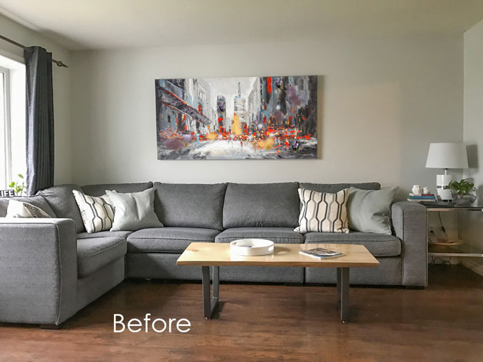
Shari’s end table was already just right for the space. But the first thing I did with the sectional was move it 4″ away from the wall. Give your furniture some space to breathe! It also allowed the curtains to hang freely.
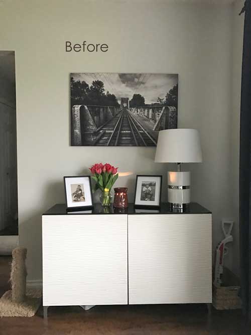
Before
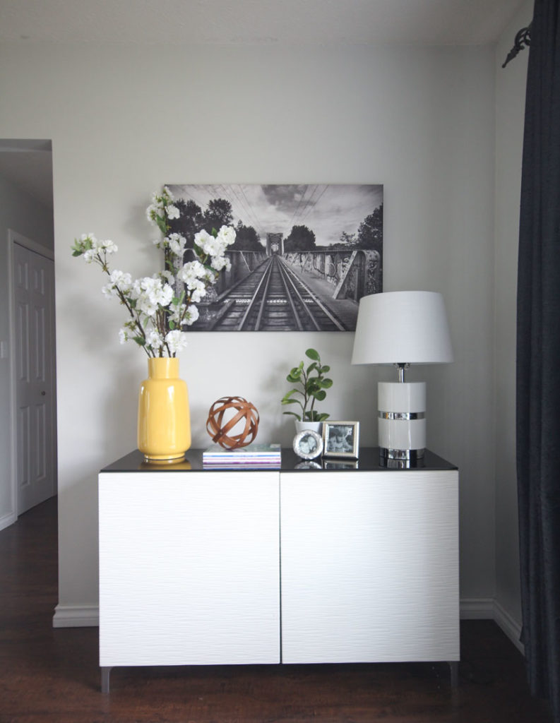
We repeated the marigold colour on the other side of the room in the vase.
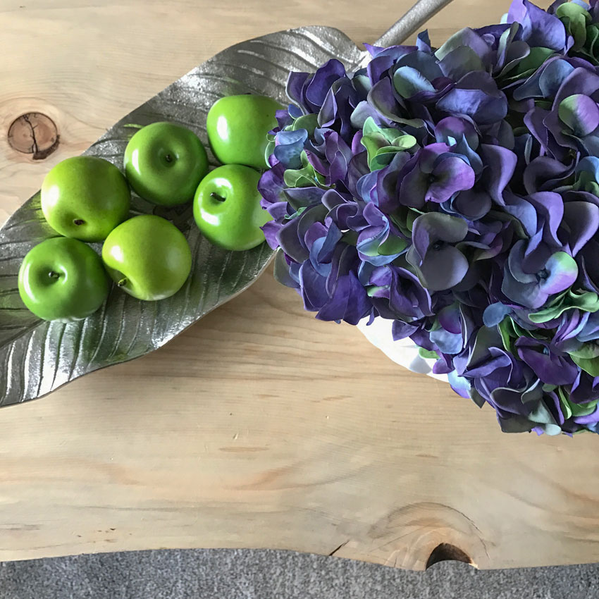
The organic coffee table adds texture and warmth.
I photoshopped the charcoal drapes so you could see how the room looks with white.
And here they are in the marigold shade
Here’s the before again:
And here’s the after again:
Which drapes do you prefer? The charcoal, white or gold? Let me know in the comments!
I like the purple in this colour scheme because it feels trendy and current. Pinks and purples are coming on trend big time, because they feel newer than some of the blues and greens and oranges we’ve been decorating with for a long time.
Maria & Shari
When I arrived on Sunday to take photos Shari said, “I wish I had video taped my daughters reaction for you when she walked in the door, she shrieked with joy and started rolling around on the rug”.
That’s what happens when you suddenly have a look and a feel.
Later, Shari sent me this note:
Being a huge fan of your blog and your work, I was still so amazed at how quickly you chose different colours for everything we bought that day and how they all just worked. I am so very grateful. You made my cold living room into a cozy and beautiful room for my family. Thank you!
If you live in the lower mainland, and would like a one day transformation, contact me here.
If you need an eDesign transformation, you can purchase our ‘Get me Started’ package here.
My very first business before I fell in love with colour was called One Day Design. Transforming an interior in just one day with a little styling is still my absolute favourite thing to do!
Don’t forget to let me know which colour drapes are your favourite!
I leave for my Austin Specify Colour with Confidence event in exactly one week, I’m excited! It’s much warmer there than it is here right now!
Related posts:
How NOT to Choose Paint Colours; But Everybody Does It



My favorite is the marigold drape…makes everything pop!
I was going to post that exact comment Kimberly, the marigold drapes makes everything else pop!
Hi Maria!
Love your blog! The white drapes are best. One question though, why didn’t you pic up any red in the pillows or in a throw ?
Thanks for sharing you knowledge of color!
Michelle
Because the art was mostly her husbands choice and she was not a huge fan of red. Compromise 🙂 Maria
Marigold drapes! Gives it a nice pop of color. Great job! I sure wish you lived down the street from me.
Even though the specific color of marigold is not my personal favorite, I actually like the marigold drapes best in this room! Practicality would tell me to do the white in my own house because I am a commitment phobe! (My husband is the exception!) But I LOVE the coordinating color here! Looking forward to seeing you in your upcoming course in Chicago, Maria!!
I think the charcoal as they balance the dark in the large painting…. the yellow look cheap…they would need to be a richer looking fabric and more fullness. The white look yuk…
great makeover
Like the marigold drapes the best
I like the gray–the other colors call too much attention to the drapes. With the gray drapes my eye goes first to the yellow pillows and then to the rest of the room.
Maria,
This post is personally directed at me! We remodeled a year and a half ago and my husband and I agreed on a charcoal sectional BEFORE rug and pillows. I’m still buying pillows to get that finished look. The before in this post is my sofa . I need color! Unfortunately, there is no artwork to pull from (great room with very limited wall space) so I’m thinking I can pretty much go crazy with color). Walls are BM Thunder and I see a purple undertone. At least I love the purple/lavender assessories in the room the most.
Thanks for the post. I LOVE how the room turned out and feel motivated to get some color in our room!
Fantastic! Simply done, but stunning! I prefer the white drapes. In my home I like white drapes but often tie in a color as an edging on the drapes. How about a white edging added to her grey drapes?
Pamela’s suggestion for a trim or edging on ANY of the drape colors would be fantastic. Much more of a custom finished look and inexpensive. A great way to dress up non-custom drapes plus coordinate with the other colors in the room. Best comment so far!
Love the gold drapes! Absolutely gorgeous and completely finishes the room. Another brilliant job. Well done!
I like the marigold drapes. They tie in with the cushions and brighten the whole room. You pulled that room together beautifully and in such a short time.
Hi Maria,
As much as I love white drapes too, I actually like the charcoal because I think that it somehow balances out the room a little better than the white or yellow. I think a dark blue and white geometric would look nice too. Lots of options. Great job! You brought the room to life!
Gold or Charcoal, both work for me! One for spring/summer and the other for a fall/winter look.
Love the marigold drapes!
Surprisingly, I like the charcoal as first choice, marigold as second choice and my usual favorite, white comes in last- My eyes was drawn to the pretty pillows and decorating accesories with the darker drapes.Another fantastic job, Maria.
I love the marigold! If it were a marigold that had a subtle pattern in it it might be even better! Great transformation Maria.
I like the look of the yellow drapes best. It makes the yellow in the picture and in the pillows really pop. You did a fabulous job on Shari’s room. Little wonder that she’s so happy with it. Love the tip about the rug. (The charcoal drapes would be my 2nd choice).
Wow, Maria! I sure wish you lived across the street from me,lol! What amazing transformation the addition of the right throw pillows can make in the look of a sofa. The lavender and yellow make the gray sofa look so pretty now! I love the vignette with the hydrangeas and green apples with it too!
I like all the different drape choices- each gives a different look.
i seem to see a faint bit of purple in the original artwork above the sofa ( I’m looking st this on a small iPhone screen)– Is it more predominant in real life? (Just wondering where the inspiration for the purple came from. )
Thanks.
The white drapes give a modern serene feel and the marigold is also modern but with more energetic vibe !
I absolutely LOVE the marigold drapes! The entire room looks fresh and pulled together.
Maria, Nice styling! Of course I like your favorite drapes the best (yellow)! It punches up the room and your can move easily all the way around. Isn’t Home Good great? I find so many accessories there for a low price and you don’t have to run all over town. I love the basket under the coffee table for throws and pillows. As usual, great job!
P.S. Such a cute picture of you and your client!
Love the transformation! The yellow drapes are definitely my choice. I do wonder about the placement of the second art piece though. My eye keeps wanting to make the spaces between it and the other art and the walls more equal. I totally get that it’s contributing to the vinette with the end table, but due to it being almost exactly the same height as the other art piece, my eye is screaming for them to be closer together– is anyone seeing this or I just crazy?
I noticed the paintings, too. I think the bigger one would look better centered over the coffee table. Perhaps, move the end table out slightly and put a tall plant or floor lamp with reading light attached, behind it.
I felt that repositioning the artwork was in order too. I would play with these suggestions….. or do the Japanese theory about all groupings in 3’s and add another almost all red SMALL art piece.
The room most definitley needed the second piece. I would have liked a few more pieces but thats another day 🙂 Maria
I vote for the marigold drapes.
Charcoal drapes are the best! I agree with everything Laurel said!
What a great post! Thanks Maria, filled with wonderful, down to earth, usable advice. I really do like the charcoal drapes best.
I love the after photos….but I do have a question. Why did you place the second painting so close to the corner? I would have moved it an inch or two closer to the bigger piece for more balance, maybe it’s because I’m an artist? I do get the layering of objects on the table, but feel it could breathe a little more if it was placed less in the corner.
I liked it to visually feel like it should be part of the end table vignette. I think the wall needs even more art, a few more different size pieces would be amazing! But that’s another day.
Marigold drapes. Definitely.
Beautiful transformation!
The marigold–not my favorite color–makes the room look cheery. However, curtains in that color would make it harder to change out accent colors. You made the room look wonderful, and the big painting does dictate yellow accents, but adding yellow curtains takes the yellow from cheery accent to main event. By sticking to her boring charcoal curtains she could, in a year or two, change out the lavender as it starts looking tired and pick up more of the red. She could have another new look without changing one major piece. I realize that a gray sofa is not exciting, but a colored sofa really commits you to certain colors. With gray there are more options. Surprisingly, I don’t like the white curtains, although all the white accents look great.
Wondering whether you might consider a purple-gray? The dark color balances the room in this photo, but may also darken the room. Using a purple-gray might result in getting a lighter color to “work” with the sofa and room, rather than (only) with accent pillows and accessories.
Just an idea.
The transformation depicted here is amazing! I appreciate you blog….
Marigold!
Hi Maria, thanks for another great post. I’m liking the look of the dark grey curtains. I like the contrast and the way they bring out the dark grey colors in the pictures. My second choice would be the white curtains. They are more simple and blend nicely with the walls.
Another vote for the gray drapes.
I like the white drapes best, maybe its because it balances out the room with the white lamps and sofa pillows!
Your coming to Austin at the perfect time the weather has been beautiful and not too hot yet
tho lots of pollen in the air. I hope you get a chance to drive out in the country to see the Bluebonnets blooming. Its pretty spectacular when you see a massive field in bloom.Maybe
a trip to Brenem to tour the Bluebell Iceo cream factory and see the flowers on the way……(call ahead for reservations tours book up pretty fast) or maybe Waco to visit Magnolia Market….home of Chip and Joanna Gaines? Anyway a trip thru the countryside is well worth the effort. Google to see where the flowers are blooming the most…….oh and Wimberly Texas
is a short drive from Austin and a cute little artsy town to have lunch and highway12 is usually
a good place to see flowers too!!!
I like the marigold drapes the best.
The white drapes work the best for me. It makes the room fresh. The yellow is too matchy, matchy with the pillows and a bit too much color. (Color hog) and the Gray is too dark.
The marigold drapes seem to make the room feel happy. The white drapes feel more sophisticated and the charcoal drapes seem to make the window side of the room feel heavy.
I prefer the pop of marigold on the windows. The white & charcoal looked lifeless to me. Great transformation!
Until you put your touch on the room, I didn’t like the charcoal curtains. But once everything was added, I actually preferred the charcoal curtains, which surprises me!
My sister, who has pale gray walls, just bought a charcoal sectional and paired it with a white and navy area rug, navy curtains, and white pillows, gray furry pillows, and gold patterned pillows. It works.
White would be my first choice as it breaks up the heaviness of the couch and gives it some contrast. Great transformation, it makes me want to run out to Homesense!
Yellow.
Such a lovely transformation! I love the end result. I also keep toggling between the Before and After. Small changes really, but clever impactful ones. Brava!
What a lovely improvement. Your tweaks and additions made all of the difference!! The area rug dramatically softened the room and defined the space. The rug took the space from looking like an unfriendly waiting room to an inviting living room. Thankfully, you found one that fit under all of the front legs of the seating area, it kills me when someone proudly puts their postage stamp rug under a coffee table. Hard to believe that happens, but I just visited my cousin’s house a few days ago and she did that! I was stunned.
The end table vignette is beautiful and the subtle trick of using books to raise a lamp that is too small is so effective here. One year, when New Year’s Day fell on a Sunday, our pastor asked congregants to get up and tell about transformations they had experienced in the previous year. A client of mine got up and spoke about a simple one day decorating consultation I did with he and his wife. All he said was, “The simplest changes make the BIGGEST difference!!!”, that’s what I think of the console you decorated! You took it from mundane to magazine worthy.
I love how you made some sense out of the fire engine red in the artwork by bringing repetition in with the red flowers, instead of pillows, which would have been too intense. I love the colors you chose for the pillows.
I think my favorite window treatments are either the charcoal or the gold… knowing that this home is in Canada, I would possibly choose gold to add cheer to the winter days. I do like the white, window treatment option, too, it’s fresh, but not as cozy.
xox
White!
And I have a question about choosing the rug before the paint. We had you select our paint based on our kitchen hard finishes in an open floor plan, so I assume in this case, where the hard finishes were the inspiration for the paint, that we choose the rug next, followed by the sofa and drapes? Thanks, and love your post.
Love the yellow! So cheerful! I would hang them in the winter when you need a lift from the grey days
I am liking the white best. All the pops of color in the accessories are enough for me. Beautiful look!
Love the Marigold drapes, Maria. Yellow is a happy color for me – and the drapes spread the joy!
Another amazing feat — I wish I could walk through our US Home Goods and come out with a room all pulled together! A true talent and a joy to read about.
I tend to like the Charcoal drapes – the white go flat somehow, and though I love the image of the marigold, I’m guessing that they would be too bold for me in real life.
Thanks for this terrific post! (Wish I lived in the lower mainland….)
I love the gold drapes. It brings so much life to the room. Maybe if they were lined it would cut the light sufficiently for the family.
Beautiful work Maria! As much as I like the marigold, I think the white is more versatile for the long haul. It doesn’t overpower the room and gives more latitude to change pillows out occasionally. Of course, the drapes would need a liner for TV watching. Marigold comes in second for its cheerfulness, but to me it does distract from the rest of the room by pulling my eyes to the window. I’m afraid the charcoal is “dead” last. I feel that it sucks the life out of the room and is too heavy for the light and lively pillows. Even a lighter gray would be better. Sorry Shari. 🙂
Charcoal 1st; gold 2nd; white 3rd. I’d probably do a simple graphic print or tone on tone drapery fabric to add texture and break up the large blocks of solid color on the walls.
Honestly I prefer the Color she has. The white was dull did nothing for the room. The yellow – no – not your style Maria.
I like the white drapery. Brightens the room.
What a transformation! My favorite drapes are the marigold, of course! It’s amazing how cheery and comfy it all looks now. But you know those pillows are gonna end up on the floor with 7 kids, right? ?
Great drape in marigold.. maybe could have found something lined. Love red so that is what I would have searched for in pillows 🙂
Love the Marigold drapes! The color practically dances around the room! Looks like happiness to me.
I love marigold, but. The darker drapes look the best to me, with the current art.
(it’s always easier to buy a throw pillow..I say it as a person who’s completely nuts about throw pillows and probably spends too much on them sometimes. But you can a get a nice, or even great throw pillow for 50-150$..you don’t feel as great responsibility as when trying to find a decent sofa..:)
Even though I was lucky once to find a sofa on Craigslist for 60$..more than that, it was in great condition, and made of pink velvet..:) so comfy and cute. I wanted it for myself but it lives in my mother-in-law’s loving room right now, and makes her pretty happy(and me when we come to visit)) I usually prefer not to buy upholstery second hand but couldn’t resist this sofa. It was like seeing a childhood dream come true:)
And yes, kids are usually very excited about changes in the house:) I loved reading how Shari described her daughter’s reaction.
I love the marigold drapes as, they give the room a much warmer feel than the others and also look good with the cushions. All those extra accessories really make the room look good. A great job done in just one day.
I like marigold and charcoal equally. Nice job with the room. I do think picking area rugs is hard, but I also think people are just trained to paint first. It’s a paradigm shift for most people to pick paint based on furnishings.
Susie – you are so right!
I have a fixer-upper to update (moved in first, wishing I hadn’t) I’m in designing the layout and kitchen decision stage for an open plan house. EVERYONE that comes in says something like “at least get some fresh paint on the walls”… 😉 And I might have, but thanks to Maria, I knew better!
I thought I’d prefer white curtains, but they seem to be my least favorite this time – maybe it’s the wall color. Or the photo shopped white doesn’t match the white pillows – just seems cold.
The marigold makes me smile and I like it, but I also like the charcoal (in after picture). Maria’s staging helped a lot. If I had that many children in my house, I’d stick with the charcoal (and wish I was 30 again).
Hope Maria tells us if she’d do the white or Marigold now that the staging is done.
My daughter and I both like the charcoal drapes best. I like the contrast with the wall and sofa, and that it picks up on the darker parts of the painting. The white is our least favorite. I love the before and after – a few key changes make a world of difference.
The marigold drapes light up the grey imho, and add considerable warmth. The addition of purple is another stroke of your colour genius Maria.
I like the marigold. Seems to pull the room together. We just bought a new sofa without an inspiration. Sometimes emergencies happen and you have unexpected shopping to do. This just happened to us. So I feel her pain!
Love your blog!
Hi Maria,
My vote goes to the marigold drapes. I think the white would have been too much contrast. But since she’s keeping the charcoal drapes, I think they would look better with another panel on each end to increase the fullness. The current situation looks a little skimpy.
I like what you did on the console. The height of the white flowers brings some drama to that side of the room.
The only thing I’m not in love with in the placement of the new art. I don’t think it’s needed.
I’m liking the charcoal drapes……feels more balanced. Beautiful transformation. Love it.
Hey Maria, ha! — your anxst about the drapes is showing! All of us visually creative peeps cannot rest until the last details are ” just right”. My favorite drapes would be probably the white or yellow.
She could get room darkening drapes in ANY color, or there are white liners that will clip onto your existing drapes & totally obliterate the light when closed. Plus, if the room faces the street, the side facing out should ALWAYS be white.. ( ok, my Mom taught me that, & her best bud was a professional interior designer).
Shari — maybe the kids would enjoy the yellow ones!!!!
I was thinking about room darkening curtain liners or even that mesh shade that can be pulled down when necessary. I think the brighter colors are necessary and will be satisfying for longer.
Agree with this comment…I like to see “white” lining from the street view…It helps to prevent the fabric fading and deteriorating, too.!
White drapery for sure. They look clean bright and crisp!
I think what is most notable is that you made the painting “work” (with red in it) by highlighting the gray, lavender and marigold in it – and just a drop of red in the tulips and the umbrella.
You always amaze me with your ability to transform a room quickly and inexpensively! Looks great! As for the window treatments, I like the marigold best. Really brings out the colors in the artwork and throw pillows.
I like the gold drapes but I don’t like the addition of the umbrella painting. It looks out of place and unbalanced on the wall … like they had a picture they didn’t know what to do with.
I would use the gold drapes … get rid of the umbrella picture and re-position the larger piece to where it originally was over the sofa. And I would replace the lamp with a larger, taller lamp… maybe one with a gold/yellow ceramic base.
I personally like the charcoal drapes the best…and here’s why. I feel the white adds contrast, but is ‘blah’ feeling in the room. The marigold I feel is so much like with the pillows, it looks good, but feels like your trying to hard to match. I feel the charcoal may be darker, but it plays off of the darker sofa and floor and lends a more welcoming feel in the room now that the rug was added. I think it adds more personality than the white. And I agree with your client, you have to take into consideration the need for the function in the room.
Love, love love the white drapes – makes the room look and feel fresh and vibrant.
I understand the issue with light/sun – pair the white drapes with a lovely blackout liner
behind them.
Beautiful job Maria, and God bless the daycare workers of the world,
you have a beautiful heart !
I like the grey drapes because of the three shades of grey that are showing up in the room.
I like the gold crtins best. They balance the room.
I, too, wish you lived across the street. Luckily, I happen to be blessed with a neighbor with a design background who is very helpful and generous with her advice. It looks like “marigold” is winning, but I prefer the white as a more neutral color. I’d be more likely to swap pillow colors when I need a change rather than drapes, so I like how the white serves as a neutral for contrast to the charcoal. I also like how the white balances with the white lamp across the room, white is what I’d pick. Great job!
I initially liked the gold drapes but would go with charcoal. I’d also have a little red on the couch!
I love the Marigold drapes. The little bit of sunshine would brighten up the Grey wear coast winters.
The white is beautiful.
What an amazing transformation!! I love how you used what she already owned and enhanced it. I don’t like the charcoal curtains, but they are the best choice. The white seems to modern and the marigold is too bright and takes the eye away from the rest of the room. Maybe a softer or lighter gray would be better. Thanks for all of the styling advice!
I like the Charcoal drapes as they pick up the dark in the painting and the legs of the coffee table and plant stand..ties in the wrought iron of both..
Gosh, I really like the marigold drapes! It surprised me. I like the white, also, though. And I was wondering, too, why you didn’t pick up the red from the artwork, but you answered that 🙂 I really like the lavender and yellow with her gray sofa! Wonderful job!
Charcoal drapes are definitely my favorite here (surprised me because that color is NOT generally to my liking)…marigold and white draw too much attention to the drapes which are, IMHO, quite plain and not worthy of having that much attention. Also the charcoal picks up on the darker tones in the larger painting, which is a nice touch. All in all a very nice transformation…what you did, Maria, really elevates this room and gives it more visual interest but not so much that it would shout ‘Oh a designer staged this room but not the other rooms of the house’.
I wonder what it would look like if you photo shopped the drapes to match the red in the painting (it would probably be as good for blocking light as the black, especially if lined) and changed out the lavender pillows for red?
I like the white drapes best. I love how you pulled in the lavender/ purple tones – it looks beautiful and it works! I would never have come up with that!
Love the marigold drapes. Not as classic and timeless as the white, but love the way the color pops. Easy enough to switch between the two to get different looks. Loved your entire transformation! What fun!
I am in the marigold camp. With the other choices I find myself wanting a few more splashes of red – and Maria said they were nixed. Great transformation with any of the drape choices. I am also in the small group who wants to reposition the original artwork so it is centered with the coffee table. I would find another spot for the second picture. We are a bossy, opinionated bunch, aren’t we?
Love the Marigold drapes! Your magic touch to this room is such a fabulous transformation!
I like the gold drapes way way better but I get the dark needed for tv .. maybe a lined drape ?
Definitely prefer the charcoal drapes. They pick up some of the darker tones of the paintings and pillows. The marigold and white ones seem to become more of a focal point than the art. Scrolling thru the pictures the yellow and white drapes were the first thing I noticed without even reading that they were changed. Because they are such a large block of color?
Most likely because they were photoshopped so they look a little fake. Thanks for your comment! Maria
I’m voting for the charcoal.
Great make-over as usual Maria.
My vote is for the Marigold panels. 🙂 They look happy….matches your wonderful smile.
Loved the Yellow curtain as it tied in with the cushions, art work, completed the transformation.
Great job.
I like the white or charcoal best. Love the addition of the marigold, just not for the curtains.
Great article!
Love the marigold -so bright and pretty and it opens it up!
Marigold drape is my choice
White! Adds a pinch of sophistication and balances the smaller white acesssories. In addition, though it could be wishful thinking, the wall color appears cleaner.
Definitely WHITE!:)
Definitely White!
It makes the room look more sophisticated and timeless. Well done.
My vote is for the gold drapes. They just seem to pull the room together and give it a feel of coziness.
Gold drapes look rich! But in this case they are not matching the wall color – not contrasting neither monichromatic feel.
Black is Frenchy and I love it but it goes better with more modern furniture and an emptier space.
White is crispy – the best would really be the purple of the cushions: it comes together with the white/ grey wall color. It would be more refined keeping a low profile elegance.
White curtains certainly lighten the feel of the room, the yellow curtains add more pizazz, but I understand the practicality if the dark grey curtains. I would have looked for a rug with more pattern to hide the spills and sticky messes that kids create— with a solid color sofa and solid painted walls, I think the room needs more pattern. I’m not a fan of purple (the yellow and purple remind me of Easter) and would have leaned toward red, but you just pulled that color from the art and it works.
White curtains!
Love the freshness of the white drapes! I find the grey drapes heavy and dull. The marigold, while balancing the yellows in the room , is just too matchy matchy for me. I would tire of them quickly.
Marigold, for sure!
Go with the GOLD! 🙂
Gold makes it look warm & cheerful, and I see a lot of different options over the years if your 2 main colors are charcoal & gold–they always look great together.
The living room is now “living”! You chose a wonderful palette. And I, too, love the table the husband created.
My vote is for the white curtains (with light blocking lining so the room functions well for watching TV).
So is there a rule of thumb for hanging art over a sectional?
In this case, my eye wants to tug the larger piece to the right, centering it over the three-seat section and aligning it more closely with the coffee table. Perhaps include some wall-hung accessories with the painting if it looks small and lonely on the large wall. Then move the second piece of art which is so great in the room I couldn’t bear to eliminate it altogether.
I like the Marigold drape. It brings out the pillows on the sofa and the color in the painting above the sofa. That color warms up the room to me.
I am a WHITE fan, but not here. I like the charcoal drapes best. But I do love the marigold color you brought in. It is great with the charcoal & would be very easy to change out for my fickle self. I actually just purposely ordered a charcoal sofa chaise for my new home in spite of reading all your posts! Because, I recently had an older curved chair/loveseat of my mom’s recovered in a large lt grey/white/lime green print that I love. I am loving the yellow to accent with for pillows. But I also want to work french blue into this home. Undecided. Like I said, I’m fickle!
Great transformation. I was instantly going to suggest banding the charcoal drapes with one or two of the colors maybe the marigold and red and or lavender. Then I saw others had the same idea. I probably might have chose the white if changing but still with a touch of banding.
I’m a yellow person, so definitely the yellow. But I think the white is nice too. She has such pretty stuff to start with. Love this budget friendly transformation. Super pretty.
I love the white!!
I love the yellow!!!