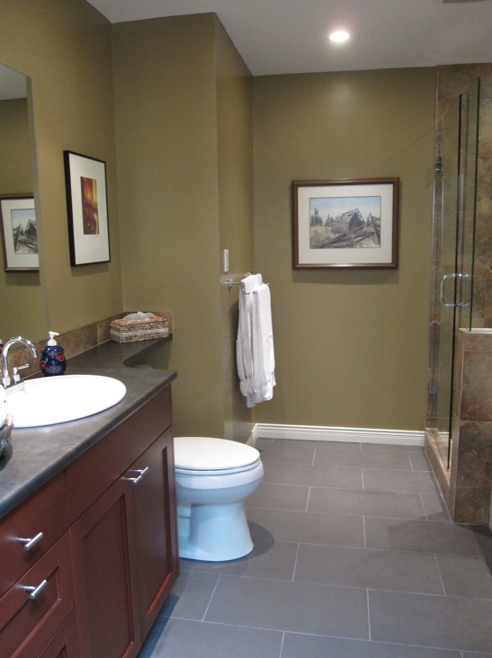
My lovely client Lynette called me to help her fix the colour in their newly renovated bathroom, it was not working.
Before
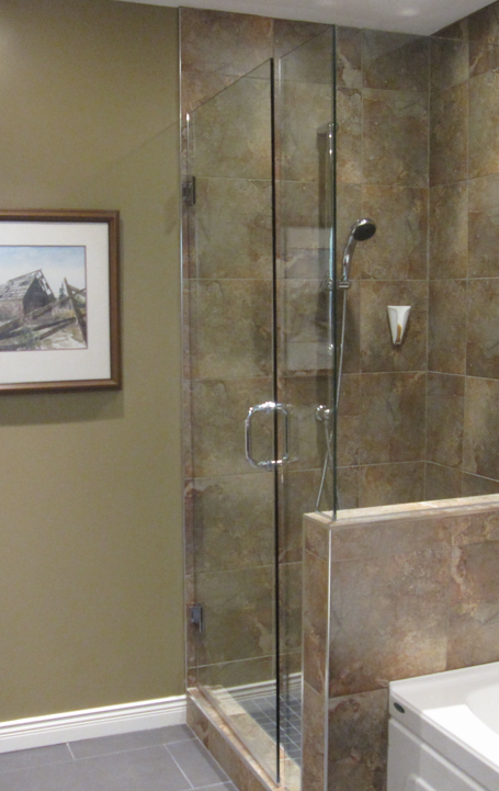
Although this colour did appear in her surround tile, it did not improve the appearance of her bathroom. Since the undertone of her gray tile was purple, that was the colour I selected that day.
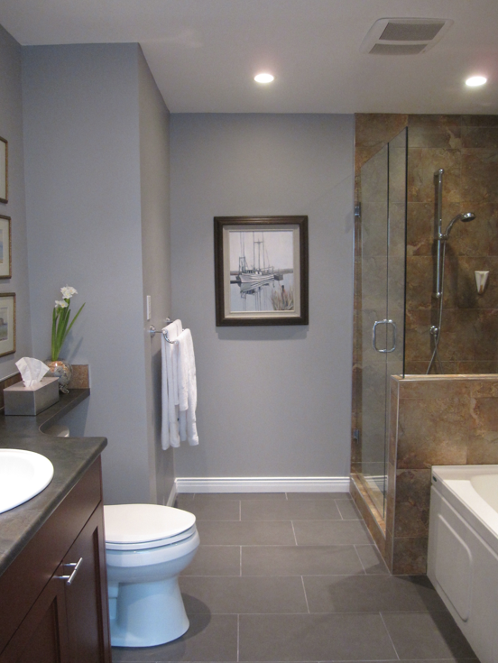
After
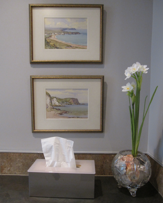
I chose SW 6002 Essential Gray/ Cloverdale Paint CA199 Lavender and it totally transformed the bathroom. We switched some art around, added some white towels (which we had already changed in the first before photo), and suddenly it all worked together.
The colour looks a little more intense and purple in the photographs because there is no natural light in this bathroom, in person however it looks just right.
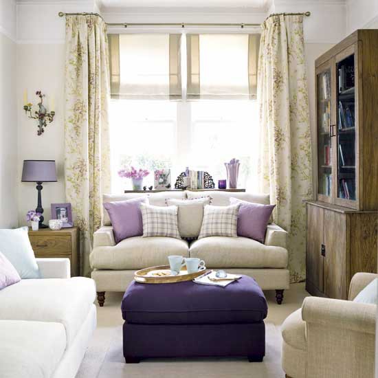
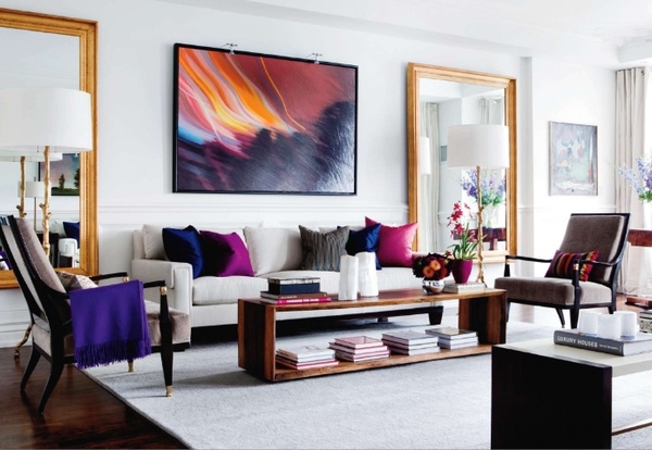
And here’s the big lesson of the day, greeny yellows usually work the best with jewel tones. Purples (not grayed purples like in this example) red, fuscia, royal blue and emerald greens.
Here the flowers in these drapes are a similar green/yellow.
If you were looking for a neutral for a room that was filled with jewel tones, all the usual undertones of beige would die. Gray would work if there was gray in the room like in the above image, but without gray to tie it in, a gray colour would die as well. Yellow is too countrified leaving you with a green/yellow.
Interior by Maria Killam
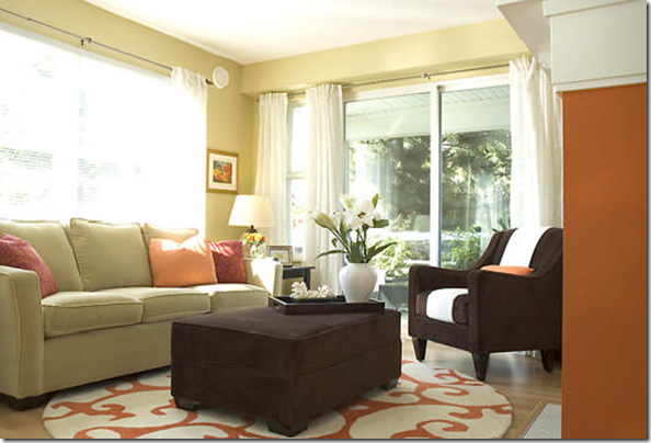
This room is painted HC-18 Adams Gold or SW 6394 Sequin. You can see that it relates to the sofa and therefore acts as a neutral.
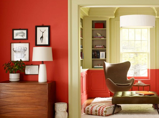
Here is a very similar colour paired with Pantone’s 2012 colour of the year, Tangerine Tango.
I’m sure you have all seen bathrooms with undertones that don’t work together because people usually choose too many tiles and try to mix and match them together. Better to choose one pattern and the rest in solid colours to avoid this problem.
If you have more than one undertone in your bathroom, choose the one you like for the walls, this way you will have a happy bathroom for many years to come!
Related posts:
What Everyone Should Know About Gray
Do you Understand Neutrals? Take the Bathroom Test
Slate or Porcelain Tile in the Bathroom?
Would you like to look at a bathroom and know which category of undertones it belongs? Download my eBook, How to Choose Paint Colours: It’s All in the Undertones.
If you would like your home to fill you with happiness every time you walk in, contact me.
To make sure the undertones in your home are right, get some large samples!
If you would like to learn to how choose the right colours for your home or for your clients, become a True Colour Expert.






When I first looked at the tile, I thought – okay, green. That works. But the gray/purple is much better. Especially when you added the artwork. Another success story, Maria.
The bathroom looks a million times better! Thanks for another lesson!
I love it when you do before and afters. The difference is amazing! One question, though, if you had a choice, what kind of tile would you use for the shower? Somehow the slate doesn’t work for me…
I love the purple – it’s awesome!
Yes! Those greens are sooo very out, especially here in Charlotte, NC. They are the “Model Home” colors that everyone uses and at this point, are extremely dated.
I did a blog post on some of the other colors that I just don’t use anymore because they are so long in the tooth – you can see them here:
http://colorspecialist-charlotte.blogspot.com/2012/04/model-home-colors-are-out.html
I love the color you chose! It really ties in the artwork instead of just enhancing the green tile. Very beautiful Maria!
Wow…such great illustrations…the before and afters are stunning…
The bathroom looks so much better! What color is on the walls in the living room with purple pillows?
What is that beautiful tone of walls of the room with the jewel tones?
So much better! So pretty. Another great lesson about undertones. Lynette must be so happy!
Well, there must be something wrong with my eyes, as I think the “before” picture makes the floor look wrong, but in the after picture, both the floor and the shower look wrong. That is, in the ‘after’ picture, the floor now appears pink and the shower is gold and gray. I think there could have been a better color, perhaps a darker gray.
Maria,
I just love your Adams Gold and Sequin design, thanks for sharing this again.
Maria, thank you! This a great post. It really shows that simple and classic is always the best solution if you have the luxury of choosing the finishes–but, if you don’t, the solution always lies in the undertones and the context of the existing finishes. You can create visual chaos or elegant simplicity based on your color solution, as your before and afters clearly show.
I”m just working on a post about greens and I so agree that there are so many bad yellow-greens. I think blue-greens are far easier to live with. Love the changes you made in that bathroom.
Maria, thank you! Awesome post. I have used SW 6002 Essential Gray, it is a beautiful wall color. As always, love seeing your work.
You raise an interesting subject: working with jewel toned accents — but you don’t elaborate much. What if the jewel tone is a wine/merlot-red (in tribal rug, ceramic lamps, kilim pillows, chair upholstery) The sofa is blue-gray. Walls are Revere Pewter but it looks a bit lavender in the north-facing room. A different shade of gray for walls? More blueish? Or something else entirely? Confused about what works with the rich red.
beautiful….I would linger in that space!
WOW what a transformation. It looks SO much better! I have rarely seen something that made so much of a difference!
I usually love all these transformations and maybe pics don’t do it justice, but to me the grey joust does not go with the shower. I don’t like the before but I still think the before color blends more with the shower than the after.
Yes, as I said in the post, without natural light it’s hard to get an accurate photo of the actual colour. It looks just right in person.
Thanks for your comment. Maria
Amazing transformation, Maria! You are a color genius! Absolutely love how dramatic the change is with the right color!
Is Philadelphia Cream considered a green yellow?
I love green-yellows, but agree they are tough as heck to get right. Excellent comment on requiring jewel tones.
Love the transformation — a great example of a skilled and talented eye, pulling all those mismatched ‘bossy’ colors together! Very impressive!
I love the before and after pictures/lessons you post. My favorite thing about them is you give real solutions to those of us that don’t have the financial resources to rip out existing tile and start over. If we had the funds would we rip out all the tile and start over with white subway tile? Absolutely! But if we can’t, you teach us how to transform with what we have. Thank you!