The fundamental insight of my entire colour system is that you can’t see the nuances of colour without direct comparison.
This means that proper testing, which is essentially comparing effectively, is the piece that makes it all work.
However, there are endless ways that colour testing can go wrong when it’s not done right.
Here is a real-life situation I want to share with you because it perfectly illustrates why improper colour testing is a BIG misleading problem.
My lovely reader sent me the following exasperated email:
I’m about to undertake painting our 3200SF home from top to bottom. The issues I’m having are:
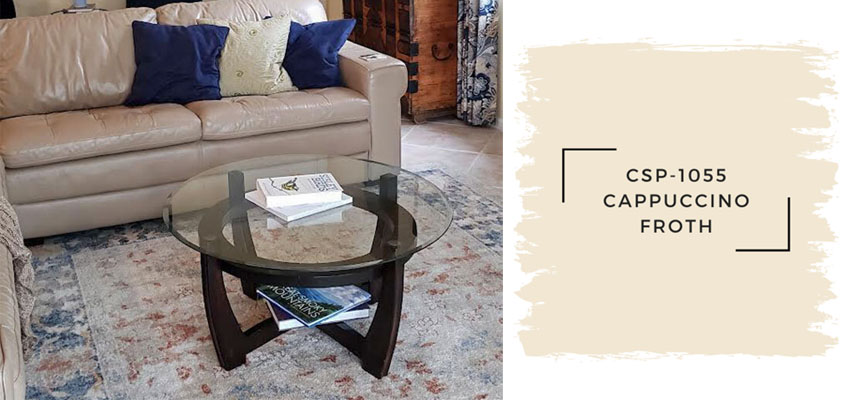
1. Why does a color paint true to form on a white door but turn completely grey on textured yellow wall right next to it? It is not lighting given they are side-by-side. My painter told me primer is not needed. This color is Ben Moore Cappuccino Froth CSP 1055 (attached). I’m also considering Balboa Mist and Pale Oak but haven’t sampled them yet.
2. Which greige is best given our decor? I’m leaning toward less brown but can’t quite get there.
Why you shouldn’t test your paint on the wall
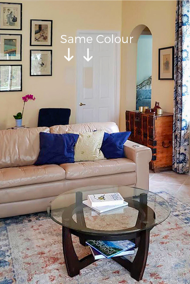
Below is the image she sent in that I really want you to see.
No one can blame her for testing her colour this way, if Google has anything to say about it, this is just how it is done. (NOT TRUE!)
I want to show you once and for all, that a colour swatch floating on a wall randomly tells us nothing about how the colour will relate to the finishes, decor and furnishings. Ultimately we can’t see if it is the right colour to pull the room together at all when testing this way.
What happens when you test your paint colour on the wall?
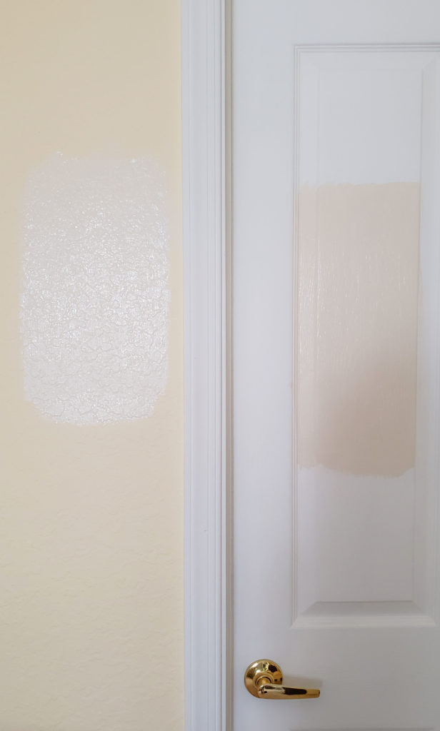
She’s right, it’s not about the light
Let’s take a closer look.
Same paint colour swatched on the yellow wall and a white door – NOT THE WAY TO TEST
It’s not about surface texture either. While the same colour can look slightly different on a smooth (door) versus textured (wall) surface, that’s not what is happening in this example.
So what’s really happening here?
How paint colour interacts on different surfaces
Colour always exists in relationships, because it’s relative. What we’re really looking at is a perfect example of how colour interacts in a relative way. That means that any given colour looks completely different surrounded by different colours.
Take a look at this example below. Paint an orange-red brown onto a warm (much cleaner) orange-red wall, it will look brown. Paint the same colour on a brown wall, it will look red-orange.
The dot on both sides is the same colour being influenced by the colour surrounding it this is known as simultaneous contrast.
See? Colour is influenced by the colours surrounding it. And not because they reflect on each other, but because their relative hue qualities are either emphasized or diminished by how they stack up to the colours directly beside them.
This can be a rather technical nugget to wrap your head around for sure.
But you can see in my reader’s example above how the existing warm saturated yellow wall colour is making her creamy sample look greyed and sapped of warmth. That’s because the yellow is so much warmer and more intense. On the white door, the colour looks “true” a warm orange beige complex cream.
The right way to test your paint colour
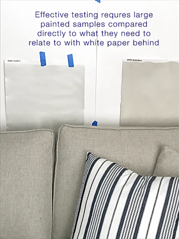
The other issue as I mentioned is that it’s important to compare any paint colour you’re testing DIRECTLY TO THE ELEMENTS IN THE ROOM IT NEEDS TO RELATE TO. In this case, if she’s going for a pale neutral, that’s the sofa and the floor.
The only way to properly test the colour and see if it relates to her leather sofa is to paint it up a large test board and prop it vertically on or behind the sofa –ALWAYS WITH WHITEBOARD BEHIND IT. Because otherwise you will have interference from the existing wall colour, and you won’t be able to see the colour accurately.
Here’s what I mean:
You can see in this image above that the green grey greige (above sample on the left) and green grey (above right) samples being tested do relate to the sofa. If the wall behind was beige or blue or yellow, it would skew the look of these green grey samples. This is why I can’t stress enough why isolating the colour you are testing with white paper is essential.
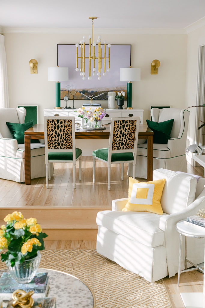
To my eye, the reader’s sofa looks too pink to work with an orange beige complex cream. Here’s what an orange beige complex cream, very similar to the colour she’s testing looks like. It’s the wall colour in
my newly decorated living room. I chose an orange beige complex cream to work with the orange undertone of my sunflower yellow sofa, leopard prints and natural fibre area rug.
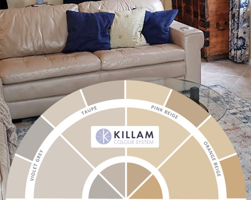
The best way to choose the colours you want to test
If you have a copy of the wheel you can place it directly on the sofa and floor tile to compare and see which undertones look closest. Then, reference the categorized by undertone curated neutrals in my system,
listed in my ebooks, to find the right colours to test.
Even with the digital colour wheel pasted onto her image, you can see that the world of orange beige, where the colour she’s testing belongs, is much too warm and yellow for her sofa and floor.
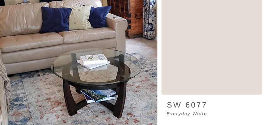
It looks like she needs to shift two undertones over on my colour wheel into a fairly pink taupe greige (a bit pinker than Pale Oak, the taupe greige she mentioned she’s considering, though it’s worth testing too).
Now can you see how this pink taupe greige digital swatch looks closer to the sofa and the floor tile than the more yellow, orange beige complex cream the reader had tested? How cool is that?
It’s important to compare large samples of your paint colour
Remember though, whether you are using digital images, or using your very own copy of
my colour wheel to compare and narrow down your options, you must ALWAYS ALWAYS follow up with a real-life test with a large painted sample. Compare the large painted sample directly to the sofa and the floor tile, in this case, with white paper behind.
Stopping short of this, you’re still only guessing. And testing incorrectly is a mistake that is likely to cost you a repaint. It’s important to make sure that you are comparing the colour directly to what’s staying in the room, and NOT the colour you will be painting out.
Learn more about my neutral colour wheel
here.Get your very own curated by undertone collection of large painted colour boards
here so you never have to guess again!
Related posts:


Hi Maria,
Thank you for the links to worthy charities to help those in Ukraine. You are a kind and generous person to have given so much, and use your platform for good.
I ordered your new Colour Wheel the first day it was available and I’ve been learning the colors in my home ever since! It’s a great tool and I wish I ordered the 3 pack! I already own your ebooks but for anyone who does not, I encourage buying the Colour Wheel and ebook package because they work perfectly together.
Do we use the same process for picking a white paint color with a white sofa?
If I were her I would get a new sofa! The one in the picture is quite ugly. She plans to paint quite a large area so why not just get a new sofa? Cognac leather or white even. She could then work around the colors from there. Of course this is my personal opinion and I may be very wrong about solving her problem. I know she would still have to do the testing like you said but I think it would be easier and prettier to get a different color sofa.
My apologies for butting in here…as I most often would not bother posting but for some reason your comment had an emotional connection today. Was it necessary to include ‘The one in the picture is quite ugly?” If you are able to remove that sentence, your entire point would still hold true…no need to indicate it is your personal opinion…whose would it be otherwise and that statement does not justify the previous thought. Furthermore, remember everything is in the eye of the beholder…even undertones. Just so one understands, colorblind people see things differently.
It’s my opinion. Plain and simple. I know not everyone will agree with me. The homeowner was looking for advise was she not? How can telling her that I think the sofa is ugly (my way I guess) offend her? You may be trying to put a guilt trip on me but I’m not feeling that way. Sorry.
She asked for paint color advice, Linda. She didn’t ask for your opinion about her sofa, so there was absolutely no justification for you to give it…especially in such a harsh and unkind way. That is not “being honest.” It’s using “honesty” and “my opinion” as an excuse for being mean, which so frequently happens on Facebook, but isn’t they way we talk to each other here. It’s not at all the same as Maria recommending a change of pillows. Your whole series of posts defending your lack of tact says much more about you than about the homeowner’s sofa.
Liz, Please forgive me for my rude comments. I was very wrong to do so.
Well, Linda Gail Trammel, let’s try an exercise: How would you feel if someone looked you in the face and said “You are quite ugly.” How could that offend you? It’s just that person’s opinion? Plain and simple. Don’t try to guilt trip that person. People’s homes are extensions of themselves; say cruel things about their homes and you are essentially saying cruel things about them. That doesn’t mean you can’t have an opinion. It means you need to express your opinion in a helpful not hurtful way. Maybe try something like : “How committed are you to that sofa?”
I am sorry. I apologize. I was wrong to make such a terrible comment. Please forgive me.
Thank you so much for your apologies, Linda. It takes a strong and humble person to apologize publicly and repeatedly as you have done. And that says more about you than your original comments did. Of course you’re forgiven! 🙂
Thank you so much!
Maybe she absolutely loves the sofa. Maybe she can’t afford a new sofa right now.
Why embarrass someone with a comment that you think their sofa is “quite ugly”?
I am sorry that I made such a terrible comment. Please forgive me.
I can’t tell you the number of times I’ve seen rooms designed by top designers that I absolutely love, yet there’s not an individual piece of furniture or accessories I remotely like. My lesson from that is it’s not about the pieces themselves; it’s about what you do with them. I don’t care for this sofa either, but with Maria’s excellent color guidance and perhaps a bit more thoughtful decorating, this room could be one where you wouldn’t even notice the sofa. This is what designers do. They make a room so cohesive you don’t immediately get drawn to the negatives. They (miraculously) make it work. I’m always in awe of how they do it, even with pieces that I might not like.
Please, remember that real human beings read your comments online. If you would not say something to a person in her living room, why would you say it online? It’s so disturbing to read this and takes away from the points you make.
Thank you everyone who came to the rescue before I had time to delete the comment. I’m leaving it up now because ya’ll are so sweet and gracious coming to her defence. I love this community and love that normally the comments add sometimes more to the blog than the blog itself! Maria
Maria, please accept my apologies for the rude comments I made on your client’s post. I was very wrong in doing that. It’s really not in my character to actually comment like that. I was very unthoughtful by what I said. I should learn from your example on how to speak to the problem without insulting any one about their property or house or any decor. You always speak very intelligently and wisely. I am very sorry.
Hi Linda, I’ve been where you are, I’ve done that, and I’ve been forgiven and accepted and understood! There’s room for everyone in this tent and I’m glad you’re here. Thanks for your honesty, thanks for being human and for cleaning this up, I must say this is a first! I love my tribe. xoxo Maria
I would just guess that if she is spending money to paint a 3400 sf home she most likely can afford a new sofa. You can get sofas at affordable prices. Even saying that I cannot believe such backlash over saying that I think the sofa is ugly. I didn’t realize that we could not be honest with our opinions. If I may, I have read in some of your posts where you would change out a particular rug or pillows, etc to make the room come together. This is all I was doing.
No, that’s not all you were doing. There is a way to be honest while being tactful. You need to learn tact.
I know this won’t upset you because it’s just my opinion. If I say you need to learn tact, you cannot be upset because it’s my opinion.
It was wrong for me to make the comments I made on this post. Please forgive me.
Linda, don’t guess about other people’s budgets and what they can afford.
Please forgive me for making such a terrible comment. I am sorry,
Maybe a new sofa is not in her budget. Maybe she loves the sofa.
You are right. I aplogize for making such a rude comment.
i have a friend/color guru who will walk into my house and say, NO, get rid of that. I may or may not get rid of it, but I guarantee when she comes back, even a year later, she will say, OOOOH, where did you get THAT? and hearts will come out of her eyes over the same thing she told me, no get rid of it. Some people just speak their minds.
In this case, it’s too bad the sofa is an inconvenient color. I’ll be curious to see if a wall color can pull this all together.
Good manners places being kind over speaking one’s mind.
If you have the type of relationship with your friend that allows for always speaking your minds, that’s great. However, it takes a long time and mutual agreement to be that way with each other.
When a perfect stranger tells someone their sofa is ugly without being solicited for an opinion, it falls under the category of rudeness.
Wow. This is getting to be more like face book. Everyone takes everything so personal. Then you are raked over the coals for saying your opinion. That would be why I solicited advice and showed pictures to get people’s opinions! It would not hurt my feelings for someone to say your sofa is actually not very pretty. Not at all. It is probably better coming from a stranger because we all are strangers on this site. anyway. I don’t know a single one of you. I have made bad choices on furniture and decor. I am not perfect.
Linda, is this really that hard to understand? Just because your feelings wouldn’t be hurt, doesn’t change what good manners require.
If she provided photos and asked for opinions about her furniture, your comment would not have been rude.
She did not solicit advice about her furniture. She solicited advice about her paint color.
If she wanted an opinion about her furniture, she would have asked for it. She didn’t. You went ahead and told her you think her sofa is ugly. What is she supposed to do with that information except feel bad? You don’t know if she can afford to replace it. And lastly, just because someone has a house over 3,000 square feet, doesn’t mean you get to assume the person has the budget to replace furniture, as you did in an earlier comment. You have no idea what a stranger’s expenses are. She could have enormous medical bills for instance.
Please accept my apologies for making a rude comment. I was wrong to do so.
This is the perfect post to illustrate your color principles, Maria.
It’s the same thing with makeup. Now that cosmetic companies are finally showing swatches on different skin tones, we can see that a dark color on a pale skin tone can look like a pastel color on a dark skin tone.
My first thoughts were about the Josef Albers paintings I saw in color theory class at art school more years ago than I care to admit. The pair of circle pictures could have been done by Albers. If interested, look him up on Wikipedia.
Please talk about which undertones work together and which clash. Thx
Maria is right! Also, don’t go to your local Lowes and get the match for, say, what happened to me, Benjamin Moore Oxford White. We did this because Lowes has a list of paint matches for different brands in the computer so I thought it must be the perfect match and we bought it. I did two things wrong. I matched the paint chip to my kitchen cabinets but never bought the sample and painted it on a piece of poster board. Big. Mistake. After I sanded down 13 golden oak stained windows and painted them my new paint color match, I noticed that my kitchen window in between two cabinets looked really yellow compared to my new kitchen cabinets. I dug out my paint samples again and said Benjamin Moore Chantilly lace and Oxford White looked like good matches and so did Sherwin Willimas High reflective White. This time I went and bought paint samples at the respective stores, (no paint matches in other brands!) and painted three large poster boards and put white paper behind each sample. Well, much to my chagrin, the only sample that matched without looking too pink (Chantilly Lace) or too greenish blue (Oxford White) was Sherwin Williams High Reflective White, but it was just a tad too light for my cabinets so we went to Sherwin Williams and had them scan the cabinet door and when they mixed the custom color, they put a dab on the back the damaged cabinet door I brought I to see if it was a close match. It was perfect so we went with the custom color, but I still went home and painted a large poster board and placed white paper behind it to make sure we had a match. It was a great match, but now I have to put a coat of my new custom color on 13 windows and doors. Again.
I know I wrote a story here, but I did it so nobody else makes the same mistake I did! Don’t go with a “Paint match” in another brand. Doesn’t work, trust me! Get the real thing and wait for a paint sale if that’s what you need to do. Also, paint the poster board like Maria recommends because you just can’t see the slight color differences that might drive you nuts like it did me on those tiny color chips. It will save you time, money, and anxiety! 🙂
Thank you for the link to World Central Kitchen as it made it easy to donate!
The two dots of the same color surrounded by different paint colors is my takeaway from your blog. And your follow up with the use of large white boards is the resolution. The pink sofa is the example. Great information!
t
I learn so much from blog posts like this and I eagerly await Monday mornings to see what’s up next. Thank you for sharing your insight and knowledge, Maria!
What a great post! I love posts like this Maria. Your solutions are like magic. As soon as I saw the color you had chosen I knew it was perfect. SO much better. Her room is so pretty with the pinks and blues. That paint color would bring it all together. Thanks again for another inspiring post!
Thank you for your generosity of time, talent and treasure! And for your prayers!
Maria, your readers are so brave to send photos and open their homes to the world. If it helps at all, this reader’s sofa is much nicer than mine. If a decorating guru saw my home and told me to get rid of my sofa I would probably agree with them. However, my 10 year old son told me several times that he wants to keep it forever. Our sofa is family cuddle under a blanket space, our home movie & popcorn space, our reading books before bed space. The sofa is comforting and we’re keeping it. It’s possible that your reader’s family feels the same way about their sofa.
Love the post Maria!
Great post, Maria. I’ve certainly made that mistake, once when choosing exterior paint. What a shock! But thankfully my mistake grew on me. 🙂
I appreciate your reader opening her lovely home to us and I’m sure she will be happy following your advice.
Maria, I’ve been following you for years and have learned much. Thank you for sharing your gift, but today especially for sharing the Links to the Ukraine aid programs. My husband and I just donated to both organizations. We continue to pray for the Ukrainians.
Blahosovy boh❤️
Oh Maria, Maria… where were you 7 years ago when I painted my new home? I went through 10–15 sample jars with swatches painted on the existing wall color. They were all hideous! I bought some 2′ x 2′ pieces of patching sheetrock and painted samples on those. As you said, placing those 2×2 squares on furniture, walls, cabinets, etc. worked much better than painting directly on the old wall color. Wish I had thought to put a larger white board behind it. Thankfully my buff cream looks great but that was mostly luck! However, the color in the bathroom is way off and I have to repaint. I just received your color wheel and could immediately see the conflicting colors on wall (green beige), cabinet (orange beige), and floor (taupe). Thank you, thank you! Your wheel gave me instant clarity!
This is a few days late but I finally got back to my Desktop computer with a keyboard. Regarding the comment about the ugly sofa….yes, that was unnecessary and maybe the person owning it knew it. There are many reasons people have things. A few years ago I went to the Bluegrass Antiques and Art show in Lexington KY and attended a fabulous talk by designer Thomas Jayne. He does amazing work, rather classical with some whimsical touches. Uses lots of antiques. Has some books out. As he told various anecdotes, keeping us laughing and entertained, I’ve never forgotten one especially….he told of doing an entire house, maybe it was in the Hamptons. The lady of the house was having him reupholster several existing pieces and one was a rather unattractive little footstool in the master bedroom. This alone, he said, was the only piece that was just puzzling to him, mainly because it was not pretty and also didn’t suit the house either, but he said nothing and had it covered with the fabric that they had chosen.
A stretch of time passed. The house was completed. He was walking on the sidewalk in the village and a car was passing. He heard a voice shouting his name. He looked and it was the lady with the house and the footstool. She was driving past and had rolled down her window. She said, “Thank you for covering the footstool….it had been my father’s.”
I almost believe he closed his talk with that. There was a hush in the room and we all learned a lot from that moment. Yes, people hang on to things for lots of reasons. I have things right now that mean a lot to me and they are not pretty. I know that. A good decorator might ask why you have things but if you say it belonged to your late mother or whatever, that carries a lot of weight. An amazing decorator will try to highlight or not highlight what you have sitting out based on how you answer the questions. I’m sure they learn that in their training.
maria…. how lucky i was to come across your skills just today…. i look at my living room walls weekly and ponder what color i want them to be…. despite my husband’s insistence that the color is just fine (when i met him, he only wore browns; so therefore any beige is fine with him!!) i was destined to ponder the wall color forever… until today…. i now know what i need to do….. i will pore over your literature i just emailed to receive…. i will make a firm commitment to brightening up this condo…. and everyone in the family (including our husky) will be excited about the change!!!!! by the way, do you have a color wheel for your clothing choices???? i love what you put together…. i definitely could use help in that area also…. thanks so much for a huge bright spot today!!!!!!!