


A while ago I showed you a sneak peek of this living room I was working on and it’s finally done! Note these photos were taken by me!

Photos by Maria Killam
The existing panelled wall was oak and did not match the new hardwood floor so we first painted it the colour of the rest of the room (BM Everlasting or Thousand Islands). Then we decided it really just needed to be the trim colour as panelling usually either is either wood stained or the colour of your woodwork.

So here’s the room before any furniture was purchased. This piece of art we moved to the hallway because it was too big for the mantle

This client had lots of her own artwork but most needed re-framing, so we took about 10 pieces to my framer Kent Picture Framing here in Vancouver on the West side and chose new mats and frames for all of it. (I forgot to take a before photo of the frame on this one)

I propped it up on the mantle with another little treasure we found in my client’s house.

We would have loved to hang drapery in this room but there was a bulky heating unit at the bottom of the window so we installed a boxed pleat valance with banding to tie in with the cranberry armchairs. I loved this rug my client actually found on her own from a local carpet store in Richmond.
 We replace the old sconces with these from Schonbek to tie in with the fireplace cover.
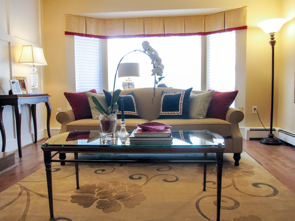
My client Savannagh had always wanted a camel back sofa so we had it custom made (along with the English arm chairs). I think this sofa is my favourite piece in this room. It’s covered in Orvis fabric from Robert Allen (one of my favourite workhorse upholstery fabrics).


Download my eBook, It’s All in the Undertones. If you have a computer, you can download my book!
If you would like your home to fill you with happiness every time you walk in, contact me.
To make sure the undertones in your home are right, get some large samples!
If you would like to learn to how choose the right colours for your home or for your clients, become a True Colour Expert.

gorgeous. Where did you get the sconces? I’m in search for something that doesn’t look bathroomy (which they all seem to in my eye).
It’s beautiful! Love it!
The scary thing is that this is almost the identical colour palette I am using for my family room except mine will have dark salmon pink chairs (it’s in my rug) and a camel sofa. I only wish my room is as big as your clients – what a nice size room to work with.
I love the herringbone on the sofa. Did you have to convince the clients on the herringbone? I’m having trouble convincing a certain someone to go for the herringbone; velvet will be Plan B.
What a great post. I love that you found the little piece of artwork in your client’s home and were able to bring it forward into the living room update. And the sconces are awesome – I love the whole presentation of the fireplace wall!
Oh I wish I could see Cranberry Cocktail, such a great rich color.
Ooh, so pretty Maria! Love the painted paneling. You made the right choice painting the paneling in the trim color – it should read “architecture” rather than “drywall.”
Great job! xoxo
Kristie
Love the way this turned out!! And I know pictures never do it justice so I’m certain it’s stunning in person! I have to go look up that wall color so I can see it in my head! Brilliant fireplace wall. Simply gorgeous in white. Bravo my friend!! 🙂
Ia that wall color more of an off-white/cream? It’s so hard to tell in the pictures. Love the sofa.
I have used Ben Moore Everlasting for years, seems most often in formal living rooms. It is a “safe” color to choose if you need to pick a paint before your design the room.
Hi Kara,
The panelling is Cloud White and the rest of the walls are Everlasting. I chose it to relate to the fireplace marble. Maria
Hi Maria: Cranberry and blue can go so doctor’s office, but you got it perfectly as usual. Karena has a huge giveaway from us on her blog. I can’t send it to Canada, though.
Best,
Liz
Love that little print on the mantel! Personality. Love how you made everything work by painting the paneling the RIGHT color.
Do you have Bombay in Canada?? All of ours in the US went out of business:( I used to find the coolest stuff in there.
What a lovely room. I like the mix of modern & traditional. I’m sure your client is thrilled with the result.
Beautiful! Colors I would never thought of and accessories that finish the room perfectly.
Maria, The photos are just great! I love how beautiful the paneling looks painted. It’s a great tip for those of us who still have a lot of oak in our house..which we do. I need to show this to Dear Hubby to assure him that painting wainscoting or paneling is OK.
I love your tips on tablescapes and all the arrangements. The color combinations are so nice. The curtains are a super idea that I may try for the office. I don’t want to block our view.
What a great post!
xo
Donna
I love this room and especially the window treatment with the cranberry band relating to the other cranberry in the room. I do have a question because I have similar windows in my living room. You wanted to have draperies but could not. Had you been able to have draperies where would you have them hanging? Just on the outside of the windows or between each window. I am grappling with this, Thanks Maria.
Hi Maria. The room is lovely, but the coffee table looks too small to me (I have had the same problem in the past). It also seems too far from the sofa and chairs to be used for drinks, etc. What is the standard for distance from a sofa for a table? Thank you!
I would love know what type of window treatments you used in the cranberry cocktail room – I am having a hard time finding the right curtains for my cranberry cocktail dining room!!…..Love the picture you have posted here….nice work!
I used a solid faux silk in a beige that coordinated with the living room. Maria