


My team and I do love an incredible kitchen transformation. We help deserving clients make it happen on the daily. We load up our presentations full of great tips and bonus recommendations. All to make sure that the renovation turns out better than they every could have imagined!
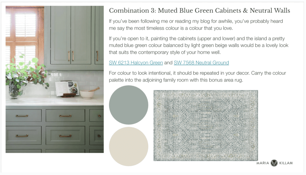
An edesign presentation page
An amazing before & after!
Recently we received this note from Jenny:
Hi! I just wanted to send some pictures of our gorgeous renovation. We love it so much and have MK design to thank. Thank you!
Jenny has a beautiful West Coast contemporary home with a spacious kitchen layout she wanted to update with new cabinets, finishes and paint colours. She loved her yellow walls because they push back against the often gloomy climate, so she was open to colour!
Here is her kitchen before:
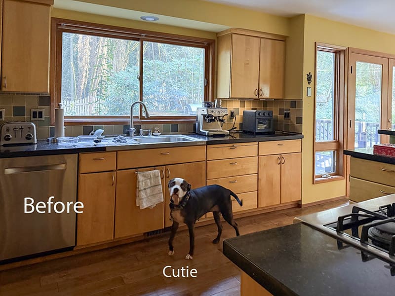
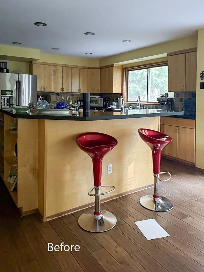
We gave her a few options. A sunny yellow kitchen:

And a pretty blue green kitchen:
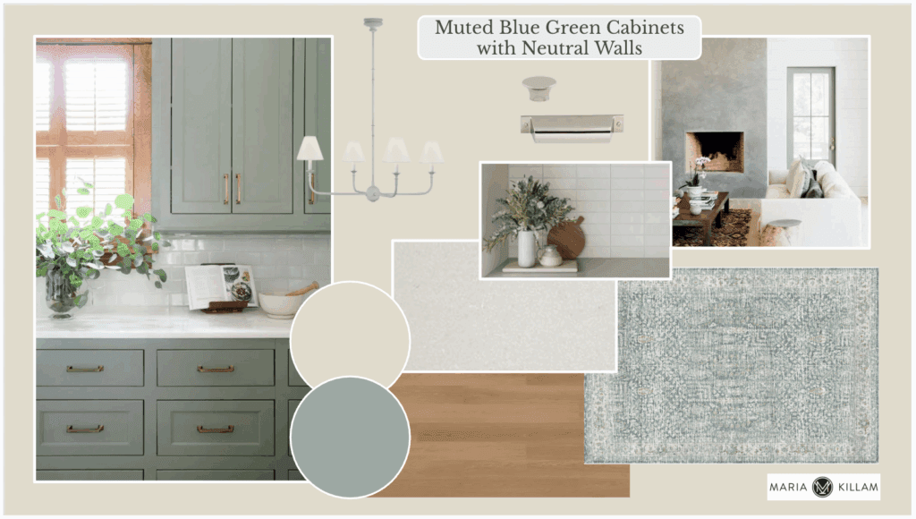
She went with the blue green option. So fabulous!
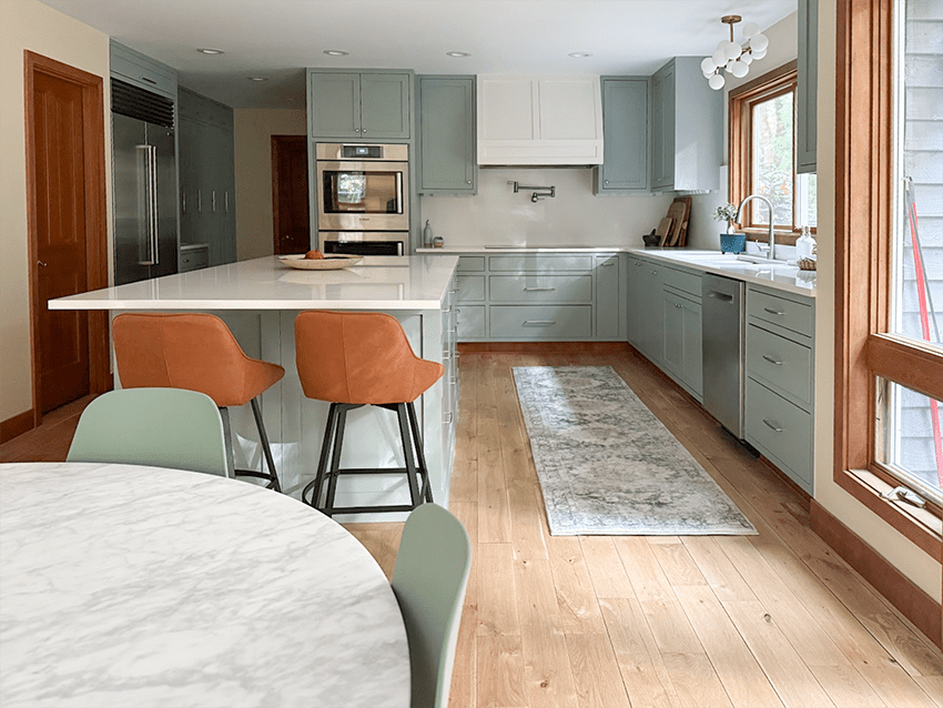
SW 6213 Halcyon Green
If you have warm wood tones like this, blue greens are perfection!
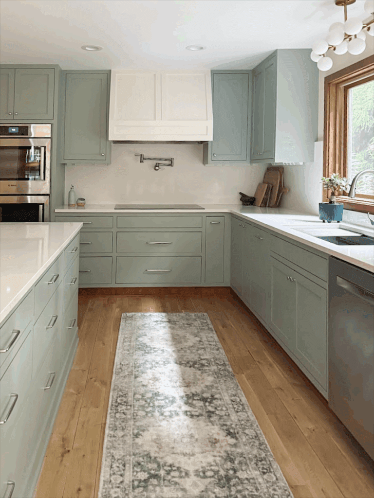
She opted for a beautiful custom millwork range hood and had it painted off white to match the countertops. I always recommend that the range hood match the cabinets if it’s millwork. But contrasting hoods are definitely a trend. So I thought I’d take this opportunity to talk about it and show her kitchen both ways so she can decide which she likes best.
Here is her renovation with the contrasting off white hood:
And here it is photoshopped to match the cabinets:
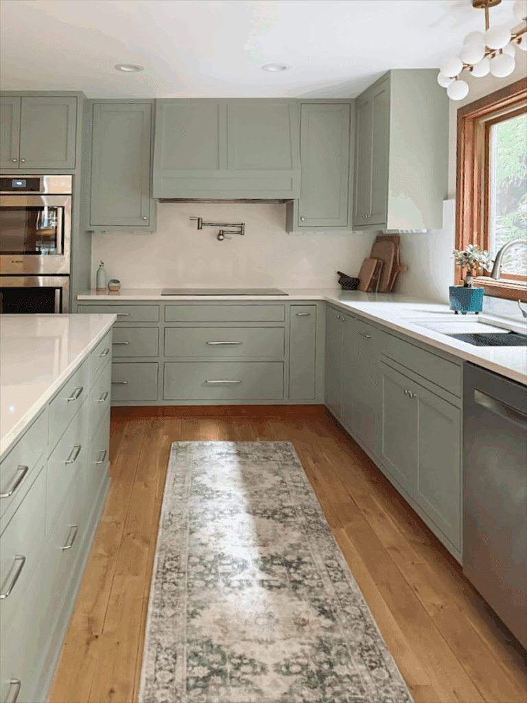
Let us know in the comments which do you prefer? Let’s help Jenny decide if it should stay off white or if it’s worth repainting it.
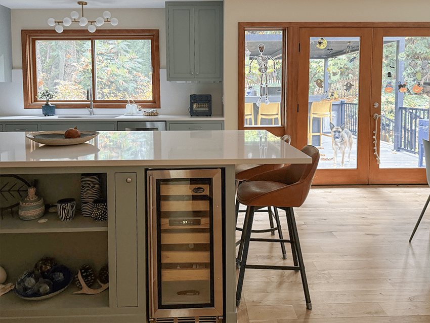
Either way, her new kitchen is so beautiful. See if you can spot the other cutie in this pic below.
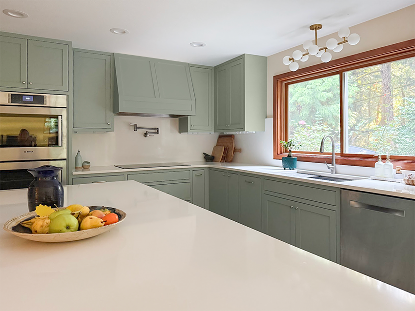
I do prefer the hood painted to match. And I think in this case because it matches the white counter and splash it works. What I do object to in this trend of contrasting range hoods is when the hood is painted a heavy dark colour like black or wood to match the island. Because then it has way too much visual weight and feels unbalanced. Let me know your thoughts on the trend.
Thank you Jenny for sharing your beautiful home! Afters this beautiful complete us 💛
Ready to get started on your timeless kitchen renovation? Get your plan here.
Your bathroom needs some love – let me show you how
Most bathrooms don’t need a gut job, they need a little love and creativity!
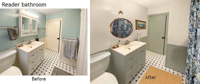
Most of us are living with inherited bathrooms — finishes we didn’t choose, colours we don’t love, and tile we definitely don’t want to rip out.
The good news?
Most bathrooms don’t need a gut job. They need creativity, clarity, and the right colour direction.
That’s why on January 8 at 1:00 pm PST, I’m hosting a free live class:
The 5 Steps to a Beautiful Bathroom (Without Renovating)
I’ll walk through a curated selection of reader bathrooms and show you exactly how I decide what can stay, what needs updating, and how to use paint, lighting, mirrors, and styling to create a bathroom you actually love.
You’ll walk away full of new ideas and inspiration for your bathroom!
Save your seat here:
Register for the January 8 Class
Related Posts
Trend Alert: Stone Backsplash and Arched Range Hood

prefer the white range hood
I like the hood painted the same color as the cabinets. I makes it more balanced with no break up of color. That is a beautiful color and made the makeover look so nice. It is a nice large kitchen. The patio door area is very nice also.
I like the vent hood painted the same color as the cabinets. It seems to keep it all balanced with no breakup of color. The patio door area is very nice also. The blue color is very pretty.
My vote… same color!
Both look pretty but my vote on that kitchen would be the same color as the cabinets .
It’s a very pretty make over ….
Eyes tend to bounce around the kitchen with the white hood; more restful when the range hood blends in with the upper cabinets. Either way, it’s a nice renovation. Season’s greetings from chilly Sask. 🙂
The white hood pops out too much and leaves the hood disconnected to anything around it. You want the hood to stand out, but in a good way. I would add a decorative strip at the bottom of the hood. For a subtle look, use a brushed stainless or nickel to match all the hardware and appliance finishes in the kitchen. For a greater contrast, add a strip of wood around the bottom of the hood that matches the warm wood kitchen window casings in color and size (height and width). That would also tie in that warm wood color into the back wall. That is what I would do!
I personally like the white rangehood. I feel it gives the kitchen more interest and a focal point. That being said, I’m not a fan of the orange-toned wood, so I would also paint all the trim and doors white. Love the floors with the cabinets though.
I’m wondering if another option for the hood would be warm wood? Is that too trendy? I think the hood in white or blue-green both look fine; it’s a matter of preference.
The first thing I noticed about the white hood fan is that the two sides are uneven – one seems bigger than the other. Personally, I would opt for the green to make it fade into the background.
I’m sure the 2 sides are equal. It’s just the way the pic was taken and the lighting.
Wow, such a pretty kitchen! I do prefer the range hood painted to match the cabinets, but I don’t find the contrasting version objectionable. I think it works either way.
I prefer the more seamless look of the hood painted to match the cabinets. That said, the white is pretty too but it feels unnecessary.
Why is everyone so keen to paint their beautiful wood cabinets? That just makes me sad. I do like the new color scheme and prefer a brushed stainless hood to a painted one.
I’ve had stainless steel everything for years and hate it with a passion. Fingerprints (though now there’s the type that’s much better) and for me it actually is looking dated, believe it or not.
I think wood vs. paint is simply a personal style preference. I used to only like wood — but I’ve had to live with orangey wood for 20+ years and I’d love to paint it. It’s far too expensive give the quantity — cheapest quote was 18K. I might spring for it but we have other more pressing house projects.
Looks like it’s brand new reconfigured cabinetry, not just painted over. Plus, the old looks like Ikea Nexus Birch, which actually has laminate doors. The style was discontinued in 2015 so the old cabinets might’ve been at end of their useful life. The new inset cabinets look like a significant upgrade. Dreamy!
The after looks amazing and I love that you are highlighting how renovation is not always the answer.
I’m not a huge fan of two-tone cabinets. I feel like in either color, this hood would benefit from an accent of natural wood to pull together the pallet.
I like the hood better when it’s the same blue-green color, as it’s not different enough in materials and style to be picked out in a separate color. Sometimes it works to have a focal hood if the hood is really special like when made from copper or French strapped, or plaster. Those are rare in typical kitchens and IMO when it’s a seamless part of a run of uppers, keep it the same as the uppers every time. Agreed about the dark painted hoods always being a mis-step. They give me Darth Vader vibes!
Same color—which is absolutely beautiful!
I actually prefer the white hood because it goes with the backsplash and counter .
Absolutely white — love the soft contrast and break in all the green. Love the green too!
On the range hood, I’m with those saying it needs to match the cabinets – the white is simply too jarring for me and takes away from the seamless, calming look of matching colors with the cabinet.
On the bathroom exhibited, I prefer the original as the blue draws the eye upward while the green draws the eye downward with nothing in the black/white tile floor to pull it together. It’s too heavy a look, despite the new shower curtain.
On the original bathroom, painting the creamy door and lower walls a white to match the floor and fixtures plus replacing that dated medicine cabinet would have been enough for me.
Love the blue-green inset cabinetry. I think the white hood sticks out too much and even though it relates to the counter it “feels” it doesn’t relate to anything. Painting it the blue-green is much more elegant and you can still see the pretty panels on it. Great job!
I prefer the contrasting hood.
It looks beautiful either way, but I prefer the contrast of the off white range hood.
Hi Maria,
That’s a great looking kitchen update! When I first saw the white stove hood, I thought why in the world didn’t she paint the same color as the cabinet? Then I saw your Photoshop version, and unexpectedly, I really like the cream colored hood. I feel like it really opens up the kitchen — makes it feel bigger, especially the cooking area. My one suggestion would be to then paint the ceiling, the same color as the hood. Either way, she can’t go wrong with a same color or cream colored hood.
I prefer the white hood. It brightens the darker corner where the kitchen is rather gloomy, in a complementary way. Was surprised she chose the blue-green in a gray climate…
If it was me, I would want the hood painted a white to match the ceiling. (Or paint ceiling and hood the wall color). I think the creamier white hood against the brighter white ceiling looks off. I do like the green hood a close second, but think the stark line of all of them visually makes things look too low. Just my opinion, since you asked. The kitchen turned out beautiful!!!🤩
If it were my kitchen, I would have redone the island to make it counter height, as she did, and I would have replaced the upper cabinets with wood and then refaced the bottom cabinets to match. I am so tired of painted cabinets and the upkeep. I also think that the painted cabinets accentuate the orange wood, which is dated. I liked her cabinets before in the wood tone. Her backsplash was dated, so that needed a change.
I prefer the white because it does pop but also because it relates to the white countertop on the island and the white light fixture over the sink-the rule of 3!
I’m in the same color camp. Harmonious. There are other ways to achieve accents.
I prefer the white range hood because it does pop but also because it relates to the white countertop and the white light fixture over the sink.
I like it the same color as cabinets. Less distracting to the eye.
Hi, I love this color overall. I just had my kitchen redone in shades of blue just like this. 🙂
In this kitchen, I would prefer the hood match the cabinet color. The focus of the kitchen is the good light and nice layout. The hood is not the focus to me.
That’s my $0.02 opinion 🙂
~Tracy
I think the white would look good if the stove or counter had some colorful items, styling, as Maria always says. But green would look better if counters, etc.are to remain bare and open.
Beautiful makeover. I prefer the range hood in the same color as the cabinets. I feel the white hood looks like it’s waiting for paint but hasn’t been completed yet. The continuity of the green hood with the cabinets makes the kitchen feel more spacious and coherent.
What was the neutral wall color, that was used with the Halcyon Green, please? Lovely kitchen, Thanks
The white looks great, and the green might be boring. I am so happy you posted this, because I am fixing to re-do my hood now, plaster to match cabinets. but I have 12 antique spongeware pitchers on my island, blue and white of course, so my hood can be boring. and I am happy to see her induction cook top, because if I go to induction ill need to do with concurrently to access inside the wall behind the old existing cabinet. I can see from this picture im going in the right direction. but from the point of view off decoration, the cast metal parts on a gas cooktop look so handsome and vintage, but I don’t need the fumes, cleaning headache, plus the induction works better(reportedly).
Jenny, induction is great! Much faster and more precise than gas, and doesn’t heat up the kitchen (or the cook!). I’ll never go back.
I think a contrasting hood can look great. But it’s also true that all the ones I’m recalling as beautiful were of a different material. To have a hood that so closely echoes the cabinets but in a different color – and kind of a non-color at that – is what moves me toward painting it to match.
Just my two cents – either way it is a beautiful kitchen, and I’m sure the homeowner is enjoying it!
and Girl, if you like that hood white, you just keep it white!
I would vote for the Blue/Green hood color. The only thing that bothers my eyes 😂 is the orange toned woodwork around the kitchen window and the patio doors ! To me it keeps the whole room from really coming together .
I like the look of having the hood the same color as the cabinets. To me it looks more elevated rather than having the look disconnected.
The white hood is in conflict with the wood trim when entire kitchen is viewed. It is distracting. Definitely looks better same as cabinets.
If this were my kitchen, I’d paint the hoodfan using a Hammered Copper paint product… (I’ve used a product before on doors and it turned out great). If it doesn’t work, then I’d repaint it – not sure the colour though… white is too much contrast, but cabinet colour is on the safe side – I’d be good with cabinet colour having a band of wood that matches the window casing/frames.
I like the white range hood, it seems to draw up the lightness from the counter.
More friendly. All the same colour in this case looked flat to me.
Is the bathroom functional for towels?
It looks like they went from having in three places to one small towel holder.
I prefer the white hood. With so many cupboards in her kitchen a bit of variety is nice.
I like the range hood painted the green colour. The white hood just breaks up the kitchen. I also noticed the other cutie looking through the kitchen doors!
Keep the hood off while. It looks amazing!
I would like the contrasting hood more if it had more visual distinction (form, decor, metal etc) . Keeping it the same color as the rest would look more seamless.
I think I am particularly not a fan of the white because it looks like the hood was forgotten. I would choose to match the Orange of the chairs as an accent color on the hood and then repeat it a few more times!
I think the white range hood is fun – I love how it brightens up the room! And she can always paint it to match the cabinets later if she wants a change. It would be like having a mini-makeover! 😉 Absolutely gorgeous color scheme either way. I’m slightly envious!
I agree….the hood should be painted to match the cabinets, especially since the trim over the sink is wood. Such a pretty kitchen!
Prefer the contrasting hood in the kitchen and prefer the new bathroom.
Jennys kitchen turned out beautiful! However, I do like the hood paint color matching the cabinetry best. Otherwise my eye goes to the hood first.
I think I prefer the white hood because it breaks up the monolith of green and because it relates to the countertop and adjacent wall. Although in the photoshop image, I think the white is a bit too bright.
I prefer the hood match the cabinets. When looking at the photo you see, white hood & blue/green cabinetry & the dark wood of the window trim. Too many finishes in a small space. Either way it will still be amazing!
Hood should match cabinet. Why? when looking at the photo you see too many different finishes in a small space, white hood, blue/green cabinetry and the dark wood stain of the window tire
I prefer the option where the range hood matches the cabinets.
My eye is drawn to the range hood when it’s painted off white. I’d rather be focussed on the rest of the kitchen, which is lovely.
I think this highlights how we all have our own style preferences and we choose what works for our home and budget. My kitchen looks very similar, and 25 years ago I chose creamy white uppers , including range hood, and BM Jamestown blue lowers. I’m lucky to have enough storage, so I eliminated the cabinets next to the window. I still love my kitchen. You do what you love!
I like the cleaner, more unified look when the hood is painted the same color as the cabinets.
Absolutely, the range should be pained the same color as the cabinets. It’s more cohesive, being cream, looks out of place.
Painted to match! When it is painted white that is what my eye first goes to, instead of taking in the entire gorgeous kitchen.
The hood should definitely match the painted cabinets.
Thanks for confirming there’s hope for my kitchen!
In this case my vote is to keep the white hood. It creates a nice visual connectedness and landing point for the island counter, and softens the stove wall, mitigating a blockiness about it when all the same color.
Peanut gallery fan with no claim to design skills; this pairing seems to make sense when I look at it
Contrasting woodwork looks like a mistake IMO despite countertop; contrasting (usually statement) materials looks more like a trend. I prefer the green here to be consistent with cabinetry.
I think most statement hoods are sort of like the counter splash trend you had mentioned a while back, not going to work well over time unless done in high end materials with a great professional designer’s eye.
Might consider the historical purpose of a vent hood and what you are trying to say with it. Is it supposed to be a focal point? Is there a reading to highlight it?
Maybe it is just an odd trend to make a big deal of it… I don’t get it.
Oops.. typo : “reading” s/b “meaning”
I’d prefer the hood be painted to match the surrounding cabinets. The white hood jumps out at me too much. Either way, this is a gorgeous kitchen renovation! I hope she enjoys it for years to come.
For me, if I were to do a white hood, it would be stand-alone. I think the color cabinets right up next to the white hood is the challenge. Or maybe having a distinctive, different style hood/or a different shape hood that would justify treating it differently than the cabinets next to it. Anyway, it is a beautiful kitchen; in the end, whatever she decides is best for her is the right choice!