Lately, the questions I’m getting are so good, and cover content I’ve never published before, so we’re getting a stream of reader dilemmas handled! Here’s another one:

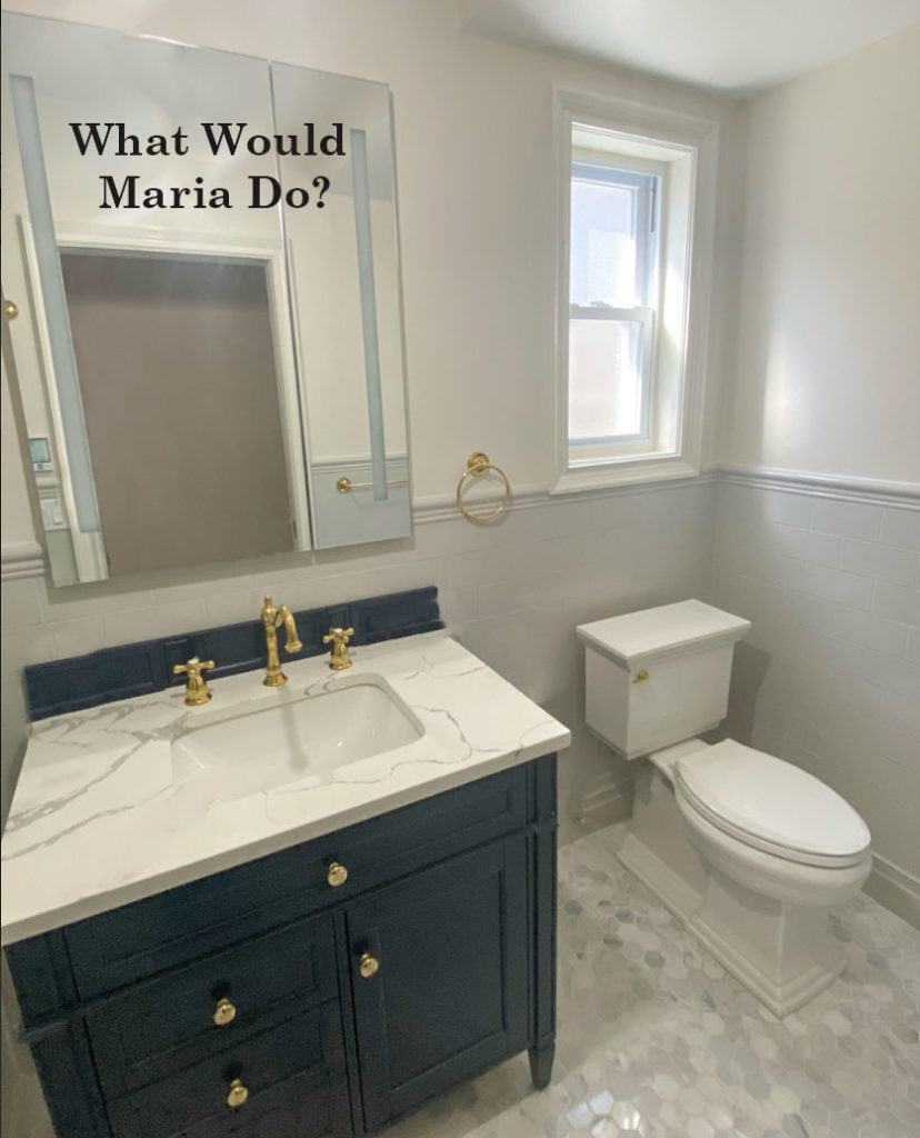
We just renovated our bathroom and added a navy blue vanity. We went with a creamy quartz countertop, soft grey tile on the bottom half of the room, blue/grey glass tile in the shower, marble hexagon floor, bright white toilet and tub, brass fixtures.
We painted the walls and trim the same color, Sherwin Williams 7009 Pearly White, where the walls are matte and the trim is semigloss. However, now I’m not sure if the bathroom’s walls and trim look too creamy against the bright white tub and toilet, grey tile and blue vanity.
Should I paint either the bathroom walls or bathroom trim a shade brighter/lighter of white, such as Sherwin Williams 7005 Pure White? If so, should it be the walls or trim that become the brighter/lighter Pure White? Will the subtle contrast help, or will a brighter white make the creamy white look even creamier and create a “clean white/dirty white” scenario? Please help!
First of all, it’s really much too easy to wind up with too many different elements going on, in the hard finishes of a bathroom.
The trouble is there are really only a handful of elements to play with in a bathroom, so they all need to perfectly coordinate and balance each other. Because when the balance is a bit off, it will bother you.
Here’s a hot tip that I really wish everyone doing a renovation or new build knew, the vast majority of marble look quartz is off white to cream and greige. I talk about this in my white ebook here. Which means that they will be much creamier than real Carrara marble and bright white bathroom fixtures.
In this case, white subway tile would have repeated the white of the fixtures and marble and been more versatile in the long run. But the quartz would still look a bit too creamy.
Read more: How to Make Earthy Tile Look Expensive
HOWEVER, all is not lost!
When all the elements are sitting together somewhat uncomfortably because they are close but not close enough, the best strategy is to DISTRACT THE EYE.
While choosing a wall colour in the white range, you will always need to “pick a lane” between the off white quartz and the true white of the floor and toilet, if you blow all of those away with a really striking BOLD and fun wallpaper, your eye will simply never waste time splitting hairs over the slight mismatches of the hard finishes.
What this bathroom needs to distract the eye from the different whites and pale greys is navy and white wallpaper.
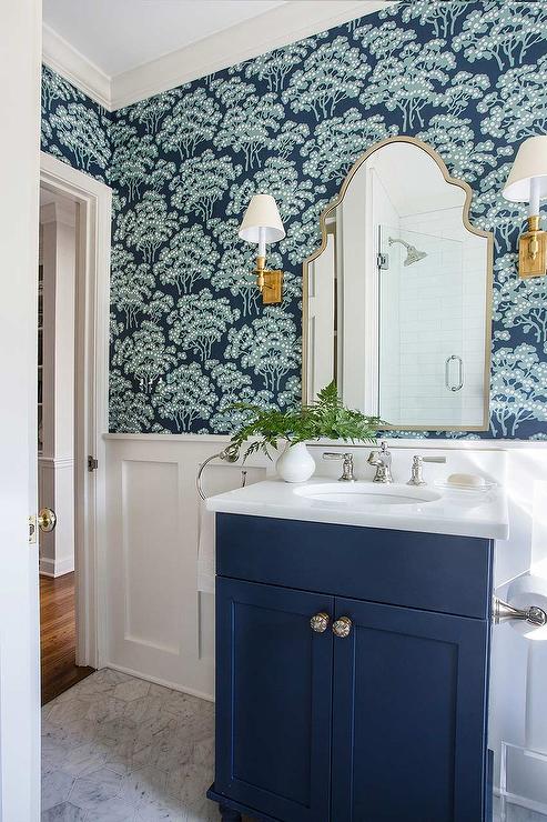
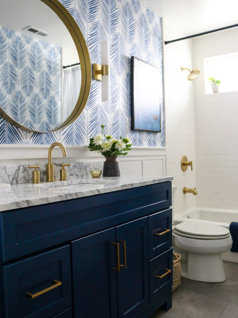
There’s also the distinction ‘alternating contrast’ that is important to remember when you are choosing finishes. You can see that in both these bathrooms (above and below) the floors are grey or in the grey world and the wainscotting is a crisp white that relates to the bathroom fixtures and (below) white shower tile.
That’s why, I’m trying to remember if I’ve ever specified grey wall tile in my life? Um, actually no. There’s way more places where white tile is simply a better choice.
You can find some fun, navy wallpaper here.
And while mirrors with built in lighting are high on the “neato” factor, in this more traditional looking bathroom, it looks much too cold, linear and contemporary. Instead, a decorative brass mirror flanked by pretty brass sconces will bring in some much needed interest and detail.
It’s almost always true that the best thing to do if you’ve made a colour mistake in your hard finishes is to decorate and style the room to give your eye something more interesting to look at.
If the room has a lovely look and a feel, no one is going to notice the slight mismatch between the quartz and the tile. In a bathroom, wallpaper, mirrors and sconces are the elements that will give you the most decorating milage since you generally don’t have room to add a lot of textiles and furniture.
I’ve said this many times and I’ll say it again. If all else fails and you made a mistake, start decorating to distract the eye!
If you have a question for my What Would Maria Do posts, take some good photos, without flash and in good natural light and email me here. Please note, questions without photos will not be considered.
PS. For those of you who already have the VIP Collection (purchased before February), you are still eligible to purchase my recent update of 20 NEW colours. Email my team here to receive a link to purchase. They are available only for a limited time, first come first serve.
Related posts:
Tread Softly when Choosing a (Plain) True White


I don’t think that bathroom actually looks that bad, the floor picks up the vanity slab and I think if all the whites where the same it might be too much? like too stark and contrasting, I think the different shades work…
If you can’t find the perfect wallpaper:
Maybe it’s that crisp navy blue that’s throwing everything off? Paint it?
Or get a fab (and distracting) patterned bath rug with blue, gray, cream, white in it?
Humbling, the Tree wallpaper.
Lights in the trees, in metaphor of tree roots emitting electricity as their communication with other trees, plants.
Great Ted Talk, if you didn’t know Trees Communicate. Pure science.
https://www.brainpickings.org/2019/07/10/trees-ted-ed/
https://www.brainpickings.org/2016/09/26/the-hidden-life-of-trees-peter-wohlleben/
https://www.brainpickings.org/2019/11/13/robert-macfarlane-underland-tree-love/
Oh no, did not pay any attention to color ! Only that TREE WALLPAPER…………….
I think that specific bathroom looks really pretty, just needs some decor and art on wall.
Maria, WHERE do you find your inspirational pictures?! They are wonderful. The images I find on Houzz and Pinterest are almost entirely AWFUL. I also don’t think that the bathroom looks all that bad and I love your suggestion about wallpaper and agree with what you write about the lights in the mirror. See them everywhere in new builds.
Personally, I ignore the toilet. To get anything other than white, you have to go custom, and it’s a TOILET, so I wouldn’t do that. I think that the wall color relates to the countertop, and the floor looks like it’s gray/griege like the countertop to me. What this needs is to repeat the navy somewhere, and a lovely curtain would do a nice job of that if they don’t want to wallpaper a bathroom (I wouldn’t because I would be concerned it would peel). In lieu of wallpaper, I might find a neat stencil in paisley and do that on the walls in navy. And then some glam art….all done. I don’t think this is the disaster the writer thought it was. I would also replace that mirror, and my preference would be a fancy frame as I feel like mirrors are the eyes of a room.
Maria great post .
For me even though her materials are pretty it’s to much going on in a small space .
With the navy it would have been simpler to do just Navy and white .
There is a quartz that looks really good .
with Navy blue .
A white tile floor
And then her gold fixture .
Thank you for all the information you share with us .
Perfect solutions, wallpaper is lovely and classic. That mirror has to go, it feels so wrong hung over the chair rail. I also don’t care for the knob on the top drawer, if it is a non functioning drawer, I would remove it.
Agreed. The mirror is the wrong size, the wrong style, and hung improperly.
Speaking as a mere mortal as opposed to a talented designer ;),I think it’s great – just needs some decor! To me, the floor looks like it has cream, white, and gray, so I think everything basically relates. I would add towels, art, window treatment, maybe a rug, and ditch the blue backsplash. To me, this is a case of “Don’t judge the room until it’s done!”, as I believe Maria has discussed in previous posts. Enjoy your lovely new bathroom! 🙂
I think the bathroom would be beautiful with these inexpensive fixes: 1) replace the navy backsplash with white strip to match the vanity top (the navy is just a weird stripe); 2) give the mirror a wood frame painted to match the vanity top or replace it with a simple round or oval brass framed mirror, 3) add artwork that picks up some navy color or add a simple patterned roman window shade. I don’t have a problem leaving the walls as is because they are just the backdrop and their quality is apparent. While wallpaper would look great, but it appears they were going for a more restful look.
IMHO, I think the one thing that is not like the others are the gold tone hand towel rack, faucet and pulls. They seem to be adding a “yellow” to the room, and seem to be creating a “jarring” note; it is the one color that doesn’t seem to belong.
I’d try something reflective, like a shiny chrome hand towel rack and chrome faucet with maybe crystal pulls on the cabinet? A chrome train rack over the toilet with colorful towels would help. The chrome elements would repeat in the toilet handle to keep the eye moving through the room.
Also, the wall paint above the chair rail is looking gray instead of white; I’d look at Maria’s bathroom for inspiration.
I also agree with the other posters who say wall art would help, but what are your color intentions for this room? Maria has said that the paint can’t do the heavy lifting of design for a room. Adding design elements like wall art, pretty towels and counter top vases or accessories in colorful coordinating colors would help.
My question is, “Why would you not specify grey tile ever?” I’m about to tile my laundry room and powder room directly across the hall with grey (taupe) tile. It seems the wisest choice for a room where we enter from the garage. And, because they look at one another I thought the flooring choices should be the same. Please advice, Maria before I make a costly mistake.
Oops I meant to say grey wall tile. I would specify charcoal herringbone tile with white grout for a laundry or mudroom for example. Maria
Thank you for the clarification, Maria!
I live in an apartment with no control over hard finishes or paint. However I am deeply grateful that the management of my building installed white subway tile and white appliances in my kitchen (even if it is accompanied by oak cabinets ;-)), and painted the wall and shower tile in my bathroom, and recoated the tub, in white. I can see the former color in a few (not obvious) chips, and it was a nauseating 1960s beigey pink. My bathroom is nothing fancy, but the cream walls and white tile, fixtures and vanity are QUIET!
The bathroom floor is tiled in a classic black and white pattern, and the rest of the apartment has lovely and classic oak floors. These classic finishes are what sold me on the apartment, along with wrap-around windows.
Just saying that the word about timeless and classic needs to spread to landlords as well. I rejected a lot of apartments with trendy gray laminate floors.
It appears to me that the mirror is a medicine cabinet…very sleek and functional for hiding bathroom clutter. If it is possible to raise it a few inches to clear the trim, it would look better. Then simply add a blue and white half curtain in a very simple pattern, for example deep blue with a thin white or cream stripe, NOT white with a blue stripe.. Make it so NO metal from the rod shows. Add art being mindful of the picture frame finish and colour. No black, white, grey or metal toned frames. Add a plant in a nice cache pot such as a basket, or in a colour that contrasts entirely with the other elements.
If you don’t want to wallpaper, the right navy would look fabulous on the walls. The walls seems to be the one thing most off in the room. The vanity top doesn’t seem too bad at all in the photo.
I love the idea of wallpaper and a different mirror. It would elevate the bathroom from very nice to magazine worthy.
I think there is too much going on here already for the bold fun wallpaper to be helpful. It looks great in the last photo but that bathroom has plain tile. What happened to your rule that there should be one pattern in a room? I think the floor tile is the biggest problem here, it’s just too busy. A lot seems to be going on in the shower as well.
The owner’s focus on the shades of white while introducing random tiles around the bathroom is puzzling. The bathroom does not offend but I really don’t think there is a way to make this a success.
The rule of pattern applies to hard finishes that cannot be removed. I think wallpaper would look amazing here even though the countertop is marble, etc. The reason I didn’t choose a dark colour for the walls is because we already have navy cabinets. And yes, we are splitting hairs on the details here because this is a lovely bathroom but the details are what take any kitchen or bathroom from ‘meh’ to fabulous! Thanks for your comment! Maria
Hi Maria! I am ready to purchase your E-Design Create a Classic Bathroom, but it is sold out! When can I expect it to be available again? Is there a waiting list I can be put on? I’m putting my master bath remodel on hold until I can purchase your package. Thanks in advance.
Hopefully in about 10 days you can add your name to the list here: https://mariakillam.com/services/
Maria
I agree with others that this bathroom is on its way to looking really nice. I think the fixed element that is most out of synch from a color/pattern perspective is the vanity top. Since it’s a single sink and there is only one vanity, I would look into changing it for a plain white one and then paint the walls/trim white. You can often buy a remnant quartz and have it cut/installed for a reasonable price. Also, I agree that a more traditional mirror and light would suit the space. If it’s a medicine cabinet you can still get a simple one with a beveled edge that would be pretty and functional.
In looking at this room, everything is rectangular, the mirror, window, vanity and toilet. I would change the mirror to a round one and add lights either to the side or above. Remove the blue backsplash, add wainscot below the rail like the photo Maria has posted, add a woven wood type blind to warm things up, along with a woven basket on the floor. Add a rug with the navy color in it and also towels and artwork. Do a few easy changes and see if you like the way it’s going before going on to more expensive ones.
Maria, do you consider a navy vanity timeless? I’m redoing a small bath off my kitchen and considering a navy vanity b/c I think they are so pretty but keep going back and forth between that and white b/c of the “timeless” factor. Would love your thoughts on this. Thanks for all your great inspiration.