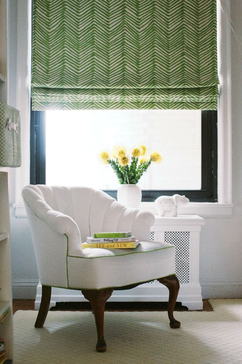
Notice the background of the roman shade is cream along with the carpet but the trim, walls and chair is WHITE. Image via pinterest
So the renovation that I mentioned here is starting next week, hooray! Habitat for Humanity is coming to remove all the espresso cabinets in the kitchen and bathrooms and install them somewhere else. So everything is moving along and that’s great right?
For the kitchen cabinets I chose a true white to go along with the honed Absolute Black Granite countertops and after the cabinet maker had his paint colours, I started sourcing fabrics.
Everything went just swimmingly (I’m soooo excited about the palette we’ve chosen), until I tried to find a roman shade for the kitchen windows in a pattern with a white background. I was surprised how hard it was to find a fabric with a plain, true white background.
In fact, the majority of the designer fabrics I flipped through have an off-white or cream background.
When I conducted a poll with my True Colour Experts on our private forum, one said she’d even complained to the fabric companies about the lack of patterned fabrics with white.
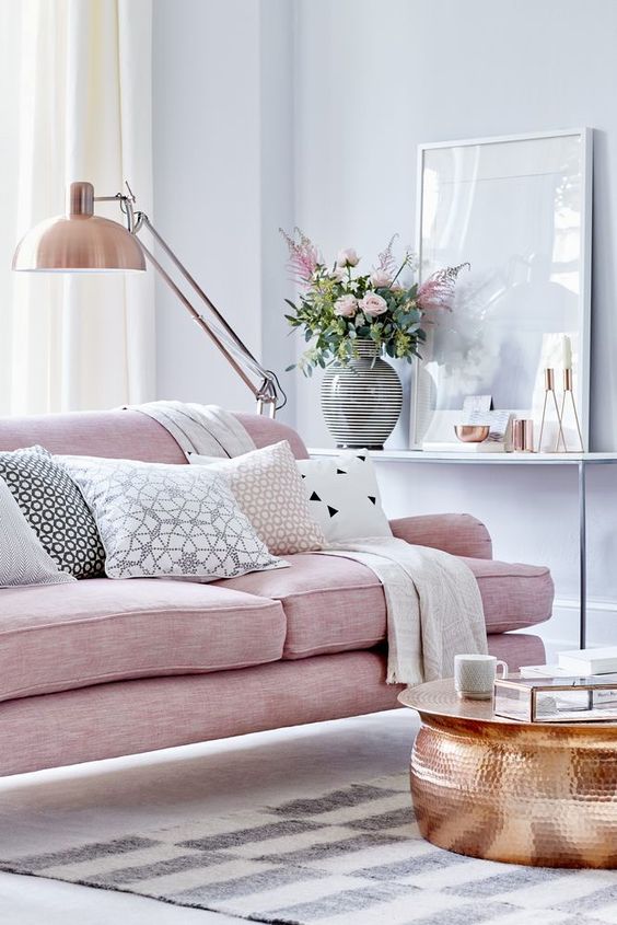
Notice that the drapes and carpet are cream and the pillows on the sofa are a true white, however the white is repeated. Image from House Beautiful UK
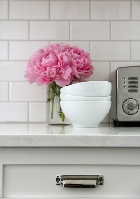
The same thing happened when I went shopping for white tile for my bathroom renovations.
Since I am not a renovator, you’ll rarely find me in a tile store so I was really surprised at how little white there was to be found. White tile is in a corner somewhere out of sight, you almost have to ask where it is. Everything is grey, taupe, beige, earthy, busy, blotchy, mid tone or dark. And I went to seven stores, in one day.
Which, by the way, is easy to do when you know exactly what you’re looking for. Designers don’t generally spend a long time browsing and waffling when we shop. We walk in, scan the showroom or store, and if we don’t see what we’re looking for. . . we’re gone.
Anyway, I have suddenly developed huge empathy for all of you with bathrooms or kitchen floors out there that ended up in tile that you just don’t love anymore, never loved even when you chose it, or bathrooms you inherited and can’t wait to rip out.
Last year in the Spring when I was in Chicago at the Harrington College of Design leading one of my Specify Colour with Confidence™ events, I went to the sample room to gather tiles, carpets and fabrics for my in-class exercises.
How much plain white (or even cream) tile do you think I found?
ZERO. ZIP. ZILCH (is that even a word?)
I realized that it’s no wonder designers leave design school and think that they should be able to coordinate one pattern after another with tile (you can’t) and get the neutral undertones right (almost impossible).
The problem with design school samples is that they are discontinued. That clearly doesn’t happen with plain white tile which is why it doesn’t end up in design school sample rooms.
Take perfectly benign looking beige tile, install it in your hallway with natural light and then also in the adjoining powder room without natural light, and suddenly in there, it’s pink beige (or a colour you were not expecting). And now, you’re cranky.
However, given the teeny, tiny amount of plain white tile out there, I suddenly get it.
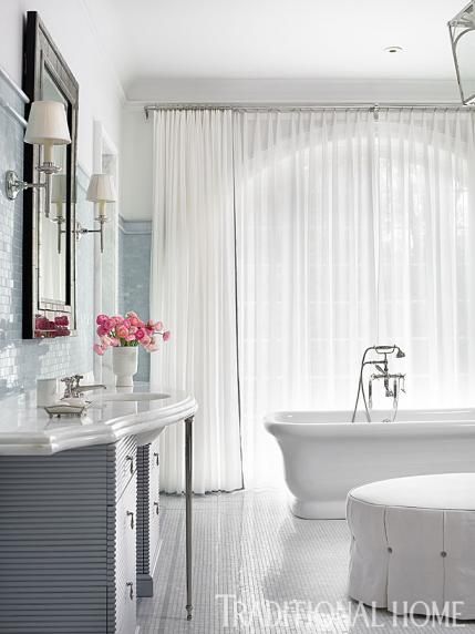
via Pinterest
So my lovelies, if you are having this problem and are driving yourself crazy here is my best advice:
If you have trouble finding plain white fabrics and you still end up with some off-white or cream choices, repeat them in the space. As long as you repeat them both, it’ll still work.
Choose off-white unless your fixed whites dictate that you must go whiter.
Your bathroom is like an island, it’s totally fine if your house has off-white or cream trim but your bathrooms are white, or your house has white trim/cabinets but your bathrooms are cream.
If all else fails and you feel like you’ve done something wrong, distract the eye with styling. There are many colour mistakes made by big name, celebrity designers, every single day that you really don’t notice because the room has been so well decorated.
I recently received an email from a long time reader Sondra who said that she once heard this quote from a celebrity designer from New York:
“When you find a colour that is off, just repeat it somewhere quietly and then it goes away. No one will notice it. Looks as if it was on purpose”.
Wise words for the decorator in all of us.
In my Specify Colour with Confidence™ 3-day course I talk about this a lot. The magic of styling and how it covers up multitudes of colour mistakes. We also spend a lot of time on the 4 gradations of white, in addition to the other 9 neutral undertones that cause the most angst.
Over to you, have you had this experience with sourcing fabrics?
If you would like to transform the way you see colour, become a True Colour Expert.
Need help choosing the right white? My White is Complicated: A Decorators Guide to Choosing the Right White eBook will help you get your whites right for your cabinets, trim, ceilings, and walls. This eBook also includes my Bonus book of Whites which will take the guesswork out of your decisions.
You’ll need them both if you have an entire house of whites and neutrals/colours to choose, get them here.
Related posts:


Hi Maria –
I might get the chance to change my kitchen back splash and cabinet color. All of the trim in my house is cream, not my favorite cream! I want the cabinets to be a different off-white color. Does this mean I need to paint the rest of the trim in my house that is in an eye shot of the cabinetry?
I argued with my contractor and the tile installer about the subway tile for my kitchen backsplash. They told me they “always use this off-white with Carrara marble.” Finally they suggested I go find what I want. I went to Floor and Decor and within five minutes found a pure white tile (At a much lower price!) After it was installed, they admitted that it worked better.
it’s true. i learned in my art program that the best way to “kill” a color that you see standing out because it’s not relating to the rest of the painting is to repeat the color. same applies to “composition” in a room. 🙂
Hi Maria – I missed the Dallas course when I was there on a work project unfortunately… Will you be in Chicago with a course anytime soon. I live in Michigan
Kathleen
Maria, you wrote this post for me didn’t you? My main furniture pieces are true white & finding fabrics for pillows & drapes with white backgrounds has been nearly impossible. That’s why I have a huge box of fabric samples. I keep ordering them hoping the backgrounds will be white. Even though you say it’s ok as long as the off-white gets repeated, it would still drive me nuts that they didn’t match.
Love the advice about repeating quietly. I am sure I will be quoting THAT.
Other great advice I read was, if colors (palette) are off, you can solve by adding another color that pulls all together.
After reading this, I have noticed again and again, how disparate colors end up working together, due to one (genius in my mind) color that made everything click.
Similar framework.
And yes, I notice (now) so many times when ‘big name’ designers get the colors ‘wrong’. Never noticed before reading your blog. LOL But you are right, excellent design helps. A lot to learn from those vignettes.
Anxiously awaiting to see your bathroom reno!
I wonder if companies have few white choices because those are likely more expensive to produce…I know when I was looking the Floor and Decor “white” was too gray a tint for white cabinets we wanted…We went with DalTile (not especially $$) which offered three different whites–not all in same sizes/style lines.
Since whites offer as many shade tones as any other color, it is very frustrating to only see 1 choice which you have to compare with your other samples…meaning you have to go more places and acquire more samples…
Maria i probably dont need to tell you how eagerly i’m waiting for the Before and After pics from your reno!! Best wishes, S.
Timely post, Maria. I’m not at the point of doing my small kitchen reno yet and a backsplash is way down the road but I intend to paint my oak cabinets white and I have white appliances but my palette is otherwise cream. So choice of white for the cabinets is critical. Got an idea a couple of weeks ago – planning to remove the cabinet over the dishwasher and the doors are off. Previous owners used Dunn Edwards Swiss Coffee for trim in the rooms where they repainted including kitchen – only have trim around patio door and 2 entrance doors – so thinking I might try painting those loose cabinets doors in the same trim color which I like and move them around. Thinking if it worked, then I’m only dealing with two whites instead of adding a third (not going to worry about the backsplash now – I’ll reread this post then).
I also found the Floor & Decor white tiles to be too gray for my white cabinets. I’m using Allen and Roth subway tiles from Lowe’s, which are the closest I’ve found to a pure white (at least at the low end of the cost spectrum). My guess is that the dearth of pure white is related to the recent dominance of the brown trend, and that pure white will be increasingly common as the gray trend grows.
Hi Maria, I have found – granted not many – but some patterned fabrics w a white background at Farbricana locally; u may want to check there if u haven’t already for the Roman blind
Great post and so true Maria. Excellent advice. I noticed this issue when I was trying to find a patterned drapery fabric that had pure white. The key is repeating it!
Maria, I have to laugh at you because we all go through this – most frustrating! I have come to believe that as designers we get a little too picky trying to make everything perfect. An untrained eye only sees how it is accessorized. You have taught us so much however that now we are even more aware. I do think that you are right about repeating the wrong shade elsewhere & after awhile we don’t even notice.
Love all of your posts.
I lived in Germany for a long time and bright white is the basic paint color you get in the store. Most paint sold there isn’t tinted and you or the painter you hire, tint it yourself with a narrow range of colors sold to mix in. Adding a bit of burnt umber to the white is also popular to make a sort of antique white/pale beige.
Paint in the US was like this for a long time too, although ready-mixed paints were invented in the US in the 1870s. Now we go crazy looking through hundreds of color chips. Mixing your own does insure having the ideal color harmony, and I have often done this myself with marked down paint.
There are some pre-mixed colors and specialty paints in Germany, but they tend to come in small quantities or are quite expensive. Lace curtains are common and usually in white or off white. Ready-made curtains and fabrics and such tend to go with this basic limited paint palette. Of course you do see quite a lot of mixing of dirty and clean colors, but somehow it usually works because the palette is limited and the tones are repeated.
In the US, we have so much more choice, but lots of difficulty in matching colors and finishes. I didn’t realize finding white background fabrics was so difficult. If you are looking for a fabric or curtains with a white background, try IKEA and maybe Marimekko (SP?) (which has some items for Target,) The selection is limited, but white (and brights) run through a good deal of what they have. perhaps in part due to the abundance of white in contemporary European interiors.
There seems to be a great inconsistency in the design world. Maria, you can’t find true white tiles while all I could find in pillows was true white; no off-white. A white background in pillows makes an off-white sofa look dirty and anything in the beige family was definitely not an option for my room.
Fabric and tile designers need to get together and coordinate.
Pental carries subway tile in artic white that is a true white. I used it in a bath reno recently. Kohler tubs however are NOT a true white so keep that in mind when tiling around a Kohler tub.
I love this post! I believe you gave us all a much needed peace about our design decisions lol
Maria I found your blogs too late. I made a big mistake with the granite choice for our basement bar. We put in espresso cabinets but my husband wanted a dark counter and I wanted light. After about a year of discussion I finally gave in to his request for the dark counter. We have a walk out basement so it is not dark like a typical basement. I’m in the process of figuring out what backsplash I should use. Floors are a biege tile with a pink undertone and counter has brown, black with some white and grey flecks. I had a lady from tile store help me find grey glass tile but the grey in the granite does not really stand out so I’m not sure if this is the right colour to use. I asked her if I should put a white or creamy tile and she said no. What direction do I go to….biege, white or grey. Will white or off white be too stark with the dark choices? By the way great information you provide to us.
Do a beige tile so that it will read cream with all the dark. And repeat cream in the kitchen. Otherwise it’ll just be debilitating. Maria
Tks Maria. I will keep looking and hopefully I can find either glass or subway tile.
Just the answer to my question before I asked it. The blinds in my house are dark wood because the designer it needed to have them to warm the house up. My bathroom is white. I want to add something to cover a large window that is made with a material that is coated for privacy. A dark blind or shade in there did not seem right. Are you saying that a white one will be okay?
Absolutely, your bathroom is like an island. Maria
Same problem with area rugs. They say white and then when I get the samples home they look cream with a heavy yellow undertone. Problem is my fabrics have a slight pink undertone. This has rendered me paralyzed for the last two years with regards to getting an area rug for my family room. I do not want to add in other yellow toned stuff. It just looks so dirty and muddy and yuk. What to do, what to do. At least my wood floors are amazing to look at, furniture is always sliding around though.
Re the issue of area rugs; totally agree as most are cream and NOT white! -Brenda-
Thanks.
Premier Prints is an inexpensive fabric line which offers many patterns with a white background
https://www.premierprintsinc.com/
Hi Maria – I just wanted to congratulate you in growing your business. I know you will find two amazing new assistants – and the Killam name will be even bigger.
You go girl!
American Olean has white tile – basic subway in 3×6 and some pretty accent tiles. ROCA has a great white tile in 4×10 and 6×9 – it’s a true white as well.
hello , i live in Europe , in Croatia, Zagreb 🙂 and i recently shopped for tiles for my kitchen, i wanted to choose something different 🙂 and there were only white tiles, in all variations 🙂 i was thinking omg how non creative lol, so i ended with pattern tile, called white cubic from porcelanosa company, its cold white, like the coldest white you have, with blue undertone, i did not notice that in a shop, only when i put them on a wall, i noticed omg they are not white 🙂 but i think will match nicely with true white, the countertop is of the same marble white colour so will go nice with tile……in the end i could not make a mistake cause in our shops you can only choose white or wait 30 days to order any other pattern lol
just to add i could have chosen plain white, but it was without any pattern, the tile i chose is this:
https://www.pinterest.com/pin/145030050477693799/
https://www.pinterest.com/pin/522487994247848166/
in my kitchen they look blue white
and there were plenty of those small how you call subway white tiles 🙂 i was thinking how old fashined haha, although they looked nice in a bathroom they installed….my tiles are huge like 1mx30cm….so there is not much of this space between tiles that goes dirty….after years
actually i am not sure if i am completely out of the bush becasue if my cabinets wont be white as my walls are….but some other white it may look like this:
https://www.pinterest.com/pin/299559812686354762/
i dont like the look fo this kitchen, cabinets look like sick white 🙂
i chose RAL 9003 its signal white, the whitest possible white , thats the range we have in europe i dont have access to that colour range you always mention….
i learnt a lot by this blog, but when you start insisting on something things happen the opposite 🙂 before coming to this blog i noticed my old tiles were pinky beige, i called them pink, and all my friends said its beige…..and i was thinking like omg i am colour blind, i see pink where people see beige 🙂 this blog opened up my eyes hehe…..i was searching all the sops to find that cheap beige tiles, and all i could find was white 🙂 and so i ripped them off and bought that cubic white pattern
happy easter
“In fact, the majority of the designer fabrics that I flipped through have an off-white or cream background”. So true Maria but be thankful you are not looking for yellow as choices are few and far between and have been for years. Looking forward to the reveal of Crystal’s new kitchen. -Brenda-
Speaking of white … my windows should be white. But they are brown. Like putty. Vinyl. Can’t paint them. I was going to do a classic white kitchen with carrera marble or similar quartz counters and provincial stained wood floors. A fancy schmancy local designer that I consulted with said I can’t have that kind of white kitchen due to the Windows.there is a window over the sink and a bay window in the eat in area. Galley kitchen. She advised to do a grey Quartz counter and calcatta gold marble subway tile. What do you think? And what the heck kind of window treatments do I use? Feeling brown and out in Virginia …