


This timeless kitchen update project from one of our eDesign clients is impressive. With the right colour choices and some attention to detail, she created a custom-looking kitchen even while keeping her existing cabinets and travertine floors.
Woot! Today I am excited to share yet another beautiful eDesign project before and after with you!
My lovely client used our Create a Classic Kitchen eDesign package to refresh her tired, glazed kitchen. It had great bones and existing high-quality inset cabinets. But with a few tweaks and the right colours and finishes, it now looks completely timeless!
Please note, these are not professionally taken photographs, so editing makes the colour appear somewhat blown out.
Choosing a cabinet colour
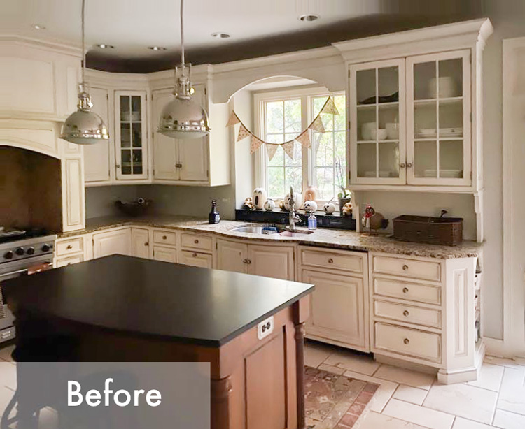
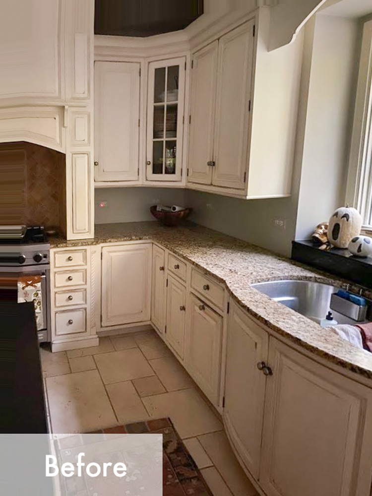
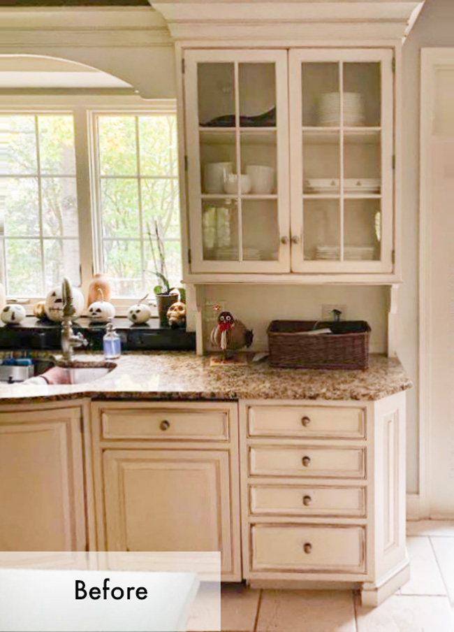
Glazed cabinets really do make an otherwise pretty cream kitchen look dated and tired. If her existing cabinets (below) were solid cream instead of glazed, my hunch is that she wouldn’t have been in as much of a hurry to repaint them.
She has great taste and shared some lovely inspiration for her kitchen. She wondered if her cabinets should be a fresher, solid cream colour or something deep and dramatic like green or taupe.
Since trends are warming up, we have received this request often in my eDesign department. My clients are looking for taupe or warm grey (mushroom), or a bold colour for their cabinets. Do I think they are timeless? Absolutely! As long as you choose a colour you will be happy to decorate with until you repaint.
Read more: Do this before you choose a cabinet colour!
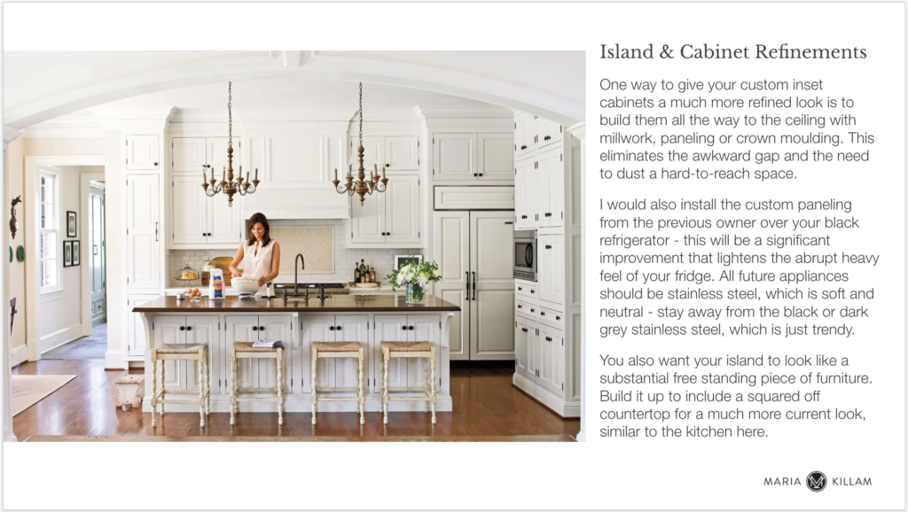
While the right cream would have been a perfectly good choice for this kitchen, I thought a high contrast dramatic colour would make her pink beige travertine floors and finishes look the freshest. Plus it would be a more novel change for her efforts and create a custom kitchen look full of character. I’m so happy she went with the bold option!
The timeless kitchen reveal!
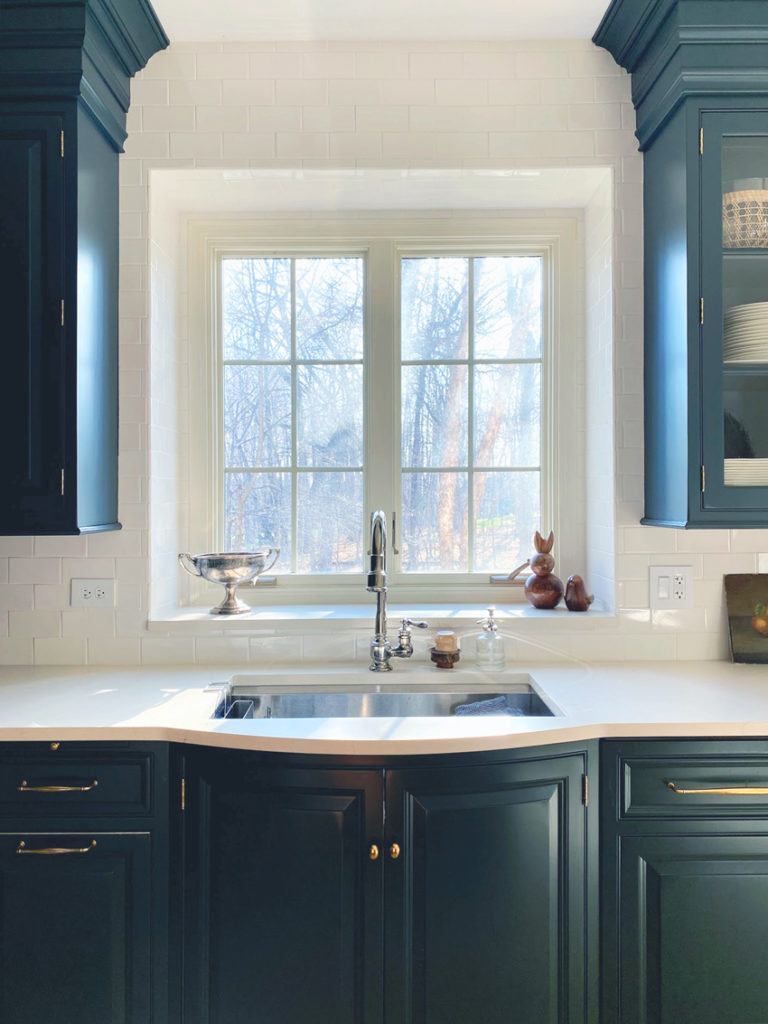
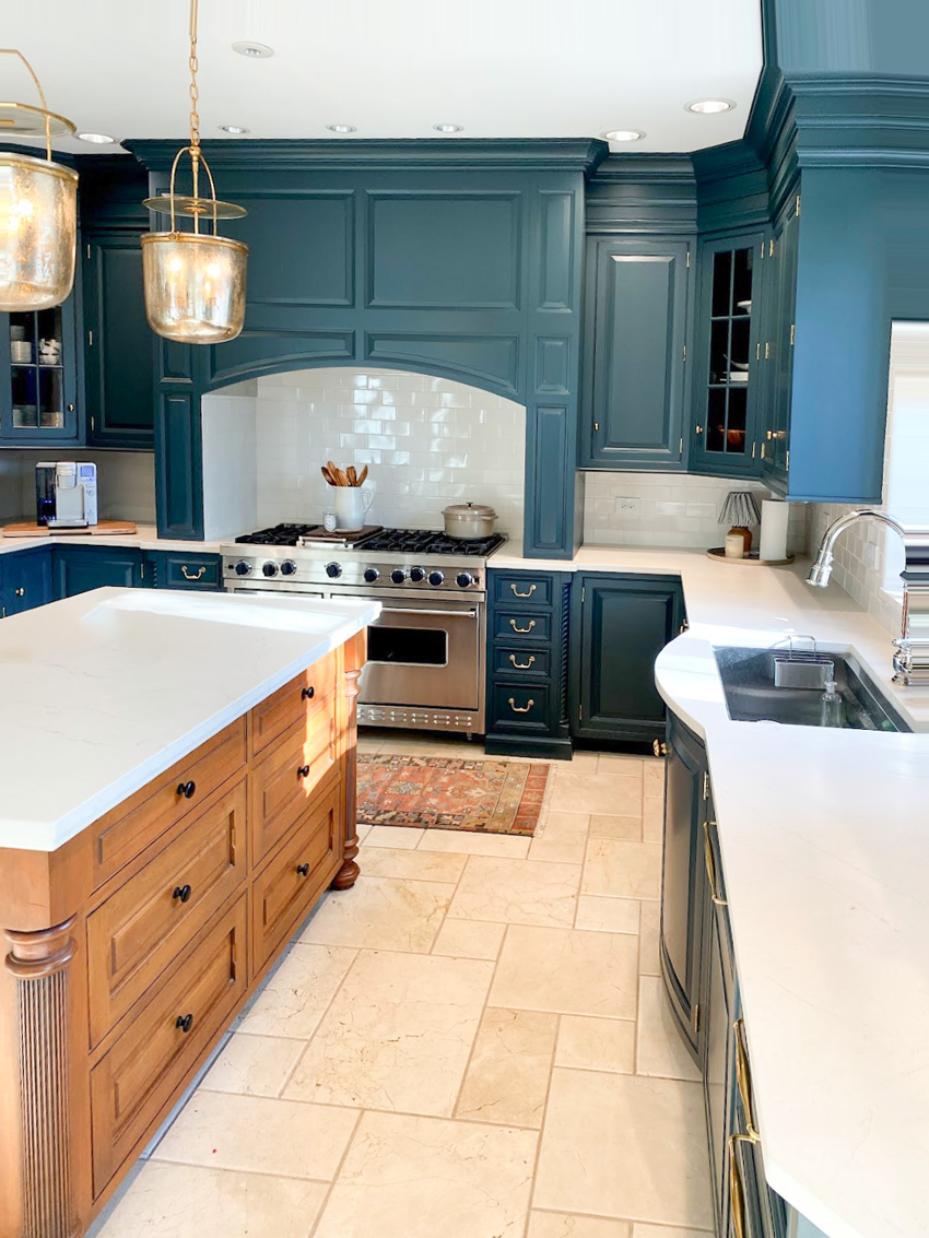
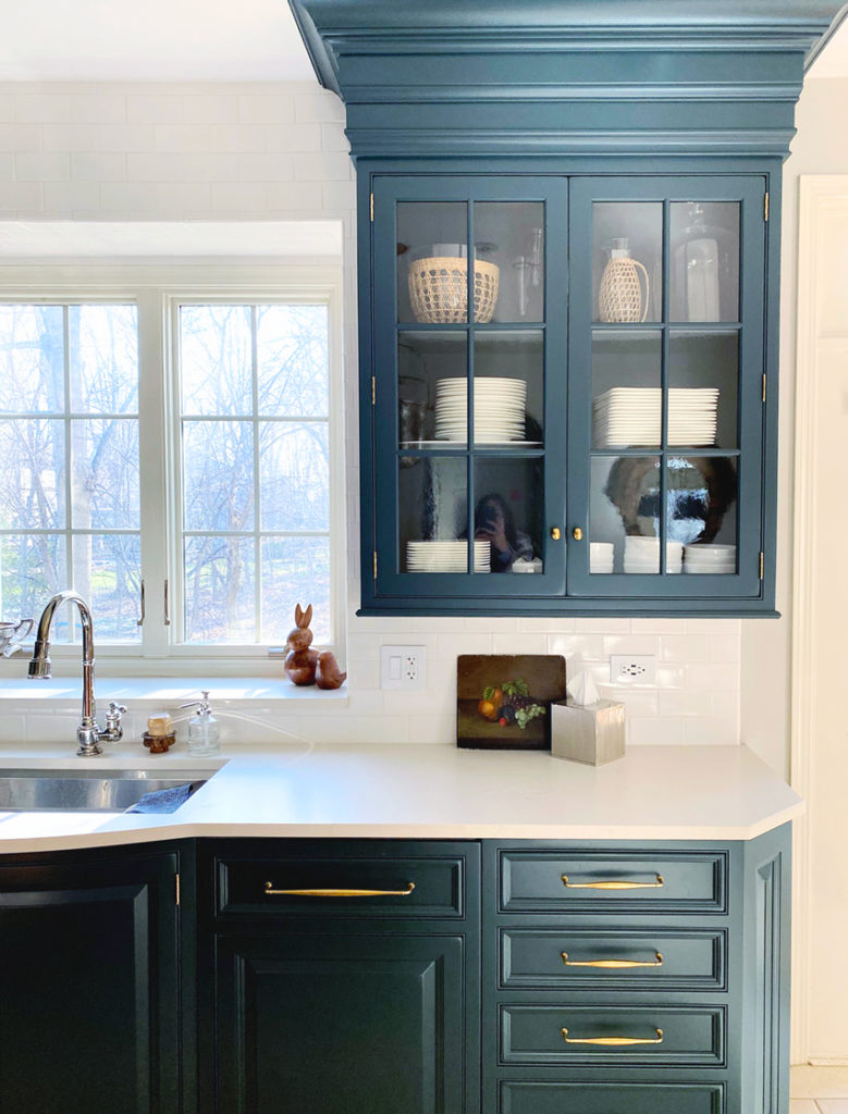
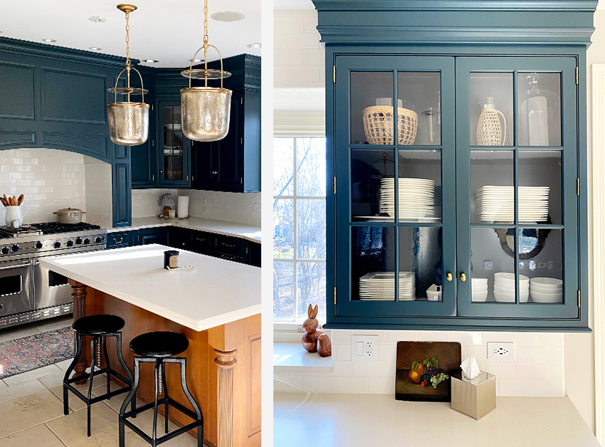
Below is her completely refreshed kitchen! The cabinets are painted a muted deep green with a hint of teal, BM Narragansett Green HC-157.
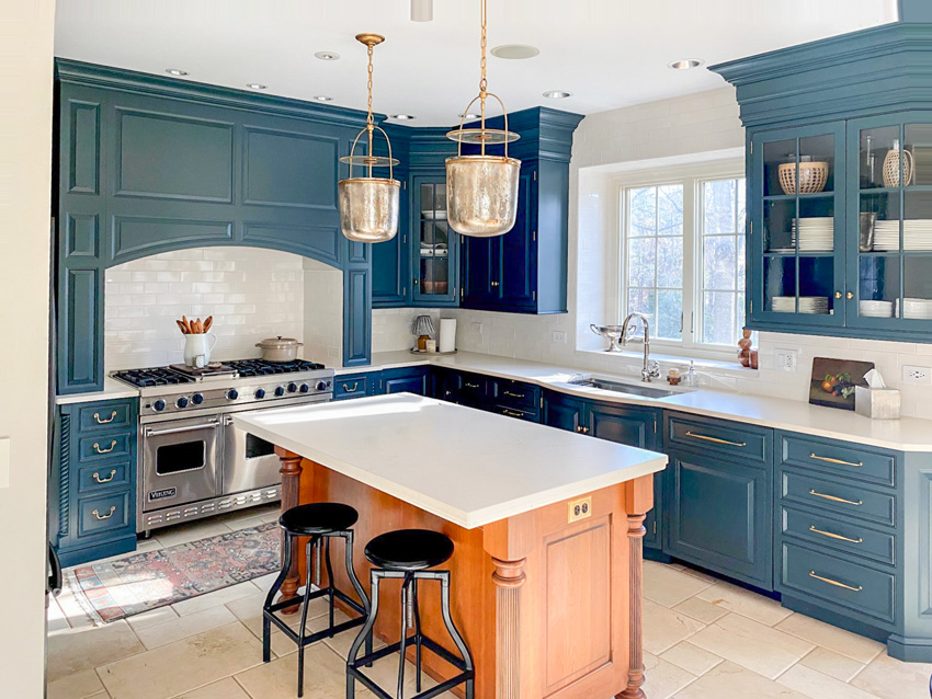
Kitchen after, Cabinets: BM Narragansett Green HC-157
I might have also painted the island, but the warm wood tone relates beautifully to her cognac leather sectional in the attached great room.
WATCH: How to choose a cabinet colour
Choosing a countertop to coordinate with tile floors
See how crisp and pretty her creamy solid quartz countertops look (above) with coordinating cream subway tile? Pssst: the countertops are a pink beige quartz to match the travertine floors.
And matching your countertops to the floor, if you have tile is key.
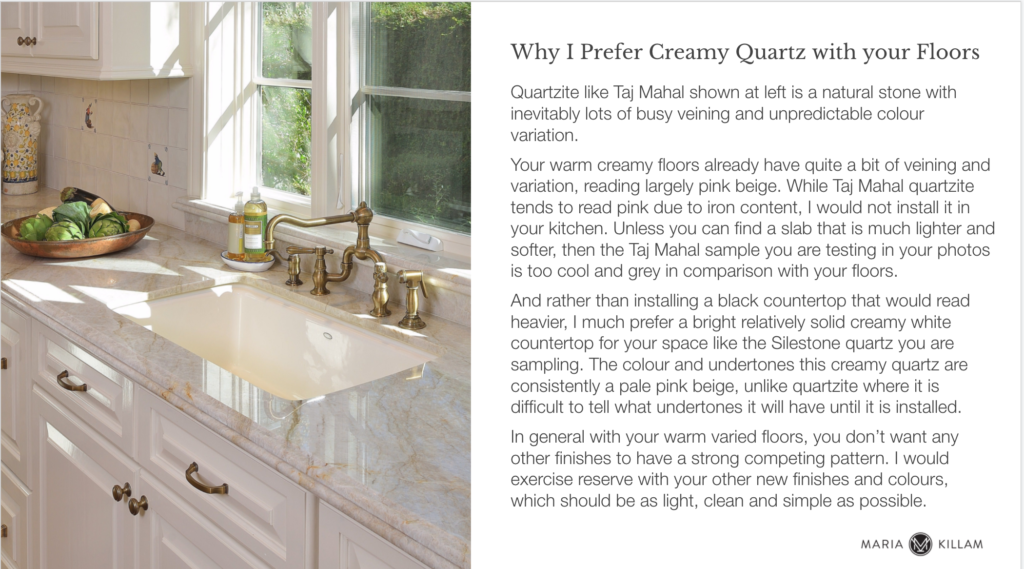
We see clients trying to force white marble look quartz into earthier cream and travertine kitchens all the time. And I always advise them that they need a creamier countertop that relates to their floors. It’s interesting how throughout the grey trend, anything cream or beige and anything with a hint of yellow or warmth, was often assumed to be not as current as white.
I’m here to tell you that this is absolutely not true. Cream, complex creams and pale beiges have always been fresh and classic.
A white marble-look quartz would not only compete with the pattern in the travertine floor here, but it would also be much too cool and stark for this colour palette.
My client wanted to update her busy granite countertops and she had a strong preference for natural stone. To her credit, she was already looking for warmer tones to flatter her pink beige floors.
As I mentioned, it’s important if you have a stone or tile floor in your kitchen, as opposed to wood, your countertops MUST relate perfectly to the floor.
The right way to test countertop samples
Do you know how to test countertop and floor combinations effectively? You place the countertop sample on white paper on top of the tile as she did below.
She tested various natural quartzite options including one pale pink beige quartz (top left).
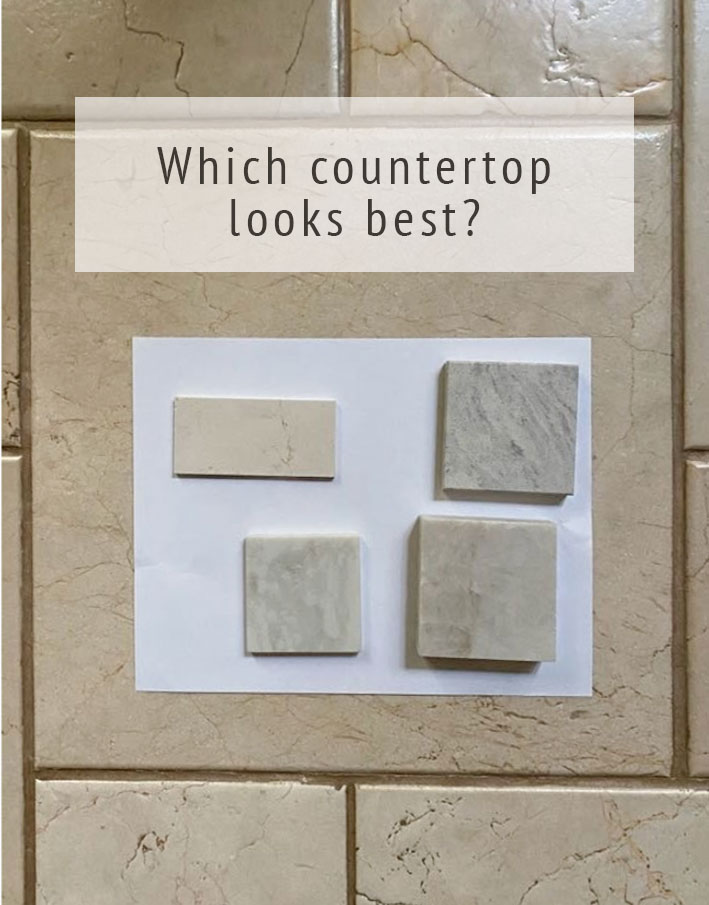
The right way to test countertops
Why I don’t recommend natural stone countertops
I urged her to overlook her preference for natural stone in favour of what will look best and most consistent overall. And that happened to be the top left solid creamy and pale pink beige quartz. While the natural quartzite options have some pink beige splotches and veins, the overall read is too grey. The pattern on these countertops was also busier and wouldn’t pair well with the travertine floor, which already has its own pattern.
Honestly, I most often steer my eDesign clients away from natural stone (the only exception is marble when it is the right choice).
It’s impossible to predict how natural stone will look once you install a slab flat onto your cabinets – especially if you only viewed it when it was stacked vertically next to other slabs in the stone yard. More often than not, natural stone countertops look much different inside your home than what you expected.
Read more: How to work with your dated granite countertops – the ultimate guide
Your countertop makes up such a large surface in your kitchen. And, since the goal is to have all your elements relate beautifully it is not something I am particularly keen to gamble on. Besides, in the end, natural stone countertops are often too busy and varied in colour to relate well together.
Here is part of the countertop advice she received in her presentation (below).
If you’ve read this and now want help choosing a countertop, please note I can’t help you with just one hard finish. And here’s why.
Is Travertine coming back?
By the way, did you know that travertine is trending again? Travertine tile and accent furniture in updated shapes is all the rage again (if you can even get it, it’s often on backorder).
And what’s the undertone of most travertine? Pink Beige. And that’s ok, as long as you know how to work with it because it is the most limiting neutral undertone.
The easiest way to know if something is trending is when you see it being used in accessories and coffee tables (below):
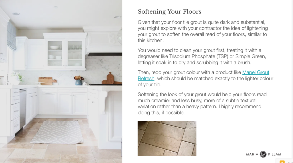
My client’s floors are a high-end real stone in a pretty, irregular cut. It gives her kitchen the old world charm that many people are looking for now in their kitchens. However, the dark grout looked busy and made the floor look slightly dated.
Often it’s the smallest tweaks that make all the difference. I recommended she simply paint her grout a pale cream. It’s a painstaking job, but the payoff is huge, it looks like a fresh new floor!
The magic is in the details
Can you spot the other refinement she made to her cabinets below?
Did you guess it? Originally, she had a gap between the upper cabinets and the ceiling. Boxing in the gap with millwork creates a high-end custom look that never needs to be dusted. Yay!
Here are more examples of my favourite designer secret for updating old cabinets.
So, before you simply decide to paint your existing cabinets, consider additional details (like that gap above the cabinets) for a truly custom look. Let’s admire this stunning before and after again shall we?
And the after!
Congratulations to my client on a job well done! The secret to renovation happiness is to get BOTH the colour and the details just right!
If you would like help refreshing or planning your kitchen, you can find my Create a Classic Kitchen package here. Please note stock on my eDesign packages is limited and they sell out often!
PS. I was recently published in a local car magazine where I’m talking about the black trend:

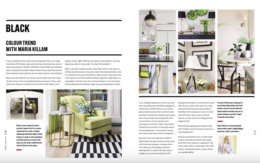
You can also read it in the digital version here.
Related posts:
Is your Cabinet Maker Still Selling Glazed Cabinets?

This is beautiful! Narragansett green is the same colour we used for our Exterior of our home!
I did Narragansett Green on the front exterior of my home and office as well and love it. I get so many compliments!
Gorgeous paint choice in the kitchen! Love the fresh, new feel with clean countertops. Can’t help wishing the cab color was repeated more noticeably in the rug AND that the counter stools were something other than black. They don’t feel right for this lovely room. In addition, Maria’s staging gifts on countertops and inside the glass-fronted cabs are sorely needed. But great job, otherwise!
Unbelievable transformation! Wow! Congrats Maria!! Simply amazing!!!
Those cabinets are absolutely stunning! The handle, pull and knob combo is the icing on the cake. For some reason, older cabinets painted a colour ALWAYS look better to me than those painted white or even cream. Your client must be absolutely thrilled and I thank you for providing all the great tips.
So happy to see a beautiful kitchen refreshed without throwing everything out. And yay to the client for keeping her travertine floors…so lovely. This is a great example of a green kitchen, simply from sending so little to the landfill. Play that up!
That is the most interesting car magazine I have ever seen…great job on your article.
Beautiful fresh color cabinets, but looks blue rather than green and countertops and backsplash look white rather than cream on all my devices.
That aid, I do love them together, but the island is a total miss for me. It’s very pretty, but I don’t think it coordinates with the cabinet color and the countertop looks too modern for it, almost plastic. I I think it would be more attractive if painted same as cabinets and had same hardware.
Again maybe my monitors, but love the pics that don’t show the island or floor.
I’m curious if the subway tile is a cool white, off white, or a cream? It’s a really beautiful remodel–if you can even call it that because the cabinets and floors were kept.
Stunning transformation! I’m sure the homeowner is deliriously happy with all these lovely updates. The travertine floor is really beautiful now with the lightened grout and the quartz countertop relates to it so well. One of my favorite things done is the removal of the arch over the kitchen sink and the extension of the cabinets to the ceiling. Well done!
Wow! Beautiful updates. Love the bold
colour choice. Now you’ve got me itching to refresh my kitchen.
Beautiful transformation. I love this traditional style of cabinet and think they look classic, not dated. Nothing wrong with Shaker style or slab doors, but I think this style is a great alternative. Your post is full of interesting, educational information, Maria – thank you. I always love learning from you.
Stunning!
Was so happy to read your reiteration of “color is timeless” advice. We chose a lovey green for our new kitchen. And even though green is a trendy kitchen color right now, it is my favorite color and I can be happy decorating with it for many years to come. ☺️ What a beautiful update to this space.
This refresh is gorgeous! Love that color. Kudos to Maria for her advice and to the client for the execution. I love these before and after posts! So inspirational. I have busy granite in my kitchen, along with travertine floors and bossy stone on our ginormous crescent shaped bar/island (kind of hard to describe). I would love to refresh my kitchen, but probably never will, because of the cost. So I just do my best with decorating and count myself lucky to have a lot of space in my kitchen. But it sure is fun to dream, isn’t it?! 🙂
Love the cabinet color, looks fresh! What I do not love is the island that was not painted for some strange reason. It totally ruins the new vibe. Then again: I’m European and would have preferred a kitchen with no island at all. After 24 years in the US, I still find it absolutely puzzling how Americans are so obsessed with kitchen islands. It’s a complete mystery to me.
Yes, I grew up with the kitchen dining area right in the middle of the kitchen and when I went to Finland two years ago that’s what everyone there had, I wrote about that here: https://mariakillam.com/scandinavian-eat-in-kitchen/
Thanks for your comment, Maria
Gorgeous transformation. Love the dramatic cabinets, the new pendant lighting and the brass hardware. Well done!
This is refreshing!
I just learned that Quartzite, beautiful as it can be, is prone to water stains. There are photos that Quartzite owners have posted online.
That would be really frustrating.
Yes quartz is better all around and especially for that reason. Maria
Hi, Maria,
I am hoping you may remember the name of the quartz countertop you used in this remodel. I think you mention Silestone but not the color. I have old travertine flooring in a small bathroom and have replaced the old formica vanity with a new simple, white, shaker-style vanity but the quartz remnants I am finding are all either too white or too gray. Is there a “warm” white quartz you can suggest? Thank you a million times over for any advice you can spare!!!
I second this question, Maria! Thank you for all the invaluable help you have lent me these last 5years.
HI Maria, I also wanted to know the name of the quartz? Thank you!
Really beautiful cabinet color! Love all the upgrades including the new pendant lights to relate to the brass cabinet hardware. Just my 2 cents, but I would definitely paint the island to match.
This looks just like Kristi’s kitchen. (The only other decorating blog I read).
Did she paint the cabinets herself or send them out to be sprayed?
I have done both my bathrooms myself with a pretty good result. However, in my kitchen I want an absolutely perfect result so am thinking of sending them out to be sprayed.
Kristi sprays them herself. She has also done the grout thing, good idea.
The follower who said it needs Maria’s decorating skills nailed it. Right now the island looks like it was forgotten. Maybe repeating that island and cabinet colors in other decor would pull it all together.
What is the name of the Quartz she used in the remodel? I’d love a good reference for one that goes with pink-beige tile.
Check out the Silestone quartz pattern “Eternal Marfil” which has a pink undertone and subtle but lovely veining.
I am a cabinet painter in the Chicagoland area. I have followed Maria for many years as I help clients select color for cabinets and furniture on a daily basis. I did not know that Maria was the interior designer on this job until reading this post but I knew that it was someone good. In fact I had to look twice to realize that my business partner and I painted this kitchen. The color of this kitchen is spectacular and the island is much larger in real life and does tie in beautifully with the adjacent eating area and family room. So glad to have an opportunity to work with you Maria even though we didn’t know it!
Beautiful renovation, and I am also delighted like other commenters that relatively little was sent to a landfill. At least the granite is rock being returned to the earth. The grout painting is easily done by tile people or grout specialists, and is surprisingly inexpensive. We did that over a decade ago, and as long as you use a water-only steam mop for cleaning, it lasts a long time. Chemicals will pull up the paint.
My one contrarian thought is questioning the extension of the cabinets to the ceiling, depending on ceiling height. In our house with 10-foot ceilings, that’s just nuts. The extension would have to be an additional cabinet run (probably glassed doors), and nobody could reach them without a tall step ladder. I can’t even reach the top shelf of my taller existing cabinets with a 1-step booster. As a designer (though not an interior one), it seems part of what ultimately becomes “classic” as opposed to stylistic or trendy, must be what is practical. Good ideas are kept over time and become classic because they work. Routinely using a multi-step ladder in the kitchen is not practical.
Also, right now there’s a good space above my cabinets with a view of the white, substantial crown molding, and it makes the kitchen area look larger. Pulling in the ceiling width by extending the cabinets up would make the overall kitchen size look smaller, especially if painted a dark color. Good thing this client’s large kitchen can visually support the choices here! For a kitchen with shorter ceiling height, this may be a fine solution. For others, not so much.
ClaireSN, these are minimum 9.5 or 10 foot ceilings (easy way to “eyeball” ceiling height in a kitchen is that a freestanding range is usually a minimum of 36” high and you can “see” that you could easily stack 3 of the ranges on top of each other on the range wall with room to spare). And as an owner of cabinets that don’t go all the way to the ceiling, I would argue that it is far less practical to have cabinets you are forced to clean the tops of on a regular basis.
Lovely. Why is the exact quartz she used?
Meant “what” is name of quartz. 😊
Love your blog! May I ask a favor as to another blog please? For those of us with a kitchen with white cabinets and light gray quartz or quartzite counter tops, would you do a blog post as to how to make it look more current? (Adding cognac, light wood or gold tone something to warm it up perhaps?). I sure would appreciate it.
I was hoping to learn the name of the Silestone quartz used in this project?
Love the rug in front of the stove…can you post link?
The problem with finding countertops for travertine floor kitchens, is that most of the pretty counters are white & marble lookalikes.
Great job Maria…four years later, and still a desirable look! Extending cabs to ceiling put the icing on the cake : )
In my opinion the dark blue cabinets will look boring in about 3 or 4 years. I personally like a natural wood or creamy colored cabinets. Timeless. Not trendy! The island looks very mismatched with the rest of the kitchen. Even if there is a sofa in an adjoining room to me it looks off. I know that I am not making all the comments like the others saying how beautiful the dark colors are but they will start to look old after a while and out dated. I go back to what I said originally, this is “trendy” not timeless. It is very expensive to paint cabinets every 4 or 5 years. Of course my personal opinion. I will always stay with white (which mine are) or creamy or natural wood cabinets.
Excellent post, so full of information!
Would you please tell me if you would use travertine tile in light color with natural oak cabinets and Taj Mahal counters for a new country French kitchen vibe ? Would love the old world look, thank you so much 😊