
After launching my brand new ‘Made with Real Paint’ Understanding Undertones three weeks ago, I have received some questions that were so basic and obvious that I realized the two videos I had created to explain how it worked, still didn’t fully explain the fundamentals.
In the meantime, this was such a fun testimonial that I received from one of my True Colour Experts:
“I am plunking down your color wheel against the carpets and other selections and it’s light a chorus sang out from heaven — Alleluia! I said, wow, that’s orange beige, and then I looked in my manuscript, what color should I use with orange beige, and there goes, plunk, Navajo White, and there goes me sighing a massive sigh of relief and grinning a huge grin — whoa, it SO works!! No more me flipping through 18,000 paint chips.”
Here’s another one:
“Mine arrived and I ran around the house throwing it on tile, counters, rug, and standing back. You are right that most carpet is pink beige and even though I tried so hard no to get pink beige I think the new carpet on the stairs and upstairs is pink beige or taupe. No wonder my yellow beige paint looks weird with it. We need a new bed upstairs and I took my new beige colour wheel, in plastic because it was raining, to the bed store and chose a fabric for the headboard that would not clash with the carpet. (It was also the only choice that was not grey!) This tool is extremely helpful and fun. Thank you.”
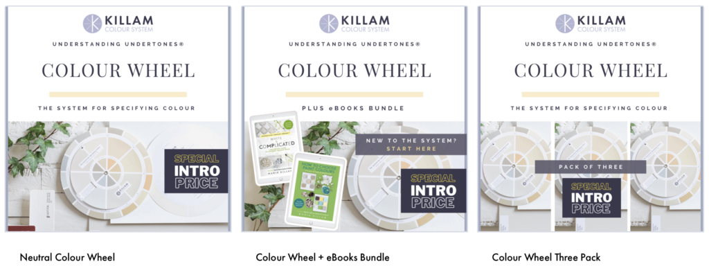
You can buy 1 or 3 of the wheels and if you have 3 of them, I recommend keeping one in the original packaging so that you don’t have to worry about it getting dirty when you’re using it in a building environment.
Or when you plunk it down on a countertop, sometimes you don’t notice that it’s dirty.
Kinda like when I was at Restoration Hardware last weekend:
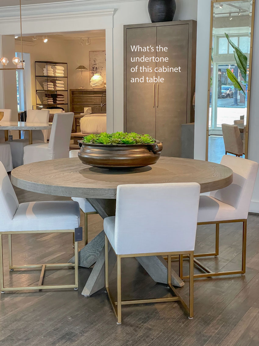
What do you think? Take a look. Keep in mind, it would be better if the artificial lighting was not shining on it.
Just like with my eDesign clients, we ask for images with all the lights turned off so we can get an accurate read of the undertones in the room.
S0 I took one look at this table and said it was taupe, and since taupe was the pink beige of the grey trend because it was cooler than all the beiges and warmer than the greys, well
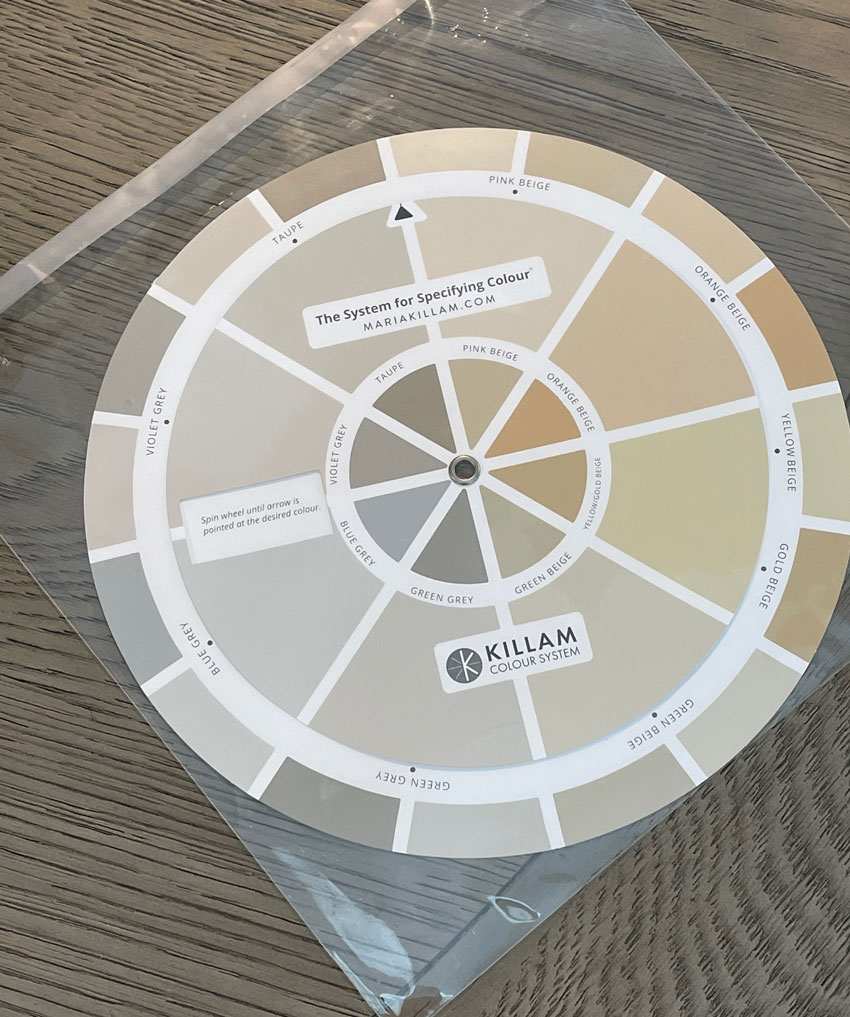
I had my wheel in plastic so I placed it on top of the dining table.
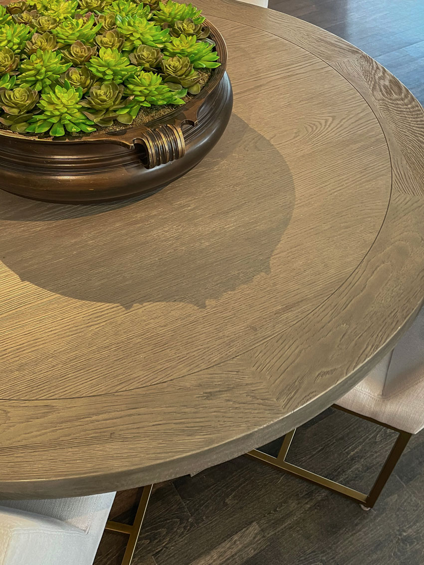
You can see that the taupe and the green grey (which often seem very similar) work with the table (below):
The final step would be to pull out my large colour boards from my curated system to determine if taupe or green grey worked the best.
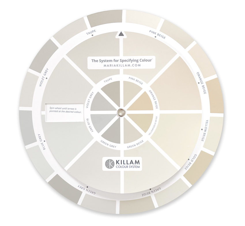
The four gradations of white are on the back of the wheel, in a second you can narrow down which world of whites you are in if you are choosing a trim, wall colour or cabinet colour:
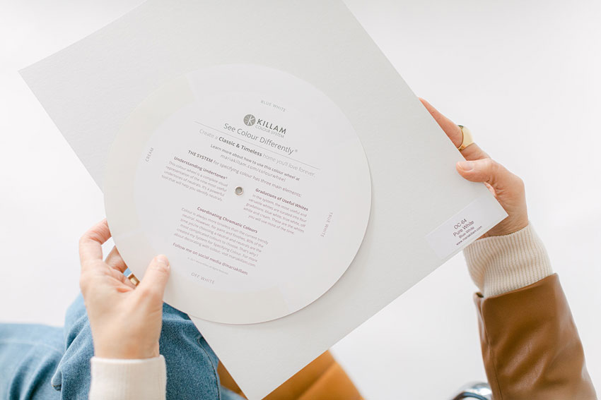
Here’s my latest video that explains the pieces and parts of the wheel:
Download the links to the paint chips here.
The introductory price ends tonight at midnight so if you’re going to choose a neutral at some point in the future, today you’ll get the wheel at the best price:
And if you miss it, it’s still totally worth it at regular price.
- How much money have you spent testing paint colours?
- If you end up with the wrong undertone, you could be bossed around by it forever
- Or it might be too expensive to replace
- How often are you out shopping and you wish you had a portable tool to reference the neutrals in your home
If you’re wondering what’s the difference between my old wheel and the new one?
Good question
The old wheel was PRINTED. Which means it wasn’t 100% accurate. To make it accurate, you needed to add the colour chips from my system.
This wheel is made with real paint. They are custom colours but the equivalents to Benjamin Moore, Sherwin Williams or Farrow & Ball can be found on the link on the landing page.
To get the complete list of my curated colours, you can find it in either of my ebooks here. Or, if you already know you’ll want the colour boards to go with the colour wheel, the wheel is free when you buy the boards here.
If you’d like to See Colour Differently® become a True Colour Expert® this Spring! My first virtual Specify Colour with Confidence workshop this Thursday and Friday is sold out but I have three more dates (including a weekend) see them here.
Related posts:
The New Understanding Undertones Colour Wheel is Here
The 9 Neutral Undertones in the World
What Makes a Neutral Room Timeless & Beautiful?


With sheer delight I used the wheel to learn that the undertone of my curtains is green grey and my sofa gold beige…and using the back of the wheel, I think it’s probably an off white I need….but still don’t know what actual paint to pick as living in England we don’t have Sherwin Williams or Benjamin Moore. I ve just seen in the blog that there might be a hallelujah moment…a link to Farrow and Ball? Please tell me where to find it because that will be a marriage saver! 😉 Jess UK
@Jessica, I love the new Colour Wheel, too! “Sheer delight” is exactly how I felt as well! To find the F&B colors, see Maria’s 02/03/2022 blog post. It includes a link to all the paint chips similar to those on the Wheel. Hope that helps!
The new Color Wheel sounds fantastic!
I’m wondering what kind of journey you went on to find someone who could actually paint the wheels!
That is a great question. We had no idea that was even a thing that we could do until a sales rep who worked for the company who makes all the fan decks saw the printed colour wheel on the site approached us with the idea! Maria
Thank-you for all the explanations on how to use the colour wheel! It is such a handy tool! I also went around my house identifying all the undertones! I think it does take a little practice to train the eye to see the varying tones and even though I have not bought the colour boards yet, I do see the need for them as the last step.
One inquiry I do have is I see you used the wheel to identify the undertone of a wooden table. I wasn’t sure you could use the wheel for identifying the undertone of wood as I tried with my new light oak wooden dining table and had trouble. Do you have any tips for identifying the undertones of wood furniture and flooring? I am in the process of figuring out which woods go together in redecorating my living/dining room space.
Oh no that was strictly a taupe table, I would generally not use it on wood, I’m glad you asked that question Maria
I have ordered the new undertones colour wheel and can’t wait for it to arrive.
I am wondering how to select the right paint colour as SW, BM and F&B paints are not available where I live in Australia. Maria, is there an alternative to your paint cards and books for us living down under?
There is not, however since the colour wheel is made with real paint, I would get samples made that match them, or you can use them to find ones in your paint system that match and then buy the samples that coordinate wit your system! Hope that helps, Maria
Thankyou for replying and for the advice.
This is a demining palette of colors that I successfully use at home 🙂
I live in Europe, read the books and the blogs and still dont get it. I am now able to tell the undertone, but what next? I bought floor tiles with green grey, but all I understood is, never use pink beige. Shall I do everything in green beige or green grey? Or everything but pink beige? I understand, why so many choose white.
Maria, I’d love a bit more explanation as well. I’ve also read the books, and I can clearly see the importance of undertones in the examples used. However, when do you deviate from the same undertone? If I get a taupe couch does that mean I should have taupe walls, taupe in the rug design, taupe lampshades, taupe curtains,, etc.? That example was a little extreme, but I guess my point is when and how do you decide to use color without having clashing undertones?
Just started playing around with the color wheel and this is fun and helpful. Thanks for making this tool! The video is also great and explains a lot. I think this will be very helpful for future painting and decorating projects and I’d recommend that all blog fans go for it and get one of these tools.