It seems our feeds are filled with gobs of pretty neutral rooms lately. But how do you replicate this neutral look on your own? If you want to create a pretty and timeless neutral room, you have to invest in some details. Let me break it down for you.
My Understanding Undertones® real painted colour wheel just launched and I’m so excited! No need to add paint chips to this new wheel. Just pull it out of the packaging and start using it right away!
Okay on to today’s post!
If you’ve spent any time with me here or on Instagram or TikTok, you probably know that I LOVE decorating with COLOUR.
You will have heard me say that a sofa in your favourite colour is always a more timeless choice than the trendy neutral sofa of the moment.
And I maintain that’s absolutely true. I live to nudge people to create happy rooms filled with their favourite colours. Because most of the time, drab all-grey or all-beige rooms are created out of either fear of colour, or not knowing how to add colour.
Can decorating in all neutrals still be timeless?
But I frequently get questions like this:
Hi Maria,
First of all, I love your blog. Your blog gave me the courage to hold my ground against my new build’s designer who strongly insisted that I get ashy grey wood floors 5 years ago, when I wanted the pale oak look. Now I’m in another home that I’m renovating, using as much of your advice to achieve a timeless look as I can. Your advice is practical and relatable, and I thank you for that!
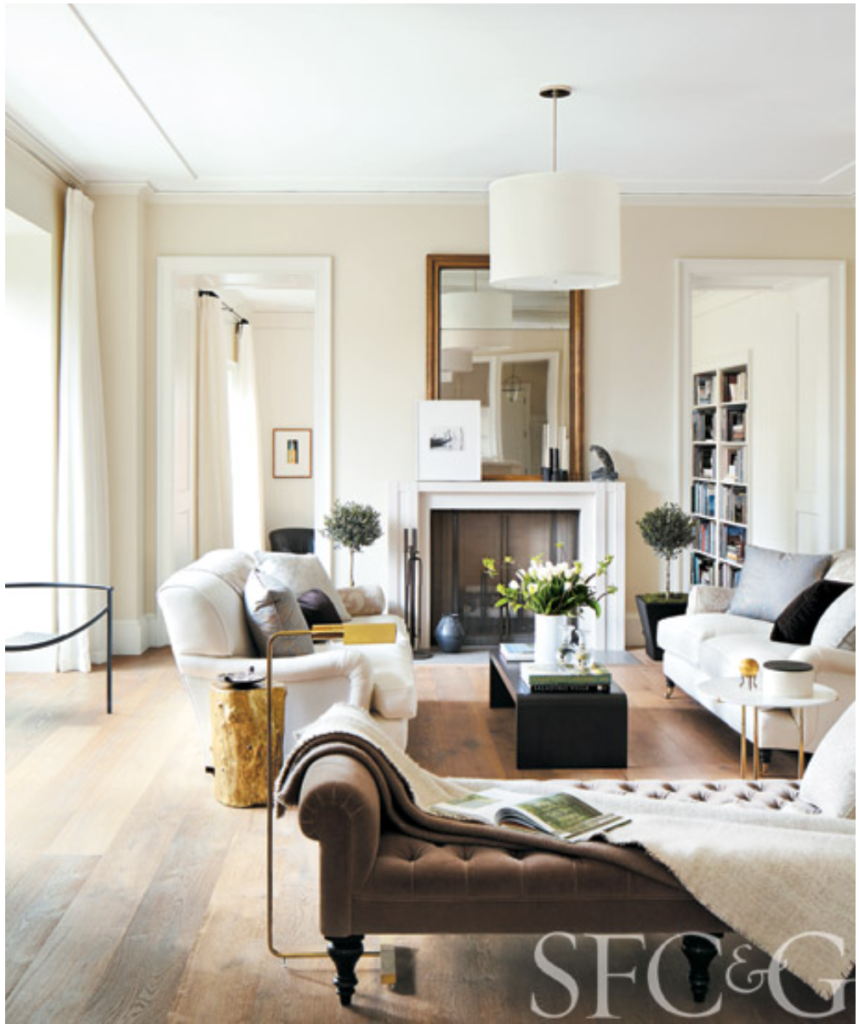
The one piece of advice that never sat quite right with me is to buy a colorful sofa. I love neutrals, if you look at my wardrobe, it’s about 90% black, white, grey, and shades of beige. So my question is, is it possible to have interior decor in all neutrals and still be timeless? For example, you posted this photo recently, and this is completely the type of interior that I love.
This living room is at least 8 years old, maybe older, and looks amazing today. What makes this timeless, when the all grey interiors and the all beige interiors before that were not?
I’d love to hear your thoughts on this topic. I hope you consider this question for an Ask Maria blog or Instagram post (or at least respond to this email).
Thank you!
Sarah
What makes a neutral room timeless and beautiful?
The simple answer to Sarah’s questions is this: it’s much harder to pull off a pretty neutral room.
Why?
Because colour has an immediacy, the eye loves it, and if a room immediately takes you in with a fabulous colour palette, you are not bothered by other less than inspired details happening in the room. You’re already past the line of drab and boring, just like that.
To create a truly beautiful room, you need more specific skills and greater attention to detail.
Let’s look at some beautiful neutral rooms designed by pros and I’ll pick out all the subtle details that make them elevated and elegant. This will help point out what’s so often missed and why so many neutral rooms fall flat. Because when neutrals are chosen to be “safe” the room often turns out dull.
This is not about design snobbery, it’s just what it takes to pull off a beautiful room like a pro. I’m letting you in on some not-so-obvious details that you can try in your own rooms to take them to the next level immediately. Even if they are not exactly thrifty, there is nothing more sensible than to create a room with some expensive details but excellent longevity.
Dissecting the perfect neutral room design details
So let’s look at the room my reader loves above. The first thing I notice is the symmetry of the arrangement, led by the symmetry of the room itself (the two matching doorways flanking the perfectly beautiful and timeless cast stone fireplace). The designer wisely played it up by placing two identical sofas facing each other.
And THOSE sofas! They have the perfect timeless English roll arm shape and they look like excellent quality, stuffed to perfection.
To wrap up the seating arrangement, she’s chosen a contrasting warm brown settee, but tufted for a shift in texture. The warm colour is repeated opposite with the beautiful antique brass mirror that (more symmetry here) hits exactly at the same height as the doors.
So the bones of the room and the layout are perfect. Then she’s added just the right pops of black that play off the firebox. Additional details include luxurious airy drapes, a timeless complex cream paint colour and just enough styling to add character and a lived-in feel.
You really can’t go wrong with classic sofas in white, with rich luxe details and perfect symmetry. But let’s be real. Most of us creating neutral rooms aren’t choosing white upholstery.
We’re probably starting with a more practical grey, beige or charcoal sofa. Because, well, life is messy. You know… the dog and the kids, and wine. So now what?
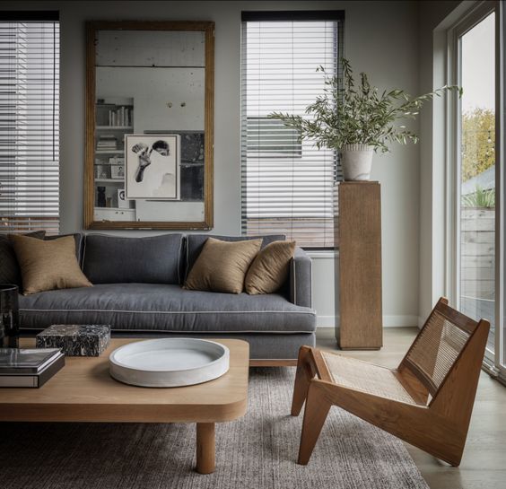
What do you notice about this beautiful room with a grey sofa above?
First, it’s a well-tailored sofa with pretty contrast piping with a bench seat cushion. And, it’s on a pretty wood base that happens to perfectly match the natural but warm wood tones that make up the rest of the pieces. All this warm wood helps to balance the cool grey of the sofa and walls.
Again, we have a large mirror that perfectly fills the space between the similarly proportioned windows. Symmetry? Check.
But the main thing to notice here is that each furniture piece or decor item in this room has a really special sculptural shape.
Have you all noticed the plinth trend? Every pretty room it seems has an art gallery-style plinth topped with a bust, a gorgeous vase or plant, or a lamp on it. I currently have one on order myself.
More timeless neutral living room details
Ok so how about neutral rooms that aren’t art gallery perfect? Are there some details that are both accessible and game changers?
Well yes, there are.
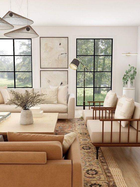
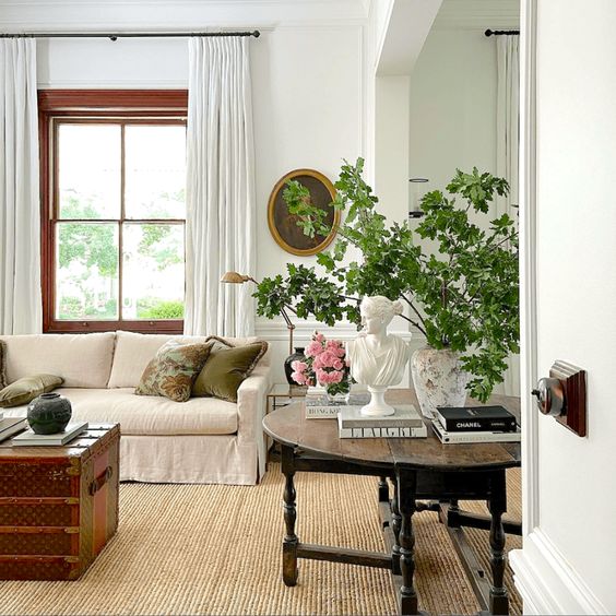
In this pretty neutral room above, we see that same strategy where the art perfectly echos the scale of the windows. Interesting. A single picture plunked between these two windows floating would simply not have the same polish.
I know I keep singing the praises of the cognac leather sofa, but it really is such a practical and versatile choice. And, here it is again. It brings natural warmth to a white and neutral room.
Wood tones do the same, just as we saw with the grey room above. Cute modern chairs with warm teak or walnut arms are never a mistake when you’re creating a neutral look with a cognac sofa.
Can you see the other thing that is doing a lot of work in this room? That’s right, the intricate vintage looking pattern of the area rug. It pulls in more warmth and oodles of interest and pattern. HOT TIP: If your room doesn’t have any pattern and feels flat, try adding a rug like this.
Often a bold light fixture is a worthwhile splurge in a room. And this cool modern light fixture definitely is. Think of good lighting as art. It’s one of those details that can elevate even the plainest of rooms.
Oh! There’s a plinth in the corner here too! If you want to get on this fun trend, you can get nice ones at
CB2. Much better than your grandma’s plant stand.
You must invest in the details
So let’s recap. If you want to create a pretty and timeless neutral room, you have to invest in some details. Here’s a quick checklist of the details that make up a timeless neutral room design:
- Include a few iconic shapes in your furnishings
- Splurge on some artwork, an oversized mirror or special light fixtures
- Add in texture (natural rugs, organic shapes/materials, vintage decor, cushy upholstery)
- Create contrast (dark/light, warm/cool)
- Neutral rooms love plants
Not everything needs to be super special, but at least some of your pieces should have elegant or even iconic shapes. Artwork, antique oversized mirrors and special light fixtures are excellent items to splurge on.
Add texture. Natural fibre area rugs, items with patina, organic shapes and materials create not only interest but mood. Find a vintage piece or two to mix in so it doesn’t look like you bought the whole room at the furniture store. Light or white pieces, especially cushy upholstery go a long way to creating a fresh look. Make sure you also have smaller pieces in grounding deep colours like black, brown or slate.
This one is big. Make sure you have enough contrast. Both dark and light and warm and cool. Balance cool whites and greys with plenty of warm wood tones, antique brass and greenery.
Neutral rooms love greenery. Large plants and casual, natural floral arrangements can add a wallop of interest in a fairly simple room.
And let’s just look at his gorgeous room. Warm wood tones? Check. Plenty of fresh white? Check. Rich contrasting pieces? Check. Texture? Check. Something old? Check. Elevated details? Also, check.
Decorating should be creative and fun, but let’s face it, for anyone who is not a pro (yet) some guidelines to success are a good thing! Next time you’re admiring some of your favourite rooms in your feed, look for these strategies and details and I guarantee you will find them everywhere!
Related posts:


Great post Maria -I think that you have given us a recipe to make any room special! I feel like “contrast” is the key. Contrast in color/texture/shapes is what make the room interesting. I think the gray room falls a little flat because there isn’t enough contract…even though the furniture is and art are wonderful.
Great post!!!
I love neutral rooms and adore the photos on this post, but I am colour all the way.
My colours are fabulous for the northern-western Canadian places we’ve been living. However, soon we are moving to Southern Ontario and I realize that in the summer I want a lighter look.
How does one go about getting slipcovers for couches and chairs? In particular we have two upholstered queen Anne chairs.
Thanks for any ideas!
surefit.com, better deals especially toward the end of the year. I have a house of pets and live by slipcovers.
Great post and suggestions.. Thanks! I love timeless looks and want to get back to that in my home. So easy to do for others, but for myself I get stuck sometimes, this post helps!
Maria
I live in Brookings Oregon and want to purchase a Comfortable, SOFT, English Roll Arm Sofa for a reasonable price. Do you have any recommendations as to where to go? Thank you so much. I enjoy your website a lot and it gives me so much inspiration. Jackie PrattJ
Hi Jackie, I’m in Southern Oregon too. This is kind of a shopping desert, but Medford has more selection than Brookings. I just googled and suggest you check out Terra Firma, Rebelle Home, Tiffany’s At Home, Medford Design Center and House To Home Gallery (nice consignment) for starters. There are others, but these are the least “cookie cutter” stores. I would also Google Grants Pass furniture stores. Let your fingers do the walking and narrow down your choices before driving over for an overnight visit, not a stressful day trip. If you strike out in Medford, you will have to widen the search further away than 2+ hours to Eugene and Portland. Hope this helps!
Liz 🙂
P.S—Great post Maria, even though I’m color all the way! My daughter did a very nice job using neutrals in her new home in Atlanta, instinctively applying some of these ideas. She has a high pressure job, so neutrals created a calm environment. I, on the other hand, need color for energy as I age.
rogerandchris.com have fabulous sofas and chairs. They are very helpful and give your every measurement and some customization. Great quality at a fair price.
PS. Maria love the post. I had neutral living room in my old house. Now I understand why it worked! It was a very symmetrical colonial home, matching pale sofas flanking the fireplace, a large antique mirror over the fireplace, neutral textured drapes, lots of dark wood, patterned asian carpet. Frankly I think I just lucked into getting it right. Now I am more into color. Thank you for your wonderful insight.
The best couch I ever owned was from Ethan Allen – exquisitely rolled arms and back, supremely comfortable and supportive to the end, and because fabric I loved was so durable yet gorgeous, it lasted a good 20 years before the fabric split on one cushion (about 5 years ago). I would have recovered it in a heartbeat if our style had not moved firmly into the more modern/clean line/transitional look.
I wish I could say that the most recent purchase I made from them was as good. PS – the new furniture doesn’t feel as supportive for some reason (though it did in the store), on two couches, we had to send cushions back because we ordered extra firm and didn’t get extra firm. And I had to send a leather armchair back because of sloppy upholstery. By the way – the extra durable fabric makes a huge difference in how the couch looks in 5 years or so.
I’m with Sarah! I’ve been following this blog for a while and as a result have a better understanding of undertones – when decorating in the neutral zone, this is critical. My interior palette consists of greys, taupes, beiges,whites ,and of course black (just like my wardrobe) but I agree with your statement – pulling this off is infinitely harder as you have to perfectly nail the details.
Great post!
Great post. I appreciate a room of color or one that’s neutral as long as they are well done! I think one of the reasons using color is easier is because you generally have a starting point, a jump off point from the use of just one colorful thing be it a fabric, a rug, or a piece of art…etc.
Thank you Maria for answering my question!! Once again, your advice is so spot on. There is so much to study here, I’m going to be reading and re-reading this post for a while! Although my house doesn’t have all that magnificent symmetry, I can definitely still incorporate your tips. In fact, I already have an English roll arm sofa on order! Your advice here is spot on, and I thank you for giving advice to us neutral lovers!
That was a great breakdown of a good room, neutral OR color. So relatable! Thank you!
Another excellent post. Thank you. I liked how you explained the details that contribute to the overall effect. I am learning to ‘see’ differently thanks to you.
I savored this post because it’s sooo rewarding to pour over the details of why a room works. I learned so much! I’m especially grateful for the wall art guidance and would love for you to talk about wall art more often. Love your teacher’s heart, Maria!
“If a room immediately takes you in with a fabulous colour palette, you are not bothered by other less than inspired details happening in the room.” I’ve tucked that helpful nugget away for future reference.
Thank you Maria for your help. I am from Europe and the different style is interesting, but color rules work everywhere. I bought already tiles and floor and discovered you not too late for a kitchen and wall paint. Since then I cannot sleep and annoye my friends with color discussions. In the picture above from Steve Cordony I see yellow beige, pink beige, green beige and different whites together- am I wrong?
The first thing I noticed in the rooms is that one specific shape is repeated in different ways. Maybe a curve that is the same on a vase, a table, pillow, picture. Or a rectangle in the mirror, table, couch, and so on. Love the examples. Very helpful post!