Whether you choose an eclectic bathroom design vs. a timeless one, your fixed finishes should relate or match. The eclectic or collected look is achieved with decor, art and accessories. Let me explain.
The Eclectic Bathroom
In all the 12 years I’ve been writing this blog, it never occurred to me to search online for an ‘eclectic bathroom’.
If you search it, you will see all kind of fun bathrooms. Including this one:
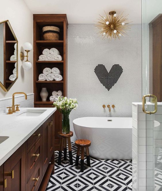
One thing that’s true about ‘matchy-matchy’ decorating is that the fixed finishes in your bathroom – in other words, anything that you can’t just pick up and take out of the room – should in actual fact, match.
For example, it looks best if your sink and tub faucet actually match (like above).
While your bathroom can have an eclectic look in terms of the items you choose for the art, carpet or accessories, a bathroom with fixed finishes from different eras rarely looks right. Like the lighting, vanity, tile, and hardware.
The bathroom that most of us inherit, looks a lot like this bathroom I came across recently (below).
So first, let me say that I didn’t look at this bathroom and think “Oh wow, this person has bad taste,” whoever chose these finishes, likely did not know that it was a marriage of wildly different worlds.
So let’s just treat this as a learning exercise, NOT from the perspective that I’m out to rip every bathroom that isn’t perfect.
When nothing relates
Okay, so check out all the different finishes:
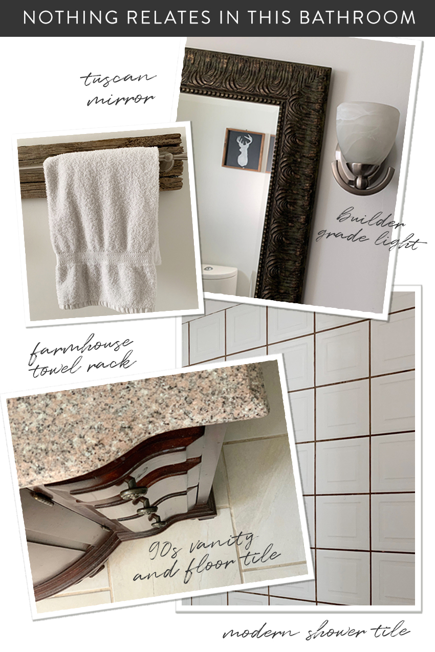
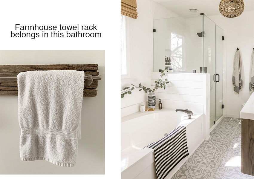
Next, I thought it would be a fun exercise to place each of these items in the bathroom they should have been installed in:
How we know that this vanity is from the 90s, is because when granite was first introduced into the world of countertops, this is what it looked like:
This is another reason why the typical 80s unpainted oak kitchen never seems to look that great with granite countertops, because we simply were not doing granite in the 80s.
Oak is definitely back for kitchen cabinets but of course the colour and style is nothing like the honey oak cabinets from the 80s.
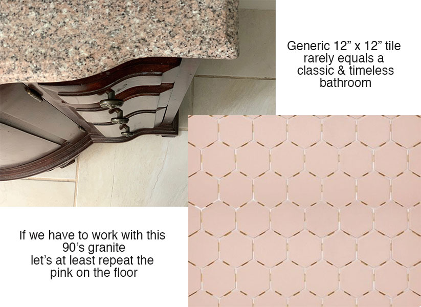
Yes you could go with a grey hex tile too, but since pink is back and you can find it in a colour to coordinate, why not, I say!
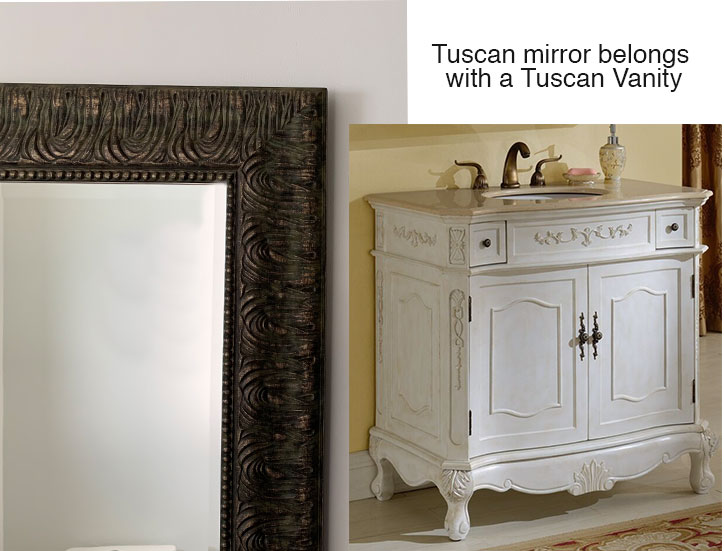
Then the Tuscan mirror, likely just picked up from a big box home decor store as well:
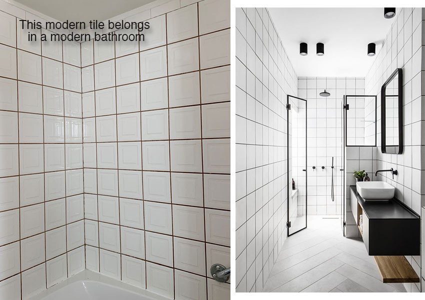
And the square tile with the inset, in this particular bathroom has a modern vibe that would look better in a bathroom like this one (right):
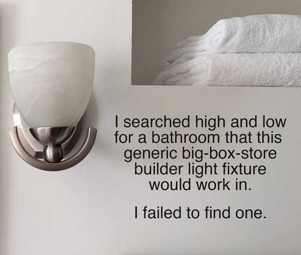
And then the builder light fixture. Probably picked up by one spouse running around completing errands on a Saturday.
Why am I saying that? Because it’s obvious by the look of the sconce in the context of this bathroom that zero thought went into, “Which light fixture would look best in this bathroom?”
In other words, if you were able to go out bathroom shopping and actually come home with everything you needed for a bathroom renovation, your bathroom has very little hope of being perfect.
Perfectly nice maybe? But not perfect. To achieve a perfect bathroom takes thought, coordination and most of all special ordering items that you would not find at your local big box store.
Read more: Second Rule of Design: Waiting Now Equals Beautiful Later
Okay, back to the builder sconce; whatever shall we do with this?
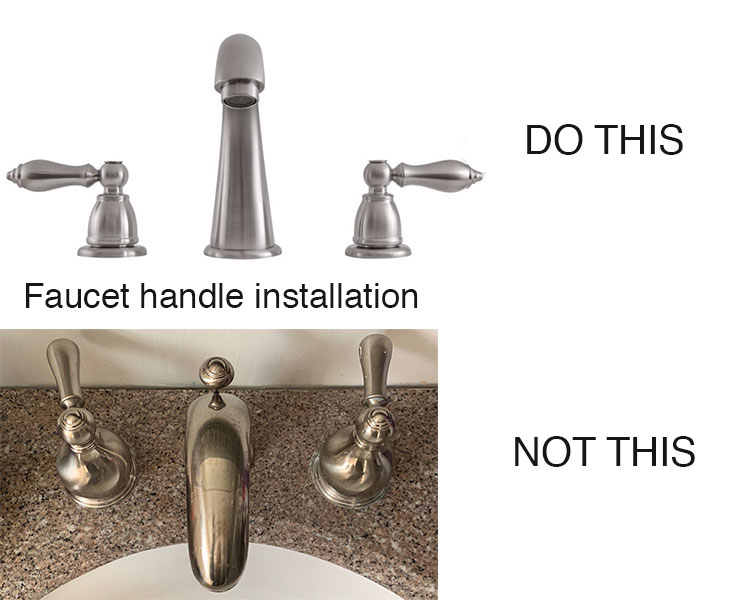
And finally, the installation of this faucet was clearly not done by a plumber who likely would have known where the handles should go:
More Eclectic Bathroom Designs
My search for an eclectic bathroom pulled up many that were over-decorated but fabulous like this one:
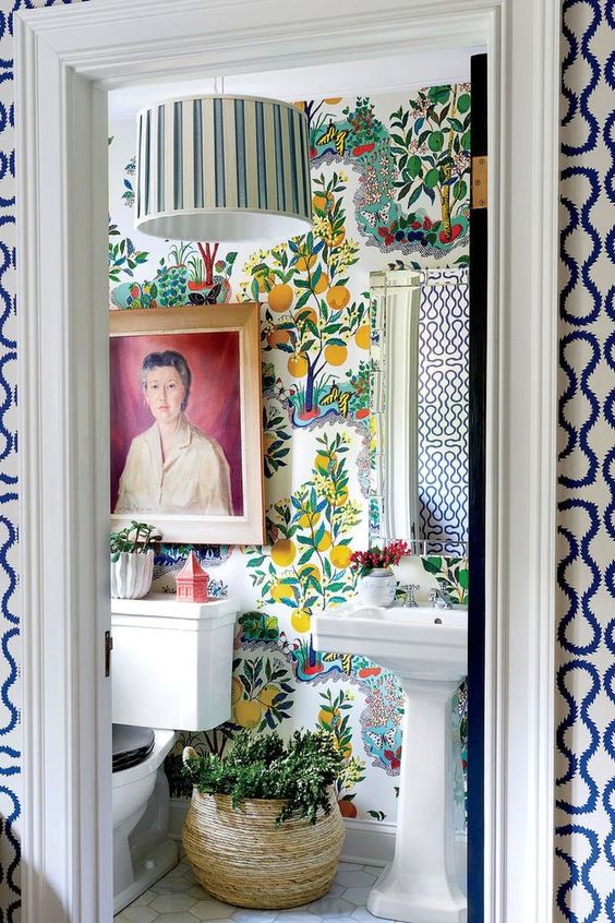
Notice the toilet and pedestal sink do coordinate. No one threw in a modern sink just to be ‘different’. In the context of a bathroom, that kind of mixing and matching mostly doesn’t work.
And, I love the idea I heard recently, that even your kitchen and bathroom should have a living room feeling to them.
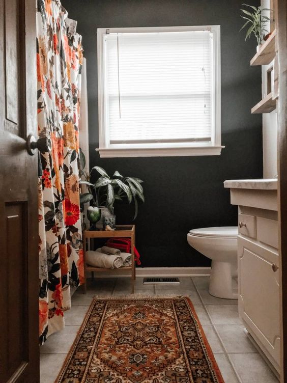
For example, why not add an oriental rug instead of just a bath mat (below)?
Add a dramatic colour, an interesting rug and a fabulous shower curtain to take the attention away from the dated finishes and TADA:
Why not hang art this close to the bathroom floor? So elegant!
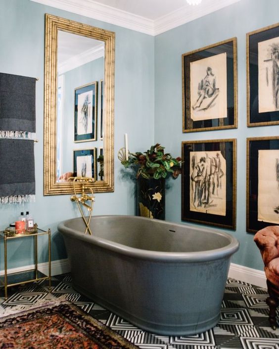
So keep the decorating eclectic but for a classic and timeless look, coordinate your bathroom so that if you have a boho farmhouse vanity for example, the rest of the bathroom fixtures are the same.
If you’d like help with your bathroom colours and finishes, you can buy my Create a Classic Bathroom package here.
Related post:
How to Update 90s Granite and Make it Disappear
A Townhouse in Finland makes Tuscan Look Fresh
The New Cabinet Stain Colour for the 2020’s









Dear Maria
Please don’t shoot the messenger !
I love your blog and have been following it for Many years however I can’t follow your story today because there are SO many ads inserted and popping up I can’t tell which photos are yours and which are the ads.
Hi Andrea, yes I know they bother me too but we had to cancel 10 live events this year and want to keep our staff employed so we’re trying other sources of income. Maria
I like this kind of post. However the bathroom that was over decorated, altho each item alone was nice, would drive me into a funny farm! That in its entirety is visual overload! The builder grade sconce looks more art deco so maybe an art deco bathroom?? Hmmm
I haven’t heard you talk about encaustic tile for a while. Altho I like it in certain cases I see it used with no sense of proportion in mind.
Thanks for another inspiring post.
Oh haha, you’re right now that I look at that sconce it does look art deco 🙂 And no I really don’t have anything new to say about Encaustic tile than what I’ve already said in a few posts.
Thanks for your comment Lucy! Maria
I love the bathrooms and I love that you always break down the looks into rational decisions. I know there is an artistic eye involved, but the reasoning helps the less artistic of us (like me) to understand and appreciate what is going on.
Ooo, I love that bathroom from Southern Living with all the vibrant colors and patterns! It would be fun as a powder room, but a bit too much for a master bath! Thanks for sharing your wisdom (and the lovely photos) with us, Maria!
Thank you for your post! Would you suggest the ALL fixtures be the same? Or can the sink be matching traditional and the faucet, towel holders, and toilet paper holder be coordinating modern? I’m learning a lot from your posts and have 4 bathrooms to redo, but don’t have any plans yet!
Also, I don’t think you tear into rooms, I think it’s helpful to know what could have been better- even if it’s already redone!
This was a really fun post! Educating by showing examples is an excellent way to teach and was a super fun read as well. Loved this approach. I have learned more from you than from everywhere else combined and one day I’ll be taking your live course. Thanks for sharing your passion.
You indeed have a gift for teaching. This post is another excellent example of your ability to convey a lesson. The labeled visuals are soo helpful. Now I must ask-do you just locate any piece of art that fits into a color scheme? I may be alone but find it quite odd to hang a the image of a person over a commode. I have aspired to many things in life but hopefully ending up behind the loo isn’t one of them I achieve. Other than that I love the colors of the Southern Living bathroom altho, as you stated, a bit overdecorated for me.
Haha, Jan! I like that bathroom, but thought the same thing! Not only would I not want my image in a bathroom, but having someone “look” at you in the bathroom is a bit disconcerting 🙂
At least there are two of us Sheree. I need to be sure to inform the children lol
I think the bathroom from Southern Living is a good example of a classic bathroom that has been souped up to have pizzazz. The toilet, sink, mirror and floor tile are actually fairly neutral, if you changed the wallpaper, the lampshade, and the art you could have a completely different mood. And I wouldn’t want my portrait over the can either… perhaps it is the mother-in-law?
Haha, I agree I love how that bathroom can be anything because of the neutral finishes! Maria
I have purchased several online color consultations from you in the past, way back when you sold them by the hour, and then several paint color consults, as well as purchasing all your ebooks. Now I want to make a few updates to my house. I’m not doing an entire bathroom, or kitchen. I’m not doing the main open floor plan color scheme, already bought that one. I’m frustrated because all the smaller packages that fit the scale of work I’m doing have been sold out for a long time. Now I understand you are busy doing major transformations, and many popular designers get to the point where they don’t do small jobs anymore. But what about your long term clients who still need continued support. I’m wondering if you have thought about hiring some of the people you have trained to do the smaller color consults. That way you can continue to support long time clients, and people who have already done a lot work and want to continue their transformation.
Hi Amy, I have hired two designers and we will be opening up the smaller packages for sale in less than 3 weeks! Hang in there, I look forward to helping you with the transformation of your home! Maria
Off topic, but here’s a great example from AD of how to make dated “orangey” granite look great: https://www.architecturaldigest.com/story/simple-updates-saved-this-designer-thousands-on-her-renovation
I loved these comparisons and examples!! Made me want to do a bathroom reno!! Thank you for sharing !!
Is it possible to find lighting and fixtures from big box stores that will look fabulous? I’m on a budget and can’t afford to special order everything. Any tips?
Pamela, buy what you like. Most of us are on a budget. I finally parted with my 1980’s brass chandeliers 2 years ago. A lot changed since then. I bypassed at least 3 major style trends by keeping my kitchen, dining room and foyer lights for 30 years! So now I am looking for new bathroom light fixtures. For me, the pretty sconces at the sides of a dual mirror are better than overhead lighting for doing grooming tasks, but it does require some rewiring behind the sheet-rock. If you can’t do side lighting, overhead lighting is also affordable. There are so many light bar choices, with pretty glass or ceramic shades that aren’t too pricey. I have a hand-me-down brass and chrome 6 light bar in an Art Deco style which I still love because it’s a transitional piece. It was in perfect shape when the previous owner wanted to throw it away!