When it comes to home design, there’s a big difference between matching and coordinating. And it’s something I want to unpack for you here. Because when it comes to hard finishes, you need to know the difference.
This week I received such a great question from a reader, that I had to post it for the benefit of everyone:
I have been in the same house for 35 years. I haven’t remodeled anything for 35 years. I’m trying desperately to get cabinets, tile, countertops, things that will last another 35 years. All of these designs and trends, everything you talk about, makes it very hard.I’m doing this all on my own. I’ve been working on it for six months. I want something I’m not going to get tired of, like I had before.I’ve noticed that the more I go to places and try to match things up the more they tell me it matches.It must be very frustrating to be on your end as design is such a personal thing. However, I am so struggling with basic design issues. Should I put geometric pattern with square tile? Do things have to match perfectly? What sizes of shower tiles vs. floor tiles match?
After I mentioned this email on my Instagram stories, someone sent me this question.
Maria, what’s the difference between matching vs. coordinating?
Matching vs. Coordinating: What’s the difference?
Let’s find out what google says shall we?
Coordinating is similar to matching, but with a little more creativity. When coordinating, you operate with the understanding that you may not be matching your patterns, colors, or designs exactly, but you coordinate them so that they still look good together.
And this is what Chat GPT said:
In summary, while “matching” focuses on selecting nearly identical elements for a uniform look, “coordinating” emphasizes combining diverse elements that complement each other to create a visually interesting and balanced design. The choice between these approaches often depends on the design style, personal preferences, and the desired ambiance of the space. Some designers even blend both matching and coordinating techniques to strike the right balance and create a unique and visually appealing result.
This last statement explains succinctly why the world is full of bathrooms and kitchens that in no way match, let alone coordinate.
Fundamentally, the difference between those words, coordinating means more colours that look good together in my mind, but it’s also the whole act of putting colours together more broadly. In other words, having the vision in your mind.
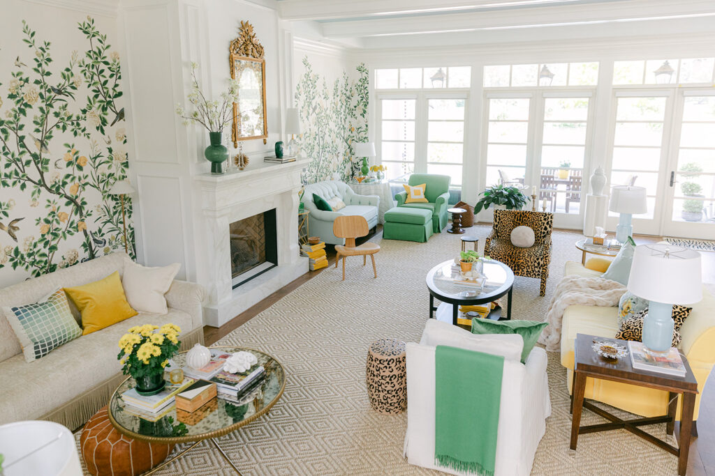
And I think another pitfall designers and homeowners have about design is that as soon as you are in a well-decorated, designer room you see a lot of different patterns being used.
This is because the designer has access to thousands of fabrics and resources to create a room that looks like this:
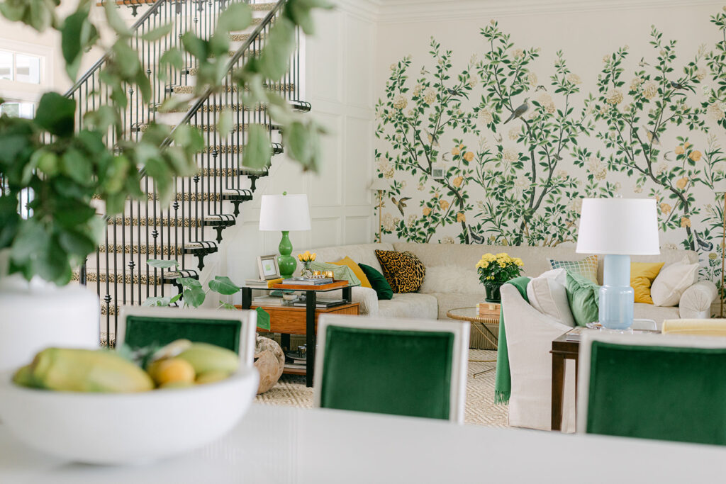
Interior design by Maria Killam
Also a designer will coordinate coffee tables and end tables (below), not buy a matching set. See the difference?
Read more: The Case for Matchy Matchy Decorating
However, coordinating patterned fabrics and soft furnishings and furniture is an entirely different world than coordinating hard finishes.
My kitchen in this same house has mismatched hard finishes: violet grey quartz countertops that do not match the Calcutta subway tile backsplash.
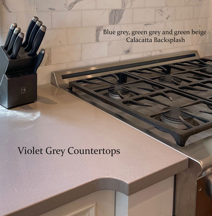
This countertop should have MATCHED the backsplash undertone.
As you have seen many times in the homes you’ve been in yourself, if the finishes don’t match, it mostly doesn’t work. Even if you can’t put your finger on what’s wrong, you can always tell something’s off.
Do the neutral undertones in my hard finishes need to match?
Colourwise, it’s very important that the neutral undertones in your hard finishes MATCH. Not just coordinate. Match.
Here are some of my past blog posts with timeless advice on this topic.
Should the patterns and sizes of my tile match?
What about patterns and sizes of floor tiles vs. wall tiles? This questions is more related to managing the details, which takes years of experience coordinating to end up with a result that is correct.
Here are some of my past blog posts with timeless advice on this topic.
Choosing what you like vs. making the right choice
Both my lovely reader and Chat GPT are pretty convinced that it’s more about personal preference than getting the design CORRECT. But I’m here to tell you, it’s way more about ‘correct design’ than your own ‘personal likes and dislikes’.
Here’s an example. Installing a small scale 2″ hex tile in your bathroom with 12″ x 24″ wall tile is wrong.
That isn’t personal preference. It’s simply not good design.
This is how my eDesign process works. You give me the bathroom or kitchen ideas you have and I can help you ‘coordinate’ your ideas into a bathroom that is timeless with all the right details considered. And my process works whether you prefer modern or traditional design elements.
That’s because your aesthetic doesn’t need to be the same as mine in order for this to happen.
This entire conversation comes right back to this post I wrote a long time ago, but still applies today:
Stay tuned for something new this fall!
I’m so giddy about this announcement that my team is barely keeping me from spilling the beans to you. 😆😆
We are still behind the scenes making some changes to my two-day training. But, when we have most of the details ironed out, I’ll be sharing with EVERYONE on THIS LIST first.
So, be sure to sign up so you’re the first to hear this exciting news!


This is more a question than a reply. I read your blogposts faithfully. And I bought your ebooks several years ago. Very helpful!! You said not too long ago that grey/black/white trend was going away & beige will be the new trend. We are building a new house & I’m trying to follow your advice about “boring now = timeless” but I’m finding it VERY difficult to select creamy tones in tile (floor, shower, backsplash). All the stores ( Lowes, Home Depot, Floor & Decor) have almost exclusively grey/black/white or a few colors. Anytime I find something that looks like travertine or natural stone cream, it’s either out of stock or discontinued. One tile that I liked was on sale, but I would have had to travel to 4 different stores to get the amount we need! And these are all “timeless” selections! Why are these popular stores so narrow in their offerings & still so behind in trends?
The trend is moving to beige for those in the know. Colour forecasters and readers of this blog for example. Manufacturers will not start selling things that are ‘beige’ en masse until the masses realize this fact as well.
We have 5 more years of the black and white trend and at least another 5 years before the masses realize there’s a different trend happening. The black and white trend will leave a lot of havoc in its wake unfortunately.
Maria
Maria,
What if you don’t like beige? I liked grey before it was “in.” I painted my LR and DR in 1989: SW Evening Shadow – loved it. I can remember the year because my 6 mo old daughter would cry for me so much while I was trying to paint, we gave up and hired a professional!
So do I just do warmer greys? I’m planning a new build now with a marble look (quartz and porcelain) for hard finishes which are white.
This is a great post, Maria – thanks!
Gloria
You can do it! I was married to creamy/ivory and just did my shower redo. Floor and Decor has a beautiful oyster color in a 3 x 12 tile. It was hard but I was able to track down some ivory samples from various places. Our whole house is more ivory than white.
I’ve had the same situation. Updating 27 year old home. I’ve never been a fan of gray, so would have done cream/travertine look anyway. Did a quartz countertop that looks like limestone 5 years ago, had a terrible time trying to find anything to work with it now. Big box stores don’t have anything but black,white and gray, and most tile stores also. I was able to find a few things, but not really what I wanted. A challenge!
I noticed the same thing
I think you’ve made a good distinction- when it comes to the fun decorating bits that are added in the final layer, coordinating different things that look good together is best. But talking about hard finishes and architectural elements – those need to match (as in be the same 1-2 undertones, not be identical materials).
I agree that creamy tones are hard to find now, especially if you’re shopping on a budget. One way to get around this is to use warmer white tiles with a neutral grout and add the cream colours to your walls. (I believe Maria advocates for white for the basic elements in bathrooms.) White and creamy tones together are very elegant. I’ve been avoiding gray and have kept the black and white combo restricted to kitchen cabinetry (white uppers, black lowers, with red-brown wood flooring) and white or white/black bathroom floors in classic patterns. In other words, using black and white in classic ways. I have a few pieces of black furniture throughout my home but I liked black before the trend and they are in classic styles. Moderation is the key. I wouldn’t go too far with beige now, just because it’s the trend.
I originally thought that the leopard print on the counter stools was too much against the backdrop of the kitchen (re. the previous post regarding pendant lighting). But now, seeing the photo of Maria’s living room that also shows the counter stools and the proximity to the living room, I understand. (Should have known 😀)
Youve helped me crack this very dilemma! I landed on ONE color that looks great with the bossiest undertone in most of the rooms (a green that works with orange beige). Then I repeated that color big/medium/small and only added two more colors to the decorating palate, also taking care that they looked good with orange beige. It helped to go to a scrapbooking store and bring home sheets of possible colors and mix them to find the right combo! Now I have an easy test palette small enough to fit in my car. It’s much easier to shop when I can eliminate 90% of the store. If it doesn’t match a color, it doesn’t come home with me. I credit you for your help!
My bathroom is an example of making it match even though it’s not my preference of colors. My tile is a blotchy green gray, which I would never have chosen. But it’s on the floors and the shower, so I chose to work with it rather than spend the money to change it. As a result, I chose Agreeable Gray for the walls, and I painted the cabinet a navy blue. Now it is beautiful–however, it isn’t the bathroom of my dreams. It looks great, but it is because I did what would match rather than what I like. Don’t get me wrong–I like Agreeable Gray, and considering we’re going into more beige, it’s a good choice because it reads beige. But my dream bathroom would be light blue walls with white tile. I see a lot of home listings in my area where similar tile is used, and the walls are painted in light blue or green, which looks terrible. With a blotchy tile like I have, it looks best to match the wall color for more of a decorator feel. I put the color on the cabinet instead and added a navy rug in front of it.
What a perfectly well-thought-out solution! Your bathroom sounds lovely. “Do what would match, not what you would like” is a rule I’m learning to live by. We moved into a house with a LOT of wood trim, and some colors that I never, ever would have chosen— but they look right at home with the trim. So we kept them and it still looks great. It opened my eyes to the possibilities of working around finishes.
Great advice, Maria, as usual!
One question: must I match my new kitchen countertops to the existing white painted window and door trim? Not planning to repaint the trim – it’s all throughout the home! Or can I choose an off white or cream countertop, paint the walls to match the new counters, and leave the trim as is??
Maria, I really learned a lot from your explanations about why things do and do not work together. Can you share a bit more about why a small floor tile would not work with a large wall tile in the example you gave.