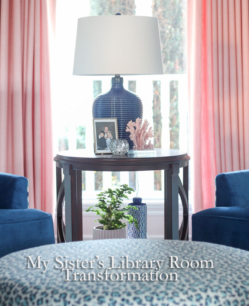
Prepare yourself.
The transformation of my sister Elizabeth’s living room (now library room) is so big, you might actually fall over.
You’ll probably need to grab a strong beverage to calm yourself down.
Are you ready? Okay, so here’s the story.
This room was still filled with black leather furniture from her husband’s bachelor days.
It’s looked like this for about eight years (as long as they’ve lived in this house).
Sadly, no amount of expert styling on my part could fix it.
It just needed to be blown up.
Especially because, it had also, very innocently, and slowly over time, turned into the extended laundry room.
As a Mom of two boys, my sister (as I’m sure many of you can relate) washes mountains of laundry on an ongoing basis, and this room had conveniently just become the clean laundry/depository room where folding was always in progress.
It just didn’t matter what it looked like since no one ever spent any time in this room.
Anyway, since my two nephews, William and Markus had grown past the messy kid stage, this summer we decided it was high time we turn it into a grown up room.
Elizabeth loves blue. When we talked about which colours she wanted blue was one, turquoise to create flow from the family room, and when I suggested adding pink because it is totally on-trend she loved the idea!
“Let’s do it!” She said, “It feels fresh and new!”
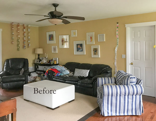
Are you ready? Here’s the before photo.
As you can see, no amount of fabulous throw pillows can hide this style of 80s, black, man-cave leather furniture.
The oversize Tuscan ceiling fan and 90s muted yellow, was still from the previous homeowner.
I had given them the white ottoman from two houses ago and the blue and white striped IKEA chair came from the family room last year after we installed new furniture in that room.
I didn’t even try to make this room cuter anymore, it was just beyond hope.
The kids had started building paper chains to dress up the walls. Really, it was just a free for all.
Laundry everywhere on most days. . . you get the picture.
The television in this room is mounted on the fireplace wall (on the right, shown further down). Across from the existing furniture they have a piano making the room too narrow to position the furniture facing the TV and one of Elizabeth’s other requirements was more storage!
Elizabeth home schools my two nephews William and Markus and they have tons of books and crafts that need a place to live.
So off we went to IKEA with our measurements.
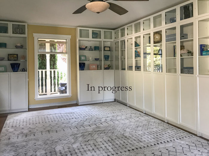
Here it is installed (below), you’ll notice I left just enough space on both sides of the window to hang drapery (below). The one window on this side of the room is small and unimpressive and I wanted it to look bigger.
We left the shelves open on the focal point wall and added glass shelves and some puck lights.
I would have chosen closed cabinets on the right side of this wall of bookshelves, but this option is not available with Billy bookshelves. If you want doors, half of them have to be glass so that’s what we chose.
We also bought the row of smaller cabinets at the top, so that they overall effect would look more like built-in millwork.
Here’s the room after the area rug and bookcases were installed:
Area rug similar here, here and here.
Elizabeth wanted the budget for this room allocated for nicer furniture and we needed a large area rug (which would be expensive), so we found this neutral one for $400.
It’s not wool, but ladies and gentlemen, I’m here to tell you, synthetic rugs have come a long way, they don’t shed like they did in the past, plus if you have kids or you entertain a lot, you don’t need to worry about the precious rug!
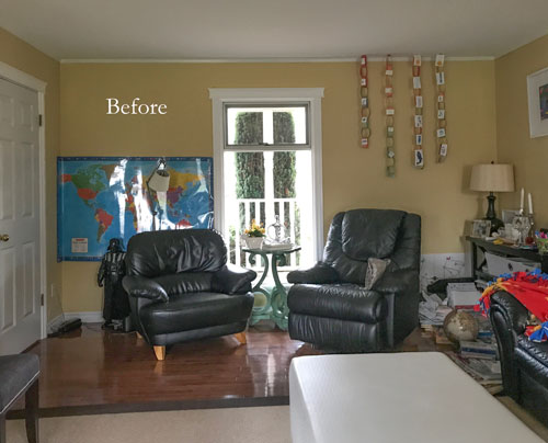
Here’s another before pic of the back wall, see how much smaller the window looks without the shelving and drapery? Notice, I left enough room for stacking the drapes, we want the window to feel bigger, not smaller (a common mistake people make when they hang drapery panels on top of the windows).
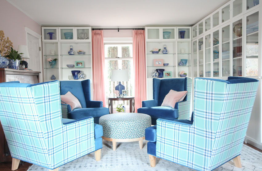
Are you ready? Here’s the after:
Pink is the colour of unconditional love and acceptance. And that describes my sweet sister Elizabeth perfectly.
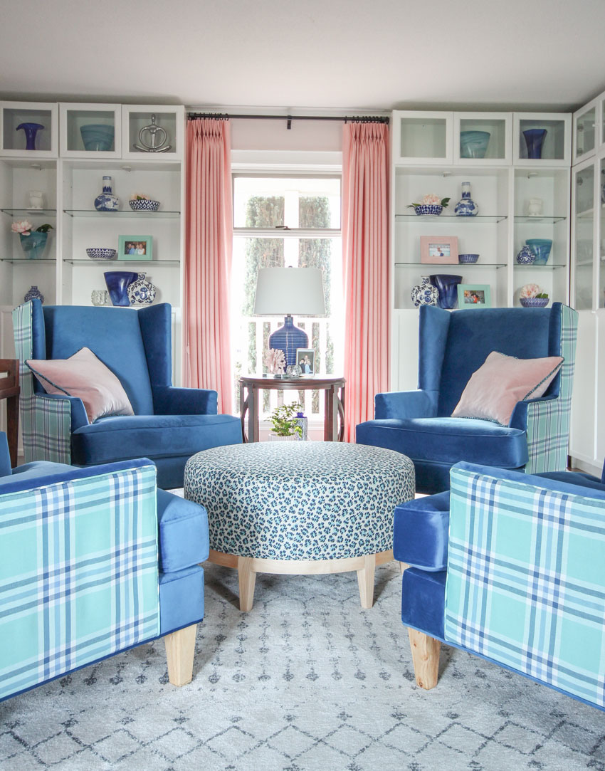
The velvet on the front of the wing chairs feels soft and sumptuous and the turquoise and blue plaid on the back adds texture and drama!
Just a note about the photography, because of the piano, the chairs don’t fit perfectly centered in front of the window, I moved them just for the photo, (normally they sit about six inches to the right).
This rug is technically a pale green beige so I was happy to find this leopard print from Maxwell Fabrics that also picked up the same undertone in addition to the blue and turquoise!
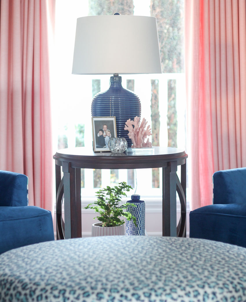
End table (no longer available)
I always buy a maidenhair fern whenever I see one, they are so pretty!
The wing chairs, throw pillows and ottoman are custom.
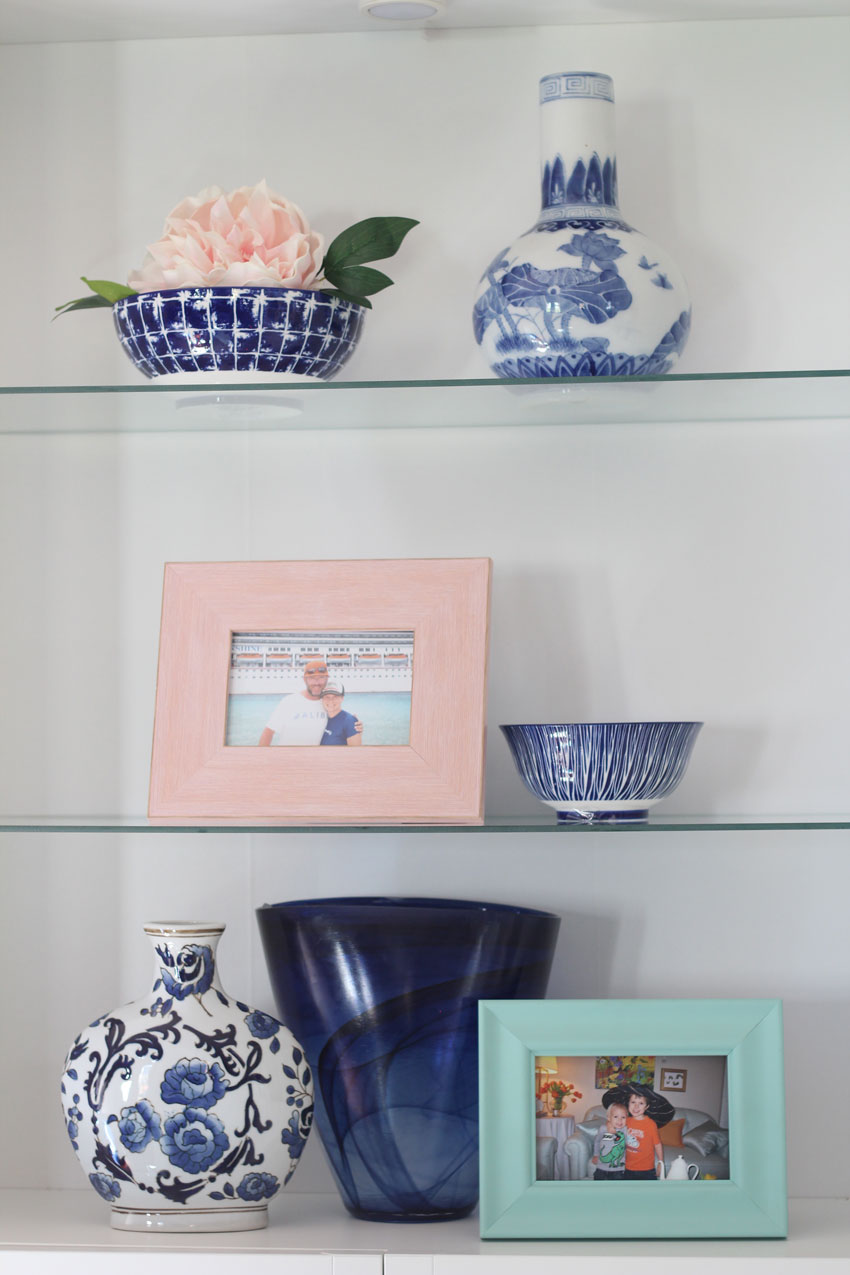
We found the blue and white porcelain in Chinatown.
This room has now officially been named the most beautiful room in the world.
Everyone wanted to spend time in here when it was finished.
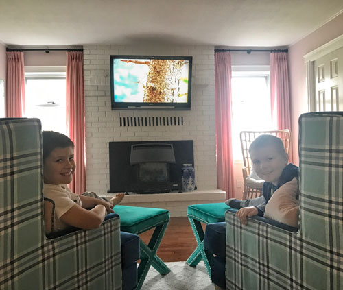
Suddenly, movie night with the family moved to this room (good thing they are a family of four).
Simply turn two of the wing chairs around and move the ottomans from the fireplace over and suddenly, everyone’s comfortable!
Also, because the ottoman has a flat top, it’s perfect for board games, the boys love to play Monopoly!
William and Markus
Anyway, as some of you know if you follow me on Instagram, since my Mom and Elizabeth live two minutes away, you will often find me in my Mom’s carriage house (behind my sisters house) having coffee at 6:00 am in the morning.
This is now the new coffee room.
I’ll text her and say “Are we having coffee in the most beautiful room in the world?”
“Yes”, she’ll respond, “Hurry up”.
It’s quite amazing how much joy this little decorated room has given us all!
There’s something so seemingly glamorous and extravagant about four wing chairs. And it’s also usually an arrangement that doesn’t happen unless a designer has specified it.
Maybe that’s what makes it especially fabulous.
But I think what makes the transformation of this room so satisfying is how long we suffered with the bad room.
It’s like this room didn’t even exist at all, in it’s previous incarnation. It feels like an extension has been added onto the house since it’s now a room we love to be in.
You’ll also notice another phenomenon that happens when you decorate a room. Suddenly, it’s so much easier to keep tidy because you just want to enjoy it’s decorated fabulousness.
At all times.
Every moment, of every day.
Okay, have I gone on a little too long with my unabashed enthusiasm? Haha, sorry. But read on, I have more to share. . .
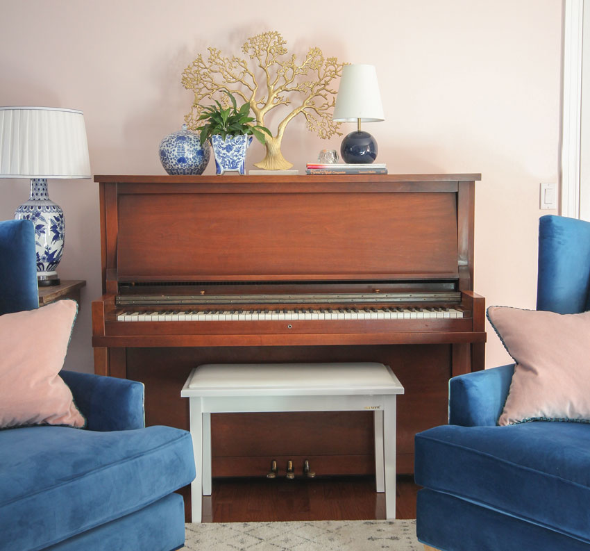
We painted the room BM 2104-70 Strawberry Yogurt (which just happens to be one of the curated pink colours in my large paint samples in my VIP Collection available on my shop page) and we also had the painter give the piano a fresh coat of stain.
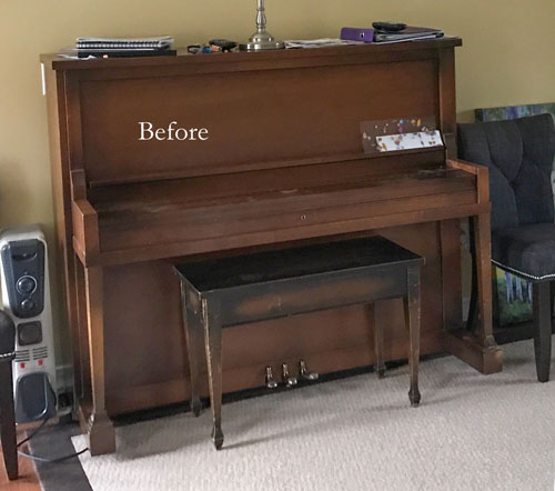
Since the piano bench looked really old and dirty (above), we replaced it with a white one.
Elizabeth bought the zen like gold tree and I found the blue and white pottery when I was antiquing in Lynden, WA, one weekend.
Having a designer sister continually sourcing accessories is one of the perks.
After
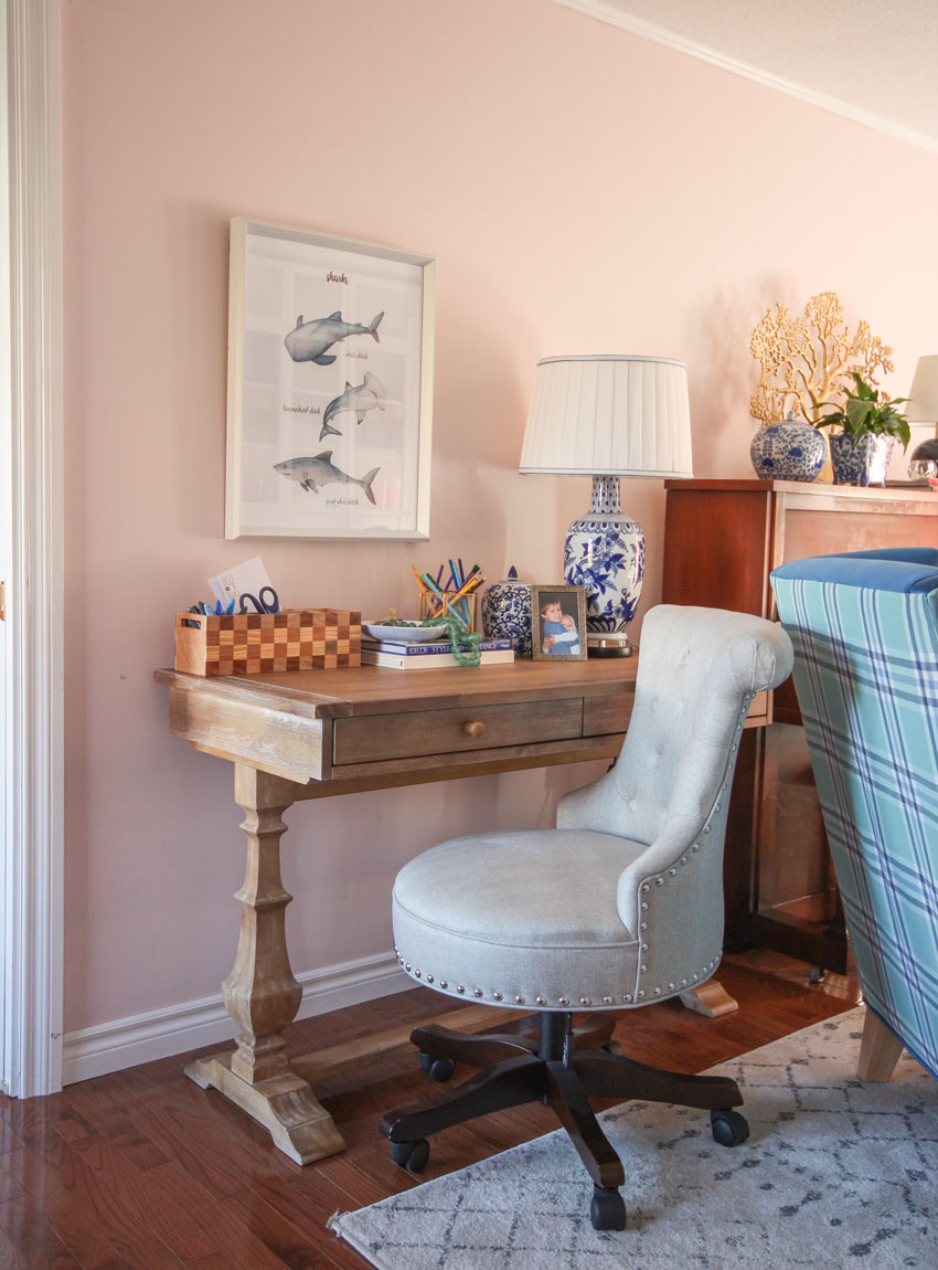
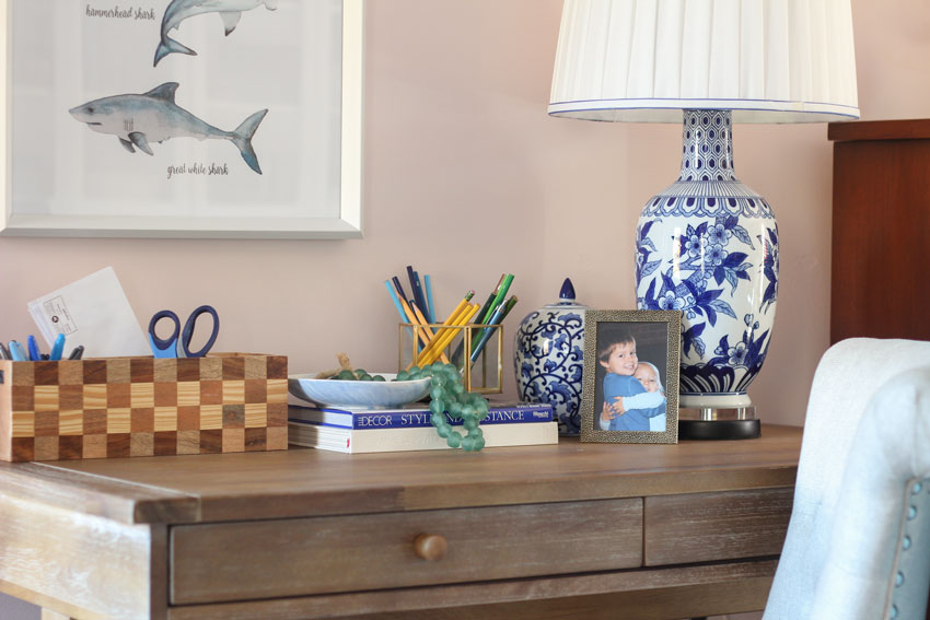
Since this is also a room where the kids are home schooled, I installed a desk and a comfy chair with a lamp for schoolwork (below)! The kids especially loved the shark art we found from HomeSense.
The chair fabric is also a pale green beige (perfect with the ottoman and area rug).
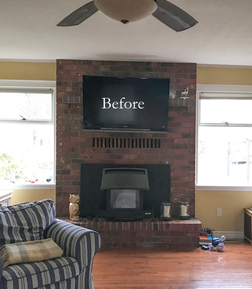
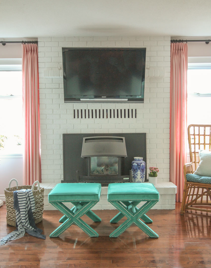
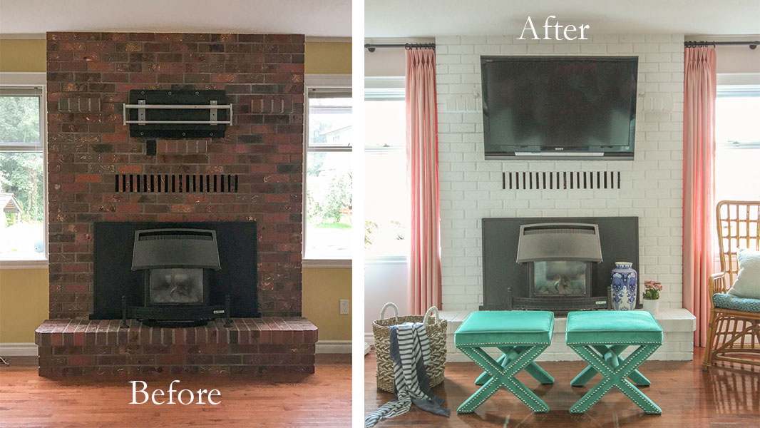
And then the 70s fireplace brick! It was just a joy to watch it being painted white, let me tell you!
Before
After | Ottomans similar here and here | Vintage rattan chair from Etsy
Elizabeth’s windows on either side of the fireplace are really narrow, we debated installing roman shades but in the end, decided that single panels on each side (because there was very little wall space for stacking bigger panels) would add more drama and softness, and wow am I ever glad we made that decision, they look amazing!
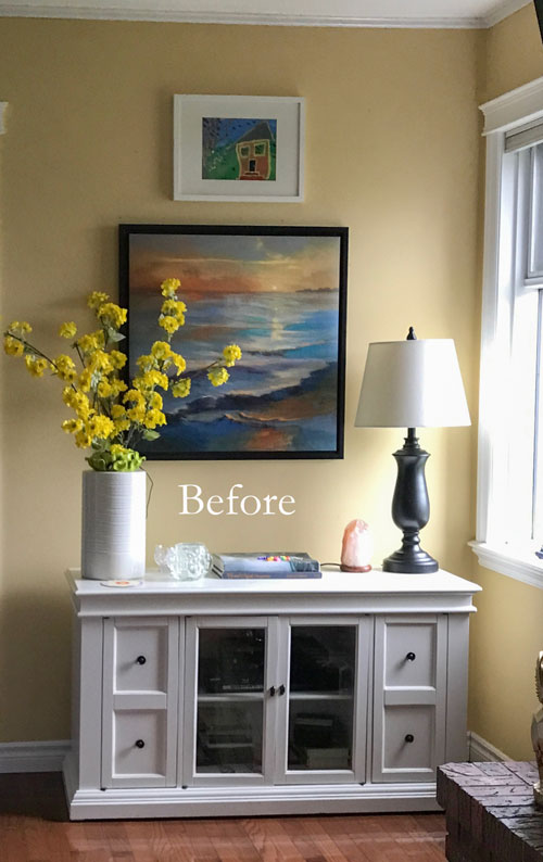
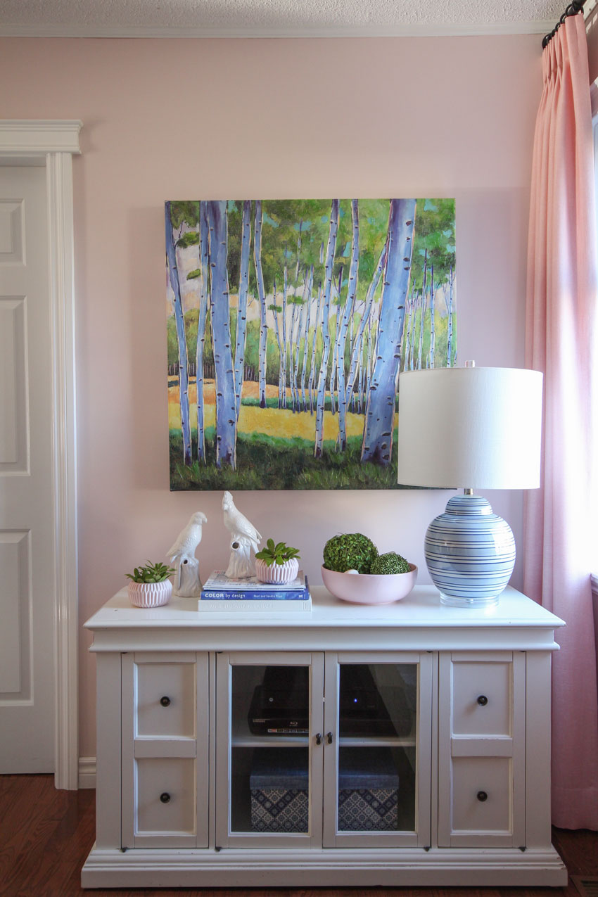
You can see this corner of the library room as soon as you walk into Elizabeth’s kitchen, so it has seen many vignettes over the years, here’s one from a Fall post I wrote.
However, this latest one (below) is the best one!
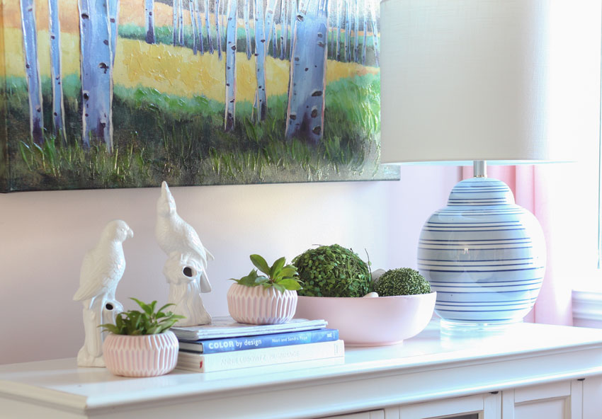
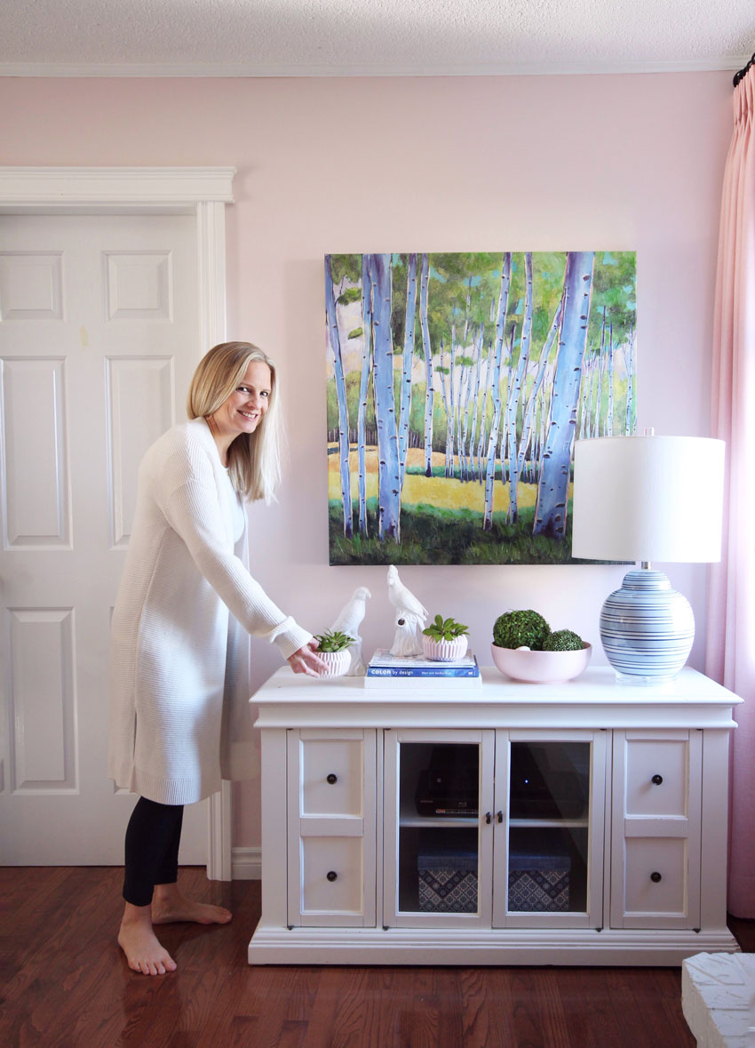
Cabinet, artwork, parrots and the blue and white striped lamp all from HomeSense. Pink bowl and planter pots from Minter Country Garden Nursery.
Photography by Maria Killam
I hope you enjoyed the transformation, we certainly did! I spend so much time with my sister, I feel like this is a new room in my own home!
We are currently working on a refresh in Elizabeth’s kitchen (here’s what it looks like now) and I’ll post that sometime in the new year!
If you would like your living room to fill you with happiness when you walk in the door, check out our Get me Started eDesign package here.
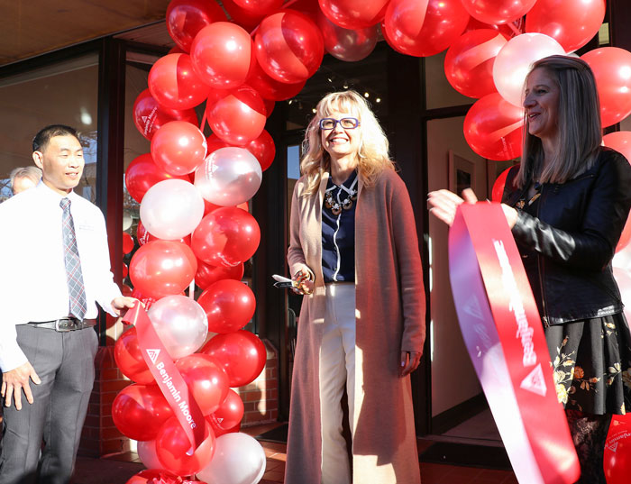
PS. I had the honour of cutting the ribbon at a new Benjamin Moore store in Dunbar last weekend! If you live in the West side, here’s where you can get everything you need to paint your house!
Owner Jeffrey Ho (left) | Maria Killam | Debbie Joubert, Manager (right)
Related posts:
Holiday Tour of Elizabeth and Bill’s Home
My Sister Elizabeth’s New Coastal Living Room; Before & After
The Best Colour for your Child’s Bedroom Furniture (my Nephews Bedroom)











That is a spectacular transformation!
Well done! I love all the colors you put in this room. Lucky sister!
Love, love, love this! What a wonderful job you’ve done.
Quite a transformation!
Best transformation ever! Love how the guiding design principle was to make it a place everyone wants to be.
This is absolutely AMAZING!!!
Cindy
That shade of pink on the walls makes everyone look at least ten years younger!
Such a beautiful room! And I’m so happy there’s another pink room for grown-ups in the world.
A-MAZE-ING!!! I wish you were my sister! (sorry Laurin!)…hahaha! Really lovely 🙂 🙂 🙂
Maria,
Gorgeous room! As a home school mom, I can appreciate all that hidden storage. Elizabeth must be so thrilled! Could you please share which Billy Bookcases you used? I think this would be a great idea in my daughter’s room surrounding a bay window — an awful 80’s update to our mid-century ranch. The window has a small ledge — not enough room for a window seat and I hate it. And I was not sure what to do for window treatments– the drapes like in Elizabeth’s library would work really well. Do you agree? (Currently there are 3 blinds on each side of the window – so ugly!) Thank you!
Thanks Dana. These are billy bookcases and then you just add the doors on top of them, they come in 30″ and 15″and as I mentioned half of them are glass. . . or you can also do half glass shelves with lighting as we did on the window wall. Or you can do ALL glass, but that means everything has to be decorative which is hard to do. Take your measurements to IKEA and they will hook you up! Hope that helps! Maria
Thanks Maria — I didn’t catch that you did glass shelves on the window wall! Beautiful!
FYI here’s a little hack if you, like me, want the tall Billy bookcases with solid doors top and bottom. You just have to drill new holes in the bookcase to mount the hinges, rather than using the predrilled hols for the shelves. You end up with the middle (fixed) shelf half covered by the lower door and half by the upper door.
I fell over
Haha, I know right? Thanks for your comment Jeanne 🙂
Wow!!!
Such a pretty room! Thank you for an email which does not advertise a black Friday sale. I am almost afraid to even look at my email. Fyi my husband is watching the Canadian football game.
Nice Job! I love your use of pink.
Truly a joy! A lovely family home.
So I wrote a letter to Santa….you may wind up at my house on Christmas (and I’m not really sorry). He’s going to let you borrow his gift bag. Whatever you need to decorate will be in there so I am absolutely sure whatever your dream up will be FAB. Really, lady, you make it look like magic! This room is so HAPPY. Thanks for sharing; your blog posts bring delight to my day.
Maria — wow I’m not even a pink person ,but this is have a glass of wine set back and enjoy the transformation moment ..
I have seen a lot of transformations but ….
This has to be one of the most dramatic ones I’ve ever seen ..’seriously can’t even put it in words !!!!
In my personal new build, the area that traditionally would be a formal dining room was made into a library with open Billy bookcases. I told my builder that I wanted the space to look like one is peering into an “aquarium” with banks of glass doors on two sides. It is such a lovely place to 1.) admire and 2.) fill up on winter sunshine streaming thru the southern glazing while reading or “working” on the iPad.
wow! just wow! who wouldn’t want to be in that room or a version of same…
once again, Maria and her magic wand…
The library looks absolutely amazing, love the colours!
Truly stunning and those pink velvet drapes are to die for. I’ve got similar ones in aqua in my office, as well as the pink pots from Minter gardens. I love the MCM vibe they provide!
Loved the story of the remake and am glad to hear about sisters who are friends. I thoughouly enjoyed thispiece.
Wow. I’m speechless
Holy moly, what a dramatic difference!!! Fantastic job, Maria. I love it all but especially the pink walls and drapes. I bet your sister just adores this.
So beautiful! I love the chair fabrics.
Lovely transformation. A quick question . Why did you choose a teal on the small stools in front of your nephews when they were seated. It is not rhe same shade as rhe velvet on the chairs right? Was this the light or was it deliberate.? It does work but curious how you got there.
Great question, it’s a darker version of the turquoise in that room which turns it into a teal green but it still relates! I chose them because I found them off-the-shelf which was a much better price than custom! Thanks for your comment! Maria
Maria,
You look so skinny at the ribbon cutting. You go girl.
The transformation of your Sister’s room is beautiful. I am in love with those chairs. The spirit of the entire family is reflected in a new space where love and memories will surely grow. Brava!!
Thanks Joanne, the magic of a long cardigan! xo
So jealous!!
Little wonder everyone wants to be in that room….I want to be in that room! BEAUTIFUL!
The tree on the piano is called a Ming Tree. I have one but I refinished mine in hammered silver paint to go with my decor. I love it.
Just beautiful! Elizabeth must be beside herself!
As a sham who homeschools, I envy all the staorage! You always do fabulous work! I am convinced now to have my red brick fireplace painted. What color did you paint hers?
Thank you for sharing, Pam
It’s BM Chantilly Lace, the existing trim in her house is pretty white. Maria
Love this!! Where do I sign up to be your sister??? Bravo!
Absolutely beautiful!
What I like about this room is that it works for the whole family. The kids homeschool there, and it is bright and cheery, but it also has an “adult” feel. It works for everyone. And you are so right — it doesn’t even look like the same room!!! I love the injection of colour and I am sure your sister will greatly appreciate that during the dull, grey winter. Way to go!
Wow! I also love blue (navy) and pink, gorgeous! Thank you for the step-by-step transformation photos, it really helped show the various layers and how to focus on the big picture. Individually, steps or pieces may seem – dare I say, “boring?” – but collectively they are stunning! In particular, I’m speaking about the IKEA bookcases and rug. My favorite quote of yours, “boring now is timeless later.” Plus, there’s so much pizazz with the chairs and ottomans. Love. Love. Love.
That is exactly right, you don’t need to be in love with everything! Thanks for your comment! Maria
I love all the pink and blue! I didn’t see a reference where the pink drapery panels came from. Were they custo. Made?
Yes they are custom made! Maria
I love this! It’s such a huge difference. So fun to see. I think before and after photos as dramatic as these make us believe transformation in our own lives is possible – not just for decor but for anything. Like it’s contagious.
Beautiful and unique!
Very nice Maria. I must admit the part I love the most is the library corner that you see from the kitchen. Excellent styling. Such a perfect way to use existing furniture and add a few well chosen simple accessories….and ta-da, it looks like a brand new space. You are a magician!
That is a room that just makes one sigh when walking in to it! Can I come for coffee?
That’s the color pink I was looking for when I painted my guest bedroom! The color ‘consultant’ at the paint store had obviously not taken your course, and I followed her advice and chose a shade of pink that is way too dark. I was afraid to make another mistake, so have just been living with the wrong pink. Thanks! PS: The 4 wing chairs does give the room a very decadent feel.
Incredible transformation!! I love your before & afters –you can’t really appreciate the after unless you see the before (looking like rooms that we all have /or have seen). I also went back and looked at your refresh of Elizabeth’s kitchen and I think that has to win the prize for the ‘biggest bang for a buck’. You made the room look warm and welcoming with the new backsplash (not a huge expense), paint, and your fabulous styling. As much as I love a whole room redo…seeing you do ‘mini-refreshes’ is so inspiring and makes me realize that I don’t have to wait until I can afford to completely redo a room to make it look MUCH better! Thanks for all the inspiration!!
What a great example of using pink outside of a girls room and it looks so fresh and fantastic!
Just for reference. My daughter was gifted a similar piano for her three children because they wanted lessons. Brilliantly, she had it painted white. It looks amazing! I believe they had to use special paint so one might want to research that before painting.
I love the 4 chair idea.
The pink walls with all the blue is beautiful. Lucky girl!!!
It’s all so irresistable, Maria! I’d love to know who you use to get your chairs upholstered, or if you order them from somewhere…..Patricia Justice, Patricia Justice Designs, MK graduate 🙂
Yes they were from Van Gogh Designs in Vancouver.
You definitely knocked this one out of the park Maria! Love everything you did here:)
As usual Maria you did a fabulous transformation! I am not a big fan of pink because it looks so delicate but with your styling, shades of blue and the beautiful in and out fabric on the wing chairs makes the room look classic! I am sure they must just go in there and think they are in someone else’s house! Always love what you do and your blow by blow description of why and how you arrived at the finished results. Kudos Maria you are a genius!
I enjoyed this post a lot. I love that now everyone wants to spend time in the room now. That is exactly what I would wish for my home. Also, the constant stream of laundry in various states…that is my life right now with two little boys.
What a beautiful and fantastic transformation!! Love it!!
It’s awesome. Sooo stylish. I’d love a room like that. Maria, you did an excellent job.
Utter fabulosity! A visual feast and emotional boost! [and thank you for validating, however unintentionally, me painting my brick fireplace about 20 years ago (Sherwin Williams Dover White)–I’ve always loved it and have never tired of the color, but people fuss so about painting brick, giving me second thoughts from time to time]
I said out loud,”That’s looks amazing!” when I saw the after photos. Well done indeed!!
WOW! WOW! WOW! I can’t believe that is the same room. It is so fabulous. I love the pink with the blues, actually, I love everything about it!
Every time you are going to show something from your sister Elizabeth’s home, my heart starts beating faster, since she shares my love, nay, passion for blue! And this time has to be the best yet. All that lovely porcelain, omg, thought I was going to faint with the joy of it. I have never considered pale soft pink as an accent, thank you for opening my eyes to further possibilities. Long Live Blue and White!
What an amazing transformation — from dark and outdated to fresh and happy! And your styling is perfect. Love all the blue and white accessiries. I know your sister and her family will enjoy this room for many years. Congrats on a job well done!
It might be hormones, but I seriously held back tears looking at this. I LOVE blue and pink together!
This room is definitely gorgeous and inviting! And that storage ?!
WOW! Love the blue and white. I really admire how you are OK with IKEA and other cost effective retailers.
Our sofa needs new cushions so it has to go. A month ago my husband suggested we just go with 4 chairs in the family room (family of 4). I was like has he been looking at furniture design online? I realized he has come across it in one of my old jobs. This family room does have a pair of used recliners that have the look I want (Sled base in a light wood and modern lines. These loved gray pieces are straight from the 80’s and this look is back in- well current modern European furniture. ). Bringing in another pair for the kids I can see. However for the rare guests (1-4) in our life what is one to do??
We all need a sister like you! Stunning!
Love that pink. The room is so refreshing.
Over the top lovely!!
I wish I could walk into, browse around or sit in this room to experience the true feel of it. It’s like an updated version of my grandparents’ house—tidbits of interesting things to look at in every corner. I can imagine that it changes mood with the changing light of the day…. so nice!
BTW what happened with the dark ceiling fan?
Thanks for the inspiration!
It was removed and covered up with a plate. . . Thanks for your comment Stephanie! x Maria
Your styling is always so beautiful. I do have trouble though reconciling “objects bought because they are the right color”, with “using things you have collected and that you love” which more often than not are NOT the “right” color. I’ve come to realize that a lot of photos we see are heavily staged for the photo shoot, and that afterward a lot of those objects get removed and the homeowner’s items go back in. But I doubt you would do that for your sister’s home. So how do you balance both types of objects?
That is a great question but there are some people who don’t have amazing taste don’t know how to buy ‘collected objects’. And there was a lot of space here for accessories so she does have collected objects here too!
There are some smart homeowners who, in their travels will send photos to their designer to make sure what they are buying will work in their home and that is a good idea but obviously not everyone can do that.
If you have collected objects, use them, if you don’t, you buy them.
Great question,
Maria
Maria, I’ve followed you for years. You just get more and more talented all the time!
Hi Maria,
Thank you so much for sharing this make-over with us. What a lovely room!!
I wonder if the gap between the IKEA bookshelves and the ceiling could be closed up with some crown moulding to make it look like mill work.
Cornelia
Beautiful pink color. I’m partial to pink; actually have a bit stronger pink-painted kitchen cupboards with copper hardware, looks fabulous. Also love the butter curtains.
Ok, several years later asking this, but am I right that you didn’t use a Billy corner unit and instead have two Billy cases at right angles in the corner?
Any particular reason for that?
Those chairs are to die for!