


It is officially July 🌞 which means you might be standing on your front lawn right now, staring blankly at a wall of swatched paint samples.
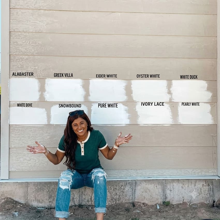
You are probably losing sleep because choosing an exterior colour is an even trickier undertaking than picking a colour for your living room. The single biggest mistake you can make is choosing your exterior paint color while sitting inside at your kitchen table.
Sunlight changes everything. Outside, the sun acts like a giant volume knob for paint. It strips out the pigment, washes out the undertones, and completely morphs the color.
That lovely, soft off-white you liked on a tiny paper chip inside? Outside in the blinding mid-day sun, it turns glaring and stark leaving you and your neighbours squinting. That perfectly greige you picked? Becomes dreary and cold, not at all subtle and sophisticated like you intended.
A word of caution too if you’re visualizing colours for your exterior with AI. It’s still not accurate with colour. Usually, it skews everything much too warm for one thing. When it comes to exterior colour, it definitely doesn’t account for the intense exterior light blowing out the colour.
I had an edesign client recently with a charming brownstone she had decided to warm up with a creamy paint colour. It was not yet painted so she showed us the visualization of it and wanted help choosing the perfect accent for her front door. She was so excited about the dreamy new colour she chose, SW Ivory Lace, a very pale green beige complex cream. Here’s her rendering:
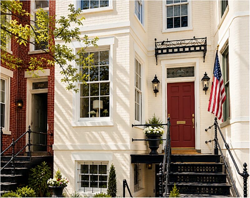
So pretty right??
The issue is that SW Ivory Lace isn’t going to look anything like this warm creamy beauty. It’s going to blow out to a much thinner looking white. She would need a warm mid tone beige to get this look. We let her know of course. But I wanted to share this here because I think this mistake is happening everywhere.
It also happens in interiors, you want a luminous creamy look for your walls so you choose one of the trending off whites like SW Alabaster, and it turns out much too stark and dingy. Because what you really probably needed was a pale neutral to get the look. But it takes experience to know that a colour you’re looking at on a tiny chip or even a larger sample is going to brighten significantly when it goes up on the walls.
And this effect is much more dramatic in bright exterior light.
So maybe you’re looking for the perfect creamy look for your exterior and you’re considering the palest creamy off whites and creams in the fan deck. You’ve heard me about proper testing, so now you’ve ordered larger samples of them all and you’re wondering why they look like nothing and you can’t see the magic you’re looking for.
This is why. And if you have the full curated collection of my neutral and whites large painted colour boards, I urge you to pull out the pale neutrals instead and haul them outside. You will be amazed how fresh and bright they look in sunlight. You need a pale beige to get a look like this below.

Move Past the Cookie-Cutter Trends
And honestly? Right now, I would avoid a stark white look for your exterior. You’ve probably noticed your neighbourhood is still being flooded with those high-contrast black-and-white exteriors. It has become the default template for every builder-grade home on the cul-de-sac. But the design world has already moved on. The shine has completely worn off the white box. It’s no longer just me yelling into the void. I know you’re feeling it too.
If you want your home to look sophisticated and timeless, you need to move towards something softer and more timeless, opt for a pretty muted color or a warm neutral for your exterior. I am seeing my clients embrace:
- Architectural Cream: Creams that are soft and architectural rather than stark don’t come from the whites collection at all.
- Warm Neutrals Complex neutrals that offer warmth without feeling heavy.
- Soft Sage Greens: Earthy, grounding greens that connect seamlessly with the landscape.
- Dusty Blues: Gorgeous, muted blues that read almost neutral.
- Buttery Yellow: The perfect choice for historic charm.
Let me know in the comments, are you tackling your exterior this summer? What colour are you leaning towards?
The 3 Most Important Rules for Exterior Colour
Before you pick up a paintbrush or hire a contractor this summer, you need an intentional, considered plan. Stop guessing and keep these three rules in mind:
- Bright Exterior Light Blows Out Colour Dramatically: So once more, that yummy creamy look you want? Believe me, it doesn’t exist in the whites collection at all. You need to look at warm neutrals to get that look outside. That means you also need to get the undertone right.
- Your Fixed Finishes Dictate the Plan: Paint is dead last. You’re probably thinking you have endless options for your siding or stucco paint colour, but if your house has stone or brick? That often means you only have one or two truly perfect options. So how do you find that perfect unicorn in a full deck of paint colours?? I’ll show you.
- Landscaping is Decorating for the Exterior: Your paint colour, stone and exterior details aren’t meant to do all the work. A naked house with zero landscaping will always look unfinished. To get real curb appeal, landscaping is the all important “decorating” phase. Stop trying to make the facade of your house interesting by throwing a patchwork of colours and claddings up. Simple is timeless. Save a decent chunk for great landscaping.
Stop Guessing. Get Smart.
You do not have to guess your way through a costly, permanent exterior mistake. Don’t walk into your project centre simply hoping it will all work out.
My Exterior Colour Masterclass is an online, 18-module program designed to give you a clear plan. I will teach you everything you need to know about choosing the right colour for your exterior. Which is powerful, because every single element you choose for your exterior is a colour choice. Get the colour right, and you’ve made the most of your investment. I want to help you spend your money wisely, so I’ve also included content on the power of landscaping.
Turn your hard work and investment into a beautiful home you’ll love looking at every time you pull into the driveway.
Enroll in the Exterior Colour Masterclass today and trend-proof your home’s curb appeal!

Related Posts
A New Build Conversation About Stone


Hi Maria, loved reading this post and your advice for choosing colours! Your comment about greens connecting with the landscape struck a cord with me as I’m considering repainting my mid green roof. Finding a green that connects with the landscape has been one of my primary goals – I find some greens are too bright and others seem too dull and stand out in the landscape instead of looking harmonious. Wondered if you could do a post or comment on choosing the right exterior greens?
Really enjoy your content and videos,all the best, Maya
I was colour shopping today for my new cottage build in Ontario. I’m going for Muskoka vibes. BM Dragons Breath. My windows are “Espresso” (so pretty dark; almost black; but not black).
Re Landscaping is Decorating for the Exterior: California new fire regulations against landscaping next to the house bring new challenges to exteriors. Required to remove all landscaping within 5 feet of the house, and only very low planting, with each plant pretty much standing alone with no mulch is now allowed outside of this 5 foot empty space. Taller bushes and trees are only allowed beyond the next perimeter. Please address how
to distract the eye and restore beauty soon!
Thanks as always for your amazing insight. Painting a cottage dusty blue next year after reading your post. Door color? No idea. Yellow?
It is so true that people struggle even more with picking exterior colors than with picking interior ones. Since taking Maria’s exterior class I’ve had several family members ask me to choose their exterior paint colors and they were all completely adrift before I stepped in.
There are two new homes nearby with vertical boards and a somewhat farmhouse style. We live in a small coastal town so they looked at odds with most of the local architecture to start. Then they painted one bright white and one beside it dark black. Sure wish they would have realized that trend was over before they pulled out the paint brushes. We used your color design service seven years ago and.painted our
house Hale Navy. We love it today as much as we did the day the paint went up. (They used an extra UV retardant component in the paint so it still looks great seven years later.) I also used your edesign services to correct a room color for my study, and still love it seven years later as well. Thank you so much for your design Services.
I’m about to pull the trigger on painting the outside of the house. The house is a two-story south-facing bungalow /cottage, all siding. I’m keeping the original color palette of the house, but unfortunately I don’t have the names or brands of the original paints. I’m shooting for a muted almost mustard
yellow . So the colors are SW Different Gold for siding and SW Vital Yellow for the trim, facia, and soffit. For the sake of simplification I chose Vital Yellow because SW identifies it as a complementary color for Different Gold. Tested Different Gold on the south and west sides of the house and looks quite different from the chip and when seen indoors. Wish me luck.