Whenever I talk about grey flooring on social media, I always hear from followers that had a bad experience with choosing grey. However, in this particular story a design professional was involved, and they blamed the bad store lighting for the error. But here’s what really went wrong and how it could be saved in the end.
Can bad store lighting lead to bad colour choices?
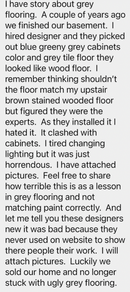
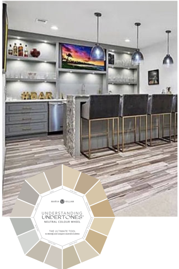
I recently received this note and photos from one of my Instagram followers. And I was dismayed to read that not only did her designer choose a very bad colour for her flooring, I also learned that it’s tile! Eeeeek. Even harder to remove and replace than a material like LVP (luxury vinyl plank).
🛑 Before you scroll down, can you identify the undertones here?
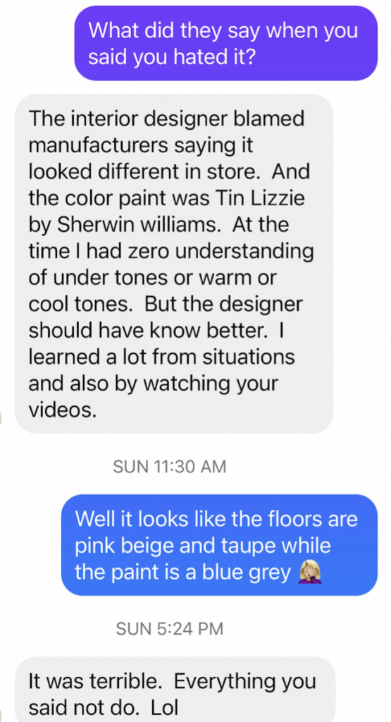
When I saw this, I had to ask how her designer replied when she declared that she hated it:
What are the undertones of grey?
Keep in mind, wood look flooring photographs badly. But the undertones in this kitchen are definitely wrong. The floor reads violet grey, and may have some taupe undertones too. And yikes, the pattern is way too busy.
In this example, the homeowner is absolutely right. The floor does not in any way coordinate with the blue grey cabinet colour.
I suspect her designer walked into the flooring store, saw “grey” and assumed grey was grey. But we know it’s not that simple right?
There are three undertones of grey:
- green grey
- blue grey
- violet grey
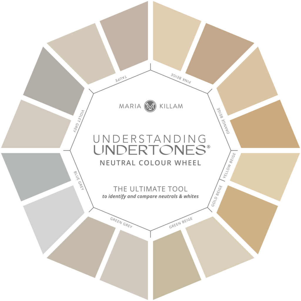
Get your neutral colour wheel (with real paint) here
What is the least expensive fix for this kitchen?
The least expensive fix here would be to repaint the cabinets and trim a violet grey. The right violet grey can be found in either of my ebooks with my Bonus book of colours here. There are only 5 to choose from, which makes this fix a lot less complicated than it looks.
How to avoid this kitchen mistake
This disaster could easily have been avoided if the designer had chosen a cabinet paint colour to coordinate with the flooring. She could have compared paint chips to the flooring options right in the store.
Everyone is quick to blame the light when their colour choices don’t work out. But most of the time the problem is that the most important step in choosing colour was skipped: DIRECT COMPARISON.
BTW, I have several hands-on exercises that help train your eye through direct comparison in my True Colour Expert Training two-day workshop.
Oh, and another thing that would have helped is being keenly aware of the undertones of neutrals and how to work with them properly. When you have a system like mine, bad store lighting won’t lead to bad colour choices.
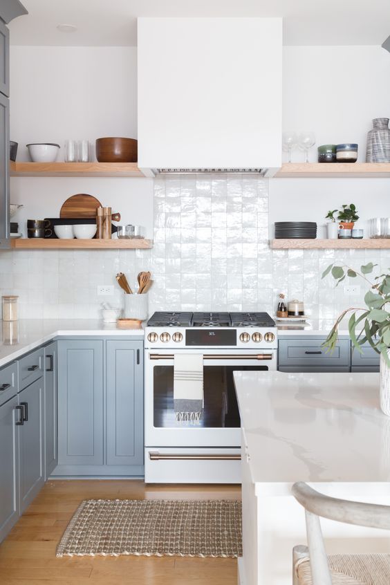
But really, had she chosen a timeless brown or blonde wood look tile flooring instead, the blue grey cabinets (or ANY cabinet colour for that matter) would have looked great in this kitchen. Remember, EVERY design decision is also a colour decision.
Read more: 5 Reasons your Paint Colour looks Wrong (It’s NOT the Lighting)
What happens when the design professional gets it wrong?
It’s upsetting that this happens to people earnestly seeking out professional design help. Sound colour choices are fundamental and exactly what you’re paying for.
This got me to thinking… Have you ever had a designer help you choose finishes and the result was bad? What did the designer say when it was all finished and there was nothing that could be done? I would love to know in the comments below!
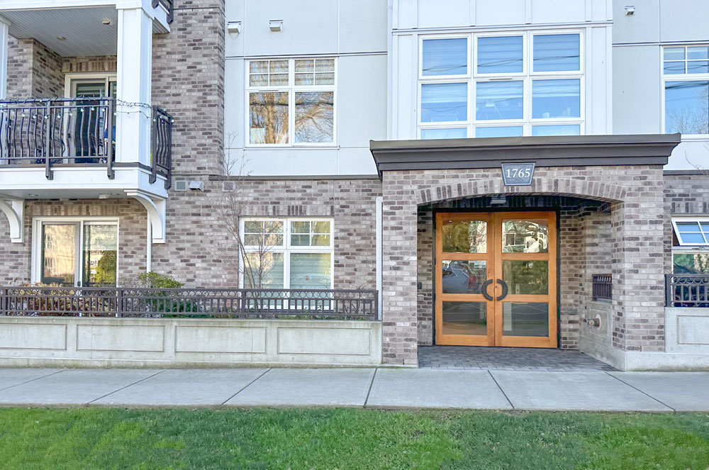
I recently drove by this violet grey exterior. It looks similar to the flooring above doesn’t it?
Whether you are a homeowner trying to update your home or a design professional working with clients, being able to choose timeless finishes in the right colour is paramount to creating a beautiful result. You be able to do with this with CONFIDENCE when you become a True Colour Expert this Spring.
True Colour Expert Training is a real-time workshop via Zoom for homeowners, design professionals, and colour enthusiasts who want to learn a solid process for making colour and decorating decisions from start to finish – that can be applied to ANY project.
Not only will you learn how to make the right choices for your home – but also the confidence that comes with understanding what’s missing or what’s wrong and how to make it better.
ICYMI: Vadara Quartz Guest Speaker
In case you missed it, I was in San Francisco last week at a speaking engagement at Vadara Quartz! See the recap of my trip in this video.
I was happy to see there are still lots of colourful homes in San Francisco, this one was so pretty in yellow:
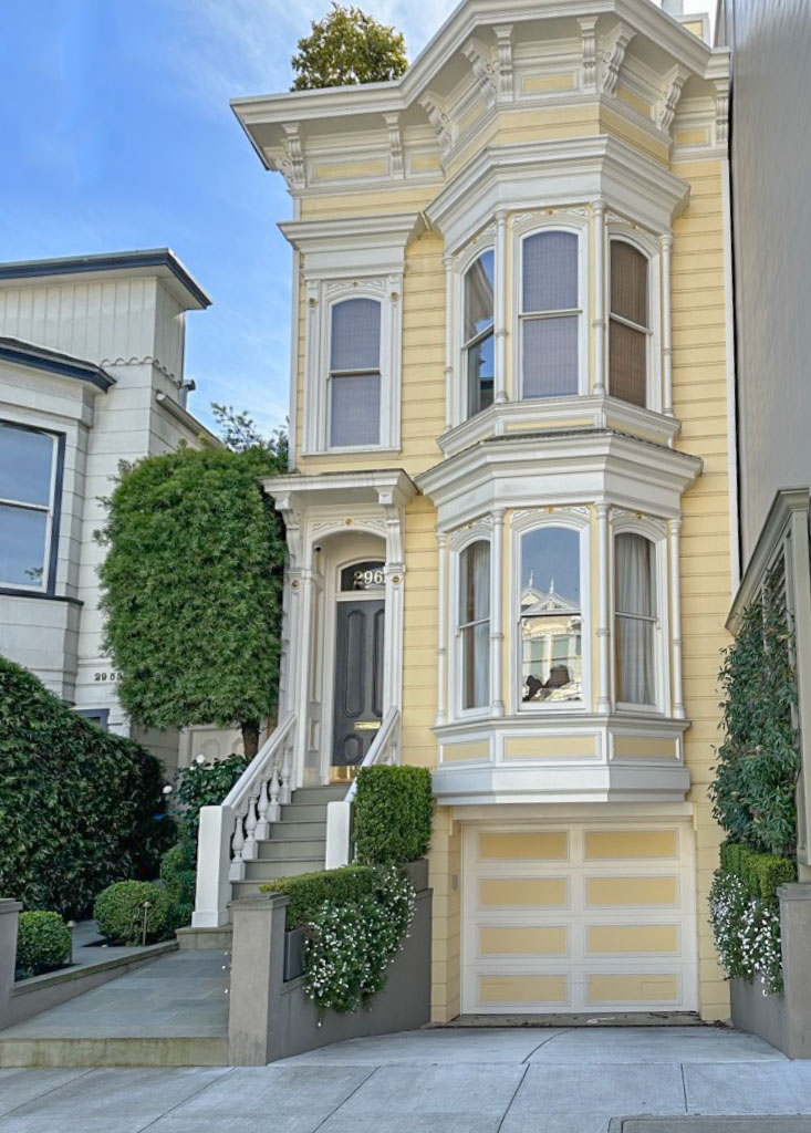
I brought my sister Elizabeth along to be my photographer 🙂

Renovation update: My primary bathroom is almost finished! I’ll be sharing here with you soon, my lovelies!
Related posts:
5 Things Everyone Should Know about Light & Paint Colour


Just here to say that I love your outfit! I’d love to be able to pull that off.
Just thinking that! Sequin jacket from Zara???
That kitchen is a hot mess.
The granite & floor are way too busy, the owner is fully aware & has my sympathy. Not all designers are good designers..sadly.
If you want to see bad exterior colour choices, come to Phoenix. Homes here usually need repainting every few years due to the extreme heat and sun exposure. I suspect folks get excited over the possibility of creating a new look and choose some trendy colour such as violet grey without ANY consideration of their taupe/pink roof tiles. So ugly. We accepted our roof was the boss (as you clearly stated in one of your previous posts) and just tweaked our paint colour, changing it from a pinkish brown to a sandy brown with a brighter cream trim color. Looks lovely.
People hate homeowners associations, but a couple years ago everyone decided to start painting the houses gray…with the roof tiles it looked horrible! The HOA quickly assembled a color team on the design committee and we put together an approved palette…people were furious, but I feel like we saved the neighbourhood. We gave them some grays (well, taupes) that worked with the roof tiles, along with other desert colours. We really had to make our case by mocking up several neighbourhood photos in gray.
Next challenge to the design committee: WHITE WINDOWS. Ugh.
I hired a designer to update my bathroom. The bathroom linen cabinet and a custom media cabinet for my living room were supposed to be a custom off white. When the cabinets arrived, they were very orangey and didn’t match the color she chose. I contacted the designer and she tried to pass them off as “close enough”. They were terrible and there was no way I was going to live with them. She suggested we paint them the correct color. This was unacceptable as I would then no longer have a factory finish on these expensive cabinets. I contacted the cabinet retailer directly who agreed with me that the color was way off and that they would replace them. He also told me she never even ordered a sample door in the custom color. In the end, the cabinet manufacturer had trouble matching the color the designer specified so I went with the stock white and it ended up being perfect. I wish I could send you a picture of the before and after!
Oh no! That’s too bad that you basically had to to the designer’s job in the end. I’m glad you were able to fix it!
I never went back to them to complain but I had two different designers who recommended color combinations that didn’t sit right with me but they brushed off my concerns and said they were fine. I never knew why I disliked their choices until I took your class and learned about mixing clean and dirty colors. Aha! In both cases that is exactly what was wrong. Made me decide to educate myself about color so I could recognize bad design advice. So thankful for your courses and blog, Maria.
On the other hand… I had paint colors that I loved in my Hawaii house that looked horrible when tested in my Idaho house. (MUCH yellower in the Hawaii house.) I was told northern sun has a lot more yellow than equator sun. It wasn’t an undertone problem, just the strength of the color.
Then I had numerous quartz samples picked out in stores that I brought home and did not look anything like they did in the store. In that case it wasn’t a latitude problem, and the lighting in tile/quartz stores is horrendous!
You are right about the lighting, but a DIRECT comparison of finishes/colors under the store lighting or in the Northern sun (with large samples) would have made all the difference. Because the lighting affects both finishes the comparison is usually valid under any lighting condition.
Yes, I fortunately painted large samples on the Northern walls before finalizing the color and spotted the problem immediately.
As to the store lighting, I’m not sure I buy that. I had all the surface materials in the stone showrooms: the cabinet doors, large piece of flooring, large wall color samples. It might have gotten me to matching undertones (assuming I’m actually good enough to get that right lol) but the colors themselves still looked very different in the actual house.
So I’m not saying that you shouldn’t take everything home, of course you should do that, but there is no way she even looked at the cabinet colour in the store because she would have seen it was a blue grey there as well as in her clients home. Yes always take your samples home. Thanks for your comment! Maria
This happens to me all the time! Not in interior decorating, but in an expensive color analysis I had done to find out “my colors,” and then again, at a hair and makeup session before my daughter’s wedding. Luckily, I knew enough to mention warm and cool tones, and quickly realized the so-called experts I’d hired knew less than I did.
I’m glad to know I’m not the only one who is certain their color analysis was wrong!
PS. A more on-topic comment — IMO, that disaster kitchen is a combination of multiple colors and styles. It’s far more than the ugly flooring or wrong-colored cabinets. The art is a no-go. The metal brass-ish stools do not complement the colors or design. The lighting, which I might like somewhere else, is out of scale and place. The stone archway is yet another random design element. It’s like the designer spun the wheel and just chose whatever she landed on.
Agreed! I gasped at how bad it was, even worse than I expected from the description before. I hope this person was able to get some sort of a refund from the designer, everything was just wrong and doesn’t relate to anything.
I agree but I think the “art” might be the tv.
I don’t get it. It’s very simple: color should be checked in the home, not a store.
And light have some effect. It’s not the only variable by far, but it can make a difference.
How may times did clients’ lamps have beige or tea-stained shades or dim builder grade light bulbs with a low CRI and/r Kelvin, or ceiling light fixtures yellowed by previous owners’ cigarette smoke or be off-white, and just changing those shades or covers made big differences. And how many clients had unhappily chosen a taupe for a room and when western afternoon light hit the walls, it turned violet or pink?
It doesn’t matter if it’s the store or the home, it’s the DIRECT color comparison that makes the difference. We’re talking about color coordination here. The flooring needed to be evaluated directly with the cabinet color under any light situation. Designers can and do correctly specify color without ever being in the space. Most colors will relate to each other the same way under any light condition.
Well my guess there was no checking at either end, and my point about the lighting is simply that if she had chosen the blue grey millwork colour in the store along with the flooring it still would have been blue, there is no way it would have looked ‘correct’ even in florescent store lighting. Lighting is not the scapegoat here as it rarely is in any mismatched situation like this.
Thanks for your comment, Maria
This reminds me of a neighbour who got new siding last summer, and now they have warm toned brick and cool toned siding.
Aside from that wrong floor color, the flooring itself is so variegated that it looks so busy and distracts from the rest of the room, which is quite nice – aside from the color choices. As interior designers we first and foremost need to know about color!
I don’t think color is the first thing designers should learn about. And it’s not the most important aspect either. Color is a part of design, but design isn’t about color.
Honestly, yes. It looks like they bought discounted leftover odds and ends and just mixed it all together. I hope this person got a refund and some assertiveness training. You know she wishes she could have told the installers to just stop as soon as she saw it, but it is so hard for people to pull that trigger isn’t it?
In this case, I feel like the mismatched undertones may be the least of her issues. Sadly that tile is just awful regardless of whether it goes well or not with the cupboards (but I do see the point). I actually think the paint and the cabinets look very nice and would have a hard time matching them to the awful flooring. Why does it stop short as well? I can’t figure any of it out. Hopefully these designers go out of business soon!
Also meant to say — it’s amazing how restful it was to look at the further down picture with the wood floor. It was like ‘ahhhh’ after looking at the mismash above.
Things that make me go mmmm. What a teachable moment. A basic sample board of materials for client approval would have helped. Like woah…as an interior designer I’m grateful I found Maria’s color wheel. It’s fun see what the undertones are. This methodology needs to be taught in all design schools (it’s not).
I would hope any design professional would’ve changed the materials when putting together that board. A board like that should never make it to the client.
I just wonder if the person who bought her home did anything to this kitchen. It should have prevented the home from selling at a premium price. I am staunchly against grey in any form or fashion. I’m kind of surprised people are still choosing to use it but that’s my personal opinion. A different cabinet color like you said was a good idea to make it better.
My main bathroom was renovated last year. I started working with a contractor who had a showroom and a designer. Of the five kinds of quartz that they had, I was advised that there was only one that I could choose from that would fit my budget. I had determined that a luxury vinyl floor was the best option as I wanted the bathroom to allow me to age in place, and found the LVP options to be very limited (there is natural finish maple hardwood in the adjacent rooms so wood-look LVP was not an option). So the floor chosen is marble look, white with grey veining. The whites in all of the various manufacturers’ LVP like this were very cold whites and the quartz patterns she had me considering were much warmer whites. I left and moved on to another contractor. I’m still surprised that she didn’t recommend another manufacturer’s quartz as it would have worked better with the floor. I ended up choosing a quartz that is a cooler white and just love it. Each time I walk up the stairs and catch a view of my new bathroom, my heart sings.
I’ve been following your blog for some time and appreciate your advice. A few years ago the baseboards, trim, etc. in the house were repainted and the white paint worked in all rooms but one. I didn’t want to repeat that mistake when renovating the bathroom so purchased your ebook, White is Complicated. I found it to be very helpful, but still very difficult to work with contractors and designers who did not understand colour. (The cabinet maker who worked with the contractor I had hired came by the house to show me a sample cabinet door with the white paint colour he always used and therefore was going to use in my bathroom and the contractor was very unhappy when I insisted on a different white; the contractor wouldn’t let me choose the tile grout until the tiler was on site (I ultimately chose a medium grey – the white grout was awful against the white subway tile), the tile store couldn’t provide samples for me to try at home with the other items that were being considered (and lost my business as a result), etc.
Thank goodness it was her basement and not the main kitchen. I’m sure she was happy to move.
Maria,
Can you put LVT or LVP over tile? My inherited kitchen has 2005 busy beige tile in an open floor plan right next to engineered hardwood. I would be scared to remove the tile in case the removal messed up the hardwood. Thoughts anyone?
I renovated a kitchen with ceramic tile floors next to white oak hardwood floors. The tile was removed and white oak hardwood floors were installed. The surrounding hardwoods were refinished about three years prior, so a matching stain was achieved. The removal of the ceramic tile did not damage the hardwoods. I knew the quality of the work of the person who did the floor which makes a difference.
Thanks, Barbara! I’m in a new area so not as confident about the trades. I wanted to see about extending the hardwood into the kitchen but alas, the manufacturer did not recommend as it is a “thinner” engineered hardwood. So my thinking had been more about the possibility of putting LVT on top to mimic a simple tile instead of trying to match the engineered hardwood. And instead of using a Schluter type transition when the hardwood was installed, it has a lovely “T” transition (not) which does not thrill me to think about aging in place as it is a trip hazard. Wish I could add a picture 🙂
Aside from the color, I don’t like those super contrasting stripe floors. It’s become such a thing, but that trend needs to die.