


I get a lot of questions about which paint colour goes with which neutrals/colours. But without this, you will continue to spin (and I can’t exactly help you). Do you know what it is?
Before we get into today’s post, I just wanted to share that our hearts go out to everyone affected by the earthquake in Turkey and Syria. The images and stories are devastating. So much tragedy. 💔
The questions I get most…
There are two questions I receive over and over and they go something like this:
I bought your colour wheel and have identified my couch as a green beige. From reading your ebooks I know green beige looks good with BM Feather Down and Soft Chamois.
But what if I wanted to paint my wall a colour? Do greens look best with green beige or what if I wanted Palladian Blue which you said is a blue green? I believe I would then need to make sure my rug relates? I think you said green beige is dirty and doesn’t go well with blues? Advice?
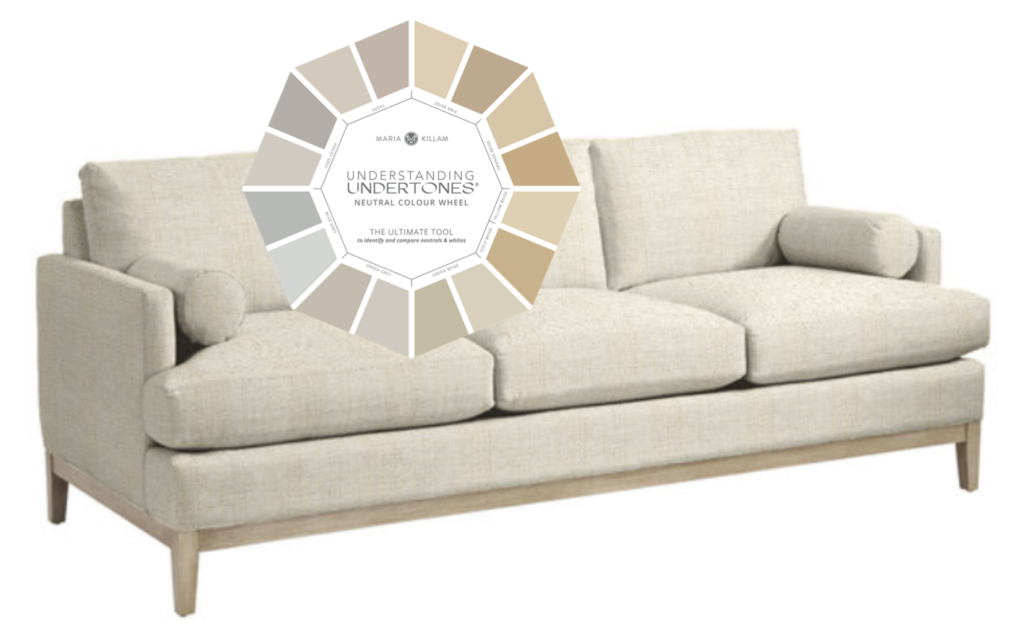
Ballard Designs | Understanding Undertones Colour Wheel | eBooks
Basically the question here is, “I have a neutral sofa. How do I choose a COLOUR for my walls instead of a NEUTRAL”
Then here’s the opposite kind of question:
I have a light sky blue colour on the ceiling in my dining room that I love and want to keep. How do I use the neutral colour wheel to find the undertone of my blue so I can find a beige or complex cream that complements it?
In this case the fundamental question is “Which neutral will look best with my ceiling paint colour?”
Here’s what I know for sure about BOTH of the rooms in question here.
The room is empty, and undecorated.
Or at minimum, the room is filled with furniture that does not help answer either of these questions.
You are asking the wrong questions about neutral and colour.
The answer to the first question is that we need to find a rug to inspire our colour choices. And the best way to do that is by assembling a mood board with some rug options.
You learn EXACTLY how to do this in my Shop Online with Confidence course here. You’ll INSTANTLY save the price you pay for this course over and over again, because you won’t make expensive purchases that don’t work once you get them home.

In fact it will be the gift that keeps on giving forever once you learn how to create mood boards before you make home decor purchases.
Whether you prefer to shop online or visit stores in-person, a mood board guides you to the right colour choices. Many times we’re looking online at our options before we enter the furniture or decor store.
BONUS! Once you learn how to do this, even the fashion you order online will start showing up in the right colour.
Why do I need to create a mood board?
Without a mood board you will spin and spin about the right option. You’ll order rugs or pillows that don’t end up working and return them over and over. You will likely get discouraged quickly, especially because creating a look and feel in our homes is so important to our daily happiness.
And choosing the right paint colour is only one step to creating a look and a feel.
Doing a deep dive into my free content is smart. But if you are a highly analytical person, you will go down a rabbit hole and find yourself dwelling on questions that have no business being in your head.
Plus there are many bad colour combinations that can be FIXED by finding a rug that pulls them together or a piece of art that magically makes it all look intentional in the end.
But you won’t get there by fixating on whether green beige and blue greens go together? That’s not the purpose of the neutral colour wheel.
By the way the short answer to this question is YES. They do work together. I haven’t ever said they didn’t. But, it’s simply not a question that will get you any closer to the answer.
The question you should be asking is, “what decor/rug/pillow will help me pull together a colour palette for this room?”
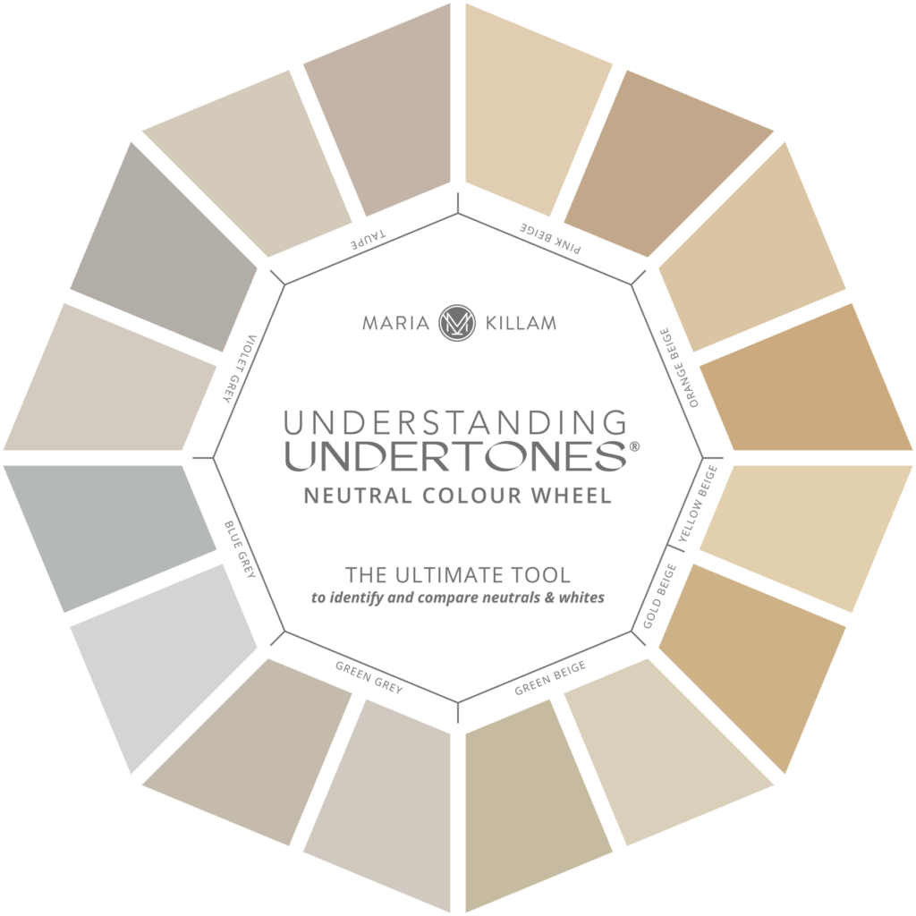
The answer to the second question is that my neutral colour wheel is designed to help you navigate the world of NEUTRALS and WHITES (the whites are on the back). It will not help you find the undertone of a chromatic colour, so that you can then choose the right neutral to go with it.
This question again tells me that the room is empty of inspiration.
And, there is probably not a colour in this world that wouldn’t work with a pale blue ceiling anyway. A blue ceiling feels like the sky so you almost don’t need to even repeat blue in your decorating.
Which neutral works with X paint colour?
However, if you are starting with a colour and want to know which neutral will work with it, the easiest way to get there is again by creating a mood board.
If you’re shopping for furniture, you might start with a rug that has some blue in it and a neutral to make it easy to choose the neutral.
What if you liked this rug? The overall background is blue, but what about the neutral pattern? That’s when you would use the colour wheel to identify what neutral it is.
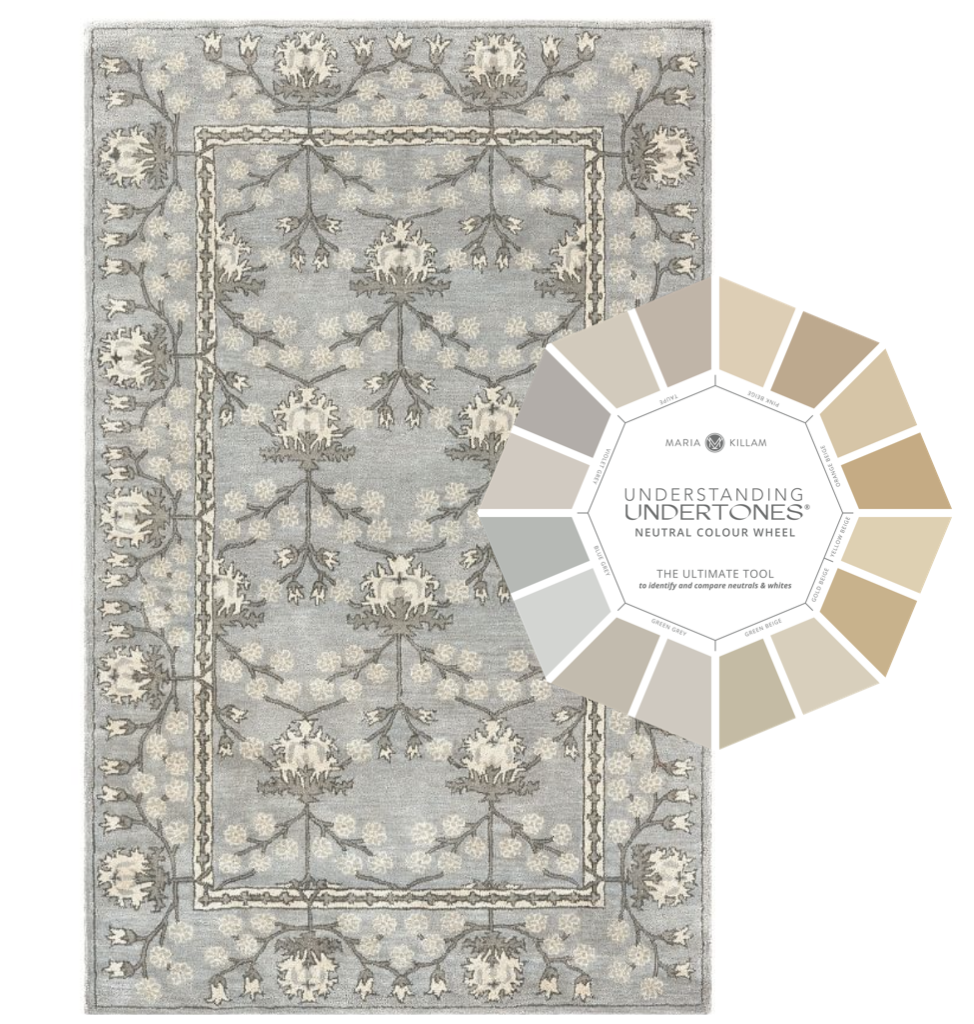
If you look closely, it appears that it could be taupe or violet grey? There are two ways to find out.
First, before it even arrives on your doorstep you can get really close by adding it to a mood board. Then find two paint dots online in those neutral undertones using my curated system colours (located in my bonus book of colours in either of my ebooks).
That’s all you need by the way. I curated 50 of the best curated neutrals and whites that are found everywhere and in everything in this world. This narrows down thousands of neutrals into the BEST and most optimal choices.
Ok now let’s take a closer look. What do you think? Which one looks best?
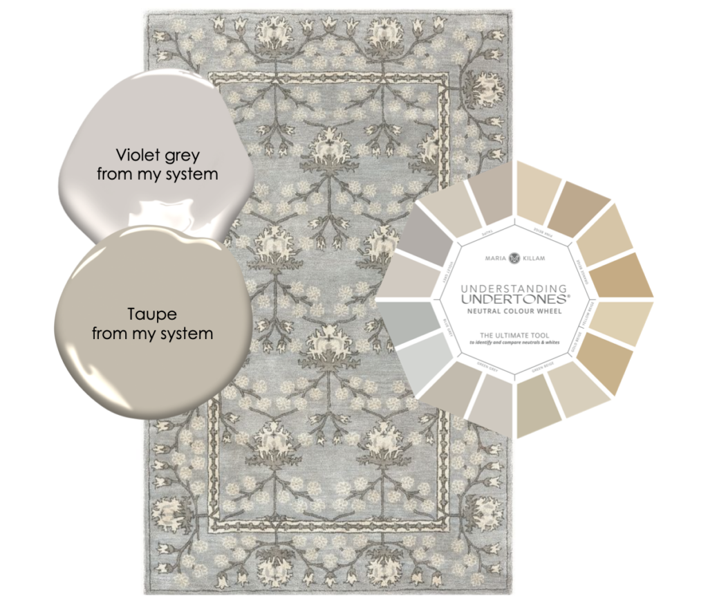
The different is pretty subtle, right? That’s why my large paint samples are needed. Because you’ll be in countless situations like this (either in your home or a clients home) where the difference between ‘meh’ and ‘perfect’ is this subtle.
So, I’m saying it’s violet grey.
If this is on your mood board and you wanted taupe, not violet grey, then you would need to find a different rug. AND, you didn’t waste your time ordering this rug, only having to return it later.
Is this making sense yet?
Where can I learn to be a better decorator?
If you really want a deep dive decorating with colour, you should register for my True Colour Expert Training. It’s kind of like that proverbial saying, “Give a Man a Fish, and You Feed Him for a Day. Teach a Man To Fish, and You Feed Him for a Lifetime.”
I’ll teach you how to fish. As a result, your house will be endlessly prettier. I promise! If you’re looking around your house and wishing you knew how to make it look better or more pulled together, this workshop is for YOU!
You’ll be sitting in the course, looking around your house while listening to me talk about something–because there is SOOOO much content–and all kinds of ideas will pop in your head on ways to make your house more beautiful and more timeless.
When my former assistant first took my course, she heard me mention that most windows need at least two off-the-shelf curtain panels to avoid the ‘sheet blowing in the wind’ look. She immediately purchased a second panel for all the windows in her home upon arriving home.
She knew something was off, but couldn’t put her finger on it. That’s because I help you see colour and design differently. And you can’t unsee it. You’ll finally know what might be missing or what choices to make for a more beautiful home.
So my lovelies, I’ve said this before and I’ll say it again, for the best result, you need to actually commit to the DECORATING. Find the duvet, the area rug, the sofa colour, the throw pillow, the artwork, or even a countertop — BEFORE you ask for a paint colour.
If you’re renovating or building a new home and don’t have time to make any decorating decisions before, then start with your countertop (or tile) to help you choose a main neutral for the entire house. The point is you must choose SOMETHING.
Any hard or soft finish choice is a better starting point, because paint is the easiest colour to change.
Should I just paint all my walls white dove?
Lately the question I’ve been getting a lot is, “Maria, should I just paint my house white dove until I decide what to do with the decorating after I move in?”
Why choose a white that looks like you just “called it in” and had your builder spray it all down a stark white that resembles primer?
This is why choosing an open layout paint colour is a good idea, whether it be an off-white, a complex cream or a greige. I can help you get it right and you’ll love your house every time you walk in the door.
PS. I’m in San Francisco this week speaking at a Vadara Quartz showroom opening! Come see me there!
Related posts:
Ask Maria: What Undertone Should I choose if I’m starting from Scratch
Where to Start when you Have a Blank Slate
Got Inspiration? 10 Steps to Create the Rest of the Room

Bang on Maria! I am analytical and I did go down a rabbit-hole on your site. I finally bought your colour wheel and took the online shopping course.
I thought I was a savvy online shopper and I’m pretty technical so figured I wouldn’t learn much :-). But a few of your tricks truly have paid for the course (in money and significantly reduced frustration!).
I’m really looking forward to working with you on my kitchen e-design….I just have to get my thoughts in order to guide you on our aesthetic!
Hooray, thanks for your note! Maria
I understand that a rug can pull together a design scheme and serve as the unifying design element of a room. However, in terms of costs, in general, an area rug is far cheaper than a professional paint job. It is far easier to buy a new rug than to have your room or rooms repainted. Therefore, I don’t understand choosing the cheaper, more disposable, more easily changed piece first.
It’s for people who are painting anyway, and need to choose a color. If you have a rug you like, you just pick a color or neutral out of the rug. Easy peasy.
Also, there are THOUSANDS of paint colors but far fewer rugs to choose from. 🙂 Once you love the rug, finding the right color in the rug to use on your walls is relatively easy.
So true. Even more true if you are picky about rugs.
The exception is if you are bound and determined to have a certain color on your wall like me. I like aqua walls, so I’d have to either hunt for a rug or choose a neutral rug which would be easier.
Just know this . . . Professional designers always do mood boards with furniture, rugs, fabrics, and wall colors to show their clients.
They usually offer 2 or 3 mood boards as a starting point, and the client chooses one they can tweak further.
If a professional wouldn’t show a client a wall color in isolation, neither should you show yourself a color in isolation.
They usually begin with fabrics and rugs, and build the room from there.
Yes you said it the best Lorri! Maria
It’s my long-ago self who worked as an assistant in a design studio talking.
I slung around more designer fabrics than I care to remember. 😉
I love hearing your readers questions, it’s helpful to know what is going on, so we create a way to help them.
I’m almost thinking of stopping providing paint colors to my clients as you have mentioned, it’s really the decorating that is needed to ‘pull a room together’. Might just keep it to the design service. It’s challenging showing them that a paint color is ‘the one’ without the supporting stars – the decor!
Maria, I hope you don’t mind, but I am interested in your color with confidence course and have a few questions:
1. Will participants get to ask you questions directly during the workshop?
2. Do the colors include Sherwin Williams colors or just Ben Moore. It’s tricky b/c a lot of painters around me have SW accounts but not BM, so it’s better to use SW colors.
Thank you!
Yes you’ll be able to ask questions throughout the course! I teach my system in both BM And SW but everyone gets a BM fan deck because that’s how I originally learned the system but they both work just as well and you’ll receive a form that tells you which BM colour is equivalent to the same undertone in the system in SW. Please email [email protected] if you have any other questions, we would love to help! Maria
Hello!
Thank you for all the information, suggestions and advice! This may seem like an odd question, do you know where the sofa is from that is included in this post? I love the style of it, thanks for your help!
Lori
It’s linked underneath the image! Maria
I think it’s also worth pointing out that rug designers are in the business to make money, and color palettes that are aesthetically unpleasant don’t sell! The same goes for artwork. Therefore, picking a rug or art that works with the hard finishes does a lot of the heavy lifting for you – as long as you work with the colors present in the design, the resulting colors are very likely to be harmonious and pleasing to the eye. Bottom line – as a newbie, don’t try to create a color palette for yourself – let the accessories choose it for you.
The balloon gif is gone! I want to thank you for listening to those of us who had a difficult time with that moving image. Much appreciated.
Hi Maria, You mentioned you’ll be in San Francisco at the Vadara showroom opening and that we can come hear you speak. How can I get more information? I would love to attend. Thank you, Lisa
Go to the Vadara Quartz website, scroll down to the bottom and click “News and Press.” Maria’s event should be the first one on the top left “Love Is In The Air.” Click that box with the balloon for the schedule and scroll to the bottom to register.
Here is the link: https://www.vadaraquartz.com/news-press/events/love-is-in-the-air/
How do you get Sherwin-Williams dots from the internet? I can get Benjamin Moore, but not Sherwin-Williams. I have some curtains that I would love to match (I have a weakness for matching curtains to walls), but I’m stuck just uploading a picture to one color, and switching the color and uploading the picture again. It makes it really tough to compare. What do you recommend?
SW colours are square and you pretty much just need to search the colours but you can also get them from their website. Maria
I think that was my question about the blue dining room! I appreciate your straightforwardness. How did you know the room doesn’t have much inspiration?! Haha. It’s true!
If I’m understanding you correctly, you’re saying: “Do not choose a neutral to coordinate with your blue paint color in a vacuum. Choose a decorative item you love that fits your room, and work from the neutrals in that item.” This feels like a DUH moment, but I also see why I wasn’t thinking that way in the first place.
I will make a mood board and go from there. Thank you!
Maria
I know this is an older post .
But I have a question
If you had to pick time for a whole house
Carpet bedroom
But the rest tile and you had no other option what color tile would you pick ?
And your trim and ceiling had to be SW pure white ?