What makes a design good or bad? Often, the one thing that sets apart good design is having a plan. What else makes a good design?
Good design and bad design cost the same
Have you ever thought about that statement? We see it all the time – just like in this post. A brand new kitchen–no money spared–and it was still badly designed. Ugly costs the same as pretty.
The key to good design is by making informed decisions from START to FINISH. Because every finish you choose is a colour decision first.
Bad design usually happens with inexperience. You don’t know what you don’t know. And that’s when you just keep choosing the same colour for everything. Or, you make your kitchen a collection of all your wants and wishes, and install them without a designer or without a design plan. And a design plan simply helps you consider the everything – the whole, or the sum of all the details.
Good design is a game of balancing contrast and coordinating colour. When you get these right, you’re most of the way to beautiful. And it’s really hard to do without a plan.
Bad design also happens when you start asking the wrong questions, like this:
❌ Will ______ paint colour or flooring make this room look smaller?
❌ Should we install _______ because it looks warmer?
❌ Should we install _______ because it’s bigger or smaller?
Good design happens, NOT when you have ALL the answers to ALL the questions, but when you know the most important questions to ask. That’s when you’ll get the answer to the question:
✅ Why is this flooring choice better than that one?
→ You’ll discover which questions you need to ask in my two-day Specify Colour with Confidence Workshop.
Adding windows & creating contrast in my upstairs kitchen
Here’s our media room and how it looked on the day we took possession of this house. Truly I call this room our entertainment room instead of a media room because it also came with a full size kitchen.
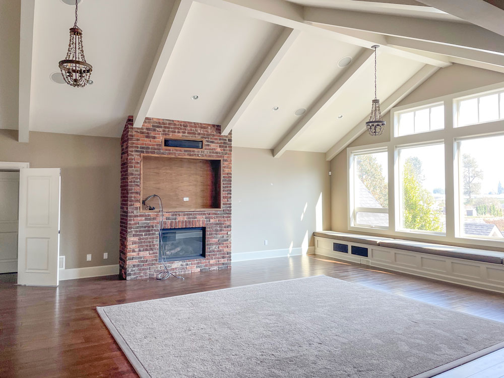
Since it is on the second floor, the views from this room are so beautiful.

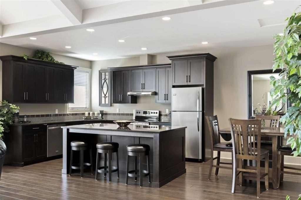
Here’s a look (below) at the adjacent kitchen on the day we took possession. See where the two mirrors are in the kitchen area? There’s one on the left beside the cabinets and then one on the right.
We have windows there now. They were installed last week. Actually we installed 4 new windows in this house. One in our primary bathroom and another in Terreeia’s office – both on the first floor. My project manager/bestie Jan Romanuk said when they built the house, they used up all their window allotment in the sunroom and simply didn’t apply to add more windows.
 Before
Let’s talk about bad design. There are several things I don’t like about this upstairs kitchen design that we inherited. Most glaringly, it breaks one of the top rules for good design: CONTRAST
There is zero colour or tonal contrast in the finishes. The floors are brown, the cabinets are espresso, the backsplash is brown, the counter stools are espresso and the countertops are almost black. This gives the eye no interest to land on and no relief from all that BROWN.
Bringing in more light is key, but I needed to make several other changes to turn this badly designed kitchen into good design.
Lack of contrast is an unfortunate design fail that happens with kitchens all the time. Most recently you’ve likely seen scads of all-black and all-grey kitchens and bathrooms with almost no white or cream to break things up.
→ How to handle contrast is covered great detail in my two-day Specify Colour with Confidence Workshop.
Good kitchen design = considering EVERYTHING
Every day I receive messages from followers who ask if they can JUST get help with their countertops, or their flooring, or their cabinet colour. But we stopped selling single selection eDesign packages like that a few years ago. . . Because it didn’t work.
Here’s why: If you aren’t sure about how to pull your room together with this finish or that one, you won’t know if you are really asking the RIGHT question. Chances are, advice on the one element you are purchasing help for, will not alone create a good design.
And you don’t know what you don’t know, right?
So, a cheaper consultation on just one element doesn’t allow me to help you design a beautiful and timeless kitchen the way I really want to. Because it’s the combination of the whole that needs consideration. Focussing on one element in isolation is not the kind of help that will actually make you happy with your kitchen or bathroom.
Much like an IKEA bargain can fall short on good design (if you don’t have the right hack): Read the rest of this post here.
Knowing how to fix bad design choices in the MOST cost effective way is something I am constantly sharing here on the blog. We take a deep dive into the BEST WAYS to spend your money (or your client’s money) in the right places in the two-day workshop as well.
Because knowing what tweaks will create the most impact is a seriously magical skill.
We also go deep into the process of how to successfully combine various finishes and colours by testing and comparing them EFFECTIVELY so that you’re never again just crossing your fingers and hoping for the best.
→ Learn how to move forward with the right colour decisions NOW so that you have a long-term design for LATER in my two-day Specify Colour with Confidence Workshop.
Upstairs kitchen updates
Here’s what my upstairs kitchen looks like now without a backsplash or a hood fan (still coming). We removed all the uppers to make it feel less like a kitchen and more like a casual bar area. The refrigerator was replaced with a pull-out fridge and we added a butcher block countertop because we didn’t have access to any more of this granite.
The counter stools were leftover from my last kitchen. You can still buy them here. I should warn you, they are not the most comfortable counter stools in the world but they sure look good.

Sources: Pendant Light | Counter Stools
It looks like a completely different space right? My engineered flooring looks so much warmer and more timeless because re-stained it in Provincial.
You’ll also notice I drywalled over the recessed lighting. I will have a surface mount light over the sink and lighting along the upper shelving that will most likely be installed on the left side of the windows.
And can we talk about how fabulous these new windows are?
Now that we mirrored the window above the sink on the right it feels like one big window (of course, the wall still needs to be painted).
And the window in the kitchen dining area on the right truly elevates the vibe in this room. It’s so much brighter and happier already.
I have paused the renovation here because I want to focus on other areas of the house right now. I still need to complete the furnishings plan for this room. And I may consider replacing the dark countertops, or I might keep them. They look much better with the soft blue cabinet colour. I still need a backsplash tile, upper shelving and a decorative hood fan. #staytuned
What makes a good design?
It’s common to think that GOOD design is all about filling an empty box with interesting colours, finishes and furnishings. It’s kind of like those popular game-like design apps.
But the truth is, the majority of the time, GOOD design is about knowing how best to work with that you’ve got. It’s about knowing the right questions to ask. And that’s what sets an expert apart.
→ Discover how to look at the big picture to make the right colour and decorating choices for your home – but also the confidence that comes with understanding what’s missing or wrong and how to make it better in my two-day Specify Colour with Confidence Workshop.
Early-bird rate ends soon!
Begin your journey towards becoming a True Colour Expert in my two-day workshop this Spring. I promise, you will discover a whole new way of seeing colour – and there will be so many things you can no longer UNSEE.
But it’s also so much more. You’ll learn how to solve REAL-LIFE colour and design challenges. I will guide you through hands-on activities with real room exercises to help train your eye.
Plus, you’ll gain a clear understanding of timeless design principles and how that gives you more freedom to express yourself through styling and decorating – with my BEST styling tips.
Who is Specify Colour with Confidence for? This real-time workshop is for homeowners, design professionals, and colour enthusiasts who want a solid process for making colour and decorating decisions from start to finish – that works for ANY project.
Seats are filling up fast, so don’t wait to sign up! My early-bird rate ends February, 28! Enroll now.
I can’t wait to MEET YOU this Spring! 💛
Related posts:
The True Story of the First True Colour Expert
Another Creative Who Traded in Their Old Job for a Design Career


I think a hutch or shelves over the but the butcher block would be a place for serving pieces and glasses. It could look like a piece of furniture. I know you are not done. Will love to see the decorating part. Love the windows.
Your renovations are happy-feeling and inspiring. Thank you for sharing your photos and descriptions. I love reading your blog posts while having breakfast. Benjamin Moore ought to put you on commission, because I’ve been motivated by your blog to do far more painting In the past few years than all the decades before put together.🙂 By the way, I always click “no” when they offer to purchase a color wheel comes up, but that’s because I’ve already purchased one. (Please make one for shades of blue! Or yellow!My favorite colours but I never get them right The first time around.)
Amazing transformation! Just wondering, are you planning to do a classic/timeless pool finish series?
This is so gorgeous. I love that because it’s a second kitchen upstairs, you have the opportunity to do a less “kitcheny” space. I’ll stay tuned for how it will evolve 🙂
I actually liked it before. It just needed pendant lights, and the new windows help with more light. Then add colorful stools and some flowers on the island plus pretty floral fabric curtains would have been enough for me! I guess if money is no object, then doing projects like this are fine. It’s not the main kitchen, so I wouldn’t put much money into it. I am never going to be a fan of open shelves in the kitchen because I don’t want to dust them and I don’t want to constantly organize the things on them.
Using a mirror to duplicate an existing window looks great when there is nothing in front of the sink but will you feel the same when there is a reflection in the mirror and not the other window? Since it is not the main kitchen it won’t be used that much but you anticipate having groups of people from classes use this space…just wonder how it will feel/work when in use…
And personally.I think the idea of making the wall above the butcher block into more of a dry cabinet with some glass in doors a good idea
Like a Welsh cupboard
I’m pretty sure Maria used the word “mirrored” to mean the same as “duplicated”. She added an identical window.
Maria, I just looked at your Instagram. You’re moving through your renovations at the speed of light!
So lovely! Thank you for sharing.
I guess you order a lot of DoorDash. Removing the uppers? Kitchens should be functional and this begs the question, where do you put all the stuff that was in the uppers? A big miss for me on function although the colors are great.
This is a second kitchen and not primary.
This is a second kitchen in her home.
Did you read anything before commenting?
Did you read the article? It is a secondary kitchen in an entertaining space. Their main kitchen is downstairs.
This is so not me…though I so often think about posting a response to comments…this may be the first of many comments to previous comments…in defense of Kathy…the original kitchen and upstairs layout appeared to be for another fully functional adult (stairs) (maybe airbnb or seasonal rental or maybe even for the parental units). Taking the kitchen apart to suit M & T is clearly their choice but quite honestly the trend of no uppers in the entire kitchen appears not only not functional but, to me, a bit …well bland. Like colour contrast, texture, shape, movement of the walls, & light all play a part in one’s perception of a space. I love the colour but strangely my DH and son prefer the brown, stainless/black kitchen…their comment was ‘finally a man’s kitchen.’ Is there any chance one’s gender proclivity has any bearing on one’s preferences? And to all the responses, please be constructive in your comments…I understand your responses but clearly, they are not necessary and only reflect upon the poster. Thank you for reading and have a wonderful weekend!
Regarding your questio of color, there have been many, credible scientific studies that show females can see more shades of color than males. Men are also less adept at distinguishing among the shades in the center of the color spectrum, like blues, greens, and yellows. This may explain why your DH and son prefer brown – they just can’t see the difference???
The transformation is amazing! I love everything you’ve done and would leave the dark counters as they are. The refreshed space looks right at home in the rest of the house without looking too “new”.
It looks leaps and bounds better already! Would you consider not doing a vent hood at all? I think they feel very blatantly KITCHEN and as you said, you want this to feel more like a bar hangout and entertainment area. If you aren’t boiling pots of soup or frying foods, you honestly don’t need a hood in a lite-use kitchen IMO (Please no one shoot me… I cook daily and in my first two homes had no over the stove vent system of any kind and it was totally fine. When I finally got an outside-venting hood put in, I discovered it was good at taking the cooking heat away quickly in summer but otherwise noticed no difference.) Of course there are inconspicuous downdraft pop-up vents you can put in, too. More expensive but nicely invisible.
Hmmmm. . . that is an interesting idea. . thanks, Maria
There are even down draft hoods which can be installed behind the range..electronically go up when in use and down, out of sight when down. I totally agree with Julie’s suggestion…as a stand alone hood would attract attention/focal point and clearly says ‘kitchen.’ Give is some serious thought if not too late.
That’s exactly what I was thinking Julie. The bar-like kitchen area is much better without uppers and a range hood would make it look more like a kitchen. We cook a lot and our down draft Jenn-Air range was quite sufficient in our previous house.
Maria, the bar-like area is such a good idea considering the future use of this entire room.
I love that you have added more windows and I love your views and the extra light. When you decide on the appropriate placement for a new window, I assume you have to also consider how it will look on the outside of the house? When we had our house built over 20 years ago, when I was making window changes, I never stopped to think how it would look from the outside, I just wanted a bigger view on the main floor and upstairs I wanted higher windowsills so the kids wouldn’t fall out! I think everything turned out OK but I realize now I should’ve thought more about how the windows looked on the outside of the house.
All 4 windows were installed on the sides of our house so no one will ever be looking at them, therefore I didn’t pay much attention to that, although I think Jan (my project manager) did. Maria
Hi, Did you use two different materials on the counter? I would really like to do that. It looks like you changed it at the stovetop. If you change it, do you look for a natural stopping point such as a stove or sink?
The reason it’s a butcher block is because we took out the old fridge and didn’t have any more countertop material. Renovations are rarely perfect so this was a good solution! Maria
Could you share the color of the blue cabinets?
Yippety Do Dah! You are zipping along girl. Everything looks lovely. When I designed my new home last year, we went with soft blue cabinets in the laundry room and I’m loving them!
Designing our own homes is so challenging isn’t it? As designers, we know all of the options and our inbox is flooded with new images and offerings from our suppliers as well. Lots of choices to sift through.
At first I didn’t notice that the cabinets were blue but then I saw your gorgeous ceiling and it connected. Beautiful!
It looks GREAT Maria! It amazes me how many peeps have something negative to say. The painted cabinets are 1000% times better than the blah brown ones! And, losing the uppers I’m sure makes it feel light and airy… There is a place and time for uppers but definitely not here, enjoy your updated space!
Hello! Instead of a range hood, wine rack and art 🙂 We had a wine rack custom made to fit the space and our needs and more than happy!