When I was in New Jersey leading my Specify Colour with Confidence™ event and the second evening at dinner, I was sitting next to a designer who asked me a question about kitchen valances she was designing for a client. She was having trouble finding a fabric that her client liked.
I suggested a solid fabric (below) with contrasting tape or a band of fabric, this way you’ll get two colours without a pattern you have to commit to for a long time.
I don’t know about you, but I generally get tired of pattern easily, which is why I usually only include patterns in throw pillows when I design colour palettes for my clients because they are easy to change up. Just like the ones I recently picked up from High Point Market for my living room. I’m so happy, I feel like I have a new living room.
If you have a lot of disposable income for decorating, it’s much easier to commit to a trendy pattern because then when you get bored, you can just replace your drapes, for example.
This morning I received an email from a reader who was trying to decide whether to purchase an area rug in one of the new geometric patterns. My advice was to go for it but just make sure you don’t treat it like you’re buying an heirloom for the house. I have worked with so many clients over the years who just won’t part with their rugs because they were so expensive.
But every pattern has a shelf life, some last longer than others. However, if you spend too much money on a trendy item, it might boss you around for longer than you’d like if you can’t bear to part with it for that reason.
So here are my three tips:
1. If you need two colours, create a colour block using colour or white plus a colour!
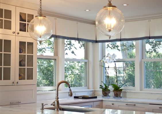
Notice the blue fabric lines up with the window sill. When designing a colour block drape like this, you’ll want to notice that kind of detail to see if it applies to your window.
Interior Design by Maria Killam
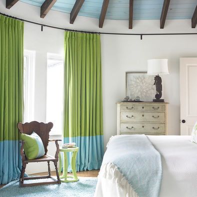
This living room drapery I designed for a client also lines up to her window sill (above).
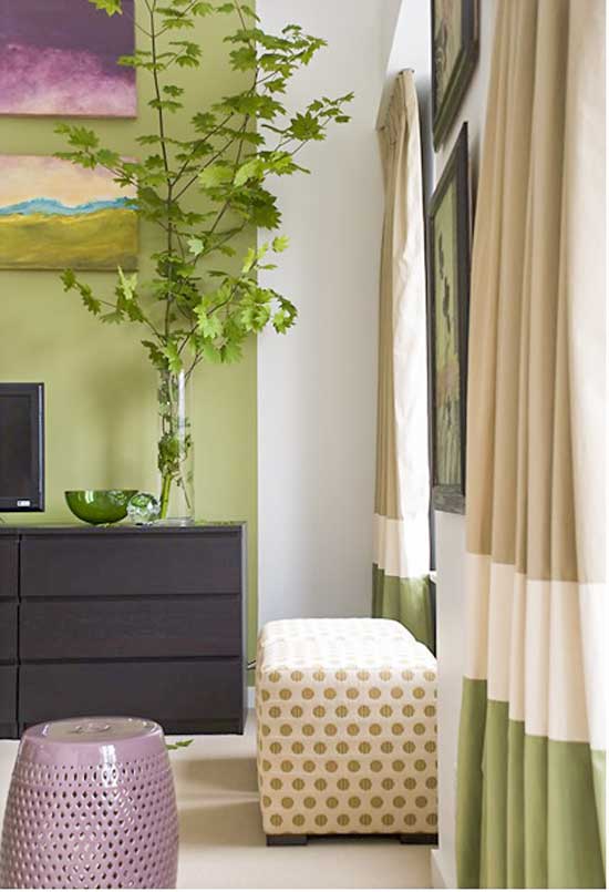
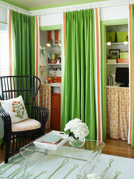
This is also an option (above) keep in mind this kind of window treatment would be very labour intensive and won’t be inexpensive. You’ll have to pay by the foot to create each panel of colour.
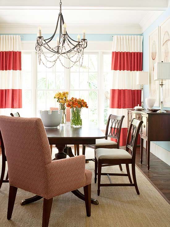
Also, careful when you specify large stripes like this, they can sometimes look like you’re in a carnival. This one is too wide to look like a carnival stripe.
2. Use tape or a contrasting fabric to add more colour.
Love this combination of the pattern underneath the bookshelves with the contrasting banding.
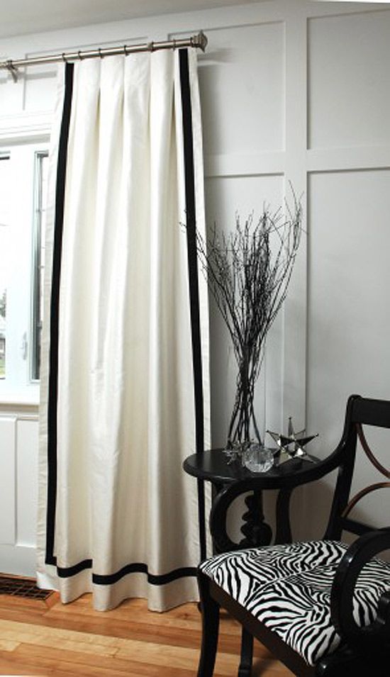
If you are just getting side panels made for your window, you could run the banding all the way around like this black and white one. Then you can actually see it.
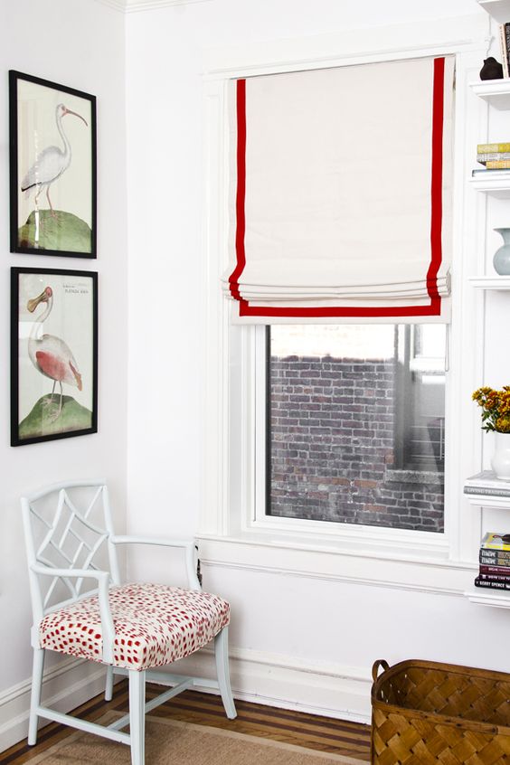
For a roman shade, you can design the band so that its sewn all around the edge, or have it start approximately one inch inside like this one (above).
3. Same goes for pillows, I have never met anyone who didn’t like the idea of including a colour blocking pillow (the white and yellow one below) in their collection of throw pillows.
Interior Design by Maria Killam
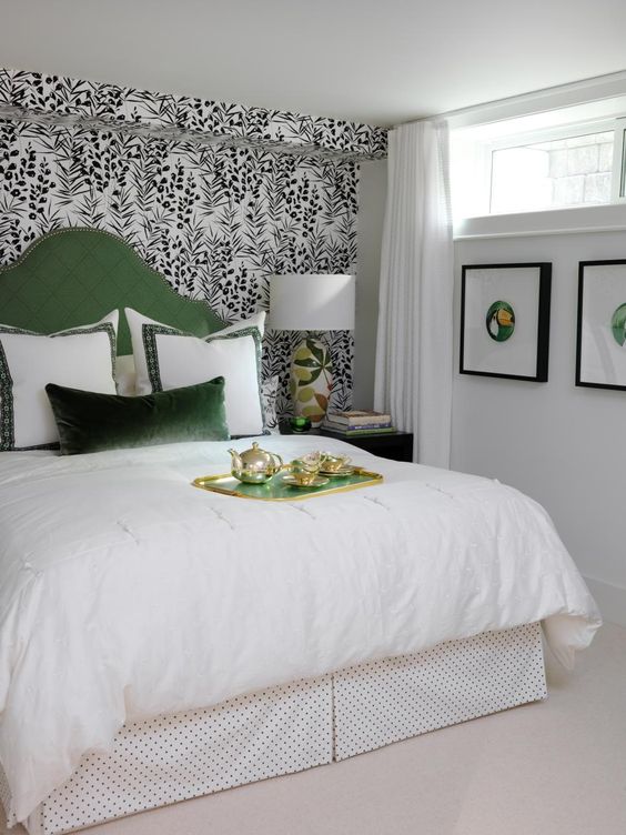
Or run tape around all four sides of a pillow like the euro shams above. I also love how Sarah added artwork below the window in this basement bedroom.
There are lots more ideas on my Window Treatments Pinterest boards, here.
Related posts:


GAWD YOU’RE GORGEOUS!
These photos are absolutely perfect!
You are stunning!!! Love the pics!
Your advice about being careful how your blocks of color or stripes line up with your windows is good advice. It’s visually jarring to the eye if they’re off kilter to the panes or dividers.
Fabulous you and great advice on the window resolutions..
Perfectly timed advice, thank you, Maria! I am about to start shopping for fabric for curtains for our sitting room.
Great advice, as usual. Can’t wait to see the new site!
So beautiful Maria!
I tell my clients the same thing about pattern and window treatments! 😉
Fabulous post!
Same shoes!
You just gave me ANOTHER ahha moment. I go through drapes quite often. Mostly because I can make my own. But the ones I’ve kept the longest are the ones with no pattern. You just explained why that is.
Since my furniture is in solid fabrics, I thought I had to add pattern in the drapes. But color blocking didn’t occur to me.
You’re so smart!
Wonderful ideas! Could you advise on treatment ideas for bay windows sometime?
You can, technically, put almost any window treatment into a bay. You need enough hardware mounting room and the right rod. Sometimes that means having the rod custom-made to get the bend right. Form must follow function in a bay or you can loose too much window. Decide what you need your window coverings to do for you — like block sun, or provide privacy at night, or just be pretty over the blinds — and design accordingly. I find that in an inset bay a ceiling mounted rod where the brackets attach to the top of the rod is usually the most versatile because the drapes don’t have to gather in the corners. Placement of the rod above the windows in a regular bay follows normal mounting guidelines. Don’t let the shape of the window fool you into thinking you have to do something different. Get the hardware sorted first and the design second and you won’t have nearly as many problems as if you go the other way.
The link to the cushions post takes us back to the curtains post.???
I’m really excited about the color wheel you’re developing. This will be helpful with clients.
Love your photos!
PS I’m the one who would probably refuse a color blocked pillow)) I like more fluid patterns. Even when geometrical..
Oh, but I also love different textures. Velvet and linen and wool and embroidery..
So if this color blocked pillow was, say, cashmere..))
Am I the only one who does NOT like color block window treatments? I think they look cheap no matter how much they cost. I think they look like you couldn’t decide what to do so you threw all the colors together. Plain is always so much prettier than color block.
Personally, I agree. I have never, once sold color blocked drapes. I think, if the color is added on the bottom, it looks like the draper ran out of fabric, if it’s at the top, the high contrast often demands so much attention it deters from the fluid look of the drapes. And it locks the colors into the room. No room for change if the client so desires. I really believe that drapes are like subway tile — classic and timeless is best.
Great post, Maria! Thanks for these thoughts and tips. I am SO with you on minimal use of patterns- I only use them in small doses that can easily be changed out as well. Glad to know I’m not alone in this! Thanks for articulating this concept.
Love that white and yellow square pillow, so cute! And you look so stylin’ lounging in that chair!
xoxo, Jill
Maria, First, such a good post! Everyone has likes and dislikes as far as color blocking. I use it to add a little pizzaz to a boring room. That way you can bring in color that pulls the whole room together.
I will be so excited to see your new format and especially excited to see your new color wheel! What a wonderful tool that will be! You are a wonder woman and you should have your own TV show!
That’s pretty amazing how good you look in that
room! Its like you were both designed to go together…interesting!
Carol
I love the photos, really beautiful pictures, and especially your picture inside this photo, it seems so perfect, your picture belongs there.
Thanks for sharing! Thinking of changing the living room sofa slipcover, pillows, and curtains. In the past I added contasting but in my third color banding around an added panel which was a print. It worked really well as it was just enough. FYI looking for new towels in gray and seeing green gray. I need the blue undertone – in the past I would have settled but no more lol!
As always, this was such a thoughtful and informative post! I appreciate your great observations, including the importance of lining up color blocked lines with window sills. I also enjoyed getting a peek at your branding photo shoot and felt your pain when you mentioned worrying about having to muster up a sincere smile for the camera. Have a great weekend!
I’ve always thought simple is the way to go when it comes to window treatments. Thank you so much for showing me why! I often have the problem of finding a pattern I actually like, so seeing someone suggest to just not use pattern is wonderful.