


My team is back and sharing the biggest and best colour trends as seen at High Point Market. Here are their colour expert-approved trends any home or design lover should know.
⭐️ Have an interest in interior design combined with a knack for organization and a liking for providing day-to-day support in an administrative role? Click here! ⭐️
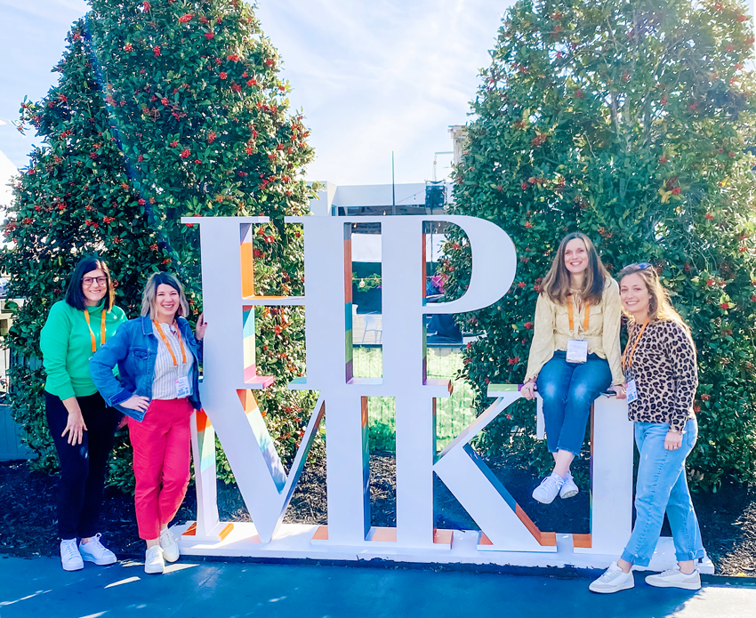
I wasn’t able to get away, but I sent my eDesign team and my social media director to High Point market on my behalf. Enjoy this recap from my team!
______________
High Point Market is such a great way to really immerse yourself into the design world. And after not travelling for a few years, it was so exhilarating to step outside of our homes, our cities, and even our country (for one of us) to see what’s happening in the world of colour and design.
We are so grateful to Maria for sending us on this colour scouting trip! 💓
What’s new in colour for 2022 and beyond?
Overall, just as Maria predicted in this post, people are starting the really lean in to colour – as in more saturated and bold colours – not just darker neutrals. And that makes all of us at Maria Killam Inc. so very happy.
That’s not to say that neutrals are going away anytime soon, but there’s more balance in the use of saturated colours with cool and warm neutrals. Just as this post forecasted, everything is warming up.
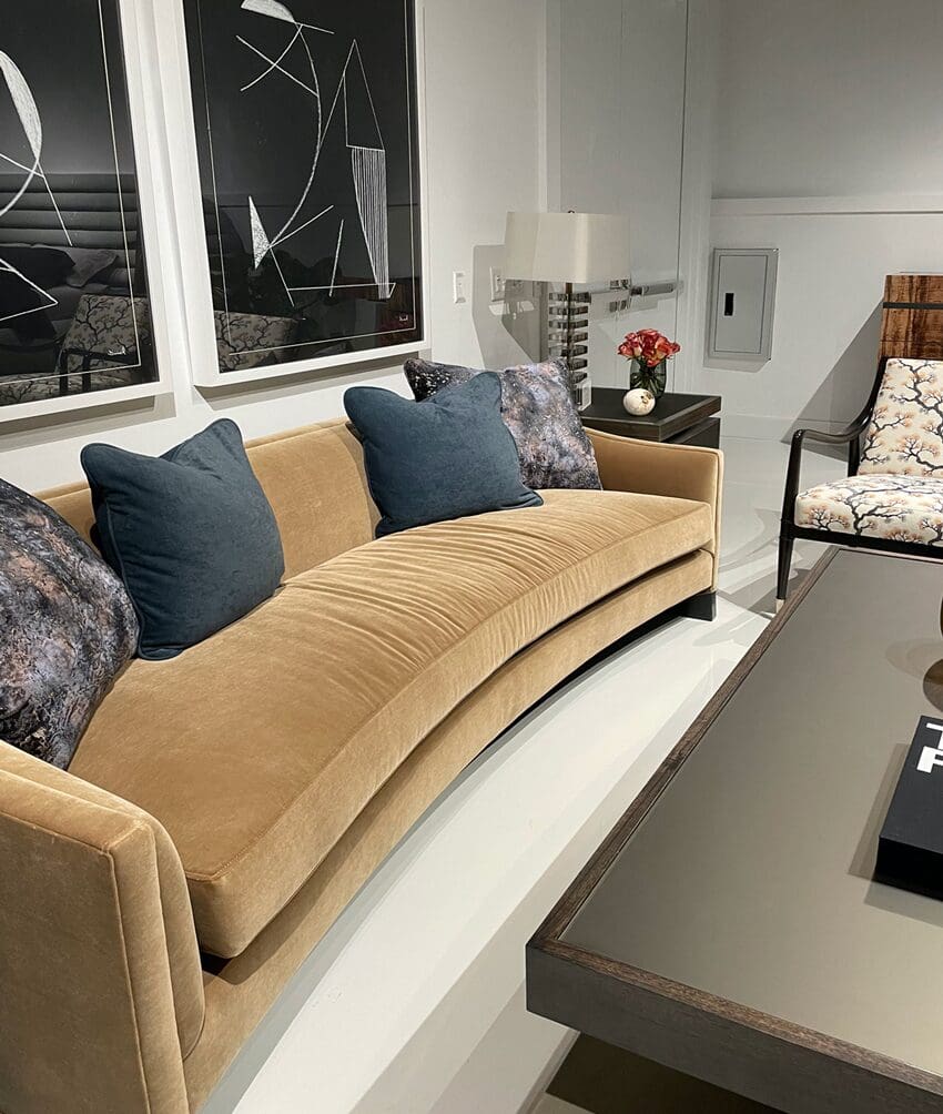
And FINALLY, there really seems to be a departure from grey as a whole. It was still present, but the greys we did notice were primarily violet grey or taupe, shifting to the warmer side of things. We also saw a lot of blue greys, which typically read as blue and not grey.
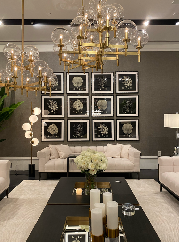
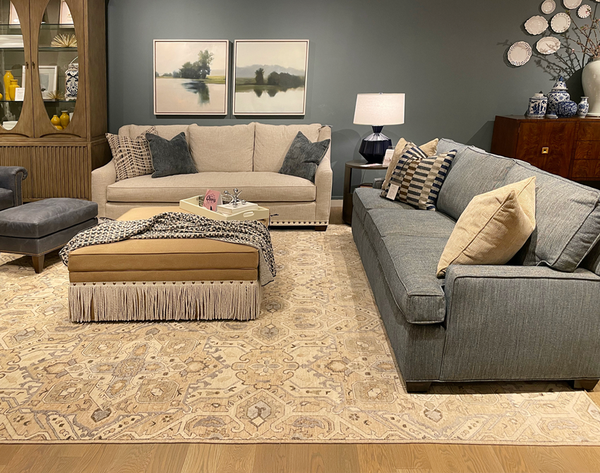
Cream and white were the dominant settings for large furnishings like sofas – no surprise there. However, when a showroom was absent of saturated colour, bold patterns and chunky textures were used to warm things up.
As you might expect, there was plenty of green on display, but that’s not what we’re going to show you here. Open any shelter magazine or look up any paint company’s colours of the year (COTY) and you’ll find greens everywhere, so this wasn’t a new.
Read more: Greens that are HOT; Greens that are NOT
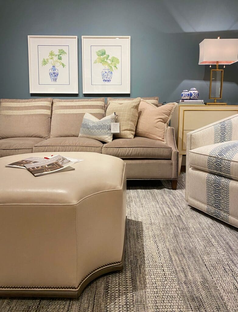
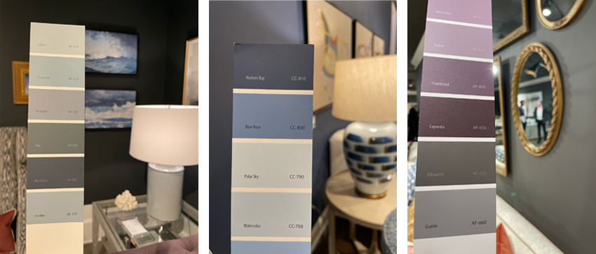
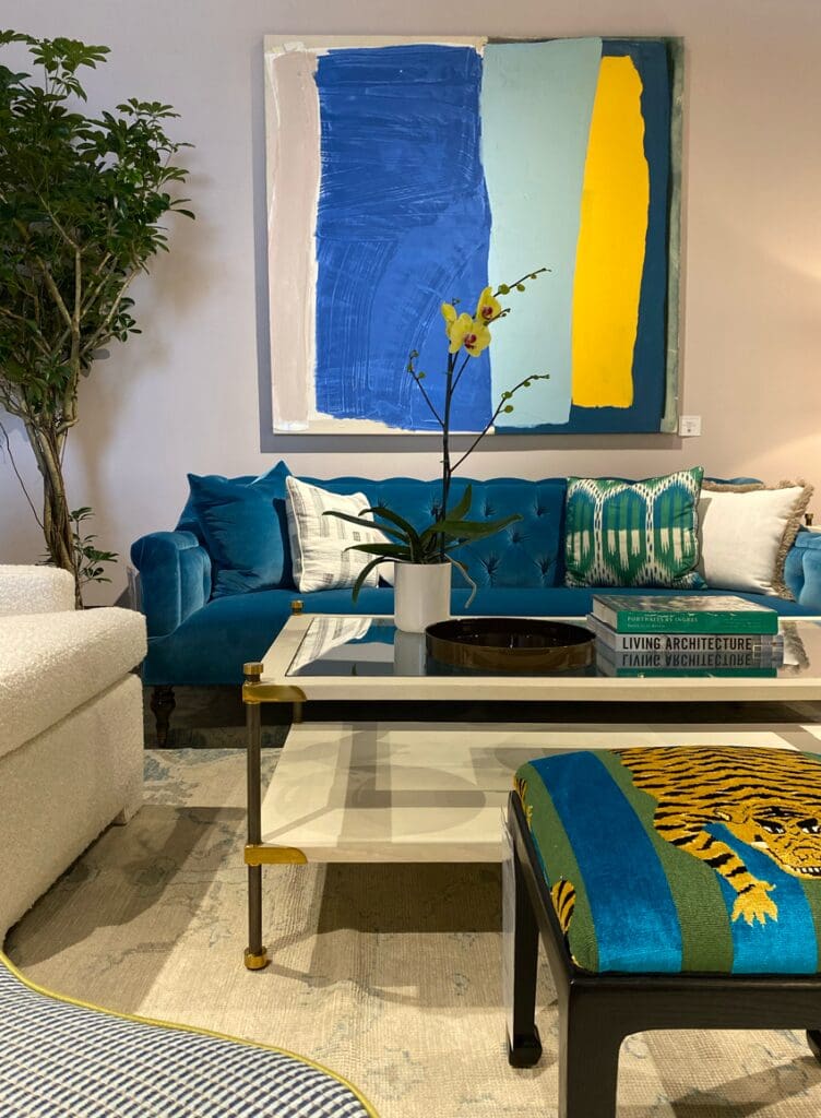
Nuanced, Rich Colours on Walls
This really isn’t about one colour trending in particular. But, collectively, we noticed richer colours like blues and greens on the walls. Elaborate details like high contrasting saturated colours in upholstery, metal and art decorated the showrooms.
This lent a dramatic and glamorous vibe, which is a departure from the earthy, natural feeling of interiors we’ve been seeing everywhere.
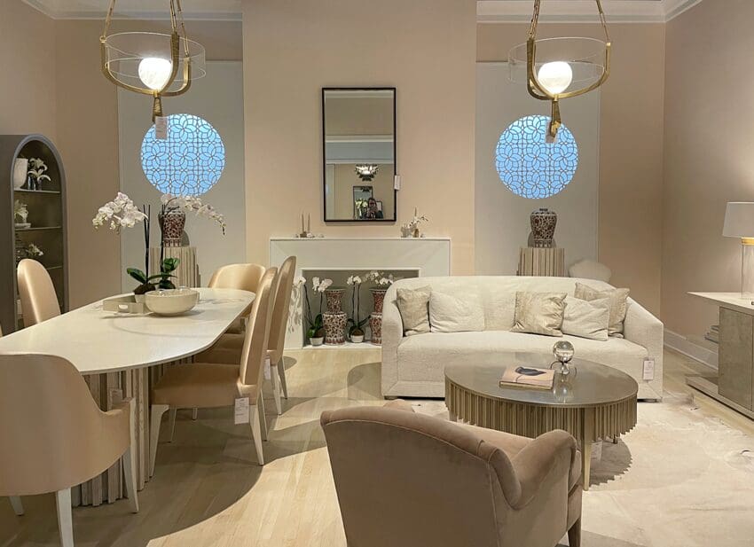
Again, in metals, brass took top billing and makes a good companion for white and beige furnishings. Deep charcoals are warming up to bronzes as well. (PS. We love this trend in eDesign as well.)
Read more: Is Brass Out? How to Mix Metals like Pro
1. Terra cotta isn’t just for plants
It’s another shade that’s trending. Here’s a look at the lighter terra cotta that we saw on walls and in furnishings.
Also, if you’re going to install random, geometric moulding on an accent wall, it would be better if you created a removable wall like this one:
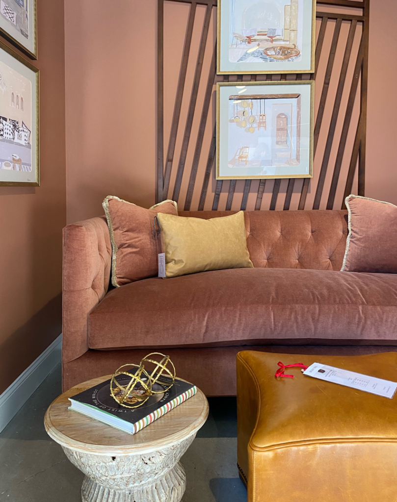

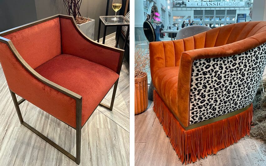
We also saw a lot of deeper, saturated terra cotta that felt more like rust (which was big in the brown trend) or orange to us – and was highlighted in both more modern and masculine room designs. This colour was also used as an accent to warm up charcoal textiles.
Something else we found interesting is that a few years ago overdyed rugs in blue, teal or even pink were everywhere. Here, the overdyed rugs were predominantly a rusty orange.
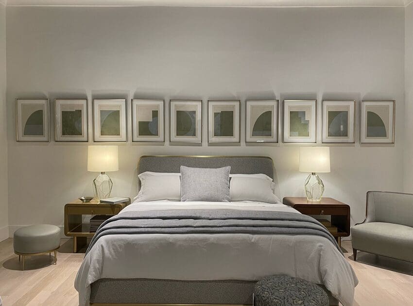
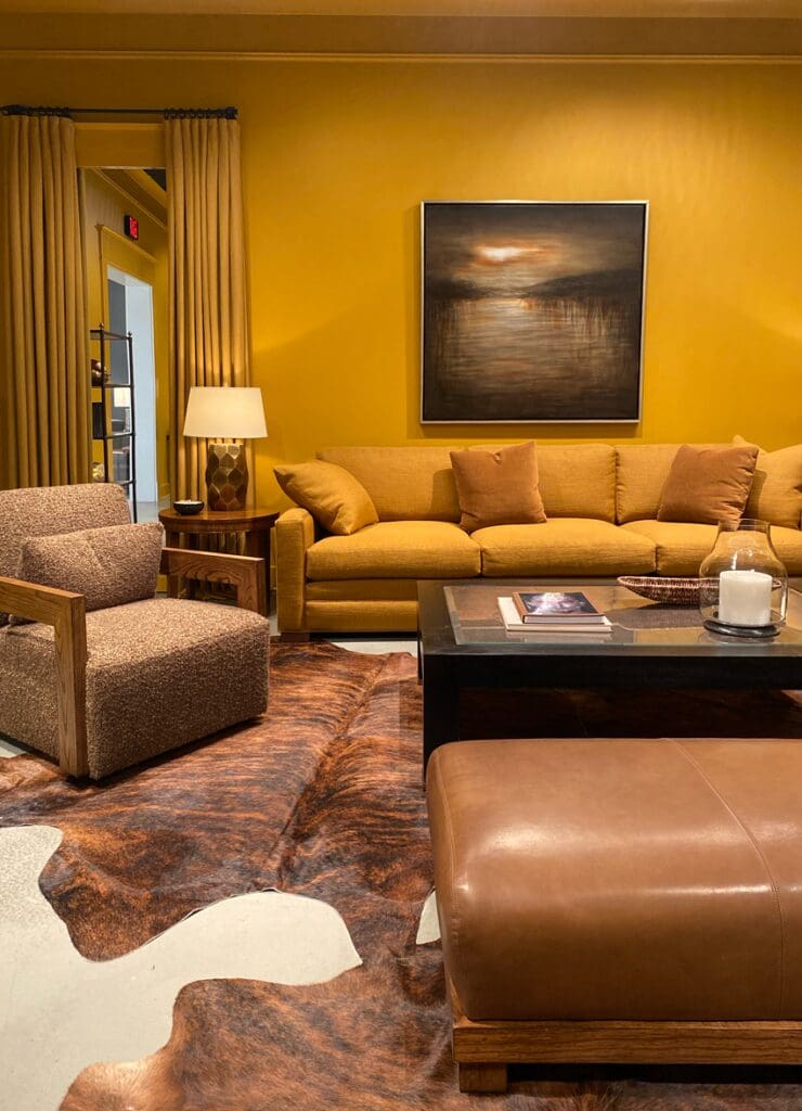
2. Colour me happy – yellow is back!
We imagine there isn’t anyone more excited about the yellow colour trend than Maria herself. High Point market finally confirmed that yellow is emerging in home decor too.
The bright, sunny yellow colour (similar to Maria’s sofa) appeared in very traditional, glam or very modern room designs.
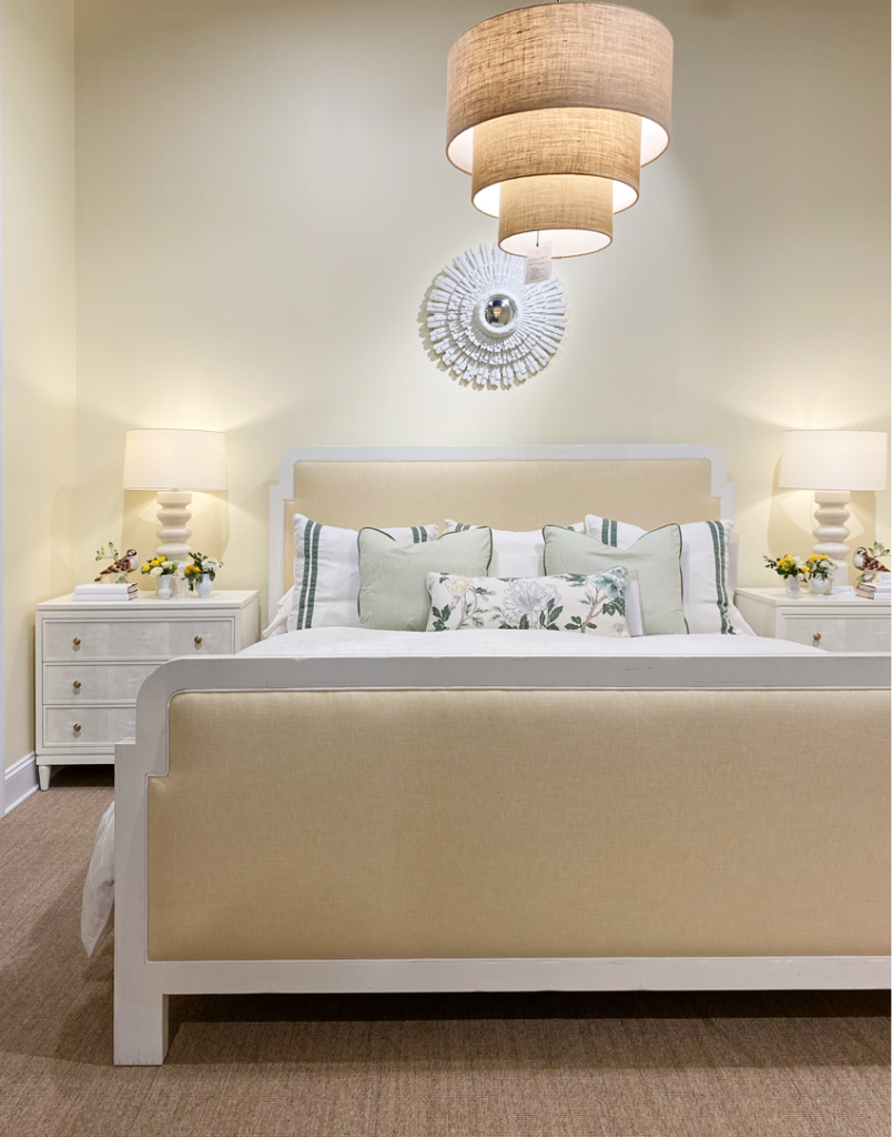
And, while most of the yellow we were seeing was yellow beige (like in the bedroom above) when it was integrated as the main colour of the design – the bolder deeper and more saturated yellows were used as accents to rooms that were portraying an overall warmer look with a richer colour palette
A warmer, golden yellow showed up in both furnishings and on walls in a variety of design styles. Don’t mistake this with metallic gold, but rather a more ubiquitous hue like Benjamin Moore Stuart Gold or Bryant Gold.
3. A softer version of cognac emerges
Cognac is likely responsible for bringing all things orange forward. And while we were surprised there weren’t more cognac sofas being used in showrooms, we did see cognac and even lighter caramel, butterscotch or orange-y gold hues in all kinds of fabric and decor.
In other words, cognac has been softened and refashioned in all kinds of ways.
Read more: The 2022 Trends we’re Warming up to!
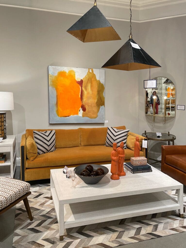
Remember when cognac first entered the scene? It was mostly just being paired with black and white. And it was really only interpreted as leather colour. Now we’re seeing it layered in rooms as wall colours and other textures like velvet.
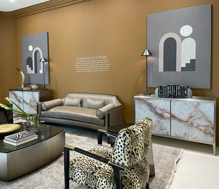
These warm oranges are definitely the perfect addition to an animal print, too, which is a classic print that seems to be gaining popularity again in home furnishings.
4. Can gold beige really be current again?
Gold beige is definitely a blast from the past. And we saw plenty of gold beige sofas in modern shapes and new materials.
If you think back to the world of early 90s beiges from the Tuscan era, gold beige was typically paired with creams. But now, in an all-white room, it feels fresh again.
The furniture lines we saw in gold beige were more streamlined too. We’re not seeing the big rolled arms and oversized nailheads that these colours used to be associated with, and that makes it prettier and classic.
This new warmer gold beige (aka soft caramel) sofa might have more appeal as a safe neutral for the masses – especially if you aren’t committed to colour. And when it’s paired with a richer-looking fabric, like performance velvet, it takes on a whole new feel.
By the way, we heard from many showrooms that luxe-look textured fabrics like performance velvet are now available at lower price points. This makes it very desirable for consumers trying to achieve a more curated “magazine” look in their furnishings.
Gold beige also looks pretty with blue greys and when used on a modern sofa shape, looks current when it’s interpreted as a fabric (as seen below), rather than leather.
5. Are you team pink/mauve?
Depending on your age, you might be really excited about the arrival of pink and mauve or you might be horrified. If you grew up with mauve, it’s very likely you aren’t a fan now. And, if you are a millennial, you just might find it super chic.
Is there any colour that evokes a more emotional response than pink?
The pinks we noticed most leaned into mauve, but there were some saturated pops of pinks too.
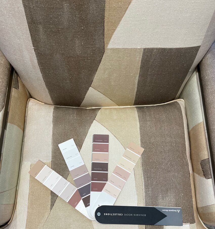
Did you know that most pinks/mauves look pretty with both beige and grey. Mauve in particular could work well as an accent colour in a room where you are layering in some beige to warm up your existing grey (as seen on this chair fabric below).
If you’re looking for a calming or romantic colour for your bedroom, consider pink or mauve.
_____________
The biggest and best colour trends
When talking about trends, I like this analogy:
“Trends are like a river: You can try to divert the water’s course, you can go for a swim, or you can sit on the bank and watch. The only thing you can’t do is stop the current. ” – Stephen Orr (editor-in-chief, Better Homes and Gardens)
We discuss trends on day one of my true colour expert training. You’ll discover some colour and design history, aka, “What does knowing about past colour trends have to do with me in 2022 and beyond?”
A LOT actually.
To work well with colour, you need to have an understanding of where we’ve been and where we are going. And, I can help you navigate timeless, no matter where the trends are headed. Grab a seat here.
Don’t just take my word for it…
I so appreciated your explanation of the past color trends and how to navigate the bossy elements. I’m the artist, not the scientist – thank you for saving me from another color theory course! Amazing 2 days! As a designer of 25 years, I have renewed confidence as I help people transition from our heavily Tuscan architecture to the newer trends. I’ve got my mojo back!!! – Cindy S.
So, now over to you my lovelies? Any trends you are super excited about (read: yellow)? How many of you are team pink? 😉
Related Posts:
Maria Killam’s Colour Trend Forecast for 2022

I love orange, so I’m happy to see it making a comeback! I won’t be able to convince my husband to paint any orange walls, but it would be nice if orange accents are easier to find.
Love pink.
Hate mauve for eternity and beyond.
So happy color is the new “trend”. That room with the deep blue sofa and tiger on the ottoman-perfect! I also love the rich orangey and yellow colors. For me I’d use it for furniture or accessories rather than painting a whole room. Pale blue-grey or blue-green-grey is so beautiful. And pink. Love pink, in certain shades. Not mauve though. A very pale pink can look elegant with the right furnishings. And I’m pretty crazy about pops of Fuchsia or Magenta!
I’m happy to know my newly decorated creamy yellow-undertoned bathroom with yellow beige countertop will be current! And the terra-cotta coloured tile in my white kitchen with black counter tops and my orange accent items is current too!
Thanks for giving us a peek of what was trending at the recent market. There seems to be a tendency towards combining pink/mauve with yellow or gold whether it’s color or neutrals, not my fave color combination. But I loved your first picture so I went onto Highland House’s website, so many pretty vignettes with vibrant colors/muted colors with cream or white. I feel more hopeful now. 🙂
Just didn’t see anything that I would use for inspiration in my home. The last 7 pictures were kinda ho hum. I noticed a switch from wood to painted, glass, or metal end tables and coffee tables. Loved the color in Maria’s living room; many tips and ideas including the painted ceiling! Having said that, I was surprised how much I liked the yellow bedroom above. Hopefully, more colorful accents will be available (rugs, pillows, lamps).
What a fun post. Thank you. I never painted my red brick fireplace (dark rust), just wouldn’t do white, gray or black. Now I’m happier with that decision, especially with the pale terra cotta pillows I just bought to tie it in.
Thanks for the update. I love that you love yellow but there are miles between your yellow and that yellow beige bedroom. Yellow beige feels dirty and old while yours is happy. I could just never sign off on yellow beige for anything. Pink is OK in limited doses but a big ole No to mauve.
In general, I see these color combos as drab and depressing. Is this where the swerve away from “gray”is taking us? I am needing to do some color updating in large areas of my house and I couldn’t be more dejected at these rooms for inspiration. I would love to hear your ideas on how to use some of these beige, terra cotta, pink, and gold schemes in a more energizing way. But perhaps it’s not possible. I once had a greyed pink suede jacket. I eventually got rid of it because absolutely nothing looked good with it, like many of the fabrics and walls in these pictures. Weirdly, only those bright mauve pillows gave me joy!
Jane, I couldn’t agree with you more! The only room I liked was the one with the cool brass light fixtures. The other stuff looked yuck to me.
Ditto!
Heart eyes to the teal sofa and bold blue and yellow artwork!
Looks like I’ll be sitting on the bank of the river waiting for this gold-orange-yellow-beige trend to pass by! I love color but personally I favor blues and greens and my favorite neutrals are taupe and violet grays. Mauve?!?! Sigh.
All of these just make me want to barf. This is clearly a “transitional” phase – away from gray, but uncertain what it really should go to next. Beiges are sort of a default placeholder. I truly hate them with gray. It feels icky 1981 to me. This is not “Blondie” punk rock 1981, it is your Aunt Millie’s formal sitting room that you weren’t allowed into. PLEASE let’s go toward Blondie Punk Rock. Right away!
Team Pink!
Oh goodness, there’s almost nothing here that I like. At all. I guess it’s a good thing I’m not a trend follower? 😖
Love it! I have been waiting for gray to go away. I love color.
That blue sofa is killer!