You’re dreaming of a timeless kitchen design but the pink beige travertine floors are staying. Can it be done? The answer is YES! Take a closer look at my eDesign client’s fresh, but timeless kitchen design.
Sometimes you need the magic of my eDesign services, which instantly narrows down all your choices and provides a clear path. And that’s perfectly fine.
But if you want MORE THAN the answers, like EXACTLY how my system makes these decisions EASIER – with beautiful results – then you need to take my course as well.
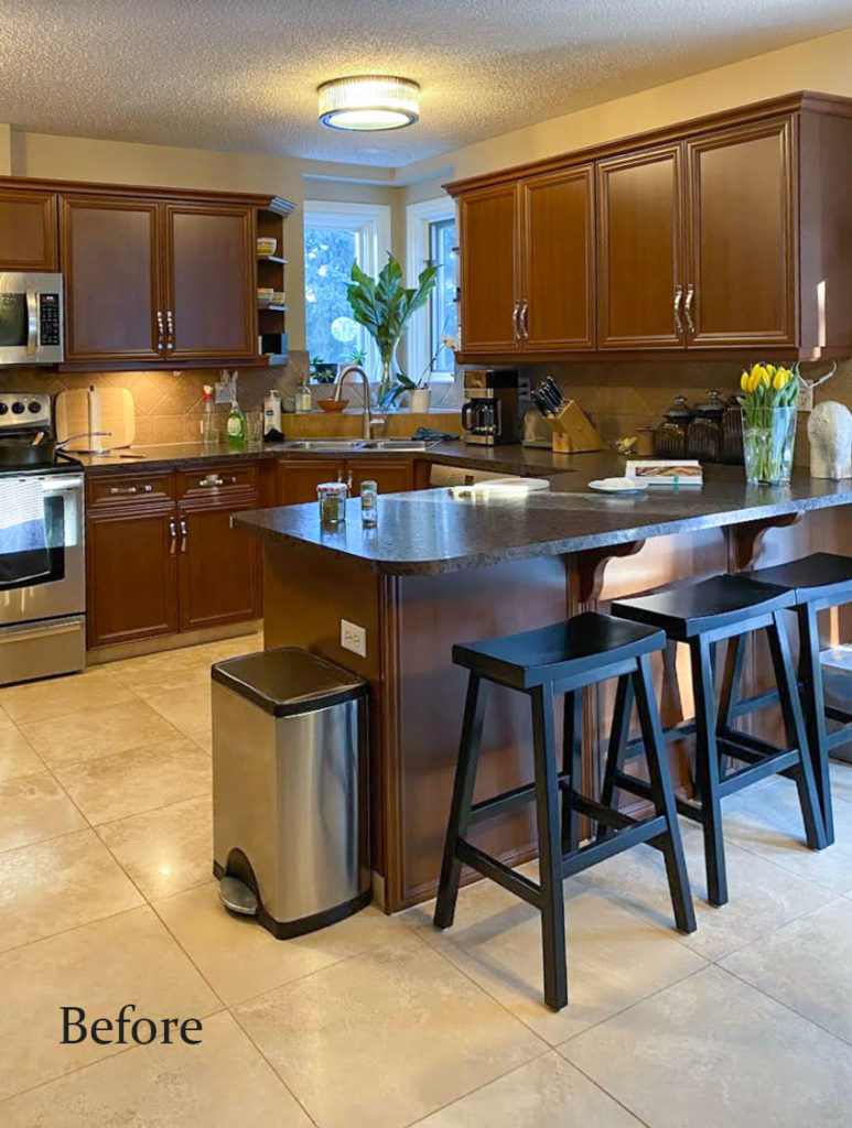
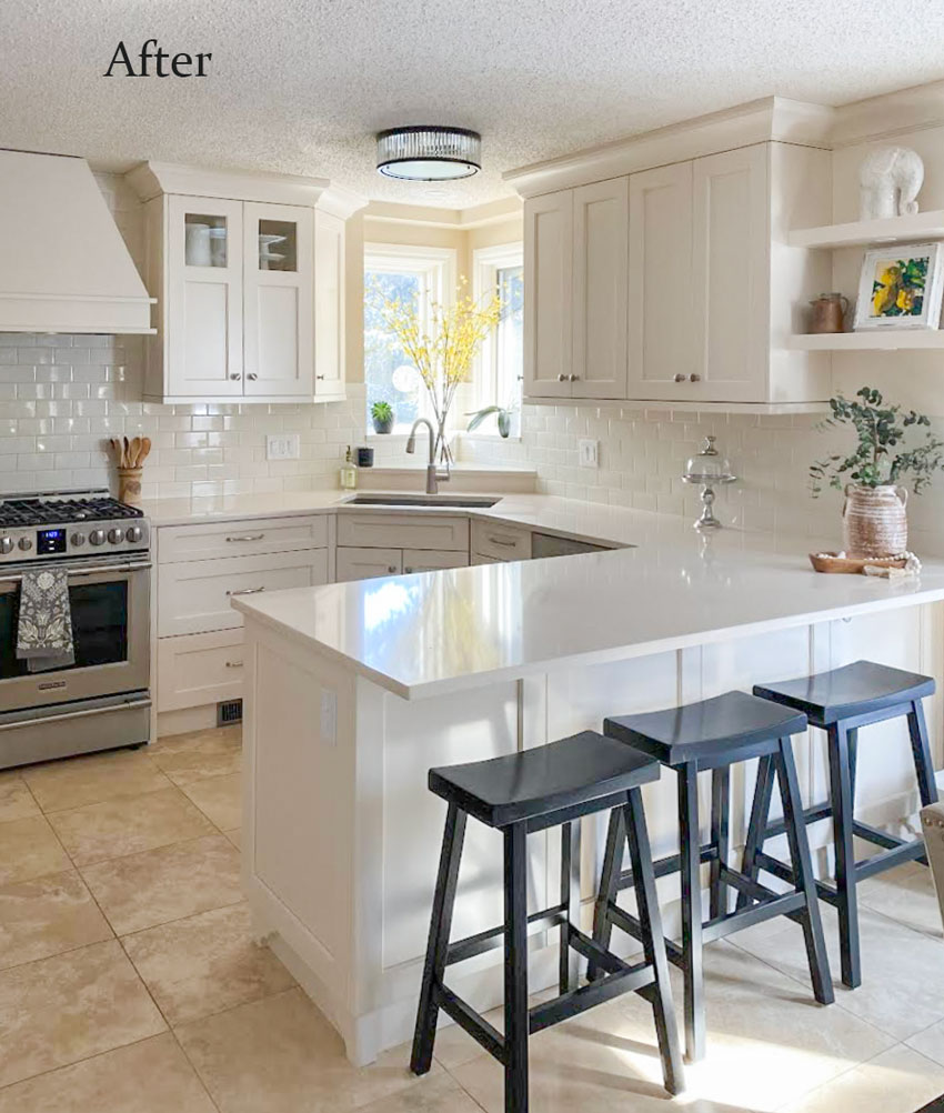
Kitchen eDesign project: before and after
I love getting photos of completed projects from my eDesign clients! This one is from Janice, thank you! Here is her note:
“It helped me feel confident in the choices I made”
In 2021, you provided me with assistance on color choices for my cabinets and countertop and backsplash selections. We started the project in October, and it was completed for the most part right before Christmas. I am still working on some styling. I’d like to get some new stools, but in the meantime, I’m using my black Pottery Barn ones that were in my previous kitchen.
I’m very happy with how it turned out. I am so glad I used your services to help me. It made such a difference in helping me feel confident in the choices I made. The cream paint color that you recommended looks so pretty and fresh. Jan M.
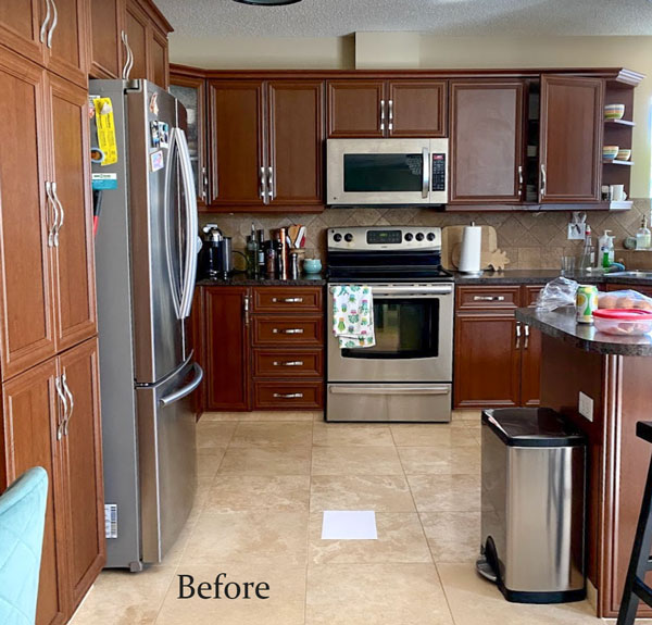
Here’s her kitchen before:
And, just in case you need a reminder on how to choose countertops to coordinate with existing flooring, this is how it’s done. 🙌🏻
You must always place a piece of white paper in between the countertop samples AND your existing flooring. The white paper helps isolate the undertone visually which also helps make it so much easier to see which countertop sample works the best.
And if you have pink beige floors, you need a pink beige countertop and here are the two we approved (she ended up with one very similar, she had to substitute based on stock shortages) I will post the cabinet colour and countertop name in the Killam Colour Academy Facebook page. You can get access with my Shop online course or my Virtual Live workshop.

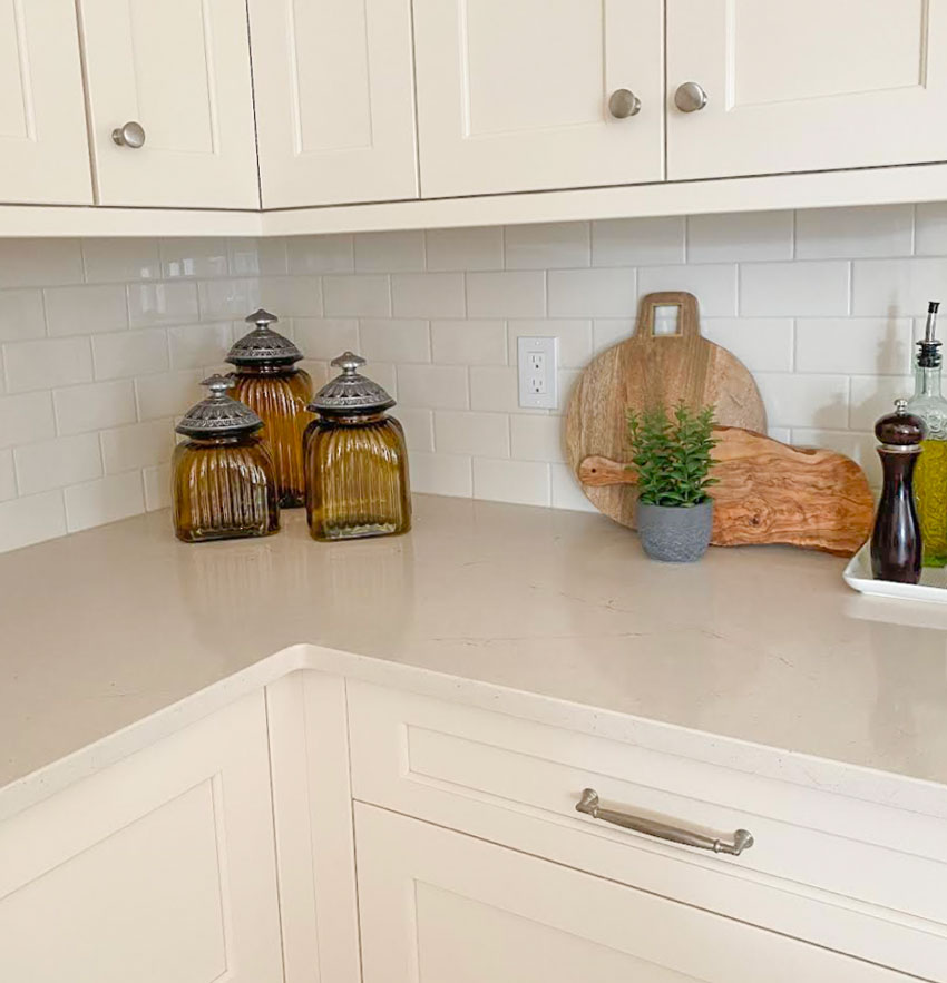
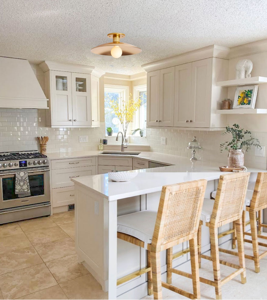
Here is her kitchen below with the new countertops, paint and backsplash installed!
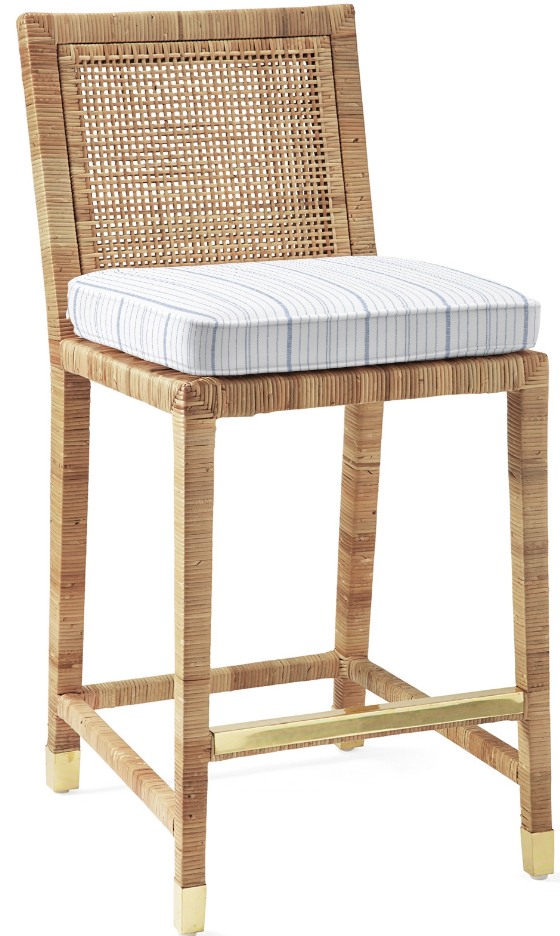
The counter stools I recommend for this kitchen would be in a colour that visually repeats the pink beige travertine.
I love these woven ones from Serena and Lily and here’s what they might look like in the photo below with a little photoshop magic:
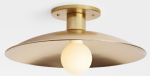
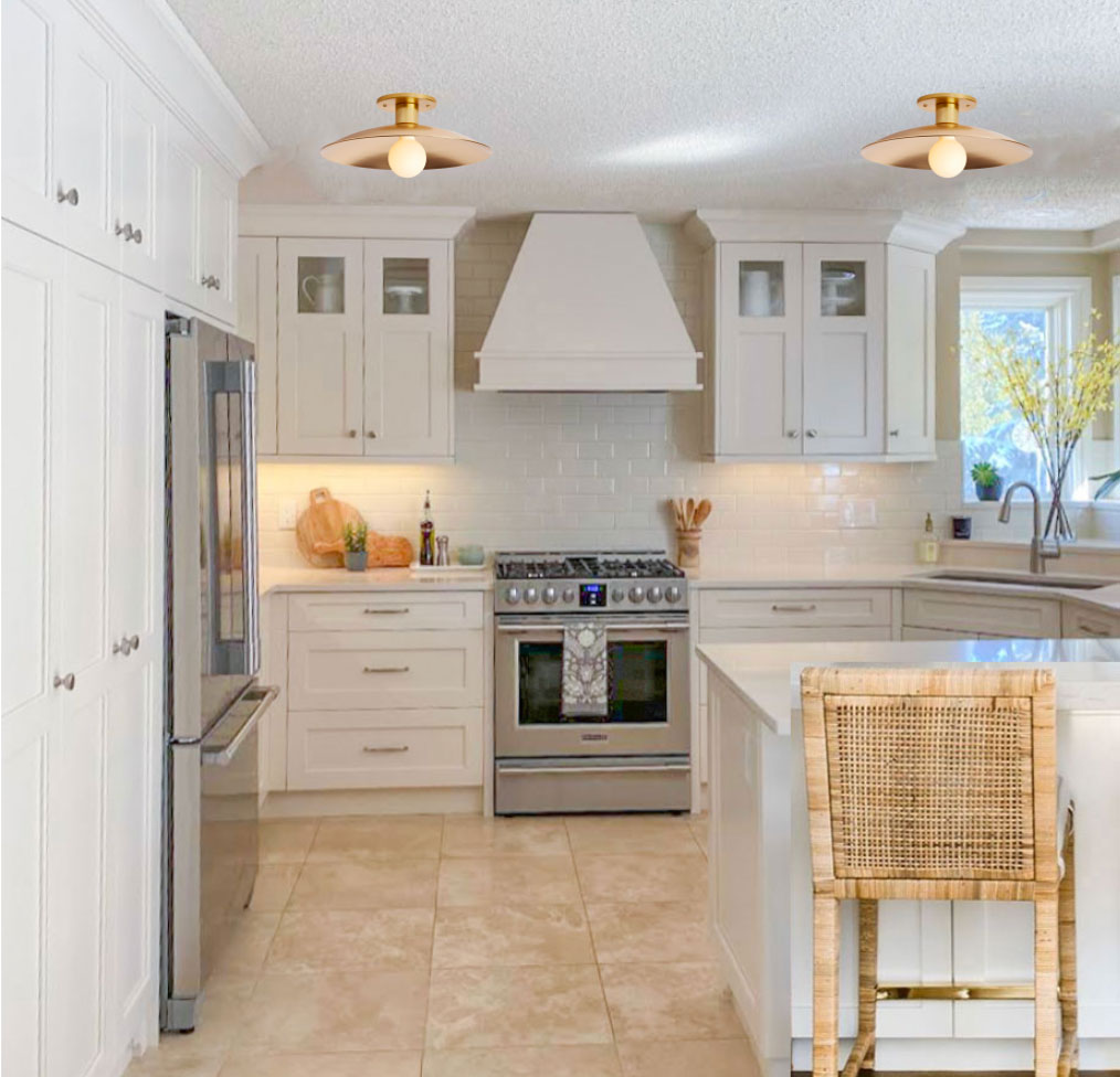
And here’s a more sleek-looking flush mount light that would be better in her kitchen to add warmth.
Are there rules for mixing metals in your kitchen?
In terms of mixing metals, generally, the rule of thumb is that you should repeat each metal finish twice. Her brushed nickel hardware is repeated in the faucet and the stainless appliances. If you look hard, there’s a little brass accent on the counter stools but in this case, the warmth of the brass flush mount again repeats the floor colour. So, we don’t actually need to repeat the warm brass colour here.
I also like this light bulb because it’s frosted, meaning the light doesn’t hit you directly in the eyeballs when you look up. There’s also plenty of room for a lamp in this kitchen. Perhaps you could add a lamp underneath the open shelving where the terra cotta vase sits?
Read more: Is Brass Out? How to Mix Metals Like a Pro
Here’s another before angle of the kitchen:
From this angle below, you can see more of her styling. The wood cutting boards also relate and repeat the colours in the chairs and flooring. I would also give this client bonus points for including space between her hood fan and the cabinets. That looks good with a stand-alone hood fan.
Read more: How to Choose a Classic and Timeless Hood Fan
Combine the clarity of eDesign with the knowledge of my system
I often get asked by readers if they should hire me for eDesign or if they should sign up for my course. And, my answer is BOTH.
Sometimes when we take on a renovation project, but one of the finishes is staying – like this floor – we start second-guessing our gut instincts on which colour is right?
Choosing the colour to pull any space together should be the QUICKEST and EASIEST part of the whole process of design. And that’s exactly how it goes when you learn my system.
Is my floor too pink? Too orange? How can I move this kitchen forward, but also make timeless decisions in my renovation? If you’re spinning, it’s because you don’t know the right questions to ask. More specifically, you don’t know how to make the right comparisons.
Once you have a solid footing in my effective process for accurately choosing colour, you don’t need to rely on intuition OR overthinking.
Designers already know this kind of clarity is beyond valuable. And, if you’re a homeowner, knowing WHY your pick is right is the best way to move your project forward and make a sound investment in a new paint job, bathroom or kitchen renovation, or beautiful new sofa. WITHOUT LOSING A MINUTE OF SLEEP OVER IT.
Whether you’re a pro, an aspiring designer, a colour-loving homeowner tackling a renovation, a budding home stager, or someone in the construction business, this course will remind you why you decided to get colour confident in the first place.
PS. After you’ve completed my Specify Colour with Confidence event you’ll be able to enrol in my brand new Advanced Course, the Business of eDesign. This course has 8 modules and you’ll be able to watch it at your leisure. This course will be launched to previous True Colour Experts soon.
Related posts:
Inside an eDesign Online Paint Colour Consultation


What a beautiful transformation. Hard to believe it’s the same kitchen 😍
Absolutely beautiful!
Beautiful! Replacing the microwave cabinet above the stove with that hood is a masterstroke. One observation though. Since it appears that the ceiling light fixture is the only ceiling light in the room, would you recommend a higher wattage fixture with multiple bulbs?
Your kitchen looks wonderful! Do you mind sharing information about your countertop choice, quartz? What color? Same for the backsplash tile, color?
Did you use the color wheel to help make the choices? Where did you move the microwave?
Thanks!
Hi Janice, what color did you use on your cabinets? Beautiful renovation!
Looks so fresh and pretty. Gives new life to the travertine and another save from the landfill💕.
Yay, Janice! I’m so happy for you! Beautiful job on the kitchen and it actually looks like the travertine floors are brand new and fresh. I’m loving the bar stool suggestions and I immediately noticed how they brought out the travertine floors and looked intentional.
Kind of strange because yesterday I was actually wondering how subway tile would mesh with travertine tile and the result is beautiful. Subway tile really does go with everything! I also love how space was left between the hood range and cabinets.
What a difference going from a darker kitchen to light, bright and fresh!
Beautiful transformation and really love the warmness of the paint color!
A home run! Wonderfully uplifting transformation! I just bought a house with an almost great kitchen except no microwave and no built in garbage drawer. I won’t be tearing it out but I’m disappointed.
It also has one of my PET peeves..a REALLY dinky “powder room”.. It’s ho hum hopeless and tiny. I love a pretty room with a lamp, a silver mirror, guests towel tray, art.
Am racking my brain.
Has that ever been addressed here?
I’d like to see it!
It’s inviting and beautiful!!!
Those counter stools or something similar would be perfect.
The kitchen is beautiful and the addition of the chairs really completes it. IMO, though, the shininess of the subway tile does not go well with the rest of the kitchen, which has a more organic or natural feel to it. I’m wondering if you (Maria) have ever addressed the question of sheen?
I think sheen is important, too, but here I think it works. The countertop is highly reflective, suggesting a gloss sheen, and the glass panels in the upper cabinets are too. They work with each other, and the shine on the back splash adds movement and reflection that gives interest without being dominant.
The shiny subway tile is what I would choose because I like a more glam look, I think it’s a preference thing, I don’t have a big opinion on dos and dont’s in this case. Maria
That’s gorgeous. It’s looks very expensive. It seems even if you do spend the thousands on your course or service it’s still going to cost big bucks to get it done and out of my price range. Good advice though on what yo look for in a kitchen when buying a house so you won’t have to renovate
I am in love with this kitchen redo! And the counter stools suggested would work perfectly!
This result is stunning!
I do have a question, though. You say in the post that the “after” photo includes new countertops, paint and backsplash. But the cabinetry also looks entirely different to me — not just painted. For example, the “after” photo has Shaker panel doors, go entirely up to the ceiling, and the drawers, etc. are different than the original cabinetry.
So is this actually new cabinetry built using a specified cream-color or refaced cabinetry that was painted?
This is a great question re the cabinetry. I hadn’t even noticed, but it’s what makes the room so perfect. I see now the new refrigerator is now built in to the cabinets, they extend to the ceiling, their doors and drawers are different, etc. My guess is, they’re new — or a very talented carpenter remade them.
She paid for countertop and paint colour advice but yes she has a new kitchen. Maria
I agree. It’s definitely new cabinets.
Beautiful! Can you share the colour of the cabinets please?
The colour of the cabinets will be posted in my Killam Colour Academy Facebook page, you can get access to the page through any of my workshops including the shop online course: https://mariakillam.com/shop-online-with-colour-confidence/
I have participated in a workshop but have not been added to the facebook group. Can I please be added?
Hi Sheree, generally there is the opportunity to join either at the beginning or the very end of the modules. You might want to go back and take a look in case you missed it.
Please email [email protected] to be added.
Gorgeous! I’m confused on the countertop though it looks pretty white, vs the two you approved. Is it a different one, or maybe the photo is blown out? Also, interested to hear your comments on sheen for tiles as another commenter mentioned. It seems like that’s the style now, and wondering if that will ever be dated since it’s so pronounced? The tile I love for my kitchen now has the same sheen and that’s the only thing holding me back. Would love a post on this, as I haven’t seen it addressed other places. Thanks!
It is a different one, close to the ones I approved but at the time they were not available. I think sheen is mostly preference. I prefer shine because I like glam, however it can be traditional or modern. Thanks for your comment! Maria
I was wondering the same thing Kelly. I would like to know what those two countertops that were approved were, as the final pic looks way more white as to what was installed. 🙂
She found something similar because those two were not in stock! Maria
That is a beautiful transformation, but it definitely needs the addition of stools and ceiling lights that bring the color of the floor up. Right now, the travertine color is overwhelmingly only in the floor, but the stools and light would balance it out nicely.
Really love this make-over. Looks like CROWN MOLDING added to top of cabinets–making them look new and different. Beautiful. I loved the STOOLS, too…but looked them up as I’d like them to go with my SISAL rug…but they were $868 each. Out of my price range!
Yikes…that’s pricey! However, there are always less expensive knock-offs. I have noticed on the Driven By Decor blog that Kris often shares when these items go on sale or finds less expensive alternatives to make these items more accessible. Maybe you will find something there.
This website has counter and bar height “look-a-likes” for less: https://www.wellappointedhouse.com/cane-bar-stool-with-cushion.html. And here’s another possible source for dupes: https://www.kendrafoundit.com/archive/serena-amp-lily-balboa-counter-stool-dupe
I also love the Serena and Lilly stools/chairs and am always looking for dupes. Braxton Culler makes a very similar style–called Pine Isle. They are about half the cost and come with a choice of fabric for the seat. The Pine Isle chairs and stools are so similar I wonder if Braxton Culler makes the more expensive version for Serena and Lilly. The only down side is a long lead time for the Braxton Culler version.
Love the photo shop addition of the bar stools. They really pull the look together with the floor. 👏
Wonderful transformation!
Why it is so important to consult a professional before attempting any design renovation
If you’re not a designer there are so many details in a kitchen that can easily go wrong, all you have to do is start house hunting and you’ll see them all, house after house, filled with kitchens where everyone installed what they ‘liked’ when they went shopping, what they ‘fell in love with’. . .when they went shopping, just like a new dress. Especially when working with existing finishes, what you like has very little to do with what will look good in the end. Great question! Maria
Beautiful results! I like how the new design opened up the window/sink area even tho nothing changed. New shaker cabinets, crown molding to ceiling, and range hood are winners! Love the addition of the shelving above the countertops.
The elephant in this lovely updated kitchen is the popcorn ceiling. Visually a large space that you can’t ignore.