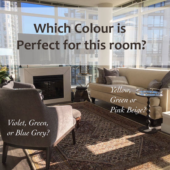
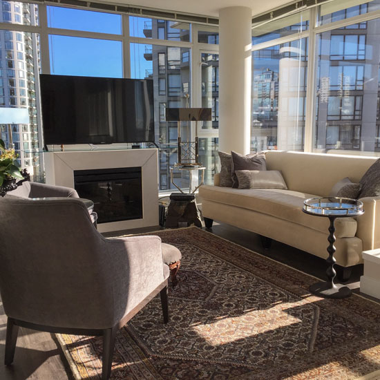
Look first, before you read any further. Which undertones are the chair and sofa?
My good friend Jan Romanuk and her husband recently moved into a new condo. She asked if I’d come over to evaluate her colours. She had a plan but also wanted my opinion. Jan has been such an amazing mentor to me over the years, I was thrilled to lend my expertise in the colour department!
And, if you’re a designer, you can relate. It’s hard for us to decorate our own homes, something better, more fabulous and more perfect might be just around the corner. Sometimes it’s easier to not be so aware of everything in the world of design.
Here was her dilemma. Her sofa was beige and relatively new (and she didn’t want to change it) and she wasn’t in love with the idea of working with beige. It seemed so, well, dated. However, she had two new chairs upholstered in grey and her area rug coordinated with both.
After all, there’s nothing wrong with beige and grey together.
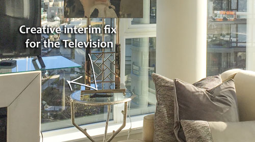
Jan has designed new millwork which will accommodate the television, however in the interim she had a piece of glass cut so that the TV could sit on top of the fireplace (below).
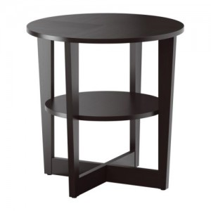
Love this IKEA hack (below). Jan placed a piece of granite on top and you’d never know the base was from IKEA.
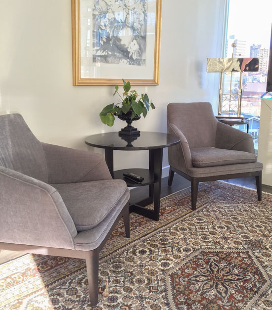
Here’s another view of the chairs opposite the sofa.
And of course with neutral undertones, if it’s not obvious which undertone you’re looking at, as soon as I tell you what it is–unless you’re colour blind–most people can see it immediately.
So what’s your best guess?
You could guess, or pull out your fan deck and wave it around for effect ; ) ; ) and hope that you’re right. Or, if you had my Core and VIP Collection of large samples, one of them would be the perfect colour for this room because they have been specifically selected to work inside my Understanding Undertones™ system.
This living room colour palette is basically two colours so it’s certainly more straightforward than other living rooms but this is why it’s such a good example for this post.
For choosing a wall colour, the biggest items in the room are the first place to look. The upholstery, carpet or drapery are usually a good place to start. Here are the colour options for this room.
- A colour that relates to the chairs.
- A colour that relates to the sofa.
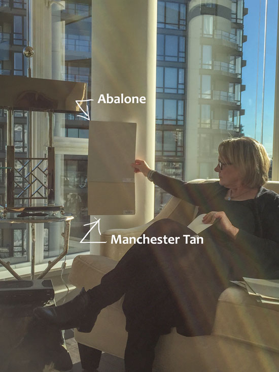
First, I pulled out all of the colours that I thought could work with either the chair or the sofa. Then I had Jan hold them up for me against the column so that I could see them (below):
Jan Romanuk
We narrowed it down to a violet grey which was BM Abalone and a green beige, Manchester Tan. You might have noticed that the chairs had a purple undertone but the sofa was a little trickier because upon first glance, it simply looks like a yellow beige.
However, as soon as we eliminated yellow beige by using my large samples, we were left with a pale green beige that was a perfect match.
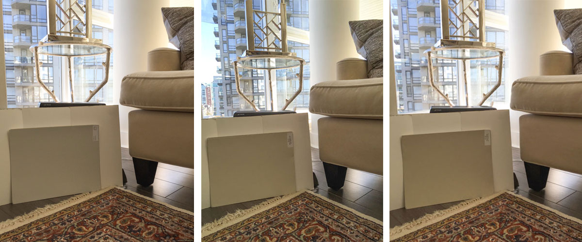
Next I turned some colour samples around to basically create a white wall and propped up the same colours to see if they still looked right. The white isolates them, so it is easier to view them this way.
They worked. And I’m also showing Grant Beige on the far right which is one shade darker than Manchester Tan (in the middle).
You can see that the first image with the purple undertone relates to the pillow (which relates to the chairs) and the second and third go with the sofa.
Both of these colours would work in this condo, I felt that the colour of the sofa should be repeated on the walls because the chairs and throw pillows are grey and the area rug reads primarily grey. However, Jan is leaning more towards the grey at this point, and perhaps going even paler towards BM Pale Oak.
Notice, that it’s super easy to simply choose at this point. It’s obvious now that we have narrowed down the colours to two undertones inside of the nine available.
The infinite world of colour gets really small in a hurry once you go about choosing colour this way.
Which would you choose? Post your answer below.
And if you don’t have your own set of boards painted already, this is the best place to get them.
Here’s what two of my recent True Colour Experts said about the boards:
Ever since I took your training in Chicago my interior design business hasn’t been the same…thanks to your 11 x 14 exclusive colour boards. My clients take one look at the large colour boards and how I use your system to enlighten them about undertones. They are always in awe and are amazed on quickly we can select the correct color for their space. They feel empowerment in being part of the process as well because they actually can see what the colour looks like in a large format versus a tiny little chip. I have gained new client’s trust much more quickly than in the past.
True story…just tonight I was in the furniture store selecting fabric for a client and a young lady was studying fabrics and I casually asked if she was working on a particular project. She responded that they was currently selecting paint colors and fabrics for a new home. I mentioned that I was a trained color specialist and that I use 11 x 14 colour boards for a better visual so you can actually see how the color will look in your room. She promptly asked me for my business card. I’ve never had that happen before!
Hands down I would recommend this colour training course to anyone in the design business or for the novice that wants to do their own home or their friends. It is a must in my humble opinion and worth every penny! Julie Kay Design
“I received my set of color boards just a few days after I completed Marie’s Specify Colour With Confidence training. Because I had the boards I could immediately apply the concepts I had learned in the course during my color consultation sessions with clients.
Armed with the boards and the knowledge and confidence I gained at the training, I’ve been able to communicate with my clients in a language they understand…visually. The large samples help my clients truly see the color in context and help me reinforce why the color I’ve chosen for a client’s space is the right one.” Arianne Bellizaire
Which colour would you choose for Jan’s living room? I’d Love to hear what you think!








Maria, I am leaning gray for the walls. I see very little actual wall space with so many windows and the bright sun pouring in. Wouldn’t a cooler color such as gray be more appropriate for the room because it reads as such a warm room?
I lean towards The Manchester Tan first of all or the Grant Beige because the sofa is the largest single solid colour element in the room and feels like it needs to be repeated in the room. And with that many windows, it would lighten up I suspect in the daytime and feel warm – epsically in the gray days of winter here!
Hi Maria, I’m trying to purchase your ebooks using the winter2015 promo code. However, it’s not working. When I enter the code and hit apply, nothing happens. Please help. Thanks!
It is working, perhaps try clearing your cache? If that doesn’t work, email [email protected] for more help.
Got it, thank you!
I love the grant beige, thinking with the light pouring in it would be absolutely rich. beautiful room and furnishings
I would pick the Grant Beige. That is a large room filled with light and that seems a warmer color.
Wow! This room is nice enough, but it sure needs some life with color.
Interesting room, lot’s of windows. I would first put down the shades and see what color they were to determine which color to choose.
They are white.
This is an interesting exercise. To my eye, the windows, sky, and multiple shades of concrete and glass create an extremely busy and not at all restful room. I would therefore add drapes, close them, and then address color.
When I lived in a similar place in New York, and worked in offices with similar views, the skyline was part of the entertainment.
What strikes me is the tv. In a quake zone, that freaks me out, but that was a clever temporary solution.
I like the Manchester Tan because from what I can see, that rug doesn’t look gray to me. What about Classic Gray? Gray and beige ish?
Unasked-for advice: you should get a pixie haircut, like Michelle Williams.
Oh my gosh! I’ve always thought that too.
Do it Maria. It’d be so cute on you.
If you’re talking about my hair (could be Jan’s) I have had a pixie cut about 10 years ago and it was VERY BAD. I do NOT have the bone structure for it. I felt very unattractive the entire time I was growing it out, haha. Maria
I would go with BM Pale Oak, I think that this room is the kind of room that would look good in white. Pale Oak is light but has just enough color to relate to the sofa.
Going with gray walls makes the sofa the odd man out, which won’t feel balanced. But I so feel Jan’s pain of wanting to ignore a key design element! So if beige walls make her gag, put beige elsewhere (or multiple elsewheres): beige prominant in art that she truly loves (don’t pick art just for color!), changing a less expensive piece of furniture, painting a piece of furniture, putting creamy beige ceramic vases on a display shelf or mantle, etc.
And yes, cute haircut, Jan. : )
I had a similar dilemma, Resto Hardware sand sofa and purple/grey leather chairs. I also wanted a very light almost white colour, and one room in the house I painted Balboa Mist, that room also has an aubergine sofa, but the rest of the house ended up being Classic Grey and I love it. It is such a chameleon of a colour depending on the light, but every room in this old house now looks fresh and clean, and it just seems to go with everything.
I think I would choose the pale oak with her choices of carpet and furniture.
Maria I would personally recommend your boards to anyone who seriously wants to be a colour designer. I have been specifying colour for over 20 years and my frustration was always fan decks and small paint chips. I had a rag tag collection of larger paint chips that I had painted personally. Buying your collection was the best thing EVER. It is not just that you turn up with the large samples and look professional right away. It is the look of relief in the client’s eyes that you are not going to overwhelm them with a fan deck of a thousand colours
. Of course the fan decks are always in my car but my clients always feel like i am in control when I turn up with your two boxes of large samples tucked under my arm.
PS. Glad you have your Mom back!
Abalone! If she’s leaning towards gray painting the walls anything else may in the end make her unhappy. I give the couch 2 years before it is switched. The light in this home is amazing. I bet the night view is even magical.
It is, Jan and her husband love sitting and watching the lights of the city, they also have a lovely view of the water! I will post after photos when her place is painted which is very soon!
I would choose Abelone. I think its sexy and appropriate for that urban like, high rise living.
Right off the bet it just stood out to me and I envision it would instantly up the chic level of the room.
Maria, you do such a great job in explaining the process! I too have your colour boards (after completing your training) and can NOT live without them. My clients love the fact that they don’t have to squint to try and visual the colour.
As for the room, if it was my room, I would go with Pale Oak. The condo looks gorgeous with a ton of natural light streaming in.
I’m sure that whatever is chosen, it will look fantastic.
BTW – just specified SW Abalone for the first time for a girl’s bedroom and it’s absolutely a stunning paint colour.
Always fun to have a jam session about colour with Maria. Painting is being done this weekend and art work is being moved around and added. Look forward to sharing the transformation. Thank you all for your wonderful suggestions and comments. Jan
Thank you for sharing your room! That is very generous of you.
I would choose Manchester Tan, or if she wants a lighter colour, maybe Feather Down. I think a warm colour would create a more cozy environment and the sofa colour needs to be repeated (as you pointed out, there is already grey in the chairs, pillows and carpet). It’s also my opinion that grey works better in a space with clean colours and lots of white.
I also agree with the previous poster who said a warmer colour might be nicer there on the Westcoast where there are lots of grey, rainy days. Especially considering that this home is surrounded by concrete towers.
I just had my client’s south-east facing living room painted in Feather Down. There are huge windows so there is lots of light pouring in and the space feels sunny, happy, warm and fresh.
Here’s proof that I’ve never taken your classes or bought your boards….
My first thought upon seeing the room was “With all that light, I’d paint the room a charcoal/black. I’d go for a very dark, moody, dramatic color.”
But that’s just me. I love dark rooms.
The right charcoal could be nice if the client wanted a different ambience – it’s still gray, so not a wrong answer. Just my take. (I haven’t taken Maria’s course, having done a different, longer IACC-NA program, but have Maria’s boards, ebooks and took a short video course. There are some areas where they clash but I don’t care. : ) )
I believe, in this instance, it’s not just the existing furniture to consider but the hardscrape out the expanse of windows. Go warm with the paint.
Can I just say, I’m kind of excited because my instant reflex on upon seeing the first photo was to try Manchester Tan first. Years of following you have paid off! I should still take your class in person though. xoxo!
Colour is a science and if you understand the importance and working of your 5 senses, your whole approach to colour design will change drastically. Colour is not there for you to adjust to, but colour must serve you. The basics of Humane Colour Design!
No two people in the world can perceive colour the same way…. it is a subjective experience!
Amen! Thanks for your comment. Maria
I think I’d go with making the sofa feel totally comfortable in the room with all the other pieces, so Manchester Tan gets my vote. Additionally, with the warmth of the sofa color and all the light coming in, and with the “cold” distraction of the buildings and all the busy reflection off the glass windows, “warm” walls would be very anchoring and relaxing to me. It sounds as though Jan has already made her decision so it will be interesting to see the results.
I would pick Abalone because it looks more “today” to me.
I would go with Grant Beige. I have almost the same color as her sofa on my dining room chairs and bar stools and have had Grant beige on my walls for 5 years, I never tire of it. I think the gray chairs will be a great compliment with GB. I have Abalone in my spare room and I find it has a pinky undertone.
Even tho the sofa is a large piece the pillows do a nice job of incorporating the grays. LOVE, love the violet gray and the only choice for me.
I love this question! My inclination is Manchester Tan, but I would want to see the Manchester Tan board behind the before I made my final decision. If Jan decides to go with a grey undertone, I would want some contrast between the paint and the chairs since they will be so close to the wall. And personally, I LOVE all the windows and the interest that the buildings provide.
As for Maria’s hair – I am sure she looked great in a pixie cut no matter what she says!! Although short cuts are not always as easy as beauty editors would suggest!
OOPS – “behind the chairs”
I love the Manchester tan hands down!
For me, it would depend on whether I wanted to “warm” things up due to the massive window walls and how daring I felt. In the pictures, the Abalone looks most striking, but it’s always hard to tell from pictures. I’ll be anxious to hear what she ends up picking out, so please follow through. 🙂
I recommend a dark color, probably a dark gray with brown undertones. In a room that bright the dark paint on the window walls will make the background view pop. On the opposite wall an off white would be nice, but something that works with what ever color is being reflected off the buildings and view. That light will change the color dramatically.
Having lived in a bright, open condo like this in Singapore and in an older craftsman hill side home in Portland I can personally say that dark paint works with a great view. It makes frames the view and making it special. Also, light colored walls break up and fight with the view. The view is the focus, not the furniture or the walls. Also, cutting down the reflected light helps make the room cozy and special where reflected light makes it so bright it’s difficult to feel comfortable. My experience.
My home in Portland had dark taupe walls in the living room with deep cream woodwork. The big picture windows over looking the city were the focus. I didn’t put any art on the walls, but did cover the opposite wall and fireplace with a huge plant and other large objects, glassed in book cases, and lots of interesting things, arranged in groups, that I’d picked up on my travels. It was a delicious and wonderful room. Probably my favorite room ever.
The room in Singapore was on the dark side of the building on the 14th floor. When we moved in it had white walls. I had the painted a dark Paynes gray, a blue gray the color of dark clouds, and it didn’t work. So I had them painted the same dark brown as the trees below us and it was spectacular. I didn’t care about trends or fashion. I was going for a room I wanted to spend time in. The floors were a white marble, and we put red and brown rugs on them. The furniture was all bamboo I had made locally so it glowed a warm, deep yellow. I had all the upholstry done in a pink beige silk with a brown motif and added deep red, green, and bright pink pillows to echo the orchids grown there. Also one of my favorite rooms once the white walls were gone!
Suzan, I would really love to see photos of this. Do you have them posted on your own web site somewhere?
Very interesting to consider everyone’s thoughts and insights…
I think the walls should be a very, very dark green, almost black. And then the sofa and chairs should be covered in the same yellow velvet as yours. Yes,
Aloha Maria, in my opinion, Abalone would give the room a more updated, fresher look than the other 2 choices. But I’d also choose Abalone because not only does it go well with the 2 chairs and area rug, but because the windows are a huge portion of that room, and what lies beyond the windows. Because the view is of – what appears to be other exterior buildings in the gray colors – I prefer how Abalone also works with their exterior view vs the beiges. Let us know what she chose and how it comes out!
I would use the Abalone to blend with the buildings. I cannot wait to see. I have waited six years to paint my house. I tried Manchester. It did not work here with a south window. Snip of Tanin from Kelley Moore was suggested for a previous home. I loved it but did not want to use it again. After all the wait and attempts I went with it again. The boards would have helped more than samples. You are right about that.
If this were my space, I would actually pick up the dark reddish brown color from the center area of the rug and paint the wall behind the chairs that color. I personally think there is enough neutral already. However, I would definitely keep the pillar neutral as you were suggesting. And, I would replace the artwork on that wall because it looks washed out by the sunlight there.
Maria has taught me to take into account “bossy” features.
With this in mind, the view is the bossiest of all bossy features:
Do you want the eyes to rest inside and ignore the view? Then lighter color is the choice, for walls/trim.
Do you want the eye to rest on the view? Then paint the walls or trim medium or dark.
This decision would probably drive all choices.
Managing the view, plus the colors outside (that are in fact create ‘walls’ of their own), seem to be the pivotal decision points that will ‘force’ all others.
🙂
SEEMS the Abalone works better with the outside, “bossy” view. (I agree with other respondent, matching to sofa is a short-term solution)
Consider, painting the trim on the windows a medium/dark shade, to allow the view to dominate and pull the eye outside.
IMHO, either the Manchester Tan or Abalone would work with the fantastic outside view as well as the furnishings so my decision would also include consideration on the fixed elements in the adjoining space(s) provided of course if there is any. -Brenda-
My very uneducated opinion – since the wall is the background to the chairs, and the best view of it seems to be from the couch, while the view of the couch has glass/shades/city, therefore I would go with what looks best with the chairs. As someone else said, the green beige could be repeated in decor.
Dear Maria (and friends), when I saw the first pic, I thought that the interior feels so glamorous and chic so that a dash of gold on the walls would really make the soft colours pop. I realize that this is not an option for everyone and I would really appreciate your feedback (or anyone else’s) on this. Did your client ask specifically for beige or grey? Would you recommend any other vivid colour (like purple perhaps?) or stick to the beige family anyway. I understand that your options are the best for a room with a “classic” approach (very true to your style indeed), but what if the client is a bit more risky and asked for something more dramatic? I’d love to see how the muted gold of the lamp would work on a bigger surface. What do you think??
First, Jan is a designer, she has her own strong opinions about what she wants in her house, I just added mine to the mix.
Your wall colour should pull your space together, so once carpets and furnishings are in place, colours should be drawn from them.
Choosing beige or grey in this case has nothing to do with ‘classic and timeless’ paint colour is the easiest to change anyway, however painting the walls a purple that is not in this room would not make any sense and would make the room look like you’ve just moved in and have not painted yet.
Hope that helps,
Maria
Of course Maria, your opinion is always greatly appreciated! (I’ve been an admirer of your work for many years). But what I meant was something similar to what Suzanne Reed said. I meant repeating a greyish purple so that it would relate more to the chairs and the carpet (incorporating some more purple/grey accessories of course) or a muted gold that already exists in the lamps or the picture frame, all colours that exist in the room (as far as I can see especially in the first picture). I think choosing darker colours would work a bit as a frame around the windows, incorporating the light reflections of the surrounding buildings. Darker shades of the colours that already exist in the room. I hope I explained what I meant in a better way now, since english is not my mother language and sometimes I get lost in translation. To sum it up, I’d probably choose a darker grey/purple shade or go crazy with gold and see how that would look (I’m really curious about how the gold paint would reflect the changing light during the day). So what do you and/or Jan think of repeating the gold in there? Thanks again for your time – I know it is limited and I’m always amazed when you find extra time to reply to everyone! You ‘re a true colour expert! Φιλιά πολλά!
HI Dimi, I see what you mean now, all of that is a possibility, Jan is painting this week and she won’t tell me what she chose so it’ll be a surprise but I will take pics and post it!
x
Maria
Thanks Maria – I just needed to check with you if it’s an option. It’s a wonderful room with a stunning view, so I can’t wait to see the “after” pics. I’m sure your collaboration will produce great results. Happy Holidays, Love and Joy!
Another great post Maria! My instincts says a color, especially with that view and amount of light. My first choice is Carter Plum CW-355, second choice Manchester tan. Cannot wait to know the end result 🙂
I would go with the third sample – I think it goes the best with the sofa. I like the idea of creating a cocoon of color with the sofa and walls, and the accent is the chairs and the pillows.
I’d choose Abalone. The room seems to be a bit of an “evening” room to me-with the TV that is usually watched more in the evenings, and the view that’s magnificent now, and probably is even more so in the night, with all the city lights. Violet gray always reads more mysterious and “evening” to me..I think it will make the view the real star, repeating it on the walls and in the furnishings, thus taking a room a bit into a background, diffusing the borders between it and the city skyline even more.. Of course hard to say until you see how both colors “behave” in the evening light..It’s also important to know what’s the desired effect..I suggested blending the borders, because Jan choose this condo)) but I might be totally wrong.
I agree there’s nothing wrong with beige and gray together; more than that, they can make for a very elegant combination.
Whichever way the room will be painted-it’s one gorgeous space.
You have to go with a violet grey (abalone) because a beige (manchester) will make the chairs look purple – and maybe that’s what she’s after.
I think a really dark wall (like Amazon Soil 2115-30) would be beautiful behind the chairs and then gold-leaf the table base for some spark.
Love your work and this exercise!
xo
Jenn
Any updates yet? I would love to see the end the result.
Me too! I will take photos in January! Stay tuned! Maria
May I ask why PALE OAK was a paint option when it is Taupe, and not an undertone of the furniture mentioned? 🙂