This design critique dissects a newly constructed home that awkwardly merges fading black-and-white modern trends with emerging beige/Tuscan elements. It’s a showcase of mismatched finishes, random accent walls, and poorly coordinated bathroom designs that exemplify current transitional period confusion in interior design trends.
So, what can we learn from this? Keep reading…
When colour trends merge
When I saw this house for sale, sent to me by a follower, I had to post it here for you too. That’s because I love to keep ya’ll right on the pulse of what’s happening in trends.
This house is a perfect example of what happens when two trends merge, which happens a lot when one trend is on its way out and a new one is coming in.
What’s a No-Style Home?
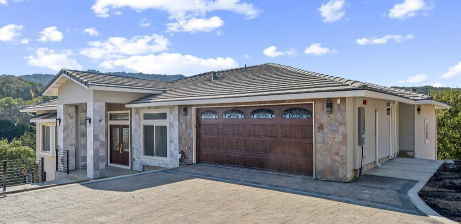
First, let’s just notice the finishes on the exterior of this brand new build shall we? It’s like two houses were pieced together with the new beige/tuscan trend on the right paired with random grey and white tile on the left.
And to top off this exterior, they added a red garage door (by the way, cherry wood is coming back, too) with unnecessary scroll-y details that match the front door.
I would call this a “no-style” home.
Let’s go inside next:
Hey Black & White! It’s me, Beige. I’m Back!
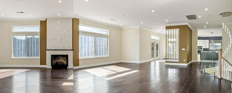
Here we have added two random accent walls in gold.
Just when I think I’ve seen every possible design choice imaginable, something new and unexpected appears – it’s precisely these surprising moments that make my job so endlessly fascinating. And, why I love this job.
A fireplace wall with a 2-foot strip of colour on either side that simply stops where the windows begin. Immediately no.
Also notice the walls are a pale beige (complex cream is what we’ve been calling it for years because everyone was allergic to the word beige).
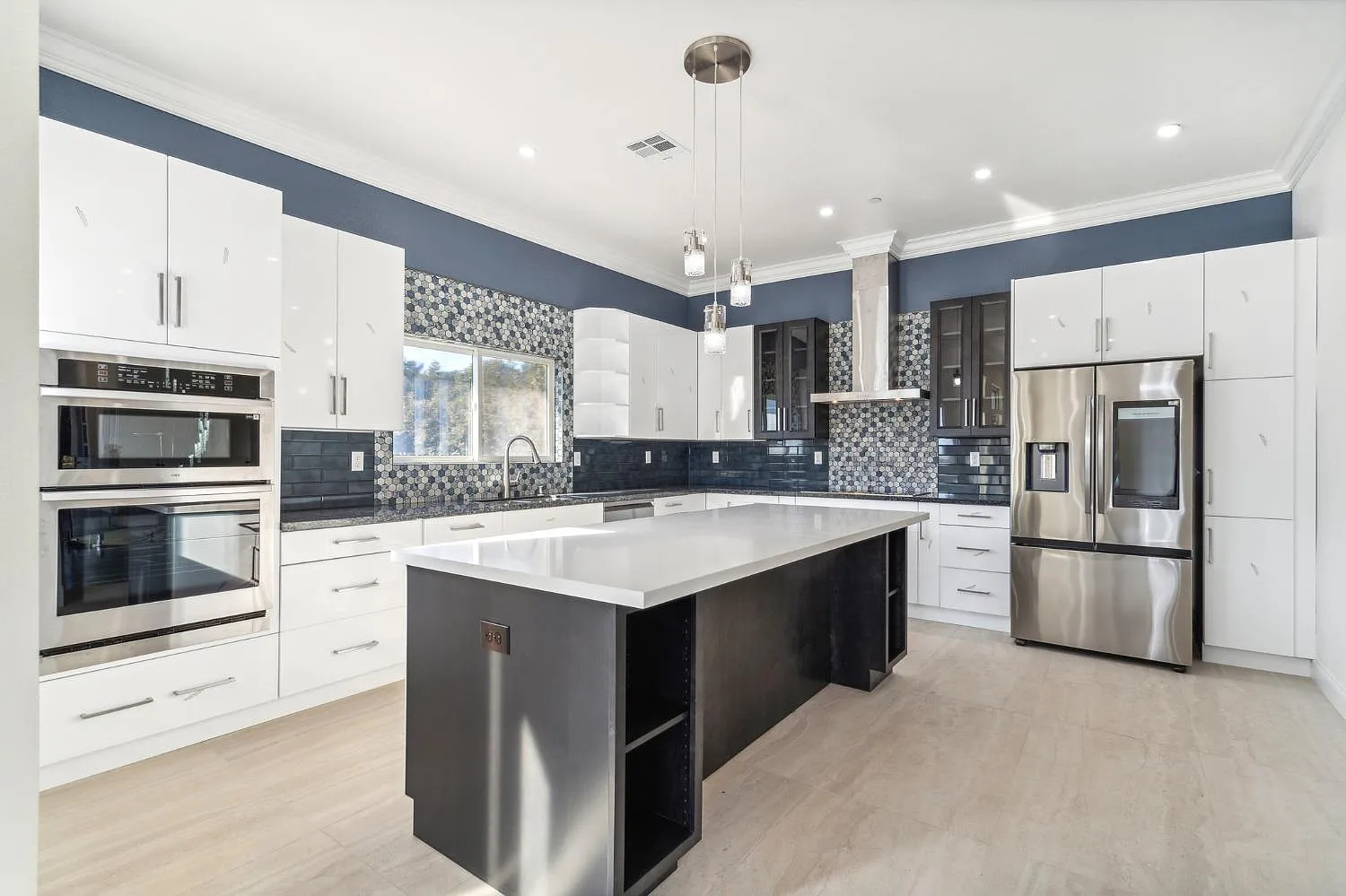
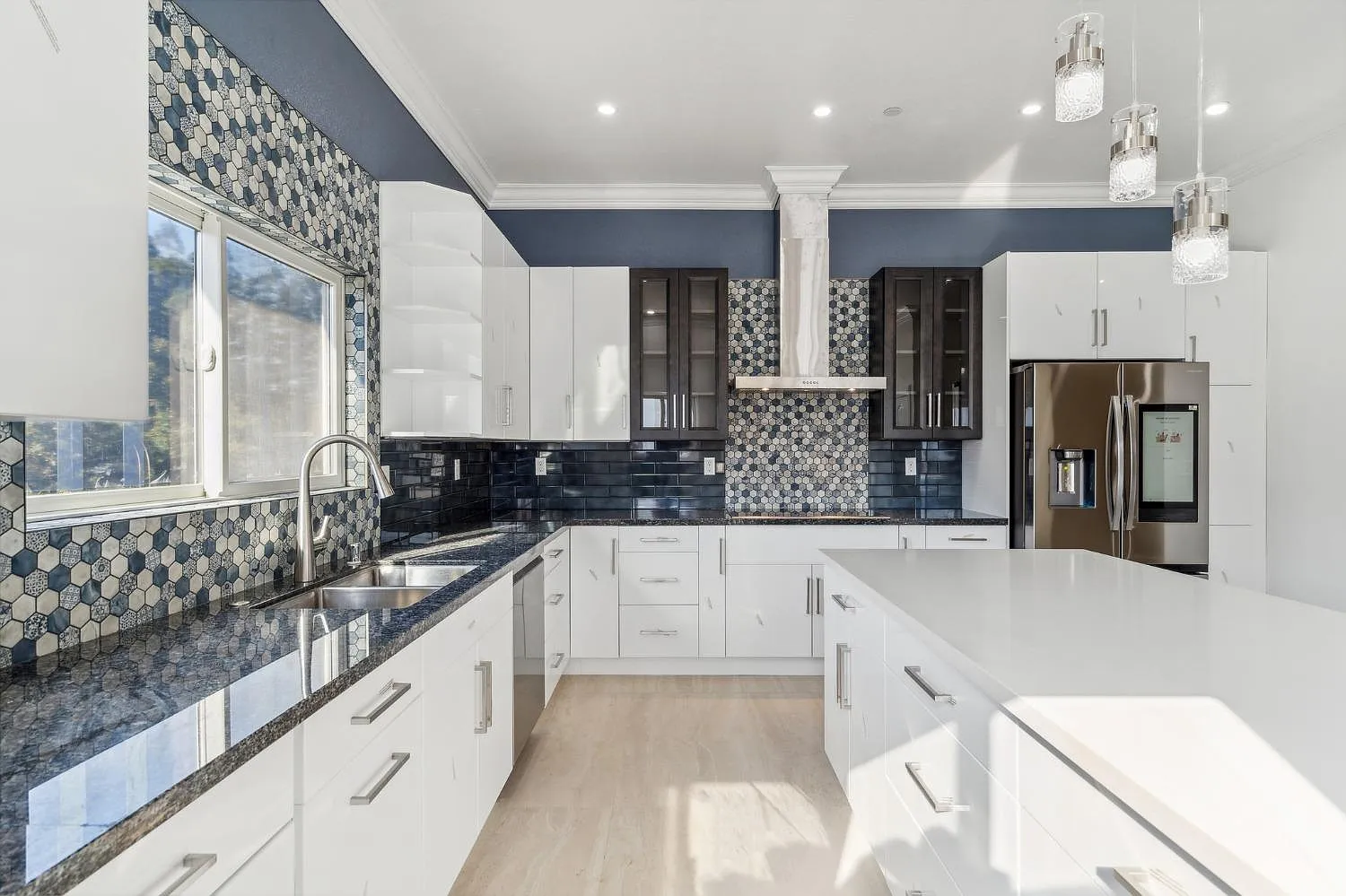
Now, let’s take a closer look at the kitchen. If you’ve ever wondered about introducing a navy blue to your black and white kitchen, you can refer to this image. And we haven’t even got into the multiple use of patterns here.
A lot of people introduce navy because it feels like an easier decision–it’s a colour but feels like a neutral. Usually navy comes up when they feel they don’t want to make yet another choice in black or white. And navy just feels like a ‘safe’ decision, I suppose.
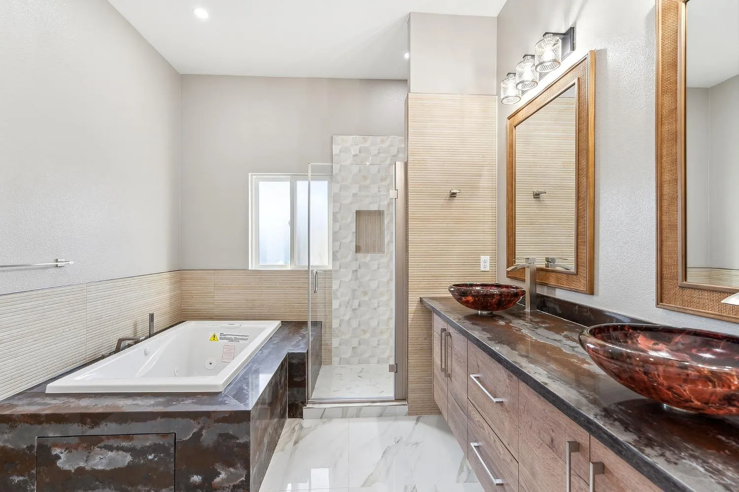
Here’s the bathroom where the mish-mash of beige begins to appear. Also if you’re considering a vessel sink for any bathroom BUT the powder room, I recommend you skip this idea. They are messy and impractical. Just ask anyone who has one.
This bathroom (below) is a primary example of why I recommend choosing timeless finishes for the big ticket items on your design plan.
The design choices here created unnecessary complexity by incorporating different finishes for each element – the tub, shower, vanity, and floor. Future homeowners will likely want to simplify this space by updating some or all of these varied hard finishes to create a more cohesive look. It’s such a waste.
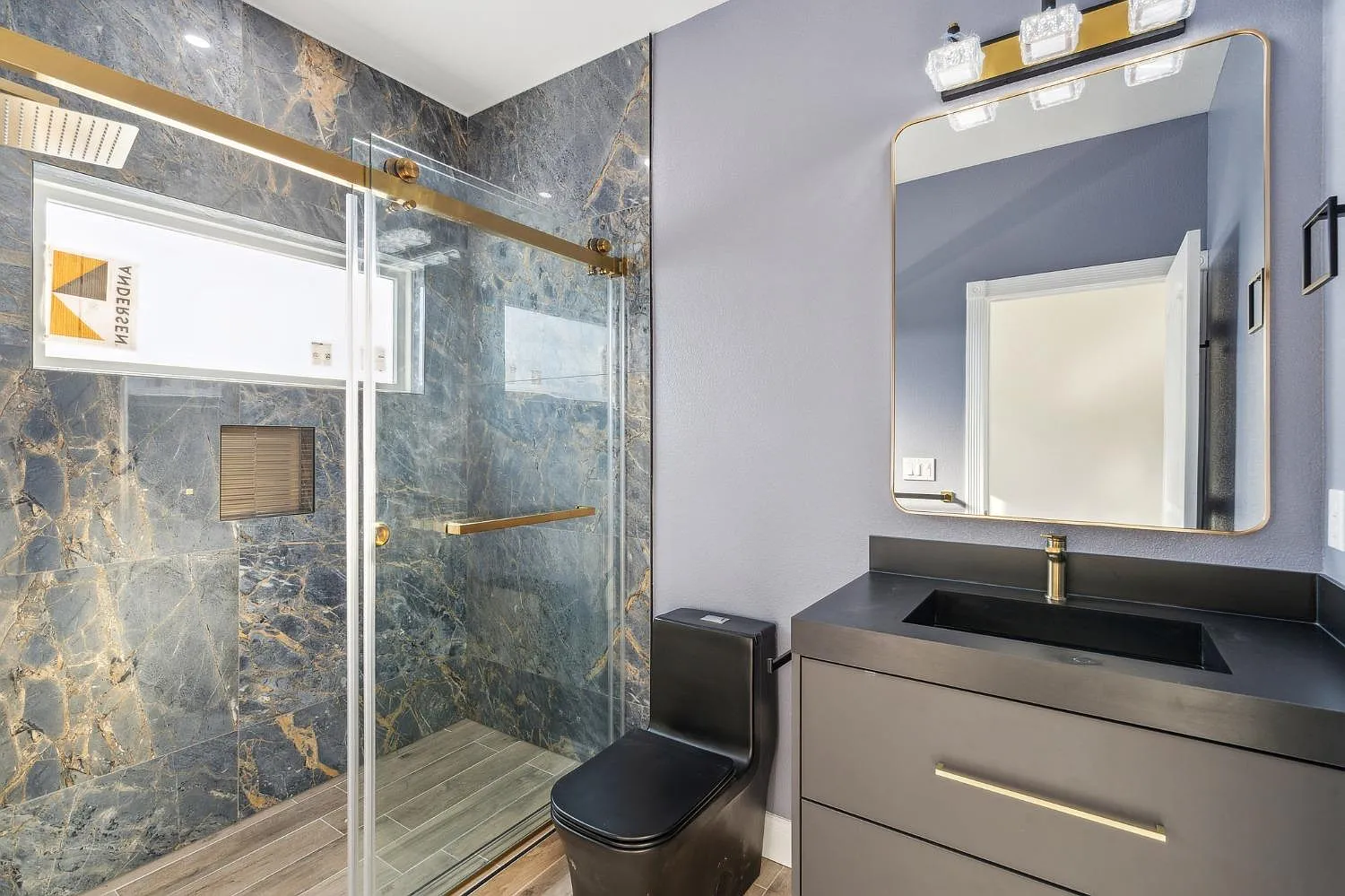
And in this bathroom below, we have a black on black vanity with a black toilet. Then we’ve attempted to add warmth by adding black and gold beige to the shower surround.
We’ve also carried the wood-look tile into the shower floor. I’m guessing they had to choose a solid colour vanity because the wood-look tile severely limited their wood vanity options.
And if given the choice, just say no to anything but white plumbing fixtures.
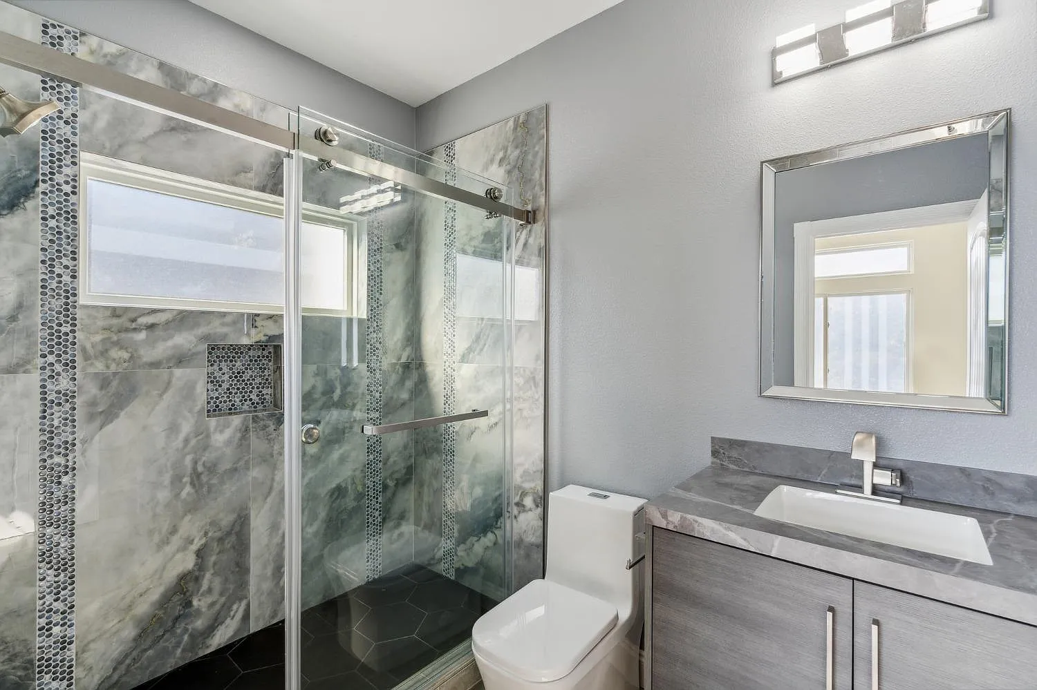
And in this bathroom (below) we have a random black shower floor that doesn’t relate to anything, or maybe it is on the rest of the bathroom floor but we won’t know until we tour the house in person because it was cropped out of the photo. Still not the right choice for this bathroom anyway.
A lot of money was spent in these bathrooms on unnecessary creativity, especially with the shower surround that again in no way relates to the vanity. A tell-tale sign? It looks like these finishes were installed at different times.
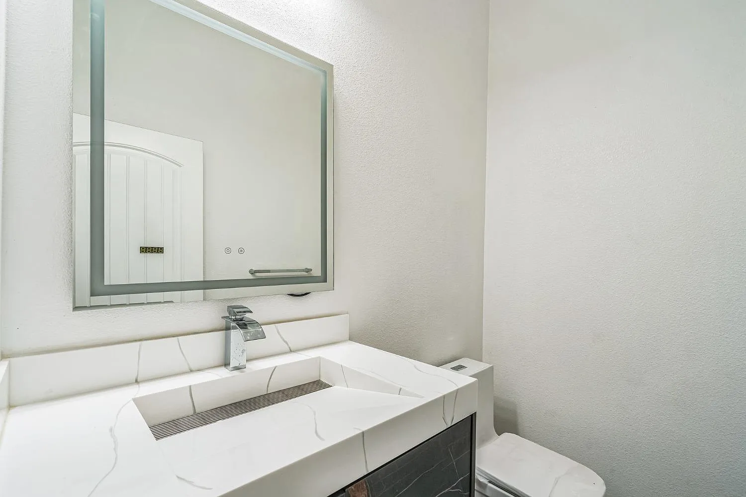
We also can’t see the floor in the powder room so I’m guessing it was also another random tile.
Choosing Timeless Finishes for Your Bathroom
Years ago I arrived at a clients home because they needed my help reselecting countertops for 3 different bathroom vanities where the tile floors were already installed.
They had countertop samples chosen by their cabinet maker, but they wanted a second opinion.
All three countertops clashed with the existing floors, highlighting why expert colour guidance matters. Most homeowners don’t realize how limited their options become with hard finishes, particularly with countertops – which is precisely why we always select them first in the design process.
In this case, solid white was the only option for one of the bathrooms in this story because there was no other countertop samples that worked with the tile that was already installed.
A white countertop seems like a no-brainer now, but years ago in the middle of the brown trend, no one was doing that.
And clearly the person who had helped choose the first round of countertop samples was too inexperienced too know this simple rule. The goal in any bathroom or kitchen with tile floors (rather than timeless hardwood floors) is that your countertop MUST look like it’s married to the rest of your finishes. Skip the colour theory and read this post instead.
I also teach this important rule for choosing finishes in my colour training.
Well my lovelies, remember this moment – it’s when we witnessed the awkward collision of beige with black and white trends, creating a cautionary tale in design history. And one you don’t want to repeat in your new build or renovation project.
If you’d like help choosing finishes for your home shop my edesign packages here.
Related posts:
The Style of your Home vs. Your Design Style



The house had so much potential. This article demonstrates why builders need an expert to help select finishes! Just because they can build it doesn’t mean they know how to coordinate finishes. Maria has, once again, shown beautiful can come at a same or better price than ugly.
I think the builder had a variety of leftover supplies in his warehouse and decided to clean out and use all of them in this house 🥴
This is exactly what I was going to post!
This house looks like they designed each room based on what they could get on sale/clearance. Totally bizarre. I will say that I have a new white and hale navy kitchen with leathered black granite countertops that looks fantastic. The weird decisions in this kitchen are what ruined it – mix of cabinets, two toned island, not going to the ceiling, the busy tile…
Wow. Just wow. My eyes hurt now. Maybe I should go pro with this color hobby of mine after all. People need help with color. Such expensive mistakes here. The fact that it’s on a new build kills me.
And to modify Roosevelt: a house that will live in infamy
I think we knew this house was not well designed from the placement of the fireplace
Does nothing positive for furniture placement or aesthetics overall—bigger mistake than any finishing choicr IMO
If the actual construction work is as flawed this housr is going to have multiple problems for owners.
A friend of mine often uses the descriptor “it’s trying too hard.” I now fully understand what that means and it fits here. It seems the primary goal is to look different or stand out in a unique way, regardless of how it looks. Different, simply for the sake of it.
That’s the ugliest new house I’ve ever seen.
O. M. G. Truly awful in every way.
Where do you even purchase a black toilet???
….and then the builder will be confused about why it isn’t selling!
The builder said to 8 random people, “each of you go to your fave big box store. Fred, pick out sinks. Mary, pick out bathroom floor tile. Raoul, pick out shower wall granite. Louise, pick out counter tops. Margo, pick out the garage door. John, pick out the exterior stone and tile. Melissa, pick out faux wood flooring. Robert, shoes the paint colors.” See? Wasn’t that easy?
I would never buy this house, super ugly finishes that I’m sure were not cheap. Perfect example of colors clashing! Thanks for your expert advice!
This house looks like a very bad renovation attempt rather than a new build. It’s shocking how this could have been done SO badly from scratch. We’ve all heard the expression “word salad”; this is “design salad” at its “finest”.
That home is a travesty! $3.3 million for that mess. What a shame. Search130 Arbor View Ln Lafayette, CA for more pics.
Really sad!
Wow! Thanks for the info. This is just beyond sad – like you said – a travesty.
It strikes me as odd that a house at this price point is not staged. There must be some weird back story. This house makes me feel happy towards my old builder grade oak cabinets and white drywall kitchen. And, I thought I hated that kitchen!
100% agreed!
Wow, this really gives me more confidence in my own abilities! lol. I bet this wasn’t designed by the builder. What this looks like to me is that someone proclaimed themselves a “designer” and got hired for the job. It looks like someone was trying way too hard to be creative but had absolutely no clue what they were doing…obviously. Ugh! what a mess.
This may be the worst interior I’ve ever seen.
Really Sad!
If a real estate agent had been showing me homes, I wouldn’t have even gone inside to look past the awful exterior. That would be a deal breaker for me. I can’t imagine that someone with enough money to buy this home would want it.
What a waste of materials. Such a huge house and most of those fittings will end up in landfill in a few months. Unless the purchaser is blind.
That is the most execrable house I’ve ever seen in my entire life! The sad part is there are so many expensive hard finishes. What could the builder been thinking? And who would pay $3.3 million for that abomination?
Oh, what an ugly house! How can anyone live in a.house with such an ugly kitchen and backsplash and navy paint. And as for the bathrooms and front of the house, it’s just mind blowing. Why don’t builders employ a designer to choose the colours, fixtures and fittings. It would be to their advantage in selling their houses. What a mess!
Oh My! I’m not one of your designer followers, just a homeowner who needed your help with our home remodel 5 years ago. But even as an untrained homeowner, I easily saw all that was wrong in this sad mix of a home. Any future remodel will have to be a total gutting. Who would buy this? You have taught even us amateurs well, Maria. This is a great step1 tool for teaching why timeless/classic surfaces matter.
What a mess and such a waste. So sad.
This house just makes me mad.
I would say that it looks like somebody walked in to a Habitat for Humanity ReStore and just bought materials with out even looking at the color or texture but that would be an insult to Habitat.
There’s so much out there like this but as long as real estate keeps selling, it doesn’t seem to matter how wasteful it all is sadly 🙁
Thank you Maria, SO MUCH for showing me this awful house today 🙏 I now feel a thousand times better about my bathroom with the slightly off neutral tones. I’m laughing at how heavy that had been weighing on my mind. I am now at peace 😂
This house is so uggggly! Inside and out!
Please offer a multi room rescue to the buyers. You’ll have 6 months of material!
I generally do not reply to most blog posts but I simply had to on this one… … … … oh wait…there are no words!!!🤦♀️
Wow. Just wow. With every scroll it just kept getting worse! That house is what my nightmares are made of.