Recently, I received this listing. It came from a reader along with this note:
Let’s find out.
It happens every day. You start shopping online for a new home.
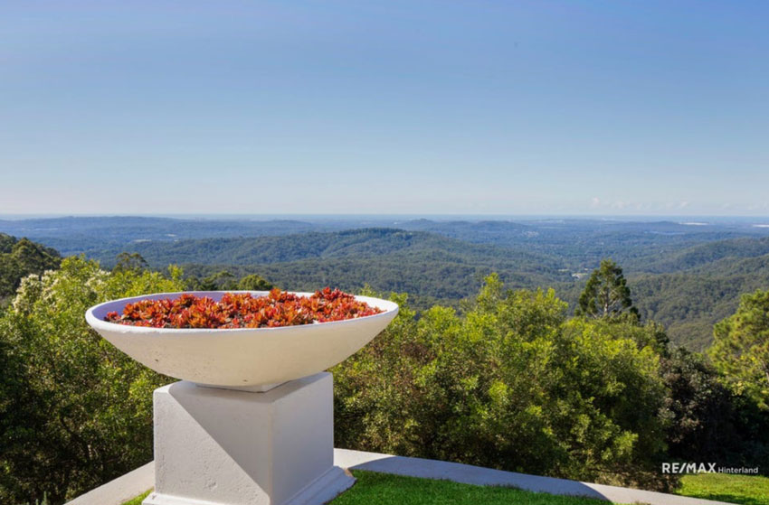
You see views or exterior photos and think, ‘Fabulous, I love it’.
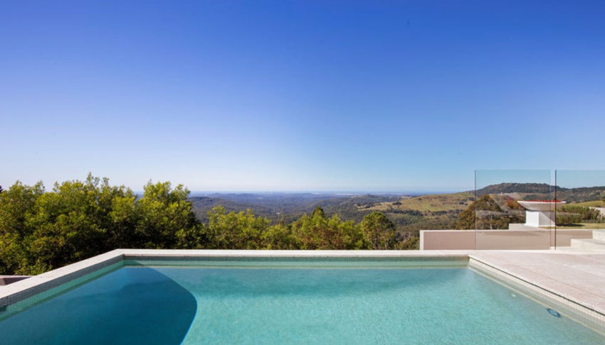
Yes, I could live here.
What happens when you combine yesterday and today in a kitchen?
But then you see the kitchen. Hmmm. . . brown cabinets (Tuscan trend which makes this kitchen about 15 years old) with pink beige travertine tile floors.
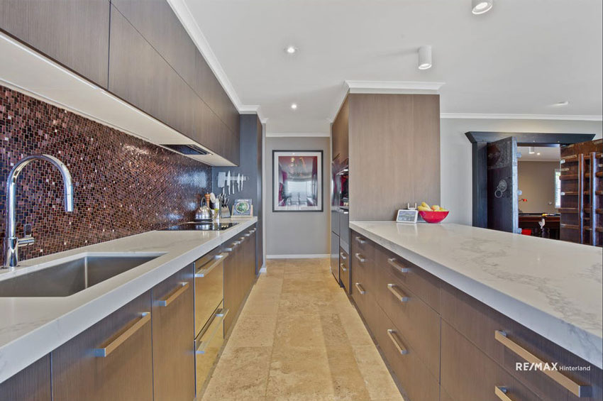
The update in the last few years would have been the white marble countertops and purple mosaic backsplash–unless the backsplash was somehow kept from the first renovation.
Cha-ching, cha-ching.

Now you start adding up how much it will cost to renovate the backsplash and countertop that in no way relate to the floors.
What should have happened here? Since the pink beige travertine floors are throughout this home, the countertops should have been a pale pink beige quartz to relate.
White marble countertops are a timeless look for a kitchen, AND they were trending all throughout the grey trend. However, if your home has tile floors like this that you have no plans to remove, you MUST consider them when choosing new finishes.
This kitchen now looks like “old floors and cabinets, new countertops.” The backsplash? It’s over there flying its own plane.
This is why so many people end up building. Because they can’t bear to live with trendy and creative finishes that the previous homeowner “fell in love with.”
And, having said that, this house is definitely not as bad as so many out there.
There are many lessons here but please keep this one in your mind if you are renovating or building: fall in love with a purple sofa, NOT a purple backsplash.
Read more: Bad Design Advice: Fall in Love with All Your Finishes
Let’s move on to the bathrooms shall we?
But first, is this tile really everywhere in this home?
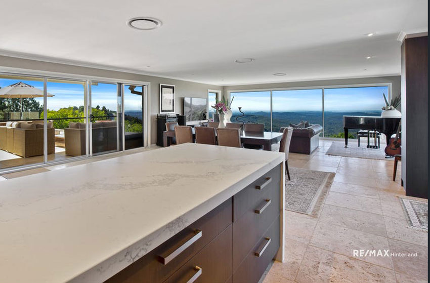
Yes, including the bathrooms, currently being ignored by the dark taupe paint colour on all the walls.
Now since beige is back, Travertine is also back, therefore, the fact that it’s throughout this home, might not be as bad for a new homeowner as it would have been in the last 10 years, during the grey trend.
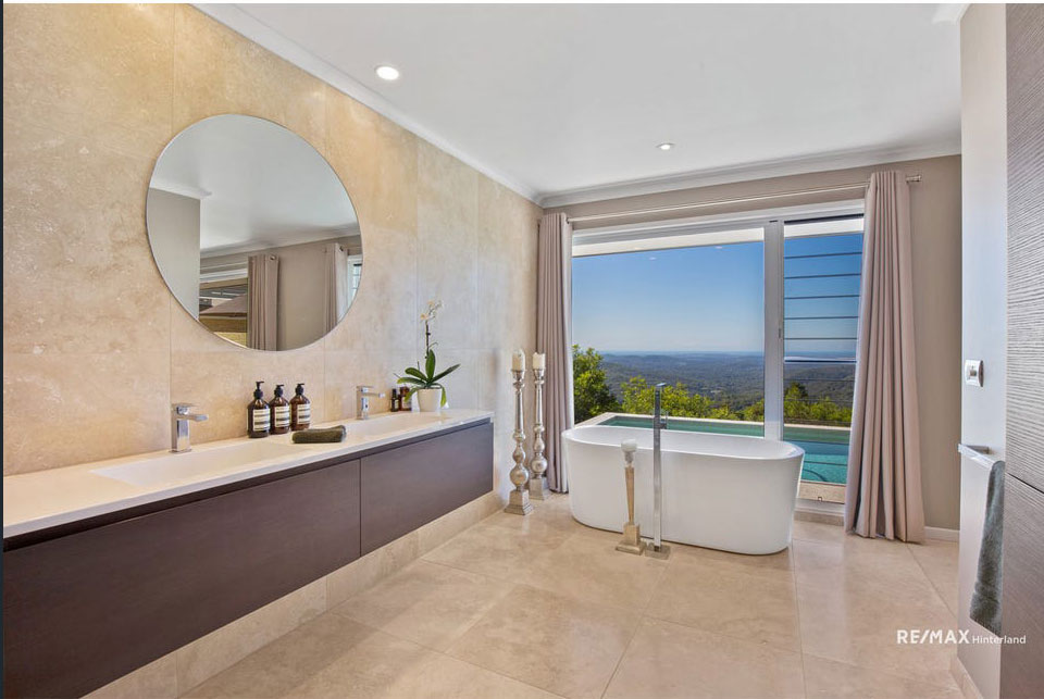
Blissfully, there is no stripy accent tile in this modern bathroom. Here the white countertops in fact relate to the white tub so it doesn’t look as out of place.
Where are my True Colour Experts?
So, if you’re a TCE, what colour(s) should this bathroom have been painted? Post your answer in the comments below. And please, let’s repeat the the white one more time in the drapes. That’s what they should have been.
As an aside, I am really over grommet drapery. Since it’s the style of most off-the-shelf curtains.
But, I feel we dodged a bullet with this bathroom. I can live with this, other than the too-high and wrong mirror that desperately needs to be replaced. It’s also odd that it was placed in the middle of the double sinks.
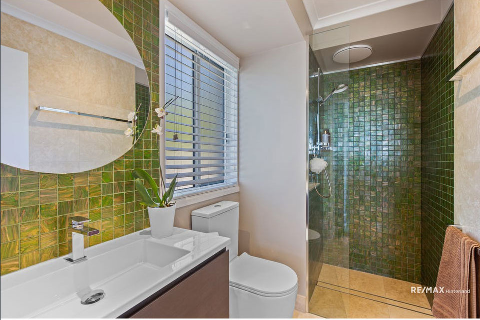
Moving on to the last two bathrooms.
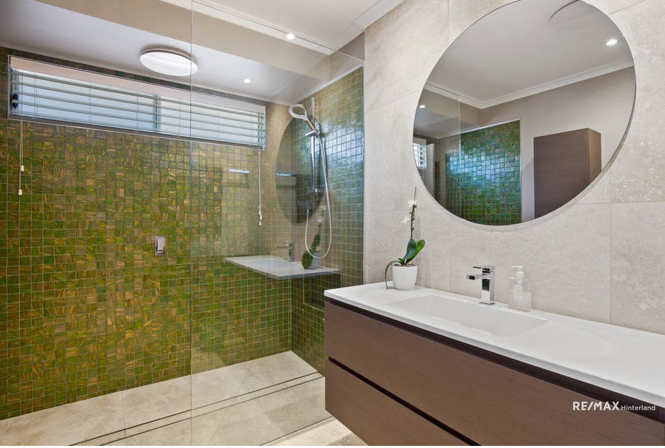
Well hopefully you love green. And I’m again grateful that the obligatory accent strips of tile were not included here, that would have made them way more unbearable.
If green is not your colour, the best way to cover dated shower tile is like this.
My take on the bathrooms in this case is that I wouldn’t change them until the house was fully decorated and looked exactly the way I want.
I think a lot of new homeowners rip out bathrooms too quickly when they can be done later.
Generally, the floors and kitchen are often an emergency because it’s hard to decorate around bad flooring. And, we spend so much time in our kitchen, it’s important we update as soon as possible, preferably before we move in.
However bathrooms? We spend so little time in them that they can wait.
And, I have saved many a bathroom from an instant renovation with fresh paint. It makes no sense to spend your entire budget on a complete renovation and then end up in a house with no furniture or worse, your old furniture that often just doesn’t work in your new house.
Recently on instagram, a follower sent me this snapshot of a hotel she was staying in with this comment, “Maria, I felt so smart because I could immediately see that this hotel was just renovated inside the black and white trend.”
Look at this elevator hallway for a minute. What would you do to make it less harsh, flat and predictable?
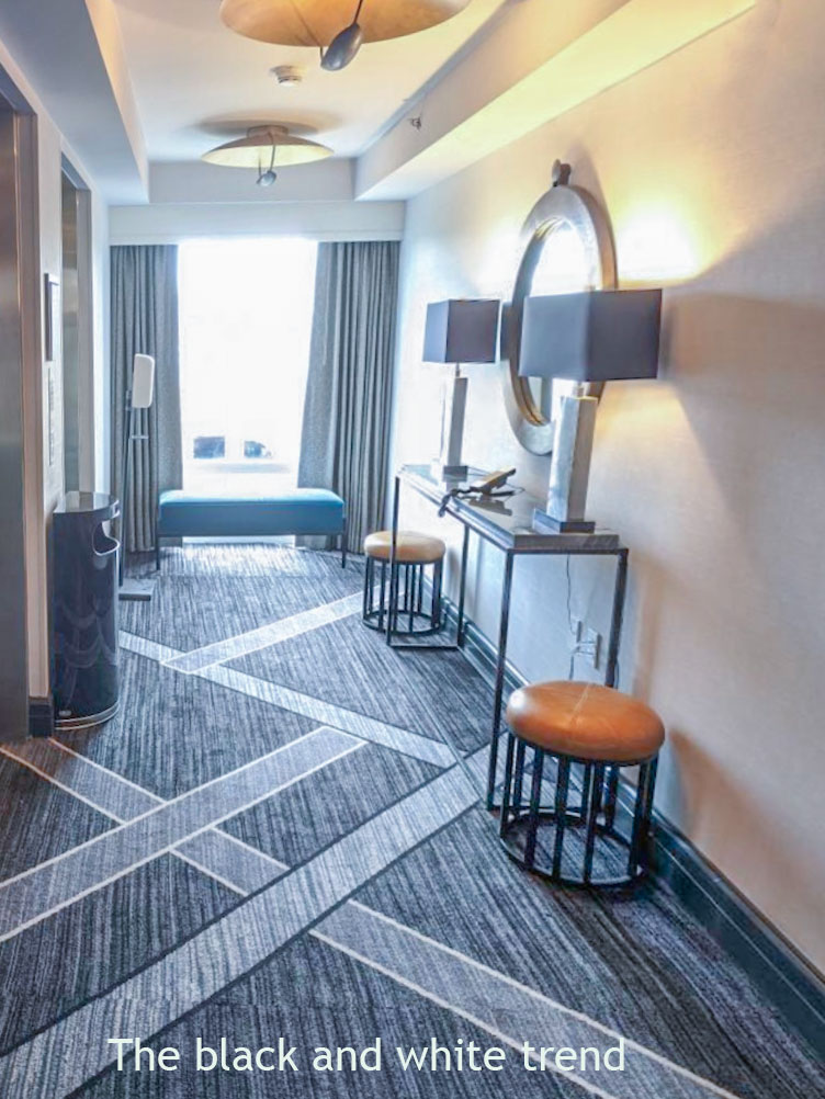
We need white curtains here, the cognac ottomans add warmth but the black metal base is bad. The console table should have been a wood stain, the mirror, gold and the lamps should have had off-white shades. This much black screams trendy, while just a little black looks just right since there’s nothing wrong with black in small doses.

Over to you my lovelies. Should I do more of these real estate tours with commentary? What do you think? Would you keep the bathrooms and decorate or would you take them out?
Also, could you live with the travertine? Or would that be a deal-breaker for you?
If you see a listing you’d like me to critique email me with the link here.
PS. My weekend Virtual, Specify Colour with Confidence just happened! I loved being with my tribe!

I flew my fabulous Social Media Director Kristy Robb from Indianapolis to be here live with me this week and we were also fortunate to have Rene, a True Colour Expert from Campbell River who volunteered to help where needed behind the scenes this weekend along with my amazing virtual team behind the scenes! I’m so fortunate to work with such wonderful people.
Here’s a lovely note I received immediately from a designer and now True Colour Expert, in Palm Beach County:
“Maria what a pleasure to have been in this weekend’s class learning about color.

If you would like your home to fill you with happiness when you walk in the door, see our eDesign packages here.
Related posts:
Ask Maria: Which Undertone Should I Use if I’m Starting from Scratch?


The paint in the MB should have been Maritime White – I have it in my bathroom that has Crema Marfil and it’s such a gorgeous color and just pulls the bathroom together (thanks to my eDesign from Maria)!
Yes BM Maritime white or SW Divine White is the answer! The perfect pink beige complex cream. Maria
Here I am rolling my eyes again at the “lets rip off travertine and brown cabinets because they are supposedly old or outdated mentality”. Those are very workable and livable, if you really know what you are doing or has someone that do, you should be able to make them work and love them all at the same time.
Not everybody cares for the ultimate trends or whatever colors are the rage at the moment, nor they want to rip off good material because of expenses or even because they support sustainability and avoid planned obsolesce.
Hi Lorena, I didn’t say I would remove it. But it is sad that the beautiful white marble quartz countertops don’t work with the floors. Are there worse combinations out there? Absolutely! This is exactly why I preach timeless not trendy. Maria
>>The backsplash? It’s over there flying its own plane.
LOL!
I find the house cold, hard, shiny, and uninviting — except for the gorgeous views, of course. Texture and sheen are really important factors, and this house is a great example of what NOT to do.
BTW, the blinds with strings dangling in the shower — kill me.
I would enjoy seeing your perspective on real estate listings anytime! This was interesting.
Lol – I got a good couple of chuckles out of that one, thx Maria! 😄 But I find it so disheartening to see such a hodgepodge situation in what looks to otherwise be an amazing home.
I couldn’t live w the floors or dark cabinets but surprisingly I might actually try to work w that green bathroom tile. Super fun post, for sure do more! 👍🏻💕
Yes, the real estate posts are a great idea!
And, yes, I could live with travertine floors. I stood my ground during the gray trend and kept with warm neutrals. So glad warm yellow and green beiges are coming back. Makes it easier to choose fabrics and accessories to go with what you have on yhand.
Now, however, I want to update by switching from a “dirty” to a “clean” palette and using bright colors for pillows, art, and accessories. My problem is expensive hand-knotted rugs which are in excellent condition, but seem to be dating my rooms. Some posts about freshening up a room without tossing vintage rugs which cost thousands would be appreciated, assuming that’s even possible.
Love your posts!
Yes please! I’d love a post on working with expensive wool and silk traditional carpets and if there’s any way possible to mix clean and dirty colours as most hand-make traditional carpets tend to use dirty colours.
Great post Maria. I have learned so much from you!
I too dislike the grommet off-the-shelf drapery. But the estimate I got for custom drapes [Ottawa] was $5K!! Can you please give a few words of advice on what are better alternatives. I’m willing to spend some money because I know that draperies can really make a room, but maybe more like $2-3K?
What are your thoughts on drapery from Pottery Barn or Crate & Barrel? Or maybe Ballard?
Love you blog!
What you can do with grommet drapes is fold over the top and staple them (or sew them down and pleat them if you’re at all handy with the sewing machine) or use iron-on fusible webbing and then use curtain pins and o-rings. I can sew but I wasn’t in the mood to make full drapes again, so I bought 3 panels from Home Depot, ripped out the side seams, resewed them as one big panel, pleated the top and hung them on a traverse rod. It was under $100 for all three panels. Ballard Designs has pretty reasonable plain panels as well. I find the Pottery barn panels are more costly and typically pink beige.
If you go with Pottery Barn be sure to order extra panels so you can return the panels that are not the stated length. Sigh . . . There were variances in my last order up to 4”. The blackout I currently have from them pucker on the sides. I would love to go custom in the future (or be talented enough to sew my own!) Also, the unlined Ritva by IKEA has a header that drapery hooks can be used on for a really inexpensive alternative.
Yes custom drapery is expensive. Nothing wrong with off-the-shelf drapery, I would just avoid the grommet look! Do rings and clips instead! Hope that helps, Maria
Maria, I love hearing your opinions, especially on the real estate listings. I am constantly learning something from you. I am not looking to move, but enjoy taking a peek inside local homes for sale and thinking about what is good and bad with the decorating, layout, colors. I think it’s the best way to learn when you point things out, so I hope you keep doing it. Just to further entice you to keep going with it, I just sent you an email with 3 listings in our area of high end homes with some big decorating mistakes in my opinion. Would love to hear what you think!
I learned something new today. I didn’t know that the modern brown slab cabinets were in the Tuscan trend. I thought the Tuscan trend was more on the traditional side with all the ornate swirly lighting and raised panel cabinets. I didn’t realize that because it was brown it was Tuscan, regardless of the modern style, if that’s what you’re meaning. oh, and yes, to the real estate pics and commentary. Loving it! I’d probably just decorate in that bathroom. i think I could love with the travertine if the paint was done right.
I also wanted to mention to you, Maria, that I somehow made it out alive of my kitchen redo without overdoing the black in my black and white kitchen. I ended up with a black countertop and black lighting and some black that’s in my stainless-steel appliances and that’s it. My cabinets, subway tile and grout all white (carefully selected from your eBook color system). I would like to thank you for the knobs on cabinets and pulls on doors suggestion because I did chrome hardware (much to the chagrin of my mother and friends who said they would’ve done black). If I would’ve done all handles, which were 1/3 the size of all the drawers and would have been on the doors to if I would’ve done all handles, I would’ve been smacked in the face with all that bling every time I opened the door to my open concept space. It would’ve been waaay too much, regardless of the hardware finish I selected. My husband happily agreed and admitted that the “boring white subway tile” (with white grout instead of black or gray) looked great! Thank you, thank you, thank you, Maria! I could not have done it without your knowledge and ebooks! 😀
I cringe every time you mention “stripy accent tile” because yes we have that in 3 bathrooms renovated 10 years ago. I wanted all off white tile and the decorator I had hired at the time (because I wasn’t confident with my own decisions) convinced me I didn’t want to be boring… Not only the super large bill for her design help (almost none we agreed to – thank goodness), I’m going to have pay to redo the tile in the bathrooms someday as the accent tile drives me crazy.
I inherited poor choices in my master bathroom, but I refused to rip out the tile because it’s in the shower as well as on the floor. So I identified that it was a green gray and painted the walls in Agreeable gray. I took the laminated doors off the vanity because they were a dark gray and replaced just the drawer front and doors with wood shaker doors. I then painted them in navy. I added a navy rug in front of the cabinet to repeat the color. I replaced the countertop with a quartz remnant that had a light green gray background and some gray veining in it. Done! At a fraction of a full renovation and no mess. I agree that sometimes it’s best to work with what you have, but it can definitely be a challenge! As we move into warmer trends, the green gray in my bathroom, which to many reads as a beige, will be right back in popularity.
Yes to critiquing real estate pics! It helps so much to have visual examples of ordinary rooms and I’d love to see more. As well, I’ve always hated grommet drapes. They’re everywhere. It’s difficult to find nice long drapes without either going custom (expensive) or grommeting. Also yes, travertine would have been a deal breaker for me. I’m more of a French ‘black/white with colour traditionalist’ than a ‘Mediterranean browns lover’. As well, I’m sending you a traditional carpet pic that I’m hoping you’ll use if you do a post on using traditional wool/silk expensive rugs. Thanks so much for sharing your knowledge. I learn a lot from you which sometimes gives me confidence and sometimes causes me to rethink design decisions I made in our new build 6 years ago before I followed your blog. Nothing major or awful. I just know it could be better which is why your blogs are great for me!
I have seen way too many spaces held hostage by expensive yet dated rugs. If you’ve had them in a home for over 10 years or certainly more than 20, it’s time for a change. Think of it this way. If you moved, they would likely go anyway because it’s unlikely they would work in a new house which always needs custom sizes and colours if you’re committed to having a well decorated home. I say move them to a guest room. Maria
I don’t mind travertine—and could even use the white counters but the cabinets would have to be repainted
I like what I like—and I am totally fine with the idea my house might look dated—that’s ok…I am dated—
Love this type of post!
It’s not just hard finishes that people get wrong, it’s the strong, idiosyncratic paint colors they use all over a house. I know it’s only paint, but having rooms painted is quite expensive. I groan when I see red and cantaloupe and purple walls, often in rooms furnished with brown and black furniture. All the color is in the walls.
I wish children could be taught simple basics of design in schools!
As an Interior designer there is no way I could live with Travertine, it’s too busy and I never liked it even when it was trendy! However it’s great that we can updated it with paint & other items and make it not so noticeable by blending it in a little.
I’d love it you critiqued the real estate listings, especially the ones that aren’t so obvious at first! Love it!
I’d love to see more Real Estate related assessments. I do home staging and I’m often contradicting advice my sellers have been given by others. Like above, many advise them to just put in new countertops or just paint the cabinets white. Such a waste when since it’s just a splash of new that makes the old look even worse. As always, appreciate your posts so much!
I am not a designer but it seems to me that the yellow-green tile in the bathrooms has a very boho vibe that doesn’t relate to anything else. I could see the tile working with a dramatic teal or deep turquoise or even navy — and some plants and a rug on the floor.
Everyone has their material, style and color preferences- the key is knowing how to pull them together to create a home that feels like a loving embrace. I still love my earthen rusty travertine floors. Living in the stone dotted foothills of Santa Barbara, they continue to be a great look with my buttery hand plastered walls that we colored ourselves with a a smidge of clay from Sienna. Yellow based creams and rusts flow seamlessly from the boulders and soil of our avocado ranch and surrounding mountains. Ivy grows up our pale pumpkin stucco walls and the oceanic trim echos the sea below. Inside, classic European furniture collected over the years plays with billowing English rose gardens outside the windows. Trendy clean colors would be a sore thumb obliterating our indoor outdoor flow and harmony. I trust that living in the present moment, surrounded by colors that mirror back my soul, adds up to eternal joy and satisfaction with what is, and desire for new and shiny does not arise. Transcending trends that come and go anchors us in our own timeless individuality and grounds us in grace. Thank you, Maria, for all I learned from you while building this house, so the quiet peace of our home is an ageless and seamless nest of solace and comfort.
Beautifully written – I can just envision it!
Haha! Me too! I literally just said to myself, this woman could write a book and I’d read it, cover to cover!
Beautifully written – I can just envision it!
A Yes Please to more real estate listing posts! And I still like travertine in the right setting. Maritime White re your paint colour question.
The bathrooms don’t appear to be a big challenge. The green shower tile definitely needs to go and replaced a subway tile in a more contemporary pattern in white which relates to the countertop and paint BM Muslin would be a color to look too. With those stunning views, I could easily live with those green bathrooms though. lol If you want for some truly horrendous real estate listings to pick apart, Florida won’t disappoint you.
What colour(s) should this bathroom have been painted?
My response: The first color that came to my mind for Tuscan walls was Manchester Tan. Then I confirmed what Maria said on day 2 of our specifying color course “If you have Tuscan finishes green beige is the answer bc there is no gray in Tuscan finishes”. Yeah! I got it right.
” The backsplash? It’s over there flying its own plane” is a great comment. 🙂
Wouldn’t a pink beige like Maritime White be the best color for that bathroom that is swimming in pink beige travertine? I guess a green beige could work too, or White Down (that was another color specified for my bathroom with pink travertine).
I would love to see the green tiles in the bathroom kept and something beautiful coming from that.
I do like this type of post.
I love this post! Please do more of this kind. Giving us real life examples is a great way to learn. Thank you Maria!
The travertine floors look fine, but I could not live with them due to back issues.
I would paints the walls green in the bathroom with the green tiles.
The house has great views, but the design feels very cold.
I have been looking for a home for the past year, and I have seen more disasters than I can describe. I frequently have said to my husband, “I have GOT to send this listing to Maria Killam. It is everything she talks about in one lesson.”
The thing I seem to see most often in our target, vintage neighborhood, is that people are ripping out charming wood floors and replacing them with grey luxury vinyl tile throughout the home. Frequently, this flooring choice is in the same room with the original brown wood of cabinets, brown trend countertops, and busy accent tile used as an entire backsplash. Grey and brown crash together everywhere, and bright white paint is used on every wall. If there was any charm to the place originally, you have to look hard to see it. When I try to see what it could/should look like and start adding up all the hard surfaces that need fixing, we just back away.
Funny, but every house we’ve seen that we were interested in purchasing had subway tile and many of the things Maria advocates. And those homes always seem to be the more expensive homes (although the materials are no more expensive) and it always turns out that those homes go for well over asking price. Coincidence? I think not.
Great post. I, too, benefit from seeing examples of the message that you are trying to convey. The use of real estate pics of “average” houses help too. I liked that you also indicated where you would start to improve the house since it is so difficult to determine where to start since so many places need help. Also, I would like to hear more of your decorating thoughts, especially as it relates to window treatments. How do you determine the best draperies—solids or prints? etc.
Great stuff, Maria. I really enjoy the practical reminders of putting your system into practice. I’d love to see more real estate examples.
I wouldn’t choose travertine but I’d definitely quite happily work with it if I inherited it. I’d be embracing the pink beige and repeating a pale pink beige complex cream, timber, natural textures and maybe some denimy blues. Sounds warm, earthy and cosy to me.
So interesting!
What I’m MOST interested in is taking bad design and turning it into better design without ripping everything out and starting over – similar to the pink carpet bedroom problem from a few months ago.
Instead of starting over in our homes, how can we make some incremental changes that allow us to enjoy the space? That’s normally what I can afford.
(That said, we are renovating a house for retirement, and it’s going to be beautiful, boring classic – so we can decorate to our hearts content).
yes as a buyer I’m looking at a house thinking how much it will cost to replace whatever the current owner did, no matter how new or how expensive it was.
Unless I can live with it. Which I would probably do, and try to work around it as much as possible. While it would not be optimal, I could probably live with travertine floors, much better than depressing gray vinyl ones.
I would love to see you take on real estate listings, Maria. Perhaps even an occasional rental. We’ve chosen to rent, rather than buy since 2011, and have moved four times during the past eleven years. All of our rentals have been lovely, but I can’t paint or change anything. I found your blog when I was decorating our first rental and it’s helped me ever since to decorate around the owner’s choices. I can overlook things I don’t love as long as I distract myself with colorful rugs and furniture. And lots of lamps! 🙂 Currently, our bathrooms are Tuscan, with shiny travertine tile in the master bath. I don’t mind it, but since we are on the downhill slide toward 80, the slip-and-fall factor is a big concern. However, I’ve had fun with colorful towels and shower curtain, even as I tread very carefully on that dangerous floor!
That purple backsplash is definitely “flying its own plane.” LOL As much as I love, love, love purple, that would have to go!
Hi Maria, my husband and I live in Florida. We have very light travertine floors and they are perfect for here. They’re indestructible. easy to clean and perfect for coming in from the beach. I would never consider ripping them out. They’re very neutral and I haven’t had problems decorating with them. Loved this post!
Thanks for this. I just finished reading about travertine to see what the big deal was. I see that it is sometimes “busy.” However, maybe if we called it “natural stone” we’d all be fine with it. Seriously!
If you are looking for dated homes on real estate listings can I recommend McMansion Hell as a fertile source of material? Although I think even you would struggle with these two examples:
https://mcmansionhell.com/post/662410760317714432/the-mcmansion-hell-yearbook-1980
https://mcmansionhell.com/post/667428216873664512/the-mcmansion-hell-yearbook-1981
What I’m not looking for is homes where nothing is redeemable and it just needs to be completely redone. But I am familiar with that site, haha. Maria
As to the Travertine bathroom. Wow!
I love the sheer space in there. How about a wall color, golden beige, similar to the travertine tiles? There’s even a Bm color called Travertine Tan. Yes, white drapes and rectangular ( horizontal edge wider) mirrors over each sink. Done.
I love this post. I took photos at on open house not long ago and wanted to share them with you as an example I thought you’d love of what not to do after following your blog :). But I wasn’t sure if I could legally do that?
I would buy that property even with dirt floors! Can’t imagine anything as simple as floors being a “deal-breaker” on this stunning property. Yes, please, more real estate tours with commentary. Your outfits are always beautiful and creative.
I too would love to see more real estate postings evaluated. And what to do in lieu of ripping everything out.
I wouldn’t chose travertine but I would live with it if I bought a house that already had it. I think it looks nice when properly decorated and it’s a durable material. It also works better in certain parts of the country and specific styles of homes.
Did we ever specify what color the bathroom wall SHOULD have been painted?