Ever wondered how a eDesign consultation works? Can you really choose paint colours online? Here’s an inside look of how our eDesign process works and how we can help you with your paint colour dilemma’s from the convenience of home.
Today I’m sharing a simple eDesign consultation for a new open layout wall colour so you can get a sense of what the process looks like.
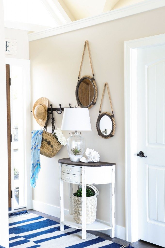
Interior Design by Maria Killam (another pic of the wall colour we specified)
First, after you purchase your eDesign consultation, you’ll receive an email with the next steps. We will even send you a brief video that outlines our entire process. Then you’ll complete a questionnaire where you’ll provide additional information, such as:
- Preferred paint brand
- Existing paint colours on your walls
- Any hard finishes or furnishings that are being replaced or are staying
- Colour preferences
- Any other helpful information about your home
How to choose paint colours online.
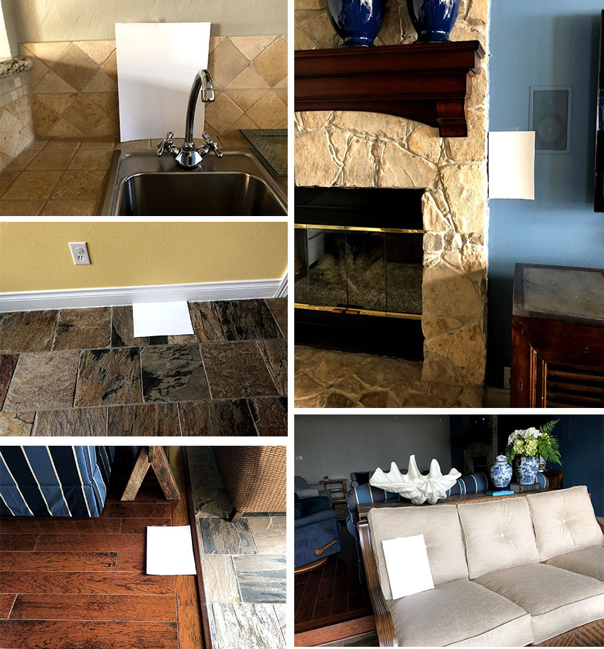
We’ll also ask you to upload an online photo album with photos of your space. We need photos taken in good natural light, without a flash – photos from your phone are perfect! But, most importantly we need you to take photos with a piece of white paper placed somewhere on the hard finishes. This helps us correctly see the neutral undertones and especially how either white, off-white or cream they are.
As you can see in the following photos, this client took great photos so we could see the primary undertones in her hard finishes. This is key to choosing accurate paint colours online.
This eDesign client wanted a new, lighter, overall main neutral wall colour. In her questionnaire, she explained that her existing paint colours felt dingy and dated (below). And, she wasn’t ready to change her kitchen tile or floors, however she did indicate she wanted some guidance on painting her stone fireplace.
Because our eDesign consultations are about getting the colour right, we will explain why are recommendations are best for your individual space, so you can feel confident that everything will come together beautifully as you move forward.
Photos taken for an Open Layout eDesign (Online Colour Design) Consultation
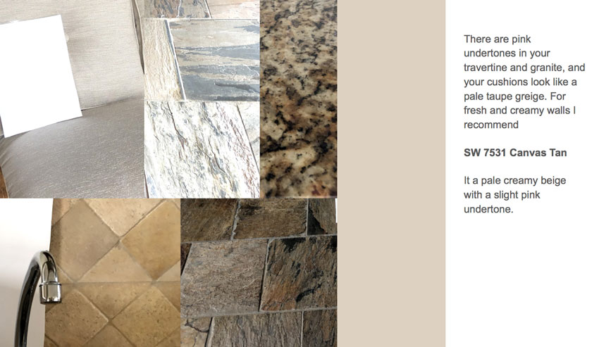
After we received her photos and questionnaire, and evaluated her space, we provided paint colour recommendations in a well-organized PDF that can be viewed online or printed easily.
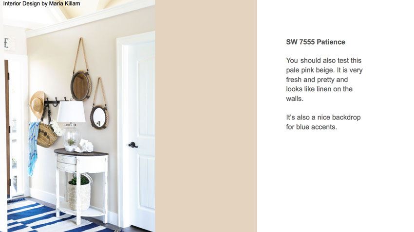
Here are a few pages from our eDesign paint colour recommendations for this client:
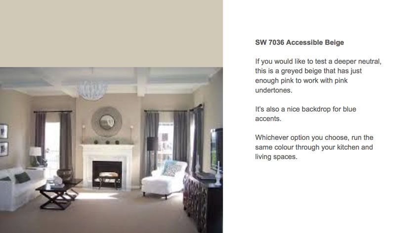
Notice the chip on the screen (above) looks much pinker than what it looks like on the walls in the photo next to it. It will alway look darker on a computer screen or even on the small paint chip in your hand. That’s why we also include a photo of a space with the paint colour we recommend.
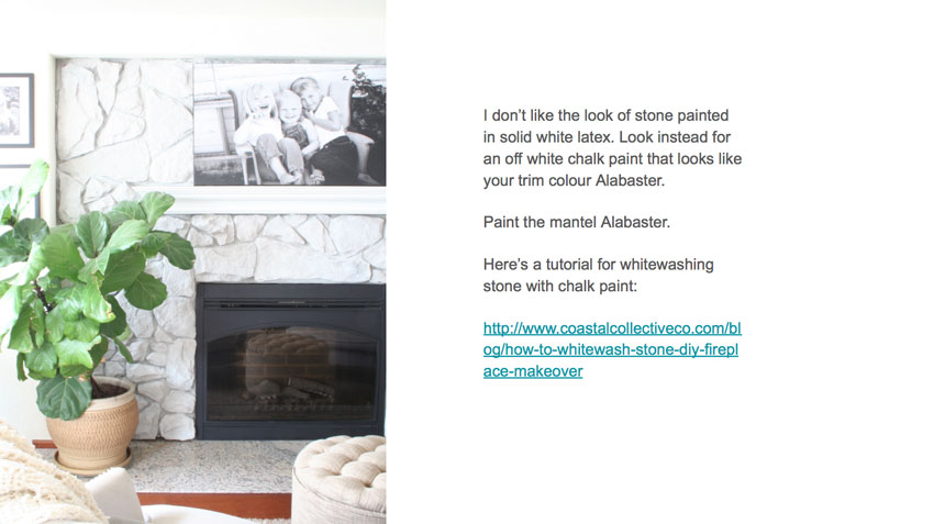
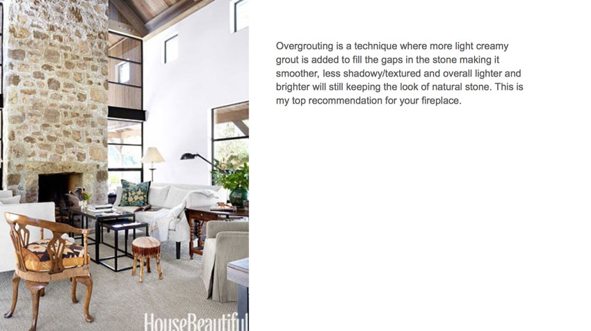
She also mentioned that she wanted to paint her fireplace. So we gave her two options to work with our wall colour recommendations, along with some guidance about painting stone:
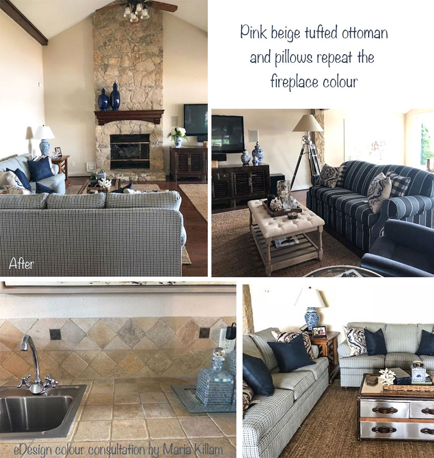
And here’s the finished room (shown below). The client still hasn’t decided on which treatment she will use for the stone fireplace, but that’s the beauty of this eDesign consultation. When she’s ready, she’s already equipped with a plan that will be cohesive with her new paint colour. Design decisions like these should be made together to keep your space unified.
My client did such a nice job of styling the room! I like how the upholstered pink beige linen ottoman (below right) and the pillows both pick up the wall colour and repeat the blue colour in the room!
You can also see that the new paint colour she chose (Sherwin-Williams Patience) relates nicely to the hard finishes in her bar area (above left).
I specified a similar colour in another interior design project for a client a few years ago:
Interior Design by Maria Killam
Isn’t it amazing how a room will just feel “right” when the colours are properly coordinated?
Rather than ignore or fight with the pink undertones in her finishes, she took our recommendation to paint the walls a very pale and current pink beige, which looks so pretty with all of her blue accents. Hint: Pink beige and blues play very well together.
Getting Colour Right in an Online Colour Design Consultation
Getting colour right online is 95% about choosing the right undertone and only 5% about the how the lighting influences the colour, as you may have noticed in my recent posts, here and here and also in this post about white walls.
Almost any shade of blue will give a fresh look to pink beige hard finishes. My sister is freshening up her kitchen with blue paint and keeping her existing cabinets, which have a glazed pink beige undertone. It looks beautiful so far!
If you’d like help choosing the right paint colour for your open layout home, try this eDesign package here.
To see the rest of our eDesign services go here.
Learn how to choose the right colour and see colour online in my Specify Colour with Confidence events coming up this Fall!
If you have any questions about this process please post a comment below!
Related posts:
10 Steps for Planning Your New Build



Love the “overgrouting” idea and photo. And yes the mantel will look awesome painted!
Really liked this post Maria! It’s great to see your thought process and how you suggested what you did. I have been nervous about on line consults for color wondering what the true finishes are but love your guidelines here.
What do you do with respect to a e- consultation if the room has little or no natural light?
A room with no natural light does not photograph well, if we can’t see the colour, we don’t specify one and we’re straight up about that! Maria
Its amazing how many times it leads to “Pink beige.” It is a color I truly fight against choosing. (I just don’t like it in any way). I have yet to use it to truly see it in a space as I am only a decorating enthusiast working on my own home and close friends. I guess I will have to go with it and stop going around and around it.
Well anyone who reads my blog knows how I feel about this colour but it is found in natural stone a lot and it works much better if you go with it rather than fight against it. I spend a lot of time talking about pink beige in my courses so that my students learn to see it because it comes in so many different finishes. Maria
Kelly, I generally hate all beige no matter what the undertone, so I get you. But SW Patience at least has a fresher look than most beiges. It undeniably goes with the fireplace and everything else in that house. Even the kitchen tiles look prettier with the color. It’s like a 1000% improvement!
I wonder if there are any greige paints that would have worked also.
Hi Maria, this is a great post. Thanks for sharing the specifics and details of this project. There’s another option for the stone fireplace that will give you a natural, beautiful finish in an easy to use, one coat of paint. Check out Romabio Classico Limewash, an authentic slaked-lime paint manufactured in Italy -Romabio.com/Limewash
Yes, I can also vouch for Romabio. We used it on a brick house and it’s awesome. They make a limewash, which is less opaque and a mineral paint which is opaque. I hate the look of latex or oil on stone or brick. It adds a fake factor. Home Depot carries it now so it’s much easier to get.
Cool! I love the idea for the fireplace too. I think it would be perfect with that treatment!
I had Maria choose a wall paint for my living room recently. She chose BM Muslin, another pink beige. I had spent 1 year looking at beiges and tried 12 different samples on my wall and could not find the “right”color. The BM Muslin is perfect and I am so happy I decided to use Maria. I love reading her blog and I have a few of her books. I find everything she does fascinating.
Very good post and was delighted that you suggested SW colors rather than BM! I also see that you are doing a collection of color boards using SW paints. Will you be offering your collection like you did Benjamin Moore or will they be just another alternative to BM?
The difference in feel and how well it all goes together is amazing.
One question: I wonder how it would have looked to have the SW Patience continued onto the ceiling in the living room. I think I prefer when vaulted ceilings without crown molding are the same color as the walls.
I agree that vaulted ceilings (especially without trim) and any kind of angled ceilings such as those in attic rooms usually look best when painted the same colour as the walls! ??
Maria, how do you recommend a neutral paint when the existing hard finishes clash with each other?
Do you suggest replacing some of the hard finishes?
Hi Maria,
I absolutley LOVE your work and believe in your message.
Just a note that I found this last posting very confusing to follow. Maybe it’s me, but I’m scrolling up and down..back and forth….looking for before and after, interrupted by inspirations photos commingled with “real” pics…., getting unexpected closeups…..followed by zoom outs.. yikes. I’m exhausted…
Anyways, I know you love input… so that’s mine
Keep Coloring! LOVE IT!!!
That paint colour looks fabulous and has transformed the room. I’d love to see the room once the fireplace has been completed.
Is the rule of a paint colour looking darker on a small test square than on the wall the same for a larger swatch? I always thought the rule was that paint colours generally look darker once on the wall and carpets generally look lighter on the floor than their test swatches.
Another fantastic job by Maria! I do love your style, Maria! Quick question: would the mantel color, Alabaster, also be a good color choice for her trim and cabinets? Or would you use a different white?
I have a north facing bathroom with a north facing small window. My tiling is travertine which has a pink undertone to it, and the vanity is a medium oak. I am wanting to know if BM Muslin would work in this lighting.
There’s only one way to find out, paint up a sample and hold it beside your tile! If you’re still not sure, we can help you choose a colour but that often is a good one with Travertine! Hope that helps, Maria
Maria, this post is FABULOUS!!! Thank you for always showing the way. I cannot even begin to describe how powerful an impact signing up to become a True Colour Expert has had on my life. It’s not just a class. It’s a lifestyle.