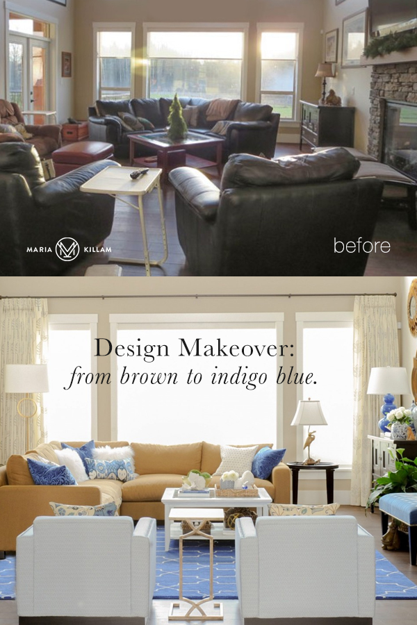
Adding bright and classic blue to this brown and dated living room feels fresh and new. You don’t want to miss this design makeover before and after, from brown to indigo blue.
My client Barbara and her husband had built seven homes together. Every time they would start a new build, she would say, “Can we please save enough money to decorate at the end?”
That day never seemed to arrive.
Last year, her husband passed away, and Barbara decided it was now or never. She’d been following my blog for years, so she felt she could trust me to give her the look and feel she wanted. In January, we started the decorating project: the living, dining, kitchen, and master bedroom.
When I arrived for the first consultation, Barbara spent some time pointing out the mistakes she had made when choosing finishes for her house.
I quickly reassured her, “You won’t even notice them when we’re done! You’ll be too busy admiring your new furniture and drapery.”
Here’s the before:
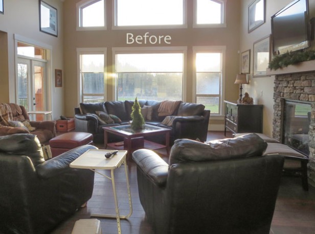
Look at those windows and high ceilings! I was excited to get started on creating a beautiful space for her.
The recliner on the left (above) was the most comfortable one she could find for her husband before he passed away at the end of last year.
From brown to indigo blue.
When I asked Barbara which colours she loved, she said blue! I said, “How about indigo blue and white?”
She said, “I love blue and white, but didn’t think I could have that in this house with all the brown. I thought it had to be a more muted shade like turquoise.” (Her adjoining kitchen, not shown, is also brown. It was her husband’s choice in this house; Barbara has always installed white kitchens).
My theory on why she thought she was stuck with turquoise is that turquoise was really big during the brown trend. In fact, that was the first colour combination that was introduced with brown! Here’s a living room I decorated for a client using turquoise five years ago.
All these brighter blue colours that are now trendy were introduced inside of the colour trend (aka grey trend), so perhaps that’s why it’s common to think you can’t use them with browns if that’s what’s still happening in your house.
Here’s the after:

Photos by Tracey Ayton
I choose a caramel-coloured sofa to relate to the stone fireplace and the granite in the kitchen nearby.
Notice there is no grey in this colour scheme, but it’s still on trend. The existing wall colour was very close to SW Wool Skein, so I said it could stay because it would work with the new decor. It was just the right colour with the stone fireplace.
This was good news for Barbara because that saved her the expense of repainting the entire main floor.
You can see that the coffee table is the same one from the before photo. Barbara painted it with chalk paint. The dog lounging underneath the ottoman (from Wisteria) was a wedding present from her husband’s best friend 44 years ago.
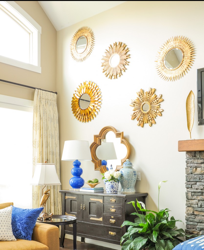
What do you do with such high walls? An arrangement of sunburst mirrors, of course!
The floors are wide plank oiled, so they take the abuse of dogs running around. They are easy to touch up, Barbara says.
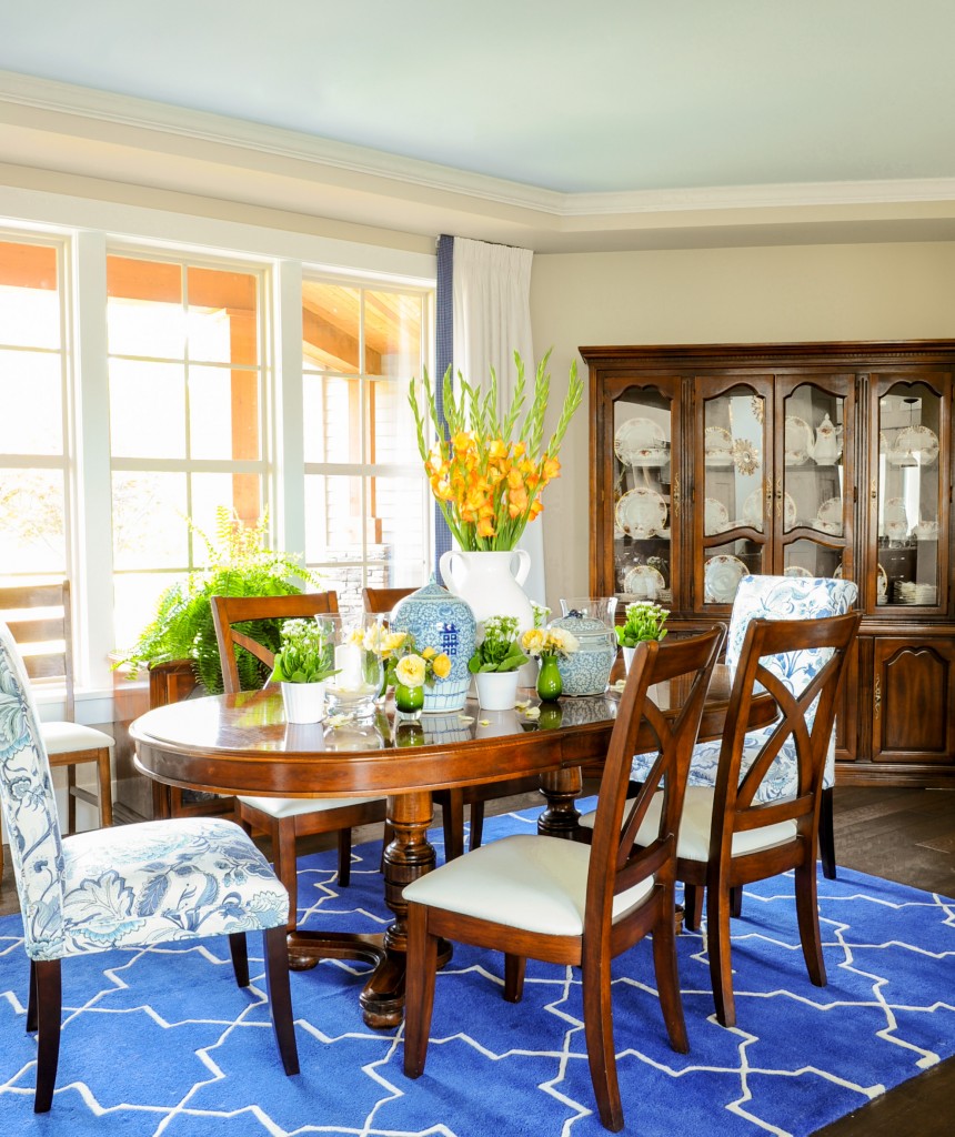
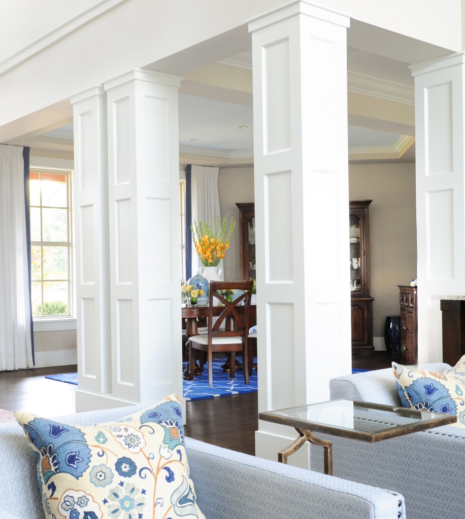
I used the same area rug in both the living and dining room. Notice you can do this with geometric rugs, but NOT with more traditional rugs like an Oushak rug for example, that’s when you need to coordinate them.
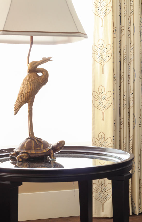
Photo by Maria Killam
Barbara and I both loved this whimsical table lamp we picked up from Bombay & Co.
She often watches a crane land in her backyard.
Look how the mirrored top of the end table feels like water; you can see the reflection of the tortoise in it (above).
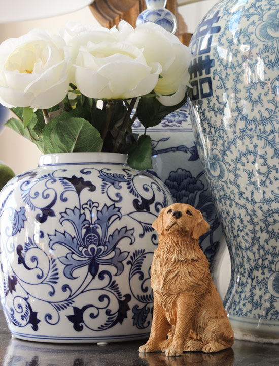 Photo by Maria Killam (Happiness Pot from Wisteria)
This figurine of a golden retriever is in memory of two they had years ago, Blue and Buddy.
We also updated her kitchen by switching out lighting and adding drapery, see that transformation here.
I am loving these bright blues these days. I think it’s because it feels new — we haven’t seen this colour since the 80s!
Have a wonderful week, everyone!
xoxo Maria
Related posts:
Vancouver Colour Queen on the Cover of BC Home
Indigo & Turquoise Summer House in the Fraser Valley
If you would like to transform the way you see colour, become a True Colour Expert.


Maria, how can I find a True Color Expert in my area? Do you keep a database that we non-designers can access? I live in a southwest desert town with a VERY specific personality and I’d love to hire someone that really understands color but also knows the (weird) area I live in.
Well done Maria! What a transformation from the overstuffed gray or brown leather!! From man cave to design extraordinaire! I especially love thee ginger jars w the dog figurine, the Suzani pattern on the blue chairs, as well as the sunburst mirrors. Great use of the wall space.
I’m really digging the indigo and other wonderful blues that we are seeing now. I did several rooms for a client a few years ago, and that’s what she wanted. We had a dreadful time finding fabrics, and now they’re everywhere! I never get tired of the blues, and I’m so glad they’re available again.
Was this a distance project
No this was local. . . the furniture, pillows and drapery were custom made for the space. Maria
You did a beautiful job, Maria. Barbara must just love it. And I bet her husband would have loved it also.
On trend but classic. Love the starburst mirrors. I love how you made use of several pieces she already had. This color combination really lovely.
I’m kicking myself – I had that exact rug in my grey living room and couldn’t get used to how bright it was so I recently replaced it with a grey and beige rug which is infinitely more boring. I think if I’d accessorized properly I may have loved it like I love it in her living room!
Beautiful blues! Im glad to see a brighter blue. Like your client, I was kind of stuck with turquoise in mind to blend with browns.
I’ll bet that Barbara sits in this room with a huge smile on her face and quietly sighs! It’s pretty and peaceful.
Maria,
Considering how popular the color blue is, why would it take 30 years for it to return as a widely available decorating color?
The living room looks great–so much more cheerful. Which is another thing I don’t understand–how many people really love a dark and moody house? A cheerful atmosphere is so much more conducive to getting up in the morning!
Great transformation! Based on my impression from your photos, I think you could maybe leave the table white – it’s very nautical, and repeats the white of all the window trim and the lampshades:-)
I agree, the white seems to fit with the white in the rug, the ottoman/bench, the lamps and the shades.
Beautiful room, I love blue!
Beautiful transformation!
The new room is truly fabulous! Light, bright and serene. Maria, you have created a gorgeous space here as always. Brilliant that you kept the old wall color and fireplace, yet successfully introduced the bright blues. The room looks classic yet fresh and modern. I actually like the white table, which to me coordinates with the white in the fabulous blue rug, and with the white trim. The blue made me think of the ocean when I first saw the room. Those blue chairs are wonderful! I’m happy to see how this transformation was done without repainting. Absolutely love this room and I am sure the owner will feel at home in this peaceful space.
Hi Maria – what would be an equivalent paint color in the Benjamin Moore collection that mirrors SW Wool Skein? I like to pull out my fan decks and test my color mapping skills when I read your blog. Thanks!!
I’m on trend then! My bedroom is all those bright and dusty blues with gray carpet. I love the blues, and personally, while I suppose they are a trend, I feel blues are timeless. And such a soothing feeling. I wish some yellow would come back, too. I would love to have yellow floral curtains for my living room, but the choices are slim and ugly. I also love light blue with browns, so this is nice.
Perfection …can’t wait to see the rest. I reminds me of a blue version of your living room.
Hi Maria! Looks Wow–thanks for sharing.
Great blog. I enjoyed this one, as it was good to see that it was not a total makeover. Also nice to see items displayed that have a story or an emotion behind them instead of a clean sweep, sterile look. Looks great!
Maria, did you know that Benjamin Moore in BC and Alberta now sell a chalk paint that can come in any Benjamin Moore colour? That’s how I got the Cloud White chalk paint for my dining chairs.
Beautiful house!
Beautiful transformation. Where did you find that gorgeous blue rug and matching table lamp? I’m digging the white coffee table, too. Looks clean and fresh!
The lamp is from Robert Abbey (I just checked it’s no longer available) sorry. The rug is from Rugs USA.
I’m not a blue person and it would never be my choice for myself but I can and do admire beautiful rooms done in blue and this is one. In fact, the blue gives this room an open, airy feel, almost as if you looked out the window, you’d see the beach. If Barbara is local, that feeling every day in your part of the country would probably be very desirable. I like the coffee table as is also. It’s the perfect white piece to sit on that rug. I’m eager to see the rest of the home.
I hope Angie finds some inspiration here. I empathize with her. If her southwest desert town is anywhere near my southwest desert town of Sun City West, AZ, inspiration is essentially non-existent. The brown trend is still strong in Arizona and grey rooms are uncommon – not at all sure what’s going to happen when the grey trend departs. So many new builders still offer a mish-mash of a little bit of everything in very open floorplans. Sue Calvin from Wiseman and Gale in Scottsdale does beautiful work with desert southwest homes but it would take more than MY ship to come in (probably at least the Queen Mary) to access her talents. A database would be a great idea; but in the meantime, I’m so glad we have you with all the creativity and generosity you offer us on a daily basis. It’s a really unique and special thing.
Boy, can I ever relate to Barbara in the building of all those homes with 0$ left over for decorating. Though it has forced me to “make do” and get super creative, we have done the same pattern. My guess is that the cost of this REFRESHING! make over was much less than the cost of a landscaping project! Right?
Bravo Maria…. And your photo skills are top notch. (I know that the professional gal will bring over special lighting, etc., but yours already look magazine worthy).
Cobalt and Indigo blue are my absolute favorite colors. Great job with this room! You’re right, the blue really updates the brown. A warm, cozy, bright space. Love the dogs, too! 🙂
Love the rug. Where is it from?
Barbara must totally love this new look — great job.
It’s from RugsUSA.
She could use a light coat of brown tinted furniture wax to tone down the white of the coffee table, and that could relate well to the carmel in the sofa. I would like to see a bit of carmel or brass near the two blue chairs too–maybe a throw tossed over one or some brass accessories on the side table?
Oh Maria you are so talented! The room turned out so beautifully. I love the play of blues which demonstrates your proportion of small, medium and large. I agree that the coffee table could be left white however you know best because we cannot see the room in person.
Also I like your “styled” shots of accessories.
So we’ll done!
Barbara sure should enjoy her adventure from brown to blue! You are a talented leader! xo Leslie
Absolutely stunning! I could move in!
What a wonderful transformation, you have brought some colour back into Barbara’s life, she must be thrilled with the outcome. Blue and white or blue and beige are my favourite combination and feature in my living room and my main bedroom.
The curtains soften the windows and the new colour palette makes the room look so much brighter.
Love it!
Very pretty. I just think it’s really special to be able to make such a difference in someone’s life, after such a major loss. Well done both of you!
Oh, how fabulous. It doesn’t look trendy at all, it looks ‘forever’.
Just keep scrolling and looking, scrolling and looking. Just love the changes you made.
Maria, I don’t usually comment twice on the same post but when I checked your Facebook page to see what’s new and scrolled down the page, the photo of Barbara’s great new room came up and I was drawn to open the post and re-look.
I hope Barbara doesn’t touch that white coffee table. I love it in the room and I think it’s perfect in its bright whiteness. You followed your own principle of repeating a color and the rule of three, at least. The bright white of the table (large) is repeated in the rug (small) and in the shade of the blue lamp on the console (medium) and even in the smaller vase with the flowers behind the pup.
That after shot of the newly styled room is delicious and it’s going into my inspiration folder right now!
Maria, what a difference a fabulous decorator makes! Great examples of style fitting the client. The blue and white is refreshing and classic.
Awesome transformation. I really love the look of the house with blue and white combination. It brighten the house.
Maria!!! Always love these amazing transformations. And interestingly, I’ve gone with blue and white (and some red accents) in the family room and kitchen of our new home. So wish I could get you down to Texas to help me pull it all together. You are a miracle worker!
Can you share the color on the dining room ceiling? I painted mine (this was my inspiriation, as I have a trey ceiling in my dining room), however, I went a wee bit too light. I think I’m the only one who notices… ugh after all that work. So, I’m thinking I may finally get the gumption to re-paint it… But I want to be sure I get it right this time! LOL
Where can I see the bedroom makeover for this transformation? Your article mentioned LR, Kitchen, and Bedroom. They are all so beautiful. Thanks.
Nearly 10 years later and this room still looks fresh and modern. I guess it’s proof of Maria’s timeless taste!
Sadly, my husband would think the Before version is the more attractive one. Why I now refuse to let him have any input into our decorating decisions!😂