


When I first stumbled across the work of author and colour enthusiast Ingrid Fetell Lee, I immediately shared her incredible Ted Talk here on the blog. Her insights about colour and shape and how they make us feel in an environment are fascinating. And looking around, I still see SO many spaces devoid of colour, and SO much fear of colour that I decided it’s important to share her work again.
Years ago, someone gifted me a pendant in the shape of a triangle.
I never wore it.
Well read on because Ingrid explains exactly why.
Traditional design has more curves
My aversion to sharp corners is probably why my design aesthetic is more traditional vs. ultra modern. Traditional design has way more curves, while modern has a lot more straight lines.
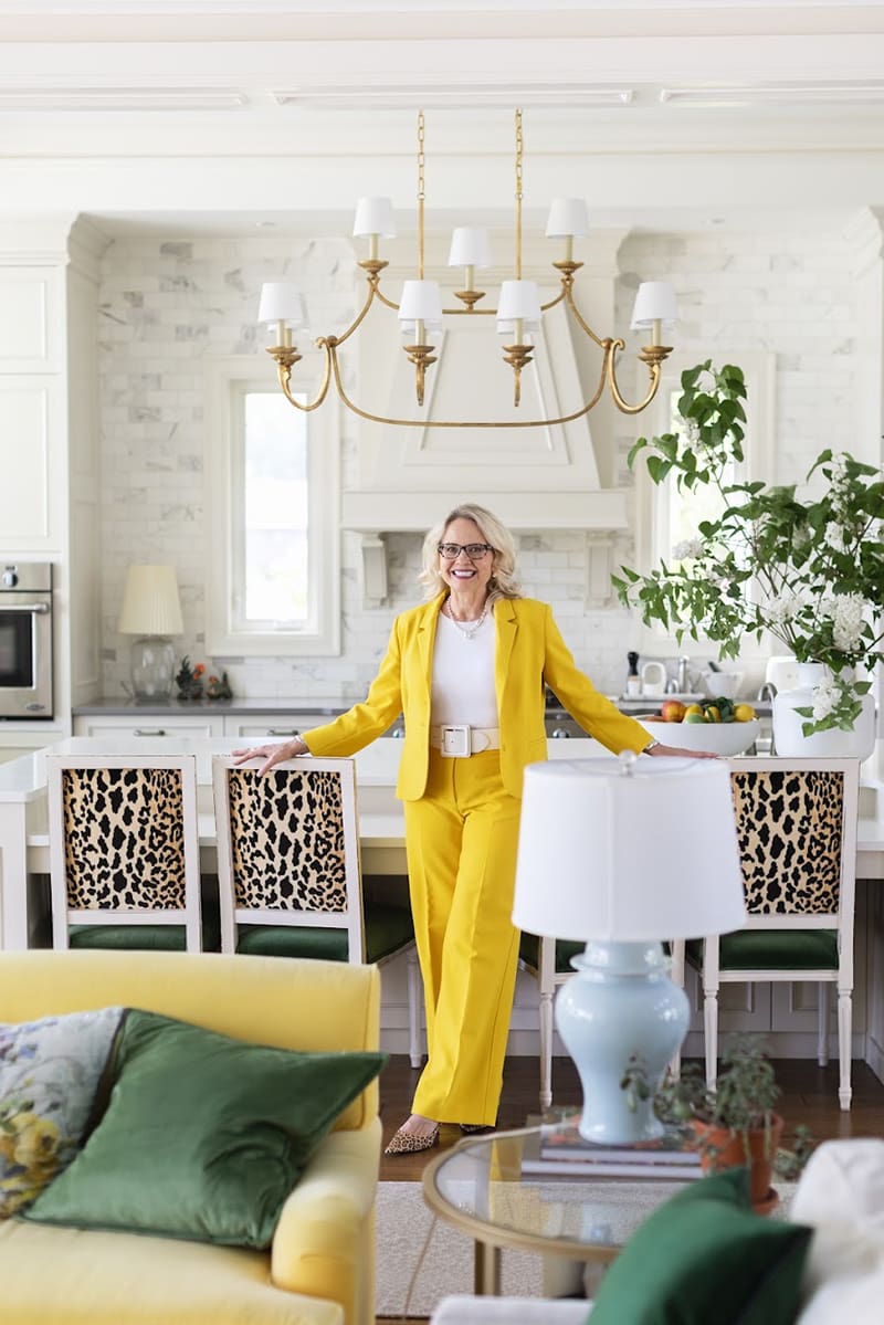
A builder once told me that if you build a traditional and ultra-modern house right beside each other, the traditional house sells way faster than the modern one.
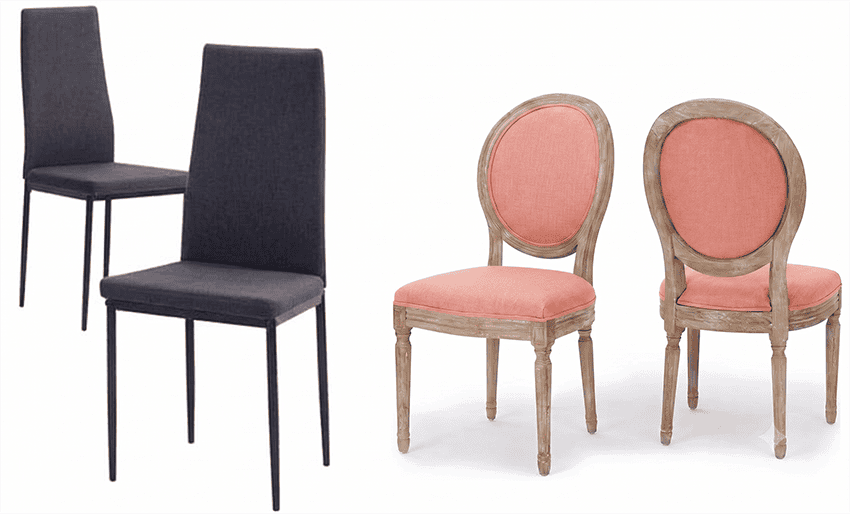
The shape of your furniture matters
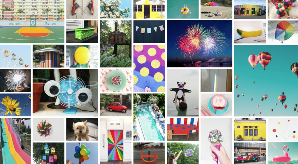
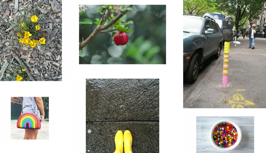
Universally, people responded that joy was represented in things like, rainbows, bubbles, polka dots, hot air balloons, bright pops of colour, etc.
Colour is where the joy is
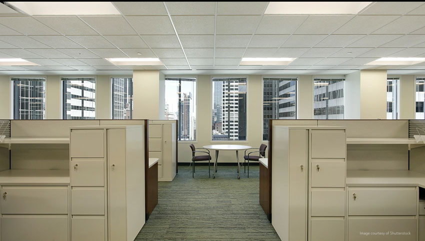
And it made her wonder why we go to work every day in offices that look like this:
Recently I was downtown for a meeting in an office tower where the finishing touches were just being added to brand new offices that looked like this:
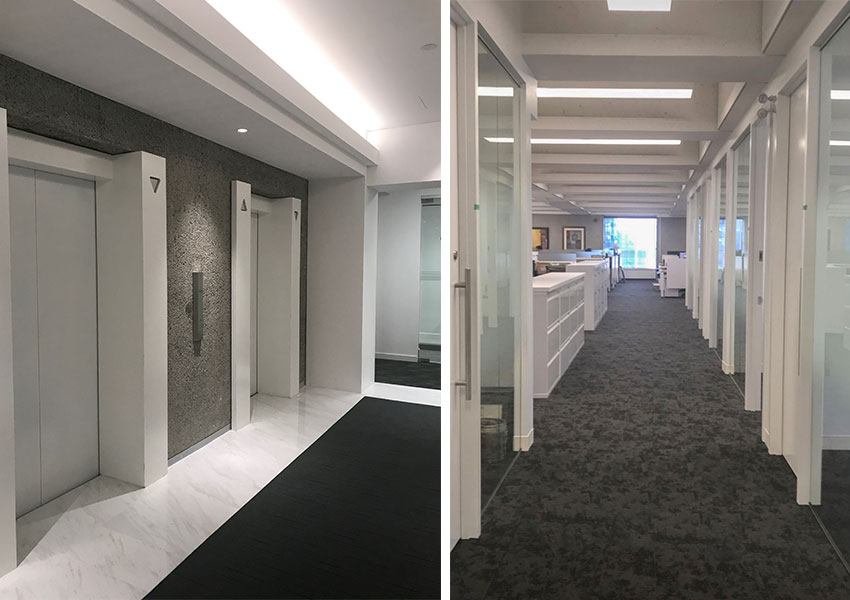
We sat in a meeting room with black carpet, black chairs and STARK white walls and I actually noticed that my eyes got tired.
As I learned years ago, when I was in colour training, high contrast workspaces like this, create eye fatigue because your pupils have to keep dilating to adjust to the contrast. It makes the workplace a high stimulation environment which is not good.
In her talk, Ingrid stated that research conducted in four countries, says that people working in colourful offices are more alert, more confident and friendlier than those that work in drab spaces.
This is why the trends have swung so quickly away from the harsh black and white look of the modern farmhouse trend to the much softer and more liveable warm and colourful looks everyone is asking for now.
Colour is abundance
Why do we love colour so much? Researchers say it’s because colour in a very primal way, is a sign of life, a sign of energy, and of abundance, we evolve in a world were scarcity is dangerous and abundance is survival.
Soothing vs alarming shapes
This next piece of her talk was the most interesting, she said that neuroscientists tested people and found that when they showed them pictures of angular objects vs. round ones, they found that the part of the brain that associates with fear and anxiety, lit up when they looked at the angular objects but not when they looked at the round ones.
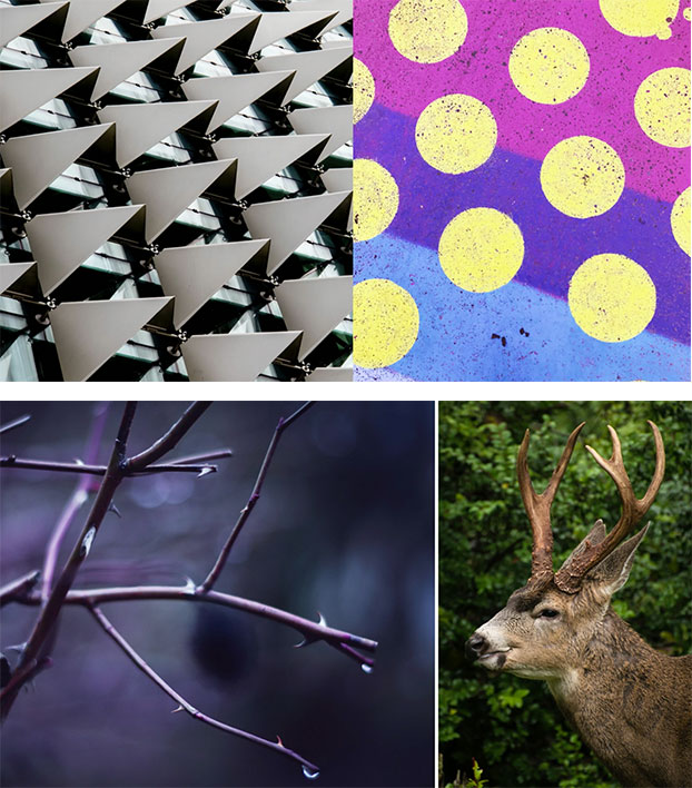
And they speculated that angles in nature are often associated with objects that might be dangerous to us that we evolved an unconscious sense of caution around these shapes (above).
While curves (below), set us at ease.
You deserve a home that fills you with joy
It’s why I don’t get tired of the colour in my house, it fills me with joy walking through it every day. In fact, I’ll often say out loud “House I love you! You are the best!” (not kidding, haha).
 Maria’s living room (see my full house tour here)
If you’re avoiding colour in your decorating? It’s most likely because you’re afraid of making a mistake you’ll tire of. But living in a home devoid of colour is actually what’s depleting you.
“Living in a home devoid of colour is actually what’s depleting you.”
Colour is where the joy is
What’s the best way to get brave with colour? By understanding it better. The great news is it’s easy to learn!
As much as I’m known for subtle undertones in neutrals and love to teach them, the reason I’ve written so many posts about clean and dirty colours, (this is a good one) is because that is where the SECRET to choosing and specifying colour CORRECTLY, actually lives. Neutrals are best at being the backdrop, but colours create the feel of a room.
“Neutrals are best at being the backdrop, but colours create the feel of a room.”
My Colour Training involves learning how to choose neutrals (which we’re doing 80% of the time) and COLOUR. Why? Because it makes no sense to understand neutrals if you don’t understand how to choose colour as well.
This course fills up fast, make sure you don’t miss it!
Get on the waitlist for the next session.
When I travel to Europe I’m always struck by how much more colour lives there and it makes me wonder why North Americans are so colour averse.
That’s why I was so excited when I watched Ingrid’s talk about Joy.
I love how this video completely changed how I look at shapes in the world. I will never look at triangular objects vs. round objects the same way ever again.
And neither will you.
Ingrid also wrote a book about joy I gifted a copy to my entire team, it’s a must read!
What was your favourite part of the video?
Related posts:
Timeless Isn’t a Rule; It’s Freedom
How to Create a Colour Palette

I think it would be fine to repeat the Carrara on your backsplash as long as you don’t think that look is too busy, but you still have lots of colour options for decorating because it’s a blue white/grey. . . hope that helps, Maria
Haha, I have lots of pointy shoes as a matter of fact but I have never seen them as a sharp triangle, haha! Maria
If I may weigh in here, as a homeowner with Carrara marble countertops and subway tile backsplash (two walls, actually), if I visualize what my kitchen would look like with marble on the walls, I would find it far too busy. You and your wife may have a higher tolerance for pattern than I do, of course, but if you like serenity in your surroundings, subway tile is probably a safer choice. Maria posted pictures of my kitchen some years ago, if you’d like to see it: https://mariakillam.com/whitekitchentransformation/
Ack, well maybe I chose one that was not enough like the ones I see. . . this one isn’t the same. thanks for your comment, I agree with your point of view too! We don’t all have to be the same that’s for sure! Maria
I’m looking at Ingrid Lee’s book online right now – they let you read a bit of it and it’s good. I will have to get it because she is speaking my language.
I think there are people who love color, but are also afraid of it. I know a person who writes adventurous novels and lives in a house that is nothing but gold-beiges and cream. Yet this same person has a Pinterest account of everything that captures her author’s imagination, and it is an explosion of color, beauty, and fantasy.
I find the contrast very interesting.
@Julie: Regarding Feng Shui theory; it was only until I started to dabble in it that I realized I’ve been practicing it for many years without even knowing it. For example, the majority of my tables in my home are round, oval or octagon. As for the dislike of pointy things; I personally believe it could be from ‘a conditioning process’ (that usually begins at an early age) which teaches us such things are often harmful. i.e.: Don’t run with that stick or you’ll poke your eye out! ☺ -Brenda-
This is very thought provoking. I love how she explains contemporary vs traditional. I will listen again and pass it on to my design professionals.
Great Ted Talk, thank you Maria for sharing. I feel immense joy when I enter my home. I am surrounded by my favorite color which is green and it’s so calming. I once heard a person describe their home as giving them a warm hug That’s exactly how I feel about my home. I wake up everyday feeling blessed to live in my home, so much so, I don’t wish to be away from home very long. I have traveled to many beautiful countries and have seen many beautiful sights but at
day 7 of the trip, I am ready to go home.
Dear Maria,
thank you for sharing this absolutely fantastic video on ‘Joy’.
I follow you and love your videos and work.
Now I know why.
Thank you again for you expertise, your work, and the gift of joy that you bring to others.
I work at a YMCA. We are about joy and community. The region got a new CEO two years ago and over the past year he has been stripping away all color. I know the intention is just to make it more modern and updated, but it’s horrible. We had multicolored hand weights and weighted plates for the barbells (red 10lb, blue 5lb, purple 2.5lb, etc) and now they are black , black, and black. All the walls have been changed to stark white and the base boards and door trim have been painted black. All the machines and gym equipment was replaced with plain black. It literally hurts my eyes when in one of the smaller rooms or offices that are now “primer” white, especially with the harsh office lights. I wish I could show this to the executive team, but the multi-million dollar renovations and updates are almost completed at this point.
Thanks for sharing this, very appreciative of her insights!
I read Joyful several years ago. I am so glad you are bringing this up here! I teach middle school and hung a bunch of round paper lanterns of varying sizes throughout my classroom after I read this book and learned that this makes us think of bubbles! I need to visit this book again. I fully believe that small little hits of joy can help us to keep it together in this scary world.