I’m so excited to share the before and after photos of my wonderful client Crystal and her husband Rob who live in Promontory Hill in Chilliwack. We renovated and decorated the two top floors of her house over a year ago now, and the main floor will be published in May (can’t wait to show you those images).
This is their forever house and when you see their view, you’ll understand.
We totally updated the house from the Tuscan brown trend to a way more classic and timeless look.
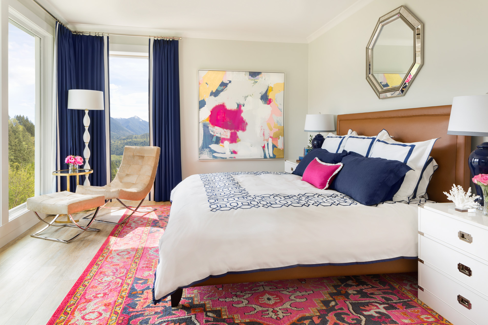
Pottery Barn Duvet (similar here and here) Art from Maria Killam Inc. Rug no longer available
Crystal and I were so happy when her husband shrugged and said he had no problem with introducing pink to these rooms!
Since cognac is a great colour to ground pink, I introduced it in the custom made upholstered bed. And we created a corner to sit and read and enjoy the uninterrupted view of the mountains.
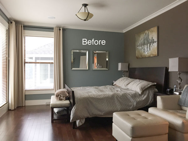
Before
The after photo was taken by my professional photographer who stood enough to the right so that the neighbours house was not in the shot. The windows were fully painted white as they were half wood, half white in the before photo.
And, since there is no mullion in the window on the left, the photographer photoshopped the mullion on the right so that it would look consistent in the photo. This window is also shorter than the other one, but looks visually lengthened because the lower area is covered by the new chair. I love that happy accident!
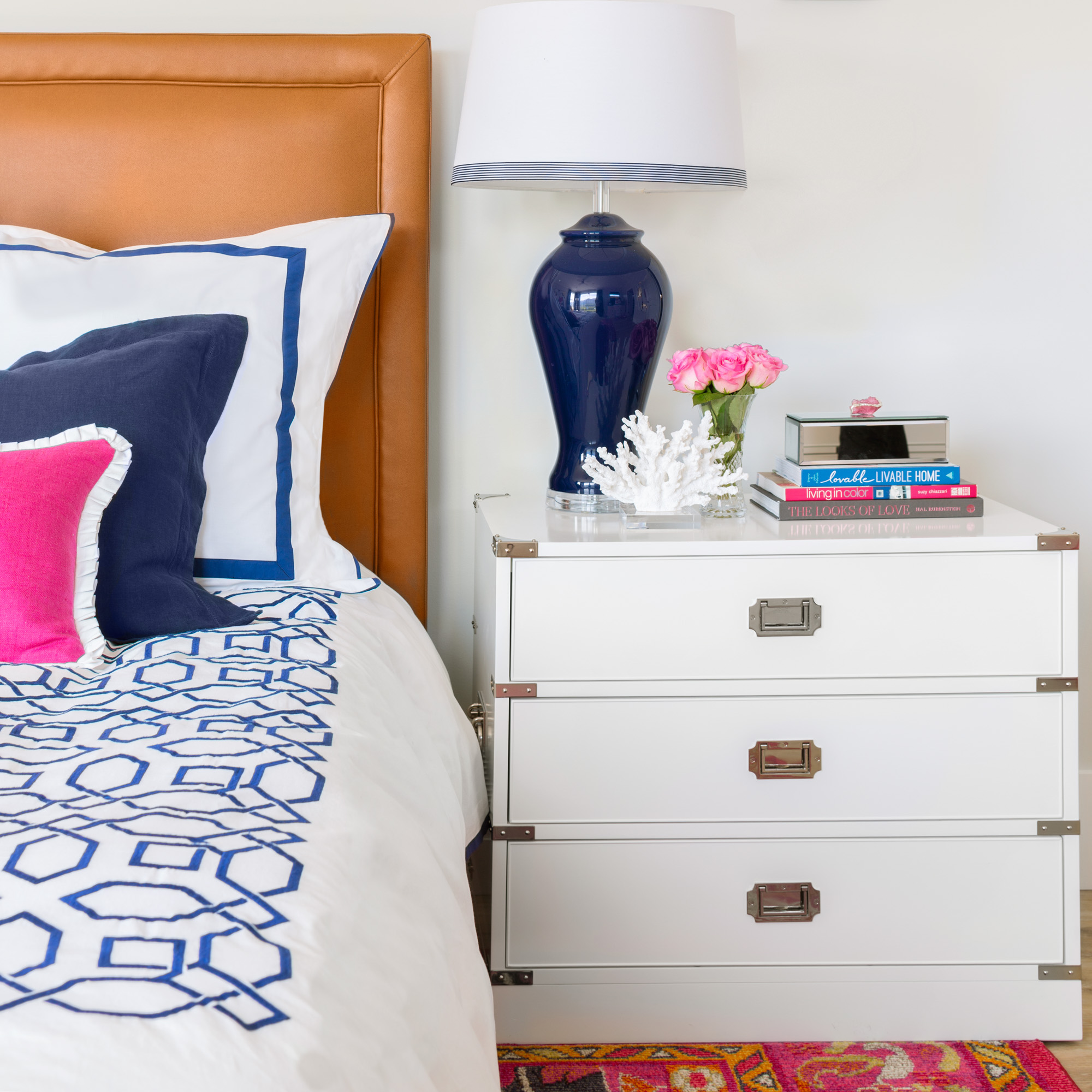
Navy Table Lamp | Williams & Sonoma Campaign Dresser
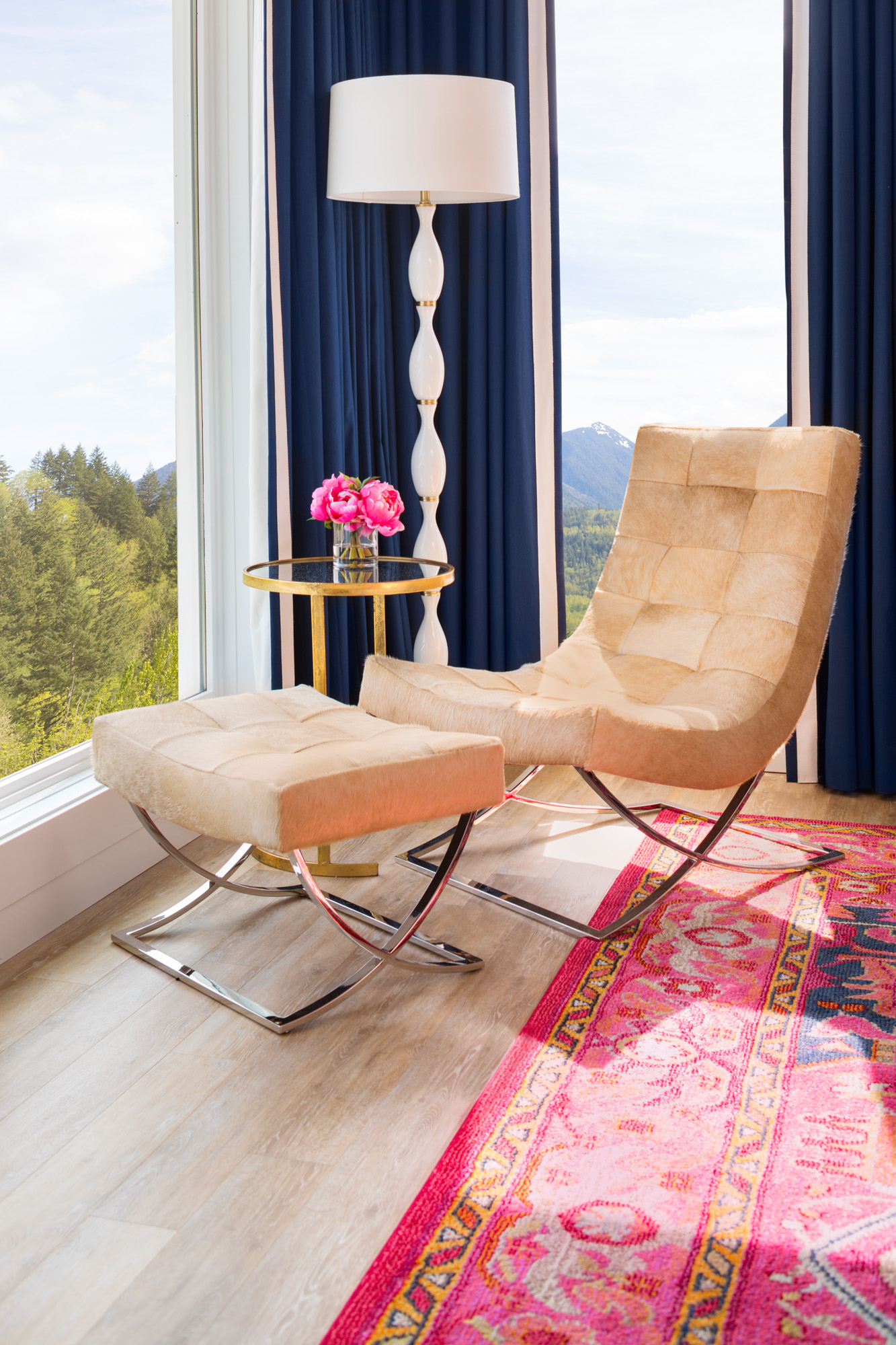
(Navy and white banded drapery were Custom made) Williams & Sonoma Occasional Chair & Ottoman
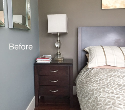
Before
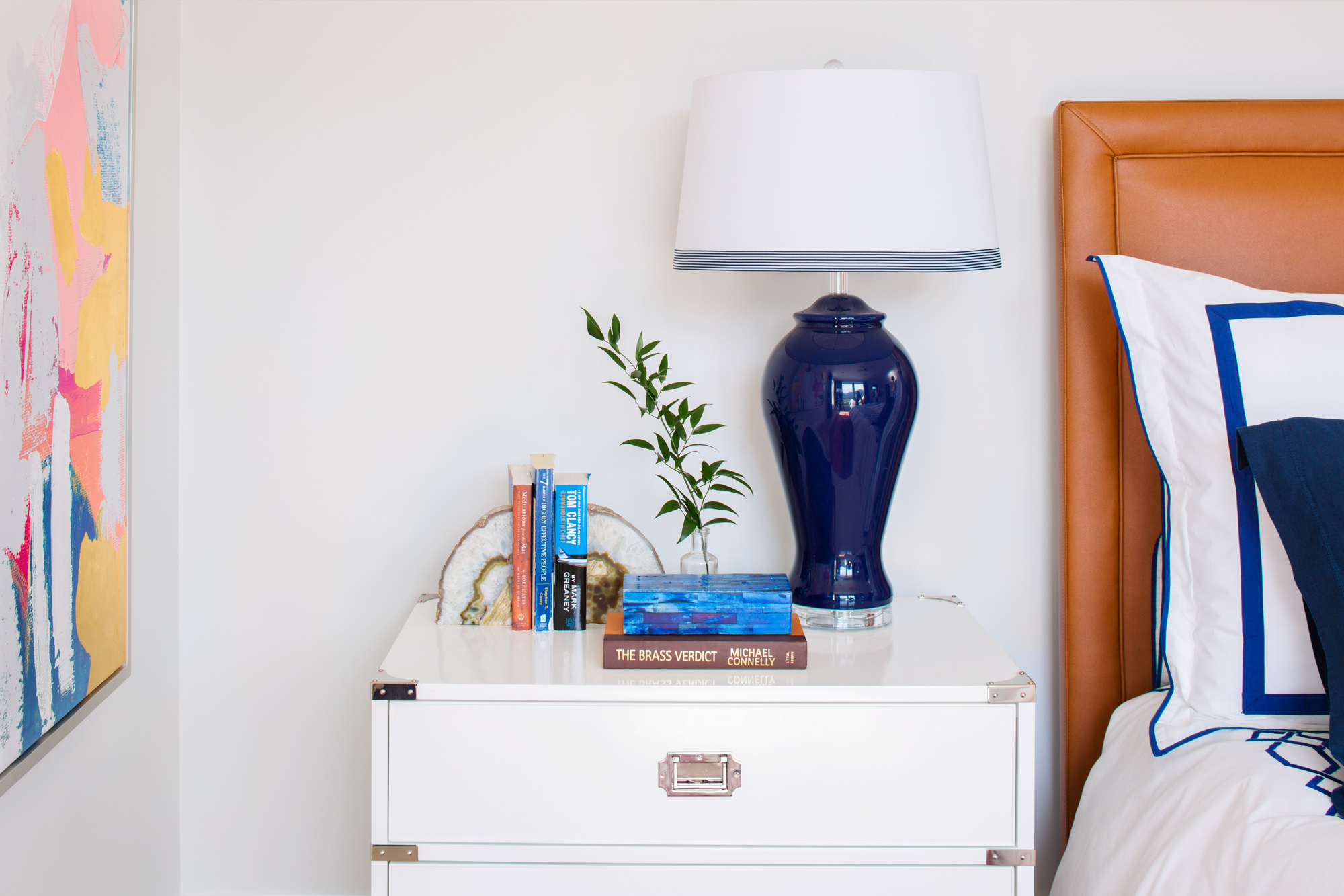
Navy Table lamp (similar here) Williams & Sonoma Campaign Dresser
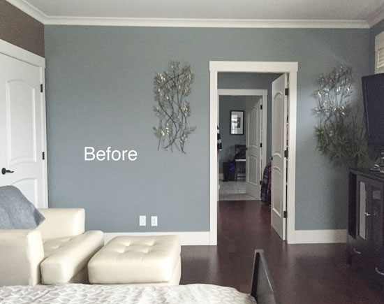
Before
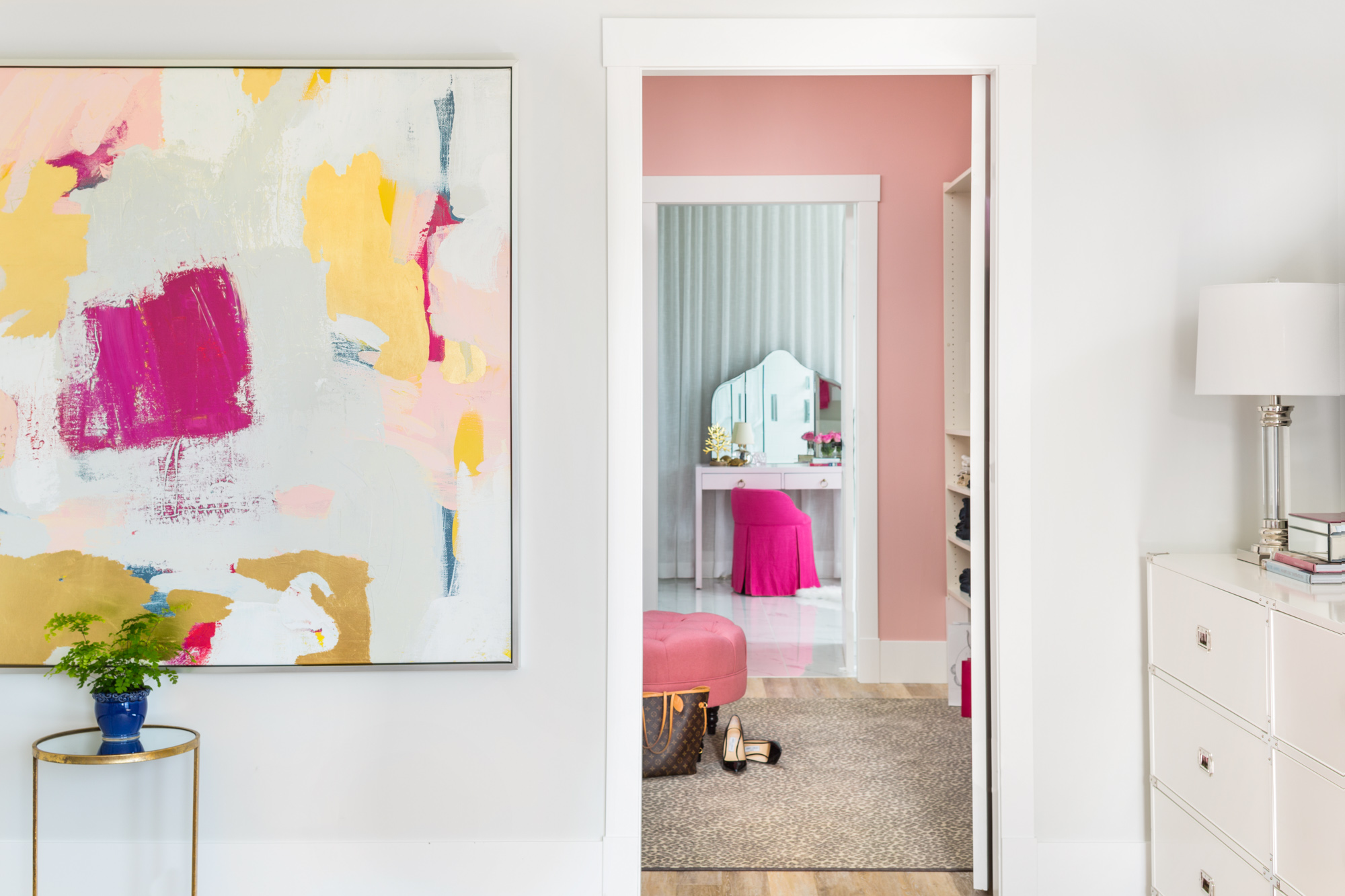
AFTER White Campaign Dresser Williams & Sonoma (Also comes in black and navy)
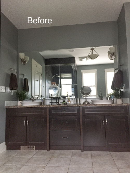
Before
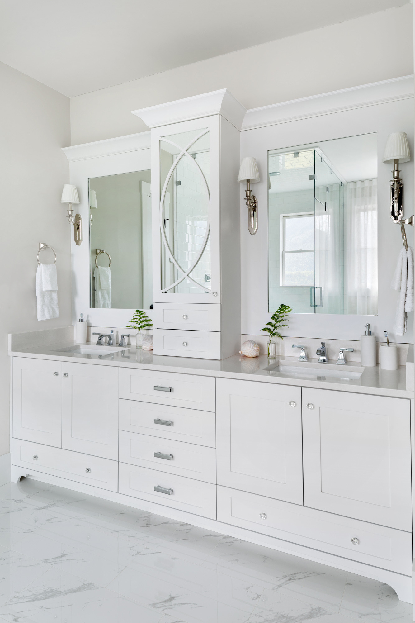
After (Notice how lovely the 1″ glass knobs vs. the bigger ones)
Millwork design by Jan Romanuk. Millwork by Quality Cabinet in North Vancouver. Vanity BM OC-61 White Diamond.
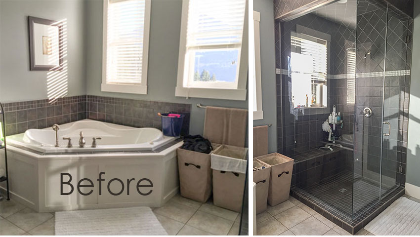
Before
The windows were small and high and not symmetrical to the new free-standing tub, so I added two walls of sheers to minimize this.
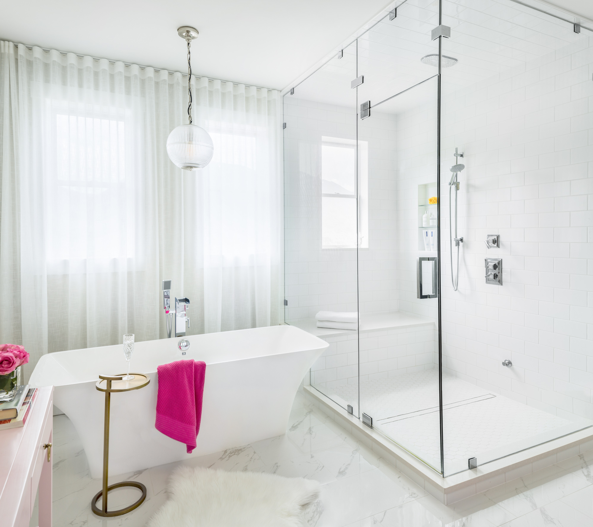
after (We chose a 12″ x 24″porcelain tile in faux marble)
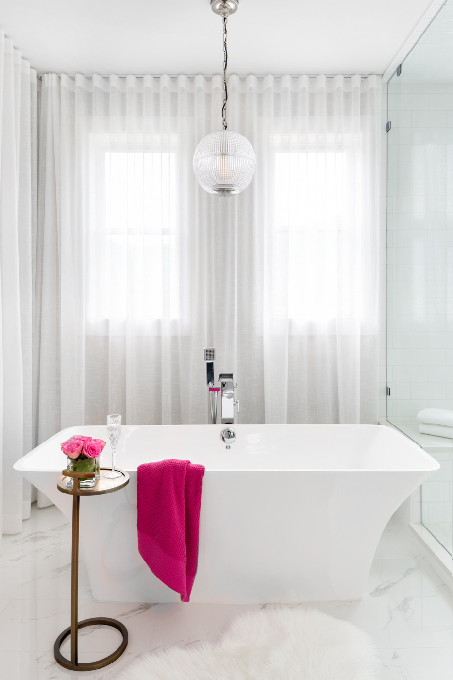
after (Photography by Barry Calhoun)
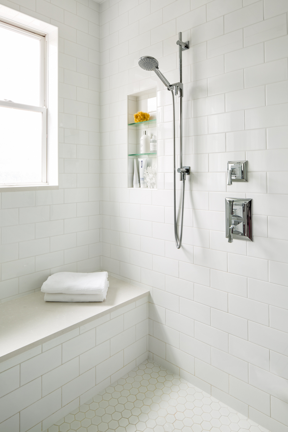
AFTER (White 2″ hex tile in the steam shower with 4″ x 8 subway tiles)
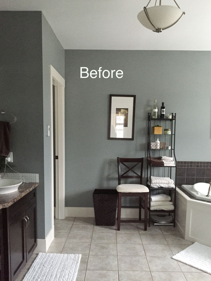
Before
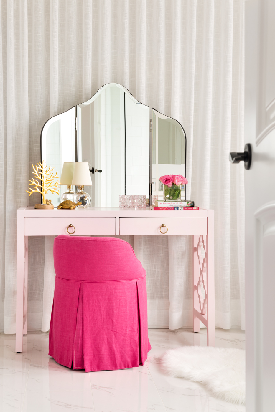
After (vanity mirror Pottery Barn, similar here)
I found the vanity at HomeSense already painted in this soft pink. We found the vanity chair on-line (it’s no longer available).
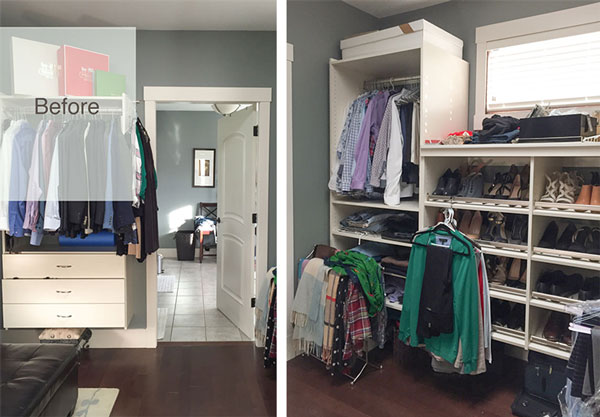
Before
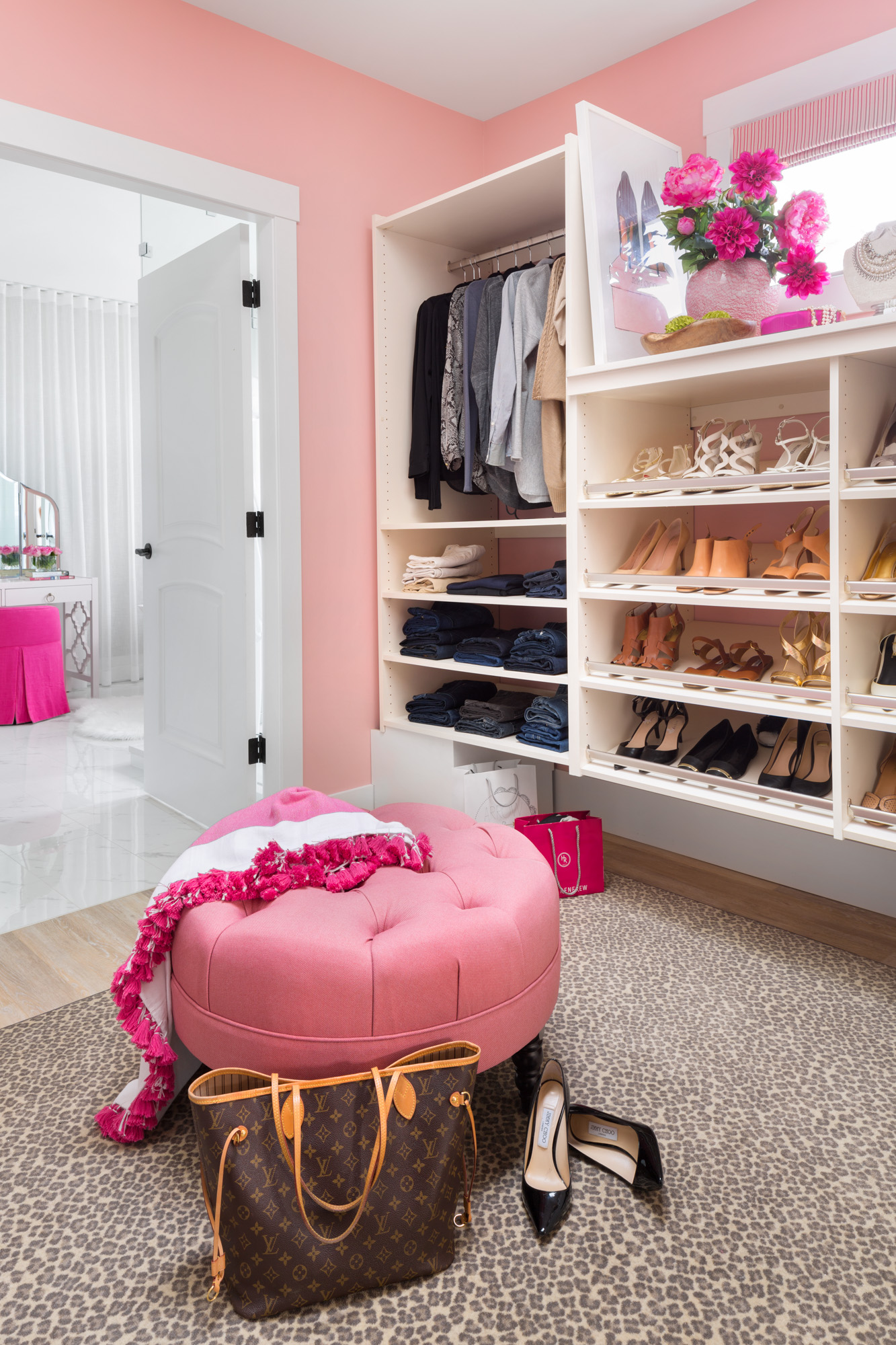
After (ottoman custom made, leopard carpet from Banner Carpets) Closet (SW 6316 Rosy Outlook)
Since the entire house was renovated, they opted to leave the master closet millwork for another time. As you can see, it’s still cream, we ignored it and styled it instead!
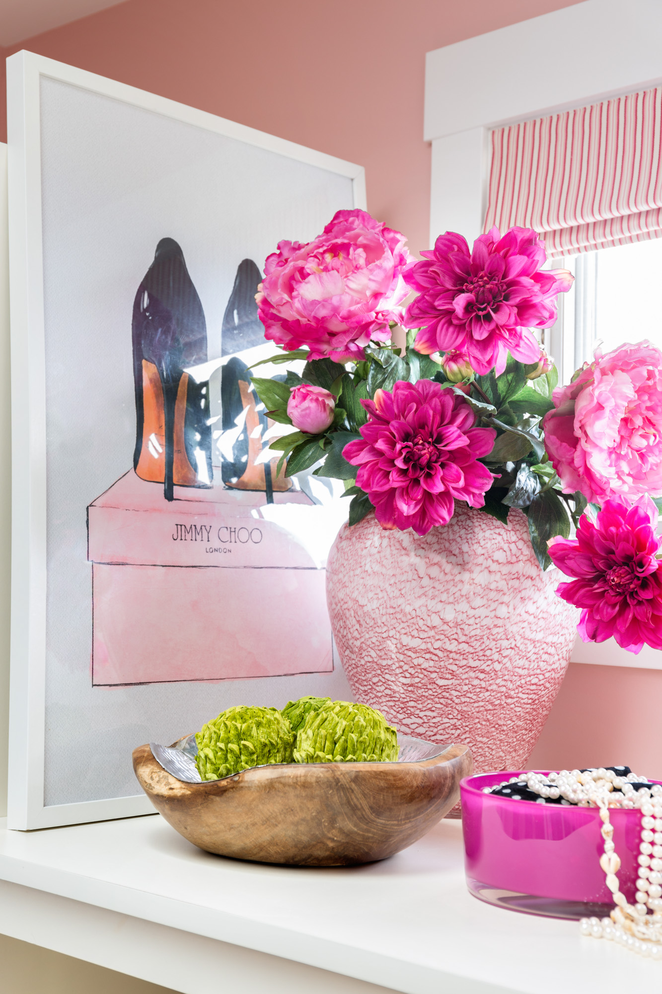
After (Interior Design, Styling by Maria Killam)
Hope you enjoyed the tour, can’t wait to show you the rest of their lovely home!
Related posts:
5 Ways to Transform Your Bedroom Right Now
Maria! This might be your best ever. Stunning transformation.
Thanks Cindy! Maria
It looks lovely and fresh and I really love it, it’s so pretty. Although I’m thinking will it date?
Colour is WAY MORE TIMELESS than the current, trendy neutral. If this bedroom had been decorated in shades of grey it would be dated shortly.
Pink is just arriving on the scene, it’ll be on trend for many years! Thanks for your comment! Maria
Gorgeous and well done. I’m in love with fuschia and navy right now so for me this was amazing.
Love the transformation, Maria! Did you support local businesses for the beautiful products?
Local trades yes. But we live in the country, this bedroom would never have looked like that if we didn’t order on-line, as you can see because I’ve linked to what I could. Maria
Love, love, love! So bright and fresh! And what a wonderful view they have!
Great space!!!! It’s so fun and fresh!
Wow!! Such a happy place. Well done!
The bedroom does not look the same. The old windows are double hung and you can see the neighbors house. The remodeled one is solid plate glass all the way to the ground in one and the neighbors house is gone. Hmmm
If you stand 2 feet over which is obviously what the photographer did, you don’t see the house. Maria
A beautiful mix of feminine & masculine. Kudos to the husband for not falling for the outdated notion that pink is just for girls.
Love it! Would love to do it in the cheap version!
I’m confused about the house seen through the bedroom window in the before shot, but mountains in the after, through the same window. Did you destroy their neighbor’s house, Maria?!? Haha.
Saw this too and was puzzled!
It was a puzzle for a minute, they closed the drapes a bit and took the picture from a different angle.
It is the same angle, and the wood piece in the middle of the window is missing now, too. My guess is that the after is photoshopped to look prettier.
Me too. Confused. Window looks smaller. There is either a house there or not but it needs to be consistent. Even with a house the view out the other window is wonderful. Maria, I’d this an optical illusion?
The blinds were removed and the angle of the photo is different. The photographer might have removed the mullion to show the view. I didn’t notice that until now.
Maria
I wondered about that too, as well as the forced-air vent at the bottom left of the bathroom cabinets that’s missing in the after shot.
The forced air vent is still there, the shot is taken a lot higher in the after photo. Maria
color and/or mfr of the wood floor? It’s so rich and warm…
Divine!
Regardless of whether I like pink or not (or I should say it’s just out of my comfort zone), what I do like is that your color palette is always FRESH. I’ve learned that I feel happier around fresh clean colors in my home vs dirty muted colors. What a transformation.
Oh Maria what a transformation! I just love it!! It is so fresh and just yummy. The pink does not look too girlish at all. You have combined it with the navy blue which grounds the whole look. Job simply well done! No wonder it is being published. One question that I have is you have “art by Maria Killam.com”. Are you endorsing art or do you mean it is your selection?
Great job Maria!! Love the bathroom… Classic but still not boring at all!! At least not in 2018… We used 4 x 8 matte tiles a year and half ago and occasionally I wonder if I made a boo-boo; however, you just confirmed that I made a good choice, thank you : ) I didn’t see any mention of paint colors… I’m thinking the wall color may be BM Classic Gray, Farrow & Ball Ammonite or Behr Silver Drop (I see a green undertone) but I may be way off base! Please share the wall and trim colors.
Forgot to tell you that I love the bedroom too…the leather headboard looks awesome w/the pink!
Beautiful! This new room is gorgeous, what color are the walls, please? I saw the closet color listed but not the bedroom and bathroom, maybe I missed it??
I have an antique blue and pink rug that I love and couldn’t figure how to pull a room together. Your room is such an inspiration. Thank you!
Looking forward to seeing more.
Omigod, I’m melting from the beauty of it all. Love the magic you work with white and a clean palette of colors! That rug and oil painting are exquisite… and that steam shower? Drop-dead gorgeous.
Magic, my Sister!
Gorgeous Maria! Absolutely love it!
Lovely makeover! Yummy pops of colour are uplifting and playful?
Bye-Bye GRAY.
Yay, YAY, YAY!!!!!!
Very 1980s now (except for the drapery style).
I found out that real estate agents are not allowed to photoshop photos, at least not here in BC.
They certainly shouldn’t, that would be false advertising. however, they do use a wide angle lens which makes each room look two to three times bigger than what it is. THAT is false advertising!
Thanks for your comment,
Maria
Would love to know the time frame it took to achieve, as when upgrading just two of my bathrooms regardless that I had the majority of supplies on hand (tiles, fixtures, lighting, etc. etc.) they took close to a total of six months to complete which ended up to be a real test of patience … :). That said; beautiful transformation Maria, Jan and Crystal.
-Brenda-
Yes this was a 6 month renovation! Thanks Brenda! Maria
Thank you Maria as that is very consoling since there were times I thought mine were never going to end regardless that I felt I was extremely organized and had a wonderful General Contractor however still wished I had ‘a Jan’ overseeing the projects since I quickly discovered ‘you can lead a horse to water but it doesn’t necessarily mean, you can make it drink’. 🙂
-Brenda-
Stunning!!
Absolutely gorgeous!!! I agree that this may be your best design yet! Wondering where to find the beautiful abstract art? Confused by the “Maria Killam Inc.” listed in the caption as the source. Are you selling art now? Thank you in advance for clarifying!
Sorry for the confusion, it means it’s sold to the trade only, so you can get it through me. Thanks, Maria
Breathtaking transformation. The atmosphere and mood are completely changed. The before colors felt heavy and grounded. The after colors lifted the rooms and let them fly.
Perfect comment! : )
You were recommended by the faculty at NYIAD as a designer to follow and learn from. Your posts are my new daily habit. A great addition to the lessons.
Ehm… a question about the view. In the first picture, what you can see outside (through the sheer curtains) looks a bit different from the view in the ‘after’ pictures. Is that just a ‘hitch’ caused by the curtains?
Love the pink, by the way. We painted one wall in our new bedroom a saturated berry pink. Turned out very nice – the only question I consistently get is, ‘Was that OK for your husband??’ Well… no complaints from him yet. I think he was just happy not to have to think about paint colours! 😉
So I’m guessing the artwork was the inspiration to the room’s look?
The rug was what we started with here. However everything was chosen ON-LINE to coordinate with it. That’s what you can do when you understand undertones and it’s exactly what I teach in my courses. Maria
Is that the Crossville Virtue faux marble tile in the bathroom? I used it in my master bath remodel, a beautiful tile.
Lovely! We also have pink, blue/navy, and instead of yellow – a light green in our Master. I was excited to see all the mid century furnishings. Here in Chicago we have access to vintage pieces so I was disappointed to see these are new. However having new makes the style much more available to folks and many of us mix the old with new anyways 😉 Thanks for the post and looking forward to more on this beautiful home.
Access to vintage in Vancouver is SLIM and VERY EXPENSIVE. Our flea markets are filled trinkets and trash from China unfortunately. We designers do the best we can in this town given our limited access to these kinds of items.
Thanks for your comment,
Maria
Beautiful transformation Maria!
Hilarious, noting the house next door ! Always what I see with interior shots, views outside.
Beautiful work !! Congrats.
Garden & Be Well , XOT
Drop dead gorgeous!! omg that bathroom!!!
What a gorgeous improvement! Simply beautiful!
So lovely, especially the bathroom and closet! Great job as always!
Love the use of colour. Looks fabulous. Thank you for inviting me to work with you on this project regarding the Millwork. Always fun to be involved with one of your projects. Janet Romanuk
Sorry. Not a fan this go round.
I LOVE that tub!!! Beautiful work!!??
My dream bedroom! Just exquisite 🙂 Love all the colors.
Maria, you are a genius with colors but, honestly, I prefer the Tuscan Brown look in the bedroom.
Maria – That is a gorgeous transformation. I love the color palette, furnishings and art; love the beautiful dressing room/closet. I’m not a copy editor and I don’t work for Williams Sonoma but I’m compelled to correct your listing of that retail source: there is no “&”; it is Williams Sonoma. OK, got that off my chest. Now a question: why was the shower door moved to nearer the tub? It seems like the former location would be better. Thanks.
It looks to me that the shower was made bigger to be in proportion to the tub? … so maybe there was no longer enough room to swing the shower door in its original location?
Wow!!! Beautiful! I especially love the bathroom – —- incredible!!! And the closet too.
Oh, Maria, this is sublime perfection, right down to the Vancouver location (I was fortunate to visit your beautiful area of the world a few days before an Alaskan cruise.)! Navy is my favorite color with white, so this is spot-on for me, and I even think my husband would welcome the accent of pink in our master bedroom. I’ve never been (even in its hey-day) a fan of the Tuscan Brown look but so many homes have it, still, it’s nice to see how it can be updated with your vision. Thank you, again, for sharing your talents with so many admirers!
…oops! In my comment, I wrongly said the location is in, “Vancouver.” I reread your post and realize it’s in Chilliwack, but still just as gorgeous of a location.
I love it! Your clients must be smiling ear to ear. I would not have thought camel would look nice with pink, but it works. Both the dark navy and camel keep the pink from being too sweet. I might be convinced to change from neutrals to some colour.
Very pretty Maria! Is the wall color a greige?
No it’s BM Horizon. Maria
[…] Nicely done Maria: a pink and navy bedroom makeover. […]
[…] Nicely done Maria: a pink and navy bedroom makeover. […]
[…] Nicely done Maria: a pink and navy bedroom makeover. […]
The bathroom is stunning! What quartz brand & color name countertop did you use?
Love it all. I would like to know about the floor lamp beside the lounge chair in the bedroom. We rearranged our living room and dining room swapping them out. As I held off getting lamps I think floor lamps are a better choice. And this one looks perfect to me. Love to send you a picture and see if you agree.
That swoon-worthy bathroom left me speechless … just gorgeous.
BTW … it’s Williams Sonoma (no “&” between the 2 names) and Pottery Barn, plain and simple (no “the” before “Pottery”).
Cheers!
[…] is a color expert who blogs about how you can use color in different ways. Check out this blog post by her, to see how she did a makeover on a client’s home using vibrant colors. Her use for before […]
I bought two e books. Where do I find them?
In your promotions folder probably, otherwise email [email protected]! Maria
Maria, not sure if you read comments this long after the post, but I’m curious about the bathtub in this photo. It looks a little more compact (shorter) than a lot of freestanding tubs out there. Do you remember the brand of this one?
The gray in the before shots appears absolutely drab and depressing in comparison to the after’s. I love all the color, it’s uplifting and fresh. I would have to have a deeper, darker color on the walls in the bedroom though, I just cannot sleep with so much light. What would you do if this client didn’t want white on the walls? What would be a deeper option for this color scheme? I am not a professional decorator btw.
Hi Mary, the room has black-out drapes. Perhaps a greige would also work, or a pink but they would both be light. . .Maria
[…] от автора блога https://mariakillam.com […]
Hi, may I know where you got those wall art from? Having a difficult time finding large scale abstract wall art. I moved to my current home about a year ago which is why I asked this question now.