Make your home look more expensive without breaking the bank. Here are 5 surprising ways to elevate your style in a big way.
Today, I have a few more tips to share but if you’re looking for ways to take your room to the next level, I invite you to go back and review that post too.
I think you’ll find ways to apply several of these tips. Because your home should fill you with happiness when you walk in the door… and there’s no reason to keep waiting on it to happen.
Need I mention that the holiday season is coming up fast. So it’s a good time to rethink some of the details in your home and flex your decorating muscles just in time for hosting.
Ever notice how those designer rooms you save on Instagram seem to be more than a sum of their parts? Maybe you try imitating the look, so you paint your walls the same colour and get a pretty new area rug to freshen up your room.
Yet, when you step back and look at your newly decorated room, it doesn’t quite have the same elevated feel? Has this ever happened to you?
Designers know that DETAILS are everything. So, I’m going to unlock the mystery for you with a few more tricks for making your room look more expensive. And, it’s all in the details.
1. Consider where you can add more softness
So you’ve coordinated your colour beautifully. Your walls relate to both your hard finishes and your furnishings. You’ve done some styling and your colour palette is nicely edited to 2 or 3 accent colours repeated in a balanced way around the room. But it still doesn’t feel cozy?
Often what you need is more inviting softness. There are a few ways to soften a room.
Many rooms suffer from too many hard, cold pieces in wood, glass or metal. This combination often lacks warmth.
See where you can swap some of them out for softer surfaces – like an upholstered ottoman instead of a hard surface coffee table. Or maybe add several panels of soft drapery layered over your blinds. Or find some luxe throw blankets and drape them casually over the end of your chaise, sofa or accent chair.
Think textiles and texture. Anything tactile and inviting.
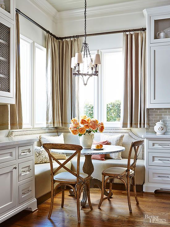
Drapes and upholstery are an unexpected way to soften a kitchen full of hard finishes, like this below.
Don’t forget to consider the shape of your pieces too. Most rooms have an overload of hard linear shapes – think squares and rectangles for miles. The walls of the room itself, the rug, the tables and chairs, the wall art, the windows, the fireplace, and the shelves are linear or square with serious pointy corners and hard edges.
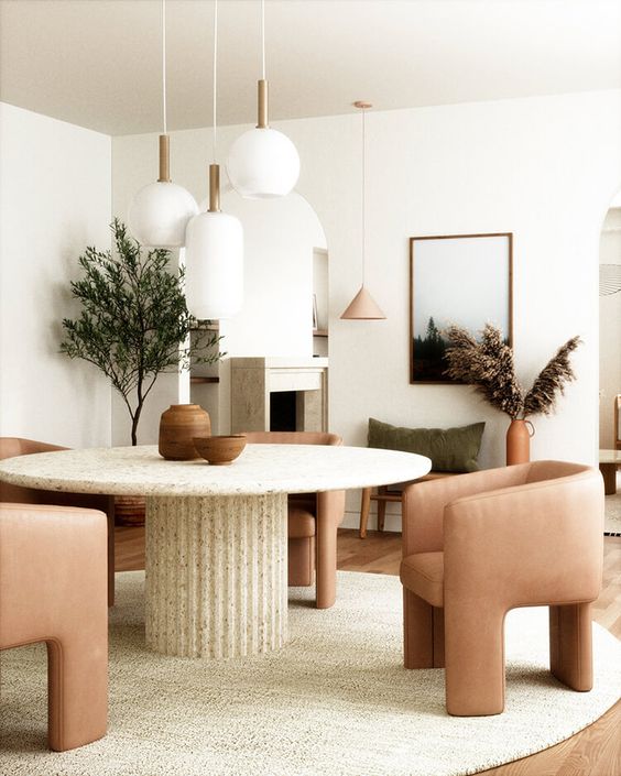
Consider choosing softer, more rounded or irregular shapes for coffee tables, side tables, accent chairs, ottomans, mirrors and art. This is one of the most missed considerations in creating an inviting room. This is also an essential tip for decorating an all white room.
Look at all the curves in this dining room below. How many can you count?
Anthology Creative Studio via Desire to Inspire
2. Move your furniture away from the wall
Another common mistake is to inadvertently emphasize that square or rectangular layout by jamming all the furniture up against the walls.
Not only does this look awkward, but it is not inviting in any way. Unless you have a tiny room, pushing the chair and sofa all the way to the wall creates a vast desert of emptiness in the middle of your room.
Furniture arrangements should be more intimate and conversational.
So roll up your sleeves and start playing around with an arrangement that does not tether your furniture to the wall. I think you will see that it instantly creates a more dynamic and high-end look.
3. Declutter, then add another layer of white or cream
I talked about editing (a sexier term for decluttering) in the last post on this topic. But I think it bears repeating that decor should not be items of habitual attachment. If your knick-knacks and pictures aren’t serving the overall look and feel of the room, to the attic they go (if you must keep them).
After you declutter, the next step is to add MORE. This time add a new layer of interest that serves to enhance the look you’re creating. This means they either repeat the colour palette or add the softness and texture you need.
Consider creating a layer of decor that is exclusively white or cream. Add in white lampshades, toss pillows, throw blankets, larger white mat boards for your artwork, or even sculptural white objects for styling your surfaces and shelves.
And speaking of objects for styling your shelves, make sure they have some SCALE. Choosing fewer, more visually simple objects in the correct scale or oversized is the surest way to avoid a busy cluttered look.
Here are even more tips for styling your bookshelves.
4. Incorporate a pattern into your room
It may be that your room needs more interest. Pattern can be scary, so start by choosing a motif that really excites you in a simple colourway that pulls in the colour of the main piece in the room (plus maybe some additional white or cream). This post may be helpful.
For instance, you can completely transform your room with patterned wallpaper, a wall of drapes or even a couple of custom-made pillows. HINT: My Shop Online with Colour Confidence online training shows you how to shop for a pattern and incorporate it into your room decor.
Or, maybe you have a boring chair that could use new life? Consider covering it with a patterned fabric.
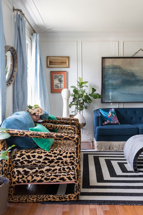
Not sure which pattern to choose? You can’t go wrong with an animal print like this below. I consider most animal prints a neutral.
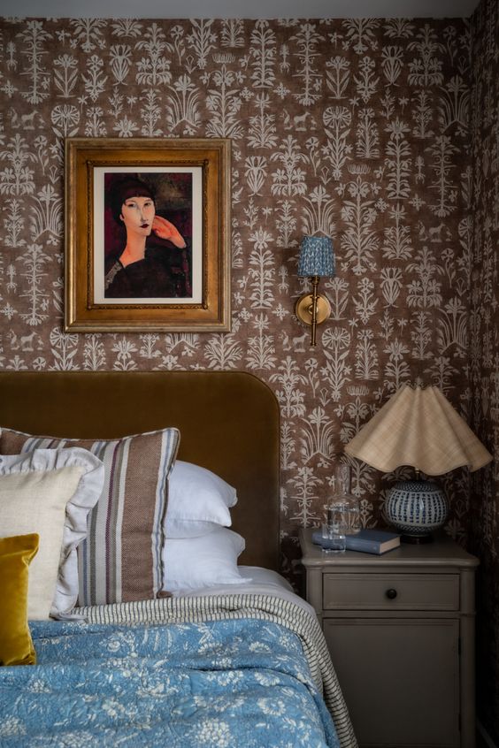
In this room below, the pretty wallpaper repeats the warm brown colour of the velvet headboard. It makes a bold but refined statement in what otherwise could be a perfectly ordinary bedroom.
I should note that the mixing of patterns is truly next level here with the stripes and the blue bedspread. And the patterned sconce that picks it up the blue. Again, start with a pattern that picks up the main colour of the room, and build on that.
5. Add sconces
Speaking of sconces. You know that I have to end with the absolute most important element of any beautiful room. That’s right. More lamps!
You may be limited by the surfaces available in your room for lamps, so if you’re shopping around for some new tables, here’s a TIP: purchase some larger end tables or console tables. More surface equals more pretty lamps, and some might say that is exactly the same as spiritual enlightenment. 😉
BUT if you don’t have room for more table lamps, that’s when you should consider sconces! They don’t have to be wired into the walls. Plug in sconces with cord covers are just as charming. And you can connect them all with a remote switch.
Not only do wall sconces add an instant glowy atmosphere, but they also just look sophisticated in their own right.
Because if you can make only one change in your room, it should almost always be more mood lighting.
There’s still time to make your home look pulled together before the holidays. Start in your living room and see which details you can elevate with some of these tips… then keep going to the next room. Who’s excited to finally have in-person gatherings this year?
NEW! 2022 Specify Colour with Confidence
Good News! My 2022 Spring Virtual Specify Colour with Confidence workshop dates are live! We have included a weekend date again because that worked for so many of you!
February 24 & 25, 2022
April 23 & 24, 2022 (Weekend dates)
May 19 & 20, 2022
June 9 & 10, 2022
Related posts:
How to Make Earthy Tile Look More Expensive
10 Easy Ways to Make your Home Look More Expensive
Third Rule of Design: Expensive Does not Equal Timeless







I have built in sconces scattered through my home. Should I avoid using table lamps near the sconces? I have spots where the height of a lamp would be welcome, but should I avoid using a lamp when a sconce is above or beside the surface?
Maria, One way to make your decor look fresh is to gather it all together in one spot (like the dining room table) and mix things up by trying new things in new places. You can add brand new pieces or drag out old favorites, but having each spot start empty give you an opportunity to try something new!
You’re so bloody Brilliant! Wow! The tips are easy to execute and make all the difference! Thank you for helping us with little decorating savvy!!!
In the picture with the velvet headboard, and patterned wallpaper… I thought it was a no-no to have small bedside table lamps? Why do they look so good though?
They’re really not that small if you study the scale of that headboard… and there are sconces there too. 🙃
After I commented and went back to look at the picture I and realized the headboard as well and the lamp is not as small as I thought. I guess I’m just used to seeing really big lamps lately. That being said, I need to search this blog bedroom side table lamps and figure out the right scale for my room. I’m thinking mine will be a bit tricky as we have a memory foam mattress (no box spring) on top of a platform bed with drawers and it sits low. I also don’t have a headboard. Oh, boy, this should be fun.
Perhaps it would be better to have the caption say “how to make your home look more ARTFUL” rather than “expensive.” I am seeing the “expensive” term alot in design, as if that were the primary point. (at least I hope not. That would be tacky.) Design is related to art. Art can be expensive and often is as we pay more for the skills that bring us beauty, but it isn’t art simply because it is expensive. It’s art because someone (sometimes even us) considered the situation carefully and is expressing something in a meaningful, curated way.
I think designers are under a lot of pressure to make things look expensive because people want to think they’re getting their money’s worth.
But the fault lies with consumer priorities in a way.
I had a beloved cat who had digestive issues die unexpectedly this past Friday. I had gotten rid of my last area rug and had been thinking that it would be difficult to keep a rug looking good with her health issues.
Well, when she died, a gigantic shift happened to me. I thought about her “ruining” a rug and I thought, “And?” So what!
I always knew houses should be decorated for the people who live there, but now I see that the people and pets in the house are always elevated above the house. The house exists for the people/pets – the people/pets don’t exist for the house.
I’m not putting away my interest in design, but I’d like to see people aim for emotional decorating more, which to me means beauty, but not necessarily perfection that restricts the inhabitants. I’d like to see houses that reflect the love inside.
Don’t mind me. I’m very very emotional right now.
I’m sorry for your loss, Lorri. Pets feel like people to me and the pain is real when you lose them. <3
Thank you so much, Holly!
She was definitely a “people” to me. She was the most loving cat I ever met. We were somehow soul mates and we both knew it.
I will miss her big blue saucer eyes. 😉
She has permanently changed the way I think of a house, but for the good.
I said to someone recently that we once had a dog that liked to put her paws on the window sill. She left a couple of gouges on the window sill in one house.
But if your dog dies, those gouges might become a precious reminder that they were there.
I guess that’s what I mean when I say I’m changed.
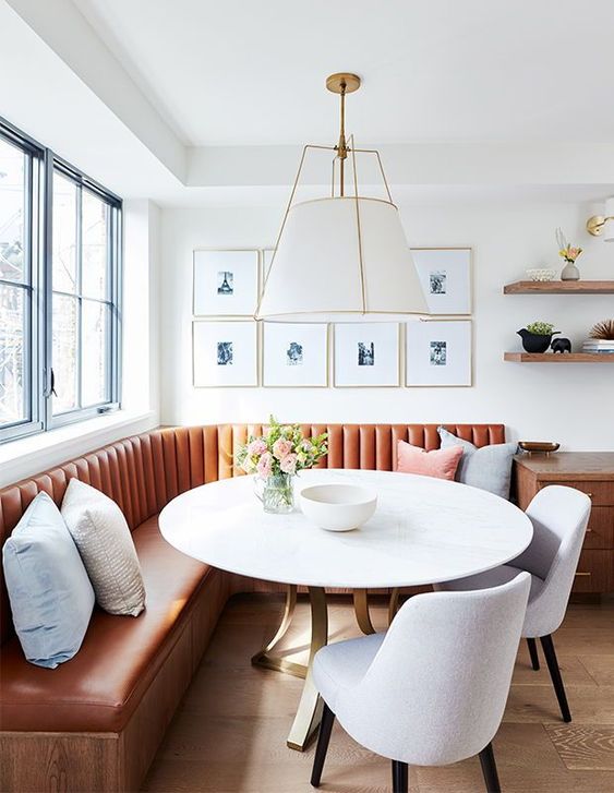
Thanks for this informative post, including the embedded thinks. Love the banquette photos. I want one nigh time, but hard for me to envision in my little bumped out 3 sided kitchen nook, w 2 windows and sliding door to patio.
Maria, I like the idea of seeing readers before & after shots after applying your tips — maybe with a Maria specific hashtag. I imagine your tips make excellent improvements. Thank you for sharing.