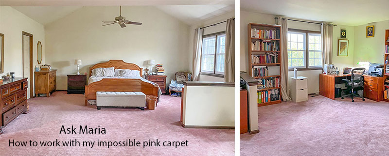
We can’t always change everything from top to bottom in our homes. There are some finishes we have to live with for a while. This reader’s wall-to-wall pink carpet is causing a decorating roadblock. But, can she really make her bedroom look less like it belongs in a Molly Ringwald movie from the 80s?
The answer is yes! And I have a few decorating tips up my sleeve to share.
When this question landed in my inbox I realized it would answer soooo many other decorating dilemmas my lovely readers have all wrapped up in this impossible pink carpet.

“One of the biggest challenges I am hoping to take on is our master bedroom. It is enormous, faces northeast, and still has the original, “dusty rose” carpet, among other challenges. I really want to replace the carpet. In an ideal world I’d put in hardwood, but a) price (especially now) and b) my husband really loves carpet, and I’d rather fight that battle in other common spaces of the house rather than the bedroom.
Plus, we have a lot of wood furniture and I think would compete with the floors. I’d like to do something very neutral on the floor, but I’m really torn. I love color and this is a big room. And we’ll need to figure out what color to paint the walls, too.
Up to now, I have been trying to keep anything new we get (bedspreads, ottoman) from competing with the pink and from drawing it out more. But I know I need to think bigger and I’m frankly overwhelmed by the scale and list of to-dos in the room. Any advice on where to begin?”
It’s a mistake to ignore a fixed colour, even if you don’t love it
Here’s the number one mistake she is making:
She’s completely ignoring the pink carpet. There is not a stitch of pink in this room because yes, my lovely reader, if you have this much of any bossy colour, YOU CANNOT IGNORE IT.
You must embrace it like the long lost love of your life.
I’m serious.
Know when to make the best of a colour you can’t change
And I agree with my reader. The main rooms of your home, the ones you LIVE IN all day long, should be the first priority. After all, that’s where you spend most of your hours.
Eventually, the carpet should be replaced with a creamy pale green beige or green beige complex cream one for versatility.
But for now, this carpet is definitely not mission impossible. I think you could have fun with it.
With some effort of course. And by paying some attention to the other elephant in the room.
The real decorating colour dilemma
The orange and red traditional furniture in combination with the pink carpet is the real issue in this room.
First, we need to address all the orange and red furniture. It definitely makes the carpet feel like 1985.
When furniture is a saturated orange, cherry or burgundy wood tone, it’s best to treat it as an accent colour and repeat it. These rich and formal stains are simply not as neutral as natural wood tones.
How to make pink carpet look less dated
When I searched ‘wall-to-wall pink carpet’ on Pinterest, I was not surprised to find examples for this post.
Why?
Because pink and even (gasp) forest green and burgundy are back again from the 80s.
Hot tip: if you are struggling with decorating around a bossy element in your house. Search for it online to find out how other people are decorating around it.
You’ll notice the best-decorated rooms are ones where the offending colour is being repeated.
If you’ve been living with something dated like my reader’s pink carpet for many years, I understand YOU’RE SICK OF IT. But I would assert that you’re tired of it because you haven’t considered how you could make it look much fresher (and in this case, than the tired, dated, dusty rose from the 80s).
And, if you tried to re-decorate this room 10 years ago, you would have had trouble finding ‘off the shelf’ pink to repeat your carpet. But now this shade is widely available. Colours do have their moment in the spotlight just like neutrals do.
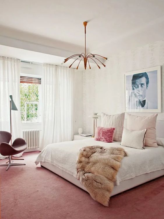
Here is a dusty rose carpet looking very current and intentional (below). The room has a lot of white, and to really make this pink carpet work, I think it still needs even more pink accents, but you get the idea.
However, it will be nearly impossible to get a fresh modern look like this with all the traditional orange furniture.
How to decorate with pink and orange
Pink and orange? The real challenge in my reader’s room is the combination of the furniture and the carpet. The furniture ranges from orange to red. While it would help to paint the mismatched end tables white, you still have two dressers that are different colours.
In this inspiration photo (below) the orange wood trim is being repeated in the pillows. And the pink carpet is not repeated in the space at all. The point here is the orange trim would look even more wrong WITHOUT the pillows.
So while this is better, it’s not fabulous yet.
Pale grey makes pink look current
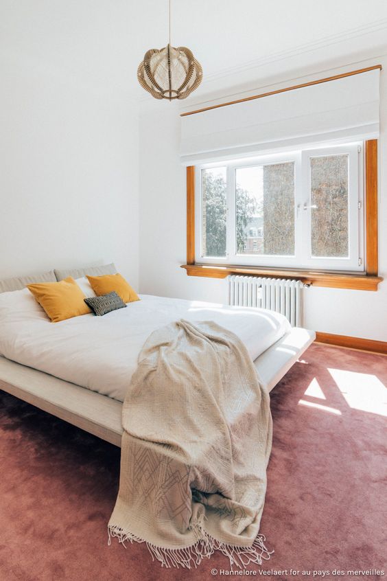
The antique vibe of your orange and red furniture also makes soft grey another great colour for cooling down and modernizing the pink carpet. It’s probably not your best option but for the sake of generating ideas, light grey does help cool down the orange and pink in terms of colour. This current look in the room below is an example of that.
In my opinion, they should have repeated the pink in this room above. Mind you, this image is not a snapshot of the entire room. Again, the casual solid grey duvet and drapes and the orange end table are very modern, giving it a whole different minimal and relaxed feel that won’t work as well with your formal red and orange furnishings.
But you could cool down the walls to a pale violet grey greige that won’t compete with the pink carpet as much as, in comparison to the much-too-yellow creamy wall colour currently on your walls.
Is there a way to keep the traditional orange and red furniture from dragging the dusty rose carpet back to the 80s?
Get my curated list of neutrals including whites, greiges and complex creams in my White is Complicated ebook here.
The right pattern can create colour magic
The main thing is, you need a strong pattern to pull together the orange and burgundy wood tones and the cooler pink.
Pattern is what is needed with the traditional look to pull in the style of the furniture, rather than trying to colour block in solids as seen in the modern minimal style of most of the rooms above.
So you’re right, thinking bigger is the right idea. And in this case it means embracing the right pattern to pull the room together.
I found this orange, burgundy and pink duvet with a modern floral pattern that gives a nod to the traditional in its intricacy and richness. It could be a stripe or a check if floral is not your thing. But remember, the pattern should have both the pink and the orange, and ideally the deep burgundy red in it. That’s a pretty specific combination of colours.
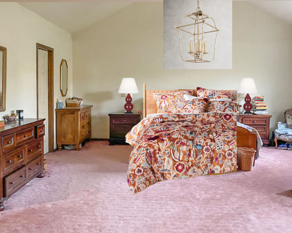
Burgundy lamp | Bedding | Chandelier
The burgundy lamps (seen on the nightstands) relate to both the duvet and the cherry wood tones. Adding an updated lantern chandelier is another detail that would help make this room much more current.
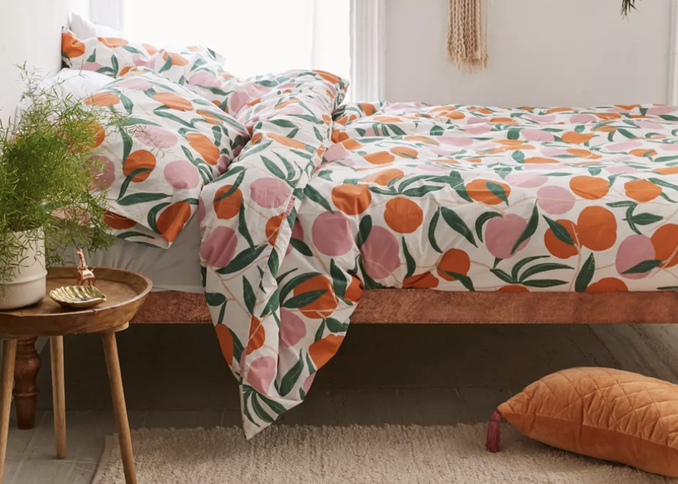
Here’s another playful pattern that repeats the dusty rose and orange in the room (below). But again, it’s a more Mid Century pop kind of pattern that would work better with mid-century modern furniture in addition to the pink carpet. I think the pattern should be a bit more traditional than this.
Pink is trending
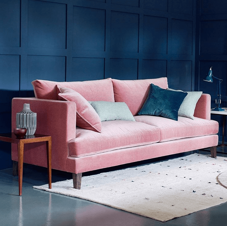
As I said, it’s a good time to have to work with a pink carpet. Because the colour is trending it’s easy to find coordinated pink decor. If we didn’t have all the orange furniture we could create a pink and navy colour scheme:
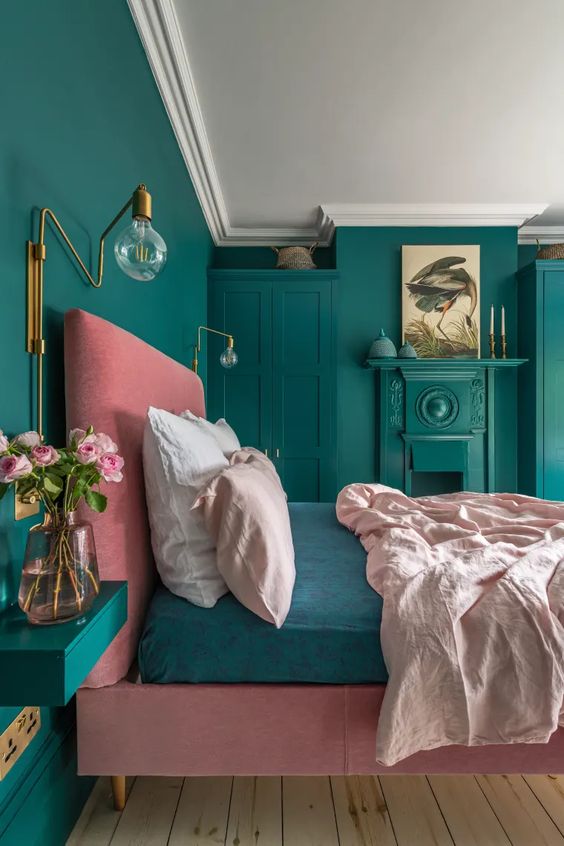
Or pink and deep green:
But as it is, the orange and red wood tones need to be treated as an accent colour in your room.
Just like the pink carpet, these wood tones can’t be ignored. So it’s really that you already have two (actually three with the range of orange and red pieces) bossy colours to work with. The challenge is in finding a pattern you like that ties them together.
The best way to see how this works is by creating a mood board with your existing pieces and then adding patterns to the mood board to see how they work. I show you exactly how to do this in my Shop Online with Colour Confidence course. Enroll now and get immediate access to this online training!
So as you can see, this pink carpet (on its own) is not as bossy as you thought. But anything this big that you pretend is not even there definitely becomes the elephant in the room in so many ways.
Old colours can definitely become new again. It just takes some imagination and creativity.
If you have an Ask Maria question, clean up your room, take photos in good natural light (no lights) and email me here. Please note, questions WITHOUT photos will NOT be considered.
And make sure you’re subscribed to the blog because you never know when your question will be the one that gets featured! 😉
Need more decorating help?
If you have a room (or many rooms) that don’t feel you with happiness when you walk in the door, then try one of my eDesign packages here.
Devasting BC floods
Terreeia and I are still traveling but we wanted to thank everyone who reached out to us when our little community was flooded this week. It looks like our house took on some water, but the damage is minimal. 🙏
Yarrow has been downgraded to an evacuation order, but there are still so many who need help right now. 💔 The Canadian Red Cross is working to help people in and around the affected areas. If you want to help, please click here.
Related posts:
4 Steps to Choosing the Right Wall-toWall Carpet Colour
Ask Maria; Will my Cherry Kitchen Work with my Cognac Leather Sofa


I hope she finds that first duvet cover and burgundy lamps because they are perfection! I love the color pink and think orange is the perfect complement if you already have it going on.
These help me posts are my favorite. You definitely are the expert!
I agree. As I was reading down, I thought with the right pattern with the right colors, this could be a lot better for not that much money. If there’s a different pattern with blues or greens, then they could bring in the solid blue or green.
Hi Maria, I so enjoy your blog posts even when the dilemma is not one I’m dealing with, fortunately (I have enough of my own)! Even so, I always learn something or am reminded of help I’ve found in your ebooks or blog. Would you suggest layering an area rug on top of the carpet to break it up? That is a lot of pink! Love your suggestion of navy or teal, and the duvet is gorgeous. I hope you get some follow up and will post again!
it is just amazing how something with all the colors pull the room together!! I love these “Ask Maria” posts because it is real life…and often we can’t make the changes we want in the real world! Thanks Maria for showing the way that even a room that starts out looking kind of bad, can look fabulous!!
I wouldn’t have thought it possible to make that room look good but you did it! 😉
That pattern with the burgundy lamps changes everything. And I love the chandelier. If it were me, I’d paint all the furniture to get rid of the orange and burgundy—maybe a very pale lavender gray—paint the room navy with white ceiling and moldings, and then Incorporate those colors into the soft furnishings, lamps, and other decorative elements. Painting furniture is a lot of work, but chalk paint really simplifies the process and makes it a lot more fun. And I’d either update the furniture pulls, or if they are real brass, polish them up. They would look great with the brass repeated in the chandelier. My sister took a dated piece of formal wood furniture and painted it a beautiful deep green, keeping the original brass pulls. It looks gorgeous.
Yes, I was thinking along the same lines, I like your ideas.
You are amazing, I would never have thought to add burgandy in there. I think this person is already ahead because their husband likes the pink. That yellow wall is the first thing I would change.I would use a soft pale green. What color would you paint it?
I think adding a large natural chunky woven rug to hide some of the pink and then use the popular blush colors to tie it together would also look current.
I had to laugh with the post because I love that color of pink, and I have a bedroom with pale pink walls and ivory wall-to-wall carpeting. The curtains are blush and ivory damask linen and I have inherited off-white bedroom furniture, a black easy chair and black lampshades, and the whole think is girly, which I feel I deserve, and it works with inherited art.
If I had a pink carpet, I would definitely go for the look in the first photo which I loved, although I did think it was remarkable what the printed duvet cover did for the room. That is a lesson in itself! What I noticed about the first photo is how white walls and curtains were calming, the gray chair and fur throw added a sophisticated tone, but that single fuschia throw pillow made that whole room come alive.
When we bought our house, it had a horrendous basement bathroom and I couldn’t spend much money on it ’cause the dollars had been spent elsewhere. There was a cheap-looking vinyl tile floor I couldn’t get rid of; it was a light blue with a sort of shiny almost irridescent coating. Finally I decided that the best thing to do was make it disappear by painting the walls the same color (but no irridescent coating!). This worked, with a small pale green rug, but what really worked was when I added deeper blue hand towels. The floor was not noticeable and although I eventually replaced it, I wouldn’t have done it without the water emergency which is a whole other story.
For the pink-carpeted bedroom, I would paint the walls white, paint that furniture at least an ivory, go for a cowhide somewhere in the room, and add something in gray, navy or dark-green, like a chair and maybe a fuschia throw pillow!
Lovely suggestions. I too love the floral pattern burgundy lamps. I really appreciate the explanations as to why the others while correct may not work quite as well with her traditional furniture. Makes so much sense.
Great post. I learned somethings that I can use even though I don’t have that specific dilemma. Thank you. Glad to know your house is not too damaged. I have been thinking of you both since I saw T’s post and picture
Great post and as usual great ideas!
I love the duvet and think the lamps are genius. If all those dressers and bookcases have to stay, then I think you hit upon the perfect solution. Alternatively, I vote for a large patterned rug in shades of pink, burgundy, and orange. Wayfair has some gorgeous options for not very much money. I would love to see the office area separated from the bedroom, perhaps with a large folding screen.
Paint that furniture (in a color that WORKS with the pink, but is not dictated by it.)! There are so many options; chalk paint, furniture paint, DIY, or sent out. Transitioning the furniture from tired traditional will allow a huge shift in the room. Even with the pink carpet.
Also, I love large area rugs over carpet, also a more modern look, though yes, it would have to relate. Which is not that hard right now.
The duvet and burgundy lamps are perfection! It makes everything work without painting the furniture. We all know that most men/husbands hate the idea of painting over wood! 🙂 And what a messy, labor-intensive job that would be when a duvet and lamps make it unnecessary. A well-chosen area rug might be a good idea too, but getting the duvet right is the most important decision. I’d love to see what the reader ends up doing.
Love the recommendations for taller lamps and a modern airy looking chandelier. Not being a big fan of patterned bedding, I would instead use very textured, creamy white bedding (or a bedspread that matches the colors in the curtain and bench). Make the bedding look crisp and modern, tucking in the sides and paying particular attention to using tailored pillows that go the full width of the bed (think welting not flanges). Perhaps one pink pillow on the bed, or a patterned or solid pink coverlet folded at the end of the bed or across the bench.
Probably would replace the side chair with something smaller and less ornate. Also, either 1) the dresser in the corner has to go or 2) the nightstands need to be painted white or replaced because too many wood pieces in that corner make it look like a furniture store display, no way around that. On the bed wall I might put a deeply textured paintable wall covering of a large graphic design (think block and angles) and then paint it, and all of the other walls, a barely creamy white, warm enough to complement the furniture, but not so warm as to go yellow against the pink carpet. And then finally, just for the fun of it, a pretty vignette done in sparkly pink glass pieces on a mirrored tray on a dresser.
For the office paint the bookcases white and make liberal use of pretty boxes and fancy magazine holders in the bookcases so the wall you’re facing in bed will look prettier and less like an office. And finally, if at all possible, upgrade/paint the moldings white as their wood tone is distracting and nothing special. I know this is a lot said but I really feel for anyone facing this common frustrating situation of a unfortunate carpet colors and quality older furniture.
I love that duvet you chose, Maria! It’s great that a few relatively minor changes can make such a big difference. Some artwork and accessories that repeat the colors would also contribute a great deal to the room. I did a refresh like that in our bedroom last year (new bedding, art, accessories, plants), and I love being in that room so much more :] Thanks to the reader for sharing her decorating challenge with us, so we could all learn from Maria!
Good ideas in this post. I would totally go full maximalist & do pink walls + bold wallpaper plus + plus + plus. It’s a great opportunity for that.
Oh fantastic post Maria!! I love that you work with real life. I have to say, it’s been so long since I’ve had colored carpet in my life, that I’m secretly enamored with the colored wall to wall carpet I tend to see in the UK and this pink carpet. I love the idea of curtains that pull the colors and presence of the duvet pattern through the room. Or someone else mentioned patterned wallpaper on the wall behind the bed, love that too with simpler bedding. A part of me is itching to rearrange the office area, but without dimensions, I wouldn’t make suggestions beyond adding the accents colors in the form of storage and office accessories.
Maria, why not just paint the orange and red furniture and wood trim to update it? Wouldn’t that be a simpler solution or is painted furniture outdated?
I didn’t focus on painted furniture suggestions because it sounded like if the pink carpet stays the furniture stays too. But of course painting furniture is always a great option for an updated look!
Thank you for answering my question, Maria! For the past two weeks I’ve contemplated sending you pictures for your Ask Maria questions! I have the dilemma of newly updated LVP floors throughout my house combined with a 20 year old wood kitchen table and even older bedroom furniture that were originally beautiful neutral brown and blonde colors but have darkened and formed a golden orange tint from age and sun exposure.
I took a step back after installing the medium brown oak LVP in our bedrooms when we moved the furniture back in and cringed at the difference in wood tones and how they clashed. NOT a pretty look at all. My bedroom furniture needs some heavy CPR! I’m so glad you said you can paint wood furniture for an updated look because my gut said paint them all as I already stripped the stairs in my raised ranch home entrance and tried 4 wood stains to no avail. It was tedious and nearly impossible to get a match I was satisfied with so I went ahead and painted my stairs white to match the white of my new kitchen cabinets and trim color. I do not regret that decision. Oh, how I love getting up in the morning and sipping my coffee while reading your wonderful blog and your eBooks have helped me so much! 🙂
I wonder if the light paint is also flashing green from the greenery outside, a white paint color would also reflect green when the curtains are open. Do you think a color would be best here, a wallpaper for the headboard wall for drama and paint the rest of the room the same background color as the wallpaper? If all the furniture isn’t needed, edit some out and paint dressers and shelves same color as walls or white. The nightstands and headboard, re-stain those to match each other or paint a darker color, so the eye goes there first.
No she had a green desk lamp on when she took the photos, that’s where the green came from. I tried unsuccessfully to photoshop it, but I realize that creates the appearance of a reflection. good eye! I would generally NOT do an wallpaper accent wall. I think it’s a rare wallpaper that works as an accent wall. Maria
As always, Maria — LOVE your perspective and wisdom! I just had one other idea and i was surprised you didn’t mention it bc you usually talk about using wall art to pull together a look/feel. That wall behind the bed is just begging for a lovely huge piece of art — am I right or is there some reason to not put art there? would that help? of course it would need to be the correct color / pattern feel (what would that be???), coordinated with whatever duvet you pick — and need to satisfy both hubby and wife. a landscape? an old movie poster? a huge floral (magnolia blossom comes to mind, ikea used to have a gorgeous huge grey/pink magnolia wall canvas)… a music festival poster?? a retro really cool car or scene from a drive in movie or ice cream shop?
ALso in this room, i notice that everything is pushed back against all the walls. In a room of this enormous size, it might be more cozy to create smaller ‘internal spaces’ and bring some of that furniture into groupings or somehow not all against the walls. especially in the little workspace area, is there some way to turn some things around or hang a ceiling curtain (again ikea has those amazing sliding ceiling gliders) to separate the space and bring some color unity??
Hi Maggie, I didn’t mention it because the room is large and needs a lot more decor, drapes, a seating area, I would remove the pony wall, and yes of course it needs art. I just focused on the pattern that was missing to make this room work with the pink carpet! Great suggestions thanks! Maria
That duvet set and the lamps are an incredible solution: not a lot of money, and not a lot of time, either, with lovely results. I don’t usually like patterned sets, but this one looks great in that room! A large burgundy throw on the chair is another quick & easy step towards pulling the room together. In addition to the new bedding and lamps, I would try switching nightstands. Right now, from L to R, the wooden pieces are dark/med/dark/med. in color. The lighter dresser and nightstand being next to each other might also help.
The reader said she’s spending her budget on redecorating the common areas; remember that redecorating not only takes money, but time and energy, as well. Having repainted a couple of pieces myself, I can tell you that painting ALL those pieces would daunting, taking a lot amount of time and energy, or a surprising amount of money to have them done. If she wants to try chalk painting furniture for the first time, I suggest starting with the two bookcases: lots of flat surfaces, not a lot of details, and the books will hide most mistakes! Just be sure to finish with two coats of wax. If you can, you’re supposed to let it cure for 21 days before using-3 weeks before putting the books back in, ha! Or paint the two nightstands. It looks like there’s a minor color of blue or green in the duvet, if you could get a chalk paint in that shade they would look tremendous with the burgundy lamps on them!
The duvet was a lesson in itself, and yet makes total sense! Thank you for sharing this.
If you are looking for odd colour mixes, try checking out the sari quilts. You can find some at DIGNIFY.CA
The colours are sometimes surprising, and just beautiful.
I may own *a few*.
Admittedly, I’d kill for her pink carpet. It’s sooo gorgeous. Great post as always, Maria!
I’m an existing reader, but I found this post when Googling pink carpet images, because I have a very similar pink wall to wall carpet, also in my master bedroom! Mine is a bit more coral. It’s exactly the color of my pink salt lamps. I’ve been at a loss for what color to paint the walls, as my decor is full of strong colors (some might say too many different colors, but I like it, and I’m an artist so I can make my own art to match.) After reading your post, I’m leaning toward embracing the elephant in the room WHOLEHEARTEDLY and painting the walls the same color as the carpet. I am not sure it will work… But it makes more color sense than the other ideas I’ve considered!