Trend alert: Everyone is painting their walls white. We expect a lot from a white paint colour, but it can’t always work magic. Here are the top 4 reasons white walls look bad and what you need to know before you embrace the white wall trend.
It’s new build planning season, January is when my eDesign department kicks into high gear!
More than ever, WHITE walls are being requested over and over.
And I’m here to tell you that white is a snob and it’s soooo NOT the answer for every home.
Every day my eDesign department fields questions about white looking dingy or grey. And it’s not fun being the messenger that bears the disappointing news that white is not the right colour for someone’s house when that’s what everyone wants right now.
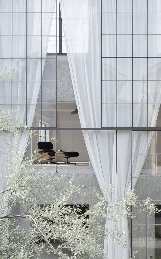
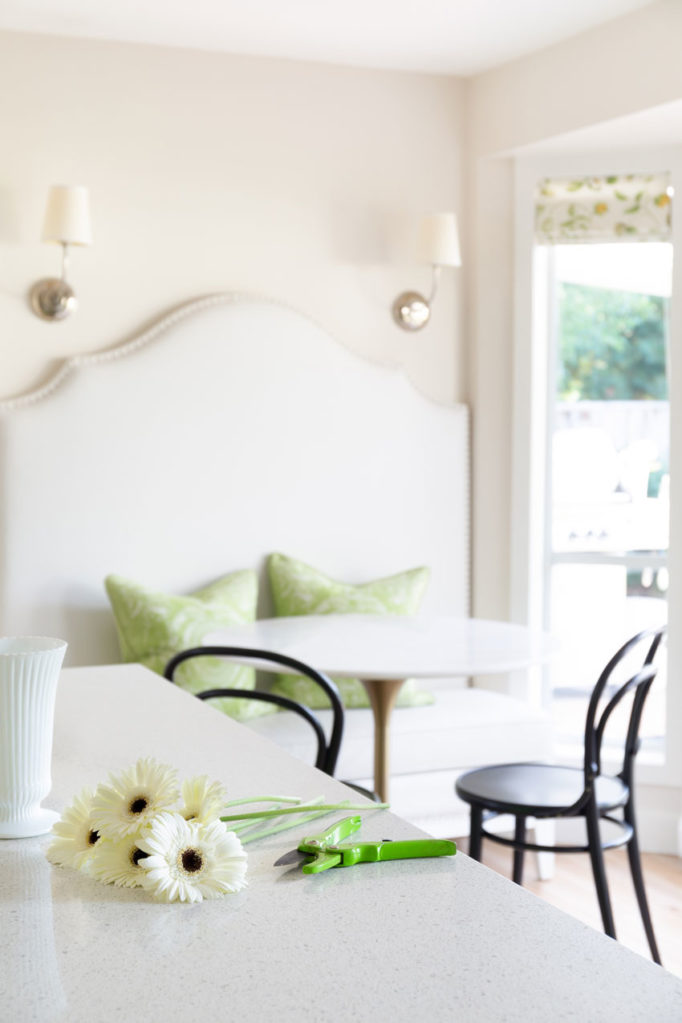
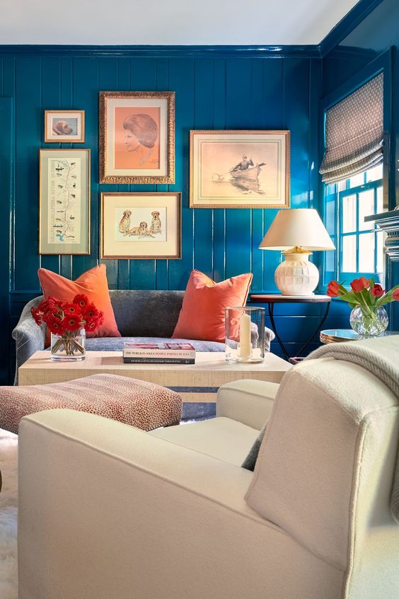
Layered whites and creams by Studio McGee
Exaggerated blown out white rooms dominate our feeds and make us all want gobs of LIGHT to flood our homes. And we turn to our paint colours to deliver. We expect white paint to BE the life giving light we crave.
Paint is powerful stuff, but it is not a source of light.
Your room does not have photoshop filters
I think it’s fascinating. The medium of photography is at the heart of this cultural moment. Instagram. Pinterest. Houzz. This blog. Bright and airy photos with lots of white are what look best across platforms. And we have all fallen for it hard.
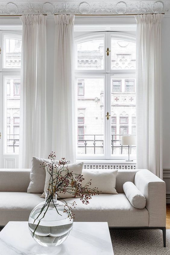
Even the floors are white and reflecting lots of bright natural light in this pretty room. House & Home.
But here is the problem. Your house does not have Photoshop filters. Your paint colour will not make your house look suddenly sunny if it’s not. Even white, the most reflective of paint colours, can only reflect the quality and quantity of light that’s available.
Let me say that again: a lighter, whiter paint colour will often only amplify the LACK of light or the random colours that are reflected into your room from outside.
[cue the sound of hearts breaking]
Don’t worry! You can still energize your space with light. Failing perfect architecture and exposure, lamps and lighting are the analogue way to add more light and create atmosphere.
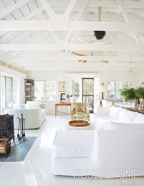
Rare is the room that will look this bright and airy without the help of Southern exposure or Photoshop filters. Rachel Ashwell via House Beautiful
White walls will reflect whatever the available light throws at them (and no magical white paint colour will change that)
Yes, sadly, despite our collective obsession with white, so often it — or a very pale paint colour — is not the answer.
Here are 4 reasons your white (or super pale) walls just look BAD:
White is highly reflective. White walls are not for those of us who are prone to over analyzing the way the colour shifts depending on where and how the light hits it on the wall. Like a movie screen, white walls will tell you the story that is projected on them, whatever that may be.
ONE / If your windows face a park or a bunch of GREEN trees -and- you don’t get a lot of natural light streaming into your interior, your white could go green!
If the movie outside is lush trees and grass, white walls will tell you all about it. It is typically best to invite green into your colour scheme rather than fight it if that’s the case.
TWO / If you live directly across from an orange building and your walls are white, they could look orange or peach (or whatever colour you’re dealing with) at certain times of the day when the sun bounces off it.
Unless you are on good enough terms with your neighbour to beg them to paint their building, you are stuck with orange reflections. It should only be an issue at certain times of day, when the light is at specific angles, but there is no magical white or light paint colour that will make it go completely away.

THREE / If you live somewhere with a lot of sunlight, your windows might be tinted. This will also affect the both the colour and quality of the light reflecting onto your walls.
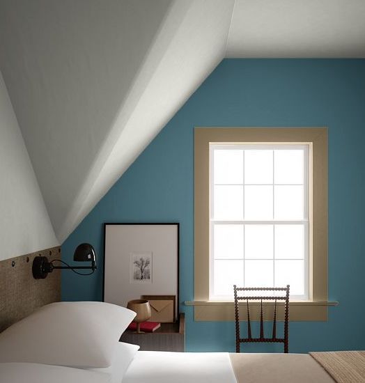
Tinted glass is necessary in intensely sunny climates. Your best bet is to embrace the tint of your windows which are often blue green and try a barely there blue green wall colour and decorate with this range of colours incorporated in the plan. If your house looks like this one below, the colour of your glass is a fixed element that needs to coordinate with your decor.
FOUR / You haven’t really decorated yet.
Bottom line, white reflects colour. And the less decorated and styled your home is, the more annoyed you will be by this fact. Without a look and a feel in your room, the only thing you’ll NOTICE, is that your white walls are not looking as white and bright as you hoped they would.
In my experience, when people are most critical of their paint colour it is because they are asking too much of it. They haven’t decorated yet. There is no look and feel.
And this is especially true of white, we expect an awful lot of magic from it.
I know I sound like a broken record but white and pale colours change the MOST throughout the day. And this is a fact.
The light in North facing rooms is more constant, but also not very bright.
One exception is if you live in an apartment or condo that strictly faces NORTH. If you barely get direct sunlight in your home, your walls will basically look the same throughout the day and probably at night as well. And North facing rooms are also typically lower light rooms, so they definitely will not give you the sun-drenched-photoshop-filter-white look either. (Remember the real life analogue for a photo filter is lamps).
But if you ARE in a darker, north facing apartment, or basement, or otherwise dark interior, you might intuitively think WHITE is the answer to the darkness. Since white is the lightest colour, it would seem to make sense that your interior would feel the brightest with white walls.
But this is a very common mistake. Because again, white cannot ADD light, it can only reflect what is there. And in a low light room there are too many shadows.
Available light photography is like fake news.
As I said, the phenomenon that creates this expectation that white walls will create the feeling of sunlight is all those gorgeous, blown-out white rooms we are obsessed with on social media.
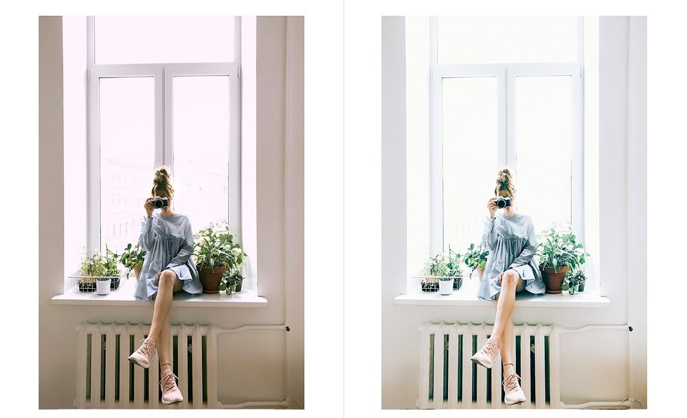
Before and after filters Via Instagram The Light and Airy Photographer
Most of these rooms DO NOT look like this without using available light photography (aka slow exposure that lets in more natural light) or without the ‘light filters’ that many bloggers and influencers use and sell today.
It’s not like we don’t know this, but knowing it doesn’t change the desire we have to create this look in our homes. It’s just like any other unattainable-for-many-of-us standards we all covet due to advertising and social media.
While my South facing living and dining room are drenched in lovely light all day, my NORTH FACING kitchen, family room and master bedroom feel DARK and GLOOMY most days.
Does the fresh and crisp wall colour in my sun-filled rooms look more greyed and shadowed on the darker side of the house? You bet it does.
So, I’m here to tell you:
LAMPS are what you need, NOT the whitest of white paint.
Decorating AND adding lamps with a shade, are the only real solutions.
When I’m home, I have three lights on at all times in my kitchen (two sconces–below–and a new lamp in the corner on the counter, not shown).
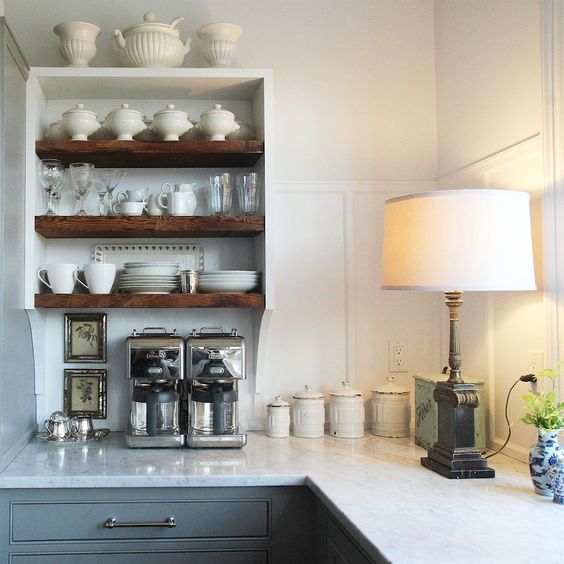
Try a lamp on your kitchen counter to create an inviting feel when natural light is lacking. Image via Laurel Home.
The first thing I do each morning is turn on the lamp in my master sitting area. And, it remains on all day long (even when I leave the house). This way when I walk in and out, the room still feels inviting.
More is more when it comes to lamps.
My small family room has 6 lamps. YES you heard me, 6! And at any given time, depending on the quality of light outside, I have 2 or 3 of them on.
Last week I arrived at a consultation where my lovely client already had white walls and had lived with them for the last 15 years. She wanted her white to feel ‘cooler’ than it was. She didn’t like that it looked peachy, which, she assumed, was because of her orange hardwood floors and orange beams.
When I matched the white, it actually was a cream with an orange undertone. That’s why it looked orange.
When I suggested a pale blue, rather than a cool white, her husband commented that the room would feel darker.
However, all you have to do is go into a dark room (below) and look up at the white ceiling (because most ceilings are white in the first place). With the exception of the very brightest of rooms, you’ll notice how dingy and grey the white ceiling looks.
Related post: 3 Ways to Love your Home Again; Before & After (This post is about lamps)
In this room, white on the walls will not look brighter than it does on the ceiling where it looks grey. The Spruce.
The reason my client’s living room “felt dark” and her husband worried it would look darker painted a pale shade of blue, was because there wasn’t a single lamp in this room. She turned on white fairy lights that were wrapped around the decorative rod and confessed that they were here all year round.
And the Christmas tree was still up because it also brought soft, lovely light into the room. Of course, that also creates atmosphere.
Something your recessed lighting will NEVER replace. Just one more reason to skip recessed lighting altogether.
Atmosphere is what we all want and in many cases white walls do not deliver. Colour, lamps and decorating do.
Barnes Vanze Architects via Elle Decor
This Spring during my in-person, three-day Specify Colour with Confidence events, I have dedicated an entire half day to a brand new training called: The White Workshop; everything you need to know about white, when it works, when it doesn’t and how to get it right.
If you need help choosing the right white, neutral or colour for your home check out my eDesign packages here.
To continue my conversation about white – watch this video for more:
Related posts:
How to Fix Your White room (If it Turned Green) Before & After
5 Reasons Your Paint Colour Looks Wrong; It’s NOT the Lighting


Just clarifying that ‘north facing rooms’ only applies to the northern hemisphere. Here in Australia, that would be our south facing rooms.
Yes good note thanks Heather! x Maria
Also worth mentioning – professional photographers place filler lighting all around rooms to make them look brighter. And the “sunlight” that is streaming in is often from lights placed outside to make a room appear sunny and bright.
Loved this post….however need more please. I am also addicted to lighting but need to know more about lampshade color and light bulb color. There are so many selections of LED lighting. Many variables including ones you addressed here.
Thank you SO much for this very informative post. It was a wonderful reminder about the reality of those filtered photos we fall in love with. The side by side photos were a perfect example. Thank you! We know this, but do not “think” about it when we start to choose for ourselves. I never even considered outside the window influences before, but instantly knew what you meant. (Our bedroom!) The reminder of the necessity of multiple lamps was excellent, too, I remember previous posts you had with before/after and the startling differences. This really rings true this time of year, when the days are short and mostly gray. The brief video was another great footnote to this lesson. Thank you.
Good morning Maria! I have also made the same mistake with white or an extremely pale color in a north facing room. My dining room receives only indirect light from a northern exposure. It’s “sort of” bright on sunny days, but in no way has the warmth of my south facing rooms. When I repainted the house with BM Classic Gray, I knew from prior experience with this room that I needed to amp up the paint color wattage. I went with a medium deep blue (BM West Coast), crisp white wainscot and a blingy chandelier. An Oushack rug, fabrics, silk drapes and art…the room isn’t dark, it’s luxurious. But you should have seen me panicking when I first put that deep color on the wall. Hubby actually brought home this color sample can in addition to the lighter ones I had chosen. His two-word declaration: “Go Bold!” It’s glorious!
Several years ago, I purchased your ebook, White is Complicated. It (and your color boards)was such an eye-opener and was instrumental in choosing a wall color when I renovated my new home. I knew I wanted very light walls, eventually choosing Shoji White rather than a white or an off white.
Recently my daughter bought a home built in the 1800’s that is on a brick street with massive trees that line the sidewalk. A great setting for a Christmas movie, but really dark inside the house half of the year. She repainted her bedroom a very light blue and it looks “brighter” than other rooms painted a more neutral color.
Can you share what kelvin bulbs you use in your lamps? Are they different in certain places? I have lamps everywhere as well and I LOVE my one on my kitchen counter but it tends to look a little yellow on my off white cabinets and backsplash. What kelvin do you recommend in kitchens for under cabinet lighting too? Thanks for this article because I’m about to paint our entire interior!
My next post will be about under counter lighting so stay tuned! Maria
Maria, I am standing in a full ovation wildly applauding. Amazing article – so so so true!!!!
Hi Maria. Wonderful information. I do have a question. My family room faces east. It only gets sunlight, late afternoon. Any thoughts on what color i should paint it? Starting from scratch. Not decorated yet. Unfortunately, the crown molding and woodwork trim. Is all stained a brownish fruitwood color. Thanks!
Hi Carol, What I’m saying in this post is stark white is likely not the best for a darker feeling room for the reasons outlined in it. I would choose your sofa first and then the paint colour, that will be much easier since there are way more shades of paint than fabric/leather options for sofas! Hope that helps, Maria
I understand what you are saying but these days most people are trying to limit the electricity – and therefore usually the carbon emissions – they waste/cause. I never leave lights, or appliances other than a fridge on when I leave the house. I do however like to have multiple lamps lights on in a room I’m using instead of overheads.
Agreed!
Thankfully I’m not “stuck with orange reflections,” but I do notice a difference with incoming light based on the season outside. In spring/summer greens are reflected, in fall…red (neighbor’s maple tree), and in winter…bright white snow reflections.
love your videos!!
This is so helpful! My house doesn’t get much light at all. My kitchen is massive with just a teeny half window. The previous owners painted it a dark olive. The countertops are a pinkish tan fake stone laminate. I have NO idea, what I could possibly do to lighten it up, until I one day can redo the countertops. (They are so bossy, haha) but this helps me know not to try white like I so badly want to! Can’t wait to learn more! I’ve lived with it for 3 years and can’t wait to change it for the better.
Awesome post Maria. The lightbulb over my head just came on!!!
I love all white rooms but realize it won’t work in my home. I’ve decided to go with a cream colour instead. Now…my light beige wall to wall in the bedrooms has a slight pink undertone. What undertone should I look for in an off white paint? Will a pink undertone in the off white compliment it or make the carpet look more pink?
Wonderful post. I love the straightforward point of view you share on your blog. As a purist to the core, I never used a filter on a pic of myself or my home. I don’t even know of a filter to use bc I don’t pay attention to that stuff! I know they have their place, but it feels like cheating. And it is so obvious when they are used.
Wow! This was terrific information! Thx, Maria! A graduate from Dreary Pittsburgh!
Looking forward to your post on lamps, shade colors, and light bulbs. I probably spent over $300 on LED bulbs before I figured out that you have to pay attention not only to Kelvin, but even more importantly to CRI (Color Rendering Index). The CRI measures how accurately that LED light renders the colors of objects that it reflects off of. A low CRI bulb will make reds look rusty, blues look dusty, brown and maroon look the same, because objects can only reflect the frequencies of light that fall upon them. A bulb with CRI of over 95 (out of 100) will render colors radiant and rich.
Great comment thanks! Maria
When we moved into our house 30 years ago, the living room and hall were painted in what I later learned was BM Linen White, and they looked incredibly drab. One big window faced west and two more faced north, but even the sunlight flooding the room in the afternoon didn’t improve things. And the hall had no source of natural light. Eleven years ago a decorator friend suggested yellow walls in both areas. I found Ellen Kennon’s full spectrum paints and her pure soft golden yellow and had both walls and our low ceilings painted. The transformation was unbelievable. I know yellow isn’t a currently fashionable color, but this yellow sets off everything beautifully without calling attention to itself: my sister, who took your class, says a visitor doesn’t even notice what color the walls are. The impression is of beauty and richness and coziness. At night everything is lamplit, with candles burning when we have guests.
This was all before I found your blog, Maria, but I still cannot imagine any color doing more for these spaces than that particular yellow. Our newer living room extension is painted BM Antique White, but that room has windows on the south, east, and north, so the paleness looks great. And our kitchen, although north facing, has two skylights and is the brightest room in the house, so BM Chantilly Lace (as you recommended) looks wonderful there.
It’s too bad that people always run toward what they see on Houzz and Pinterest and other decorating sites and magazines, instead of being open to less trendy options that might suit their spaces much better. Our homes should reflect who we are, not who other people are. The work you do in trying to educate us is invaluable; I hope your blog followers are increasing exponentially!
Very good article. I have no white walls in my house for all the reasons you outlined. However I do have a question about dingy white ceilings. We have white ceilings in 2 bedrooms and they look awful. One room is painted an orangey yellow- the other a deep green. Is there a paint colour you can recommend? I thought of painting the ceiling in the yellow bedroom a complimentary blue but am worried that will look dingy too. (Both bedrooms face north ). Thanks so much for your blog posts, Maria. In my books you are the leading expert in this field.
How about a pale clean blue? I would just pick the lightest one from any pale blues from the BM Colour preview collection. This is when a baby blue should be selected because it feels like the sky and works even though there is no blue in the room for this reason. My living room ceiling is blue and I don’t have any blue in there and no one even notices! Hope that helps. Maria
My lampshades turn yellow after 2 or 3 years, and that changes everything in the room. Is there a certain brand or material that will not yellow?
That is interesting, I had that happen with my kitchen sconces but I haven’t noticed that in any other rooms. . .I will have to ask when I get new ones made why that happens? Perhaps call a shop that specializes in custom shades in the meantime? Maria
I would have to ask if your shades are lined in fabric or are they a plastic lined shade? A plastic backed shade will eventually react to the heat of your light source as well as environmental influences…smoking, cooking oil, aerosol sprays, chemicals, etc. therefore changing the color of the liner and ultimatly the color of the shade….it can start out as a very clean, warm light and eventually change and send off a yellow cast to the room. I always go with a fabric lined shade for this very reason. They are usually more expensive than a plastic lined product but worth it as they last longer and don’t change color.
Leaving the lights on would not be a good idea. That last blue room is terrific. Lots of wood paneling in the lake houses here. That gloss could really help bring back an old room.
Maria, your comment on window tinting really hit home with me. My southern exposure windows have lovely blinds that go a sickly shade of pink beige at night. Was really irritated until I figured out it was due to the interaction of the low-e window coating and the exterior lighting that I can’t do anything about. There’s always tradeoff’s, but when purchasing blinds again, I’ll check the samples against the night lighting too!
Love the post and video and it is so true! I am a real estate agent for a big, online brokerage, and show hundreds of homes a year. Sometimes we walk into a vacant home where they have gone to the expense of having everything freshly painted — white — including the trim. This always makes the home look less-inviting, and to tell the truth, like a cheaper, low quality home, compared to the vacant homes that have been freshly painted a greige , light warm gray, or even a cream. I think it is partly because usually the trim is also white, so if the walls are also white there is usually no contrast or interest in the otherwise vacant room. And of course, usually the other fixed finishes weren’t designed to go with stark white, either, making it look more like its just white primer on the walls, rather than paint! I imagine that either the sellers, or their mis-guided agent, decided it was safest to repaint everything white! I’ve also seen an occupied home, with soaring vaulted ceilings, that had recently repainted everything white and the buyers commented on how sterile and cold everything felt. None of the finishes or furniture went with the white.
Fortunately, I do see many vacant (and staged) homes that have been repainted in a nice neutral greige these days. Those homes look so much more “high end” and interesting because, there is now at least some contrast with the trim, and the color usually works better with the fixed finishes. Also, I always cringe when I walk into a vacant home that has been completely repainted in what I call “gray gone wrong,”–you know, the grays that end up looking either like “battleship gray” or like a very cold blue on the walls! Those colors never make a vacant home look high-end or “warm and inviting”! It always gives me at least, the impression that the contractor or home owner just walked into the paint store and thought–ok, gray is popular, and just picked out any old gray! (Although we’ve learned from Maria that the popularity of gray is starting to fade in the design world, (maybe already faded?-) so many folks out there are evidently “late adopters” of design trends and still think that it has to be gray to be “in-style!”) Just thought I’d share for those thinking about repainting for resale, too! (and by the way–a freshly painted home always looks better overall and commands a higher price than one that needs repainting!)
Love the combination of blog post and video Maria!!! Please keep them coming! I’ve learned so much from you! You are awesome!
This is such a great comment, you’ve said it so well, thanks for contributing to this post with your insights! xo Maria
Wow this is such a great post! I feel like I need to copy it and give it to every client to read before we choose color and make them sign it. I am working with a neighbor right now who may never choose a wall color because it looks too dark or too light no matter how many times I explain the lighting in her room will make a difference. She doesn’t seem to understand how accessories will make the difference. I hear people say “being a designer would be so much fun and glamorous”. I have news for them! LOL
Hi Maria. I have been following your blog for over 10 years, and your posts just get better and better.
This is one of the very best. Thank you for sharing your expertise. Without it, I would not have the house of my dreams right now. Not even close:).
My SW Incredible white walls look amazing in my open space. Part of it faces north. It’s the lamps you recommend, which are on all day, that make it sing. In the open space, our over and under the cabinet lighting also helps. Interestingly, I get more compliments about the lighting than anything else.
Thank you for another informative post. Good to know I’m not the only one that leaves lamps on when I leave the house. The older I get the more I dislike entering a dark room at night.
I’m with you 100% xo Maria
Loved this post. I tried to update a guestroom…wanted to make it look brighter and fresh so I had it painted white BUT I had to use White Dove because that was what the trim was and the shutters were chosen to match the trim. It looked dreadful. The wonderful trim went away and the whole room was totally blah. I immediately repainted the walls BM Ivoire and it looks great.
But I just completed a complete basement renovation-added a bedroom, bathroom, game room and TV room (with only two windows) and I painted it all BM Decorator White and it looks fantastic! I have recessed lighting but also have some sconces and uplighting to help with the lower ceilings…all on dimmers and it is so bright and cheery. Everyone loves it. It is accented with black fixtures, black barn doors, black cabinets, etc. and warmed up with multicolored rugs. So I learned my lesson on where and when to use white.
Great comment thanks Kathy! xo
Anyone out there know of a light bulb that most closely mimics sunlight? We are about to turn our deck into a three season room. There will be an East and a West facing skylight, I plan to paint the ceiling light blue, and there will be cove lighting around the ceiling. My goal is to look out and feel like the sun is shining all day in the room.
Fantastic post Maria, your advice is spot on. I have your book ‘white is complicated’ and every time I walk in to my kitchen, I thank you for that. It gave me the confidence to realise what a huge mistake I had made, (I had painted the walls a pale powder colour, great colour but it made the cabinets look purple!)
I luckily was able to download your book and changed it to the right white and its lovely now.
I have learned so much from you but this post will have me out buying lamps tomorrow, thanks for the nudge in the right direction : )
Thanks again and best wishes from Colette in Ireland
Amen Maria! Fantastic blog post, mic dropped. Perfectly written.
very true. have an east facing white bedroom that looks like the dingiest gray all the time. Very uninviting.
I have a lamp on my kitchen counter and it makes the room more cozy. Any tips for hiding the cord? I have two feet of cord on my counter next to the lamp and no where to hide it.
I fold mine up and tie it together with a rubber band and stick it behind the lamp but if you can see two feet of the cord because of where the lamp is placed I don’t have a solution for that. Maria
Confused because I thought you said WhiteWhite was not the answer and neither were any Pale colors… but complex beige is the palest of the beige… so could you please clarify? Thank you!
An everlasting fan…
When did I say pale colours were not the answer? Any colour including white must always be chosen in context with what is surrounding it and rarely is a bright, true white the answer. Let me know, Maria
I also a interested in which light bulbs to buy for lamps and other fixtures. I’m sure it is hugely important.
I’m not Maria, but I have found that high lumens are actually blue, not sunlight white. I would go less and talk with your light store, not box store. Lighting my cabinets I will change to a higher lumen as it makes the green color blend better by erasing the yellow in the uppers. . The higher lumens, get rid of the yellow.
Ohhh Maria, this post is an eye opener for most of your readers haha. You gave a secret key on how to make a room look harmonious. May be in a big city with buildings close to each other, crisp white is not a solution. But in a rural place where I am now, my white walls totally fascinate me and my relatives. But… may be that white has a tint, not sure : )
Hi! Love this post. So helpful. I have a quick question. Can you get the same feeling/result with overhead lighting such as ceiling lights as you do with lamps? Thanks :o)
Definitely no. That’s why I always talk about lamps. Buy some and return them if you don’t agree. Maria
You are so RIGHT! All I am seeing on social media are white interiors! This is such a timely article. Thanks for your expertise!!!!
Yes, we have a north facing bathroom which is white (hoping to reno the space one day & paint) and its so drab and lackluster.
I have an idea about leaving your light on! I have an app on my phone that allows me turn on/off a few lights in my house. So I Just turn the light on from my phone when I’m out/at work when its getting dark outside. That way you don’t need to leave the light on all day. Sometimes I’ve spooked my hubby when he’s happened to be in the living room and the light suddenly comes on! haha!
It’s official…I really have no idea what to paint my house now. LOL! When we built 15 years ago, I thought I covered the lighting issue by installing a gazillion can lights along with a main ceiling light for each room. We have beautiful Brazilian Cherry floors throughout the home, white trim, open concept floor plan, 9ft. ceilings (great room has 18ft), and I have painted this house twice and HATE IT! First I did a color by Eddie Bauer, called “Barley”- which completely turned into a dungeon. Five years later came that yellowish/goldish color that I have no idea what it’s name is, and I sometimes have wondered what planet I was visiting when I painted it that! Now, my house looks like an Appaloosa because I have so many painted spots with so many colors! LOL! My hubs keeps wondering when I’m gonna paint it, but hey what can I say…I’m not getting younger so I kinda want this to last a good 10 years. I finally came to the conclusion to paint it “White Dove”- that is until I read this and watched the video. Oh good Lord I need help. Please have mercy on me and share something.
Cindy, haha, send me photos to [email protected] and I’ll see if I can turn it into an Ask Maria post 🙂 take them without flash and in good natural light! xo
A very thoughtful and informative piece. I think I understand a little move about my white paint in our great room, kitchen/dining area, and sunroom.
Thank you, Maria!
What category do you place an almost directly east facing home in? We get lots of direct sunlight in the morning, and have huge windows, vaulted ceiling on the front so we get constant light but not direct sunlight all day. I’m having trouble figuring how the white undertones will look throughout the day in a room with good natural light, but that’s not completely bright and southern facing. We are in the mountains sitting up on a hill with pine trees surrounding us in the distance. The house has natural wood trim, warm wood floors and staircase with an open floor plan. Along with the wood we have a tall stone fireplace but there are mostly grey and pink tones in that! Current wall color is a too dark beige that matches the wood and I hate how it all blends in and feels dirty. Is it a bad idea to accent a wood with off white? I’m afraid it will reflect too much and look orange. I’m also worried even large white color samples will reflect the current dark beige wall and skew warmer.
Another great reason not to use white is because everyone else is, and it’s boring. I have been sooo happy with a very pale golden apricot as well as a light, light green yellow, both of these trimmed in a great white (the slightest hint of pink in certain light).
I hate it so much. I can’t even tell you. It’s not that I hate white as a color in general, I don’t. I just hate white paint inside houses, especially white trim. Walls don’t really bother me. Its the trim, the doors, the crowns, the cabinets and cupboards, the shelves, the door frames and window frames…. and on top of all of that the white painted walls. Lovely earth-tone brown wood that just gets hastily painted over with white in a rush to make a home look modern contemporary just doesn’t look good, in my opinion. Thing is, seems almost every home I look at buying has this white interior in abundance, and I keep seeing less and less homes with that earth-tone interior. The last thing I want to do is come in from a cold, cloudy, nasty, windy day outside only to find myself in a home that has that same white-gray depressing feeling as it does outside. Am I being to harsh on the modern white decorative look, or am I just crabby?
– a sad homebuyer
Personal preference I guess, and maybe familiarity? For example, I used to like dark and cozy homes like log cabins, covered in wood. But over the years I’ve learned nothing makes me happier than bright rooms and sunlight. 10 years ago I was fine with wood trim, and now I want nothing to do with it, and would probably paint over it in most cases unless it was very light. (I do prefer wood cabinets, never liked the white cabinet look.) But you should be happy because earth tones are getting more popular again. Just in a more fresh way.
Great article and very interesting. I just selected Sherwin Williams Pure White after much hemming and hawing between that and SW Extra White. I love a super clean look but was afraid it would run too cold. There is no house yet to bring paint samples to so I was unable to check beforehand and the only other color choice was a bland tan and that was a sure pass. I hope there’s enough sunlight. I’ve got an Eastern exposure for the most part and it’s in the desert so the light is pretty strong. I hate having to use lamps during the day but I have been using them here for years because the light just isn’t strong enough. Thanks a bunch.
I sampled just a few whites for the home we purchased in 2021. It was an obvious winner – BM White Christmas. We have cherry stained hardwood flooring. It is absolutely the best white I could have ever imagined. I regularly stare at it and think “man, I love this paint color!” and it’s just white. Great article. Can’t wait to read more!
Thanks for the article, I can’t stand white walls. Reminds me of antiseptic doctors offices in the 50s and 60s. Had to live with them for many years and always hated them. A light tan, grey, green is so much better. Finally got my husband to paint the walls a light tan. Sooo much warmer and felt more like a home. People sayit looks clean to use white, looks too hands off to me.