


I’m starting to see a new accent tile trend coming soon where people are installing a black pencil tile border on their kitchen backsplashes. Let’s discuss…
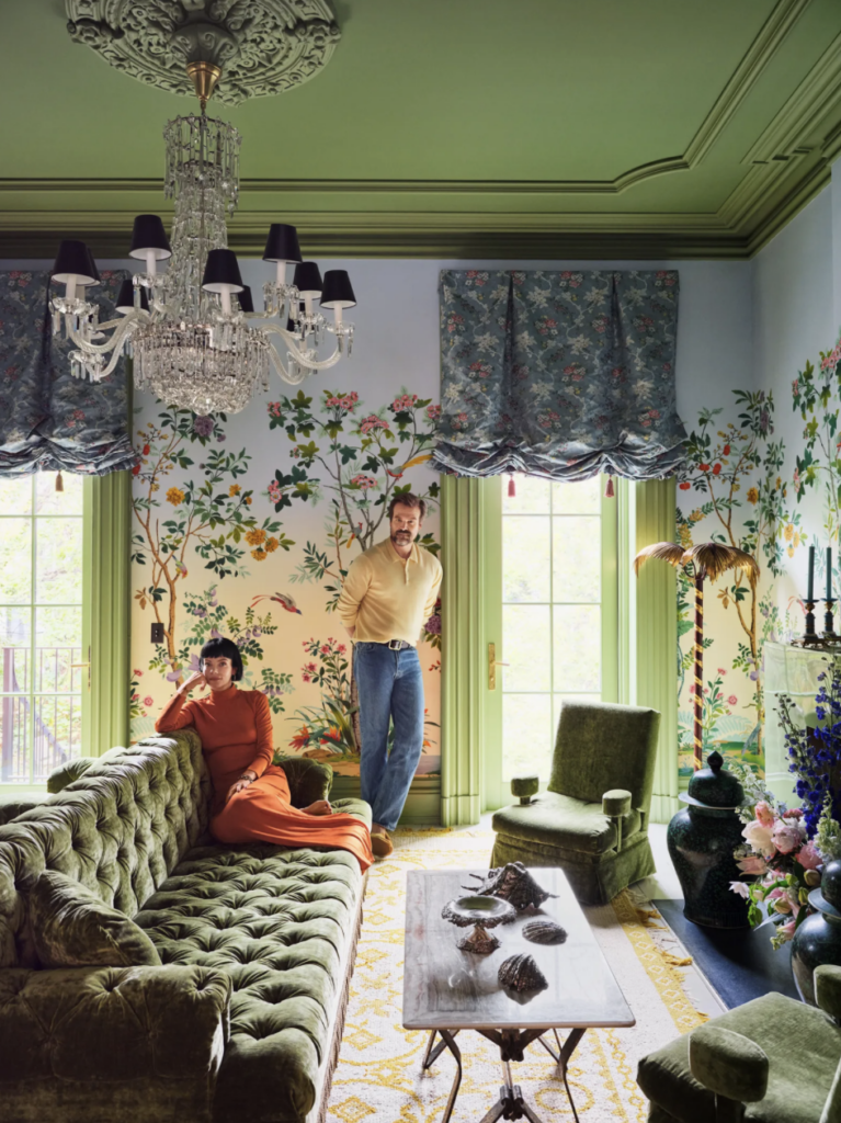
So many people sent me this home tour from Architectural Digest because this space reminded them of my new living room. I’m absolutely flattered! Their lovely wall mural combined with a colourful ceiling definitely has something in common with mine!
Kitchen Backsplash with Black Pencil Tile Accents: Yay or Nay?
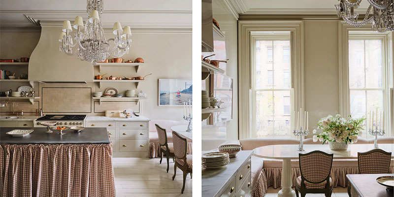
But, when I saw the kitchen in this house tour, I immediately noted the border on the peach backsplash, which is new.
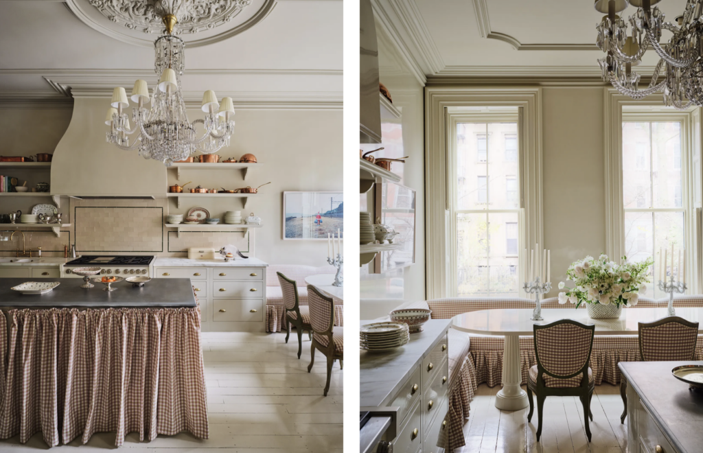
I haven’t seen a kitchen backsplash with a pencil tile border around each section in my entire career (and I’ve seen a lot of kitchens).
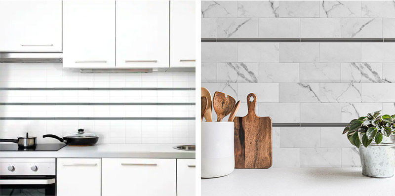
Then, this week one of my followers sent me this photo from a real estate listing and I realized that this border tile thing might already be turning into the latest backsplash wall trend as people look for other ways to add black to their renovations or new builds.
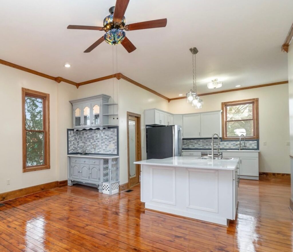
And I’m here to tell you that it’s not good. Imagine this kitchen with a few black appliances and other random objects on the countertops. It will most certainly create a roller coaster effect. Not beautiful yet.

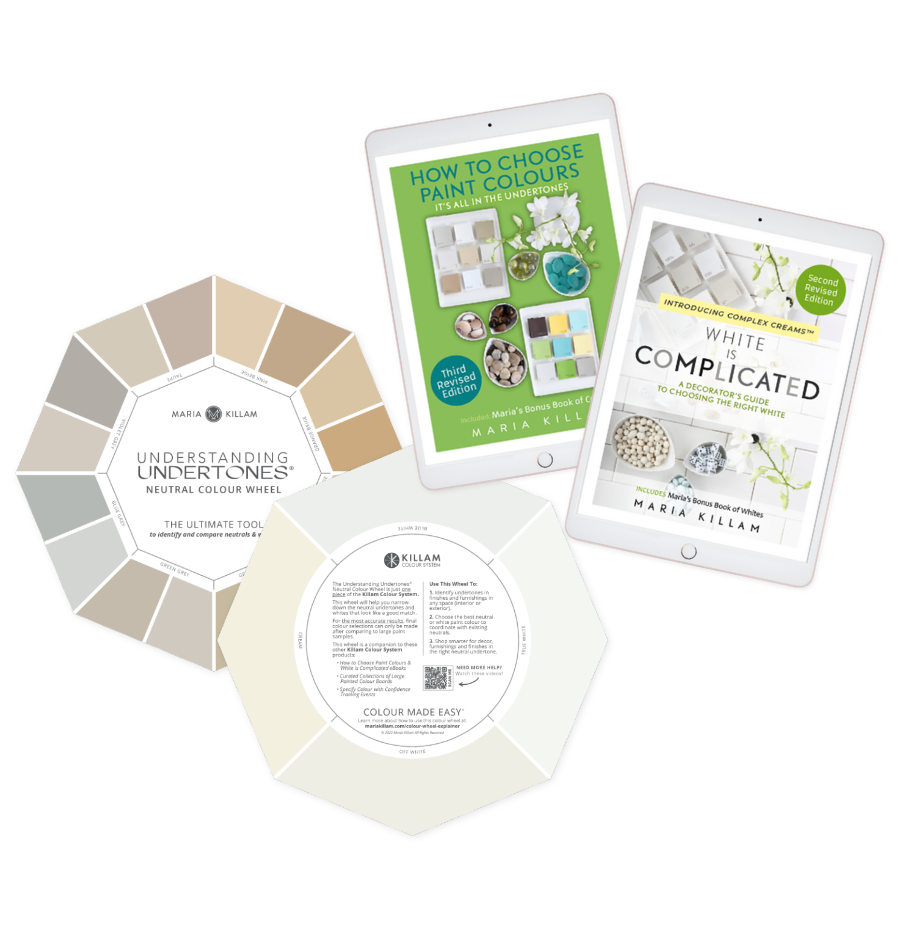
See Undertones Instantly
- Real Benjamin Moore paint chips
- All 9 neutral undertone families
- Compare directly to your fixed elements
Stop trying to make your kitchen backsplash less boring
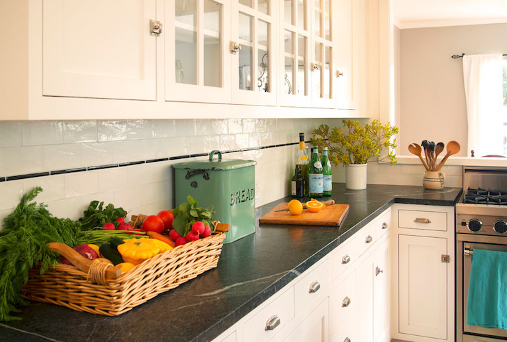
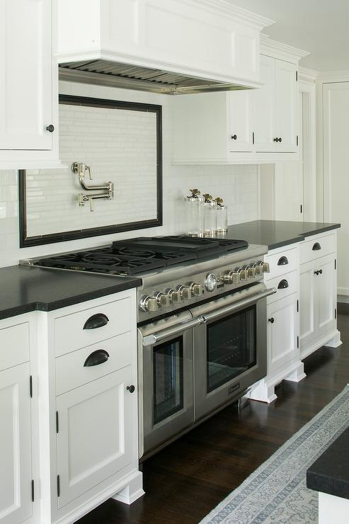
Speaking of the pencil tile border trend … I found both of these images below recently from separate online stores selling tile. Both of these backsplashes would be considered timeless without this unnecessary contrasting border tile.
The best way to make it less boring? Create a look and a feel by adding styling with decor and accessories. It’s a prettier way to dress up a kitchen anyway – and you won’t be taking an expensive risk by installing something that is trendy right now.
After a search, I realized this trend was often seen in vintage kitchens, and even though this kitchen design is likely a heritage house paying homage to its roots, the black border going through the center of the backsplash is still an unnecessary detail.
I know that many of us find inspiration online and in design magazines, but magazine worthy kitchens cannot be easily copied.
Because when you try to copy something like the pencil tile border in the Architectural Digest home tour at the beginning of the post, it’s ALL the details that make or break the design.
In this kitchen below, it just looks like someone drew a black square around the backsplash. And because it’s black – it ends up looking way too harsh.
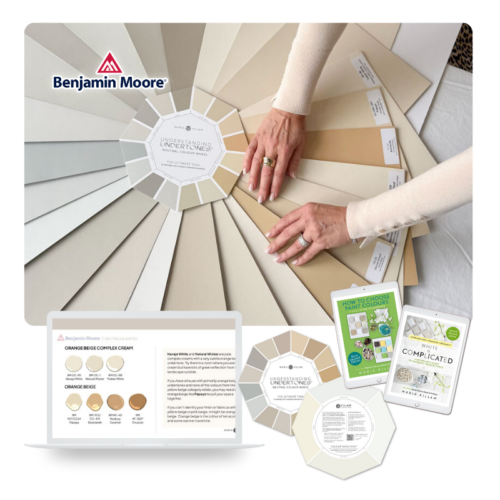
The Killam Colour System™ in Action
Start with the Colour Wheel to identify undertones, then upgrade to the Bundle for a more complete colour decision toolkit.
So be careful of jumping onto this soon-to-be-trend. If you want to create a timeless kitchen backsplash, skip the pencil tile border or outline.
Adding a thin border to your kitchen backsplash tile does not belong in the average kitchen in a traditional home, anyhow.
Even the tastefully-done pencil tile border in the Architectural Digest kitchen was unnecessary in my opinion. It does nothing for the peach backsplash tile that visually relates to the terracotta gingham skirted furniture and copper pots. Adding that extra border wasn’t needed for this beautiful kitchen.
When it comes to kitchen trends, practice caution
I know the idea of everything that’s NEW seems so exciting when you’re starting a new build or renovation. And when selected in isolation, you may think that accent tile is so pretty and interesting all on it’s own. But then when the kitchen design comes together… it starts to look choppy, mismatched, even *GASP* dated!
So you will be MUCH HAPPIER if you practice restraint in introducing all things new and trendy. Because trust me, once it’s all done and the next trend comes along, you’ll forget how much you loved THIS trend for THAT one. I see it happen all the time.
Nothing ages more quickly than newness.
Well my lovelies, what do you think? Will this trend catch on?
If you’d like my help creating a timeless new build, renovation or kitchen design that you won’t regret, grab one of my eDesign packages here.
Related posts:
My Favourite Backsplashes (That Are NOT Subway Tile)
A 10 Year Review of Accent Tile; Should you Install the Current Fad Tile?
Is Your Black Accent Tile Perfect (or Just Perfectly Nice)?


I totally agree with you Maria. Keep it simple and timeless.
Maria
Totally agree it doesn’t look good .’every picture you showed it was why ?’why is that there ?
I hope that isn’t a trend .
That last kitchen makes me cringe, it’s as if they’ve put a picture frame around the pot filler. But worse, are all of the lower cabinet feet! I’m imagining all the times the poor person preparing meals in this kitchen will be stubbing their toes!
And imagine cleaning under those cabinets. I can’t count the number of times I’ve had peppercorns and blueberries rolling around my kitchen floor. At least my toe kick acts as a stopper.
I think they probably have a toe kick. Feet are added after installation to give the look of it being furniture pieces like in pre-1900 homes. Even though it never really looks like that, it just looks unnecessary. These people have managed to actually make it worse than usual by getting squared off feet added that stick out past the cabinet profile (usually the feet do not protrude). Hopefully, this is a “shoes on” house or the kitchen is only for caterers during parties since they will all be wearing shoes. Congrats to them, they have failed successfully.
I would risk the stubbed toes to own that range, LOL!
Yes yes yes. Agree totally.
I hate it, even in the Architectural Digest house. It will be sad for the folks who get on this trend train.
I agree! Plus all that gingham check? No thank you.
I like a lot of the AD house tour, but that kitchen stopped my eyes in their tracks. The tile design is just…awful. It looks like a very foolish person was in charge of that, everyone involved looks foolish and like they do not deserve their jobs.
I agree. Not necessary. Get interest elsewhere.
Agree with you, it doesn’t look fabulous. However, I’m now second guessing my selections for shower tile. The person at the tile store persuaded me to add a pale gray pencil tile border to my white subway tile in the shower, which references the gray porcelain marble patterned floor and niche tile. It won’t be as in-your-face as the black, but now I’m panicking. Should I try to cancel the trim tile?
Joanne
I would, haha, but I have extremely plain tastes. We’ll see what Maria says. Sometimes designers and salespeople will indulge their own need for newness and applying whatever tropes they learned in design school or saw on HGTV, rather than spec’ing what’s in the best interest of the client.
I think cancelling the gray pencil trim border AND tiling the niche in the same subway as the rest of the shower is the best way to go. Contrasting niches are already dated.
Yes.
The subway is beautiful on its own, plus it’s got enough going on with the staggered grout lines.
You could always just make the pencil tile white then it wouldn’t have to be redesigned
If it’s not too late to cancel the pencil tile, I would! Every time I see a pencil tile border in a bathroom or kitchen, it already feels dated to me. I also agree with Les, who replied about not having contrasting tile in the niche. I think you’ll be happier in the long run. Just my opinion!
Thanks. The reason the “designer” suggested the pencil tile is because there was not a bullnose available to finish the edges. Trying to match the wall tile might be difficult. I’m not sure if a pencil tile is available to match.
That AD kitchen (and living room) is a disaster! Clearly, they think it looks good or they wouldn’t have featured it. IMO, it is a mishmash of styles, lines, colors, and patterns, and is SUPER busy. Just in the kitchen, there is at least one of every shape known to humanity — lines, squares, rectangles, ruffles, curves, half curves, swoops. What the heck?!
The kitchen looks a lot better on the video. Anyway, Lily Allen is known for her offbeat taste and her husband, David Harbour, loves it, but knows not everyone will like it.
From David Harbour’s Instagram: “Weigh in on our controversial ‘tub-on-carpet’ living. Join. The. Convo. My wife @lilyallen and her soulmate @billycotton have designed a very special home we love and our kids think is ridiculous. @designbuildmade killed it, and special shout out to all the hawt ppl at @swelterhouse for my hobbit homes in the backyard. Ty @archdigest for the lovely profile, sorry I ate all the art directed crème puffs. Vid is somewhere online. If you were a fan of my precious LES loft…ooooooooo u gonna hate this 😝
I’m glad he’s so laid back and good humored about it. If he doesn’t care and she does (and loves it), they can have it. They have money to keep tradespeople employed. Although I do hope when they eventually rip it out (or the next owners do) someone sends it to a Re-Store or something.
I totally agree. I really hate it. To me it’s ugly Love the timeless look. Add decor, so much better and can be changed
I feel it cheapens the tile. The overall look needs to be cohesive…the black look like an afterthought. Not a designer lol
Yikes! Good call-out.
Because I’ve followed you for so long I noticed that pencil tile in the AD tour and thought – that was a mistake. And I’ve learned from you that one key difference between them and most of us is that they can afford to replace it when they are tired of it.
I also agree with you, Maria! You we derail this trend train?
Hi Maria, yes, I totally agree with you. The pencil black border is an added detail that was not necessary and it took away the beauty of the tone on tone orange beige. If the design is to work with the pencil border then more tiny doses of black would need to be added so that the border relates to something else in the space.
That second kitchen is one of the worst I’ve ever seen. There is nothing pretty, timeless, coordinated in that hideous kitchen. The thick border is only one of the many misses in that room. I agree harsh lines in tile don’t add anything positive. However, I like the decorpad kitchen. Would it have looked just as beautiful or even more beautiful without the pencil tile? I’m not sure but it is a gorgeous kitchen in my opinion.
I mean the kitchen with the BREAD box on the counter!
I agree. That’s the only one that I think looked good and was in keeping with the style of the house, instead of these other ones trying to make a trend happen.
Once again, a fabulous post with great examples. I do love the countertops in the kitchen with the green breadbox. Do you think those are soapstone? We had soapstone in our old kitchen and while I loved the look and the natural veining – I did not like the upkeep and having to oil the counters every week.
They definitely look like soapstone to me!
I love the architectural digest kitchen. It’s not really my style, but it’s so romantic. I want to be there! don’t mind the black border in that kitchen. It’s more subtle than the other examples, and the black relates to the island countertop, and the kitchen chairs. I hate all the other examples. It’s a good illustration of your previous kitchen post about don’t try this at home, you can’t get the same look as a magazine because you don’t have the budget for that much customization.
I noticed their kitchen is much better in the video than the photos suggest. I don’t like the pencil outline, but overall the kitchen feels wonderful in the video.
They are such a funny couple during the tour! I found this quote:
“I’m a suburban boy from Westchester, so I’m accustomed to a more middle-of-the-road aesthetic. But I love that my wife has her own vision and isn’t afraid of taking risks,” he insists. On the subject of risky decorating, Allen remains sanguine: “My kids call this the clown house,” she confesses, “but they say it in the most loving way.”
I do love a vintage bathroom with pink tile with black trim and pink fixtures. Otherwise NO. It stands out like a sore thumb.
My grandmother’s bathroom in their late 1940s house had pink and gray tile and pink bath fixtures. I loved it.
The tile went halfway up the wall and she had the perfect wallpaper with a silvery background and birds and lily pads. That wallpaper never looked dated and there are similar designer wallpapers you see today.
Ha, ha! That is exactly what I thought of.
I’m not with you on the AD house. There is absolutely nothing in that place that is timeless. Not the kitchen, living room, bedroom without windows, black bathroom, tiger print carpet & upholstery. But that is the whole point. It was meant to be an ephemeral design statement made by people affluent enough to rip it out and do it over again on a whim.
I do agree that for the more typical, funds-restricted renovation, it makes sense to stick to what will look pleasing for years to come. And your point is well taken that anyone who doesn’t have the money to redo what isn’t right should think long and hard about the overall design before making a single step.
Honestly, I don’t think they will rip it out because that’s their authentic taste.
Heck, I don’t like the wood crown molding “line” at the top of the wall in one photo either. It lowers the ceiling. And the backsplash in the kitchen with the cut open orange and knife reminds me of a commercial (gas station) bathroom.
I have to say, I’m a sucker for a stripe, so I could see myself falling for this! I think there’s a difference between a simple stripe (in a color that relates) and empty rectangles outlined by tile, which have much less of a sense of movement. There was a traditional but simple cream kitchen in the Schoolhouse catalog recently that had a stripe of yellow-beige accent tile in its white subway backsplash, and I loved that.
I also have a recently remodeled bathroom very inspired by Maria’s posts on how to judiciously add black, as well as by a Heidi Caillier inspiration photo featured here, with a black bullnose tile above a half-wall of white herringbone subway. I love it! However, my original design for the coordinating black and white flower penny tile on the floor included a vintage-inspired black rectangle around the borders of the floor. Once the tile was mocked up, the rectangle looked busy and felt constricting. We went with just the flower tile, no border, and along with a few flowers sprinkled in the penny tile niche, that was all the black it needed.
As always though, Maria’s right that details box you in and restrict decor freedom!
Maria – your living room is gorgeous ! The AD living room is visually unpleasant – the only thing you have in common is a wall mural.
All the kitchens are so sad – what a colossal waste of money. The kitchen with the green breadbox and the black pencil line remind me of See’s Candies
– all 1920’s white and black. Timeless also means you can spend a lot of time in a space and enjoy it –
Excellent post today. Thanks.
Recently I talked my husband out of adding a pencil tile accent to a spare bathroom we renovated and I’m so glad I did! Fifteen minutes on realtor.com”just looking” makes me completely understand and re-internalize your message about trends and timelessness.
Oh I remember this in the ’80s, but I had only seen it done as a rectangle in the backsplash over the stove. Nowhere else.
It’s like people are coming up with different backsplash just to look ‘new’ and ‘current’.
Hopefully none of my design clients have their heart set on this linear tile. Not a fan.
Photo #3 and #6 are HIDEOUS. Photo #6 looks like they put a picture frame around the pot filler to showcase it.
The DecorPad kitchen at least did it skillfully enough not to make me angry. 😉
I agree 100%. This look is not good in any way, shape or form. It’s very distracting – causes the eye to go straight to the pencil trim. As a result, you miss the overall beauty of the entire room. Changing out accessories is a snap. A new backsplash – not so much!
I agree, these backspashes look awful!
The top picture of the avocado green living room has me thinking that a group of people had an unlimited budget that could only be used in Habitat for Humanity (which by the way has some real treasures).They picked whatever they liked and tried to pull it all together in a small space to make it look like a Thrift store.
Of all the kitchens shown here, I think the only one I could really live with is the Decorpad one with the breadbox. It definitely looks more vintage to me than the others and the stripe is more subtle. However, with that being said, I’m so thankful I found your blog during my kitchen renovation and went with cream subway tile as my backsplash. It’s easy on the eyes and won’t look dated!
Black line in the DecorPad photo doesn’t bother me, looks vintage rather than trendy and suits that kitchen. The rest, hideous, especially the one accentuating the pot filler as someone mentioned. I don’t care for the AD living room either, way too busy for my taste, but AD is often one extreme or the other that is often so specific to the architecture of the particular home that it doesn’t translate elsewhere.
Yikes! Why would someone want to frame their pot filler? The living room is gorgeous, though, as is yours.
Maria, I can’t help but point out that the word you need in your headline is “yea,” not “yay.” It refers to voting in times of old when “yea,” meant “yes”. So the term means “yes or no,” not “hooray or no.”
I’m an editor. I see this all the time online and it makes me cringe as hard as you probably did when you saw that black tile!
That black rounded pencil tile was popular in the 50s in bathrooms as trim with aqua, pink or yellow tile. As part of an original bathroom of the time, I like it, but it made no sense to do it here, and it will not look good going forward in modern kitchens and bathrooms. It won’t relate to materials being used today, and will be misused.
I’m okay with the thin pencil line (no rectangles) in the Decorpad example, but why not eliminate the black and add interest with decor which is easily changed? Maria, I agree with your “boring is timeless” approach, except that I love a pretty, clean white bathroom or kitchen and don’t find them boring at all — only timeless! Do love the added playfulness of those pops of color, however!
And speaking of timeless . . . My great, great grandmother had a white tile kitchen with black countertops installed in the late 1800s-early 1900s which I remember visiting when my grandmother’s family still had the house (long since torn down to make way for a hospital). Apparently, a clean kitchen as well as a clean look was what they were after. The kitchen had a floor drain which I was told allowed them to periodically hose everything down to insure good sanitation!
Ha, I’ve always told my husband that the ideal kitchen would have a floor drain! Apparently not such an outlandish idea 😉
I’m not a fan of the accent stripe. But more to the point, I see nothing “flattering” about comparing your beautiful living room to that green disaster. I know you love Kelly green, but no, not on that ceiling and trim. It doesn’t relate to the wallpaper or the curtains…undertones are off. And what’s with the white section on the top of the wall? It looks like they ran out of wallpaper! I don’t think I’ve ever seen an uglier living room, and the other rooms aren’t much better. Wall-to-wall-and-sofa tiger stripe? Just no! It is indeed a “clown house” as her kids dubbed it. Yours is classy, classic and beautiful!
I don’t agree with a hard and fast rule for no borders or pencil tile lines in tile design. There can be a place for them if done right. The backsplash tile design is not the worst part of the AD kitchen…that award should go to the fabric skirted island and the skirted bench seating! The second kitchen from the RE listing looks like either a DIY rehab or contractor/flippers, and I wouldn’t consider this a source for good design or trends. The 3rd and 4th photos are taken out of context. While I would have opted for less contrast with the pencil liners, neither seem horrible. The 3rd kitchen looks like a contemporary, minimalist design, where the lines may have added just the right amount of visual interest. The 4th kitchen looks like the tile went higher than the standard 18” between counter to upper cabinets and may work within the overall design. The breadbox kitchen is timeless, vintage and classic. Agree with other comments on the last kitchen, and because there is a different tile inside the border, they could have kept it the same color, and let the visual texture be the focal interest.
Why would anyone frame a pot filler?
I hate accent tiles. They tend to look dated and cheap. Would much rather decorate with beautiful accessories.
I completely agree! I really dislike all those fussy details that are so unnecessary and just making visual clutter.
Hi, Maria… I think the accent tiles, in the AD pic, compartmentalized each area, wrecking the flow.
Love, love, love your living room!!! It’s so cheerful. I’ll bet your mom loves it, too!
Love ya, Candy ❤️ 💕 ❤️
This looks like a trend to avoid. I did like the Decorpad kitchen though. That was the best of the bunch.
Maria I’m so grateful I found your blog when I did my kitchen renovation in 2021. I did white subway tile and my brother, a tile man for years, balked at me doing “cheap arse, plain subway tile” and wanted me to do something with more detail, but then came back a few weeks later, looked at my kitchen and said, “Hey, this looks good! I’m going to do this when I renovate my kitchen.” Sometimes less is more! 😀
I agree! My otherwise timeless white kitchen backsplash (circa 1995) has a single maroon line of accent tile 3/4″ of the way up. It’s been high on my list of non-necessary dated things to change, and I’m excited for the moment when I can make it dissappear! For 2023, I think I will have to paint it, since we have some pressing items to replace in other areas of our home.
Becky, many years ago just before Y2K, I painted a blue accent strip on an otherwise timeless white backsplash in our house. A couple of years ago that house came on the market, and out of curiosity, I checked out the photos. They still have the same tile, and the blue accent tile strip is still painted white. 20 years and several owners later, the painted tile is being left alone. So, I’d say go ahead and get some paint and cover-up that maroon line of accent tile. You’ll be much happier.
I would say Yay is the equivalent to Yes or Yea in the context of Yay or Nay. Or as in the Australian parliament Aye or Nay. Language evolves. We don’t have to like it, we just have to suck it up.
I’m in the minority here. I like the green (yes it’s green, not black) pencil tile used in the AD kitchen. It looks like trim molding to me. It also coordinates with a little brass light the designer installed with a green shade. If they had gone with a thicker tile, it would have looked bad. But the pencil tile is just enough green to make it work. Without seeing the entire kitchen, it’s really hard to say it doesn’t relate to anything.
The second kitchen looks horrible because they did the tile completely wrong. The tile should end at the edge of the upper cabinets, not at the edge of the countertop. And it definitely should not have wrapped around the wall where that cabinet is on the left or continue to the edge of the wall. It looks out of proportion with the cabinets in that corner.
It all has to be done in context.
The thin black stripe is chic and classic, like the edging of a Chanel suit. But that real-estate-listing kitchen is a monstrosity. Egads.
ugh all of these kitchen have one thing in common: CLUTTER. too much going on, the open shelves with stuff everywhere , then add the xtra pencil lines and just chaos. the pencil line are almost like the border trend in bathroom where they broke up the tile on the wall… no thanks, less is more. Speaking of trends can we also stop with the crazy floral wall papers?
I would not use the pencil trim in my kitchen, but in their kitchen, I thought it was beautiful and well done. I loved everything about the kitchen.