My director of eDesign and I are at High Point Market scouting for colour trends. And, there is one colour we saw over and over again for interiors. So here’s our take on the bordeaux colour trend.
It’s summer in High Point! Tricia and I arrived on Friday night and sat in the square for two hours it was fabulous!

Colour Trend Alert: Bordeax
If you’ve been around as long as I have, to see colour trends come around again, you’ll notice the same thing. And that is, we like to rename the colour of the moment so it sounds fresh and new.
Royal blue is indigo blue now.
Peach is apricot now.
And burgundy is now bordeaux. Whether you’re ready for it or not, according to High Point Market, it’s back.
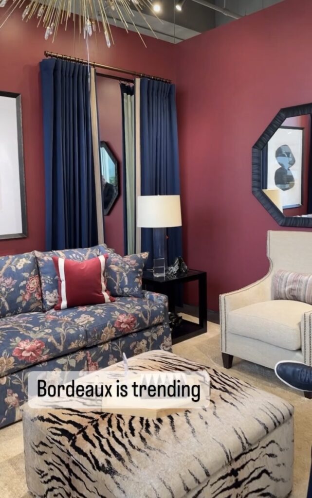
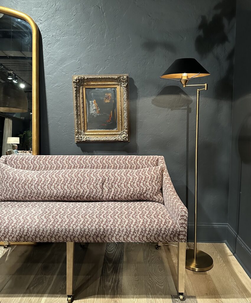
Kravet showroom
How is Bordeaux new?
Here’s the thing. I’ve helped clients repaint their burgundy rooms for too many years to fall madly in love with it myself. But as the trend cycles keep moving like a steady river current, this colour is back.
But, with a sexy new name. An old trending colour that was overdone back in the day is added to new shapes and remixed with different colours and textures to make it look new again.
Young designers who didn’t live through the wine and green world of the 80s and 90s see it as completely cool and retro. In fashion spotting at market we noticed three trends:
- savvy young men everywhere clad in a combo of burgundy and blue
- Sundresses in wine and apricot
- Burgundy accessories on black and white outfits
And interior design follows fashion. Remember Pantone’s 2015 COTY Marsala quickly began showing up in fashion.
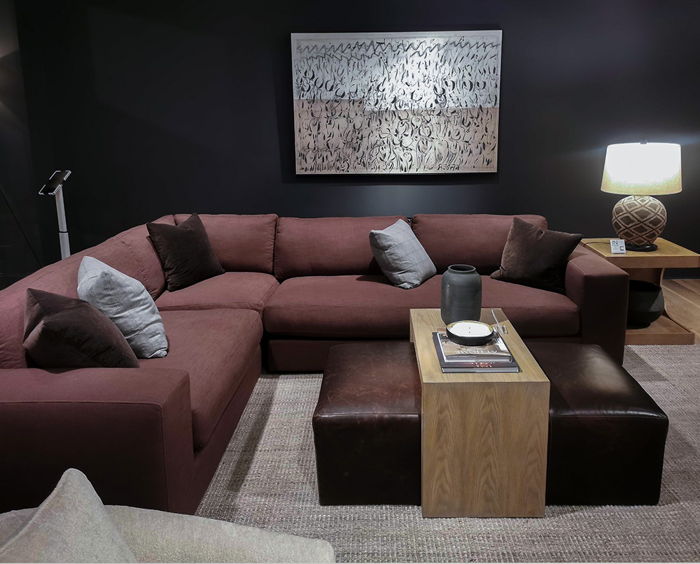
What Tricia and I noticed this weekend in the showrooms is that this shade of maroon is being used in a couple new ways.
Wine toned accents with black, grey and white
There was plenty of cognac orange and brown at market, and similarly wine is being used to add colour to black and white spaces. Especially in the “organic modern” style that has been trending for a few years now.
Rowe Furniture
Matte fabrics in bordeaux were wrapped around boxy and curved modern sofas and chairs. Whereas the deep wine tones of old were the standard colourway for a decadent formal mood. We noticed that the new role for burgundy is as a laid back accent.
Burgundy anchors whimsical colour
It was also sprinkled around as an accent in all neutral rooms (above), or as the grounding deep accent in fresh colourful rooms just like in the check sofa in this soft green room below.
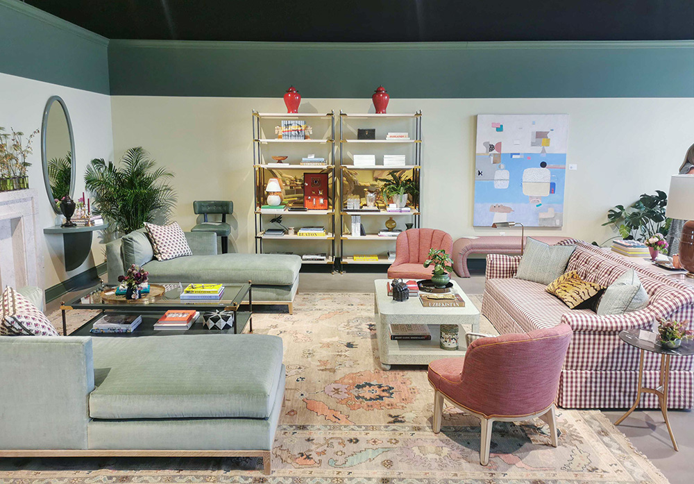
Highland House
Pretty in pink
Overall, it’s used in a much more laid back and casual way. This is NOT your Grandma’s burgundy damask.
The most formal and glam use of bordeaux we spotted was at Chaddock. To keep it looking fresh, it was paired with mellow mauve pink and blue as well as distinctly contemporary shapes and modernist art.
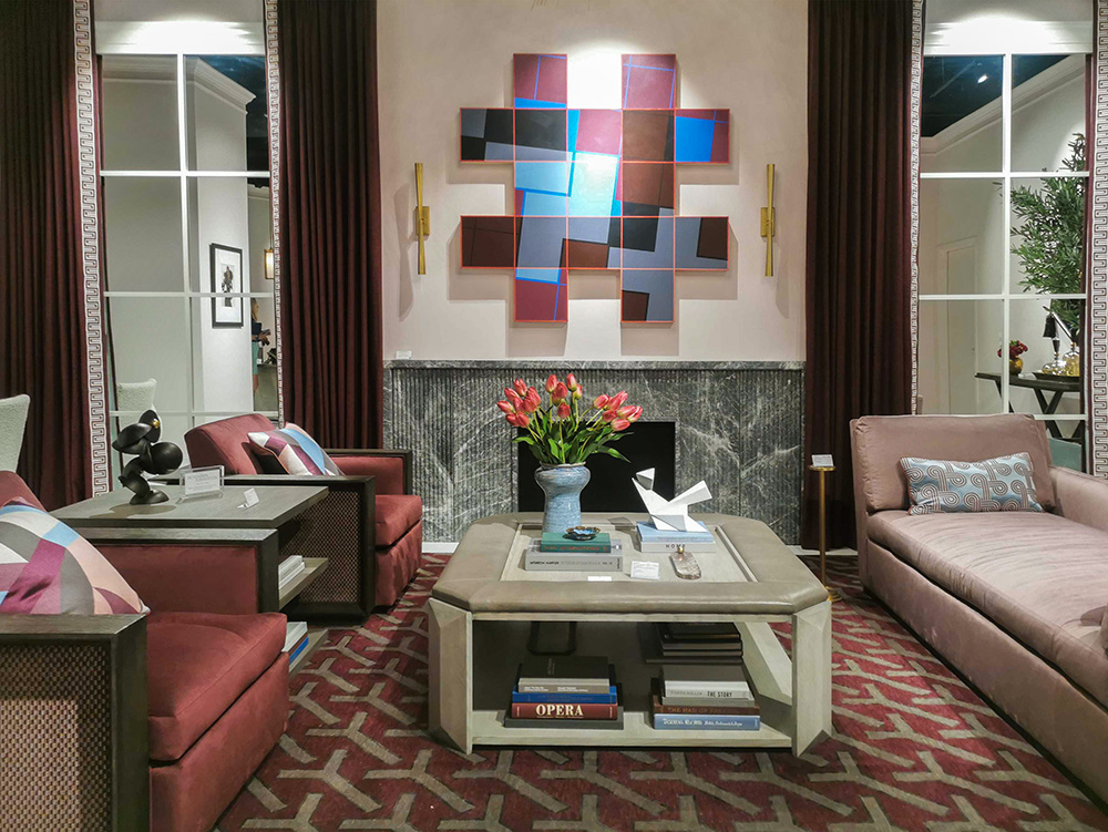
Chaddock
Double trend moment
We saw another trend having a moment at HPMKT Spring 2023. The hottest trend in we saw in prints is block prints. Here’s a moody double trend vignette below: block print + burgundy.
Rowe Furniture
Over to you my lovelies, our full trends report is coming but what do you think? Could you embrace it again? Or is it new to you?
During my panel talk about Courageous colour (watch a clip here) at the Jaipur Living showroom on Saturday, our moderator Lance Trachier reported that he is renovating his home right now and burgundy is what he’s decorating with.

Loved meeting so many of my followers out and about at High Point!
Become a True Colour Expert this Spring. There are just 3 dates left!
I’ll be adding more insider info on trends to keep you in the loop during the course. My live workshop is always fresh, and it’s never the same.
And how many online courses have you bought that you’ve never watched? That’s why a virtual, real time workshop is best for learning colour!
May 10 & 11, 2023
May 20 & 21, 2023 (weekend)
June 21 & 22, 2023
Related posts:


Not a fan of the burgundy, no matter what it is called. It always looks “old” and stuffy to me.
Exactly what I was thinking! I think I can trace it back to the 70’s and it does seem very old fashioned.
a little too conservative!
No, just NO!
Dreadful all around.
Next thing you know they’ll be bringing back men’s burgundy leisure suits.
Nope. Have never liked these deep shades of red no matter what they’re called. Not in the 80’s and not now😎. Too heavy and depressing for me!
I think it’s just ok. Maybe the royal blue,oops, sorry, Indigo Blue. I don’t see -wow- in any of it. Love the animal print ottoman 😍!! Now that blue flower couch in front of the animal print ottoman, once was enough, never again! LoL
Hi Liz The floral sofa can be found on garbage/recycle pickup in most neighborhoods. This one looks tired and worn out. Yes agree, never!!!!
Whether it’s called wine , burgundy, maroon, or Bordeaux, I’m not a fan. I predict it’s popularity will be short lived.
Great colour to spill red wine on. I mean that in a good way as it’s easier than getting it off a white sofa!
Nice to hear from our expert what trends and colours are coming our way.
David, in the Scripture says, “there is nothing new under the sun”.
Doesn’t need we need to use it. Pantone was wrong on this color. I think their committee was out the night before drinking too much burgundy 2Buck Chuck..
HOWEVER, I’m happy you enjoyed your trip and you wore the correct shoes!!!!!
Actually David’s son Solomon said that. So true, though.
Thank you Carol. Yes, it will always be true.
Bless you
I don’t mind the first photo with the animal print ottoman and starburst chandelier, however I wouldn’t choose any of this for my own home. I was born in 1969, so it all seems old to me. Attending High Point Market is on my bucket list!
No. No way, not again. Not in my house.
i loved it in the early 2000s. Not now. Ich.
Nope. Not a fan either.
No. But I do like the matte burgundy sectional against the black wall for an entertainment room.
I am a “Winter,” so I love burgundy and blue and even hunter green, but not in wall colors. Too dark for most rooms in most homes. I like it in accessories and accent pieces, and have used these in my home over the years. I do not have an unlimited budget to go with trends, so have decorated with neutrals and classic pieces as much as I could. Just as Maria preaches, I can afford to change out accessories to keep things fresh, but not the expensive things. I love seeing what you do, and try to incorporate your advice, which is so helpful, when I buy things. It heartens me to see these colors back. It means I’ll be able to find flattering clothes to buy as well. Trend colors are always cycling through–it is just the names that change.
But winters (as in Color Me Beautiful) are both icy and jeweled colors. Hunter green is Autumn. But maybe you’re talking about the season. Probably. Excuse me, when I had my colors done by a CMB rep it was a long time ago; I’m old.
Me too, Beth! So much fun! ( I’m a summer..)
I say an adamant NO to burgundy, Bordeaux, and especially maroon in ALL seasons! ( Throw in mauve for good measure..)
I DO appreciate your market updates, though, Maria!
Eek, mauve! Shhh!
I’m a summer too, btw.
Burgundy (AKA Bordeaux) looks like blood. I will never use it, wear it, or recommend it.
Oh no, that has taken permanent residence in my brain.
I will join in with the chorus….NO! Not a fan. Looks downright depressing and old. Can’t see it going very far at all. Glad that I don’t go by these people who make the trends because they are out of touch.
That first blue floral couch – wow. Not a fan. Honestly can’t imagine having that in my house ever. It’s like New England meets the Golden Girls 🙂
UGH, UGH, UGH!!!
NO!
Ohhh, I just can’t. How many clients did I have way back when that HAD to have a burgundy dining room? If it fit the rest of the rooms, often I could move them to navy, but once in a blue, um, burgundy moon, I couldn’t. Their house, their choice.
I’ve had enough burgundy/bordeaux for a lifetime (the color, not the wine.) I once had a mauve ruffled bodysuit that came with a short burgundy circle skirt before I realized that those colors are usually too cool for me
The blue and bordeaux floral sofa in the top room photo with the animal print ottoman – that sofa just looks frumpy and dowdy. I didn’t love this color the last time it was popular and it’s never going to look fresh to my eyes.
It has taken me a couple decades to be ready for the reds/burgundy/mauves again after the tuscan trend. But you know what, I’m here for it! I recently bought a cognac sofa and surprisingly, burgundy/bordeaux/mauve look stunning with it – like aged whiskey in a rose-colored glass. Bring it on!
I’m with Christine – I never really stopped liking burgundy, and am happy to see it again. Anything would be better than the all-gray that is everywhere around me right now (usually with clashing undertones) – that’s what makes me say ugh.
Please…are there no other colors. Ugh.
While I’m not a fan, as presented at this market, I am sure that over the next couple of years, we will begin to “acclimate” to this color, once again. I actually love all shades of red, used correctly. What I can’t even look at is the pink and blue, as seen in the modernist art print, above the fireplace. I STILL have PTSD from the mid-1980’s, mauve and blue sponge painted walls my neighbor did in her very large, family room….. This contemporary take on that color scheme is no less heinous than the “art deco” rooms or “country” rooms we saw back then.
Judging by a quick glance over the comments I”m in the minority: I really like the bordeaux/burgundy.
Me too.
Me too!
I thought the first photo with floral sofa was a “before” photo, it looks so frumpy.
I can’t, I just can’t. Nooooo…… too many ’80s vibes for me, it’s not flattering and looks dull & flat.
Surely there are other colors that are pretty to pick from.
Don’t like it at all, but it does wonders next to my complexion🙂
No, and it’s probably my age. Over the decades, I’ve been in too many burgundy (ahem, Bordeaux) doctors’ offices and hotel ballrooms to find this color anything other than drab and institutional. I look forward to seeing what the young designers do with it.
Drab, dull, and depressing- then and now. The first photo makes me think “they need to update and let the light in”
Just no to Burgundy , Bordeaux or wine red, …except in my glass. Especially when combined with Hunter Green or other dark colors.
I can see burgundy used in extreme moderation with light pink tones and lighter greens in a complex cream off-white setting, maybe. But generally it just looks old and stuffy.
I canNOT!
I bought a house where the previous owners had painted the dining room in burgundy and then sponge painted with brown on top. It looked like blood. I painted that a lovely pale yellow very quickly! I think the problem with burgundy is that it is the color of blood–it’s hard to accessorize with it because nothing really goes well with it. Even dark green is not beautiful with it. It’s like a solo singer at karaoke who doesn’t sing very well. The only place that it looks good is in a palace or a theater.
Yes – WHY? Because I’ve learned that it takes time to acclimate to a color – especially when it’s a repeat color from another time and place. I think of my garden and all the beautiful red, pinks, corals, burgundy … and when it’s an English garden or an Italian countryside garden … almost anything goes. As designers we’ve been “GRAYED” for so many years and “TUSCANED” before that … I never fell into the dance of gray UNLESS it was right for my client’s home or lifestyle … no matter what color … colors are trending … the package … the whole enchilada needs to be considered. What type of home? Personality of clients? How long will they live there? Children? Pets? Budget? What needs to be repurposed … what can be replaced? What colors do they absolutely HATE … will not live with … and I always look at my clients as part of the room! What colors do they look good in … what will lift their spirits? What colors will complement them? There are so many variables when creating a design for a client; a new floor plan; a new color scheme … I can’t automatically embrace a color nor can I automatically reject it … I’ve learned that ‘everything OLD is new again’ and to ‘never say never!’ Burgundy, Bordeaux, Sapphire blue, Indigo Blue, Royal Blue … I think of Shakespeare … “A rose by any other name would smell as sweet” … perhaps not … but as a seasoned designer I’ve learned to be receptive to change … as long as my client will benefit … I’m often asking my client to keep an open mind and I need to do the same thing. “To Bordeaux or not to Bordeaux …that is the question.” PS – I love Maria’s blog … if you’ve NEVER taken her course YOU MUST … it’s a real game changer in how you’ll perceive color and how, as a professional, you’ll present color!
I agree w you! I bought a condo that the previous owner chose a red mahogany LVP flooring throughout 15 yrs ago and still in great shape and I was horrified! Everything fell into place when a decorator helped me choose a fabulous vintage rug that repeated the floor color plus other shades and complimentary colors and that was my spring board for the entire condo. It was difficult finding the exact shades and decorating items to repeat the medium and small color throughout but I did it and I am enamored with this color now and the one of a kind look. Maria’s blogs were immensely helpful in pulling this off. I even found a small lamp! Now I need to choose a warmer paint color for the stark white walls ……😉
I’m so glad it worked out for you AND by using a designer … it’s wonderful to know that it all fell into place. Sometimes important items can be salvaged. Other times they can’t. As far as a new wall color – I would think that your designer could quickly figure that out. I love choosing paint colors … I always say that paint in a can is … money well spent or money spent!
I say just use what you like regardless of trends.
No. Barf bag required for many of these vignettes. Anticipating nightmares.
Do admit the patterned Rowe sofa is not without saving grace, but even that would look better in another color.
It’s a big, fat NAY for this girl. Lol.
I like burgundy/bordeaux in clothing but find it difficult to liven up. Those model bordeaux rooms look somehow flat to me. And some look downright dead.
Yikes! I’m not impressed with any of the rooms. To me, the Highland House living room looks like a “his and hers” mix of furniture and styles. And absolutely NO to burgundy. It’s so gloomy and depressing!
It seems my grandmother passed two years before the return of her favorite color. Maybe if the thrift store still has her sofa they can find a buyer soon.
No, thank you, not my cup of tea! Yikes!
Just to pile on…absolutely NO! Haven’t seen it in clothing, wallpaper, soft decor, paint, cars, furniture anywhere. Don’t think it is catching on in the major I-95 corridor cities in the USA….could be a ‘southern’ thing trying to set a trend that the rest is feeling rather blah about. Have had zero requests and can’t envision it happening…and let’s hope not. Viva Magenta and the related hues would be preferable and Yes, I am seeing a lot of these colours in bedrooms, dining rooms, living rooms and even outdoor spaces.
Well I had and has always been around in clothing. I actually wear it on occasion. Looks great on me.
….would like to add…have been privy to quite a few people in their 30s gravitating to Yellows for their public spaces..(goes well with green/navy/magenta/apricot…almost everything…..perhaps Highpoint didn’t get the memo.
Ok, I don’t like burgundy (I still remember the horrors of burgundy/ hunter green and gold wallpaper borders). However I painted my family room, front entry and hallway a gorgeous shade of raspberry. Brighter, bluer and richer look than burgundy. The areas had lots of windows and doorways so the colour was more of an accent. The people who bought the house 10 years ago still have it although they might just be afraid of repainting over a dark colour lol!
Hi, what was the raspberry colour called, I’m intrigued.
It definitely seems like we need more happy in our lives lately, and burgundy sure doesn’t feel happy to me. It feels like an attempt to be sophisticated or fussy or expensive. It reads a bit oppressive to me which is maybe why it’s fitting for wrapping up this Covid era 😉 or maybe I’m overthinking as usual!!! I’ll take yellow any day.
Burgundy by itself, no! But in the right environment, it’s lovely. I’m not a fan of red, but I’ve seen some rooms with a red sofa or wall that were stunning because of the whole mix of the design.
Um, NOPE! Maroon (burgundy) and white were my high school colors, and I wore a lot of maroon and white 1978-1982. Haven’t worn it since and don’t want to decorate with it either.
I am not feeling any of it. . Every single inspires photo posted here is hideous so Iif even YOU can’t find a decent photo it’s def a hard pass.
I don’t mind softer pinkish burgundies. They add real warmth to a room and I’ve always been drawn to warm, cosy colour palettes.
Indigo and Royal Blue have always been very different shades of blue in my mind, indigo having an almost purple cast to it and royal being a very vibrant true blue.
I don’t think any of the images above show either of these colours in a way that makes them look good.
Dreadful … just dreadful. I don’t know they define fresh, but it doesn’t mesh with my definition. The colors, the prints … not my idea of fresh.
I always liked burgundy as a very elegant color and had used it in decor back in the late 90’s, early 2000’s and I actually wear it on occasion but right now, I am not feeling it for my decor. I don’t follow trends in color, I just go with what I am gravitating towards at the moment color wise. Maybe in a few years.
I’m a grandmother so I’ve been through a lot of color trends. In one of my houses I had a burgundy dining room and loved it. In another house, I had a burgundy study/office. I loved it at the time but I could never do that color on walls again. I also had the flowered fabric prints and wallpaper which I could also never do again. My house now is mostly white, creams, and touches of black with a little seasonal color added in at each change of season. For instance, this spring I have added a little yellow and green accents such as a few pillows, vases, dishes. I like this so much that I don’t think I will ever change what I have now no matter what trend comes in and then goes out. You younger people can follow the trends, but I never want to go back to dark paint colors and prints that I quickly tire of. BTW, I’ve been to the High Point Market several times and absolutely enjoy every minute of it!!!
Haha, Yep, I had a burgundy and green home in the 90s! My sofas were green and burgundy stripe–so glad to get rid of those! Anyway, I really like the matte look sectional sofa with the black and natural wood tones, such an update.
I feel like the only place this color feels right is in an ornate vintage theater. None of these examples use burgundy well to me. In living spaces, I’d want it to be paired with lighter colors. Otherwise it feels oppressive.
I can imagine it in the background of a palate full of whites or golds, pinks… but WAY in the background. The geometric burgundy rug could be a good accent with a lighter-colored palate.
But the deep blue drapes, ouch. The gray walls, ugh. Not for me.
Yuck! Reminds me of the 80’s and not in a good way.
While I don’t follow trends and I would never paint a wall burgundy/Bordeaux, Mariah’s subtitle “Burgundy anchors whimsical colour” describes my use of burgundy. My living room rug is a wild and whimsical version of a Persian rug in orange and yellow with splashes of red, purple, pink and teal. I have two orange mid-mod chairs, and a purple armchair. Trust me, it’s beautiful. I get lots of compliments. Accents are in various shades of red/burgundy, including a large wall hanging from India and a huge photo of Antelope Canyon in AZ (red, orange, purple sandstone) on cream walls. For me, it’s a “color me happy” room.
I’m old, so it was finally time to buy my first recliner/lift chair. Recliners come mostly in neutral/boring colors, as you know, unless you want to wait 10 weeks for custom upholstery and pay a fortune. I don’t. I found a beautiful recliner online described as “red chenille” (I didn’t want leather). Got the swatch and it was burgundy, not red. Because there was truly NOTHING else anywhere that would even come close to working, I took a deep breath and ordered it. Thankfully, it’s very comfy, but even more importantly 😉 it’s beautiful and it truly does “anchor the whimsical colors” in my area rug and ties in well with my accents.
I happen to wear burgundy well, so my new chair is also very flattering for me to sit in. 🙂
Maria’s, not Mariah’s! Where did that come from LOL!
I assume that plum and eggplant fall into the burgundy trend? I adore these shades and have always had a little bit here and there- But- I treat it as an anchor- the same as black- in very small doses, and very much in the background. A lamp, a throw, a vase, a bowl of grapes…The way I see it is that it is a jewel tone-and just as jewels are meant to be worn sparingly, so it is with the deepest, richest colours.
Liz describes it so well above and nails it, in the portrayal of her livingroom, which I wish we could see!
Awwww…thanks Mimi. If o could post a photo, I would. Finding the rug, after some trial and error, really pulled the room together. And that’s why Maria says to pick the rug first if you’re starting from scratch!
I agree that plum and eggplant should fall into this trend. I like your illustration of using jewel tones sparingly, like the jewels they mimic…not that I’m able to show that much restraint LOL!
I’m actually surprised at all the “no”s. Young, cool people around here have been liking all the deep reds, and even mauves, for awhile. I agree with the people who have said we will acclimate. Overall, this range of color is really good for alot of people. I guess for us older people, though, there is always the risk of looking like we’ve had it the entire time.
I don’t like the way it was used before. It has potential this time around. 🙂
The new HGTV contest house has lots of dark colors this year. It really surprised me. I’ve been there and done that and not doing it again.
I had fun reading the comments ^^ I didn’t think people had such strong opinions about the colour burgundy. I personally like it a lot, I think it’s a bit like vampires but also elegant! Even if it is a bit old-fashioned… Still yay for me ^^
I am so happy to see color again! Remember when you would visit someone’s home and it would reflect their personal style? So tired of everything being gray or black and white! I just painted my living room a rich green and I love it.
Sure, a little burgandy is nice. Maybe in a pillow, throw, some of it in an area rug maybe even a side chair. I wouldn’t do walls in burgandy thou.
The decorating in the photos included in this blog post are unspeakably awful. The “colours” are sick making. I intensely dislike all of it. For me, the decorating displays no focus. It’s muddled and muddy and just plain ugly.